RibbonTabPanelItem in WPF Ribbon
8 Jul 20261 minute to read
RibbonTabPanelItem is used to display items below application Close button and above the RibbonBar content area. It is usually aligned in the right side of the Ribbon and we can place desired items like emojis, help button etc., in this Tab panel.
<syncfusion:Ribbon Name="_ribbon" HorizontalAlignment="Stretch" VerticalAlignment="Top">
<syncfusion:RibbonTab Name="_ribbonTab" Caption="HOME"  IsChecked="True">
<syncfusion:RibbonBar Name="_ribbonBar">
<syncfusion:RibbonMenuItem  Header="NEW" Width="100"></syncfusion:RibbonMenuItem>
</syncfusion:RibbonBar>
</syncfusion:RibbonTab>
<syncfusion:Ribbon.TabPanelItem>
<syncfusion:RibbonButton SizeForm="Small" Label="Help"/>
</syncfusion:Ribbon.TabPanelItem>
</syncfusion:Ribbon>
Create instance of RibbonButton and assign it to TabPanelItem property of Ribbon through code behind.
RibbonButton _ribbonButton = new RibbonButton() { Label="Help"};
_ribbon.TabPanelItem = _ribbonButton;
Dim _ribbonButton As New RibbonButton() With {.Label="Help"}
_ribbon.TabPanelItem = _ribbonButton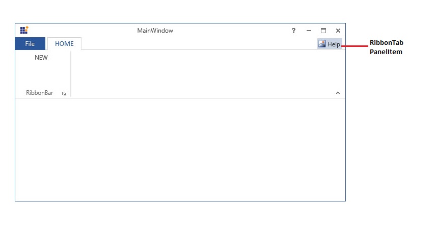
NOTE
Ribbon control supports TabPanelItem for both normal and simplified layout, where the simplified layout is designed to display the most commonly used Ribbon commands in a single line interface, allowing more screen space for compact viewing of the content. To know more about the simplified layout, refer here.