Ribbon Context Menu in WPF Ribbon
8 Jul 202624 minutes to read
RibbonContextMenu allows you to customize the Ribbon with the Right Click and it displays different functions for Ribbon and RibbonItems.
<syncfusion:Ribbon x:Name="Ribbon" VerticalAlignment="Top">
<syncfusion:Ribbon.QuickAccessToolBar>
<syncfusion:QuickAccessToolBar syncfusion:WindowChrome.IsHitTestVisibleInChrome="True"/>
</syncfusion:Ribbon.QuickAccessToolBar>
<syncfusion:RibbonTab Caption="Home" >
<syncfusion:RibbonBar Header="Clipboard" >
<syncfusion:RibbonButton Label="Paste" SizeForm="Large" LargeIcon="/Resources/Paste32.png" />
<syncfusion:RibbonButton Label="Cut" SizeForm="Small" SmallIcon="/Resources/Cut16.png" />
<syncfusion:RibbonButton Label="Copy" SizeForm="Small" SmallIcon="/Resources/Copy16.png" />
<syncfusion:RibbonButton Label="Format Painter" SizeForm="Small"
SmallIcon="/Resources/FormatPainter16.png" />
</syncfusion:RibbonBar>
</syncfusion:RibbonTab>
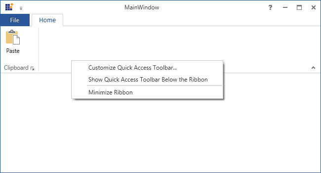
</syncfusion:Ribbon>The below RibbonContextMenu gets generated when the user right click on the ribbon
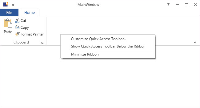
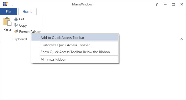
It displays along with “Add to Quick Access ToolBar” function while clicking at the RibbonItem as like in the below screenshot
Adding custom item to the ContextMenu
Ribbon Context Menu supports display of custom items. To add the custom item, set an attached property called CustomContextMenuItems of the RibbonContextMenu
<syncfusion:Ribbon x:Name="Ribbon"  VerticalAlignment="Top" syncfusion:RibbonContextMenu.IsCustomContextMenuItemsOnTop="True" >
<syncfusion:RibbonContextMenu.CustomContextMenuItems >
<syncfusion:RibbonMenuItem Header="Edit" IsCheckable="True" />
<syncfusion:RibbonMenuItem Header="Delete" IsCheckable="True"  />
<syncfusion:RibbonMenuItem Header="Rename" IsCheckable="True"  />
</syncfusion:RibbonContextMenu.CustomContextMenuItems>
</syncfusion:Ribbon>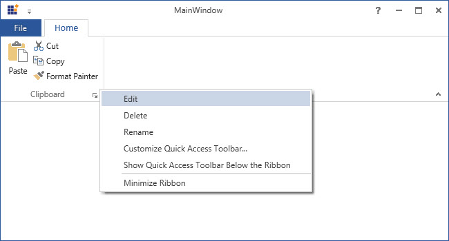
How to disable the RibbonContextMenu
In order to disable the ContextMenu handle the RibbonContextMenuOpening event
<syncfusion:Ribbon x:Name="Ribbon"  VerticalAlignment="Top"  RibbonContextMenuOpening="Ribbon_ContextMenuOpening">
<syncfusion:Ribbon.QuickAccessToolBar>
<syncfusion:QuickAccessToolBar syncfusion:WindowChrome.IsHitTestVisibleInChrome="True"/>
</syncfusion:Ribbon.QuickAccessToolBar>
<syncfusion:RibbonTab Caption="Home"  >
<syncfusion:RibbonBar Header="Clipboard" >
<syncfusion:RibbonButton Label="Paste" SizeForm="Large"
LargeIcon="/Resources/Paste32.png" />
<syncfusion:RibbonButton  Label="Cut" SizeForm="Small"   SmallIcon="/Resources/Cut16.png" />
<syncfusion:RibbonButton  Label="Copy" SizeForm="Small"  SmallIcon="/Resources/Copy16.png"  />
<syncfusion:RibbonButton  Label="Format Painter" SizeForm="Small"
SmallIcon="/Resources/FormatPainter16.png"  />
</syncfusion:RibbonBar>
</syncfusion:RibbonTab>
</syncfusion:Ribbon>
private void Ribbon_ContextMenuOpening(object sender, ContextMenuEventArgs e)
{
e.Handled = true;
}Private Sub Ribbon_ContextMenuOpening(ByVal sender As Object, ByVal e As ContextMenuEventArgs)
e.Handled = True
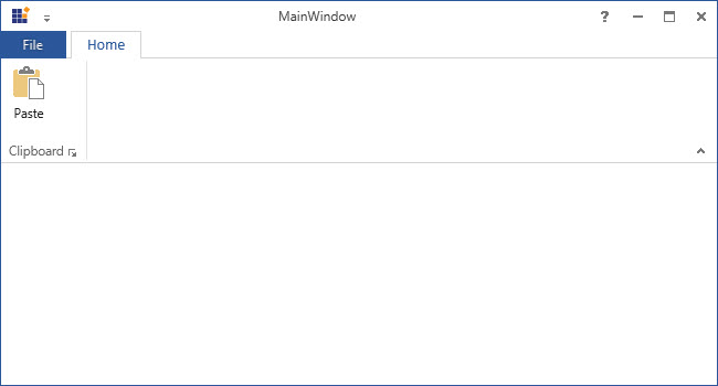
End SubThe following snapshot gets generated before handling the RibbonContextMenu event
After the event is handled, the output gets display as follows
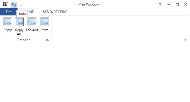
Add items to QuickAccessToolBar (QAT)
Quick Access Toolbar is used to group the frequently used commands above or under the Ribbon, and it allows to add or remove commands to it. It is placed next to the ApplicationMenu to provide end users with the easy accessibility.
Add default QAT items
Use the following code to add items to the QuickAccessToolbar
<syncfusion:Ribbon.QuickAccessToolBar>
<syncfusion:QuickAccessToolBar>
<syncfusion:RibbonButton Label="Undo" SmallIcon="/Resources/Undo16.png" SizeForm="ExtraSmall"
ToolTip="Undo" syncfusion:RibbonCommandManager.SynchronizedItem="Undo" />
<syncfusion:RibbonButton Label="Redo" SmallIcon="/Resources/Redo16.png" SizeForm="ExtraSmall"
ToolTip="Redo" syncfusion:RibbonCommandManager.SynchronizedItem="Redo"/>
</syncfusion:QuickAccessToolBar>
</syncfusion:Ribbon.QuickAccessToolBar>
RibbonButton RibbonButton = new RibbonButton();
RibbonButton.SmallIcon = new BitmapImage(new Uri("/Resources/Redo16.png", UriKind.Relative));
RibbonButton.SizeForm = SizeForm.ExtraSmall;
QuickAccessToolBar QAT=new QuickAccessToolBar();
QAT.Items.Add(RibbonButton);
Ribbon.QuickAccessToolBar = QAT;Dim RibbonButton As New RibbonButton()
RibbonButton.SmallIcon = New BitmapImage(New Uri("/Resources/Redo16.png", UriKind.Relative))
RibbonButton.SizeForm = SizeForm.ExtraSmall
Dim QAT As New QuickAccessToolBar()
QAT.Items.Add(RibbonButton)
Ribbon.QuickAccessToolBar = QAT
Add items to QAT Menu items
Ribbon also supports to add the items to QAT Menu items. To add the items to the Drop Down Menu of the QuickAccessToolBar, use the attached property, QATMenuItems of the Quick Access ToolBar . QATMenuItems can be added to the QAT by making the Selection.
<syncfusion:Ribbon.QuickAccessToolBar>
<syncfusion:QuickAccessToolBar>
<syncfusion:QuickAccessToolBar.QATMenuItems>
<syncfusion:RibbonButton Label="Save" syncfusion:RibbonCommandManager.SynchronizedItem="Save" />
<syncfusion:RibbonButton Label="Quick Print" syncfusion:RibbonCommandManager.SynchronizedItem="Quick Print"/>
<syncfusion:RibbonButton Label="Print Preview" syncfusion:RibbonCommandManager.SynchronizedItem="Print Preview"/>
<syncfusion:RibbonButton Label="Undo" syncfusion:RibbonCommandManager.SynchronizedItem="Undo"  />
<syncfusion:RibbonButton Label="Redo" syncfusion:RibbonCommandManager.SynchronizedItem="Redo" />
<syncfusion:RibbonButton Label="Paste" syncfusion:RibbonCommandManager.SynchronizedItem="Paste"/>
</syncfusion:QuickAccessToolBar.QATMenuItems>
<syncfusion:RibbonButton Label="Undo" SmallIcon="/Resources/Undo16.png" SizeForm="ExtraSmall"
ToolTip="Undo" syncfusion:RibbonCommandManager.SynchronizedItem="Undo" />
<syncfusion:RibbonButton Label="Redo" SmallIcon="/Resources/Redo16.png" SizeForm="ExtraSmall"
ToolTip="Redo" syncfusion:RibbonCommandManager.SynchronizedItem="Redo"/>
</syncfusion:QuickAccessToolBar>
</syncfusion:Ribbon.QuickAccessToolBar>
RibbonButton pasteRibbonButton = new RibbonButton() { Label = "Paste", SmallIcon = new BitmapImage(new Uri("/Resources/Paste32.png", UriKind.Relative))};
this.Ribbon.QuickAccessToolBar.QATMenuItems.Add(pasteRibbonButton);Dim pasteRibbonButton As New RibbonButton() With {
.Label = "Paste",
.SmallIcon = New BitmapImage(New Uri("/Resources/Paste32.png", UriKind.Relative))
}
Me.Ribbon.QuickAccessToolBar.QATMenuItems.Add(pasteRibbonButton)The “Paste” QATMenuItem has been selected and it is displayed as one of the items in the QAT.
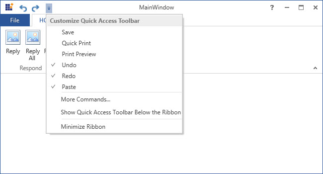
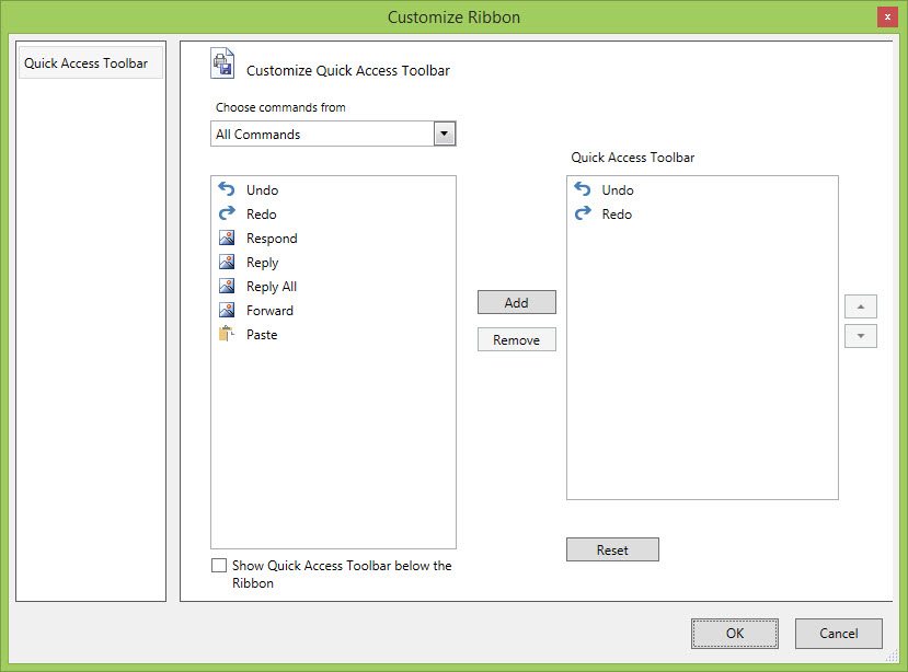
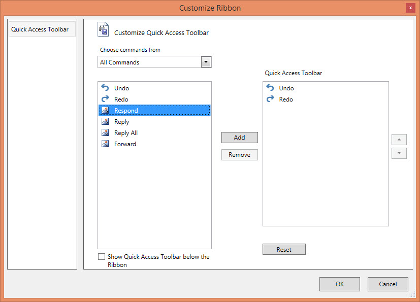
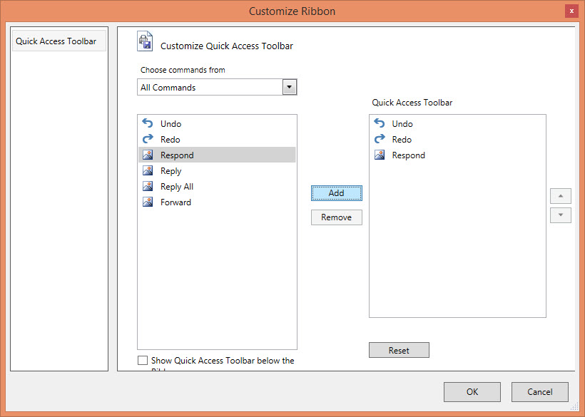
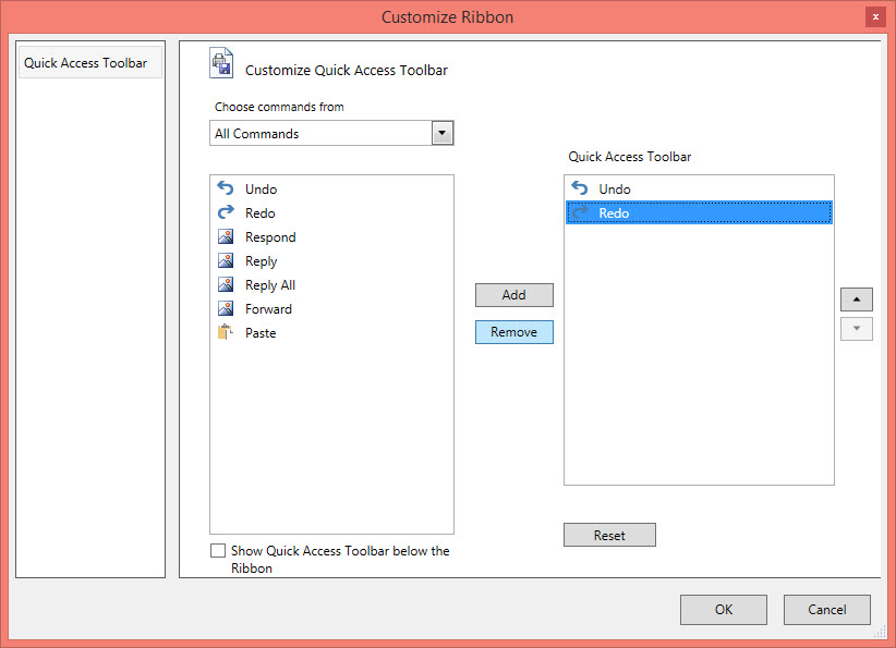
Add items to QAT customize window
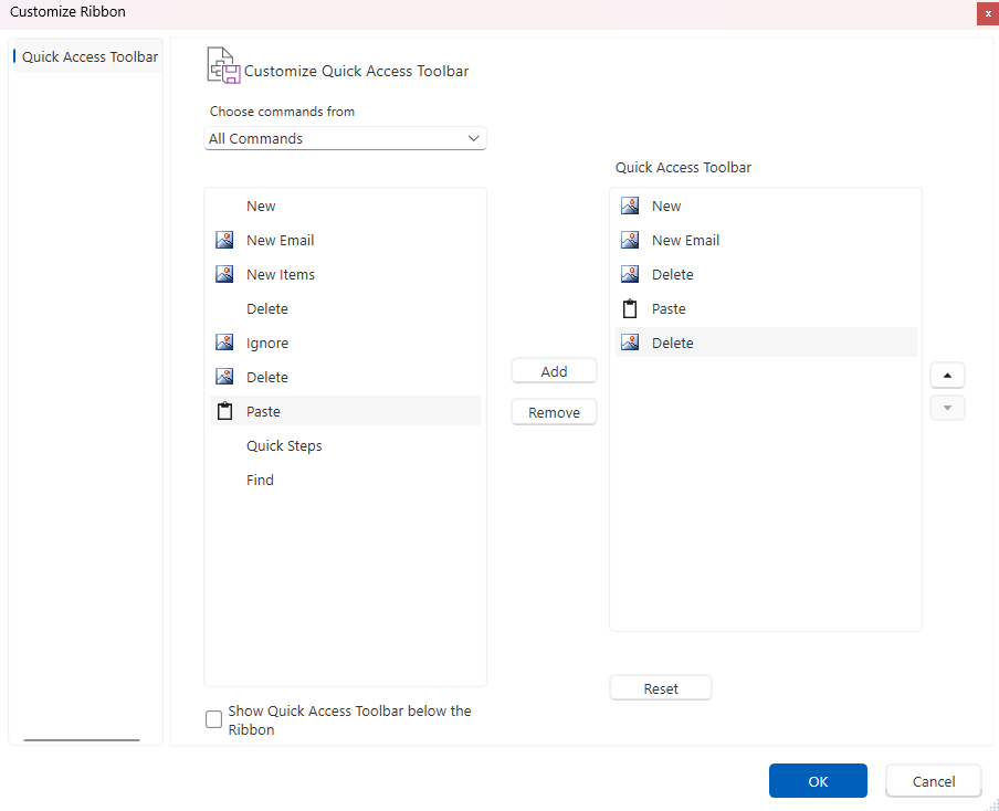
To open QAT Customize Window, select MoreCommands option from the ContextMenu of the QAT. In the QAT Customized Window, the list of Commands is available. The Commands can be filtered only from the Particular tab by using Choose commands from option. Then, select the Command to add to the QuickAccessToolBar and add commands to the right Pane of the Quick Access ToolBar Dialog by clicking Add Button. Finally click OK.
When same item is added to QAT

when we click the reset button in QATCustomization dialog

Finally, the Items gets displayed in the QAT
Customize image of RibbonBar in QAT
Ribbon control provides an option to customize image of RibbonBar in the QAT. These images can be defined in the DataTemplate of the xaml file and can be accessed using IconTemplate.
<Window.Resources>
        <DataTemplate x:Key="PasteTemplate">
            <Viewbox>
                <Path Data="M2.5549936,7.1569824L2.5549936,29.490997 20.737007,29.490997 20.737007,7.1569824 17.521002,7.1569824 17.521002,10.377991 5.7709984,10.377991 5.7709984,7.1569824z M11.646,1.3519897C10.678989,1.3519897 9.8949928,2.0939941 9.8949928,3.0099792 9.8949928,3.9259949 10.678989,4.6679993 11.646,4.6679993 12.613011,4.6679993 13.397008,3.9259949 13.397008,3.0099792 13.397008,2.0939941 12.613011,1.3519897 11.646,1.3519897z M11.646,0C13.402013,0,14.824011,1.3469849,14.824011,3.0099792L17.521002,3.0099792 17.521002,3.9729919 23.292,3.9729919 23.292,32 0,32 0,3.9729919 5.7709984,3.9729919 5.7709984,3.0099792 8.4679899,3.0099792C8.4679899,1.3469849,9.8899879,0,11.646,0z"
                                    Stretch="Uniform"
                                    Fill="{Binding RelativeSource={RelativeSource Mode=Self}, Path=(TextBlock.Foreground)}" >
                </Path>
            </Viewbox>
        </DataTemplate>
    </Window.Resources>

      <syncfusion:RibbonBar
                 syncfusion:Ribbon.KeyTip="FN"
                 syncfusion:Ribbon.ShowInMoreCommands="True"
                 IsLauncherButtonVisible="False"
                 Header="Paste"
                 IconTemplate="{StaticResource PasteTemplate}">
      </syncfusion:RibbonBar>
var pasteTemplate = FindResource("PasteTemplate") as DataTemplate;
var ribbonBar = new Syncfusion.Windows.Tools.Controls.RibbonBar
{
KeyTip = "FN",
ShowInMoreCommands = true,
IsLauncherButtonVisible = false,
Header = "Paste",
IconTemplate = pasteTemplate
};Dim pasteTemplate = TryCast(FindResource("PasteTemplate"), DataTemplate)
Dim ribbonBar As New Syncfusion.Windows.Tools.Controls.RibbonBar With
{
.KeyTip = "FN",
.ShowInMoreCommands = True,
.IsLauncherButtonVisible = False,
.Header = "Paste",
.IconTemplate = pasteTemplate
}
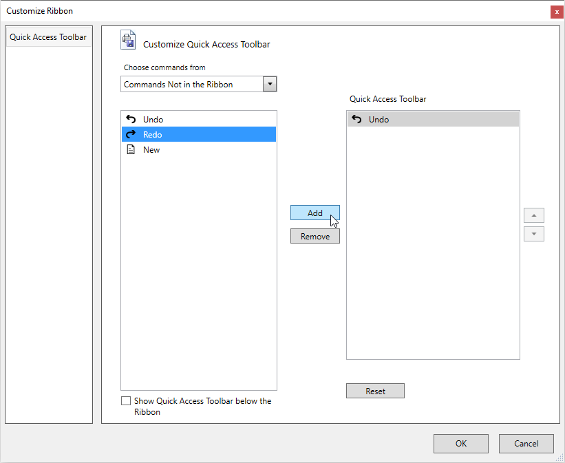
Add custom QAT items
Ribbon control provides an option to add items to the QAT that will not be present in the Ribbon. These items can be defined in the CustomQATItems collection of the QuickAccessToolbar and can be accessed from the QAT Window in the “Commands Not in the Ribbon” and “All Commands” section.
<syncfusion:Ribbon.QuickAccessToolBar>
    <syncfusion:QuickAccessToolBar QATDropDownVisiblity="Visible">
        <syncfusion:QuickAccessToolBar.CustomQATItems>
            <syncfusion:RibbonButton Label="Undo" SmallIcon="/Resources/Undo_01.png" />
            <syncfusion:RibbonButton Label="Redo" SmallIcon="/Resources/Redo_01.png" />
            <syncfusion:RibbonButton Label="New" Command="ApplicationCommands.Open" SmallIcon="/Resources/Document-01.png"/>
        </syncfusion:QuickAccessToolBar.CustomQATItems>
    </syncfusion:QuickAccessToolBar>
</syncfusion:Ribbon.QuickAccessToolBar>
RibbonButton undoRibbonButton = new RibbonButton() { Label = "Undo", SmallIcon = new BitmapImage(new Uri("/Resources/Undo_01.png", UriKind.Relative))};
RibbonButton redoRibbonButton = new RibbonButton() { Label = "Redo", SmallIcon = new BitmapImage(new Uri("/Resources/Redo_01.png", UriKind.Relative))};
RibbonButton newRibbonButton = new RibbonButton() { Label = "New", SmallIcon = new BitmapImage(new Uri("/Resources/Document-01.png", UriKind.Relative))};
this.Ribbon.QuickAccessToolBar.CustomQATItems.Add(undoRibbonButton);
this.Ribbon.QuickAccessToolBar.CustomQATItems.Add(redoRibbonButton);
this.Ribbon.QuickAccessToolBar.CustomQATItems.Add(newRibbonButton);Dim undoRibbonButton As New RibbonButton() With {
.Label = "Undo",
.SmallIcon = New BitmapImage(New Uri("/Resources/Undo_01.png", UriKind.Relative))
}
Dim redoRibbonButton As New RibbonButton() With {
.Label = "Redo",
.SmallIcon = New BitmapImage(New Uri("/Resources/Redo_01.png", UriKind.Relative))
}
Dim newRibbonButton As New RibbonButton() With {
.Label = "New",
.SmallIcon = New BitmapImage(New Uri("/Resources/Document-01.png", UriKind.Relative))
}
Me.Ribbon.QuickAccessToolBar.CustomQATItems.Add(undoRibbonButton)
Me.Ribbon.QuickAccessToolBar.CustomQATItems.Add(redoRibbonButton)
Me.Ribbon.QuickAccessToolBar.CustomQATItems.Add(newRibbonButton)Once the CustomQATItems are added to the Quick Access Toolbar using the Add button, it will be visible in the Ribbon QAT and in the QAT Dropdown menu. The visibility of this item in the Ribbon QAT can be toggled by checking/unchecking from the QAT Dropdown menu.
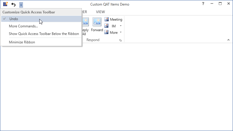
The added CustomQATItems in the QAT Dropdown menu can be removed through the QAT Window using the Remove button.
Add items from Ribbon context menu
QAT can also customized by adding the items from the Ribbon ContextMenu. Select Add to Quick Access Toolbar by right clicking the Ribbon item required to add to the QAT. Then, the respective item gets added as one of the items in the QAT.
Add custom items using RibbonItemHost
The control hosted in RibbonItemHost can be added to the QuickAccessToolBar using ribbon context menu or through QAT customization dialog. In the QAT customization dialog, all the ribbon items are displayed using its Label and IconTemplate properties. Similarly, the RibbonItemHost also allows us to set the label and icon using its Label and IconTemplate properties respectively.
-
Label- Used to display the text ofRibbonItemHostinside the QAT customization dialog. -
IconTemplate- Gets or sets the template that is used to display the icon ofRibbonItemHostinside the QAT customization dialog.
In the below example, the Label and IconTemplate are set for the RibbonItemHost controls which will be used when the items are displayed in the QAT customization dialog.
<syncfusion:RibbonWindow x:Class="Ribbon.MainWindow"
xmlns="http://schemas.microsoft.com/winfx/2006/xaml/presentation"
xmlns:x="http://schemas.microsoft.com/winfx/2006/xaml"
xmlns:d="http://schemas.microsoft.com/expression/blend/2008"
xmlns:mc="http://schemas.openxmlformats.org/markup-compatibility/2006"
xmlns:local="clr-namespace:Ribbon"
mc:Ignorable="d"
xmlns:syncfusion="http://schemas.syncfusion.com/wpf"
xmlns:skin="clr-namespace:Syncfusion.SfSkinManager;assembly=Syncfusion.SfSkinManager.WPF"
skin:SfSkinManager.Theme="{skin:SkinManagerExtension ThemeName=FluentLight}"
WindowStartupLocation="CenterScreen"
Title="Custom items demo" Height="450" Width="650">
<syncfusion:RibbonWindow.DataContext>
<local:ViewModel />
</syncfusion:RibbonWindow.DataContext>
<syncfusion:RibbonWindow.Resources>
<DataTemplate x:Key="OnePage">
<Grid>
<Path
Width="13"
Height="16"
Margin="0.5"
Data="M0,0 L11,0 11,15 0,15 z"
Fill="White"
Stretch="Fill" />
<Path
Margin="1"
Data="M1,1 L1,15 11,15 11,1 z M0,0 L12,0 12,4.158 12,5.0689998 12,16 0,16 z"
Fill="#FF3A3A38"
Stretch="Fill" />
<Path
Margin="3"
Data="M0,8.9999991 L5.9999999,8.9999991 5.9999999,9.999999 0,9.999999 z M3.2782552E-06,5.9999998 L6.0000033,5.9999998 6.0000033,6.9999996 3.2782552E-06,6.9999996 z M3.2782552E-06,2.9999995 L6.0000033,2.9999995 6.0000033,3.9999995 3.2782552E-06,3.9999995 z M3.4272668E-06,0 L6.0000033,0 6.0000033,0.99999952 3.4272668E-06,0.99999952 z"
Fill="#FF797774"
Stretch="Fill" />
</Grid>
</DataTemplate>
<DataTemplate x:Key="AlignLeft">
<Path
x:Name="Align_Left1"
Width="14"
Height="13"
Margin="2,0"
HorizontalAlignment="Left"
VerticalAlignment="Bottom"
Data="M0,12 L10,12 10,13 0,13 z M0,8 L14,8 14,9 0,9 z M0,4 L10,4 10,5 0,5 z M0,0 L14,0 14,1 0,1 z"
Fill="{Binding RelativeSource={RelativeSource Mode=Self}, Path=(TextBlock.Foreground)}"
Stretch="Fill" />
</DataTemplate>
<DataTemplate x:Key="Tables">
<Grid MaxHeight="32" MaxWidth="32">
<Path
Margin="0.5,4.5,0.5,0.5"
Data="M0,0 L27,0 27,23 0,23 z"
Fill="White"
Stretch="Fill" />
<Path
Height="4"
Margin="0.5,0.5,0.5,0"
VerticalAlignment="Top"
Data="M0,0 L27,0 27,4 0,4 z"
Fill="#FFC8C6C4"
Stretch="Fill" />
<Path
Margin="1,5,1,1"
Data="M9,8 L9,14 17,14 17,8 z M8,0 L9,0 9,7 17,7 17,0 18,0 18,7 26,7 26,8 18,8 18,14 26,14 26,15 18,15 18,22 17,22 17,15 9,15 9,22 8,22 8,15 0,15 0,14 8,14
8,8 0,8 0,7 8,7 z"
Fill="#FF797774"
Stretch="Fill" />
<Path
Data="M0.99999994,5.0000001 L0.99999994,27 27,27 27,5.0000001 z M0.99999994,1 L0.99999994,4.0000002 27,4.0000002 27,1 z M0,0 L28,0 28,4.0000002 28,5.0000001 28,28 0,28 0,5.0000001 0,4.0000002 z"
Fill="#FF3A3A38"
Stretch="Fill" />
</Grid>
</DataTemplate>
</syncfusion:RibbonWindow.Resources>
<Grid>
<syncfusion:Ribbon x:Name="mainRibbon">
<syncfusion:RibbonTab Caption="Design">
<syncfusion:RibbonBar Header="Table Style Options" IconTemplate="{StaticResource Tables}">
<syncfusion:RibbonItemHost Label="Header Row" IconTemplate="{StaticResource OnePage}">
<syncfusion:RibbonItemHost.ContentTemplate>
<DataTemplate>
<CheckBox Content="Header Row" Height="22"/>
</DataTemplate>
</syncfusion:RibbonItemHost.ContentTemplate>
</syncfusion:RibbonItemHost>
<syncfusion:RibbonItemHost Label="First Column" IconTemplate="{StaticResource AlignLeft}">
<syncfusion:RibbonItemHost.ContentTemplate>
<DataTemplate>
<RadioButton Margin="4,0,0,0" Content="First Column" Height="22"/>
</DataTemplate>
</syncfusion:RibbonItemHost.ContentTemplate>
</syncfusion:RibbonItemHost>
</syncfusion:RibbonBar>
</syncfusion:RibbonTab>
<syncfusion:Ribbon.QuickAccessToolBar>
<syncfusion:QuickAccessToolBar/>
</syncfusion:Ribbon.QuickAccessToolBar>
<syncfusion:Ribbon.BackStage>
<syncfusion:Backstage>
<syncfusion:BackStageCommandButton Header="Save" >
<syncfusion:BackStageCommandButton.IconTemplate>
<DataTemplate>
<Path Width="12" Height="12" HorizontalAlignment="Center" VerticalAlignment="Center"
Data="M5.0000019,11 L5.0000019,15 11.000002,15 11.000002,11 z M4.0000019,1 L4.0000019,6 12.000002,6 12.000002,1 z M1,1 L1,13.174 2.7160001,15 4.0000019,15 4.0000019,10 12.000002,10 12.000002,15 15,15 15,1 13.000002,1 13.000002,7 3.0000019,7 3.0000019,1 z M0,0 L3.0000019,0 13.000002,0 16,0 16,16 12.000002,16 4.0000019,16 2.2840004,16 0,13.57 z"
Fill="{Binding RelativeSource={RelativeSource Mode=Self}, Path=(TextBlock.Foreground)}" Stretch="Uniform" />
</DataTemplate>
</syncfusion:BackStageCommandButton.IconTemplate>
</syncfusion:BackStageCommandButton>
<syncfusion:BackStageCommandButton Header="Close" >
<syncfusion:BackStageCommandButton.IconTemplate>
<DataTemplate>
<Grid Width="12" Height="12" HorizontalAlignment="Center" VerticalAlignment="Center" SnapsToDevicePixels="true">
<Path
Width="12" Height="12" HorizontalAlignment="Center" VerticalAlignment="Center"
Data="M1.4139423,0L7.0029922,5.5845888 12.592018,0 14.006015,1.4149939 8.4180527,6.9985202 14.006,12.582007 12.591996,13.997001 7.0030056,8.4124444 1.4140122,13.997001 1.5026823E-05,12.582007 5.5879484,6.9985092 0,1.4149939z "
Fill="{Binding RelativeSource={RelativeSource Mode=Self}, Path=(TextBlock.Foreground)}"
SnapsToDevicePixels="True" Stretch="Fill" />
</Grid>
</DataTemplate>
</syncfusion:BackStageCommandButton.IconTemplate>
</syncfusion:BackStageCommandButton>
</syncfusion:Backstage>
</syncfusion:Ribbon.BackStage>
</syncfusion:Ribbon>
</Grid>
</syncfusion:RibbonWindow>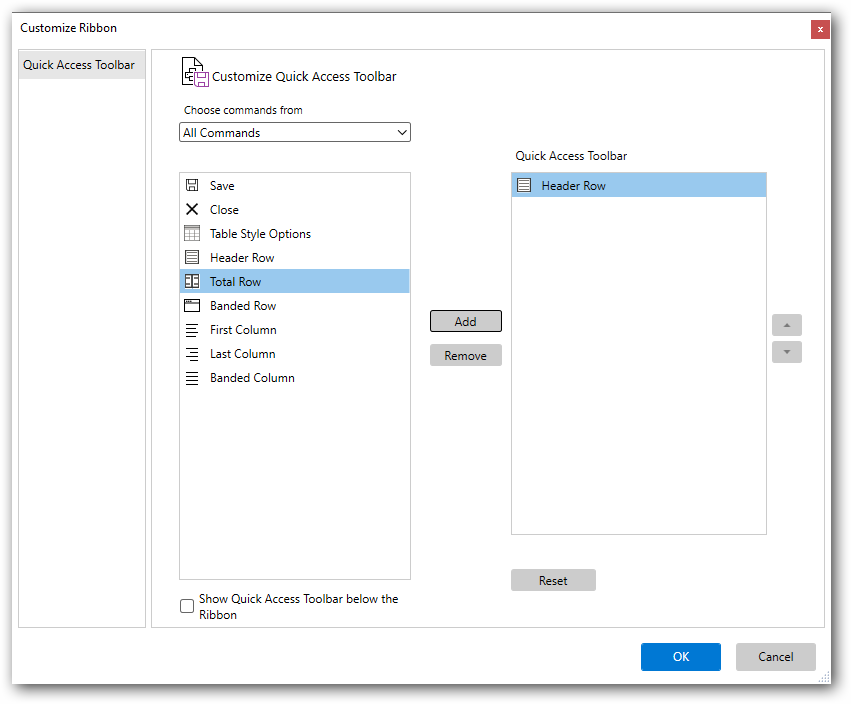

To know more about the RibbonItemHost, refer here.
Add custom RibbonTab and RibbonBar
The following section illustrates how to customize Ribbon at the run time
QAT customized window
This topic illustrates in detail about the QAT topic.
First, select MoreCommands option from the QAT to open the QAT Customized Window.
QAT can be Customized further by using the following options
-
Add
In the QAT Customized window, the list of Commands is available. The Commands can be filtered only from the Particular tab by using
Choose commands fromoption. Then, select the commands to be added to the QAT and add the command to Right Pane of the QAT Dialog by clickingAddButton. Finally, Click OK. Now, the selected command gets added in the QAT.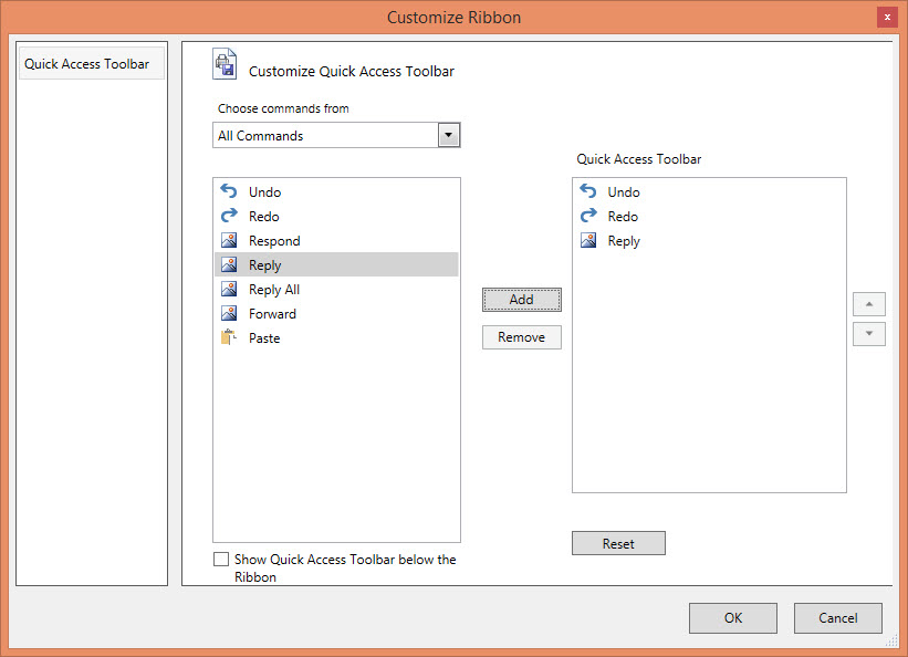
-
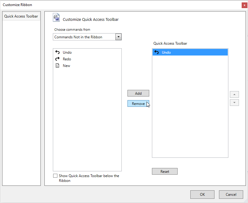
Remove
QAT items can be removed at the Run time. In the QAT Customize window, select the Command to be deleted from the QAT Dialog,and then click Remove Button. In the following screenshot, Redo command gets deleted and the output is changed according to it.
-
Reset
To restore the QAT to its default content, use this
Resetoption.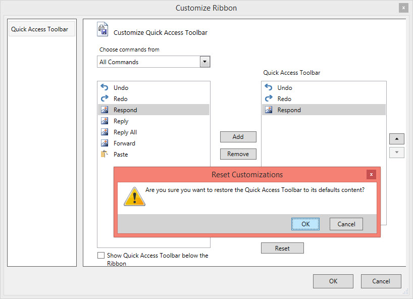
-
Reorder
QAT also supports to reorder the items by clicking the Up and down arrow at the left of the QAT Dialog.
Customize Ribbon with RibbonTab and RibbonBar
QAT can also support to customize Ribbon Tab and RibbonBar while running. To customize the Ribbon, enable the ShowCustomizeRibbon property of the Ribbon to true and follow the steps.
-
Click the Quick Access Toolbar drop-down button and click the
MoreCommandsmenu. -
Then, select the
Customize Ribbonoptions from the left-side column. -
You can add
RibbonTabandRibbonBarby selecting New Tab and New Group Options Respectively.
-
To move the tab up and down, select the tab to be moved and click the button at the right-side corner accordingly. Similarly, the group can be moved within the tab.
-
By using the
Renameoption, rename any particular Tab/Group present in the Ribbon by selecting it.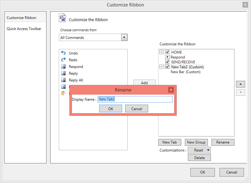
-
The visibility of any particular Tab can be changed by enabling the checkbox of the corresponding selection.
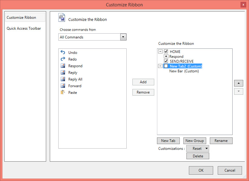
-
By using
Deleteoption, the Custom RibbonBar and RibbonTab can be deleted. But, this option does not work in the case of original content.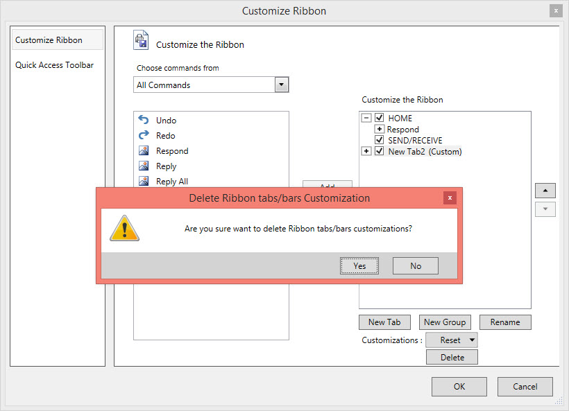
-
To delete all the Ribbon Customization, use
Reset All Customizationfrom the Reset Drop Down Menu.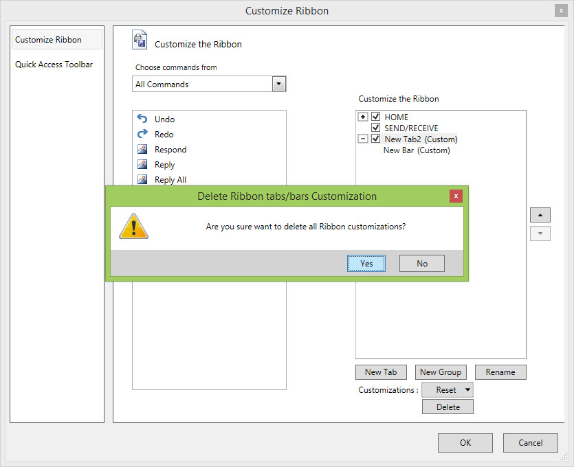
After customizing the RibbonTab and RibbonBar, RibbonItems can be customized. Customizing Ribbon Item concepts are explained as follows.
Add items to the customized RibbonTab
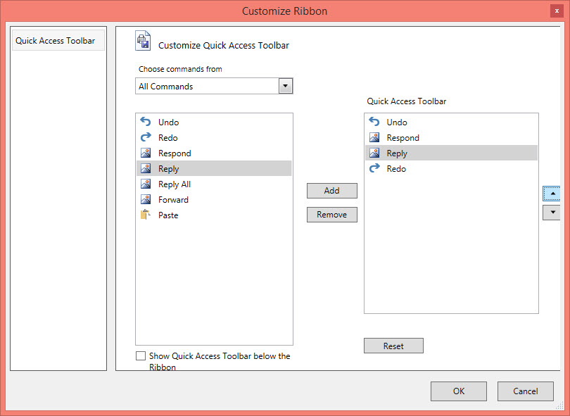
The steps to customize the Ribbon Item are as follows
-
The
Choose commands fromdrop-down list is used to filter the commands only from the Particular Tab. -
To add the item under the right-side column of a newly added
RibbonBarandRibbonTab, select the item from left-side column and click theAddbutton.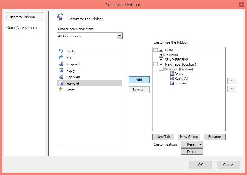
-
Also, the Ribbon Item from the RibbonBar can be removed that is added recently by using
Removeoption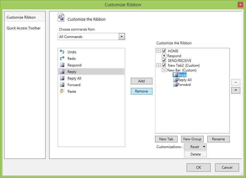
-
The order of the RibbonItem within the RibbonBar can be changed by using
UpandDownarrow -
By using the Rename option,the RibbonItem can be renamed
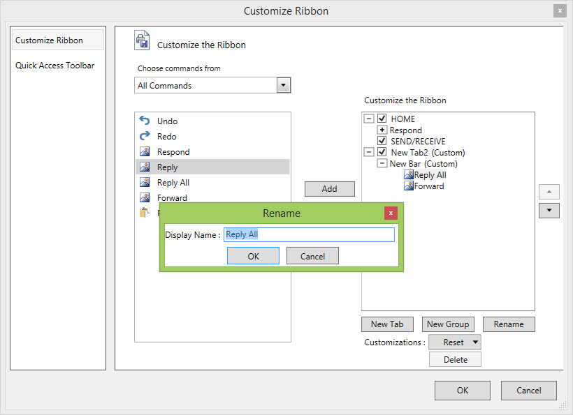
-
Click
OKbutton. The Changes are reflected in the output window.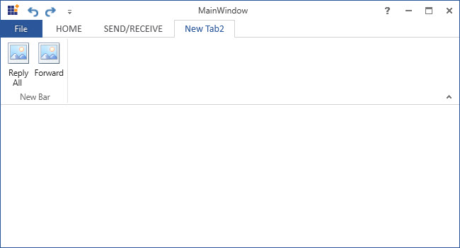
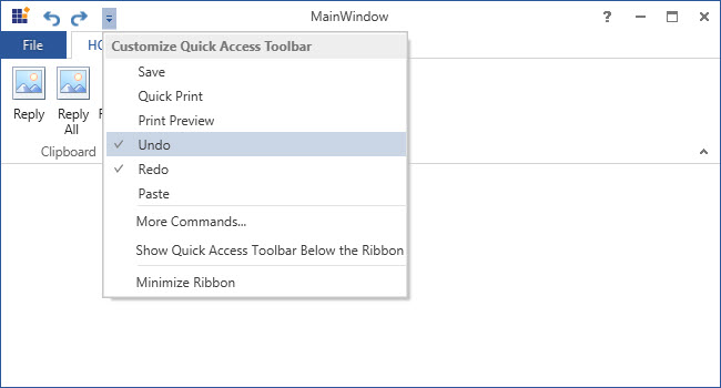
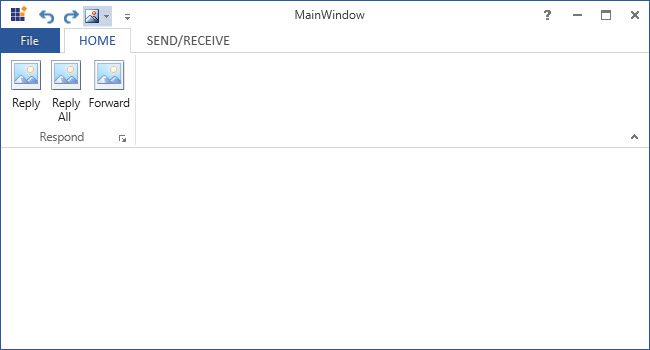
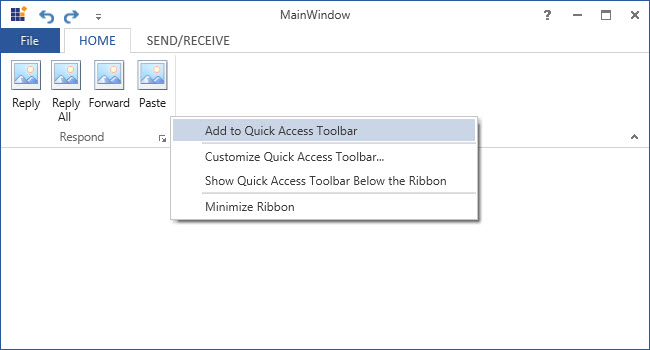
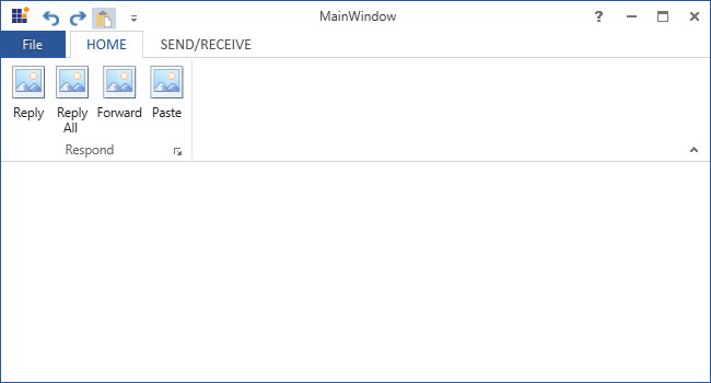
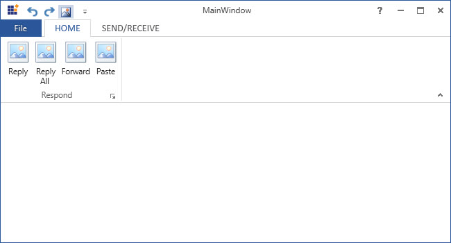
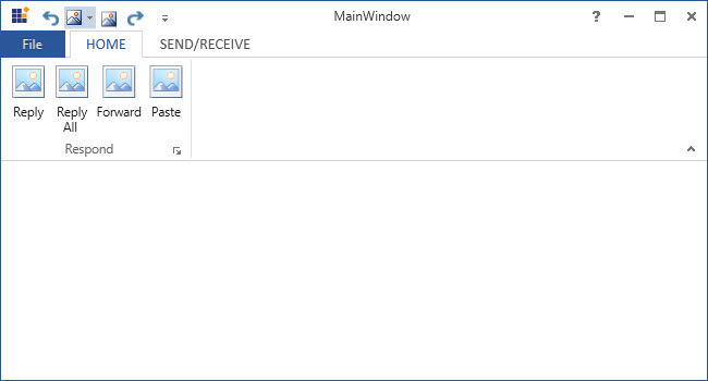
How to disable the customization in Ribbon
To disable the customization in the Ribbon, set ShowCustomizeRibbon property of the Ribbon as False
<syncfusion:Ribbon  VerticalAlignment="Top" x:Name="Ribbon" ShowCustomizeRibbon="False">
<syncfusion:Ribbon.QuickAccessToolBar>
<syncfusion:QuickAccessToolBar >
<syncfusion:RibbonButton Label="Undo" SmallIcon="/Resources/Undo16.png" SizeForm="ExtraSmall"
ToolTip="Undo" syncfusion:RibbonCommandManager.SynchronizedItem="Undo" />
<syncfusion:RibbonButton Label="Redo" SmallIcon="/Resources/Redo16.png" SizeForm="ExtraSmall"
ToolTip="Redo" syncfusion:RibbonCommandManager.SynchronizedItem="Redo"/>
</syncfusion:QuickAccessToolBar>
</syncfusion:Ribbon.QuickAccessToolBar>
<syncfusion:RibbonTab  Caption="HOME" >
<syncfusion:RibbonBar  Header="Respond">
<syncfusion:RibbonButton Label="Reply" SizeForm="Large"/>
<syncfusion:RibbonButton Label="Reply All" SizeForm="Large"/>
<syncfusion:RibbonButton Label="Forward" SizeForm="Large"/>
<syncfusion:RibbonButton   Label="Paste" SizeForm="Large" SmallIcon="/Resources/Paste32.png" syncfusion:RibbonCommandManager.SynchronizedItem="Paste" />
</syncfusion:RibbonBar>
</syncfusion:RibbonTab>
<syncfusion:RibbonTab Caption="SEND/RECIEVE"/>
</syncfusion:Ribbon>
In the following screenshot, customizing Ribbon is disabled and it shows only the QAT Customize window