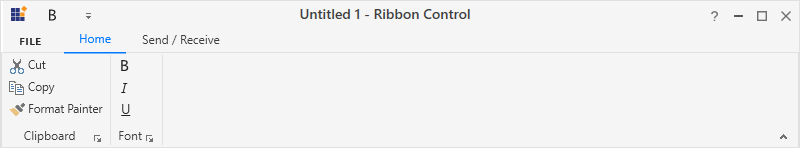
Simplified Layout in WPF Ribbon
8 Jul 202610 minutes to read
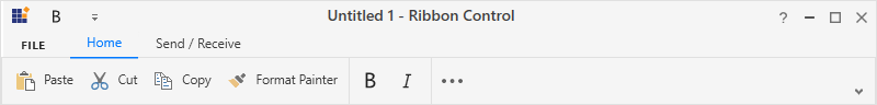
The Ribbon is available in simplified layout which is designed to display the most commonly used Ribbon commands in a single line interface, allowing more screen space for compact viewing of the content. For the best user experience, the other Ribbon commands are located under the overflow menu. It also provides option to switch back and forth between the simplified and the normal layout using the minimize button.
The LayoutMode enumeration property provides an option to load the Ribbon control in simplified layout. It contains the following options like:
- Normal - The Ribbon items are arranged in the standard layout. This is the default value.
- Simplified - The Ribbon items are arranged in the simplified layout.
<Grid>
 <syncfusion:Ribbon x:Name="ribbon" LayoutMode="Simplified" VerticalAlignment="Top">
 </syncfusion:Ribbon>
 </Grid>
Ribbon ribbon = new Ribbon();
ribbon.VerticalAlignment = VerticalAlignment.Top;
ribbon.LayoutMode = LayoutMode.Simplified;
grid.Children.Add(ribbon);Switching between simplified and normal layouts
The Ribbon control allows you to switch between simplified and normal layouts at runtime using the Ribbon minimize button located in the lower right corner of the Ribbon. To enable this option, set the EnableSimplifiedLayoutMode property to True. By default, its value is False.
<Grid>
 <syncfusion:Ribbon x:Name="ribbon" EnableSimplifiedLayoutMode="True" VerticalAlignment="Top">
 </syncfusion:Ribbon>
 </Grid>
Ribbon ribbon = new Ribbon();
ribbon.VerticalAlignment = VerticalAlignment.Top;
ribbon.EnableSimplifiedLayoutMode = true;
grid.Children.Add(ribbon);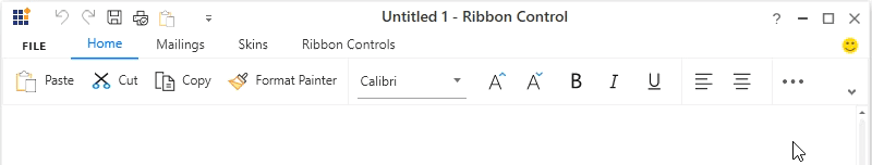
Visibility of the Ribbon items between normal and simplified layout
The Ribbon items can be set common between different layouts or can be made visible only in a particular layout using the SimplifiedLayoutSettings.DisplayMode attached property. By default, items will be displayed in both normal and simplified layout. The DisplayMode is of flag enumeration type that contains the following values.
- Normal - The item will be displayed only in the normal layout.
- Simplified - The item will be displayed only in the simplified layout.
- OverflowMenu - The item will be displayed only inside the overflow menu when simplified layout is enabled.
Also, the DisplayMode property allows the following value combinations as well.
- Normal, Simplified – The item will be displayed in both normal and simplified layout.
- Normal, OverflowMenu – The item will be displayed in both normal layout and inside overflow menu during simplified layout.
- Simplified, OverflowMenu – The item will be displayed in simplified layout.
- Normal, Simplified, OverflowMenu – The item will be displayed in both normal and simplified layout.
In the below code snippet, the SimplifiedLayoutSettings.DisplayMode property for Paste option is set to “Simplified”, so it will only be displayed only in the simplified layout. The SimplifiedLayoutSettings.DisplayMode property for Underline option is set to “Normal,OverflowMenu”, so it will be displayed in the normal layout and will also be displayed inside the overflow menu in the simplified layout.
<!-- This item will only be displayed in simplified layout -->
 <syncfusion:RibbonButton Label="Paste" syncfusion:SimplifiedLayoutSettings.DisplayMode="Simplified" />

 <!-- This item will only be displayed in normal layout -->
 <syncfusion:RibbonButton syncfusion:SimplifiedLayoutSettings.DisplayMode="Normal" SizeForm="ExtraSmall" />

 <!-- This item will be displayed in normal layout and inside overflow menu during simplified layout -->
 <syncfusion:RibbonButton Label="Underline"  syncfusion:SimplifiedLayoutSettings.DisplayMode="Normal,OverflowMenu"  SizeForm="ExtraSmall”/>

 <!-- This item will be displayed both in normal and simplified layout -->
 <syncfusion:RibbonButton Label="Italic" SizeForm="ExtraSmall"/>
// This item will only be displayed in simplified layout
RibbonButton pasteButton = new RibbonButton();
pasteButton.Label = "Paste";
SimplifiedLayoutSettings.SetDisplayMode(pasteButton, DisplayMode.Simplified);
// This item will only be displayed in normal layout
RibbonButton boldButton = new RibbonButton();
boldButton.Label = "Bold";
boldButton.SizeForm = SizeForm.ExtraSmall;
SimplifiedLayoutSettings.SetDisplayMode(boldButton, DisplayMode.Normal);
// This item will be displayed in normal layout and inside overflow menu during simplified layout
RibbonButton underlineButton = new RibbonButton();
underlineButton.Label = "Underline";
SimplifiedLayoutSettings.SetDisplayMode(underlineButton, DisplayMode.Normal | DisplayMode.OverflowMenu);
// This item will be displayed both in normal and simplified layout
RibbonButton italicButton = new RibbonButton();
italicButton.Label = "Paste";When using simplified layout, the Margin, Width and Height values of the Ribbon items can be ignored as they are changed based on the size form and layout mode. If the item to be shown in both normal and simplified layout, the Margin, Width and Height properties can be set for normal layout alone using triggers.
<syncfusion:RibbonButton Label="Copy" syncfusion:SimplifiedLayoutSettings.DisplayMode="Normal,Simplified"   SizeForm="Small" MediumIcon="/Resources/Copy_20.png" SmallIcon="/Resources/Copy16.png" >
    <syncfusion:RibbonButton.Style >
        <Style TargetType="syncfusion:RibbonButton" BasedOn="{StaticResource SyncfusionRibbonButtonStyle}">
            <Style.Triggers>
                <Trigger Property="syncfusion:SimplifiedLayoutSettings.LayoutMode" Value="Normal">
                    <Setter Property="Height" Value="48"/>
                    <Setter Property="Width" Value="48"/>
                    <Setter Property="Margin" Value="2"/>
                </Trigger>
            </Style.Triggers>
        </Style>
    </syncfusion:RibbonButton.Style>
 </syncfusion:RibbonButton>
Setting image for Ribbon items
For “Normal” layout mode, the images from the SmallIcon and LargeIcon properties are used inside the Ribbon items based on the size mode (extra small, small and large). However, the simplified layout mode uses 20 * 20 image size for the Ribbon items as standard and it can be obtained from the MediumIcon property. In-case if the IconTemplate property is used to display the image, the simplified layout will automatically resize it to 20 * 20 size.
<syncfusion:RibbonButton Label="Paste" syncfusion:SimplifiedLayoutSettings.DisplayMode="Simplified" MediumIcon="/Resources/Paste20.png" />
 <syncfusion:RibbonButton Label="Italic" SizeForm="ExtraSmall">
    <syncfusion:RibbonButton.IconTemplate >
        <DataTemplate>
            <Path Margin="4,2,2,1"
              Data="M2.000005,0 L6.000005,0 6.000005,1 4.4186966,1 2.4888427,8.9999952 4,8.9999952 4,9.9999952 0,9.9999952 0,8.9999952 1.4594386,8.9999952 3.3901918,1 2.000005,1 z"
              Fill= "Black" />
        </DataTemplate>
    </syncfusion:RibbonButton.IconTemplate>
 </syncfusion:RibbonButton>
RibbonButton pasteButton = new RibbonButton();
pasteButton.Label = "Paste";
pasteButton.MediumIcon = new BitmapImage(new Uri(@"/Resources/Paste20.png", UriKind.RelativeOrAbsolute));
SimplifiedLayoutSettings.SetDisplayMode(pasteButton, DisplayMode.Simplified);
RibbonButton italicButton = new RibbonButton();
italicButton.Label = "Italic";
italicButton.SizeForm = SizeForm.ExtraSmall;
DataTemplate iconDataTemplate = new DataTemplate();
FrameworkElementFactory icon_element = new FrameworkElementFactory(typeof(Path));
icon_element.SetValue(Path.MarginProperty, new Thickness(4, 2, 2, 2));
icon_element.SetValue(Path.FillProperty, new SolidColorBrush(Colors.Black));
icon_element.SetValue(Path.DataProperty, Geometry.Parse("M2.000005,0 L6.000005,0 6.000005,1 4.4186966,1 2.4888427,8.9999952 4,8.9999952 4,9.9999952 0,9.9999952 0,8.9999952 1.4594386,8.9999952 3.3901918,1 2.000005,1 z"));
iconDataTemplate.VisualTree = icon_element;
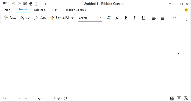
italicButton.IconTemplate = iconDataTemplate;The following screenshot shows the simplified layout within the Ribbon control.

NOTE
View sample in GitHub.
Customizing the Ribbon during runtime through the QAT window
The Ribbon control allows to customize the Ribbon and Ribbon items through the QAT window, where user can add the Ribbon items to a new RibbonTab or RibbonBar. The newly added RibbonTab or RibbonBar will only be visible in the respective layout in which items were added originally. In the below example, the LayoutMode is set as “Simplified” and a new RibbonTab named Folder is created and added using the QAT window. This tab will now be visible only in the simplified layout and not in the normal layout which is the default behavior.
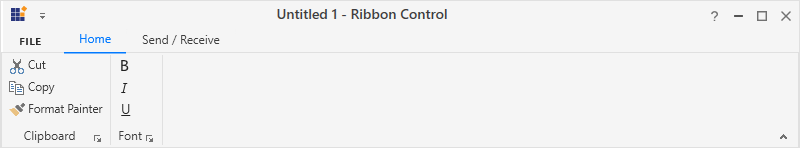
Normal layout
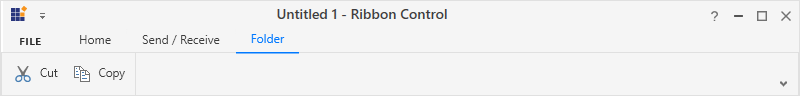
Simplified layout
In the meantime, the Ribbon control also allows to add items to the Quick Access Toolbar (QAT) with the help of the QAT window or through the context menu shortcut. Items added during normal or simplified layout will always be visible even when switching between layouts. In the below example, the LayoutMode is set as “Simplified” and the Bold item is added to the QAT through the context menu. This item will now be constantly visible in both normal and simplified layouts.
Normal layout
Simplified layout
Resizing Ribbon in simplified layout
While re-sizing the Ribbon, when the width of the window decreases and touches the last positioned item in the Ribbon, the appropriate item will be moved inside the overflow menu automatically. The same behavior will continue for each item when the window is resized continuously.