Custom Shapes in Flutter Range Selector (SfRangeSelector)
18 Nov 201824 minutes to read
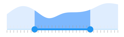
This section explains how to customize the shapes of the range selector elements.
Track shape
You can change the size and shape of the track using the trackShape property in the SfRangeSelector.
- getPreferredSize() - Returns the size based on the values passed to it.
- paint() - Used to change the track shape.
You must use the
startThumbCenter,endThumbCenter, andcurrentValuesparameters of the paint override method for customizing the track of the Flutter Range Selector.
import 'dart:math' as math;

import 'package:flutter/material.dart';
import 'package:syncfusion_flutter_charts/charts.dart';
import 'package:syncfusion_flutter_core/theme.dart';
import 'package:syncfusion_flutter_sliders/sliders.dart';

class TrackShapeSample extends StatefulWidget {
  @override
  _TrackShapeSampleState createState() => _TrackShapeSampleState();
}

class _TrackShapeSampleState extends State<TrackShapeSample> {
  final double _min = 2.0;
  final double _max = 10.0;
  SfRangeValues _values = SfRangeValues(3.0, 8.0);

  final List<Data> chartData = <Data>[
    Data(x: 2.0, y: 2.2),
    Data(x: 3.0, y: 3.4),
    Data(x: 4.0, y: 2.8),
    Data(x: 5.0, y: 1.6),
    Data(x: 6.0, y: 2.3),
    Data(x: 7.0, y: 2.5),
    Data(x: 8.0, y: 2.9),
    Data(x: 9.0, y: 3.8),
    Data(x: 10.0, y: 3.7),
  ];

  @override
  Widget build(BuildContext context) {
    return MaterialApp(
      home: Scaffold(
        body: Center(
          child: SfRangeSelectorTheme(
            data: SfRangeSelectorThemeData(
              activeTrackHeight: 10,
              inactiveTrackHeight: 10,
            ),
            child: SfRangeSelector(
              min: _min,
              max: _max,
              initialValues: _values,
              trackShape: _TrackShape(),
              child: Container(
                height: 130,
                child: SfCartesianChart(
                  margin: const EdgeInsets.all(0),
                  primaryXAxis:
                      NumericAxis(minimum: _min, maximum: _max, isVisible: false),
                  primaryYAxis: NumericAxis(isVisible: false),
                  plotAreaBorderWidth: 0,
                  series: <SplineAreaSeries<Data, double>>[
                    SplineAreaSeries<Data, double>(
                        color: Color.fromARGB(255, 126, 184, 253),
                        dataSource: chartData,
                        xValueMapper: (Data sales, int index) => sales.x,
                        yValueMapper: (Data sales, int index) => sales.y)
                  ],
                ),
              ),
            ),
          ),
        ),
      ),
    );
  }
}

class Data {
  Data({required this.x, required this.y});
  final double x;
  final double y;
}

class _TrackShape extends SfTrackShape {
  @override
  void paint(PaintingContext context, Offset offset, Offset? thumbCenter,
      Offset? startThumbCenter, Offset? endThumbCenter,
      {required RenderBox parentBox,
      required SfSliderThemeData themeData,
      SfRangeValues? currentValues,
      dynamic currentValue,
      required Animation<double> enableAnimation,
      required Paint? inactivePaint,
      required Paint? activePaint,
      required TextDirection textDirection}) {
    Paint paint = Paint()
      ..color = themeData.activeTrackColor!
      ..style = PaintingStyle.stroke
      ..strokeWidth = 1;
    super.paint(context, offset, thumbCenter, startThumbCenter, endThumbCenter,
        parentBox: parentBox,
        themeData: themeData,
        enableAnimation: enableAnimation,
        inactivePaint: inactivePaint,
        activePaint: paint,
        textDirection: textDirection);
  }
}
Thumb shape
You can change the size and shape of the thumb using the thumbShape property in the SfRangeSelector.
- getPreferredSize() - Returns the size based on the values passed to it.
- paint() - Used to change the thumb shape.
You must use the
currentValuesparameter of the paint override method for customizing the thumbs of the Flutter Range Selector.
import 'package:flutter/material.dart';
import 'package:syncfusion_flutter_charts/charts.dart';
import 'package:syncfusion_flutter_core/theme.dart';
import 'package:syncfusion_flutter_sliders/sliders.dart';

class ThumbShapeSample extends StatefulWidget {
  @override
  _ThumbShapeSampleState createState() => _ThumbShapeSampleState();
}

class _ThumbShapeSampleState extends State<ThumbShapeSample> {
  final double _min = 2.0;
  final double _max = 10.0;
  SfRangeValues _values = SfRangeValues(4.0, 8.0);

  final List<Data> chartData = <Data>[
    Data(x: 2.0, y: 2.2),
    Data(x: 3.0, y: 3.4),
    Data(x: 4.0, y: 2.8),
    Data(x: 5.0, y: 1.6),
    Data(x: 6.0, y: 2.3),
    Data(x: 7.0, y: 2.5),
    Data(x: 8.0, y: 2.9),
    Data(x: 9.0, y: 3.8),
    Data(x: 10.0, y: 3.7),
  ];

  @override
  Widget build(BuildContext context) {
    return MaterialApp(
      home: Scaffold(
        body: Center(
          child: SfRangeSelectorTheme(
            data: SfRangeSelectorThemeData(overlayColor: Colors.transparent),
            child: SfRangeSelector(
              min: _min,
              max: _max,
              initialValues: _values,
              thumbShape: _SfThumbShape(),
              child: Container(
                height: 130,
                child: SfCartesianChart(
                  margin: const EdgeInsets.all(0),
                  primaryXAxis: NumericAxis(
                      minimum: _min, maximum: _max, isVisible: false),
                  primaryYAxis: NumericAxis(isVisible: false),
                  plotAreaBorderWidth: 0,
                  series: <SplineAreaSeries<Data, double>>[
                    SplineAreaSeries<Data, double>(
                        color: Color.fromARGB(255, 126, 184, 253),
                        dataSource: chartData,
                        xValueMapper: (Data sales, int index) => sales.x,
                        yValueMapper: (Data sales, int index) => sales.y)
                  ],
                ),
              ),
            ),
          ),
        ),
      ),
    );
  }
}

class Data {
  Data({required this.x, required this.y});
  final double x;
  final double y;
}

class _SfThumbShape extends SfThumbShape {
  @override
  void paint(PaintingContext context, Offset center,
      {required RenderBox parentBox,
      required RenderBox? child,
      required SfSliderThemeData themeData,
      SfRangeValues? currentValues,
      dynamic currentValue,
      required Paint? paint,
      required Animation<double> enableAnimation,
      required TextDirection textDirection,
      required SfThumb? thumb}) {
    final Path path = Path();

    path.moveTo(center.dx, center.dy);
    path.lineTo(center.dx + 10, center.dy - 15);
    path.lineTo(center.dx - 10, center.dy - 15);
    path.close();
    context.canvas.drawPath(
        path,
        Paint()
          ..color = themeData.activeTrackColor!
          ..style = PaintingStyle.fill
          ..strokeWidth = 2);
  }
}
Divider shape
You can change the size and shape of the divider using the dividerShape property in the SfRangeSelector.
- getPreferredSize() - Returns the size based on the values passed to it.
- paint() - Used to change the divider shape.
You must use the
startThumbCenter,endThumbCenter, andcurrentValuesparameters of the paint override method for customizing the divider of the Flutter Range Selector.
import 'package:flutter/material.dart';
import 'package:syncfusion_flutter_charts/charts.dart';
import 'package:syncfusion_flutter_sliders/sliders.dart';

class DividerShapeSample extends StatefulWidget {
  @override
  _DividerShapeSampleState createState() => _DividerShapeSampleState();
}

class _DividerShapeSampleState extends State<DividerShapeSample> {
  final double _min = 2.0;
  final double _max = 10.0;
  SfRangeValues _values = SfRangeValues(4.0, 8.0);

  final List<Data> chartData = <Data>[
    Data(x: 2.0, y: 2.2),
    Data(x: 3.0, y: 3.4),
    Data(x: 4.0, y: 2.8),
    Data(x: 5.0, y: 1.6),
    Data(x: 6.0, y: 2.3),
    Data(x: 7.0, y: 2.5),
    Data(x: 8.0, y: 2.9),
    Data(x: 9.0, y: 3.8),
    Data(x: 10.0, y: 3.7),
  ];

  @override
  Widget build(BuildContext context) {
    return MaterialApp(
      home: Scaffold(
        body: Center(
          child: SfRangeSelector(
            min: _min,
            max: _max,
            initialValues: _values,
            interval: 1,
            showDividers: true,
            dividerShape: _DividerShape(),
            child: Container(
              height: 130,
              child: SfCartesianChart(
                margin: const EdgeInsets.all(0),
                primaryXAxis:
                    NumericAxis(minimum: _min, maximum: _max, isVisible: false),
                primaryYAxis: NumericAxis(isVisible: false),
                plotAreaBorderWidth: 0,
                series: <SplineAreaSeries<Data, double>>[
                  SplineAreaSeries<Data, double>(
                      color: Color.fromARGB(255, 126, 184, 253),
                      dataSource: chartData,
                      xValueMapper: (Data sales, int index) => sales.x,
                      yValueMapper: (Data sales, int index) => sales.y)
                ],
              ),
            ),
          ),
        ),
      ),
    );
  }
}

class Data {
  Data({required this.x, required this.y});
  final double x;
  final double y;
}

class _DividerShape extends SfDividerShape {
  @override
  void paint(PaintingContext context, Offset center, Offset? thumbCenter,
      Offset? startThumbCenter, Offset? endThumbCenter,
      {required RenderBox parentBox,
      required SfSliderThemeData themeData,
      SfRangeValues? currentValues,
      dynamic currentValue,
      required Paint? paint,
      required Animation<double> enableAnimation,
      required TextDirection textDirection}) {
    final bool isActive =
        center.dx >= startThumbCenter!.dx && center.dx <= endThumbCenter!.dx;
    context.canvas.drawRect(
        Rect.fromCenter(center: center, width: 5.0, height: 10.0),
        Paint()
          ..isAntiAlias = true
          ..style = PaintingStyle.fill
          ..color = isActive ? Colors.white : themeData.activeTrackColor!);
  }
}
Major and minor ticks shapes
You can change the size and shape of the major and minor ticks using the tickShape and minorTickShape properties in the SfRangeSelector.
- getPreferredSize() - Returns the size based on the values passed to it.
- paint() - Used to change the ticks shape.
You must use the
startThumbCenter,endThumbCenter, andcurrentValuesparameters of the paint override method for customizing the ticks of the Range Selector.
import 'dart:math' as math;

import 'package:flutter/material.dart';
import 'package:syncfusion_flutter_charts/charts.dart';
import 'package:syncfusion_flutter_sliders/sliders.dart';

class TicksShapeSample extends StatefulWidget {
  @override
  _TicksShapeSampleState createState() => _TicksShapeSampleState();
}

class _TicksShapeSampleState extends State<TicksShapeSample> {
  final double _min = 2.0;
  final double _max = 10.0;
  SfRangeValues _values = SfRangeValues(4.0, 8.0);

  final List<Data> chartData = <Data>[
    Data(x: 2.0, y: 2.2),
    Data(x: 3.0, y: 3.4),
    Data(x: 4.0, y: 2.8),
    Data(x: 5.0, y: 1.6),
    Data(x: 6.0, y: 2.3),
    Data(x: 7.0, y: 2.5),
    Data(x: 8.0, y: 2.9),
    Data(x: 9.0, y: 3.8),
    Data(x: 10.0, y: 3.7),
  ];

  @override
  Widget build(BuildContext context) {
    return MaterialApp(
      home: Scaffold(
        body: Center(
          child: SfRangeSelector(
            min: _min,
            max: _max,
            initialValues: _values,
            interval: 1,
            showTicks: true,
            minorTicksPerInterval: 3,
            tickShape: _TickShape(),
            minorTickShape: _MinorTickShape(),
            child: Container(
              height: 130,
              child: SfCartesianChart(
                margin: const EdgeInsets.all(0),
                primaryXAxis:
                    NumericAxis(minimum: _min, maximum: _max, isVisible: false),
                primaryYAxis: NumericAxis(isVisible: false),
                plotAreaBorderWidth: 0,
                series: <SplineAreaSeries<Data, double>>[
                  SplineAreaSeries<Data, double>(
                      color: Color.fromARGB(255, 126, 184, 253),
                      dataSource: chartData,
                      xValueMapper: (Data sales, int index) => sales.x,
                      yValueMapper: (Data sales, int index) => sales.y)
                ],
              ),
            ),
          ),
        ),
      ),
    );
  }
}

class Data {
  Data({required this.x, required this.y});
  final double x;
  final double y;
}

class _TickShape extends SfTickShape {
  @override
  void paint(PaintingContext context, Offset offset, Offset? thumbCenter,
      Offset? startThumbCenter, Offset? endThumbCenter,
      {required RenderBox parentBox,
      required SfSliderThemeData themeData,
      SfRangeValues? currentValues,
      dynamic currentValue,
      required Animation<double> enableAnimation,
      required TextDirection textDirection}) {
    final Size tickSize = getPreferredSize(themeData);
    final bool isTickRightOfThumb = endThumbCenter == null
        ? offset.dx > thumbCenter!.dx
        : offset.dx < startThumbCenter!.dx || offset.dx > endThumbCenter!.dx;
    final Color begin = isTickRightOfThumb
        ? themeData.disabledInactiveTickColor
        : themeData.disabledActiveTickColor;
    final Color end = isTickRightOfThumb
        ? themeData.inactiveTickColor
        : themeData.activeTickColor;
    final Paint paint = Paint()
      ..isAntiAlias = true
      ..strokeWidth = tickSize.width
      ..color = ColorTween(begin: begin, end: end).evaluate(enableAnimation)!;
    context.canvas.drawLine(
        offset, Offset(offset.dx, offset.dy + tickSize.height), paint);
    context.canvas.drawLine(
        Offset(
            offset.dx,
            offset.dy -
                2 -
                math.max(themeData.activeTrackHeight,
                    themeData.inactiveTrackHeight)),
        Offset(
            offset.dx,
            offset.dy -
                2 -
                math.max(themeData.activeTrackHeight,
                    themeData.inactiveTrackHeight) -
                tickSize.height),
        paint);
  }
}

class _MinorTickShape extends SfTickShape {
  @override
  void paint(PaintingContext context, Offset offset, Offset? thumbCenter,
      Offset? startThumbCenter, Offset? endThumbCenter,
      {required RenderBox parentBox,
      required SfSliderThemeData themeData,
      SfRangeValues? currentValues,
      dynamic currentValue,
      required Animation<double> enableAnimation,
      required TextDirection textDirection}) {
    final Size minorTickSize = getPreferredSize(themeData);
    final bool isMinorTickRightOfThumb = endThumbCenter == null
        ? offset.dx > thumbCenter!.dx
        : offset.dx < startThumbCenter!.dx || offset.dx > endThumbCenter!.dx;

    final Color begin = isMinorTickRightOfThumb
        ? themeData.disabledInactiveMinorTickColor
        : themeData.disabledActiveMinorTickColor;
    final Color end = isMinorTickRightOfThumb
        ? themeData.inactiveMinorTickColor
        : themeData.activeMinorTickColor;
    final Paint paint = Paint()
      ..isAntiAlias = true
      ..strokeWidth = minorTickSize.width
      ..color = ColorTween(begin: begin, end: end).evaluate(enableAnimation)!;
    context.canvas.drawLine(
        offset, Offset(offset.dx, offset.dy + minorTickSize.height), paint);
    context.canvas.drawLine(
        Offset(
            offset.dx,
            offset.dy -
                2 -
                math.max(themeData.activeTrackHeight,
                    themeData.inactiveTrackHeight)),
        Offset(
            offset.dx,
            offset.dy -
                2 -
                math.max(themeData.activeTrackHeight,
                    themeData.inactiveTrackHeight) -
                minorTickSize.height),
        paint);
  }
}