Basic Features in Flutter Range Selector (SfRangeSelector)
18 Nov 201824 minutes to read
This section explains how to configure numeric and date range selectors.
Minimum
The minimum value that the user can select. The default value of min property is 0.0 and it must be less than the max value.
Maximum
The maximum value that the user can select. The default value of max property is 1.0 and it must be greater than the min value.
Initial values
It represents the initial values in the Flutter Range Selector. The thumbs of the Range Selector are drawn corresponding to this value.
For date values, the Flutter Range Selector does not have auto interval support. So, it is mandatory to set
interval,dateIntervalType, anddateFormatfor date values.
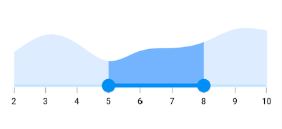
Numeric Range Selector
You can show numeric values in the Flutter Range Selector by setting double values to the min, max and initialValues properties.
import 'package:flutter/material.dart';
import 'package:syncfusion_flutter_charts/charts.dart';
import 'package:syncfusion_flutter_sliders/sliders.dart';

class Data {
  Data({required this.x, required this.y});
  final double x;
  final double y;
}

class NumericRangeSelectorSample extends StatelessWidget {
  final double _min = 2.0;
  final double _max = 10.0;
  final SfRangeValues _values = SfRangeValues(5.0, 8.0);

  final List<Data> _chartData = <Data>[
    Data(x: 2.0, y: 2.2),
    Data(x: 3.0, y: 3.4),
    Data(x: 4.0, y: 2.8),
    Data(x: 5.0, y: 1.6),
    Data(x: 6.0, y: 2.3),
    Data(x: 7.0, y: 2.5),
    Data(x: 8.0, y: 2.9),
    Data(x: 9.0, y: 3.8),
    Data(x: 10.0, y: 3.7),
  ];

  @override
  Widget build(BuildContext context) {
    return MaterialApp(
      home: Scaffold(
        body: Center(
          child: SfRangeSelector(
            min: _min,
            max: _max,
            interval: 1,
            showLabels: true,
            showTicks: true,
            initialValues: _values,
            child: Container(
              height: 130,
              child: SfCartesianChart(
                margin: const EdgeInsets.all(0),
                primaryXAxis: NumericAxis(
                  minimum: _min,
                  maximum: _max,
                  isVisible: false,
                ),
                primaryYAxis: NumericAxis(isVisible: false),
                plotAreaBorderWidth: 0,
                series: <SplineAreaSeries<Data, double>>[
                  SplineAreaSeries<Data, double>(
                    color: Color.fromARGB(255, 126, 184, 253),
                    dataSource: _chartData,
                    xValueMapper: (Data sales, int index) => sales.x,
                    yValueMapper: (Data sales, int index) => sales.y)
                ],
              ),
            ),
          ),
        ),
      ),
    );
  }
}
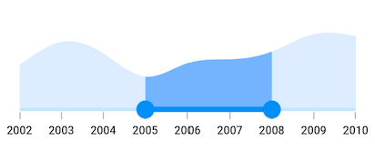
Date Range Selector
You can show date values in the Flutter Range Selector by setting DateTime values to the min, max and initialValues properties.
You must import
intlpackage for formatting date range selector using theDateFormatclass.
import 'package:flutter/material.dart';
import 'package:intl/intl.dart';
import 'package:syncfusion_flutter_charts/charts.dart';
import 'package:syncfusion_flutter_sliders/sliders.dart';

class Data {
  Data({required this.x, required this.y});
  final DateTime x;
  final double y;
}

class DateRangeSelectorSample extends StatelessWidget {
  final DateTime _min = DateTime(2002, 01, 01);
  final DateTime _max = DateTime(2010, 01, 01);
  final SfRangeValues _values =
      SfRangeValues(DateTime(2005, 01, 01), DateTime(2008, 01, 01));

  final List<Data> _chartData = <Data>[
    Data(x: DateTime(2002, 01, 01), y: 2.2),
    Data(x: DateTime(2003, 01, 01), y: 3.4),
    Data(x: DateTime(2004, 01, 01), y: 2.8),
    Data(x: DateTime(2005, 01, 01), y: 1.6),
    Data(x: DateTime(2006, 01, 01), y: 2.3),
    Data(x: DateTime(2007, 01, 01), y: 2.5),
    Data(x: DateTime(2008, 01, 01), y: 2.9),
    Data(x: DateTime(2009, 01, 01), y: 3.8),
    Data(x: DateTime(2010, 01, 01), y: 3.7),
  ];

  @override
  Widget build(BuildContext context) {
    return MaterialApp(
      home: Scaffold(
        body: Center(
          child: SfRangeSelector(
            min: _min,
            max: _max,
            showLabels: true,
            showTicks: true,
            interval: 1,
            dateFormat: DateFormat.y(),
            dateIntervalType: DateIntervalType.years,
            initialValues: _values,
            child: Container(
              height: 130,
              child: SfCartesianChart(
                margin: const EdgeInsets.all(0),
                primaryXAxis: DateTimeAxis(
                  minimum: _min,
                  maximum: _max,
                  isVisible: false,
                ),
                primaryYAxis: NumericAxis(isVisible: false),
                plotAreaBorderWidth: 0,
                series: <SplineAreaSeries<Data, DateTime>>[
                  SplineAreaSeries<Data, DateTime>(
                      color: Color.fromARGB(255, 126, 184, 253),
                      dataSource: _chartData,
                      xValueMapper: (Data sales, int index) => sales.x,
                      yValueMapper: (Data sales, int index) => sales.y)
                ],
              ),
            ),
          ),
        ),
      ),
    );
  }
}
Handle onChangeStart, onChanged, and onChangeEnd callbacks
onChangeStart
The onChangeStart callback is called when the user begins to interact with the Flutter Range Selector using a tap or drag action. This callback is only used to notify the user that the interaction has started and it does not change the value of the Range Selector thumb.
import 'package:flutter/material.dart';
import 'package:syncfusion_flutter_sliders/sliders.dart';

class OnChangeStartSample extends StatefulWidget {
  @override
  _OnChangeStartSampleState createState() => _OnChangeStartSampleState();
}

class _OnChangeStartSampleState extends State<OnChangeStartSample> {
  SfRangeValues _values = SfRangeValues(4.0, 6.0);

  @override
  Widget build(BuildContext context) {
    return MaterialApp(
      home: Scaffold(
        body: SfRangeSelector(
          min: 0.0,
          max: 10.0,
          initialValues: _values,
          onChangeStart: (SfRangeValues startValues) {
            debugPrint('Interaction started');
          },
          onChanged: (SfRangeValues newValues) {},
          child: SizedBox(),
        ),
      ),
    );
  }
}
onChangeEnd
The onChangeEnd callback is called when the user stops interacting with the Flutter Range Selector using a tap or drag action. This callback is only used to notify the user that the interaction has ended and it does not change the value of the Range Selector thumb.
import 'package:flutter/material.dart';
import 'package:syncfusion_flutter_sliders/sliders.dart';

class OnChangeEndSample extends StatefulWidget {
  @override
  _OnChangeEndSampleState createState() => _OnChangeEndSampleState();
}

class _OnChangeEndSampleState extends State<OnChangeEndSample> {
  SfRangeValues _values = SfRangeValues(4.0, 6.0);

  @override
  Widget build(BuildContext context) {
    return MaterialApp(
      home: Scaffold(
        body: SfRangeSelector(
          min: 0.0,
          max: 10.0,
          initialValues: _values,
          onChangeEnd: (SfRangeValues endValues) {
            debugPrint('Interaction ended');
          },
          onChanged: (SfRangeValues newValues) {},
          child: SizedBox(),
        ),
      ),
    );
  }
}
onChanged
The onChanged callback is called when the user is selecting the new values.
import 'package:flutter/material.dart';
import 'package:syncfusion_flutter_charts/charts.dart';
import 'package:syncfusion_flutter_sliders/sliders.dart';

class Data {
  Data({required this.x, required this.y});
  final DateTime x;
  final double y;
}

class OnChangedSample extends StatefulWidget {
  @override
  _OnChangedSampleState createState() => _OnChangedSampleState();
}

class _OnChangedSampleState extends State<OnChangedSample> {
  final SfRangeValues _initialValues = SfRangeValues(0.3, 0.7);

  final List<Data> _chartData = <Data>[
    Data(x: DateTime(2003, 01, 01), y: 3.4),
    Data(x: DateTime(2004, 01, 01), y: 2.8),
    Data(x: DateTime(2005, 01, 01), y: 1.6),
    Data(x: DateTime(2006, 01, 01), y: 2.3),
    Data(x: DateTime(2007, 01, 01), y: 2.5),
    Data(x: DateTime(2008, 01, 01), y: 2.9),
    Data(x: DateTime(2009, 01, 01), y: 3.8),
    Data(x: DateTime(2010, 01, 01), y: 2.0),
  ];

  @override
  Widget build(BuildContext context) {
    return MaterialApp(
      home: Scaffold(
        body: Center(
          child: SfRangeSelector(
            initialValues: _initialValues,
            onChanged: (SfRangeValues values) {},
            child: Container(
              child: SfCartesianChart(
                margin: const EdgeInsets.all(0),
                primaryXAxis: DateTimeAxis(
                  isVisible: false,
                ),
                primaryYAxis: NumericAxis(isVisible: false, maximum: 4),
                series: <SplineAreaSeries<Data, DateTime>>[
                  SplineAreaSeries<Data, DateTime>(
                      dataSource: _chartData,
                      xValueMapper: (Data sales, int index) => sales.x,
                      yValueMapper: (Data sales, int index) => sales.y)
                ],
              ),
              height: 250,
            ),
          ),
        ),
      ),
    );
  }
}
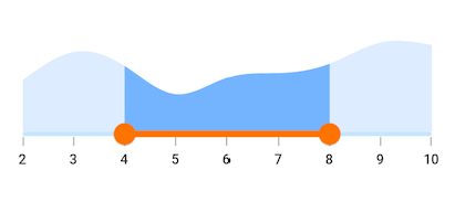
Active color
It represents the color applied to the active track, thumb, overlay, and inactive dividers.
The active side of the Flutter Range Selector is between start and end thumbs.
import 'package:flutter/material.dart';
import 'package:syncfusion_flutter_charts/charts.dart';
import 'package:syncfusion_flutter_sliders/sliders.dart';

class Data {
  Data({required this.x, required this.y});
  final double x;
  final double y;
}

class ActiveColorSample extends StatelessWidget {
  final double _min = 2.0;
  final double _max = 10.0;
  final SfRangeValues _values = SfRangeValues(4.0, 8.0);

  final List<Data> chartData = <Data>[
    Data(x: 2.0, y: 2.2),
    Data(x: 3.0, y: 3.4),
    Data(x: 4.0, y: 2.8),
    Data(x: 5.0, y: 1.6),
    Data(x: 6.0, y: 2.3),
    Data(x: 7.0, y: 2.5),
    Data(x: 8.0, y: 2.9),
    Data(x: 9.0, y: 3.8),
    Data(x: 10.0, y: 3.7),
  ];

  @override
  Widget build(BuildContext context) {
    return MaterialApp(
      home: Scaffold(
        body: Center(
          child: SfRangeSelector(
            min: _min,
            max: _max,
            interval: 1,
            showLabels: true,
            showTicks: true,
            activeColor: Color.fromARGB(255, 253, 125, 0),
            initialValues: _values,
            child: Container(
              height: 130,
              child: SfCartesianChart(
                margin: const EdgeInsets.all(0),
                primaryXAxis: NumericAxis(
                  minimum: _min,
                  maximum: _max,
                  isVisible: false,
                ),
                primaryYAxis: NumericAxis(isVisible: false),
                plotAreaBorderWidth: 0,
                series: <SplineAreaSeries<Data, double>>[
                  SplineAreaSeries<Data, double>(
                    color: Color.fromARGB(255, 126, 184, 253),
                    dataSource: chartData,
                    xValueMapper: (Data sales, int index) => sales.x,
                    yValueMapper: (Data sales, int index) => sales.y)
                ],
              ),
            ),
          ),
        ),
      ),
    );
  }
}
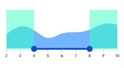
Inactive color
It represents the color applied to the inactive track and active dividers.
The active side of the SfRangeSelector is between start and end thumbs.
The inactive side of the SfRangeSelector is between the min value and the start thumb, and the end thumb and the max value.
For RTL, the inactive side is between the max value and the start thumb, and the end thumb and the min value.
import 'package:flutter/material.dart';
import 'package:syncfusion_flutter_charts/charts.dart';
import 'package:syncfusion_flutter_sliders/sliders.dart';

class Data {
  Data({required this.x, required this.y});
  final double x;
  final double y;
}

class InactiveColorSample extends StatelessWidget {
  final double _min = 2.0;
  final double _max = 10.0;
  final SfRangeValues _values = SfRangeValues(4.0, 8.0);

  final List<Data> chartData = <Data>[
    Data(x: 2.0, y: 2.2),
    Data(x: 3.0, y: 3.4),
    Data(x: 4.0, y: 2.8),
    Data(x: 5.0, y: 1.6),
    Data(x: 6.0, y: 2.3),
    Data(x: 7.0, y: 2.5),
    Data(x: 8.0, y: 2.9),
    Data(x: 9.0, y: 3.8),
    Data(x: 10.0, y: 3.7),
  ];

  @override
  Widget build(BuildContext context) {
    return MaterialApp(
      home: Scaffold(
        body: Center(
          child: SfRangeSelector(
            min: _min,
            max: _max,
            interval: 1,
            showLabels: true,
            showTicks: true,
            activeColor: Color.fromARGB(255, 5, 90, 194),
            inactiveColor: Color.fromARGB(140, 121, 244, 195),
            initialValues: _values,
            child: Container(
              height: 130,
              child: SfCartesianChart(
                margin: const EdgeInsets.all(0),
                primaryXAxis: NumericAxis(
                  minimum: _min,
                  maximum: _max,
                  isVisible: false,
                ),
                primaryYAxis: NumericAxis(isVisible: false),
                plotAreaBorderWidth: 0,
                series: <SplineAreaSeries<Data, double>>[
                  SplineAreaSeries<Data, double>(
                    color: Color.fromARGB(255, 126, 184, 253),
                    dataSource: chartData,
                    xValueMapper: (Data sales, int index) => sales.x,
                    yValueMapper: (Data sales, int index) => sales.y)
                ],
              ),
            ),
          ),
        ),
      ),
    );
  }
}
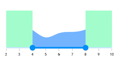
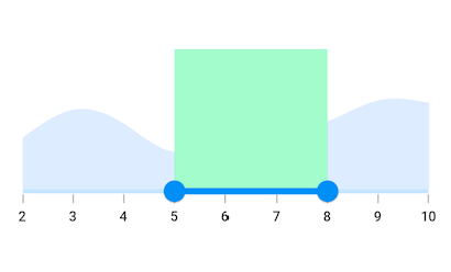
Active region color
It specifies the color for the active region of the child in the SfRangeSelector.
The active side of the SfRangeSelector is between start and end thumbs.
import 'package:flutter/material.dart';
import 'package:syncfusion_flutter_charts/charts.dart';
import 'package:syncfusion_flutter_core/theme.dart';
import 'package:syncfusion_flutter_sliders/sliders.dart';

class Data {
  Data({required this.x, required this.y});
  final double x;
  final double y;
}

class ActiveRegionColorSample extends StatelessWidget {
  final double _min = 2.0;
  final double _max = 10.0;
  final SfRangeValues _values = SfRangeValues(5.0, 8.0);

  final List<Data> chartData = <Data>[
    Data(x: 2.0, y: 2.2),
    Data(x: 3.0, y: 3.4),
    Data(x: 4.0, y: 2.8),
    Data(x: 5.0, y: 1.6),
    Data(x: 6.0, y: 2.3),
    Data(x: 7.0, y: 2.5),
    Data(x: 8.0, y: 2.9),
    Data(x: 9.0, y: 3.8),
    Data(x: 10.0, y: 3.7),
  ];

  @override
  Widget build(BuildContext context) {
    return MaterialApp(
      home: Scaffold(
        body: Center(
          child: SfRangeSelectorTheme(
            data: SfRangeSelectorThemeData(
              activeRegionColor: Colors.greenAccent[100],
            ),
            child: SfRangeSelector(
              min: _min,
              max: _max,
              interval: 1,
              showLabels: true,
              showTicks: true,
              initialValues: _values,
              child: Container(
                height: 130,
                child: SfCartesianChart(
                  margin: const EdgeInsets.all(0),
                  primaryXAxis: NumericAxis(
                    minimum: _min,
                    maximum: _max,
                    isVisible: false,
                  ),
                  primaryYAxis: NumericAxis(isVisible: false),
                  plotAreaBorderWidth: 0,
                  series: <SplineAreaSeries<Data, double>>[
                    SplineAreaSeries<Data, double>(
                      color: Color.fromARGB(255, 126, 184, 253),
                      dataSource: chartData,
                      xValueMapper: (Data sales, int index) => sales.x,
                      yValueMapper: (Data sales, int index) => sales.y)
                  ],
                ),
              ),
            ),
          ),
        ),
      ),
    );
  }
}
Inactive region color
It specifies the color for the inactive region of the child in the SfRangeSelector.
The inactive side of the SfRangeSelector is between the min value and the start thumb, and the end thumb and the max value.
For RTL, the inactive side is between the max value and the start thumb, and the end thumb and the min value.
import 'package:flutter/material.dart';
import 'package:syncfusion_flutter_charts/charts.dart';
import 'package:syncfusion_flutter_core/theme.dart';
import 'package:syncfusion_flutter_sliders/sliders.dart';

class Data {
  Data({required this.x, required this.y});
  final double x;
  final double y;
}

class InactiveRegionColorSample extends StatelessWidget {
  final double _min = 2.0;
  final double _max = 10.0;
  final SfRangeValues _values = SfRangeValues(4.0, 8.0);

  final List<Data> chartData = <Data>[
    Data(x: 2.0, y: 2.2),
    Data(x: 3.0, y: 3.4),
    Data(x: 4.0, y: 2.8),
    Data(x: 5.0, y: 1.6),
    Data(x: 6.0, y: 2.3),
    Data(x: 7.0, y: 2.5),
    Data(x: 8.0, y: 2.9),
    Data(x: 9.0, y: 3.8),
    Data(x: 10.0, y: 3.7),
  ];

  @override
  Widget build(BuildContext context) {
    return MaterialApp(
      home: Scaffold(
        body: Center(
          child: SfRangeSelectorTheme(
            data: SfRangeSelectorThemeData(
              inactiveRegionColor: Colors.greenAccent[100],
            ),
            child: SfRangeSelector(
              min: _min,
              max: _max,
              interval: 1,
              showLabels: true,
              showTicks: true,
              initialValues: _values,
              child: Container(
                height: 130,
                child: SfCartesianChart(
                  margin: const EdgeInsets.all(0),
                  primaryXAxis: NumericAxis(
                    minimum: _min,
                    maximum: _max,
                    isVisible: false,
                  ),
                  primaryYAxis: NumericAxis(isVisible: false),
                  plotAreaBorderWidth: 0,
                  series: <SplineAreaSeries<Data, double>>[
                    SplineAreaSeries<Data, double>(
                      color: Color.fromARGB(255, 126, 184, 253),
                      dataSource: chartData,
                      xValueMapper: (Data sales, int index) => sales.x,
                      yValueMapper: (Data sales, int index) => sales.y)
                  ],
                ),
              ),
            ),
          ),
        ),
      ),
    );
  }
}