How can I help you?
ToolTip in WPF TreeGrid (SfTreeGrid)
27 Feb 202511 minutes to read
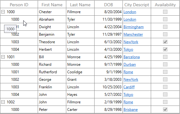
Tooltip supports showing the pop-up window that displays the information when the mouse hovers over a cell of the SfTreeGrid.
Record cell tooltip
You can enable tooltip for the TreeGridCell by setting the SfTreeGrid.ShowToolTip property to true.
<syncfusion:SfTreeGrid Name="treeGrid"
                        AutoExpandMode="RootNodesExpanded"
                        AutoGenerateColumns="False"
                        ShowToolTip="True"
ChildPropertyName="Children" ItemsSource="{Binding EmployeeDetails}">this.treeGrid.ShowToolTip = true;You can enable the tooltip of a particular column by setting the TreeGridColumn.ShowToolTip property to true.
<syncfusion:TreeGridTextColumn HeaderText="First Name" MappingName="FirstName" ShowToolTip="True" />
<syncfusion:TreeGridTextColumn HeaderText="Last Name" MappingName="LastName" ShowToolTip="True" />this.treeGrid.Columns["FirstName"].ShowToolTip = true;
this.treeGrid.Columns["LastName"].ShowToolTip = true;NOTE
It has higher priority than SfTreeGrid.ShowToolTip.
Header tooltip
You can enable the tooltip of a header cell by setting the TreeGridColumn.ShowHeaderToolTip property to true.
<syncfusion:SfTreeGrid.Columns>
    <syncfusion:TreeGridTextColumn HeaderText="First Name" MappingName="FirstName" ShowHeaderToolTip="True" />
</syncfusion:SfTreeGrid.Columns>this.treeGrid.Columns["FirstName"].ShowHeaderToolTip = true;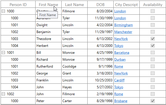
Tooltip customization
You can change appearance of the tooltip by customizing the style with TargetType as ToolTip.
<Window.Resources>
    <Style TargetType="ToolTip">
        <Setter Property="BorderThickness" Value="1,1,1,1" />
        <Setter Property="BorderBrush" Value="Red" />
        <Setter Property="Background" Value="SkyBlue" />
    </Style>
</Window.Resources>

<syncfusion:SfTreeGrid.Columns>
    <syncfusion:TreeGridTextColumn HeaderText="First Name" MappingName="FirstName" ShowToolTip="True" />
</syncfusion:SfTreeGrid.Columns>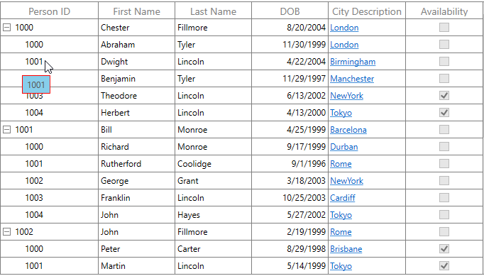
You can customize the template of the tooltip by using the TreeGridColumn.ToolTipTemplate and TreeGridColumn.ToolTipTemplateSelector properties.
Customize the tooltip using ToolTipTemplate
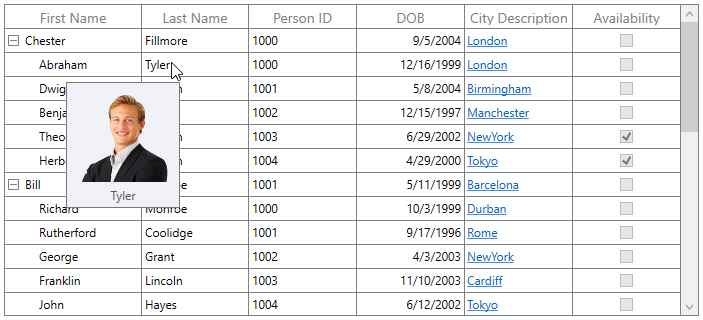
You can customize appearance of the tooltip of a particular column by setting the TreeGridColumn.ToolTipTemplate. You can also customize appearance of the header tooltip of a particular column by using the TreeGridColumn.HeaderToolTipTemplate property.
The ToolTipTemplate receives the underlying data object as DataContext by default. You can set the TreeGridColumn.SetCellBoundToolTip to true to change the DataContext of the tooltip template where it sets the DataContext as DataContextHelper. The TreeGridDataContextHelper has the following properties to reuse the same template for all the columns:
- Record: Gets the underlying data record of a row which has the cell.
- Value: Gets the underlying value of a cell.
<Window.Resources>
    <local:StringToImageConverter x:Key="ImageConverter" />
    <DataTemplate x:Key="TemplateToolTip">
        <Grid>
            <Grid.RowDefinitions>
                <RowDefinition Height="*"/>
                <RowDefinition Height="*"/>
            </Grid.RowDefinitions>
            <Image Height="100" Width="100" Source="{Binding LastName,Converter={StaticResource ImageConverter}}" />
            <TextBlock Grid.Row="1" Text="{Binding LastName}" HorizontalAlignment="Center"/>
        </Grid>
    </DataTemplate>
</Window.Resources>

<syncfusion:SfTreeGrid.Columns>
    <syncfusion:TreeGridTextColumn HeaderText="Last Name" MappingName="LastName" ToolTipTemplate="{StaticResource TemplateToolTip}" ShowToolTip="True" />
</syncfusion:SfTreeGrid.Columns>
public class StringToImageConverter : IValueConverter
{
public object Convert(object value, Type targetType, object parameter, System.Globalization.CultureInfo culture)
{
string imagename = value.ToString();
return @"..\..\Assets\" + imagename + @".png";
}
public object ConvertBack(object value, Type targetType, object parameter, System.Globalization.CultureInfo culture)
{
return value;
}
}
You can get the sample here.
Customize the ToolTip with ToolTipTemplateSelector
Different tooltip templates can be loaded conditionally in same column based on the data by setting the TreeGridColumn.ToolTipTemplateSelector property.
<Window.Resources>
    <DataTemplate x:Key="ToolTip1">
        <Grid>
            <TextBlock Text="{Binding Record.Id}" FontWeight="Bold" Foreground="Red" />
        </Grid>
    </DataTemplate>
    <DataTemplate x:Key="ToolTip2">
        <Grid>
            <TextBlock Text="{Binding Record.Id}" FontWeight="Bold" Foreground="Green"/>
        </Grid>
    </DataTemplate>
</Window.Resources>

<syncfusion:SfTreeGrid.Columns>
    <syncfusion:TreeGridTextColumn HeaderText="Person ID" MappingName="Id" ShowToolTip="True" >
        <syncfusion:TreeGridTextColumn.ToolTipTemplateSelector>
            <syncfusion:TreeGridTextColumn HeaderText="Person ID" MappingName="Id"
                                               DisplayBinding="{Binding Path=Id, StringFormat=c}"
                                               ShowToolTip="True" SetCellBoundToolTip="True" >
        </syncfusion:TreeGridTextColumn.ToolTipTemplateSelector>
    </syncfusion:TreeGridTextColumn>
</syncfusion:SfTreeGrid.Columns>
public class ToolTipTemplateSelector : DataTemplateSelector
{
private DataTemplate _defaultTemplate;
/// <summary>
/// Gets or sets DefaultTemplate.
/// </summary>
public DataTemplate DefaultTemplate
{
get { return _defaultTemplate; }
set { _defaultTemplate = value; }
}
private DataTemplate _alternateTemplate;
/// <summary>
/// Gets or Sets AlternateTemplate.
/// </summary>
public DataTemplate AlternateTemplate
{
get { return _alternateTemplate; }
set { _alternateTemplate = value; }
}
public override System.Windows.DataTemplate SelectTemplate(object item, System.Windows.DependencyObject container)
{
var treeGridData = item as TreeGridDataContextHelper;
if (treeGridData == null)
return this.DefaultTemplate;
// To see what template needs to be select according to the specified property value.
if ((treeGridData.Record as Employee).Id == (int)treeGridData.Value && ((int)treeGridData.Value % 2) == 0)
return this.AlternateTemplate;
else
return this.DefaultTemplate;
}
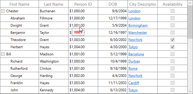
}The following image shows the DefaultTemplate applied through ToolTipTemplateSelector.
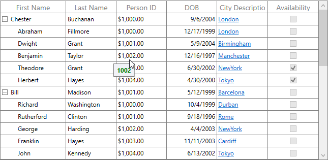
The following image shows the AlternateTemplate applied through ToolTipTemplateSelector.
You can get the sample here.
Events
CellToolTipOpening event
The CellToolTipOpening event occurs when any tooltip of the cell is opened. The CellToolTipOpening event receives the TreeGridCellToolTipOpeningEventArgs as argument which has the following properties:
- Column: Gets the hovered cell column in the SfTreeGrid.
- Node: Gets the hovered cell node.
- Record: Gets the data context of hovered cell.
- RowColumnIndex: Gets the row and column index of the hovered cell.
- ToolTip: Gets the tooltip of the hovered cells.
<syncfusion:SfTreeGrid Name="treeGrid"
                        AutoExpandMode="RootNodesExpanded"
                        CellToolTipOpening="TreeGrid_CellToolTipOpening"
                        AutoGenerateColumns="False"
                        ChildPropertyName="Children"
                        ColumnSizer="Star"
                        ExpanderColumn="Id"
ItemsSource="{Binding PersonDetails}">this.treeGrid.CellToolTipOpening += TreeGrid_CellToolTipOpening;
private void TreeGrid_CellToolTipOpening(object sender, Syncfusion.UI.Xaml.TreeGrid.TreeGridCellToolTipOpeningEventArgs e)
{
}NOTE
You can refer to our WPF TreeGrid feature tour page for its groundbreaking feature representations. You can also explore our WPF TreeGrid example to know how to render and configure the treegrid.