Data Validation in WPF TreeGrid (SfTreeGrid)
27 Feb 202524 minutes to read
SfTreeGrid allows you to validate the data and display hints in case of validation is not passed. In case of invalid data, error icon is displayed at the top right corner of TreeGridCell. When mouse over the error icon, error information will be displayed in tooltip.
Built-in validations
Built-in validations throughIDataErrorInfo, INotifyDataErrorInfo and Data annotation attributes, can be enabled by setting SfTreeGrid.GridValidationMode or TreeGridColumn.GridValidationMode properties. ` TreeGridColumn.GridValidationMode ` takes priority than ` SfTreeGrid.GridValidationMode`.
-
GridValidation.InEdit- display error icon & tips and doesn’t allows the users to commit the invalid data without allowing users to edit other cells. -
GridValidation.InView- displays error icons and tips alone. -
GridValidation.None- disables built-in validation support.
Built-in validation using IDataErrorInfo / INotifyDataErrorInfo
SfTreeGrid provides support to validate the data based on IDataErrorInfo/INotifyDataErrorInfo.
Using IDataErrorInfo
You can validate the data by inheriting the IDataErrorInfo interface in model class.
public class OrderInfo : IDataErrorInfo
{
    private string country;

    public string Country
    {
        get { return country; }
        set { country = value; }
    }

    [Display(AutoGenerateField = false)]

    public string Error
    {
        get
        {
            return string.Empty;
        }
    }

    public string this[string columnName]
    {
        get
        {

            if (!columnName.Equals("Country"))
                return string.Empty;

            if (this.Country.Contains("Germany") || this.Country.Contains("UK"))
                return "Delivery not available for the country " + this.Country;

            return string.Empty;
        }
    }
}
Enable built-in validation support by setting SfTreeGrid.GridValidationMode or TreeGridColumn.GridValidationMode property to InEdit or InView.
<syncfusion:SfTreeGrid x:Name="treeGrid"
                       AllowEditing="True"
                       ChildPropertyName="Children"
                       GridValidationMode="InView"
ItemsSource="{Binding PersonDetails}" />treeGrid.GridValidationMode = GridValidationMode.InView;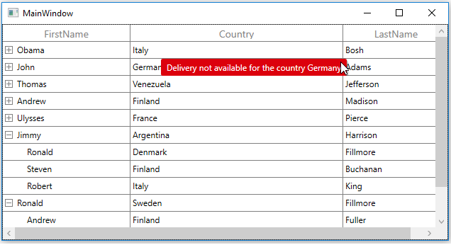
INotifyDataErrorInfo
You can validate the data by implementing the INotifyDataErrorInfo interface in model class.
public class OrderInfo : INotifyDataErrorInfo
{
    private List<string> errors = new List<string>();
    private string shippingCity;

    public string ShipCity
    {
        get { return shippingCity; }
        set { shippingCity = value; }
    }

    public System.Collections.IEnumerable GetErrors(string propertyName)
    {

        if (!propertyName.Equals("ShipCity"))
            return null;

        if (this.ShipCity.Contains("Mexico D.F."))
            errors.Add("Delivery not available for the city " + this.ShipCity);

        return errors;
    }

    [Display(AutoGenerateField = false)]

    public bool HasErrors
    {
        get
        {
            return false;
        }
    }
    public event EventHandler<DataErrorsChangedEventArgs> ErrorsChanged;
}
Enable built-in validation support by setting SfTreeGrid.GridValidationMode or TreeGridColumn.GridValidationMode property to InEdit or InView.
<syncfusion:SfTreeGrid x:Name="treeGrid"
                       AllowEditing="True"
                       ChildPropertyName="Children"
                       GridValidationMode="InView"
                       ItemsSource="{Binding PersonDetails}" />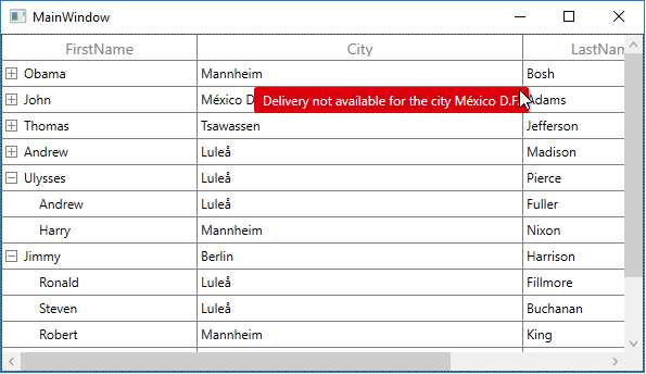
Built-in validation using Data Annotation
You can validate the data using data annotation attributes by setting SfTreeGrid.GridValidationMode or TreeGridColumn.GridValidationMode property to InEdit or InView.
Using different annotations
The numeric type like int, double, decimal properties can be validated using Range attributes.
private int orderID;
[Range(1001, 1005, ErrorMessage = "OrderID between 1001 and 1005 alone processed")]

public int OrderID
{
    get { return orderID; }
    set { orderID = value; }
}

private decimal price;
[Range(typeof(decimal),"12","20")]

public decimal Price
{
    get { return price; }
    set { price = value; }
}
The string type property can be validated using Required, String Length attributes
private string shippingCity;
[Required]

public string ShipCity
{
    get { return shippingCity; }
    set { shippingCity = value; }
}

private string customerName;
[StringLength(17)]

public string CustomerName
{
    get { return customerName; }
    set { customerName = value; }
}
The data that has heterogeneous type (combination of number, special character) can be validated using RegularExpressions.
[RegularExpressionAttribute(@"^[a-zA-Z]{1,40}$", ErrorMessage="Numbers and special characters not allowed")]

public string CustomerID
{
    get { return customerId; }
    set { customerId = value; }
}
Custom validation through events
You can validate the cells and rows using CurrentCellValidating and RowValidating events. SfTreeGrid will not allow user to edit other cell / row if validation failed.
Cell Validation
You can validate the cells using CurrentCellValidating event when the cell is edited. CurrentCellValidating event occurs when the edited cell tries to commit the data or lose the focus.
TreeGridCurrentCellValidatingEventArgs provides information to CurrentCellValidating event for validating the cell.
TreeGridCurrentCellValidatingEventArgs.NewValue returns the edited value and you can set the validation status using TreeGridCurrentCellValidatingEventArgs.IsValid property.
treeGrid.CurrentCellValidating += treeGrid_CurrentCellValidating;

void treeGrid_CurrentCellValidating(object sender, TreeGridCurrentCellValidatingEventArgs e)
{

    if (e.NewValue.ToString().Equals("1004"))
    {
        e.IsValid = false;
        e.ErrorMessage = "OrderID 1004 is invalid";
    }
}
SfTreeGrid.CurrentCellValidated event triggered when the cell has finished validating with valid data.
treeGrid.CurrentCellValidated += treeGrid_CurrentCellValidated;

void treeGrid_CurrentCellValidated(object sender, TreeGridCurrentCellValidatedEventArgs e)
{
}
Row Validation
You can validate the row using RowValidating event when the cell is edited. The RowValidating event occurs when the edited cells tries to commit the row data or lose the focus.
TreeGridRowValidatingEventArgs provides information to RowValidating event for validating row.
TreeGridRowValidatingEventArgs.RowData returns the edited value and you can set the validation status using TreeGridRowValidatingEventArgs.IsValid property.
treeGrid.RowValidating += treeGrid_RowValidating;

void treeGrid_RowValidating(object sender, TreeGridRowValidatingEventArgs e)
{
    var data = e.RowData.GetType().GetProperty("FirstName").GetValue(e.RowData);

    if (data.ToString().Equals("Andrew"))
    {
        e.IsValid = false;
        e.ErrorMessages.Add("FirstName", "FirstName Andrew is invalid");
    }
}
SfTreeGrid.RowValidated event triggered when the row has finished validating with valid row data.
treeGrid.RowValidated += treeGrid_RowValidated;

void treeGrid_RowValidated(object sender, TreeGridRowValidatedEventArgs e)
{
}
Error icon and tip customization
Customizing error icon
You can customize the error icon by editing TreeGridCell control template. If you want to customize the error icon in expander column, you need to edit the control template of TreeGridExpanderCell.
Change the shape of error icon
You can change the validation error template shape of the TreeGridCell by changing the Data property of the path in the PART_InValidCellBorder of TreeGridCell.
<Window.Resources>
        <ResourceDictionary>
            <ResourceDictionary.MergedDictionaries>
                <ResourceDictionary Source="/Syncfusion.SfGrid.WPF;component/Control/Themes/Generic.xaml" />
            </ResourceDictionary.MergedDictionaries>
            <Style TargetType="syncfusion:TreeGridCell">
                <Setter Property="Background" Value="Transparent" />
                <Setter Property="BorderBrush" Value="Gray" />
                <Setter Property="BorderThickness" Value="0,0,1,1" />
                <Setter Property="Padding" Value="0" />
                <Setter Property="Template">
                    <Setter.Value>
                        <ControlTemplate TargetType="syncfusion:TreeGridCell">
                            <Grid x:Name="Root">
                                <Border x:Name="PART_GridCellBorder"
                                        Background="{TemplateBinding Background}"
                                        BorderBrush="{TemplateBinding BorderBrush}"
                                        BorderThickness="{TemplateBinding BorderThickness}"
                                        SnapsToDevicePixels="True">
                                    <ContentPresenter />
                                </Border>

                                <Border x:Name="PART_CurrentCellBorder"
                                        Margin="0,0,1,1"
                                        Background="Transparent"
                                        BorderBrush="{TemplateBinding CurrentCellBorderBrush}"
                                        BorderThickness="{TemplateBinding CurrentCellBorderThickness}"
                                        IsHitTestVisible="False"
                                        Visibility="Collapsed" />
                                <Border x:Name="PART_InValidCellBorder"
                                        Width="10"
                                        Height="10"
                                        HorizontalAlignment="Right"
                                        VerticalAlignment="Top"
                                        SnapsToDevicePixels="True"
                                        Visibility="Collapsed">
                                    <ToolTipService.ToolTip>
                                        <ToolTip Background="#FFDB000C"
                                                 Placement="Right"
                                                 PlacementRectangle="20,0,0,0"
                                                 Tag="{TemplateBinding ErrorMessage}"
                                                 Template="{StaticResource ValidationToolTipTemplate}" />
                                    </ToolTipService.ToolTip>
                                    <Path Data="M15.396557,23.044006C14.220558,23.044006 13.268559,23.886993 13.268559,24.927994 13.268559,25.975006 14.220558,26.817001 15.396557,26.817001 16.572557,26.817001 17.523547,25.975006 17.523547,24.927994 17.523547,23.886993 16.572557,23.044006 15.396557,23.044006z M15.467541,5.1819992C15.447552,5.1819992 15.436566,5.1829987 15.436566,5.1829987 13.118533,5.5049973 13.055545,7.3330002 13.055545,7.3330002L13.055545,9.2929993 13.626531,16.539001C13.983558,18.357002 14.243538,19.020004 14.243538,19.020004 15.275555,19.975006 16.203567,19.25 16.203567,19.25 16.976548,18.565994 17.028552,16.962997 17.028552,16.962997 17.956563,9.2929993 17.696553,7.1029968 17.696553,7.1029968 17.608571,5.2839966 15.823561,5.1849976 15.490551,5.1819992 15.481549,5.1819992 15.473553,5.1819992 15.467541,5.1819992z M15.56355,0C15.56355,0 21.710574,4.1259995 31.581613,2.8030014 31.581613,2.8030014 33.634629,26.556992 15.56355,32 15.56355,32 -0.10249132,27.548004 0.00050565118,2.9670029 0.0005058694,2.9670029 10.72555,3.6309967 15.56355,0z"
                                          Fill="Red"
                                          SnapsToDevicePixels="True"
                                          Stretch="Fill" />

                                </Border>
                                <VisualStateManager.VisualStateGroups>
                                    <VisualStateGroup x:Name="IndicationStates">
                                        <VisualState x:Name="NoError" />
                                        <VisualState x:Name="HasError">
                                            <Storyboard>
                                                <ObjectAnimationUsingKeyFrames BeginTime="00:00:00"
                                                                               Storyboard.TargetName="PART_InValidCellBorder"
                                                                               Storyboard.TargetProperty="(UIElement.Visibility)">
                                                    <DiscreteObjectKeyFrame KeyTime="00:00:00" Value="{x:Static Visibility.Visible}" />
                                                </ObjectAnimationUsingKeyFrames>
                                            </Storyboard>
                                        </VisualState>
                                    </VisualStateGroup>
                                    <VisualStateGroup x:Name="CurrentStates">
                                        <VisualState x:Name="Regular" />
                                        <VisualState x:Name="Current">
                                            <Storyboard>
                                                <ObjectAnimationUsingKeyFrames BeginTime="00:00:00"
                                                                               Storyboard.TargetName="PART_CurrentCellBorder"
                                                                               Storyboard.TargetProperty="(UIElement.Visibility)">
                                                    <DiscreteObjectKeyFrame KeyTime="00:00:00" Value="{x:Static Visibility.Visible}" />
                                                </ObjectAnimationUsingKeyFrames>
                                            </Storyboard>
                                        </VisualState>
                                    </VisualStateGroup>
                                </VisualStateManager.VisualStateGroups>
                            </Grid>
                        </ControlTemplate>
                    </Setter.Value>
                </Setter>
            </Style>
        </ResourceDictionary>
</Window.Resources>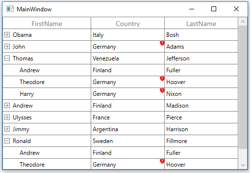
Change the color of error icon
You can change the validation error template color of the TreeGridCell by changing the Fill property of the path in the PART_InValidCellBorder of TreeGridCell.
<Window.Resources>
        <ResourceDictionary>
            <ResourceDictionary.MergedDictionaries>
                <ResourceDictionary Source="/Syncfusion.SfGrid.WPF;component/Control/Themes/Generic.xaml" />
            </ResourceDictionary.MergedDictionaries>
            <Style TargetType="syncfusion:TreeGridCell">
                <Setter Property="Background" Value="Transparent" />
                <Setter Property="BorderBrush" Value="Gray" />
                <Setter Property="BorderThickness" Value="0,0,1,1" />
                <Setter Property="Padding" Value="0" />
                <Setter Property="Template">
                    <Setter.Value>
                        <ControlTemplate TargetType="syncfusion:TreeGridCell">
                            <Grid x:Name="Root">
                                <Border x:Name="PART_GridCellBorder"
                                        Background="{TemplateBinding Background}"
                                        BorderBrush="{TemplateBinding BorderBrush}"
                                        BorderThickness="{TemplateBinding BorderThickness}"
                                        SnapsToDevicePixels="True">
                                    <ContentPresenter />
                                </Border>

                                <Border x:Name="PART_CurrentCellBorder"
                                        Margin="0,0,1,1"
                                        Background="Transparent"
                                        BorderBrush="{TemplateBinding CurrentCellBorderBrush}"
                                        BorderThickness="{TemplateBinding CurrentCellBorderThickness}"
                                        IsHitTestVisible="False"
                                        Visibility="Collapsed" />
                                <Border x:Name="PART_InValidCellBorder"
                                        Width="10"
                                        Height="10"
                                        HorizontalAlignment="Right"
                                        VerticalAlignment="Top"
                                        SnapsToDevicePixels="True"
                                        Visibility="Collapsed">
                                    <ToolTipService.ToolTip>
                                        <ToolTip Background="#FFDB000C"
                                                 Placement="Right"
                                                 PlacementRectangle="20,0,0,0"
                                                 Tag="{TemplateBinding ErrorMessage}"
                                                 Template="{StaticResource ValidationToolTipTemplate}" />
                                    </ToolTipService.ToolTip>
                                    <Path Data="M0.5,0.5 L12.652698,0.5 12.652698,12.068006 z"
                                          Fill="Orange"
                                          SnapsToDevicePixels="True"
                                          Stretch="Fill" />
                                </Border>
                                <VisualStateManager.VisualStateGroups>
                                    <VisualStateGroup x:Name="IndicationStates">
                                        <VisualState x:Name="NoError" />
                                        <VisualState x:Name="HasError">
                                            <Storyboard>
                                                <ObjectAnimationUsingKeyFrames BeginTime="00:00:00"
                                                                               Storyboard.TargetName="PART_InValidCellBorder"
                                                                               Storyboard.TargetProperty="(UIElement.Visibility)">
                                                    <DiscreteObjectKeyFrame KeyTime="00:00:00" Value="{x:Static Visibility.Visible}" />
                                                </ObjectAnimationUsingKeyFrames>
                                            </Storyboard>
                                        </VisualState>
                                    </VisualStateGroup>
                                    <VisualStateGroup x:Name="CurrentStates">
                                        <VisualState x:Name="Regular" />
                                        <VisualState x:Name="Current">
                                            <Storyboard>
                                                <ObjectAnimationUsingKeyFrames BeginTime="00:00:00"
                                                                               Storyboard.TargetName="PART_CurrentCellBorder"
                                                                               Storyboard.TargetProperty="(UIElement.Visibility)">
                                                    <DiscreteObjectKeyFrame KeyTime="00:00:00" Value="{x:Static Visibility.Visible}" />
                                                </ObjectAnimationUsingKeyFrames>
                                            </Storyboard>
                                        </VisualState>
                                    </VisualStateGroup>
                                </VisualStateManager.VisualStateGroups>
                            </Grid>
                        </ControlTemplate>
                    </Setter.Value>
                </Setter>
            </Style>
        </ResourceDictionary>
</Window.Resources>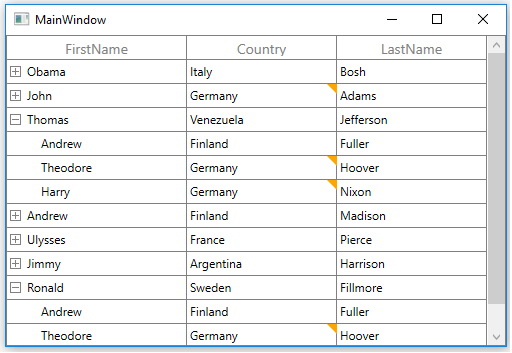
Change the cursor on error icon
You can change the validation error template cursor of the TreeGridCell by changing the Cursor property of the path codes in the PART_InValidCellBorder of TreeGridCell.
<Window.Resources>
        <ResourceDictionary>
            <ResourceDictionary.MergedDictionaries>
                <ResourceDictionary Source="/Syncfusion.SfGrid.WPF;component/Control/Themes/Generic.xaml" />
            </ResourceDictionary.MergedDictionaries>
            <Style TargetType="syncfusion:TreeGridCell">
                <Setter Property="Background" Value="Transparent" />
                <Setter Property="BorderBrush" Value="Gray" />
                <Setter Property="BorderThickness" Value="0,0,1,1" />
                <Setter Property="Padding" Value="0" />
                <Setter Property="Template">
                    <Setter.Value>
                        <ControlTemplate TargetType="syncfusion:TreeGridCell">
                            <Grid x:Name="Root">
                                <Border x:Name="PART_GridCellBorder"
                                        Background="{TemplateBinding Background}"
                                        BorderBrush="{TemplateBinding BorderBrush}"
                                        BorderThickness="{TemplateBinding BorderThickness}"
                                        SnapsToDevicePixels="True">
                                    <ContentPresenter />
                                </Border>

                                <Border x:Name="PART_CurrentCellBorder"
                                        Margin="0,0,1,1"
                                        Background="Transparent"
                                        BorderBrush="{TemplateBinding CurrentCellBorderBrush}"
                                        BorderThickness="{TemplateBinding CurrentCellBorderThickness}"
                                        IsHitTestVisible="False"
                                        Visibility="Collapsed" />
                                <Border x:Name="PART_InValidCellBorder"
                                        Width="10"
                                        Height="10"
                                        HorizontalAlignment="Right"
                                        VerticalAlignment="Top"
                                        SnapsToDevicePixels="True"
                                        Visibility="Collapsed">
                                    <ToolTipService.ToolTip>
                                        <ToolTip Background="#FFDB000C"
                                                 Placement="Right"
                                                 PlacementRectangle="20,0,0,0"
                                                 Tag="{TemplateBinding ErrorMessage}"
                                                 Template="{StaticResource ValidationToolTipTemplate}" />
                                    </ToolTipService.ToolTip>
                                    <Path Cursor="Hand"
                                          Data="M0.5,0.5 L12.652698,0.5 12.652698,12.068006 z"
                                          Fill="Red"
                                          SnapsToDevicePixels="True"
                                          Stretch="Fill" />
                                </Border>
                                <VisualStateManager.VisualStateGroups>
                                    <VisualStateGroup x:Name="IndicationStates">
                                        <VisualState x:Name="NoError" />
                                        <VisualState x:Name="HasError">
                                            <Storyboard>
                                                <ObjectAnimationUsingKeyFrames BeginTime="00:00:00"
                                                                               Storyboard.TargetName="PART_InValidCellBorder"
                                                                               Storyboard.TargetProperty="(UIElement.Visibility)">
                                                    <DiscreteObjectKeyFrame KeyTime="00:00:00" Value="{x:Static Visibility.Visible}" />
                                                </ObjectAnimationUsingKeyFrames>
                                            </Storyboard>
                                        </VisualState>
                                    </VisualStateGroup>
                                    <VisualStateGroup x:Name="CurrentStates">
                                        <VisualState x:Name="Regular" />
                                        <VisualState x:Name="Current">
                                            <Storyboard>
                                                <ObjectAnimationUsingKeyFrames BeginTime="00:00:00"
                                                                               Storyboard.TargetName="PART_CurrentCellBorder"
                                                                               Storyboard.TargetProperty="(UIElement.Visibility)">
                                                    <DiscreteObjectKeyFrame KeyTime="00:00:00" Value="{x:Static Visibility.Visible}" />
                                                </ObjectAnimationUsingKeyFrames>
                                            </Storyboard>
                                        </VisualState>
                                    </VisualStateGroup>
                                </VisualStateManager.VisualStateGroups>
                            </Grid>
                        </ControlTemplate>
                    </Setter.Value>
                </Setter>
            </Style>
        </ResourceDictionary>
</Window.Resources>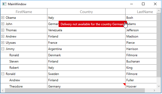
Customizing error tip
You can customize the error tip by editing the style of ValidationToolTipTemplate. Get the style of ValidationToolTipTemplate by editing the TreeGridCell style.
Change the background and foreground color of error tip
You can change the error tip background color by setting Background property of the border in ValidationToolTipTemplate.The error tip foreground color can be changed by setting Foreground property of the TextBlock in ‘ValidationToolTipTemplate’.
<ControlTemplate x:Key="ValidationToolTipTemplate">
                <Grid x:Name="Root"
                      Margin="5,0"
                      Opacity="0"
                      RenderTransformOrigin="0,0">
                    <Grid.RenderTransform>
                        <TranslateTransform x:Name="transform" X="-25" />
                    </Grid.RenderTransform>

                    <Border Margin="4,4,-4,-4"
                            Background="#052A2E31"
                            CornerRadius="5" />
                    <Border Margin="3,3,-3,-3"
                            Background="#152A2E31"
                            CornerRadius="4" />
                    <Border Margin="2,2,-2,-2"
                            Background="#252A2E31"
                            CornerRadius="3" />
                    <Border Margin="1,1,-1,-1"
                            Background="#352A2E31"
                            CornerRadius="2" />

                    <Border Background="Orange" CornerRadius="2" />
                    <Border CornerRadius="2">
                        <TextBlock MaxWidth="250"
                                   Margin="8,4,8,4"
                                   Foreground="Black"
                                   Text="{TemplateBinding Tag}"
                                   TextWrapping="Wrap"
                                   UseLayoutRounding="false" />
                    </Border>
                    <VisualStateManager.VisualStateGroups>
                        <VisualStateGroup Name="OpenStates">
                            <VisualStateGroup.Transitions>
                                <VisualTransition GeneratedDuration="0" />
                                <VisualTransition GeneratedDuration="0:0:0.2" To="Open">
                                    <Storyboard>
                                        <DoubleAnimation Duration="0:0:0.2"
                                                         Storyboard.TargetName="transform"
                                                         Storyboard.TargetProperty="X"
                                                         To="0">
                                            <DoubleAnimation.EasingFunction>
                                                <BackEase Amplitude=".3" EasingMode="EaseOut" />
                                            </DoubleAnimation.EasingFunction>
                                        </DoubleAnimation>
                                        <DoubleAnimation Duration="0:0:0.2"
                                                         Storyboard.TargetName="Root"
                                                         Storyboard.TargetProperty="Opacity"
                                                         To="1" />
                                    </Storyboard>
                                </VisualTransition>
                            </VisualStateGroup.Transitions>
                            <VisualState x:Name="Closed">
                                <Storyboard>
                                    <DoubleAnimation Duration="0"
                                                     Storyboard.TargetName="Root"
                                                     Storyboard.TargetProperty="Opacity"
                                                     To="0" />
                                </Storyboard>
                            </VisualState>
                            <VisualState x:Name="Open">
                                <Storyboard>
                                    <DoubleAnimation Duration="0"
                                                     Storyboard.TargetName="transform"
                                                     Storyboard.TargetProperty="X"
                                                     To="0" />
                                    <DoubleAnimation Duration="0"
                                                     Storyboard.TargetName="Root"
                                                     Storyboard.TargetProperty="Opacity"
                                                     To="1" />
                                </Storyboard>
                            </VisualState>
                        </VisualStateGroup>
                    </VisualStateManager.VisualStateGroups>
                </Grid>
</ControlTemplate>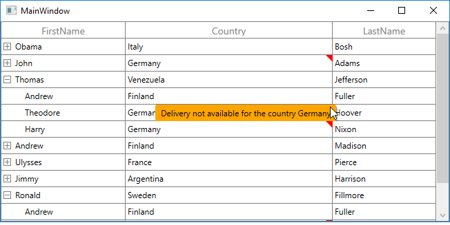
Showing error details in RowHeader
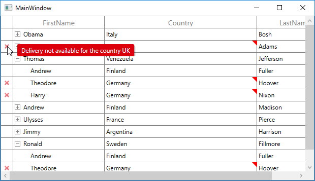
SfTreeGrid supports to show the error icon in TreeGridRowHeaderCell based on IDataErrorInfo.Error or INotifyDataErrorInfo.HasErrors property.
Using IDataErrorInfo
You can show the error information in row header by setting IDataErrorInfo.Error. IDataErrorInfo.Error will be displayed as error message in tooltip.
[Display(AutoGenerateField = false)]

public string Error
{
    get
    {

        if (this.Country.Contains("Germany") || this.Country.Contains("UK"))
            return "Delivery not available for the country " + this.Country;
        return string.Empty;
    }
}
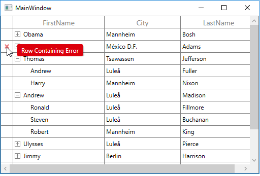
Using INotifyDataErrorInfo
You can show the error information in row header by setting INotifyDataErrorInfo.HasErrors. By default, error message “Row Containing Error” will be displayed. You can change this by changing RowErrorMessage in the resx file.
[Display(AutoGenerateField = false)]

public bool HasErrors
{
    get
    {

        if (this.ShipCity.Contains("Mexico D.F."))
            return true;
        return false;
    }
}
Validation with CheckBox column
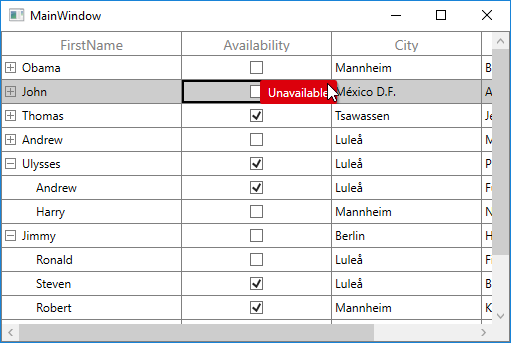
SfTreeGrid doesn’t support to validate the TreeGridCheckBoxColumn through validating events. You can validate the check box column value by setting TreeGridValidationHelper.IsCurrentCellValidated and TreeGridValidationHelper.IsCurrentRowValidated static properties by calling SetCurrentRowValidated and SetCurrentCellValidated methods from TreeGridValidationHelper.
using Syncfusion.UI.Xaml.TreeGrid.Helpers;

treeGrid.CurrentCellValidating += treeGrid_CurrentCellValidating;

void treeGrid_CurrentCellValidating(object sender, TreeGridCurrentCellValidatingEventArgs e)
{

    if (!(bool)e.NewValue)
    {
        e.IsValid = false;
        e.ErrorMessage = "Unavailable";
    }
}

treeGrid.RowValidating += treeGrid_RowValidating;

void treeGrid_RowValidating(object sender, TreeGridRowValidatingEventArgs e)
{
    var status = e.RowData.GetType().GetProperty("Availability").GetValue(e.RowData);

    if (!(bool)status)
    {
        e.IsValid = false;
        e.ErrorMessages.Add("Availability", "Unavailable");
    }
}

treeGrid.CurrentCellValueChanged += treeGrid_CurrentCellValueChanged;

void treeGrid_CurrentCellValueChanged(object sender, TreeGridCurrentCellValueChangedEventArgs e)
{
    int columnIndex = this.treeGrid.ResolveToGridVisibleColumnIndex(e.RowColumnIndex.ColumnIndex);

    //We are enabling the RowValidating, CellValidating event if the changes happen in TreeGridCheckBoxColumn

    if (this.treeGrid.Columns[columnIndex].CellType == "CheckBox")
    {
        this.treeGrid.GetValidationHelper().SetCurrentRowValidated(false);
        this.treeGrid.GetValidationHelper().SetCurrentCellValidated(false);
    }
}
Limitations
- Non-editable columns will not support custom validation except TreeGridCheckBoxColumn.
- CurrentCellValidating event will not triggered for TreeGridTemplateColumn.
NOTE
You can refer to our WPF TreeGrid feature tour page for its groundbreaking feature representations. You can also explore our WPF TreeGrid example to know how to render and configure the treegrid.