Marker pointer in Flutter Radial Gauge (SfRadialGauge)
22 May 202515 minutes to read
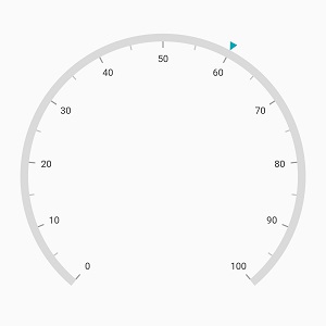
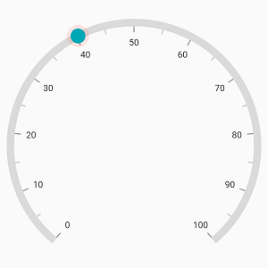
Different types of markers are used to mark the pointer values in a scale. You can change the marker type using the markerType property.
@override
  Widget build(BuildContext context) {
    return Scaffold(
      body: Center(
        child: SfRadialGauge(
          axes: <RadialAxis>[
            RadialAxis(
              pointers: <GaugePointer>[
                MarkerPointer(value: 60)
              ]
            )
          ],
        )
      ),
    );
  }
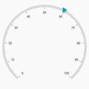
Gauge supports the following types of marker:
- Circle
- Diamond
- Image
- Inverted triangle
- Rectangle
- Text
- Triangle
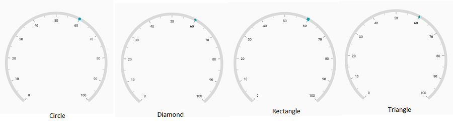
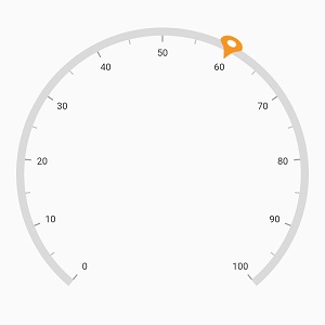
Image pointer
An Image can be used to denote the current pointer values instead of a shape. This can be achieved by setting the markerType as image and specifying the imageUrl property of the marker pointer.
@override
  Widget build(BuildContext context) {
    return Scaffold(
      body: Center(
        child: SfRadialGauge(
          axes: <RadialAxis>[
            RadialAxis(
              pointers: <GaugePointer>[
                MarkerPointer(
                  value: 60,
                  markerType: MarkerType.image,
                  markerHeight: 30,
                  markerWidth: 30,
                  imageUrl: 'images/pin.png'
                )
              ]
            )
          ],
        )
      ),
    );
  }
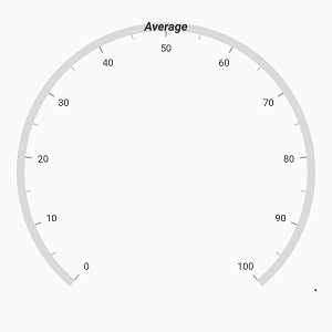
Text pointer
Text can be used to denote the current pointer value instead of any marker shape. This can be achieved by setting the markerType as text. The provided text can be customized using the textStyle property of the marker pointer.
@override
  Widget build(BuildContext context) {
    return Scaffold(
      body: Center(
        child: SfRadialGauge(
          axes: <RadialAxis>[
            RadialAxis(
              pointers: <GaugePointer>[
                MarkerPointer(
                  value: 50,
                  markerType: MarkerType.text,
                  text: 'Average',
                  textStyle: GaugeTextStyle(
                    fontSize: 15,
                    fontWeight: FontWeight.bold,
                    fontStyle: FontStyle.italic
                  )
                )
              ]
            )
          ],
        )
      ),
    );
  }
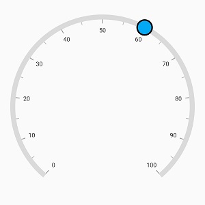
Marker Customization
The marker pointer can be customized using the following properties:
-
color– Allows you to customize the marker color. -
markerHeight– Allows you to specify the marker height. -
markerWidth– Allows you to specify the marker width. -
borderColor– Allows you to specify the border color for the marker. -
borderWidth– Allows you to specify the border width of the marker.
@override
  Widget build(BuildContext context) {
    return Scaffold(
      body: Center(
        child: SfRadialGauge(
          axes: <RadialAxis>[
            RadialAxis(
              pointers: <GaugePointer>[
                MarkerPointer(
                  value: 60,
                  markerHeight: 30,
                  markerWidth: 30,
                  markerType: MarkerType.circle,
                  color: Colors.lightBlue,
                  borderWidth: 3,
                  borderColor: Colors.black
                )
              ]
            )
          ],
        )
      ),
    );
  }
Marker elevation
The marker pointer can be elevated by rendering its shadow behind it. The z- coordinate position at which the shadow can be positioned relative to the marker can be controlled by the elevation property.
@override
  Widget build(BuildContext context) {
    return Scaffold(
      body: Center(
        child: SfRadialGauge(
          axes: <RadialAxis>[
            RadialAxis(
              pointers: <GaugePointer>[
                MarkerPointer(
                  value: 60,
                  markerHeight: 20,
                  markerWidth: 20,
                  elevation: 4
                )
              ]
            )
          ],
        )
      ),
    );
  }
The shadow color of the pointer is black by default and the default value of elevation is 0.
NOTE
The
elevationproperty applies to all the marker types exceptMarkerType.imageandMarkerType.text.
Marker overlay
The marker overlay is rendered around the marker when the marker is dragged. When enableDragging property of the marker is set to true and while dragging the marker, the overlay will appear around the marker pointer.
@override
  Widget build(BuildContext context) {
    return Scaffold(
      body: Center(
        child: SfRadialGauge(
          axes: <RadialAxis>[
            RadialAxis(
              pointers: <GaugePointer>[
                MarkerPointer(
                  value: 60,
                  markerHeight: 20,
                  markerWidth: 20,
                  enableDragging: true,
                  markerType: MarkerType.circle
                )
              ]
            )
          ],
        )
      ),
    );
  }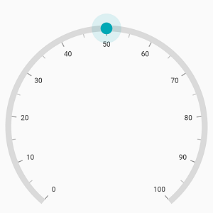
By default, the overlayRadius is calculated based on the provided markerHeight and markerWidth property and the overlayColor is derived from the marker color. The following properties are used to customize the overlay color and its radius,
-
overlayColor– Allows customizing the overlay color. -
overlayRadius– Allows customizing the overlay radius.
@override
  Widget build(BuildContext context) {
    return Scaffold(
      body: Center(
        child: SfRadialGauge(
          axes: <RadialAxis>[
            RadialAxis(
              pointers: <GaugePointer>[
                MarkerPointer(
                  value: 60,
                  markerHeight: 20,
                  markerWidth: 20,
                  enableDragging: true,
                  overlayRadius: 15,
                  overlayColor: Colors.red.withOpacity(0.12),
                  markerType: MarkerType.circle
                )
              ]
            )
          ],
        )
      ),
    );
  }
NOTE
The marker overlay applies to all the marker types except
MarkerType.imageandMarkerType.text.
Position customization
The marker pointer can be moved near or far from its actual position using the markerOffset and offsetUnit properties.
When you set offsetUnit to logical pixel, the marker pointer will be moved based on the logical pixel value. If you set offsetUnit to factor, then provided factor will be multiplied with the axis radius value, and the pointer will be moved to the corresponding position. The default value of offsetUnit is GaugeSizeUnit.logicalPixel.
@override
  Widget build(BuildContext context) {
    return Scaffold(
      body: Center(
        child: SfRadialGauge(
          axes: <RadialAxis>[
            RadialAxis(
              radiusFactor: 0.9,
              centerY: 0.65,
              pointers: <GaugePointer>[
                MarkerPointer(
                  value: 60,
                  markerOffset: -5
                )
              ]
            )
          ],
        )
      ),
    );
  }