Range Pointer in Flutter Radial Gauge (SfRadialGauge)
22 May 202510 minutes to read
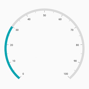
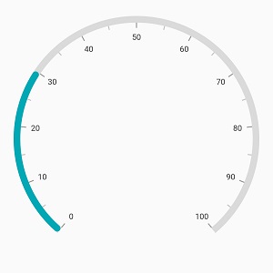
A range pointer is an accenting line or shaded background range that can be placed on a gauge to mark the current value.
@override
  Widget build(BuildContext context) {
    return Scaffold(
      body: Center(
        child: SfRadialGauge(
          axes: <RadialAxis>[
            RadialAxis(
              pointers: <GaugePointer>[
                RangePointer(value: 30)
              ]
            )
          ],
        )
      ),
    );
  }
The following properties are used to customize the range pointer:
-
color– Customizes the color of range pointer. -
width- Specifies the width of the pointer either in logical pixels or factor. -
sizeUnit– Specifies whether thewidthand thepointerOffsetare defined in logical pixels or factor.
The width of the pointer can be specified either in logical pixel or factor. If the sizeUnit is specified as logicalPixel, then the range will be rendered based on the provided pixel value. If the sizeUnitis set as factor, the provided factor value will be multiplied with axis radius. For example, if the width is set as 0.1, then 10% of axis radius is considered as the range pointer width.
@override
  Widget build(BuildContext context) {
    return Scaffold(
      body: Center(
        child: SfRadialGauge(
          axes: <RadialAxis>[
            RadialAxis(
              pointers: <GaugePointer>[
                RangePointer(
                  value: 30,
                  width: 0.1,
                  color: Colors.indigo,
                  sizeUnit: GaugeSizeUnit.factor
                )
              ]
            )
          ],
        )
      ),
    );
  }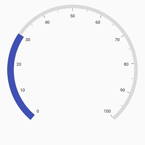
The default value of SizeUnit is GaugeSizeUnit.logicalPixel.
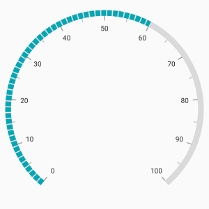
Dashed range pointer
The dashArray property of range pointer allows rendering the range pointer as a dashed line.
@override
  Widget build(BuildContext context) {
    return Scaffold(
      body: Center(
        child: SfRadialGauge(
          axes: <RadialAxis>[
            RadialAxis(
              pointers: <GaugePointer>[
                RangePointer(
                  value: 60,
                  dashArray: <double>[8, 2]
                )
              ]
            )
          ]
        ),
      ),
    );
  }
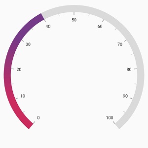
Gradient support
The gradient property of range pointer allows you to specify a smooth color transition for the pointer by defining different colors based on provided factor values.
@override
  Widget build(BuildContext context) {
    return Scaffold(
      body: Center(
        child: SfRadialGauge(
          axes: <RadialAxis>[
            RadialAxis(
              axisLineStyle: AxisLineStyle(
                thickness: 0.1,
                thicknessUnit: GaugeSizeUnit.factor,
              ),
              pointers: <GaugePointer>[
                RangePointer(
                  value: 40,
                  width: 0.1,
                  sizeUnit: GaugeSizeUnit.factor,
                  gradient: const SweepGradient(
                    colors: <Color>[Color(0xFFCC2B5E), Color(0xFF753A88)],
                    stops: <double>[0.25, 0.75]
                  ),
                )
              ]
            ),
          ]
        ),
      ),
    );
  }
Corner customization
The cornerStyle property of range pointer specifies the corner type for the pointer. The corners can be customized using the bothFlat, bothCurve, startCurve, and endCurve options. The default value of this property is bothFlat.
@override
  Widget build(BuildContext context) {
    return Scaffold(
      body: Center(
        child: SfRadialGauge(
          axes: <RadialAxis>[
            RadialAxis(
              pointers: <GaugePointer>[
                RangePointer(
                  value: 30,
                  cornerStyle: CornerStyle.bothCurve
                )
              ]
            )
          ],
        )
      ),
    );
  }
Position customization
The range pointer can be moved farther from or closer to the axis line using the pointerOffset property. The pointerOffset can be set either in logical pixel or factor value using its sizeUnit. The sizeUnit property is common for bothwidth and pointerOffset
@override
  Widget build(BuildContext context) {
    return Scaffold(
      body: Center(
        child: SfRadialGauge(
          axes: <RadialAxis>[
            RadialAxis(
              pointers: <GaugePointer>[
                RangePointer(
                  value: 30,
                  pointerOffset: 50
                )
              ]
            )
          ],
        )
      ),
    );
  }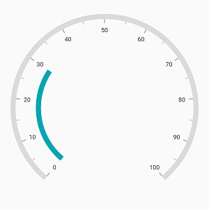
When you set the sizeUnit as logical pixel, the pointer will be moved to the provided logical pixel value.
If the sizeUnit is specified as factor, the factor value will be multiplied with the axis radius. For example, if you set pointerOffset as 0.1, then the pointer offset is considered as 10% of axis radius.