Ticks in Flutter Linear Gauge (SfLinearGauge)
21 May 20254 minutes to read
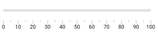
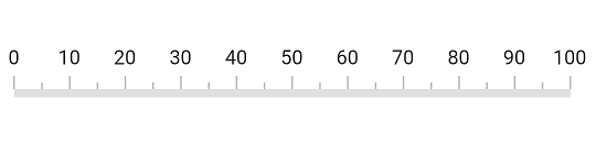
The default style of axis ticks is as follows.
Customize tick style
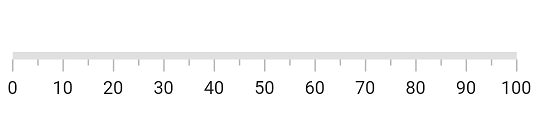
There are two types of ticks in the Flutter Linear Gauge namely major and minor ticks. In the above image, the larger ticks are major ticks and the ticks between the major ticks are minor ticks. The major and minor tick of a SfLinearGauge can be customized using the majorTickStyle and minorTickStyle properties. The following properties can be customized for both the major and the minor ticks:
-
color– Allows customization of the tick color. -
thickness– Allows customization of the thickness of ticks. -
length– Specifics the length of ticks.
@override
  Widget build(BuildContext context) {
    return MaterialApp(
      home: Scaffold(
        body: Center(
          child: SfLinearGauge(
            majorTickStyle: LinearTickStyle(length: 10, thickness: 2.5, color: Colors.black),
            minorTickStyle: LinearTickStyle(length: 5, thickness: 1.75, color: Colors.black)
          )
        )
      )
    );
  }
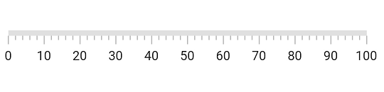
Customize minor tick interval
The major ticks are generated based on the interval property which is documented in Customize the interval between labels topic. The minor ticks are calculated using the minorTicksPerInterval property of SfLinearGauge. By default, the value of this property is 1.
@override
  Widget build(BuildContext context) {
    return MaterialApp(
      home: Scaffold(
        body: Center(
          child: SfLinearGauge(minorTicksPerInterval: 4)
        )
      )
    );
  }
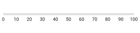
Change tick visibility
The showTicks property of the axis is used to enable or disable the visibility of both the major and the minor ticks. The default value of this property is true.
@override
  Widget build(BuildContext context) {
    return MaterialApp(
      home: Scaffold(
        body: Center(
          child: SfLinearGauge(
            showTicks: false
          ),
        )
      )
    );
  }
Customize tick position
The linear axis allows positioning the ticks either inside or outside the axis track using the tickPosition property. By default, ticks are positioned inside the axis track.
@override
  Widget build(BuildContext context) {
    return MaterialApp(
      home: Scaffold(
        body: Center(
          child: SfLinearGauge(
            tickPosition: LinearElementPosition.outside,
            labelPosition: LinearLabelPosition.outside
          ),
        )
      )
    );
  }
Customize tick offset
The ticks can be moved near or far from the axis line using the tickOffset property. The default value of tick offset is 0. While setting offset for the ticks, the axis labels are also moved along with the ticks.
@override
  Widget build(BuildContext context) {
    return MaterialApp(
      home: Scaffold(
        body: Center(
          child: SfLinearGauge(tickOffset: 20),
        )
      )
    );
  }