Range in Flutter Linear Gauge (SfLinearGauge)
30 Jul 202518 minutes to read
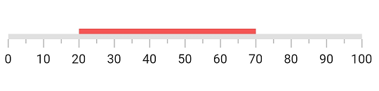
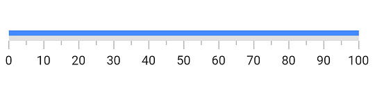
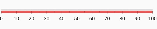
A range is a visual element that helps you quickly visualize where a range falls on the axis track. Multiple ranges with different styles can be added to a linear gauge. The default style of range will be as below.
@override
  Widget build(BuildContext context) {
    return MaterialApp(
      home: Scaffold(
        body: Center(
          child: SfLinearGauge(
              ranges: [
                LinearGaugeRange(
                  startValue: 20,
                  endValue: 70
                )
              ],
            ),
        ),
      ),
    );
  }
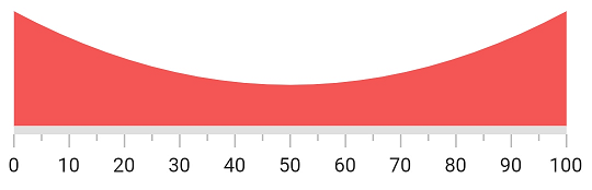
Customize range shape
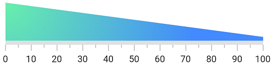
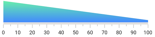
A Linear Gauge range has three values to draw a range - startValue, midValue and endValue.These values indicate where the range falls in the axis. In addition to these values, the shape of the range can be customized by startWidth, midWidth and endWidth properties. To draw a line or rectangle, just startValue, startWidth, endValue and endWidth are enough - as shown in the above code snippet in Default Linear Gauge Range topic.
However, to draw concave, convex and exponential-like shapes the midValue and midWidth properties are needed. For this, the rangeShapeType is used to create the curve. The below code snippet demonstrates how to create a concave shape for a range.
@override
  Widget build(BuildContext context) {
    return MaterialApp(
      home: Scaffold(
        body: Center(
          child: SfLinearGauge(
            ranges: [
              LinearGaugeRange(
                startValue: 0,
                midValue: 50,
                endValue: 100,
                startWidth: 70,
                midWidth: 20,
                endWidth: 70,
                rangeShapeType: LinearRangeShapeType.curve
              ),
            ],
          ),
        ),
      ),
    );
  }
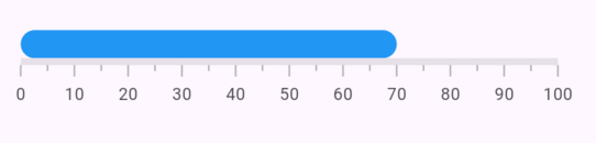
Customize edge style
The edgeStyle property defines the appearance of LinearGaugeRange with either sharp or curved edges. The available options are startCurve, endCurve, bothCurve, and bothFlat.
The default value is bothFlat.
@override
  Widget build(BuildContext context) {
    return MaterialApp(
      home: Scaffold(
        body: Center(
          child: Container(
            width: 400,
            height: 120,
            child: SfLinearGauge(
              ranges: [
                LinearGaugeRange(
                  startValue: 0,
                  startWidth: 20,
                  endWidth: 20,
                  endValue: 70,
                  edgeStyle: LinearEdgeStyle.bothCurve,
                  color: Colors.blue,
                ),
              ],
            ),
          ),
        ),
      ),
    );
  }
Customize color of a range
The color of a range can be changed by setting the color property of a range. The below code example demonstrates changing the color property of the range.
@override
  Widget build(BuildContext context) {
    return MaterialApp(
      home: Scaffold(
        body: Center(
          child: SfLinearGauge(
            ranges: [
              //Changes the color. The start and end values are 0 to 100 by default
              LinearGaugeRange(color: Colors.blueAccent)
            ],
          ),
        ),
      ),
    );
  }
Apply radial gradient to a range
The gradient can be applied by using the shaderCallback property of a range. The below code example demonstrates applying a radial gradient to the range.
@override
  Widget build(BuildContext context) {
    return MaterialApp(
      color: Colors.white,
      home: Scaffold(
        body: Center(
          child: SfLinearGauge(
            ranges: [
              //Applies a radial gradient. The start and end values are 0 to 100 by default
              LinearGaugeRange(
                startWidth: 50,
                shaderCallback: (bounds) => RadialGradient(
                  center: Alignment.topLeft,
                  radius: 5,
                  colors: [
                    Colors.greenAccent,
                    Colors.blueAccent,
                  ]).createShader(bounds)
              )
            ],
          ),
        ),
      ),
    );
  }
Apply linear gradient to a range
The below code snippet demonstrates applying a linear gradient to the range.
@override
  Widget build(BuildContext context) {
    return MaterialApp(
      home: Scaffold(
        body: Center(
          child: SfLinearGauge(
            ranges: [
              //Applies linear gradient. The start and end values are 0 to 100 by default
              LinearGaugeRange(
                startWidth: 50,
                shaderCallback: (bounds) => LinearGradient(
                  begin: Alignment.topCenter,
                  end: Alignment.bottomCenter,
                  colors: [Colors.greenAccent, Colors.blueAccent],
                ).createShader(bounds)
              )
            ],
          ),
        ),
      ),
    );
  }
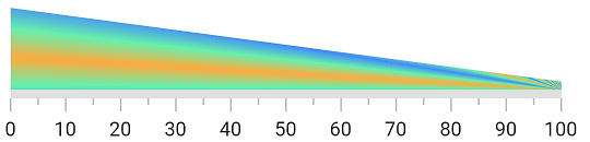
Apply sweep gradient to a range
The below code snippet demonstrates applying a sweep gradient to the range.
@override
  Widget build(BuildContext context) {
    return MaterialApp(
      home: Scaffold(
        body: Center(
          child: SfLinearGauge(
            ranges: [
              //Applies sweep gradient. The start and end values are 0 to 100 by default
              LinearGaugeRange(
                startWidth: 50,
                shaderCallback: (bounds) => SweepGradient(
                  startAngle: 0.1,
                  endAngle: 0.2,
                  colors: [
                    Colors.blueAccent,
                    Colors.greenAccent,
                    Colors.orangeAccent,
                  ],
                  tileMode: TileMode.mirror,
                  center: Alignment.bottomRight,
                ).createShader(bounds)
              ),
            ],
          ),
        ),
      ),
    );
  }
Customize range position
It is possible to position the ranges inside, cross, and outside the axis. By default, the range will be positioned outside the axis. The position property of the range is used to position the range. The below code snippet demonstrates the same.
@override
  Widget build(BuildContext context) {
    return MaterialApp(
      color: Colors.white,
      home: Scaffold(
        body: Center(
          child: SfLinearGauge(
            //Here the range is positioned inside the axis.
            ranges: [
              LinearGaugeRange(position: LinearElementPosition.inside)
            ],
          ),
        ),
      ),
    );
  }
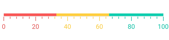
Setting range color to axis element
You can set range color to axis elements using the useRangeColorForAxis property of axis.
Container(
    child: SfLinearGauge(
      minorTicksPerInterval: 4,
      useRangeColorForAxis: true,
      animateAxis: true,
      axisTrackStyle: LinearAxisTrackStyle(thickness: 1),
      ranges: <LinearGaugeRange>[
        LinearGaugeRange(
          startValue: 0,
          endValue: 33,
          position: LinearElementPosition.outside,
          color: Color(0xffF45656),
        ),
        LinearGaugeRange(
          startValue: 33,
          endValue: 66,
          position: LinearElementPosition.outside,
          color: Color(0xffFFC93E),
        ),
        LinearGaugeRange(
          startValue: 66,
          endValue: 100,
          position: LinearElementPosition.outside,
          color: Color(0xff0DC9AB),
        ),
      ],
    )
  )
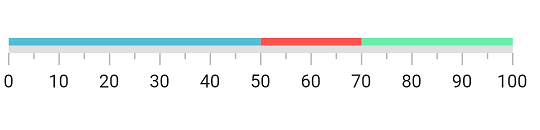
Add multiple ranges
You can add multiple ranges for an axis. The below code example demonstrates adding three ranges in a Linear Gauge.
@override
  Widget build(BuildContext context) {
    return MaterialApp(
      home: Scaffold(
        body: Center(
          child: SfLinearGauge(
            ranges: [
              //First range.
              LinearGaugeRange(
                startValue: 0, endValue: 50, color: Colors.blueAccent,
              ),
              //Second range.
              LinearGaugeRange(
                startValue: 50, endValue: 70, color: Colors.redAccent,
              ),
              //Third range.
              LinearGaugeRange(
                startValue: 70, endValue: 100, color: Colors.greenAccent,
              ),
            ],
          ),
        ),
      ),
    );
  }