Axis in Flutter Linear Gauge (SfLinearGauge)
28 May 202518 minutes to read
The Linear Gauge axis is a scale where a set of values can be plotted. An axis can be customized by changing the thickness, color, and edge styles. Axis elements such as labels and ticks can also be easily customized, and you can inverse the axis.
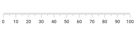
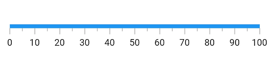
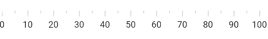
Default axis
By default axis will have a minimum axis value as 0 and a maximum axis value of 100. Without any customization, the default axis of the Linear Gauge will be displayed as follows:
@override
  Widget build(BuildContext context) {
    return MaterialApp(
      home: Scaffold(
        body: Center(
          child: SfLinearGauge()
        ),
      ),
    );
  }
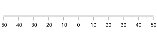
Customize minimum and maximum axis values
The minimum and maximum properties of a Linear Gauge can be used to customize the axis values. In the example below, the axis is customized to have a minimum value of -50 to maximum value of 50. The axis values are displayed by labels. which can be further customized as explained in later sections.
@override
  Widget build(BuildContext context) {
    return MaterialApp(
      home: Scaffold(
        body: Center(
          child: SfLinearGauge(minimum: -50, maximum: 50),
        ),
      ),
    );
  }
Customize axis track style
The linear axis track can be customized using the axisTrackStyle property. The axisTrackStyle has the following properties.
-
thickness– Customizes the thickness of the axis track. -
color– Customizes the color of the axis track with a solid color. -
gradient- Customizes the color of the axis track with a gradient. -
borderWidth- Customizes the border width of the axis track. -
borderColor- Customizes the border color of the axis track.
The following code sample demonstrates how to customize the thickness and color property:
@override
  Widget build(BuildContext context) {
    return MaterialApp(
      home: Scaffold(
        body: Center(
          child: SfLinearGauge(
            axisTrackStyle: LinearAxisTrackStyle(thickness: 15),
          ),
        ),
      ),
    );
  }
Apply solid color
The code snippet below sets a solid color to the axis track:
@override
  Widget build(BuildContext context) {
    return MaterialApp(
      home: Scaffold(
        body: Center(
          child: SfLinearGauge(
            axisTrackStyle: LinearAxisTrackStyle(color: Colors.blue),
          ),
        ),
      ),
    );
  }
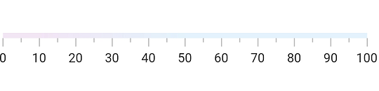
Apply gradient
The color property of axisTrackStyle allows you to set a solid color, while the gradient property allows you to apply a linear gradient to the axis track.
The following code sample applies a gradient to the axis track.
@override
  Widget build(BuildContext context) {
    return MaterialApp(
      home: Scaffold(
        body: Center(
          child: Container(
            child: SfLinearGauge(
              axisTrackStyle: LinearAxisTrackStyle(
                gradient: LinearGradient(
                  colors: [Colors.purple, Colors.blue],
                  begin: Alignment.centerLeft,
                  end: Alignment.centerRight,
                  stops: [0.1, 0.5],
                  tileMode: TileMode.clamp,
                ),
              ),
            ),
          ),
        ),
      ),
    );
  }
Customize borders
The borderColor and borderWidth properties of axisTrackStyle allow you to set a border to the axis track.
The code snippet below sets a border to the axis track:
@override
  Widget build(BuildContext context) {
    return MaterialApp(
      home: Scaffold(
        body: Center(
          child: SfLinearGauge(
            axisTrackStyle: LinearAxisTrackStyle(
              // Sets axis thickness for the better visibility of border
              thickness: 15,
              // Hides axis axis color for the better visibility of border
              color: Colors.transparent,
              //Sets the border color
              borderColor: Colors.blueGrey,
              //Sets the border width
              borderWidth: 2,
            ),
          ),
        ),
      ),
    );
  }
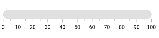
Customize corners
The edgeStyle property of axisTrackStyle specifies the corner type for the axis track. The corners can be customized with bothFlat, bothCurve, startCurve, and endCurve options. The default value is bothFlat.
@override
  Widget build(BuildContext context) {
    return MaterialApp(
      home: Scaffold(
        body: Center(
          child: SfLinearGauge(
            axisTrackStyle: LinearAxisTrackStyle(
              thickness: 20,
              edgeStyle: LinearEdgeStyle.bothCurve
            ),
          ),
        ),
      ),
    );
  }
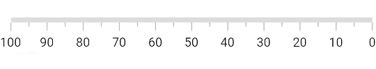
Inverse the axis
The direction of linear gauge axis can be customized using the isAxisInversed property.
When the isAxisInversed property is set to true, the axis will be displayed in an inverse direction. The default value is false.
@override
  Widget build(BuildContext context) {
    return MaterialApp(
      home: Scaffold(
        body: Center(
            child: SfLinearGauge(isAxisInversed: true)
        ),
      ),
    );
  }
You can see that the axis values are displayed from 100 to 0 as the axis track is inversed.
Extend the axis
The axis track can be extended using the axisTrackExtent property. This will extend the axis track at both ends. The following code sample demonstrates this:
@override
  Widget build(BuildContext context) {
    return MaterialApp(
      color: Colors.white,
      home: Scaffold(
        body: Center(
          child: child: SfLinearGauge(maximum: 50, axisTrackExtent: 50),
        ),
      ),
    );
  }
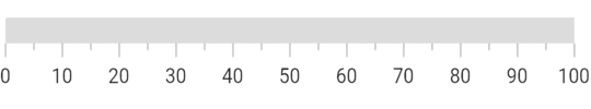
Change axis track visibility
You can hide the axis track by setting the showAxisTrack property to false. The default value of this property is true.
@override
  Widget build(BuildContext context) {
    return MaterialApp(
      home: Scaffold(
        body: Center(
            child: SfLinearGauge(showAxisTrack: false)
        ),
      ),
    );
  }
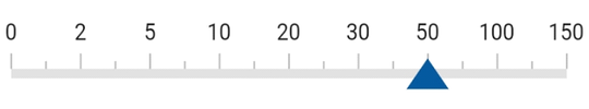
Customize axis values
Linear gauge allows you to display a set of values along with a custom axis based on your business logic by using the onGenerateLabels and valueToFactorCallback callbacks.
double pointerValue = 50.0;

  // To return the label value based on interval
  double _calculateLabelValue(num value) {
    if (value == 0) {
      return 0;
    } else if (value == 1) {
      return 2;
    } else if (value == 2) {
      return 5;
    } else if (value == 3) {
      return 10;
    } else if (value == 4) {
      return 20;
    } else if (value == 5) {
      return 30;
    } else if (value == 6) {
      return 50;
    } else if (value == 7) {
      return 100;
    } else {
      return 150;
    }
  }

  Widget _getLinearGauge() {
    return Container(
      child: SfLinearGauge(
        minimum: 0,
        maximum: 150.0,
        interval: 18.75,
        animateAxis: true,
        animateRange: true,
        labelPosition: LinearLabelPosition.outside,
        tickPosition: LinearElementPosition.outside,
        valueToFactorCallback: (value) {
          if (value >= 0 && value <= 2) {
            return (value * 0.125) / 2;
          } else if (value > 2 && value <= 5) {
            return (((value - 2) * 0.125) / (5 - 2)) + (1 * 0.125);
          } else if (value > 5 && value <= 10) {
            return (((value - 5) * 0.125) / (10 - 5)) + (2 * 0.125);
          } else if (value > 10 && value <= 20) {
            return (((value - 10) * 0.125) / (20 - 10)) + (3 * 0.125);
          } else if (value > 20 && value <= 30) {
            return (((value - 20) * 0.125) / (30 - 20)) + (4 * 0.125);
          } else if (value > 30 && value <= 50) {
            return (((value - 30) * 0.125) / (50 - 30)) + (5 * 0.125);
          } else if (value > 50 && value <= 100) {
            return (((value - 50) * 0.125) / (100 - 50)) + (6 * 0.125);
          } else if (value > 100 && value <= 150) {
            return (((value - 100) * 0.125) / (150 - 100)) + (7 * 0.125);
          } else {
            return 1;
          }
        },
        onGenerateLabels: () {
          final List<LinearAxisLabel> _visibleLabels = <LinearAxisLabel>[];
          for (num i = 0; i < 9; i++) {
            final double _value = _calculateLabelValue(i);
            final LinearAxisLabel label = LinearAxisLabel(
                text: _value.toInt().toString(),
                value: (i * 18.75).toDouble());
            _visibleLabels.add(label);
          }

          return _visibleLabels;
        },
        markerPointers: [
          LinearShapePointer(
              value: pointerValue,
              onChanged: (value) =>
              {
                setState(() => {pointerValue = value})
              },
              color: Color(0xff06589C),
              width: 24,
              position: LinearElementPosition.cross,
              shapeType: LinearShapePointerType.triangle,
              height: 16)
        ],
      ),
      margin: EdgeInsets.all(10)
    );
  }