Styles in Xamarin.iOS SFDataGrid
19 Sep 20229 minutes to read
SfDataGrid allows you to apply style to all of its elements by writing a Style class overriding from DataGridStyle and assigning it to the SfDataGrid.GridStyle property.
The following example explains you how to apply custom style to SfDataGrid.
//Apply custom style to SfDataGrid from code
dataGrid.GridStyle = new Dark ();//Custom style class
public class Dark : DataGridStyle
{
public Dark()
{
}
public override UIColor GetHeaderBackgroundColor()
{
return UIColor.FromRGB(15, 15, 15);
}
public override UIColor GetHeaderForegroundColor()
{
return UIColor.FromRGB(255, 255, 255);
}
public override UIColor GetRecordBackgroundColor()
{
return UIColor.FromRGB(43, 43, 43);
}
public override UIColor GetRecordForegroundColor()
{
return UIColor.FromRGB(255, 255, 255);
}
public override UIColor GetSelectionBackgroundColor()
{
return UIColor.FromRGB(42, 159, 214);
}
public override UIColor GetSelectionForegroundColor()
{
return UIColor.FromRGB(255, 255, 255);
}
public override UIColor GetCaptionSummaryRowBackgroundColor()
{
return UIColor.FromRGB(02, 02, 02);
}
public override UIColor GetCaptionSummaryRowForeGroundColor()
{
return UIColor.FromRGB(255, 255, 255);
}
public override UIColor GetBorderColor()
{
return UIColor.FromRGB(81, 83, 82);
}
public override UIColor GetLoadMoreViewBackgroundColor()
{
return UIColor.FromRGB(242, 242, 242);
}
public override UIColor GetLoadMoreViewForegroundColor()
{
return UIColor.FromRGB(34, 31, 31);
}
public override UIColor GetAlternatingRowBackgroundColor()
{
return UIColor.Cyan;
}
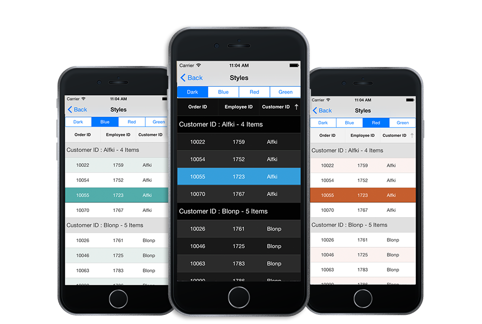
}The following picture shows the grid loaded in different styles.
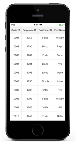
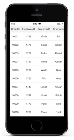
Applying alternate row style
SfDataGrid allows you to apply the alternative row style by writing a custom grid style deriving from DataGridStyle and assigning it to the SfDataGrid.GridStyle property.
//Apply alternative row style
dataGrid.GridStyle = new CustomStyle ();

// Custom style class
public class CustomGridStyle : DataGridStyle
{
    public CustomGridStyle()
    {
    }
    public override UIColor GetAlternatingRowBackgroundColor()
    {
        return UIColor.Gray;
    }
}
Customizing the alternation count
SfDataGrid allows you to customize the alternate row count for applying the alternate row style using the SfDataGrid.AlternationCount property.
The below code illustrates how to set the alternate row count.
//Apply alternative row count
dataGrid.AlternationCount = 3;
Border Customization
SfDatagrid allows you to customize the grid borders to vertical, horizontal, both or none based on requirements. Override the DataGridStyle.GetGridLinesVisibility method to customize the borders in SfDataGrid.
//Apply custom style to SfDataGrid from code
dataGrid.GridStyle = new CustomStyle ();//Custom Style class
public class CustomStyle : DataGridStyle
{
public CustomStyle ()
{
}
public override GridLinesVisibility GetGridLinesVisibility()
{
return base.GetGridLinesVisibility();
}
}Following are the lists of options available to customize the grid borders.
Both
GridLinesVisibility.Both allows you to display the DataGrid with both Horizontal and Vertical borders.
public override GridLinesVisibility GetGridLinesVisibility()
{
    return GridLinesVisibility.Both;
}
The following screenshot shows the final outcome upon execution of the above code.
Horizontal
GridLinesVisibility.Horizontal allows you to display the DataGrid with Horizontal border only
public override GridLinesVisibility GetGridLinesVisibility()
{
    return GridLinesVisibility.Horizontal;
}
The following screenshot shows the final outcome upon execution of the above code.
Vertical
GridLinesVisibility.Vertical allows you to display the DataGrid with Vertical border only
public override GridLinesVisibility GetGridLinesVisibility()
{
    return GridLinesVisibility.Vertical;
}
The following screenshot shows the final outcome upon execution of the above code.

None
GridLinesVisibility.None allows you to display the DataGrid without borders
public override GridLinesVisibility GetGridLinesVisibility()
{
    return GridLinesVisibility.None;
}
The following screenshot shows the final outcome upon execution of the above code.

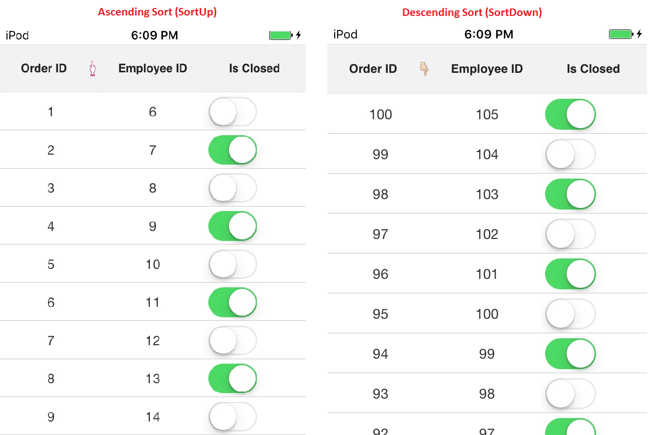
Customizing the sort icons in header
You can load any desired image as the sort icon in the SfDataGrid using the GetHeaderSortIndicatorDown and GetHeaderSortIndicatorUp overrides of the DataGridStyle class. The following code example illustrates how to change the SortIcon in SfDataGrid.
//Apply custom style to SfDataGrid from code
dataGrid.GridStyle = new Custom();

public class Custom : DataGridStyle
{

    public override UIImage GetHeaderSortIndicatorUp()
    {
        return UIImage.FromFile("SortDown.png");
    }

    public override UIImage GetHeaderSortIndicatorDown()
    {
        return UIImage.FromFile("SortUp.png");
    }

}
The following screenshots shows the final outcome of the above code
NOTE
The image’s BuildAction must be set to BundleResource so that we can access the image via its name.
Customizing resizing indicator
You can change the color of the resizing indicator using the GetResizingIndicatorColor override of the DataGridStyle class. The following code example illustrates how to change the color of the ResizingIndicator in SfDataGrid.
//Apply custom style to SfDataGrid from code
dataGrid.GridStyle = new Custom();

public class Custom : DataGridStyle
{
    public override UIColor GetResizingIndicatorColor()
    {
        return UIColor.Blue;
    }
}
Border width customization
SfDataGrid allows you to customize the border width of the grid cells and the header cells.
The default border width of the grid cell and the header cell is 0.5f.
Refer the below code snippet to customize the width of the grid cells and header cells.
//Apply custom style to SfDataGrid from code
      dataGrid.GridStyle = new CustomStyle();


    public class CustomStyle : DataGridStyle
    {
        public CustomStyle()
        {

        }

        // Customize border width for grid cells
        public override float GetBorderWidth()
        {
            return 5;
        }

        // Customize border width for header cells
        public override float GetHeaderBorderWidth()
        {
            return 5;
        }

    }