Grouping
1 Mar 202214 minutes to read
A group represents a collection of records that belong to a particular category. When grouping is applied, the data is organized into a hierarchical structure based on matching field values. The records having identical values in the grouped column are combined to form a group. Each group is identified by its CaptionSummaryRow to get the underlying records in view.
NOTE
To update grouping for the newly added row or column, set the
SfDataGrid.View.LiveDataUpdateModetoLiveDataUpdateMode.AllowDataShaping.
NOTE
When
BeginInitmethod is called it suspends all the updates untilEndInitmethod is called.
Programmatic Grouping
SfDataGrid also allows to perform grouping from the code by defining the GroupColumnDescription object and adding it in the SfDataGrid.GroupColumnDescriptions collection. SfDataGrid groups the data based on the GroupColumnDescription object that is added to this collection.
GroupColumnDescription object holds following two properties:
- ColumnName: Name of the grouped column.
-
Converter: Get the
IValueConverteras input that helps to apply the custom grouping.
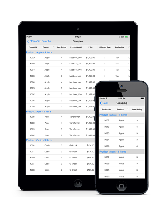
The following code example illustrates how to apply grouping by a column in SfDataGrid.
dataGrid.GroupColumnDescriptions.Add (new GroupColumnDescription () {
    ColumnName = "CustomerID",
});
The following screenshot shows the output rendered when grouping is applied.
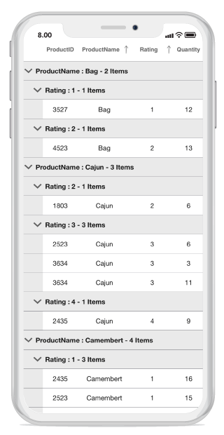
MultiGrouping
The SfDataGrid also allows to group the data against one or more columns by using the SfDataGrid.GroupingMode property. When the GroupingMode is set as GroupingMode.Multiple, the data will be organized into hierarchical tree structure based on identical values of that column. MultiGrouping feature works similarly as MultiSorting feature. Initially, the data is grouped according to the first column added in the GroupColumnDescriptions collection. When more columns are added to the GroupColumnDescriptions, the newly added column will be grouped in consideration to the previous group(s). This results in a tree like hierarchy.
this.dataGrid.GroupingMode = GroupingMode.Multiple;The following screenshot shows the output rendered when above code is executed:
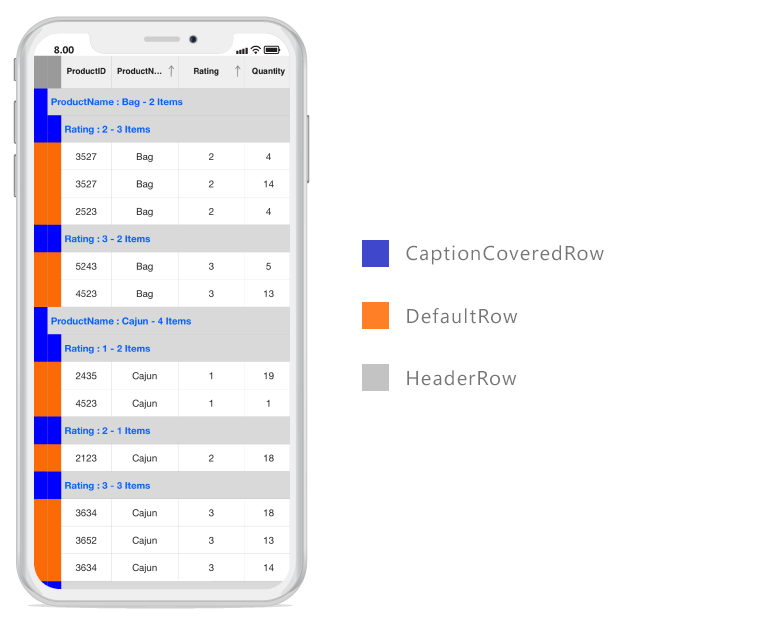
Indent column customizations
Indent columns are the columns present to the left of the CaptionSummaryRows when GroupingMode is set as multiple. The number of indent cells in each CaptionSummaryRow will be determined by the level of that Group. For example, the first group will have only one indent cell and the next immediate group will have an extra indent cell. It keeps on adding by one for each lower level groups to maintain the tree structure. Each data row will have indent cells count equal to the level of the last sub group in view. The following customizations can be done for the indent cells.
Customize indent column width
By default, the width of the indent column is 20. To customize the width, use the IndentColumnWidth property.
this.dataGrid.IndentColumnWidth = 60;Customize indent column background color
Set background color to the indent cells based on the row where indent cells present. To set the desired background color, use the GetIndentBackgroundColor() override method in the custom DataGridStyle class. Refer to this link to know how to apply custom styles to the SfDataGrid.
this.dataGrid.GridStyle = new CustomStyle();

public class CustomStyle : DataGridStyle
{
    public override UIColor GetIndentBackgroundColor(RowType rowType)
    {
       if (rowType == RowType.DefaultRow)
           return UIColor.Orange;
       if (rowType == RowType.CaptionCoveredRow)
           return UIColor.Blue;
       else return UIColor.LightGray;
    }
}
The following screenshot shows the output rendered when above code is executed:
Expand groups while grouping
You can expand all the groups while grouping by setting SfDataGrid.AutoExpandGroups to true. So, when user group any column, then all groups will be in expanded state.
this.dataGrid.AutoExpandGroups = true;
this.dataGrid.AllowGroupExpandCollapse = true;
Expand or collapse the groups
By default, the groups will be in expanded state in a SfDataGrid. However, you can expand or collapse a group in runtime by setting the SfDataGrid.AllowGroupExpandCollapse as true.
this.dataGrid.AllowGroupExpandCollapse = true;Expand or collapse all the groups
You can expand or collapse all the groups at programmatically at runtime by using SfDataGrid.ExpandAllGroup and SfDataGrid.CollapseAllGroup methods.
this.dataGrid.ExpandAllGroup();
this.dataGrid.CollapseAllGroup();
Expand or collapse a specific group
You can expand or collapse specific group by using SfDataGrid.ExpandGroup and SfDataGrid.CollapseGroup methods.
var group = (dataGrid.View.Groups[0] as Group);
this.dataGrid.ExpandGroup(group);
this.dataGrid.CollapseGroup(group);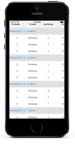
Custom Grouping
SfDataGrid allows you to group a column based on custom logic when the standard grouping techniques do not meet the requirements. To achieve the custom grouping, you need to write a converter that implements IValueConverter with your custom grouping logic and assign that converter to the GroupColumnDescription.Converter property.
The following code example illustrates how to set the custom grouping converter for the group description that is added to group the Freight column.
dataGrid.GroupColumnDescriptions.Add (new GroupColumnDescription () {
    ColumnName = "Freight",
    Converter = new GroupConverter()
});
The following code example illustrates the converter used for applying custom grouping logic.
public class GroupConverter : IValueConverter
{
    public GroupConverter()
    {

    }

    public object Convert(object value, Type targetType, object parameter, CultureInfo culture)
    {
        var orderInfo = value as OrderInfo;
        if (orderInfo.Freight > 0 && orderInfo.Freight <= 250)
            return "<=250";
        else if (orderInfo.Freight > 250 && orderInfo.Freight <= 500)
            return ">250 & <=500";
        else if (orderInfo.Freight > 500 && orderInfo.Freight <= 750)
            return ">500 & <=750";
        else
            return ">1000";
    }

    public object ConvertBack(object value, Type targetType, object parameter, CultureInfo culture)
    {
        return null;
    }
}
Display based grouping using group mode property
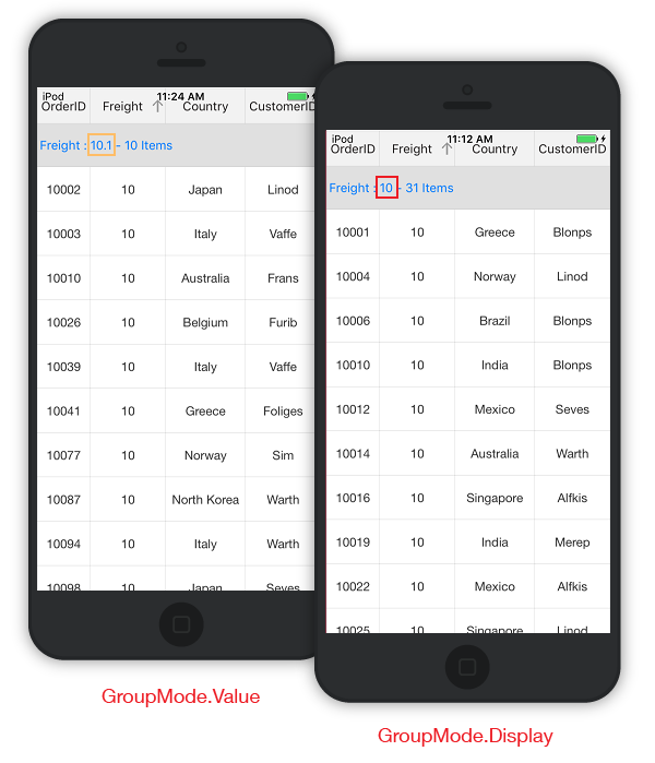
By default column grouping occurs based on the value in the underlying collection thereby creating a new group for each new value of that column. However you can also group a column based on the Display value by setting the GridColumn.GroupMode property as Display. In the below code example we have set GridColumn.Format property as “#” which displays only the rounded off value in the GridCell.
GridNumericColumn cargoWeight = new GridTextColumn();
cargoWeight.MappingName = "ShipmentWeight";
cargoWeight.GroupMode = Syncfusion.Data.DataReflectionMode.Display;
cargoWeight.Format = "#";
The below screenshot shows the comparison between the two Group modes. GroupMode.Value on the left and GroupMode.Display on the right.
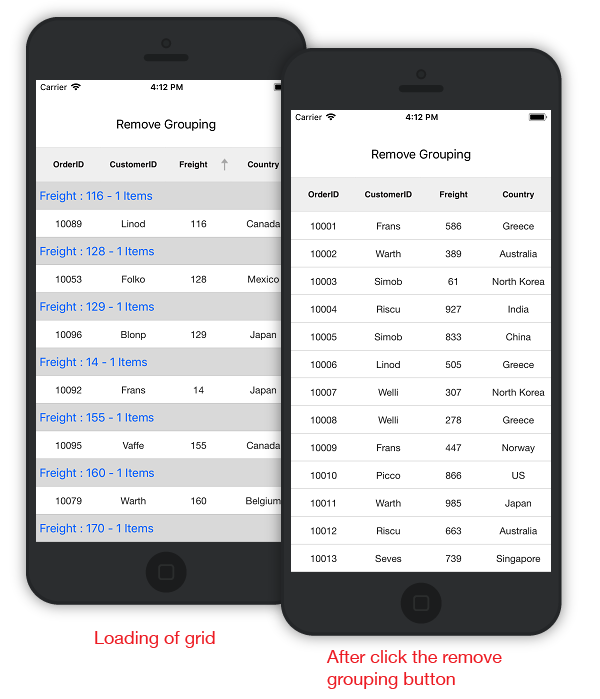
Clearing or removing a group
To clear grouping applied to SfDataGrid, remove the items from the SfDataGrid.GroupColumnDescriptions collection or clear the collection.
Refer to the following code snippets to remove grouping applied:
public class MyViewController:UIViewController
{
    SfDataGrid dataGrid;
    ViewModel viewModel;
    UIButton clearGroupingButton;
    UIStackView stackView;
    public MyViewController()
    {
        dataGrid = new SfDataGrid();
        viewModel = new ViewModel();
        clearGroupingButton = new UIButton();
        stackView = new UIStackView();
    }

    public override void ViewDidLoad()
    {
        base.ViewDidLoad();
        dataGrid.ItemsSource = viewModel.OrdersInfo;
        dataGrid.GroupColumnDescriptions.Add(new GroupColumnDescription()
        {
            ColumnName = "Freight",
        });
        stackView.Axis = UILayoutConstraintAxis.Vertical;
        clearGroupingButton.SetTitle("Remove Grouping", UIControlState.Normal);
        clearGroupingButton.BackgroundColor=UIColor.White;
        clearGroupingButton.SetTitleColor(UIColor.Black, UIControlState.Normal);
        clearGroupingButton.TouchDown += ClearGroupingButton_TouchDown;
        clearGroupingButton.HeightAnchor.ConstraintEqualTo(200).Active = true;
        dataGrid.HeightAnchor.ConstraintEqualTo(600).Active=true;
        stackView.AddArrangedSubview(removeGroupingButton);
        stackView.AddArrangedSubview(dataGrid);
        this.View.AddSubview(stackView);
    }

    private void ClearGroupingButton_TouchDown(object sender, System.EventArgs e)
    {
        //Clearing the Group
        dataGrid.GroupColumnDescriptions.Clear();

        //Removing the Group based on group item
        //var groupColumn = dataGrid.GroupColumnDescriptions[0];
        //dataGrid.GroupColumnDescriptions.Remove(groupColumn);

        //Removing the Group based on group index
        //dataGrid.GroupColumnDescriptions.RemoveAt(0);
    }

    public override void ViewDidLayoutSubviews()
    {
        stackView.Frame = new CGRect(0, 30, this.View.Frame.Width, this.View.Frame.Height);
        base.ViewDidLayoutSubviews();
    }
}
Run the application to render the following output:
NOTE
You can also clear or remove the grouping on GridTapped event, GridDoubleTapped event, or GridLongPressed event.
Events
GroupExpanding event
The SfDataGrid.GroupExpanding event occurs when the group is being expanded.
The GroupChangingEventArgs of the GroupExpanding event provides the information about the expanding group and it has the following members.
Syncfusion.Data.Group - Gets the group that’s being expanded.
Cancel – Decides whether to cancel the group expansion.
You can cancel the group expansion by setting GroupChangingEventArgs.Cancel to true.
this.dataGrid.GroupExpanding += dataGrid_GroupExpanding;

void dataGrid_GroupExpanding(object sender, Syncfusion.SfDataGrid.GroupChangingEventArgs e)
{
    if (e.Group.Key.Equals(1001))
        e.Cancel = true;
}
GroupExpanded event
The SfDataGrid.GroupExpanded event occurs after the group is expanded.
The GroupChangedEventArgs of the GroupExpanded event provides the information about the expanded group and it has the following member.
Syncfusion.Data.Group - Gets the expanded group.
GroupCollapsing event
The SfDataGrid.GroupCollapsing event occurs when the group is being collapsed.
The GroupChangingEventArgs of the GroupCollapsing event provides the information about the collapsing group and it contains the following member.
Syncfusion.Data.Group - Gets the group that’s being collapsed.
Cancel – Decides whether to cancel the group collapsing.
You can cancel the group is being collapsed by using GroupChangingEventArgs.Cancel of GroupCollapsing event.
this.dataGrid.GroupCollapsing += dataGrid_GroupCollapsing;

void dataGrid_GroupCollapsing(object sender, Syncfusion.SfDataGrid.GroupChangingEventArgs e)
{
    if (e.Group.Key.Equals(1001))
        e.Cancel = true;
}
GroupCollapsed event
The SfDataGrid.GroupCollapsed event occurs after the group is collapsed.
GroupChangedEventArgs of the GroupCollapsed event provides the information about collapsed group and it contains the following member.
Syncfusion.Data.Group - Gets the collapsed group.
Animate group expand/collapse icon
SfDatagrid loads two different icons for denoting the group expanded and collapsed state. However, SfDataGrid allows you to rotate the expander icon animatedly for denoting the collapsed status by overriding the DataGridStyle.GetGroupCollapseIcon method and returning null.
The below code example illustrates how to enable the group/expand collapse icons animation by writing a custom style.
//Apply custom style to SfDataGrid from code

dataGrid.GridStyle = new CustomStyle ();

//Custom Style class

public class CustomStyle : DataGridStyle
{
   public CustomStyle ()
   {

   }
   public override ImageSource GetGroupCollapseIcon()
   {
       return null;
   }
}
Hiding the column when grouped
In SfDataGrid a column will be generated with the default column width by default. In order to group by a column that should not be visible in view, add the column to the SfDataGrid.Columns collection and set its width as 0. Thus the column will be grouped and will not be visually seen. Please refer the below code example.
dataGrid.Columns.Add (new GridTextColumn () {
    MappingName = "ShippingDate",
    Width = 0
});

dataGrid.GroupColumnDescriptions.Add (new GroupColumnDescription () {
    ColumnName = "ShippingDate"
});