Column Types in Xamarin.iOS SfDataGrid
9 Dec 202124 minutes to read
SfDataGrid contains different types of columns each with its own functionalities. You can use any column based on your requirements.
The below table describes you the types of column and its purpose of usage in SfDataGrid.
| Column Type | Description |
|---|---|
| GridColumn | Abstract class. Base column type of all the columns in the SfDataGrid. |
| GridTextColumn | To be used to display string or numbers in each row. |
| TemplateColumn (i.e. GridTextColumn with UserCellType) | To be used when you want to customize your column based on your requirements. |
| GridSwitchColumn | To be used when you want to display switch in each row. |
| GridImageColumn | To be used when you want to display an image in each row. |
| GridNumericColumn | To be used when you want to display a numeric data. |
| GridDateTimeColumn | To be used when you want to display the date time value. |
| GridPickerColumn | To be used when you want to display the IEnumerable data using Picker. |
GridColumn
GridColumn is the base column type of all the columns in the SfDataGrid, hence GridColumn properties are used by all the columns. The following sub-sections explains you about the properties in the GridColumn and the customizations that can be done using those properties.
MappingName
GridColumn.MappingName associates the GridColumn with a property available in the underlying data source. While setting MappingName alone to the SfDataGrid, GridColumn.DisplayBinding will be automatically generated based on the MappingName. Data Manipulation operations like sorting, filtering, grouping will be done based on the MappingName property.
Header customizations
HeaderCellTextSize
The FontSize for the content of header cell in the GridColumn can be customized by using the GridColumn.HeaderCellTextSize property. The default font size of the header cells in SfDataGrid is 14.
Refer the following code example to customize the header cell text size for the GridColumn.HeaderCellTextSize.
GridTextColumn column = new GridTextColumn()
{
    MappingName = "OrderID",
    HeaderCellTextSize = 16
};
HeaderFont
The FontFamily for the content of header cell in the GridColumn can be customized by using the GridColumn.HeaderFont property. The default value font used in SfDataGrid is Helvetica-Bold.
HeaderText
GridColumn.HeaderText specifies the text displayed in the column header. If HeaderText is not defined, the GridColumn.MappingName will be assigned to the HeaderText and will be displayed as column header.
HeaderTextAlignment
You can get or set the TextAlignment of the header cell in the GridColumn by using the GridColumn.HeaderTextAlignment property. The default alignment for the header cells in SfDataGrid is Center.
HeaderTemplate
SfDataGrid allows you to customize the header cell based on your requirement by using the GridColumn.HeaderTemplate property.
The following code example shows you how to customize the header cell by loading a template in the header cell.
UILabel label = new UILabel();
label.Text = "Order ID";
label.TextAlignment = UITextAlignment.Center;

GridTextColumn column = new GridTextColumn()
{
    MappingName = "OrderID",
    HeaderTemplate = label
};
HeaderTextMargin
SfDataGrid allows you to get or set the padding for the header cell by using GridColumn.HeaderTextMargin property.
The following code example shows you how to set theHeaderTextMargin property.
GridTextColumn orderId = new GridTextColumn();
orderId.MappingName = "OrderID";
orderId.HeaderTextMargin = 15;

GridTextColumn employeeId = new GridTextColumn();
employeeId.MappingName = "EmployeeID";
employeeId.HeaderTextMargin = new Thickness(15, 0, 0, 0);
Column Width
SfDataGrid allows you to customize the width of each GridColumn in the SfDataGrid.Columns collection. You can customize the column width by using the GridColumn.Width property. By default this property will not be assigned any value and the GridColumn renders in view based on the value of DefaultColumnWidth property in SfDataGrid.
NOTE
You can set the
IsHiddenproperty asTrueinstead of setting column width as0to hide a column.
Customizing the width for auto generated columns as shown below.
// AutoGenerateColumn

dataGrid.AutoGeneratingColumn += DataGrid_AutoGeneratingColumn;

void dataGrid_AutoGeneratingColumn(object sender, AutoGeneratingColumnArgs e){
if (e.Column.MappingName == "OrderID") {
    e.Column.Width = 100;
    }
}

// Manually generated column

dataGrid.Columns.Add(new GridTextColumn() { MappingName = "OrderID" ,Width = 100 });
IsHidden
SfDataGrid allows you to hide a particular column using GridColumn.IsHidden property. The default value of the IsHidden property is False.
NOTE
You can set the
IsHiddenproperty asTrueinstead of setting column width as0to hide a column.
The following code example shows you how to hide the column using IsHidden property.
// AutoGenerate Column

dataGrid.AutoGeneratingColumn += DataGrid_AutoGeneratingColumn;

void dataGrid_AutoGeneratingColumn(object sender, AutoGeneratingColumnArgs e){
if (e.Column.MappingName == "OrderID") {
    e.Column.IsHidden = true;
    }
}

// Manually generated column

dataGrid.Columns.Add(new GridTextColumn() { MappingName = "OrderID", IsHidden = true});
TextMargin
SfDataGrid allows you to get or set the padding for the GridCell by using GridColumn.TextMargin property.
The following code example shows you how to set theTextMargin property.
GridTextColumn orderId = new GridTextColumn();
orderId.MappingName = "OrderID";
orderId.TextMargin = 15;

GridTextColumn employeeId = new GridTextColumn();
employeeId.MappingName = "EmployeeID";
employeeId.TextMargin = new Thickness(0, 0, 25, 0);
GridTextColumn
GridTextColumn is derived from GridColumn and hence it inherits all the properties of GridColumn. Each of the record cells in GridTextColumn displays text based on the MappingName which associates the column with a property in the data source.
The following code example creates GridTextColumn.
dataGrid.Columns.Add(new GridTextColumn() { MappingName = "OrderID" });The below topics explain you about the customizations that can be done in the GridTextColumn in SfDataGrid.
Formatting
SfDataGrid allows you to format the value displayed in the GridColumn by using the GridColumn.Format property. Assign the FormatString to this property based on the type of the property the GridColumn is associated with to format the value. You can use different StringFormats to customize the value displayed in the record cells.
The following code example shows you how to apply formatting for a GridTextColumn.
dataGrid.Columns.Add (new GridTextColumn () {
    MappingName = "Freight",
    Format = "C"
});

dataGrid.Columns.Add (new GridTextColumn () {
    MappingName = "ShippingDate",
    Format = "dd/MM/yyyy"
});
NOTE
For AutoGenerated columns the Formatting can be applied by handling the SfDataGrid.AutoGeneratingColumn event.
Formatting GridTextColumn with different Culture
SfDataGrid allows you to apply different CultureInfo for the GridColumns by using the GridColumn.CultureInfo property. Assign the FormatString to this property based on the type of the property the GridColumn is associated with to format the value. You can use different StringFormats to customize the value displayed in the record cells.
The following code example shows you how to apply different cultures for a GridColumns.
dataGrid.Columns.Add (new GridTextColumn () {
    MappingName = "Freight",
    Format = "C",
    CultureInfo = new CultureInfo("en-US")
});

dataGrid.Columns.Add (new GridTextColumn () {
    MappingName = "OrderID",
    Format = "C",
    CultureInfo = new CultureInfo("en-GB")
});
For auto generated columns this is achievable by handling the SfDataGrid.AutoGeneratingColumn event. The following code example shows you how to apply different cultures for auto generated GridColumns.
void GridAutoGeneratingColumns(object sender, AutoGeneratingColumnArgs e)
{
    if (e.Column.MappingName == "Freight") {
        e.Column.Format = "C";
        e.Column.CultureInfo = new CultureInfo ("en-US");
    } else if (e.Column.MappingName == "OrderID") {
        e.Column.Format = "C";
        e.Column.CultureInfo = new CultureInfo ("en-GB");
    }
}
Font and Alignment options
CellTextSize
The FontSize for the content of record cells in GridColumn can be customized by using the GridColumn.CellTextSize property. The default font size of the record cells in SfDataGrid is 14.
RecordFont
The FontFamily for the content of header cell in the GridColumn can be customized by using the GridColumn.RecordFont property. The default value font used in SfDataGrid is HelveticaNeue.
TextAlignment
You can get or set the TextAlignment of the header cell in the GridColumn by using the GridColumn.TextAlignment property. The default alignment for the record cells in SfDataGrid is Center.
LineBreakMode
You can wrap the record cell value when the text for the record cells exceeds the content area by setting GridColumn.LineBreakMode as LineBreakMode.WordWrap
The following code example shows how to use GridSwitchColumn.
dataGrid.Columns[0].LineBreakMode = LineBreakMode.WordWrap;TemplateColumn
TemplateColumn is actually the GridTextColumn with UserCellType specified and hence it inherits all the properties of GridColumn. It allows you to extend the functionality of GridColumns with your own view by creating custom GridCell to render in the column.
The following code example shows how to create a TemplateColumn.
GridTextColumn customerIdColumn = new GridTextColumn ();
customerIdColumn.UserCellType = typeof(CustomCell);
customerIdColumn.MappingName = "CustomerID";
customerIdColumn.HeaderText = "Customer ID";
dataGrid.Columns.Add(customerIdColumn);
In order to create a template column in SfDataGrid, you need to specify the UserCellType of the column. UserCellType is the type of the view to be used in the GridColumn and it must be derived from the GridCell. (i.e. a custom GridCell which hosts the view of your own requirement).
The following code example shows you how to create a custom GridCell and use it in a template column.
//Creating a Template Column
GridTextColumn customerIdColumn = new GridTextColumn ();
customerIdColumn.UserCellType = typeof(CustomCell);
customerIdColumn.MappingName = "CustomerID";
customerIdColumn.HeaderText = "Customer ID";
dataGrid.Columns.Add(customerIdColumn);

//Creating Custom GridCell
public class CustomCell : GridCell
{
    UILabel label;

    public CustomCell ()
    {
        label = new UILabel ();
        this.AddSubview (label);
        this.CanRenderUnLoad = false;
    }

    protected override void UnLoad ()
    {
        this.RemoveFromSuperview ();
    }

    public override void LayoutSubviews ()
    {
        base.LayoutSubviews ();
        this.label.Frame = new CGRect(Bounds.Left, Bounds.Top, Bounds.Width, Bounds.Height);
        this.label.Text = DataColumn.CellValue.ToString ();
    }
}
The following screenshot shows how template columns are used in SfDataGrid

GridSwitchColumn
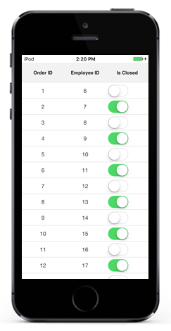
The GridSwitchColumn is derived from GridColumn, and hence it inherits all the properties of GridColumn. It loads a UISwitch as the content of record cells in the column and responds to value changes in it. You can change the underlying data source by toggling the values shown in the UISwitch. To create GridSwitchColumn in SfDataGrid the property corresponding to the column in the underlying collection must be of type bool.
The following code example shows how to use GridSwitchColumn.
dataGrid = new SfDataGrid();
GridSwitchColumn switchColumn = new GridSwitchColumn()
{
    HeaderText = "Is Closed",
    MappingName = "IsClosed"
};
data.Column.Add(switchColumn);// Model class
public class OrderInfo
{
private bool _isClosed;
public bool IsClosed
{
get { return _isClosed; }
set
{
this._isClosed = value;
}
}
}
// ViewModel class
public class ViewModel
{
public ViewModel()
{
GetOrderDetails(50);
}
#region ItemsSource
private ObservableCollection<OrderInfo> ordersInfo;
public ObservableCollection<OrderInfo> OrdersInfo
{
get { return ordersInfo; }
set { this.ordersInfo = value; }
}
#endregion
#region ItemSource Generator
public void GetOrderDetails(int count)
{
var orderDetails = new ObservableCollection<OrderInfo>();
for (int i = 1; i <= count; i++)
{
var order = new OrderInfo()
{
IsClosed = (i % 2) == 0 ? true : false
};
orderDetails.Add(order);
}
ordersInfo = orderDetails;
}
#endregion
}
Editing for switch column
SfDatagrid allows you to edit the switch column by setting the AllowEditing property as true. By default, AllowEditing is true. If you set AllowEditing as false you cannot check or uncheck the Switch column.
The below code illustrates how to set the AllowEditing.
GridSwitchColumn column = new GridSwitchColumn();

column.MappingName = "IsClosed";

column.AllowEditing = true;
GridImageColumn
GridImageColumn is derived from GridColumn, and hence it inherits all the properties of GridColumn. It displays images as cell content of a column. To create GridImageColumn in SfDataGrid the property corresponding to the column in the underlying collection must be of type UIImage.
The ImageMapStream converts the memory stream to image data, which in turn is converted to UIImage by the ToUIImage extension method of the ImageHelper static class.
The following code example shows how to create a memory stream and use it to load images(embedded resource) in GridImageColumn using the above mentioned methods.
GridImageColumn imageColumn = new GridImageColumn();
imageColumn.MappingName = "Image";
imageColumn.HeaderText = "Image";// Model class
public class OrderInfo
{
private UIImage image;
public UIImage Image
{
get { return this.=image; }
set
{
this.image = value;
RaisePropertyChanged("Image");
}
}
}
// ViewModel class
public class ViewModel
{
public ViewModel()
{
GetOrderDetails(50);
}
#region ItemsSource
private ObservableCollection<OrderInfo> ordersInfo;
public ObservableCollection<OrderInfo> OrdersInfo
{
get { return ordersInfo; }
set { this.ordersInfo = value; }
}
#endregion
#region ItemSource Generator
public void GetOrderDetails(int count)
{
var orderDetails = new ObservableCollection<OrderInfo>();
for (int i = 1; i <= count; i++)
{
var order = new OrderInfo()
{
Image = ImageHelper.ToUIImage(new ImageMapStream(LoadResource("Image" + (i % 29) + ".png").ToArray())),// Need to give the image path properly
};
orderDetails.Add(order);
}
ordersInfo = orderDetails;
}
// Create memory stream
public MemoryStream LoadResource (String Name)
{
MemoryStream memory = new MemoryStream ();
var assembly = Assembly.GetExecutingAssembly ();
var path = String.Format ("GettingStarted.Resources.{0}", Name);
var aStream = assembly.GetManifestResourceStream (path);
aStream.CopyTo (memory);
return memory;
}
#endregion
}
NOTE
The images should have its BuildAction set as EmbeddedResource since we are getting the image as stream from an Assembly.GetManifestResourceStream in the LoadResource method.
GridDateTimeColumn
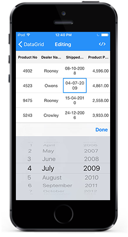
The GridDateTimeColumn is derived from GridColumn thereby inheriting all the properties of GridColumn. It displays the date information as the content of a column. To create SfDataGrid.GridDateTimeColumn in SfDataGrid, the property corresponding to the column in the underlying collection must be of type DateTime. You can enable or disable editing for the particular column by setting the GridColumn.AllowEditing property to true or false. In the editing mode it displays a customized DatePicker element that enables you to scroll through a list of dates between the GridDateTimeColumn.MinimumDate and GridDateTimeColumn.MaximumDate and select one from it.
dataGrid = new SfDataGrid();
GridDateTimeColumn dateColumn = new GridDateTimeColumn()
{
    MappingName = "ShippedDate",
    HeaderText = "Shipped Date",
    Format = "d"
};
dataGrid.Columns.Add(dateColumn);// Model class
public class OrderInfo
{
private DateTime shippedDate;
public DateTime ShippedDate
{
get { return shippedDate; }
set
{
shippedDate = value;
RaisePropertyChanged("ShippedDate");
}
}
}
// ViewModel class
public class ViewModel
{
private List<DateTime> OrderedDates;
public ViewModel()
{
GetOrderDetails(50);
}
#region ItemsSource
private ObservableCollection<OrderInfo> ordersInfo;
public ObservableCollection<OrderInfo> OrdersInfo
{
get { return ordersInfo; }
set { this.ordersInfo = value; }
}
#endregion
#region ItemSource Generator
private List<DateTime> GetDateBetween(int startYear, int endYear, int count)
{
List<DateTime> date = new List<DateTime>();
Random d = new Random(1);
Random m = new Random(2);
Random y = new Random(startYear);
for (int i = 0; i < count; i++)
{
int year = y.Next(startYear, endYear);
int month = m.Next(3, 13);
int day = d.Next(1, 31);
date.Add(new DateTime(year, month, day));
}
return date;
}
public void GetOrderDetails(int count)
{
var orderDetails = new ObservableCollection<OrderInfo>();
this.OrderedDates = GetDateBetween(2000, 2014, count);
for (int i = 1; i <= count; i++)
{
var order = new OrderInfo()
{
ShippedDate = this.OrderedDates[i - 1],
};
orderDetails.Add(order);
}
ordersInfo = orderDetails;
}
#endregion
}
GridPickerColumn
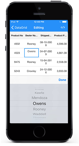
The GridPickerColumn is derived from GridColumn thereby inheriting all the properties of GridColumn. It displays a list of items in the form of a picker as the content of a column. You can enable or disable editing for the particular column by setting the GridColumn.AllowEditing property to true or false. In the editing mode it displays a customized Picker element that enables you to scroll through a list of values from the underlying collection and select one from it. The data source to Picker can be set by using GridPickerColumn.ItemsSource property. The picker column can be populated with data by the following ways.
- Collection of primitive types
- Collection of user defined types (Custom objects)
Collection of primitive types
You can create a GridPickerColumn and set its ItemsSource property to a simple collection to display the collection items in the picker drop down.
The following code example shows you how to load the GridPickerColumn with a simple string collection.
dataGrid = new SfDataGrid();
GridPickerColumn pickerColumn = new GridPickerColumn()
{
    BindingContext = viewModel,
    ItemsSource = viewModel.CustomerNames,
    MappingName = "DealerName",
    HeaderText = "Dealer Name"

};
dataGrid.Columns.Add(pickerColumn);// ViewModel class
public class ViewModel
{
public ObservableCollection<string> CustomerNames { get; set; }
public ViewModel()
{
this.CustomerNames = Customers.ToObservableCollection();
}
internal string[] Customers = new string[] {
"Adams",
"Crowley",
"Ellis",
"Gable",
"Irvine",
"Keefe",
"Mendoza",
"Owens",
"Rooney",
"Waddle",
};
}Collection of User Defined Types
You can create a GridPickerColumn and set its ItemsSource property to a user-typed collection to display a list of user defined items in the picker drop down. Initially the picker column will be displayed with the values from the GridColumn.MappingName property of the column if the DisplayMemberPath and ValueMemberPath are not set.
DisplayMemberPath
Displays a value by comparing the values of the properties set as GridColumn.MappingName and ValueMemberPath in their respective underlying collections. If the ValueMemberPath property’s values contains the MappingName property’s current value, then its corresponding DisplayMemberPath property’s value is displayed in the GridCell. Else the GridCell appears blank. However in the edit mode the values of the DisplayMemberPath property are displayed as the picker items.
ValueMemberPath
Once editing is ended the column having the MappingName equal to the ValueMemberPath has its data changed to the corresponding ValueMemberPath value for the selected DisplayMemberPath value in the picker.
Customization of picker dropdown values
The following code example shows you how to customize the picker data using DisplayMemberPath and ValueMemberPath
sfGrid = new SfDataGrid();
viewModel = new ViewModel();
sfGrid.ItemsSource = viewModel.OrdersInfo;

GridTextColumn orderIDColumn = new GridTextColumn();
orderIDColumn.MappingName = "OrderID";
orderIDColumn.HeaderText = "Order ID";

GridPickerColumn pickerColumn = new GridPickerColumn();
pickerColumn.MappingName = "OrderID";
pickerColumn.HeaderText = "Picker Column";
pickerColumn.DisplayMemberPath = "EmployeeID";
pickerColumn.ValueMemberPath = "OrderID";
pickerColumn.ItemsSource = viewModel.PickerInfo;

sfGrid.Columns.Add(orderIDColumn);
sfGrid.Columns.Add(pickerColumn);

// ViewModel class
public class ViewModel
{
    public class ViewModel :INotifyPropertyChanged
	{
		public ViewModel ()
		{
			SetRowsToGenerate (100);
            this.PickerInfo = OrdersInfo.ToList();
		}

		#region ItemsSource

        private OrderInfoRepository order;

		private ObservableCollection<OrderInfo> ordersInfo;

		public ObservableCollection<OrderInfo> OrdersInfo
        {
			get { return ordersInfo; }
			set { this.ordersInfo = value; RaisePropertyChanged("OrdersInfo"); }
		}

        public List<OrderInfo> PickerInfo
        {
			get;
			set;
		}

		#endregion

		#region ItemSource Generator

		public void SetRowsToGenerate (int count)
		{
			order = new OrderInfoRepository ();
			ordersInfo = order.GetOrderDetails (count);
		}

		#endregion

        public ObservableCollection<OrderInfo> GetOrderDetails(int count)
		{
            ObservableCollection<OrderInfo> orderDetails = new ObservableCollection<OrderInfo> ();

			for (int i = 1; i <= count; i++) {

				var order = new OrderInfo () {
					OrderID = i,
                    EmployeeID = i+5,
				};
				orderDetails.Add (order);
			}
			return orderDetails;
		}

        #region INotifyPropertyChanged implementation

        public event PropertyChangedEventHandler PropertyChanged;

        private void RaisePropertyChanged(String name)
        {
            if (PropertyChanged != null)
                this.PropertyChanged(this, new PropertyChangedEventArgs(name));
        }

        #endregion
    }
}
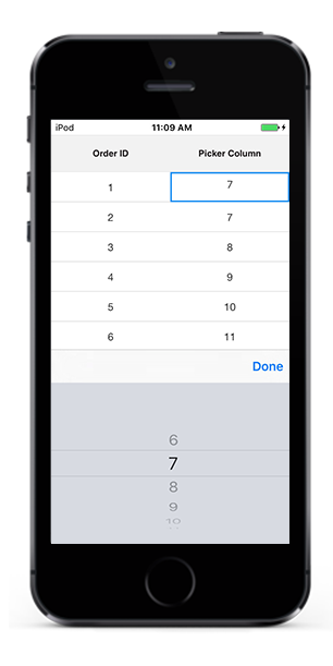
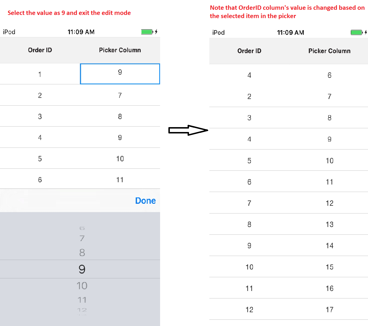
The following screenshots explains the above code and shows the working of the PickerColumn with ValueMemberPath and DisplayMemberPath properties set.
Here in the above code example underlying collection has 2 properties (OrderID,EmployeeID). We have created a GridPickerColumn with MappingName = OrderID, DisplayMemberPath = EmployeeID, ValueMemberPath = OrderID. EmployeeId has the values 6,7,8,9,10…. and OrderID has the values 1,2,3,4,5…. Initially the GridCells of the PickerColumn will be displayed with the values 6,7,8,9,10…. in row wise order based on the DisplayMemberPath.
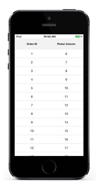
Upon entering the edit mode at RowColumnIndex(1,1) , the Picker pop up opens and with the picker items as 6,7,8,9,10…. again based on the DisplayMemberPath.
When edit mode is exited by selecting a value(9) from the Picker pop up, the GridCell at RowColumn index (0,1) displays the corresponding OrderID value for the selected EmployeeID value which is 4. Note that the PickerColumn’s GridCell data is not changed and only the OrderID columns data is changed to 4.
GridNumericColumn
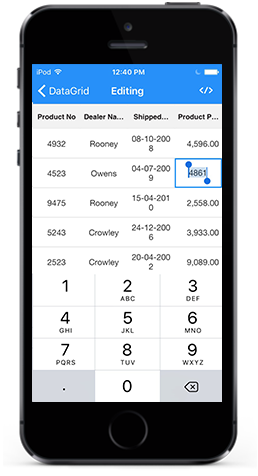
The GridNumericColumn is derived from GridColumn thereby inheriting all the properties of GridColumn. It is used to display numeric data. To create GridNumericColumn in SfDataGrid, the property corresponding to the column in the underlying collection must be a numeric type (int, double, float etc). You can enable or disable editing for the particular column by setting the GridColumn.AllowEditing property to true or false. In the editing mode it displays the SfNumericTextBox element. The below code example shows how to create a GridNumericColumn in SfDataGrid.
dataGrid = new SfDataGrid();

GridNumericColumn numericColumn = new GridNumericColumn()
{
    MappingName = "ProductNo",
    HeaderText = "Product No",
    NumberDecimalDigits =0
};
dataGrid.Columns.Add(numericColumn);
Number Formatting
GridNumericColumn allows you to format the numeric data with culture-specific information.
-
NumberDecimalDigits - You can change the number of decimal digits to be displayed after the decimal point using
GridNumericColumn.NumberDecimalDigitsproperty. -
NumberDecimalSeparator - By default, the dot (.) operator separates the decimal part of numeric value .You can use any operator as decimal separator using
GridNumericColumn.NumberDecimalSeparatorproperty. -
NumberGroupSeparator - By default, the comma (,) separates group of digits before the decimal point. You can use any operator as group separator using
GridNumericColumn.NumberGroupSeparatorproperty. -
NumberGroupSizes - You can change the number of digits in each group before the decimal point on numeric values using
GridNumericColumn.NumberGroupSizesproperty. -
NumberNegativePattern - You can format the pattern of negative numeric values using
GridNumericColumn.NumberNegativePattern. -
MinValue - You can set the minimum value of the numeric column using
GridNumericColumn.MinValueproperty. -
MaxValue - You can set the maximum value of the numeric column using
GridNumericColumn.MaxValueproperty.
Row Header
RowHeader is a special column which is placed as first cell of each row and it will always be frozen. To enable the RowHeader in SfDataGrid, you need to set the SfDataGrid.ShowRowHeader property as true.
Further, SfDataGrid allows you to customize the row header width using the SfDataGrid.RowHeaderWidth property. The default value of SfDataGrid.RowHeaderWidth is 20.
The below code example illustrates how to enable and customize the row header in SfDataGrid.
dataGrid.ShowRowHeader = true;
dataGrid.RowHeaderWidth = 50;