How can I help you?
Conditional styling in WinUI DataGrid (SfDataGrid)
27 Feb 202524 minutes to read
You can style the DataGrid and its inner elements (cells, rows and columns) conditionally based on data Using StyleSelector.
Cell style
Conditional styling of cells using style selector
The record cells (GridCell) can be customized conditionally based on data by setting SfDataGrid.CellStyleSelector property and the particular column record cells can be customized by setting GridColumn.CellStyleSelector property and you can get the container as GridCell in the StyleSelector.
NOTE
GridColumn.CellStyleSelectortakes higher priority thanSfDataGrid.CellStyleSelectorproperty.
<Application.Resources>
    <local:SelectorClass x:Key="styleSelector"/>
    <Style x:Key="redCellStyle" TargetType="dataGrid:GridCell">
        <Setter Property="Foreground" Value="Red" />
    </Style>
    <Style x:Key="blueCellStyle" TargetType="dataGrid:GridCell">
        <Setter Property="Foreground" Value="DarkBlue" />
    </Style>
</Application.Resources>

<dataGrid:SfDataGrid x:Name="dataGrid"
                       AutoGenerateColumns="False"
                       CellStyleSelector="{StaticResource styleSelector}"
                       ItemsSource="{Binding Orders}"
                       ColumnWidthMode="Star">
    <dataGrid:SfDataGrid.Columns>
        <dataGrid:GridTextColumn MappingName="OrderID" HeaderText="Order ID" />
        <dataGrid:GridTextColumn MappingName="CustomerID" HeaderText="Customer ID" />
        <dataGrid:GridTextColumn MappingName="CustomerName" HeaderText="Customer Name" />
        <dataGrid:GridTextColumn MappingName="ShipCity" HeaderText="Ship City" />
        <dataGrid:GridTextColumn MappingName="Country" />
    </dataGrid:SfDataGrid.Columns>
</dataGrid:SfDataGrid>
public class SelectorClass : StyleSelector
{
protected override Style SelectStyleCore(object item, DependencyObject container)
{
var data = item as OrderInfo;
if (data != null && ((container as GridCell).ColumnBase.GridColumn.MappingName == "OrderID"))
{
//custom condition is checked based on data.
if (data.OrderID < 1005)
return Application.Current.Resources["redCellStyle"] as Style;
return Application.Current.Resources["blueCellStyle"] as Style;
}
return base.SelectStyleCore(item, container);
}
}Here, GridCell’s are customized based on OrderID property of underlying record.
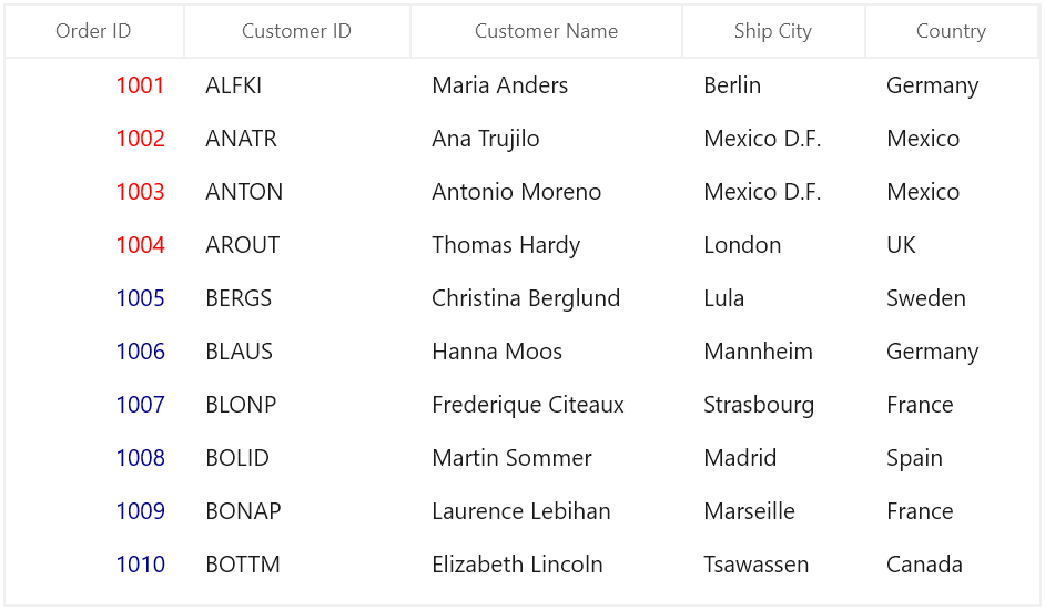
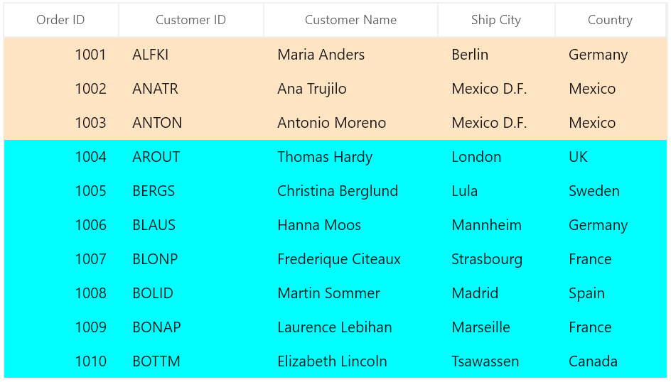
Row style
Conditional styling of rows using style selector
The record rows (DataGridRowControl ) can be customized conditionally based on data by setting SfDataGrid.RowStyleSelector property and you can get the container as DataGridRowControl in StyleSelector.
<Application.Resources>
    <local:CustomRowStyleSelector x:Key="rowStyleSelector" />
    <Style x:Key="bisqueRowStyle" TargetType="dataGrid:DataGridRowControl">
        <Setter Property="Background" Value="Bisque" />
    </Style>
    <Style x:Key="aquaRowStyle" TargetType="dataGrid:DataGridRowControl">
        <Setter Property="Background" Value="Aqua" />
    </Style>
</Application.Resources>

<dataGrid:SfDataGrid x:Name="dataGrid"
                       AutoGenerateColumns="False"
                       RowStyleSelector="{StaticResource rowStyleSelector}"
                       ItemsSource="{Binding Orders}"
                       ColumnWidthMode="Star">
    <dataGrid:SfDataGrid.Columns>
        <dataGrid:GridTextColumn MappingName="OrderID" HeaderText="Order ID" />
        <dataGrid:GridTextColumn MappingName="CustomerID" HeaderText="Customer ID" />
        <dataGrid:GridTextColumn MappingName="CustomerName" HeaderText="Customer Name" />
        <dataGrid:GridTextColumn MappingName="ShipCity" HeaderText="Ship City" />
        <dataGrid:GridTextColumn MappingName="Country" />
    </dataGrid:SfDataGrid.Columns>
</dataGrid:SfDataGrid>
public class CustomRowStyleSelector : StyleSelector
{
protected override Style SelectStyleCore(object item, DependencyObject container)
{
var row = (item as DataRowBase).RowData;
var data = row as OrderInfo;
if (data.OrderID < 1004)
return Application.Current.Resources["bisqueRowStyle"] as Style;
return Application.Current.Resources["aquaRowStyle"] as Style;
}
}Here, rows are customized based on OrderID property of underlying record.
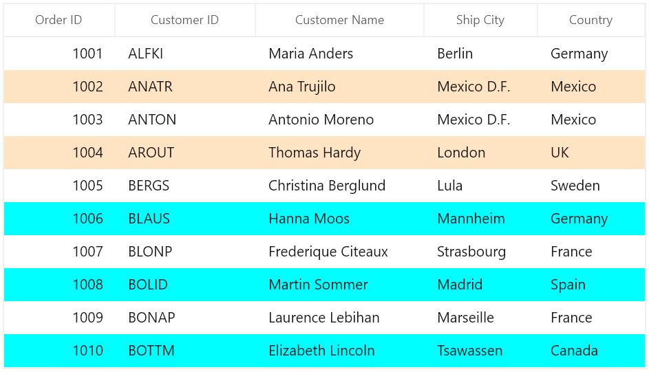
Alternate row style
The appearance of alternating rows can be customized conditionally based on data by setting SfDataGrid.AlternatingRowStyleSelector property.
<Application.Resources>
    <local:StyleSelector x:Key="alternatingRowStyleSelector" />
    <Style x:Key="bisqueRowStyle" TargetType="dataGrid:DataGridRowControl">
        <Setter Property="Background" Value="Bisque" />
    </Style>
    <Style x:Key="aquaRowStyle" TargetType="dataGrid:DataGridRowControl">
        <Setter Property="Background" Value="Aqua" />
    </Style>
</Application.Resources>

<dataGrid:SfDataGrid x:Name="dataGrid"
                       AutoGenerateColumns="False"
                       ItemsSource="{Binding Orders}"
                       AlternatingRowStyleSelector="{StaticResource alternatingRowStyleSelector}"
                       ColumnWidthMode="Star">
    <dataGrid:SfDataGrid.Columns>
        <dataGrid:GridTextColumn MappingName="OrderID" HeaderText="Order ID" />
        <dataGrid:GridTextColumn MappingName="CustomerID" HeaderText="Customer ID" />
        <dataGrid:GridTextColumn MappingName="CustomerName" HeaderText="Customer Name" />
        <dataGrid:GridTextColumn MappingName="ShipCity" HeaderText="Ship City" />
        <dataGrid:GridTextColumn MappingName="Country" />
    </dataGrid:SfDataGrid.Columns>
</dataGrid:SfDataGrid>
public class SelectorClass : StyleSelector
{
protected override Style SelectStyleCore(object item, DependencyObject container)
{
var row = (item as DataRowBase).RowData;
var data = row as OrderInfo;
if (data.OrderID < 1006)
return Application.Current.Resources["bisqueRowStyle"] as Style;
return Application.Current.Resources["aquaRowStyle"] as Style;
}
}Here, alternating rows are customized based on OrderID property of underlying record.
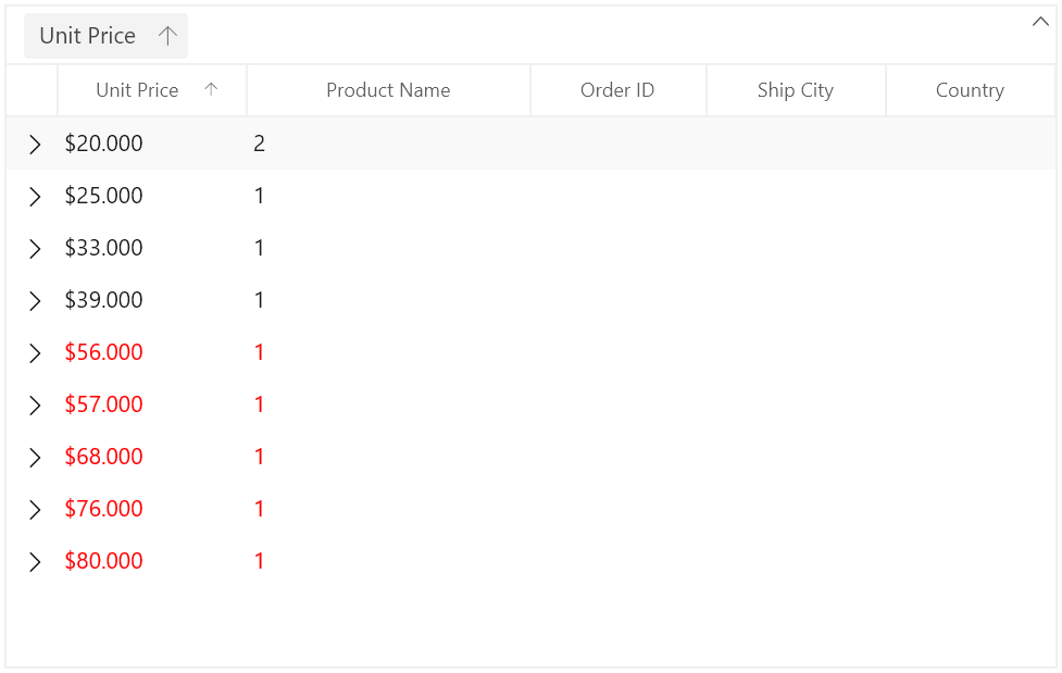
Caption summary cell style
Conditional styling of caption summary cells using style selector
The appearance of caption summary cell can be customized conditionally based on summary value by setting SfDataGrid.CaptionSummaryCellStyleSelector and you can get the container as GridCaptionSummaryCell using StyleSelector.
<Application.Resources>
    <local:SelectorClass x:Key="selector"/>
    <Style TargetType="dataGrid:GridCaptionSummaryCell" x:Key="captionSummaryCellStyle">
        <Setter Property="Foreground" Value="Red"/>
    </Style>
</Application.Resources>


<dataGrid:SfDataGrid x:Name="dataGrid"
                       AutoGenerateColumns="True"
                       AllowGrouping="True"
                       ShowGroupDropArea="True"
                       CaptionSummaryCellStyleSelector="{StaticResource selector}"
                       ItemsSource="{Binding Orders}"
                       ColumnWidthMode="Star">
    <dataGrid:SfDataGrid.CaptionSummaryRow>
        <dataGrid:GridSummaryRow ShowSummaryInRow="False">
            <dataGrid:GridSummaryRow.SummaryColumns>
                <dataGrid:GridSummaryColumn Name="PriceAmount"
                                        Format="'{Sum:c}'"
                                        MappingName="UnitPrice"
                                        SummaryType="DoubleAggregate" />
                <dataGrid:GridSummaryColumn Name="ProductCount"
                                        Format="'{Count}'"
                                        MappingName="ProductName"
                                        SummaryType="CountAggregate" />
            </dataGrid:GridSummaryRow.SummaryColumns>
        </dataGrid:GridSummaryRow>
    </dataGrid:SfDataGrid.CaptionSummaryRow>
</dataGrid:SfDataGrid>
public class SelectorClass : StyleSelector
{
protected override Style SelectStyleCore(object item, DependencyObject container)
{
var summaryValue = (item as Group).SummaryDetails.SummaryValues[0];
var aggregateValue = summaryValue.AggregateValues.ElementAt(0);
var calculatedValue = aggregateValue.Value;
//custom condition is checked.
if ((double)calculatedValue > 50)
return Application.Current.Resources["captionSummaryCellStyle"] as Style;
return base.SelectStyleCore(item, container);
}
}Here, caption summary cells are customized based on OrderID summary value.
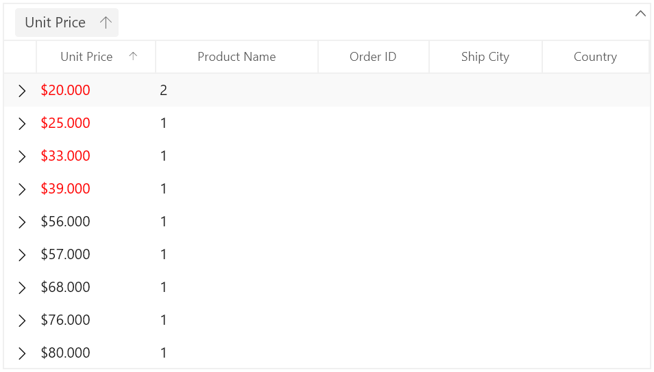
Conditional styling of caption summary cell based on column
The caption summary cells can be conditionally customized based on summary column.
Here, caption summary cells are customized based on OrderID summary column.
<Application.Resources>
    <local:SelectorClass x:Key="selector"/>
    <Style TargetType="dataGrid:GridCaptionSummaryCell" x:Key="captionSummaryCellStyle">
        <Setter Property="Foreground" Value="Red"/>
    </Style>
</Application.Resources>

<dataGrid:SfDataGrid x:Name="dataGrid"
                       AutoGenerateColumns="True"
                       AllowGrouping="True"
                       ShowGroupDropArea="True"
                       CaptionSummaryCellStyleSelector="{StaticResource selector}"
                       ItemsSource="{Binding Orders}"
                       ColumnWidthMode="Star">
    <dataGrid:SfDataGrid.CaptionSummaryRow>
        <dataGrid:GridSummaryRow ShowSummaryInRow="False">
            <dataGrid:GridSummaryRow.SummaryColumns>
                <dataGrid:GridSummaryColumn Name="PriceAmount"
                                        Format="'{Sum:c}'"
                                        MappingName="UnitPrice"
                                        SummaryType="DoubleAggregate" />
                <dataGrid:GridSummaryColumn Name="ProductCount"
                                        Format="'{Count}'"
                                        MappingName="ProductName"
                                        SummaryType="CountAggregate" />
            </dataGrid:GridSummaryRow.SummaryColumns>
        </dataGrid:GridSummaryRow>
    </dataGrid:SfDataGrid.CaptionSummaryRow>
</dataGrid:SfDataGrid>
public class SelectorClass : StyleSelector
{
protected override Style SelectStyleCore(object item, DependencyObject container)
{
var cell = container as GridCaptionSummaryCell;
if (cell.ColumnBase.GridColumn.MappingName == "UnitPrice")
{
var groupKey = (double)(item as Group).Key;
//custom condition is checked.
if (groupKey < 50)
return Application.Current.Resources["captionSummaryCellStyle"] as Style;
}
return null;
}
}
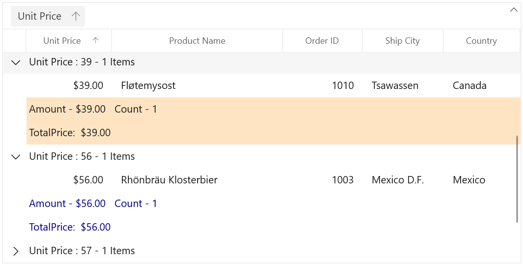
Group summary cell style
Group summary cells can be customized conditionally by getting particular summary value from SummaryValues through converter or style selector. Likewise, you can also customize the group summary cell based on various properties exposed in GridSummaryRow (example: ShowSummaryInRow property).
Conditional styling of group summary cell using style selector
The appearance of group summary cell can be customized conditionally based on summary value by setting SfDataGrid.GroupSummaryCellStyleSelector and you can get the container as GridGroupSummaryCell in StyleSelector.
Here, group summary cells are customized based on summary values whether it’s positive or negative.
<Application.Resources>
    <local:SelectorClass x:Key="styleSelector"/>
    <Style TargetType="dataGrid:GridGroupSummaryCell" x:Key="darkBlueGroupSummaryCellStyle">
        <Setter Property="Foreground" Value="DarkBlue"/>
    </Style>
    <Style TargetType="dataGrid:GridGroupSummaryCell" x:Key="bisqueGroupSummaryCellStyle">
        <Setter Property="Background" Value="Bisque"/>
    </Style>
</Application.Resources>

<dataGrid:SfDataGrid x:Name="dataGrid"
                       AutoGenerateColumns="True"
                       AllowGrouping="True"
                       ShowGroupDropArea="True"
                       GroupSummaryCellStyleSelector="{StaticResource styleSelector}"
                       ItemsSource="{Binding Orders}"
                       ColumnWidthMode="Star">
    <dataGrid:SfDataGrid.GroupSummaryRows>
            <dataGrid:GridSummaryRow ShowSummaryInRow="False">
                <dataGrid:GridSummaryRow.SummaryColumns>
                    <dataGrid:GridSummaryColumn Name="PriceAmount"
                                    Format="'Amount - {Sum:c}'"
                                    MappingName="UnitPrice"
                                    SummaryType="DoubleAggregate" />
                    <dataGrid:GridSummaryColumn Name="ProductCount"
                                    Format="'Count - {Count:d}'"
                                    MappingName="ProductName"
                                    SummaryType="CountAggregate" />
                </dataGrid:GridSummaryRow.SummaryColumns>
            </dataGrid:GridSummaryRow>
            <dataGrid:GridSummaryRow Title="TotalPrice:  {totalPrice}" ShowSummaryInRow="True">
                <dataGrid:GridSummaryRow.SummaryColumns>
                    <dataGrid:GridSummaryColumn Name="totalPrice"
                                    Format="'{Sum:c}'"
                                    MappingName="UnitPrice"
                                    SummaryType="DoubleAggregate" />
                </dataGrid:GridSummaryRow.SummaryColumns>
            </dataGrid:GridSummaryRow>
    </dataGrid:SfDataGrid.GroupSummaryRows>
</dataGrid:SfDataGrid>
public class SelectorClass : StyleSelector
{
protected override Style SelectStyleCore(object item, DependencyObject container)
{
var summaryValue = (item as SummaryRecordEntry).SummaryValues[0];
var aggregateValue = summaryValue.AggregateValues.ElementAt(0);
var calculatedValue = aggregateValue.Value;
//custom condition is checked.
if ((double)calculatedValue < 50)
return Application.Current.Resources["bisqueGroupSummaryCellStyle"] as Style;
return Application.Current.Resources["darkBlueGroupSummaryCellStyle"] as Style;
}
}Here, group summary cells are customized based on TotalPrice summary value.
Conditional styling of group summary cell based on column
The group summary cells can be conditionally customized based on summary column.
Here, group summary cells are customized based on TotalPrice summary column.
<Application.Resources>
    <local:SelectorClass x:Key="styleSelector"/>
     <Style TargetType="dataGrid:GridGroupSummaryCell" x:Key="darkBlueGroupSummaryCellStyle">
        <Setter Property="Foreground" Value="DarkBlue"/>
    </Style>
    <Style TargetType="dataGrid:GridGroupSummaryCell" x:Key="deepPinkGroupSummaryCellStyle">
        <Setter Property="Foreground" Value="DeepPink"/>
    </Style>
    <Style TargetType="dataGrid:GridGroupSummaryCell" x:Key="bisqueGroupSummaryCellStyle">
        <Setter Property="Background" Value="Bisque"/>
    </Style>
</Application.Resources>

<dataGrid:SfDataGrid x:Name="dataGrid"
                       AutoGenerateColumns="True"
                       AllowGrouping="True"
                       ShowGroupDropArea="True"
                       GroupSummaryCellStyleSelector="{StaticResource styleSelector}"
                       ItemsSource="{Binding Orders}"
                       ColumnWidthMode="Star">
    <dataGrid:SfDataGrid.GroupSummaryRows>
            <dataGrid:GridSummaryRow ShowSummaryInRow="False">
                <dataGrid:GridSummaryRow.SummaryColumns>
                    <dataGrid:GridSummaryColumn Name="PriceAmount"
                                    Format="'Amount - {Sum:c}'"
                                    MappingName="UnitPrice"
                                    SummaryType="DoubleAggregate" />
                    <dataGrid:GridSummaryColumn Name="ProductCount"
                                    Format="'Count - {Count:d}'"
                                    MappingName="ProductName"
                                    SummaryType="CountAggregate" />
                </dataGrid:GridSummaryRow.SummaryColumns>
            </dataGrid:GridSummaryRow>
            <dataGrid:GridSummaryRow Title="TotalPrice:  {totalPrice}" ShowSummaryInRow="True">
                <dataGrid:GridSummaryRow.SummaryColumns>
                    <dataGrid:GridSummaryColumn Name="totalPrice"
                                    Format="'{Sum:c}'"
                                    MappingName="UnitPrice"
                                    SummaryType="DoubleAggregate" />
                </dataGrid:GridSummaryRow.SummaryColumns>
            </dataGrid:GridSummaryRow>
    </dataGrid:SfDataGrid.GroupSummaryRows>
</dataGrid:SfDataGrid>
public class SelectorClass : StyleSelector
{
protected override Style SelectStyleCore(object item, DependencyObject container)
{
var cell = container as GridGroupSummaryCell;
var dataContext = item as SummaryRecordEntry;
if (!dataContext.SummaryRow.ShowSummaryInRow)
{
if (cell.ColumnBase.GridColumn.MappingName == "UnitPrice")
{
var summaryValue = dataContext.SummaryValues[0];
var aggregateValue = summaryValue.AggregateValues.ElementAt(0);
var calculatedValue = aggregateValue.Value;
//custom condition is checked.
if (aggregateValue.Key != "Count" && (double)calculatedValue < 50)
return App.Current.Resources["deepPinkGroupSummaryCellStyle"] as Style;
}
else
return App.Current.Resources["darkBlueGroupSummaryCellStyle"] as Style;
}
return App.Current.Resources["bisqueGroupSummaryCellStyle"] as Style;
}
}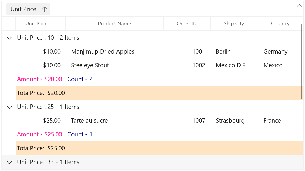
Group summary row style
Group summary row can be customized conditionally by getting particular summary value from SummaryValue through converter or style selector. Likewise, you can also customize the group summary row based on various properties exposed in GridSummaryRow (example: ShowSummaryInRow property).
Conditional styling of group summary row using style selector
The appearance of group summary row can be customized conditionally based on summary value by setting SfDataGrid.GroupSummaryRowStyleSelector and you can get the container as GridGroupSummaryRowControl in StyleSelector.
<Application.Resources>
    <local:SelectorClass x:Key="styleSelector"/>
    <Style TargetType="dataGrid:GroupSummaryRowControl" x:Key="aquamarineGroupSummaryRowStyle">
        <Setter Property="Background" Value="Aquamarine"/>
    </Style>
    <Style TargetType="dataGrid:GroupSummaryRowControl" x:Key="bisqueGroupSummaryRowStyle">
        <Setter Property="Background" Value="Bisque"/>
    </Style>
</Application.Resources>

<dataGrid:SfDataGrid x:Name="dataGrid"
                       AutoGenerateColumns="True"
                       AllowEditing="True"
                       AllowGrouping="True"
                       ShowGroupDropArea="True"
                       GroupSummaryRowStyleSelector="{StaticResource styleSelector}"
                       ItemsSource="{Binding Orders}"
                       ColumnWidthMode="Star">
    <dataGrid:SfDataGrid.GroupSummaryRows>
            <dataGrid:GridSummaryRow ShowSummaryInRow="False">
                <dataGrid:GridSummaryRow.SummaryColumns>
                    <dataGrid:GridSummaryColumn Name="PriceAmount"
                                    Format="'Amount - {Sum:c}'"
                                    MappingName="UnitPrice"
                                    SummaryType="DoubleAggregate" />
                    <dataGrid:GridSummaryColumn Name="ProductCount"
                                    Format="'Count - {Count:d}'"
                                    MappingName="ProductName"
                                    SummaryType="CountAggregate" />
                </dataGrid:GridSummaryRow.SummaryColumns>
            </dataGrid:GridSummaryRow>
            <dataGrid:GridSummaryRow Title="TotalPrice:  {totalPrice}" ShowSummaryInRow="True">
                <dataGrid:GridSummaryRow.SummaryColumns>
                    <dataGrid:GridSummaryColumn Name="totalPrice"
                                    Format="'{Sum:c}'"
                                    MappingName="UnitPrice"
                                    SummaryType="DoubleAggregate" />
                </dataGrid:GridSummaryRow.SummaryColumns>
            </dataGrid:GridSummaryRow>
    </dataGrid:SfDataGrid.GroupSummaryRows>
</dataGrid:SfDataGrid>
public class SelectorClass : StyleSelector
{
protected override Style SelectStyleCore(object item, DependencyObject container)
{
var summaryRecordEntry = (item as SpannedDataRow).RowData;
var summaryValue = (summaryRecordEntry as SummaryRecordEntry).SummaryValues[0];
var aggregateValue = summaryValue.AggregateValues.ElementAt(0);
var calculatedValue = aggregateValue.Value;
//custom condition is checked.
if ((double)calculatedValue % 2 == 0)
return Application.Current.Resources["bisqueGroupSummaryRowStyle"] as Style;
return Application.Current.Resources["aquamarineGroupSummaryRowStyle"] as Style;
}
}Here, group summary rows are customized based on TotalPrice summary value whether it’s positive or negative.
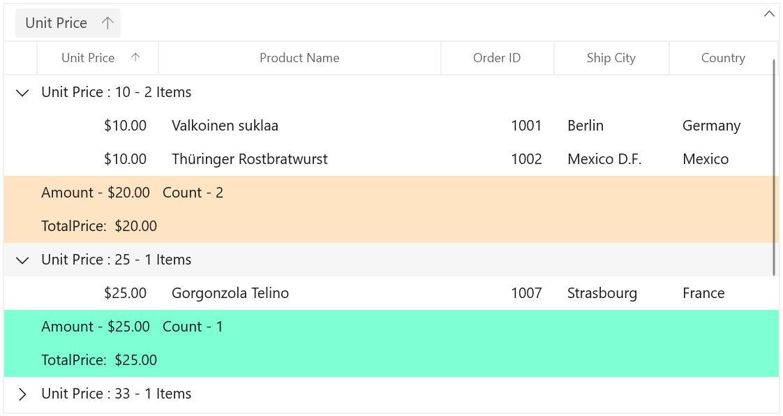
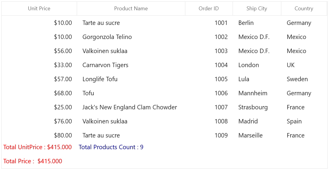
Table summary cell
Table summary cells can be customized conditionally by getting particular summary value from SummaryValues through converter or style selector. Likewise, you can also customize the table summary cell based on various properties exposed in GridSummaryRow (example: ShowSummaryInRow property).
Conditional styling of table summary cell using style selector
The appearance of table summary cell can be customized conditionally based on summary value by setting SfDataGrid.TableSummaryCellStyleSelector and you can get the container as GridTableSummaryCell in StyleSelector.
<Application.Resources>
    <local:SelectorClass x:Key="styleSelector"/>
    <Style TargetType="dataGrid:GridTableSummaryCell" x:Key="redTableSummaryCellStyle">
        <Setter Property="Foreground" Value="Red"/>
    </Style>
    <Style TargetType="dataGrid:GridTableSummaryCell" x:Key="darkBlueTableSummaryCellStyle">
        <Setter Property="Foreground" Value="DarkBlue"/>
    </Style>
</Application.Resources>


<dataGrid:SfDataGrid x:Name="dataGrid"
                       AutoGenerateColumns="True"
                       AllowEditing="True"
                       AllowGrouping="True"
                       ShowGroupDropArea="True"
                       TableSummaryCellStyleSelector="{StaticResource styleSelector}"
                       ItemsSource="{Binding Orders}"
                       ColumnWidthMode="Star">
    <dataGrid:SfDataGrid.TableSummaryRows>
        <dataGrid:GridTableSummaryRow ShowSummaryInRow="False">
            <dataGrid:GridSummaryRow.SummaryColumns>
                <dataGrid:GridSummaryColumn Name="PriceAmount"
                                Format="'Total UnitPrice : {Sum:c}'"
                                MappingName="UnitPrice"
                                SummaryType="DoubleAggregate" />
                <dataGrid:GridSummaryColumn Name="ProductCount"
                                Format="'Total Product Count : {Count:d}'"
                                MappingName="ProductName"
                                SummaryType="CountAggregate" />
            </dataGrid:GridSummaryRow.SummaryColumns>
        </dataGrid:GridTableSummaryRow>
        <dataGrid:GridSummaryRow Title="Total Price :  {totalPrice}" ShowSummaryInRow="True">
            <dataGrid:GridSummaryRow.SummaryColumns>
                <dataGrid:GridSummaryColumn Name="totalPrice"
                                        Format="'{Sum:c}'"
                                        MappingName="UnitPrice"
                                        SummaryType="DoubleAggregate" />
            </dataGrid:GridSummaryRow.SummaryColumns>
        </dataGrid:GridSummaryRow>
    </dataGrid:SfDataGrid.TableSummaryRows>
</dataGrid:SfDataGrid>
public class SelectorClass : StyleSelector
{
protected override Style SelectStyleCore(object item, DependencyObject container)
{
var summaryValue = (item as SummaryRecordEntry).SummaryValues[0];
var aggregateValue = summaryValue.AggregateValues.ElementAt(0);
var calculatedValue = aggregateValue.Value;
var cell = container as GridTableSummaryCell;
//custom condition is checked.
if ((double)calculatedValue > 10 && cell.ColumnBase.GridColumn.MappingName == "UnitPrice")
return Application.Current.Resources["redTableSummaryCellStyle"] as Style;
return Application.Current.Resources["darkBlueTableSummaryCellStyle"] as Style;
}
}Here, table summary cells are customized based on TotalPrice summary value.
Conditional styling of table summary cell based on column
The table summary cells can be conditionally customized based on summary column.
Here, table summary cells are customized based on TotalPrice summary column.
<Application.Resources>
    <local:SelectorClass x:Key="styleSelector"/>
    <Style TargetType="dataGrid:GridTableSummaryCell" x:Key="redTableSummaryCellStyle">
        <Setter Property="Foreground" Value="Red"/>
    </Style>
    <Style TargetType="dataGrid:GridTableSummaryCell" x:Key="darkBlueTableSummaryCellStyle">
        <Setter Property="Foreground" Value="DarkBlue"/>
    </Style>
</Application.Resources>


<dataGrid:SfDataGrid x:Name="dataGrid"
                       AutoGenerateColumns="True"
                       AllowEditing="True"
                       AllowGrouping="True"
                       ShowGroupDropArea="True"
                       TableSummaryCellStyleSelector="{StaticResource styleSelector}"
                       ItemsSource="{Binding Orders}"
                       ColumnWidthMode="Star">
    <dataGrid:SfDataGrid.TableSummaryRows>
        <dataGrid:GridTableSummaryRow ShowSummaryInRow="False">
            <dataGrid:GridSummaryRow.SummaryColumns>
                <dataGrid:GridSummaryColumn Name="PriceAmount"
                                Format="'Total UnitPrice : {Sum:c}'"
                                MappingName="UnitPrice"
                                SummaryType="DoubleAggregate" />
                <dataGrid:GridSummaryColumn Name="ProductCount"
                                Format="'Total Product Count : {Count:d}'"
                                MappingName="ProductName"
                                SummaryType="CountAggregate" />
            </dataGrid:GridSummaryRow.SummaryColumns>
        </dataGrid:GridTableSummaryRow>
        <dataGrid:GridSummaryRow Title="Total Price :  {totalPrice}" ShowSummaryInRow="True">
            <dataGrid:GridSummaryRow.SummaryColumns>
                <dataGrid:GridSummaryColumn Name="totalPrice"
                                        Format="'{Sum:c}'"
                                        MappingName="UnitPrice"
                                        SummaryType="DoubleAggregate" />
            </dataGrid:GridSummaryRow.SummaryColumns>
        </dataGrid:GridSummaryRow>
    </dataGrid:SfDataGrid.TableSummaryRows>
</dataGrid:SfDataGrid>
public class SelectorClass : StyleSelector
{
protected override Style SelectStyleCore(object item, DependencyObject container)
{
var cell = container as GridTableSummaryCell;
// column name is checked.
if (cell.ColumnBase.GridColumn.MappingName == "UnitPrice")
return Application.Current.Resources["redTableSummaryCellStyle"] as Style;
return Application.Current.Resources["darkBlueTableSummaryCellStyle"] as Style;
}
}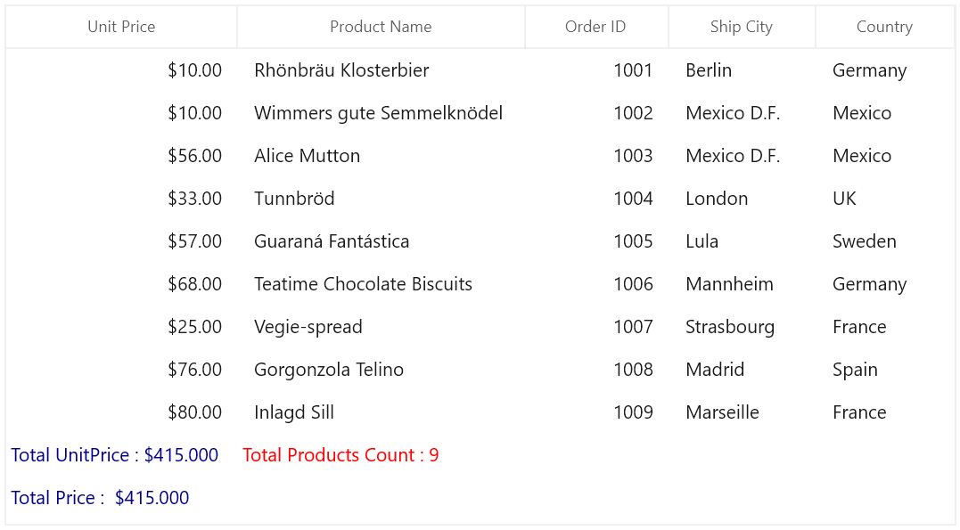
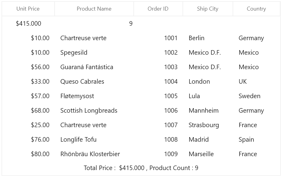
Table summary row style
Table summary rows can be customized conditionally by getting particular summary value from SummaryValues through converter or style selector. Likewise, you can also customize the table summary row based on various properties exposed in GridSummaryRow (example: ShowSummaryInRow property).
Conditional styling of table summary row using style selector
The appearance of table summary row can be customized conditionally based on summary value by setting SfDataGrid.TableSummaryRowStyleSelector and you can get the container as GridTableSummaryRowControl in StyleSelector.
<Application.Resources>
    <local:SelectorClass x:Key="styleSelector"/>
    <Style TargetType="dataGrid:TableSummaryRowControl" x:Key="bisquetableSummaryRowStyle">
        <Setter Property="Background" Value="Bisque"/>
    </Style>
    <Style TargetType="dataGrid:TableSummaryRowControl" x:Key="lightBluetableSummaryRowStyle">
        <Setter Property="Background" Value="LightBlue"/>
    </Style>
</Application.Resources>

<dataGrid:SfDataGrid x:Name="dataGrid"
                        AutoGenerateColumns="True"
                        AllowEditing="True"
                        AllowGrouping="True"
                        ShowGroupDropArea="True"
                        TableSummaryRowStyleSelector="{StaticResource styleSelector}"
                        ItemsSource="{Binding Orders}"
                        ColumnWidthMode="Star">
    <dataGrid:SfDataGrid.TableSummaryRows>
            <dataGrid:GridTableSummaryRow Position="Top" ShowSummaryInRow="False">
                <dataGrid:GridTableSummaryRow.SummaryColumns>
                    <dataGrid:GridSummaryColumn Name="price"
                                    Format="'{Sum:c}'"
                                    MappingName="UnitPrice"
                                    SummaryType="DoubleAggregate" />
                    <dataGrid:GridSummaryColumn Name="ProductCount"
                                    Format="'{Count:n0}'"
                                    MappingName="ProductName"
                                    SummaryType="CountAggregate" />
                </dataGrid:GridTableSummaryRow.SummaryColumns>
            </dataGrid:GridTableSummaryRow>
            <dataGrid:GridSummaryRow Title="Total Price :  {totalPrice} , Product Count : {count}" ShowSummaryInRow="True">
                <dataGrid:GridSummaryRow.SummaryColumns>
                    <dataGrid:GridSummaryColumn Name="count"
                                            Format="'{Count:n0}'"
                                            MappingName="ProductName"
                                            SummaryType="DoubleAggregate" />
                    <dataGrid:GridSummaryColumn Name="totalPrice"
                                    Format="'{Sum:c}'"
                                    MappingName="UnitPrice"
                                    SummaryType="DoubleAggregate" />
                </dataGrid:GridSummaryRow.SummaryColumns>
            </dataGrid:GridSummaryRow>
    </dataGrid:SfDataGrid.TableSummaryRows>
</dataGrid:SfDataGrid>
public class SelectorClass : StyleSelector
{
protected override Style SelectStyleCore(object item, DependencyObject container)
{
var summaryRecordEntry = (item as SpannedDataRow).RowData;
var summaryValue = (summaryRecordEntry as SummaryRecordEntry).SummaryValues[0];
var aggregateValue = summaryValue.AggregateValues.ElementAt(0);
var calculatedValue = aggregateValue.Value;
//custom condition is checked.
if (aggregateValue.Key != "Count")
return Application.Current.Resources["bisquetableSummaryRowStyle"] as Style;
return Application.Current.Resources["lightBluetableSummaryRowStyle"] as Style;
}
}Here, table summary rows are customized based on TotalPrice summary value.
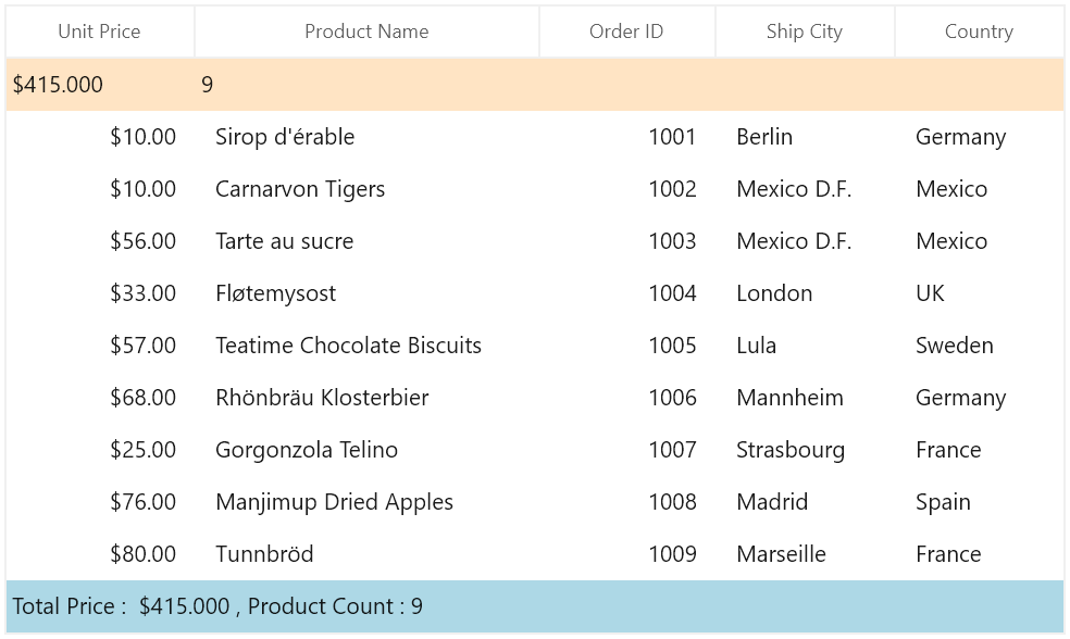
Table summary cell alignment based on column
The alignment of summary cells can be customized conditionally based on summary column.
Here, horizontal alignment of table summary cells are changed based on column name. Likewise, you can change the horizontal alignment of group, caption summary cells.
<Application.Resources>
    <local:SelectorClass x:Key="styleSelector"/>
    <Style TargetType="dataGrid:GridTableSummaryCell" x:Key="centerAlignmentTableSummaryCellStyle">
        <Setter Property="HorizontalContentAlignment" Value="Center"/>
    </Style>
    <Style TargetType="dataGrid:GridTableSummaryCell" x:Key="rightAlignmentTableSummaryCellStyle">
        <Setter Property="HorizontalContentAlignment" Value="Right"/>
    </Style>
</Application.Resources>

<dataGrid:SfDataGrid x:Name="dataGrid"
                               AutoGenerateColumns="True"
                               AllowEditing="True"
                               AllowGrouping="True"
                               ShowGroupDropArea="True"
                               TableSummaryCellStyleSelector="{StaticResource styleSelector}"
                               ItemsSource="{Binding Orders}"
                               ColumnWidthMode="Star">
            <dataGrid:SfDataGrid.TableSummaryRows>
                <dataGrid:GridTableSummaryRow Position="Top" ShowSummaryInRow="False">
                    <dataGrid:GridTableSummaryRow.SummaryColumns>
                        <dataGrid:GridSummaryColumn Name="price"
                                        Format="'{Sum:c}'"
                                        MappingName="UnitPrice"
                                        SummaryType="DoubleAggregate" />
                        <dataGrid:GridSummaryColumn Name="ProductCount"
                                        Format="'{Count:n0}'"
                                        MappingName="ProductName"
                                        SummaryType="CountAggregate" />
                    </dataGrid:GridTableSummaryRow.SummaryColumns>
                </dataGrid:GridTableSummaryRow>
                <dataGrid:GridSummaryRow Title="Total Price :  {totalPrice} , Product Count : {count}" ShowSummaryInRow="True">
                    <dataGrid:GridSummaryRow.SummaryColumns>
                        <dataGrid:GridSummaryColumn Name="count"
                                                Format="'{Count:n0}'"
                                                MappingName="ProductName"
                                                SummaryType="DoubleAggregate" />
                        <dataGrid:GridSummaryColumn Name="totalPrice"
                                        Format="'{Sum:c}'"
                                        MappingName="UnitPrice"
                                        SummaryType="DoubleAggregate" />
                    </dataGrid:GridSummaryRow.SummaryColumns>
                </dataGrid:GridSummaryRow>
            </dataGrid:SfDataGrid.TableSummaryRows>
        </dataGrid:SfDataGrid>
public class SelectorClass : StyleSelector
{
protected override Style SelectStyleCore(object item, DependencyObject container)
{
var cell = container as GridTableSummaryCell;
// column name is checked.
if (cell.ColumnBase.GridColumn.MappingName == "UnitPrice")
return Application.Current.Resources["centerAlignmentTableSummaryCellStyle"] as Style;
return Application.Current.Resources["rightAlignmentTableSummaryCellStyle"] as Style;
}
}Here, horizontal alignment of UnitPrice column alone center, other column horizontal alignment are changed into right.