How can I help you?
Column Types in WinUI DataGrid
29 Apr 202624 minutes to read
SfDataGrid provides support for various built-in column types. Each column has its own properties and renderer to handle different types of data.
You can also add or override existing columns and renderers as you need.
| Column Type | Renderer | Description |
|---|---|---|
| Use to display the string data. | ||
| Use to display the numeric data. | ||
Use to display the IEnumerable data using SfComboBox.
|
||
| Use to display the boolean type data. | ||
| Use to display the date value. | ||
| Use to display the image in each row. | ||
| Use to display the URI data. | ||
| Use to display the custom template-specified content. | ||
Use to display the DateTimeOffset type data as time value.
|
||
| Use to display custom information of each record. | ||
Use to display the boolean data using ToggleSwitch.
|
||
| Selects or deselects rows based on the check box value, which is not bound with data object. |
GridColumn
GridColumn is an abstract class provides base functionalities for all the column types in SfDataGrid.
Mapping column to particular property
Column can be bound to a property in data object using GridColumn.MappingName property. In addition, it supports to format or bind different property for display and edit mode separately via GridColumn.DisplayBinding and GridColumn.ValueBinding.
When you set MappingName, DisplayBinding and ValueBinding are created based on MappingName, if these properties are not defined explicitly. You can use DisplayBinding property to format the column in display, by setting Converter property of Binding.
public class DisplayBindingConverter : IValueConverter
{
    public object Convert(object value, Type targetType, object parameter, string language)
    {
        return string.Format("{0:C2}", value);
    }

    public object ConvertBack(object value, Type targetType, object parameter, string language)
    {
        return value;
    }
}xmlns:dataGrid="using:Syncfusion.UI.Xaml.DataGrid"
<dataGrid:SfDataGrid x:Name="dataGrid"
AllowEditing="True"
AutoGenerateColumns="False"
ItemsSource="{Binding Orders}"
ColumnWidthMode="SizeToHeader">
<dataGrid:SfDataGrid.Columns>
<dataGrid:GridTextColumn MappingName="OrderID" HeaderText="Order ID" />
<dataGrid:GridTextColumn MappingName="CustomerID" HeaderText="Customer ID"/>
<dataGrid:GridTextColumn MappingName="ShipCity" HeaderText="Ship City"/>
<dataGrid:GridTextColumn MappingName="Country"/>
<dataGrid:GridTextColumn DisplayBinding="{Binding Path=UnitPrice,
Converter={StaticResource converter}}"
HeaderText="Unit Price"
MappingName="UnitPrice"
ValueBinding="{Binding Path=UnitPrice}" />
<dataGrid:GridTextColumn MappingName="Quantity" />
</dataGrid:SfDataGrid.Columns>
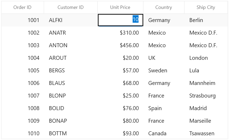
</dataGrid:SfDataGrid>In the below screenshot, Unit Price column display value is formatted to currency by setting DisplayBinding property.
By default, Columns handling the data operations (sorting and grouping) based on MappingName property. You can perform data operations based on ValueBinding by setting GridColumn.UseBindingValue to true, when the standard reflection not works or binding column with complex or indexer properties.
CellTemplate in GridColumn
You can load any WinUI control in the display mode for all columns by setting GridColumn.CellTemplate property. In edit mode, corresponding editor will be loaded based on column type.
In the below code snippet, GridTextColumn is loaded with ProgressBar and TextBlock. When you start editing DoubleTextBox will be loaded as Editor.
<dataGrid:SfDataGrid x:Name="dataGrid"
                       AllowEditing="True"
                       AutoGenerateColumns="False"
                       ItemsSource="{Binding Orders}"
                       ColumnWidthMode="SizeToHeader">
    <dataGrid:SfDataGrid.Columns>
        <dataGrid:GridTextColumn  MappingName="OrderID" HeaderText="Order ID" />
        <dataGrid:GridTextColumn  MappingName="CustomerID" HeaderText="Customer ID"/>
        <dataGrid:GridTextColumn  MappingName="ShipCity" HeaderText="Ship City"/>
        <dataGrid:GridTextColumn  MappingName="Country"/>
        <dataGrid:GridTextColumn HeaderText="Unit Price" MappingName="UnitPrice" >
            <dataGrid:GridTextColumn.CellTemplate>
            <DataTemplate>
                <Grid>
                    <ProgressBar x:Name="progressBar"
                             Height="50"
                             Background="Transparent"
                             BorderThickness="0"
                             Maximum="50"
                             Minimum="0"
                             Visibility="Visible"
                             Value="{Binding Path=UnitPrice}" />
                    <TextBlock HorizontalAlignment="Right"
                           VerticalAlignment="Center"
                           Text="{Binding Path=UnitPrice}"
                           TextAlignment="Center" />
                </Grid>
            </DataTemplate>
            </dataGrid:GridTextColumn.CellTemplate>
        </dataGrid:GridTextColumn>
        <dataGrid:GridTextColumn MappingName="Quantity" />
    </dataGrid:SfDataGrid.Columns>
</dataGrid:SfDataGrid>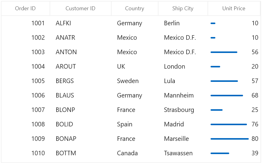
CellTemplate is not support by GridHyperlinkColumn, GridCheckboxColumn and GridImageColumn columns.
Reusing same DataTemplate for multiple columns
By default, underlying record is DataContext for CellTemplate. So you have to define, template for each column to display values based on MappingName.
You can use the same DataTemplate for all columns to display value based on MappingName by setting GridColumn.SetCellBoundValue property to true.
<Page.Resources>
    <DataTemplate x:Key="cellTemplate">
        <TextBlock Margin="3,0,0,0"
                   Foreground="Red"
                   Text="{Binding Path=Value}" />
    </DataTemplate>
</Page.Resources>

<dataGrid:SfDataGrid x:Name="dataGrid"
                       AllowEditing="True"
                       AutoGenerateColumns="False"
                       ItemsSource="{Binding Orders}"
                       ColumnWidthMode="SizeToHeader">
    <dataGrid:SfDataGrid.Columns>
        <dataGrid:GridTextColumn  MappingName="OrderID" HeaderText="Order ID" CellTemplate="{StaticResource cellTemplate}" SetCellBoundValue="True" />
        <dataGrid:GridTextColumn  MappingName="CustomerID" HeaderText="Customer ID"/>
        <dataGrid:GridTextColumn  MappingName="ShipCity" HeaderText="Ship City"/>
        <dataGrid:GridTextColumn  MappingName="Country" CellTemplate="{StaticResource cellTemplate}" SetCellBoundValue="True" />
        <dataGrid:GridTextColumn HeaderText="Unit Price" MappingName="UnitPrice" />
        <dataGrid:GridTextColumn MappingName="Quantity" />
    </dataGrid:SfDataGrid.Columns>
</dataGrid:SfDataGrid>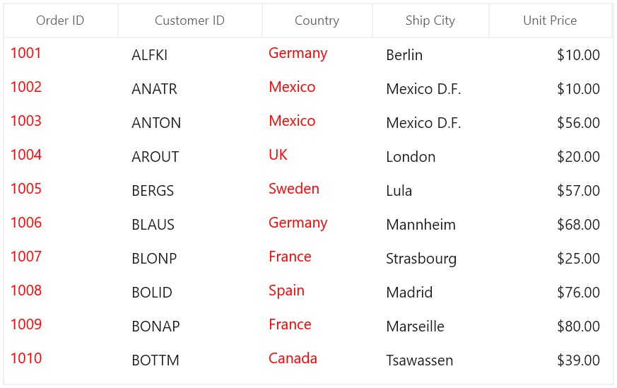
Setting CellTemplate based on custom logic using TemplateSelector
GridColumn provides support to choose different DataTemplate based on underlying data object using GridColumn.CellTemplateSelector property.
For example, two different templates loaded alternatively in OrderID column.
<Application.Resources>
    <local:CustomCellTemplateSelector x:Key="cellTemplateSelector"/>
    <DataTemplate x:Key="DefaultTemplate">
        <TextBlock Foreground="Red"
                Text="{Binding Path=OrderID}"
                TextAlignment="Center" />
    </DataTemplate>
    <DataTemplate x:Key="AlternateTemplate">
        <TextBlock Foreground="Green"
                Text="{Binding Path=OrderID}"
                TextAlignment="Center" />
    </DataTemplate>
</Application.Resources>
Below code returns the DefaultTemplate and AlternateTemplate based on OrderID’s value.
public class CustomCellTemplateSelector : DataTemplateSelector
{

    protected override DataTemplate SelectTemplateCore(object item, DependencyObject container)
    {

        if (item == null)
            return null;
        var data = item as OrderInfo;

        if (data.OrderID % 2 == 0)
            return Application.Current.Resources["AlternateTemplate"] as DataTemplate;

        else
            return Application.Current.Resources["DefaultTemplate"] as DataTemplate;
    }
}
In the below code, the custom template selector set to GridColumn.CellTemplateSelector and set SetCellBoundValue to true.
<dataGrid:SfDataGrid  x:Name="dataGrid"
                        AutoGenerateColumns="False"
                        ItemsSource="{Binding Orders}">
    <dataGrid:SfDataGrid.Columns>
        <dataGrid:GridTextColumn CellTemplateSelector="{StaticResource cellTemplateSelector}"
                                   HeaderText="Order ID"
                                   MappingName="OrderID" />
    </dataGrid:SfDataGrid.Columns>
</dataGrid:SfDataGrid>
NOTE
Non-Editable columns does not support
CellTemplate.

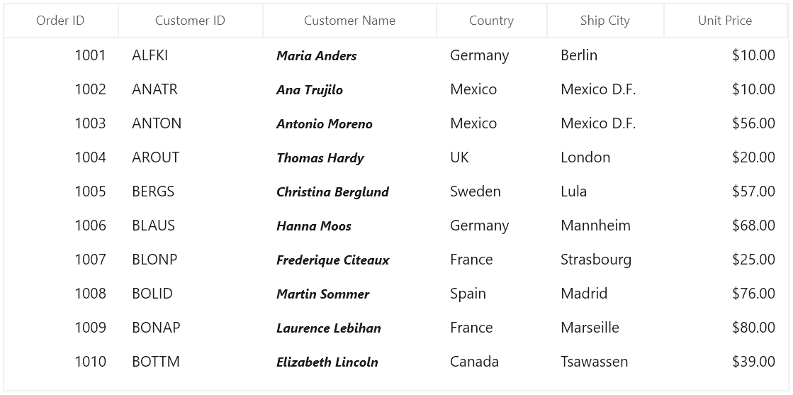
Data Formatting
GridColumn supports to format the data using Converter properties, by defining GridColumn.DisplayBinding and GridColumn.ValueBinding. GridColumn.DisplayBinding formats the data in display mode. GridColumn.ValueBinding formats the data in edit mode.
Format column using Converter
You can format the column using Converter property by defining DisplayBinding.
public class CurrencyFormatConverter : IValueConverter
{
    public object Convert(object value, Type targetType, object parameter, string language)
    {
        return string.Format("{0:C2}", value);
    }

    public object ConvertBack(object value, Type targetType, object parameter, string language)
    {
        return value;
    }
}<Page.Resources>
<local:CurrencyFormatConverter x:Key="currencyFormatConverter" />
</Page.Resources>
<dataGrid:SfDataGrid x:Name="sfDataGrid"
AllowEditing="True"
ItemsSource="{Binding Orders}"
AutoGenerateColumns="False">
<dataGrid:SfDataGrid.Columns>
<dataGrid:GridTextColumn MappingName="OrderID" HeaderText="Order ID" />
<dataGrid:GridTextColumn MappingName="CustomerID" HeaderText="Customer ID" />
<dataGrid:GridTextColumn MappingName="CustomerName" HeaderText="Customer Name" />
<dataGrid:GridTextColumn MappingName="ShipCity" HeaderText="Ship City" />
<dataGrid:GridTextColumn MappingName="Country"/>
<dataGrid:GridTextColumn DisplayBinding="{Binding UnitPrice,
Converter={StaticResource currencyFormatConverter}}"
HeaderText="Unit Price"
MappingName="UnitPrice" />
</dataGrid:SfDataGrid.Columns>
</dataGrid:SfDataGrid>When column is auto-generated, you can set the Converter by handling AutoGeneratingColumn event.
this.sfDataGrid.AutoGeneratingColumn += SfDataGrid_AutoGeneratingColumn;

private void sfDataGrid_AutoGeneratingColumn(object sender, AutoGeneratingColumnArgs e)
{
    if (e.Column.MappingName == "UnitPrice")
    {

        if (e.Column is GridTextColumn)
        {
            e.Column = new GridTextColumn() { MappingName = "UnitPrice", HeaderText = "Unit Price" };
        }
        e.Column.DisplayBinding = new Binding() { Path = new PropertyPath(e.Column.MappingName), Converter = new CurrencyFormatConverter() };
    }
}
Styling GridColumn
GridColumn support to customize the style of particular column using GridColumn.CellStyle property.
Change the font setting
You can change the font settings such as FontSize, FontFamily, FontWeight etc. by writing style of TargetType GridCell or GridColumn.CellStyle property.
<dataGrid:SfDataGrid x:Name="dataGrid"
                       AutoGenerateColumns="False"
                       ItemsSource="{Binding Orders}">
    <dataGrid:SfDataGrid.Columns>
        <dataGrid:GridTextColumn MappingName="CustomerName">
            <dataGrid:GridTextColumn.CellStyle>
                <Style TargetType="dataGrid:GridCell">
                    <Setter Property="FontSize" Value="12" />
                    <Setter Property="FontFamily" Value="Segoe UI" />
                    <Setter Property="FontWeight" Value="Bold" />
                    <Setter Property="FontStyle" Value="Italic" />
                    <Setter Property="FontStretch" Value="Condensed" />
                </Style>
            </dataGrid:GridTextColumn.CellStyle>
        </dataGrid:GridTextColumn>
    </dataGrid:SfDataGrid.Columns>
</dataGrid:SfDataGrid>
When column is auto-generated, you can style the column by handling AutoGeneratingColumn event.
<Page.Resources>
    <Style x:Key="cellStyle" TargetType="dataGrid:GridCell">
        <Setter Property="FontSize" Value="12" />
        <Setter Property="FontFamily" Value="Segoe UI" />
        <Setter Property="FontWeight" Value="Bold" />
        <Setter Property="FontStyle" Value="Italic" />
        <Setter Property="FontStretch" Value="Condensed" />
    </Style>

</Page.Resources>this.dataGrid.AutoGeneratingColumn += DataGrid_AutoGeneratingColumn;
private void DataGrid_AutoGeneratingColumn(object sender, Syncfusion.UI.Xaml.Grid.AutoGeneratingColumnArgs e)
{
if (e.Column.MappingName == "CustomerName")
e.Column.CellStyle = this.Resources["cellStyle"] as Style;
}
Styles based on custom logic
You can apply the styles to columns based on certain condition using GridColumn.CellStyleSelector property.
Below code creates two different styles by TargetType GridCell.
<Application.Resources>
<Style x:Key="cellStyle1" TargetType="dataGrid:GridCell">
<Setter Property="Background" Value="Bisque" />
</Style>
<Style x:Key="cellStyle2" TargetType="dataGrid:GridCell">
<Setter Property="Background" Value="Aqua" />
</Style>
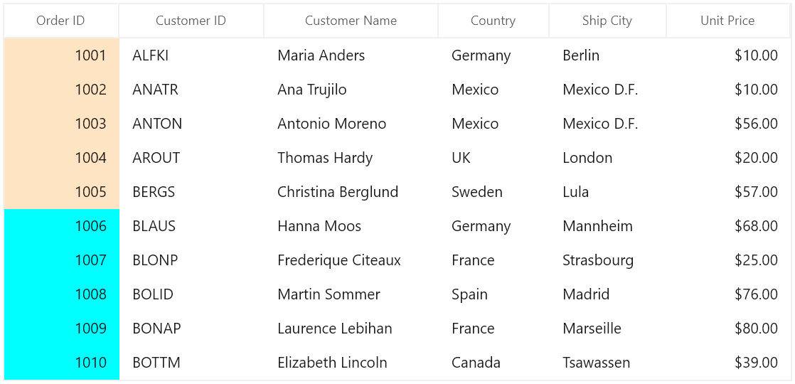
</Application.Resources>In the below code, returns the style based on OrderID value. Using Container you can format the columns data based on GridCell.
public class CustomCellStyleSelector: StyleSelector
{

    protected override Style SelectStyleCore(object item, DependencyObject container)
    {
        var gridCell = container as GridCell;
        var mappingName = gridCell.ColumnBase.GridColumn.MappingName;
        var record = gridCell.DataContext;
        var cellValue = record.GetType().GetProperty(mappingName).GetValue(record);

        if (mappingName.Equals("OrderID"))
        {

            if (Convert.ToInt16(cellValue) <= 1005)
                return App.Current.Resources["cellStyle1"] as Style;

            else
                return App.Current.Resources["cellStyle2"] as Style;
        }
        return base.SelectStyleCore(item, container);
    }
}
Below code, sets the customized style selector to GridColumn.CellStyleSelector property.
<Page.Resources>
    <local:CustomCellStyleSelector x:Key="cellStyleSelector"/>
</Page.Resources>

<dataGrid:SfDataGrid x:Name="dataGrid"
                       ItemsSource="{Binding Orders}"
                       AutoGenerateColumns="False" >
    <dataGrid:SfDataGrid.Columns>
        <dataGrid:GridTextColumn MappingName="OrderID" CellStyleSelector="{StaticResource cellStyleSelector}">
    </dataGrid:SfDataGrid.Columns>
</dataGrid:SfDataGrid>
When column is auto-generated, you can style the column by handling AutoGeneratingColumn event.
this.dataGrid.AutoGeneratingColumn += DataGrid_AutoGeneratingColumn;

private void DataGrid_AutoGeneratingColumn(object sender, Syncfusion.UI.Xaml.Grid.AutoGeneratingColumnArgs e)
{

    if (e.Column.MappingName == "OrderID")
    {
        e.Column.CellStyleSelector = new CustomCellStyleSelector();
    }
}
End-user Interaction
Hide Column
You can hide or unhide the particular column programmatically by setting GridColumn.IsHidden property. For allowing end-user to hide or unhide column in UI refer Resizing Columns section.
Disable column
You can disable column by setting GridColumn.AllowFocus property. Therefore, that column can’t be selected or edited.
Width, alignment and padding settings
Width
The width of GridColumn can be changed by setting Width property. Column width set based on GridColumn.MinimumWidth and GridColumn.MaximumWidth properties.
NOTE
If the
GridColumn.Widthis defined explicitly takes priority thanGridColumn.ColumnSizer.
Padding
GridColumn allows you to the change the padding of cell content by setting Padding property.
Alignment
GridColumn allows you to change the alignment of GridCell and GridHeaderCellControl content using TextAlignment, VerticalAlignment and HorizontalHeaderContentAlignment properties.
GridTextColumnBase
GridTextColumnBase is the abstract class derived from GridColumn. The following columns are derived from the GridTextColumnBase.
-
GridTextColumn
-
GridNumericColumn
-
GridDateColumn
-
GridTimeColumn
-
GridTemplateColumn
GridTextColumnBase properties
- Text trimming - You can trim the column’s data using
TextTrimmingproperty. - Text wrapping - You can wrap the column’s data using
TextWrappingproperty.
<dataGrid:SfDataGrid x:Name="dataGrid"
                       AutoGenerateColumns="False"
                       ItemsSource="{Binding Orders}">
    <dataGrid:SfDataGrid.Columns>
        <dataGrid:GridTextColumn Width="60"
                                   HeaderText="Customer Name"
                                   MappingName="CustomerName"
                                   TextTrimming="CharacterEllipsis"
                                   TextWrapping="Wrap" />
    </dataGrid:SfDataGrid.Columns>
</dataGrid:SfDataGrid>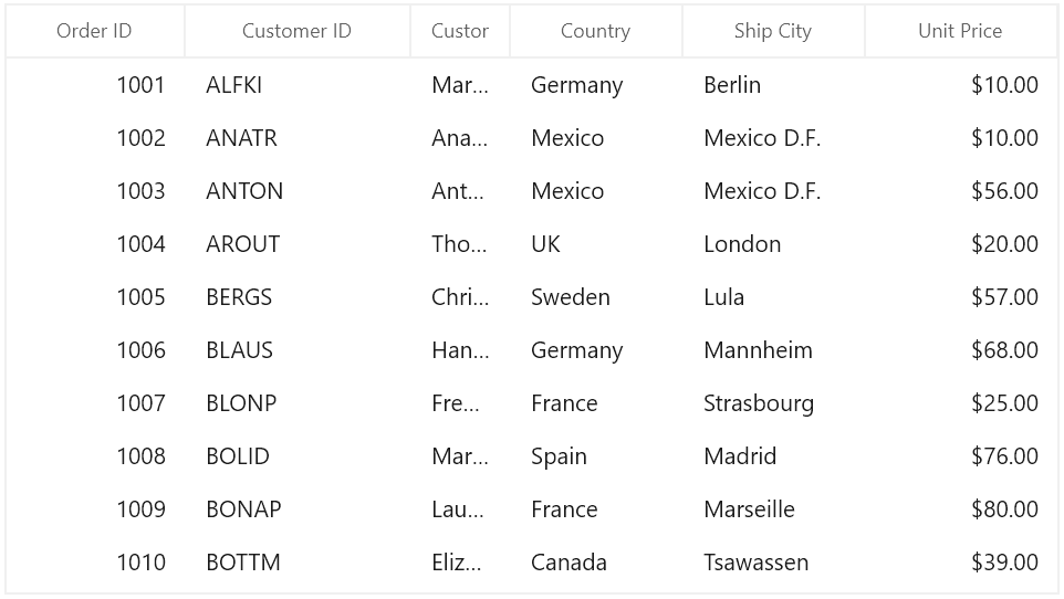
GridTextColumn
GridTextColumn derived from GridTextColumnBase which hosts TextBox in edit mode.
<dataGrid:SfDataGrid x:Name="dataGrid"
                       AutoGenerateColumns="False"
                       ItemsSource="{Binding Orders}">
    <dataGrid:SfDataGrid.Columns>
        <dataGrid:GridTextColumn HeaderText="Customer Name" MappingName="CustomerName" />
    </dataGrid:SfDataGrid.Columns>
</dataGrid:SfDataGrid>this.dataGrid.Columns.Add(new GridTextColumn()
{
HeaderText = "Customer Name",
MappingName = "CustomerName",
});Spell check while editing
You can enable spell check in GridTextColumn using IsSpellCheckEnabled property.
<dataGrid:GridTextColumn HeaderText="Ship City"
                           IsSpellCheckEnabled="True"
MappingName="ShipCity" />this.dataGrid.Columns.Add(new GridTextColumn() { HeaderText = "Ship City", MappingName = "ShipCity", IsSpellCheckEnabled = true });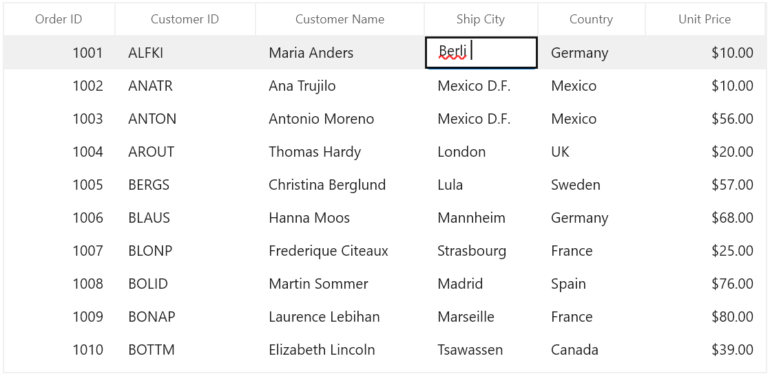
GridNumericColumn
GridNumericColumn is derived from GridTextColumnBase and hosts the NumberBox in edit mode.
<dataGrid:SfDataGrid x:Name="dataGrid"
                       ItemsSource="{Binding Orders}"
                       AutoGenerateColumns="False"
                       AllowEditing="True" >
    <dataGrid:SfDataGrid.Columns>
        <dataGrid:GridTextColumn MappingName="CustomerID" HeaderText="Customer ID" />
        <dataGrid:GridTextColumn MappingName="CustomerName" HeaderText="Customer Name" />
        <dataGrid:GridNumericColumn HeaderText="Unit Price" MappingName="UnitPrice"/>
        <dataGrid:GridTextColumn MappingName="Country" />
        <dataGrid:GridTextColumn MappingName="ShipCity" HeaderText="Ship City" />
    </dataGrid:SfDataGrid.Columns>
</dataGrid:SfDataGrid>this.dataGrid.Columns.Add(new GridNumericColumn()
{
HeaderText = "Unit Price",
MappingName = "UnitPrice",
});
Change the format of numeric value
You can format the value of a GridNumericColumn using the DisplayNumberFormat or NumberFormatter property. The default value of DisplayNumberFormat and NumberFormatter properties are null.
The following example shows how to set PercentFormatter for NumberFormatter property.
NOTE
To learn more about the formatting classes that can be assigned to the
NumberFormatterproperty.
Refer here
// Format numericColumn in percent
numericColumn.NumberFormatter = new PercentFormatter();
You can also set CurrencyFormatter and DecimalFormatter for NumberFormatter property to format the values in currency and numeric custom formats.
Using the N, C, and P format values, you can apply numeric, currency, and percent custom formats in DisplayNumberFormat property.
NOTE
When using both the
DisplayNumberFormatand theNumberFormatterproperties, theDisplayNumberFormatproperty takes high precedence.
// Format numericColumn in percent
numericColumn.DisplayNumberFormat = "P2";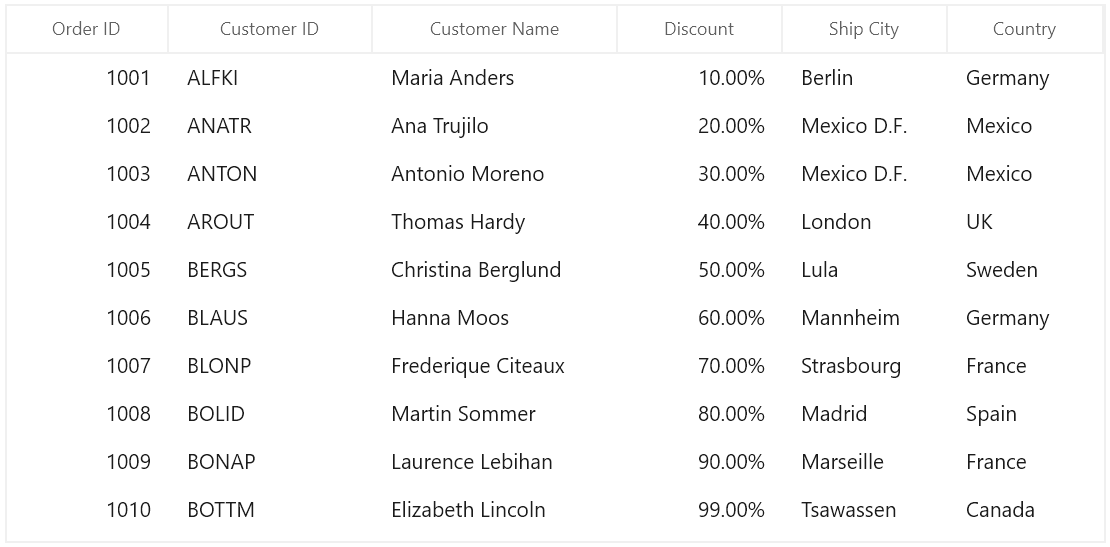
Null value support
GridNumericColumn provides support to restrict or allow null value in columns based on AllowNull property. Instead of displaying null values, you can display hint text using the PlaceholderText property.
The PlaceholderText is not displayed, when the AllowNull is set to false.
<dataGrid:SfDataGrid x:Name="dataGrid"
                       ItemsSource="{Binding Orders}"
                       AutoGenerateColumns="False"
                       AllowEditing="True" >
    <dataGrid:SfDataGrid.Columns>
        <dataGrid:GridTextColumn MappingName="CustomerID" HeaderText="Customer ID" />
        <dataGrid:GridTextColumn MappingName="CustomerName" HeaderText="Customer Name" />
        <dataGrid:GridNumericColumn MappingName="UnitPrice" HeaderText="Unit Price" AllowNull="True"
                                     PlaceholderText="Enter the amount" />
        <dataGrid:GridTextColumn MappingName="Country" />
        <dataGrid:GridTextColumn MappingName="ShipCity" HeaderText="Ship City" />
    </dataGrid:SfDataGrid.Columns>
</dataGrid:SfDataGrid>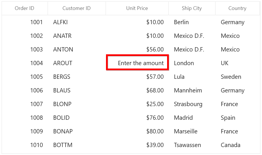
Restrict value within range
You can restrict the users to enter input within a minimum and maximum range in GridNumericColumn using the MinValue and MaxValue properties. The default value of the MinValue property is double.MinValue and MaxValue property is double.MaxValue.
<dataGrid:SfDataGrid x:Name="dataGrid"
                       ItemsSource="{Binding Orders}"
                       AutoGenerateColumns="False"
                       AllowEditing="True" >
    <dataGrid:SfDataGrid.Columns>
        <dataGrid:GridNumericColumn MappingName="Quantity" HeaderText="Quantity" MinValue="30" MaxValue="200" />
    </dataGrid:SfDataGrid.Columns>
</dataGrid:SfDataGrid>
Clear Button support
The GridNumericColumn provides a clear button feature that enables users to reset cell values during editing using the ShowClearButton property.
When ShowClearButton is set to True, a clear button is displayed in the cell editor, enabling users to clear the cell’s value during editing.
AllowNull Behavior
The behavior of the clear button depends on the AllowNull property:
-
When
AllowNullisTrue, clicking the clear button sets the cell value to null. -
When
AllowNullisFalse, clicking the clear button sets the cell value to the column’s MinValue.
<dataGrid:SfDataGrid x:Name="dataGrid"
                       ItemsSource="{Binding Orders}"
                       AutoGenerateColumns="False"
                       AllowEditing="True" >
    <dataGrid:SfDataGrid.Columns>
        <dataGrid:GridNumericColumn MappingName="OrderID" HeaderText="Order ID" ShowClearButton="True" />
        <dataGrid:GridTextColumn MappingName="CustomerName" HeaderText="Customer Name" />
        <dataGrid:GridDateColumn MappingName="OrderDate" HeaderText="Order Date" ShowClearButton="True" />
        <dataGrid:GridTextColumn MappingName="Country" HeaderText="Country" />
        <dataGrid:GridTextColumn MappingName="CustomerID" HeaderText="Customer ID" />
        <dataGrid:GridTextColumn MappingName="ShipCity" HeaderText="Ship City"/>
    </dataGrid:SfDataGrid.Columns>
</dataGrid:SfDataGrid>
UpDown button placement
You can increase or decrease the value of the GridNumericColumn using the up-down button. By default, the value of UpDownPlacementMode property is Hidden. You can change the up-down button position by assigning the value UpDownPlacementMode property as Inline or Compact.
<dataGrid:SfDataGrid x:Name="dataGrid"
                       ItemsSource="{Binding Orders}"
                       AutoGenerateColumns="False"
                       AllowEditing="True" >
    <dataGrid:SfDataGrid.Columns>
        <dataGrid:GridNumericColumn MappingName="Quantity" HeaderText="Quantity" UpDownPlacementMode="InLine" />
    </dataGrid:SfDataGrid.Columns>
</dataGrid:SfDataGrid>
GridDateColumn
GridDateColumn derived from GridTextColumnBase and it displays columns data as date. It hosts SfCalendarDatePicker element in editing mode.
<dataGrid:SfDataGrid x:Name="dataGrid"
                       ItemsSource="{Binding Orders}"
                       AutoGenerateColumns="False"
                      ColumnWidthMode="Star"
                       AllowEditing="True" >
    <dataGrid:SfDataGrid.Columns>
        <dataGrid:GridTextColumn MappingName="OrderID" HeaderText="Order ID" />
        <dataGrid:GridTextColumn MappingName="CustomerID" HeaderText="Customer ID" />
        <dataGrid:GridTextColumn MappingName="CustomerName" HeaderText="Customer Name" />
        <dataGrid:GridTextColumn MappingName="Country" />
        <dataGrid:GridTextColumn MappingName="ShipCity" HeaderText="Ship City" />
        <dataGrid:GridDateColumn MappingName="Date" />
    </dataGrid:SfDataGrid.Columns>
</dataGrid:SfDataGrid>this.dataGrid.Columns.Add(new GridDateColumn() { HeaderText = "Date", MappingName = "Date" });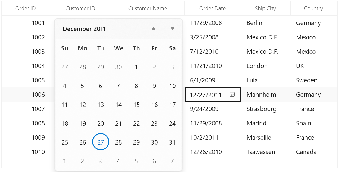
Change the Format of date value
You can edit and display the selected date with various formatting like date, month and year formats by using the DisplayDateFormat property. The default value of DisplayDateFormat property is d. For example below image shown the DateColumn with DisplayDateFormat as M.
<dataGrid:SfDataGrid x:Name="dataGrid"
                       ItemsSource="{Binding Orders}"
                       AutoGenerateColumns="False"
                       ColumnWidthMode="Star"
                       AllowEditing="True" >
    <dataGrid:SfDataGrid.Columns>
        <dataGrid:GridTextColumn MappingName="OrderID" HeaderText="Order ID" />
        <dataGrid:GridTextColumn MappingName="CustomerID" HeaderText="Customer ID" />
        <dataGrid:GridTextColumn MappingName="CustomerName" HeaderText="Customer Name" />
        <dataGrid:GridTextColumn MappingName="Country" />
        <dataGrid:GridTextColumn MappingName="ShipCity" HeaderText="Ship City" />
        <dataGrid:GridDateColumn MappingName="Date" DisplayDateFormat="M" />
    </dataGrid:SfDataGrid.Columns>
</dataGrid:SfDataGrid>this.dataGrid.Columns.Add(new GridDateColumn() { HeaderText = "Date", MappingName = "Date" , DisplayDateFormat="M" });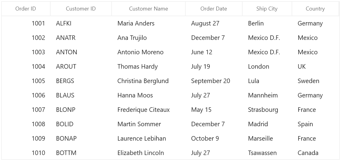
Null value support
GridDateColumn provides support to restrict or allow null value in columns based on AllowNull property. Instead of displaying null values, you can display hint text using PlaceholderText property.
The PlaceholderText does not shown, when the AllowNull is false.
<dataGrid:SfDataGrid x:Name="dataGrid"
                       ItemsSource="{Binding Orders}"
                       AutoGenerateColumns="False"
                       ColumnWidthMode="Star"
                       AllowEditing="True" >
    <dataGrid:SfDataGrid.Columns>
        <dataGrid:GridTextColumn MappingName="OrderID" HeaderText="Order ID" />
        <dataGrid:GridTextColumn MappingName="CustomerID" HeaderText="Customer ID" />
        <dataGrid:GridTextColumn MappingName="CustomerName" HeaderText="Customer Name" />
        <dataGrid:GridTextColumn MappingName="Country" />
        <dataGrid:GridTextColumn MappingName="ShipCity" HeaderText="Ship City" />
        <dataGrid:GridDateColumn MappingName="Date" AllowNull="True" PlaceholderText="Change the date" />
    </dataGrid:SfDataGrid.Columns>
</dataGrid:SfDataGrid>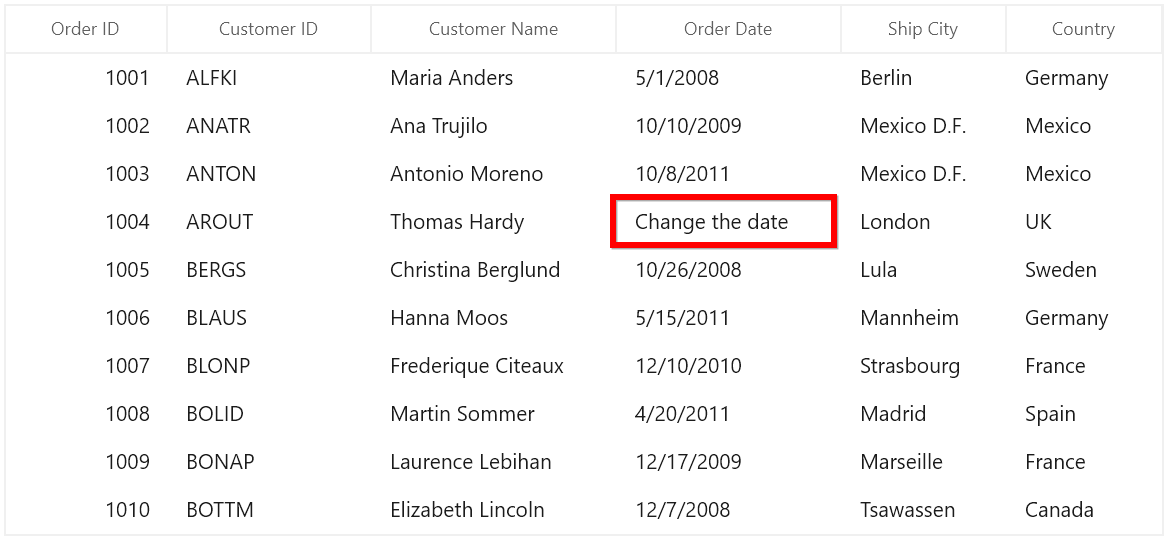
Setting date value range
You can restrict and display the input value within the range using MinDate and MaxDate properties.
Clear Button support
The GridDateColumn provides a clear button feature that enables users to reset cell values during editing using the ShowClearButton property.
When ShowClearButton is set to True, a clear button appears within the editor, providing users with a convenient way to clear the cell’s value.
AllowNull Behavior
The behavior of the clear button depends on the AllowNull property:
-
When
AllowNullisTrue, clicking the clear button sets the cell value tonull. -
When
AllowNullisFalse, clicking the clear button sets the cell value to the column’s MinDate.
<dataGrid:SfDataGrid x:Name="dataGrid"
                       ItemsSource="{Binding Orders}"
                       AutoGenerateColumns="False"
                       AllowEditing="True" >
    <dataGrid:SfDataGrid.Columns>
        <dataGrid:GridNumericColumn MappingName="OrderID" HeaderText="Order ID" ShowClearButton="True" />
        <dataGrid:GridTextColumn MappingName="CustomerName" HeaderText="Customer Name" />
        <dataGrid:GridDateColumn MappingName="OrderDate" HeaderText="Order Date" ShowClearButton="True" />
        <dataGrid:GridTextColumn MappingName="Country" HeaderText="Country" />
        <dataGrid:GridTextColumn MappingName="CustomerID" HeaderText="Customer ID" />
        <dataGrid:GridTextColumn MappingName="ShipCity" HeaderText="Ship City"/>
    </dataGrid:SfDataGrid.Columns>
</dataGrid:SfDataGrid>
GridCheckBoxColumn
GridCheckBoxColumn derived from GridColumn and it used display and edit Boolean type data. It hosts CheckBox element as GridCell content.
<dataGrid:SfDataGrid x:Name="dataGrid"
                       AutoGenerateColumns="False"
                       ItemsSource="{Binding Orders}">
    <dataGrid:SfDataGrid.Columns>
        <dataGrid:GridCheckBoxColumn HeaderText="Is Delivered" MappingName="IsDelivered" />
    </dataGrid:SfDataGrid.Columns>
</dataGrid:SfDataGrid>this.dataGrid.Columns.Add(new GridCheckBoxColumn() { HeaderText = "Is Delivered", MappingName = "IsDelivered" });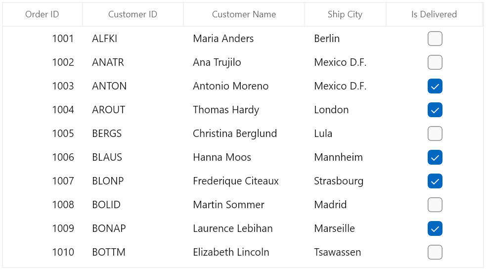
GridCheckBoxColumn allows you to customize check box state and its alignment.
-
IsThreeState - By default, the
GridCheckBoxColumnhasCheckedandUncheckedstate. You can enable anotherIntermediatestate settingIsThreeStateproperty totrue. -
HorizontalAlignment - You can change the horizontal alignment of CheckBox using
HorizontalAlignmentproperty.
GridTemplateColumn
GridTemplateColumn derived from GridTextColumnBase and it displays the template-specified cell content. You can load any WinUI control in the display mode for all columns by setting CellTemplate and EditTemplate properties.
<dataGrid:SfDataGrid x:Name="dataGrid"
                       AutoGenerateColumns="False"
                       ItemsSource="{Binding Orders}">
    <dataGrid:SfDataGrid.Columns>
        <dataGrid:GridTemplateColumn MappingName="CustomerID">
            <dataGrid:GridTemplateColumn.CellTemplate>
                <DataTemplate>
                    <TextBlock Text="{Binding CustomerID}" />
                </DataTemplate>
            </dataGrid:GridTemplateColumn.CellTemplate>
            <dataGrid:GridTemplateColumn.EditTemplate>
                <DataTemplate>
                    <TextBox Text="{Binding CustomerID, Mode=TwoWay}" />
                </DataTemplate>
            </dataGrid:GridTemplateColumn.EditTemplate>
            </dataGrid:GridTemplateColumn>
    </dataGrid:SfDataGrid.Columns>
</dataGrid:SfDataGrid>
StringBuilder sb1 = new StringBuilder();
sb1.Append("<DataTemplate xmlns=\"http://schemas.microsoft.com/winfx/2006/xaml/presentation\">");
sb1.Append("<TextBlock Text=\"{Binding CustomerID}\" />");
sb1.Append("</DataTemplate>");
DataTemplate cellTemplate = (DataTemplate)XamlReader.Load(sb1.ToString());
StringBuilder sb2 = new StringBuilder();
sb2.Append("<DataTemplate xmlns=\"http://schemas.microsoft.com/winfx/2006/xaml/presentation\">");
sb2.Append("<TextBox Text=\"{Binding CustomerID, Mode=TwoWay}\" />");
sb2.Append("</DataTemplate>");
DataTemplate editTemplate = (DataTemplate)XamlReader.Load(sb2.ToString());
this.dataGrid.Columns.Add(new GridTemplateColumn() { MappingName = "IsClosed", CellTemplate = cellTemplate, EditTemplate = editTemplate });Binding CellTemplate and EditTemplate based on MappingName
By default, underlying record is DataContext for CellTemplate. So you have to define, template for each column to display values based on MappingName.
You can use the same DataTemplate for all columns to display value based on MappingName by setting SetCellBoundValue property to true.
NOTE
EditTemplate support available only for GridTemplateColumn.
<dataGrid:SfDataGrid x:Name="dataGrid"
                       AutoGenerateColumns="False"
                       ItemsSource="{Binding Orders}">
    <dataGrid:SfDataGrid.Columns>
        <dataGrid:GridTemplateColumn MappingName="OrderID" SetCellBoundValue="True">
            <dataGrid:GridTemplateColumn.CellTemplate>
                <DataTemplate>
                    <Grid>
                        <TextBlock Text="{Binding Value}" />
                    </Grid>
                </DataTemplate>
            </dataGrid:GridTemplateColumn.CellTemplate>
            <dataGrid:GridTemplateColumn.EditTemplate>
                <DataTemplate>
                    <Grid>
                        <TextBox Text="{Binding Value}" />
                    </Grid>
                </DataTemplate>
            </dataGrid:GridTemplateColumn.EditTemplate>
        </dataGrid:GridTemplateColumn>
    </dataGrid:SfDataGrid.Columns>
</dataGrid:SfDataGrid>
Sets EditTemplate based on custom logic
GridTemplateColumn provides support to load different edit elements based on underlying data object using GridTemplateColumn.EditTemplateSelector property.
Below code returns the DefaultTemplate and AlternateTemplate based on OrderID’s value.
<DataTemplate x:Key="DefaultCellTemplate">
    <TextBlock VerticalAlignment="Center"
               Foreground="Red"
               Text="{Binding Path=OrderID}"
               TextAlignment="Center" />
</DataTemplate>

<DataTemplate x:Key="AlternateCellTemplate">
    <TextBlock VerticalAlignment="Center"
               Foreground="Green"
               Text="{Binding Path=OrderID}"
               TextAlignment="Center" />
</DataTemplate>

<DataTemplate x:Key="DefaultEditTemplate">
    <TextBox Height="45"
             VerticalAlignment="Center"
             Foreground="Red"
             Text="{Binding Path=OrderID}"
             TextAlignment="Center" />
</DataTemplate>

<DataTemplate x:Key="AlternateEditTemplate">
    <TextBox Height="45"
             VerticalAlignment="Center"
             Foreground="Green"
             Text="{Binding Path=OrderID}"
             TextAlignment="Center" />
</DataTemplate>public class CustomEditTemplateSelector: DataTemplateSelector
{
protected override DataTemplate SelectTemplateCore(object item, DependencyObject container)
{
if (item == null)
return null;
var data = item as OrderInfo;
if (data.OrderID % 2 == 0)
return Appliaction.Current.Resources["AlternateEditTemplate"] as DataTemplate;
else
return Application.Current.Resources["DefaultEditTemplate"] as DataTemplate;
}
}In the below code, custom template selector set to GridTemplateColumn.EditTemplateSelector.
<Page.Resources>
    <local:CustomEditTemplateSelector x:Key="cellTemplateSelector" />
    <local:CustomEditTemplateSelector x:Key="editTemplateSelector" />
</Page.Resources>

<dataGrid:SfDataGrid x:Name="dataGrid"
                       AutoGenerateColumns="False"
                       ItemsSource="{Binding Orders}">
    <dataGrid:SfDataGrid.Columns>
        <dataGrid:GridTemplateColumn MappingName="OrderID"
                                       CellTemplateSelector="{StaticResource cellTemplateSelector}"
                                       EditTemplateSelector="{StaticResource editTemplateSelector}"/>
    </dataGrid:SfDataGrid.Columns>
</dataGrid:SfDataGrid>
GridComboBoxColumn
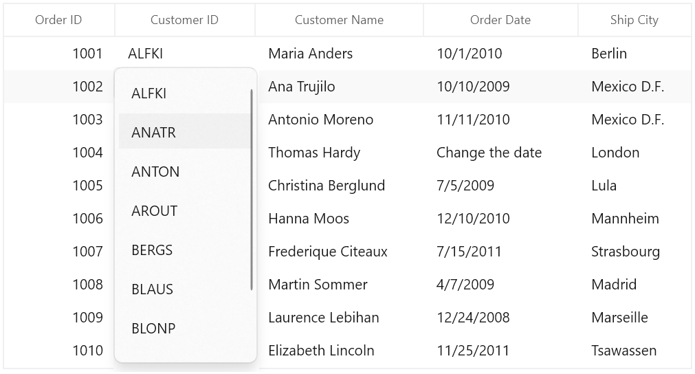
GridComboBoxColumn derived from GridColumn which hosts SfComboBox as edit element. The data source to SfComboBox can be set by using GridComboBoxColumn.ItemsSource property.
By default, GridComboBoxColumn displays the value using MappingName property. You can set DisplayMemberPath which denotes the path to a value on the source object (GridComboBoxColumn.ItemsSource) to serve as the visual representation of object. You can set the SelectedValuePath which denotes the path to get the SelectedValue from the SelectedItem.
<dataGrid:SfDataGrid x:Name="dataGrid"
                       AutoGenerateColumns="False"
                       ItemsSource="{Binding Orders}">

    <dataGrid:SfDataGrid.Columns>
        <dataGrid:GridComboBoxColumn  HeaderText="Customer ID"
                                        ItemsSource="{Binding ComboItems, Source={StaticResource viewModel}}"
                                        MappingName=" Customer ID " />
    </dataGrid:SfDataGrid.Columns>
</dataGrid:SfDataGrid>this.dataGrid.Columns.Add(new GridComboBoxColumn() { HeaderText = " Customer ID ", MappingName = " Customer ID ", ItemsSource = viewModel.ComboItems });SfDataGrid triggers, CurrentCellDropDownSelectionChanged event, when the SelectedValue is changed. CurrentCellDropDownSelectionChangedEventArgs of CurrentCellDropDownSelectionChanged event provides the information about the changed cell value.
SelectedIndex property returns the index of selected item.
SelectedItem property returns the selected item from drop down list.
Opening dropdown popup in single-click
You can open the drop down within single click by setting SfComboBox.IsDropDownOpen property to true in OnEditElementLoaded method by overriding existing renderer.
Below code, creates GridCellComboBoxRendererExt to set IsDropDownOpen property. Replace the default renderer with created renderer in SfDataGrid.CellRenderers collection.
this.dataGrid.CellRenderers.Remove("ComboBox");
this.dataGrid.CellRenderers.Add("ComboBox", new GridCellComboBoxRendererExt());

public class GridCellComboBoxRendererExt: GridCellComboBoxRenderer
{

    protected override void OnEditElementLoaded(object sender, Microsoft.UI.Xaml.RoutedEventArgs e)
    {
        (sender as SfComboBox).IsDropDownOpen = true;
        base.OnEditElementLoaded(sender, e);
    }
}
NOTE
This is applicable when the
SfDataGrid.EditTriggeris set asOnTap.
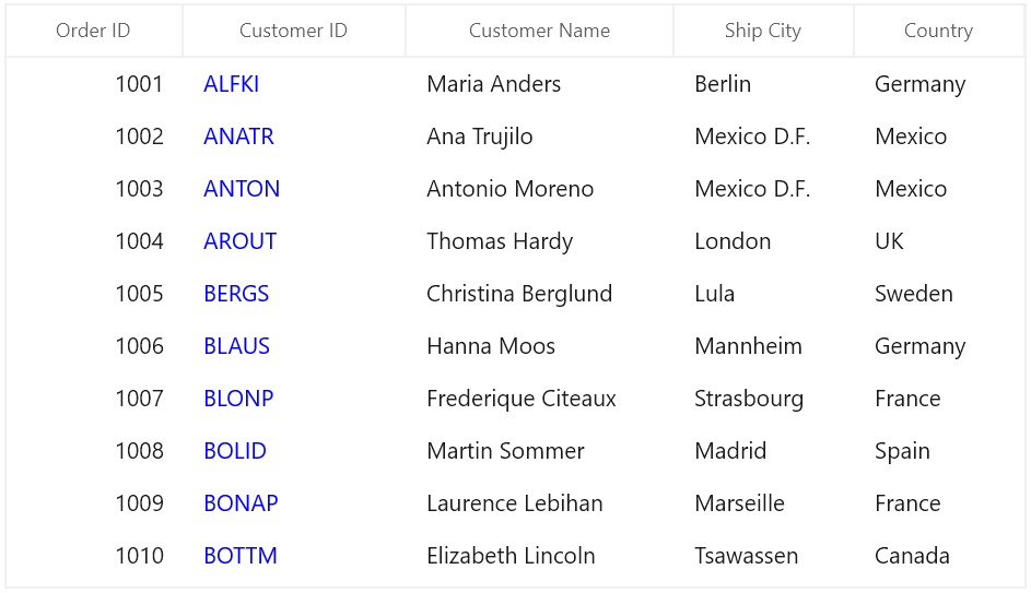
GridHyperlinkColumn
GridHyperlinkColumn derived from GridTextColumn and it displays columns data as hyperlink. It hosts HyperlinkButton element as GridCell content.
<dataGrid:SfDataGrid x:Name="dataGrid"
                       AutoGenerateColumns="False"
                       ItemsSource="{Binding Orders}">
    <dataGrid:SfDataGrid.Columns>
        <dataGrid:GridHyperlinkColumn HeaderText="Country" MappingName="Country" />
    </dataGrid:SfDataGrid.Columns>
</dataGrid:SfDataGrid>this.dataGrid.Columns.Add(new GridHyperlinkColumn() { HeaderText = "Country", MappingName = "Country" });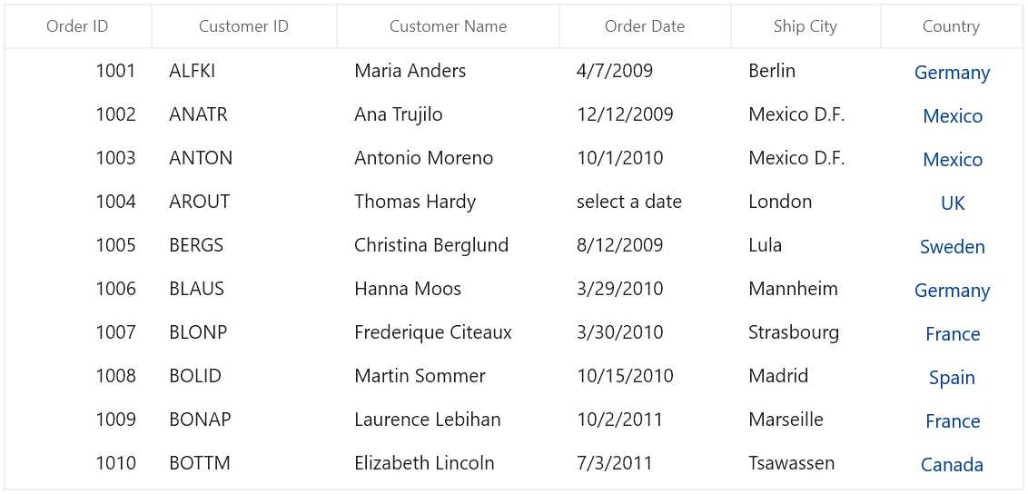
You can allow end-user to navigate the Uri when the cell value contains valid Uri address or using CurrentCellRequestNavigate event. The CurrentCellRequestNavigate occurs when the current cell in GridHyperlinkColumn is clicked for navigation.
CurrentCellRequestNavigateEventArgs of CurrentCellRequestNavigate event provide information about the hyperlink triggered this event. CurrentCellRequestNavigateEventArgs.NavigateText returns the value using ValueBinding or MappingName to navigate.
this.dataGrid.CurrentCellRequestNavigate += DataGrid_CurrentCellRequestNavigate;

private void DataGrid_CurrentCellRequestNavigate(object sender, CurrentCellRequestNavigateEventArgs args)
{
    var URI = string.Format("https://en.wikipedia.org/wiki/" + args.NavigateText);
    Windows.System.Launcher.LaunchUriAsync(new Uri(URI));
}
Cancel the navigation
You can cancel the navigation when clicking hyperlink by setting CurrentCellRequestNavigateEventArgs.Handled to false.
this.dataGrid.CurrentCellRequestNavigate += dataGrid_CurrentCellRequestNavigate;

void dataGrid_CurrentCellRequestNavigate(object sender, CurrentCellRequestNavigateEventArgs args)
{
    args.Handled = true;
}
Customize Hyperlink
Change the alignment
You can change the horizontal alignment of GridHyperlinkColumn using HorizontalAlignment property.
Change the foreground color
You can change the foreground color of GridHyperlinkColumn by writing the style with target type HyperlinkButton.
<Style TargetType="HyperlinkButton">
    <Setter Property="Foreground" Value="Green" />
</Style>
GridImageColumn
GridImageColumn derived from GridColumn and it displays columns data as Image. It hosts Image element as GridCell content.
<dataGrid:SfDataGrid x:Name="dataGrid"
                       AutoGenerateColumns="False"
                       ItemsSource="{Binding Orders}">
    <dataGrid:SfDataGrid.Columns>
        <dataGrid:GridImageColumn MappingName="ImageLink"
                                    HeaderText="Flag"
                                    Stretch="Uniform"
                                    TextAlignment="Center" />
    </dataGrid:SfDataGrid.Columns>
</dataGrid:SfDataGrid>this.dataGrid.Columns.Add(new GridImageColumn() { HeaderText = "Flag", MappingName = "ImageLink", Stretch = Stretch.Uniform });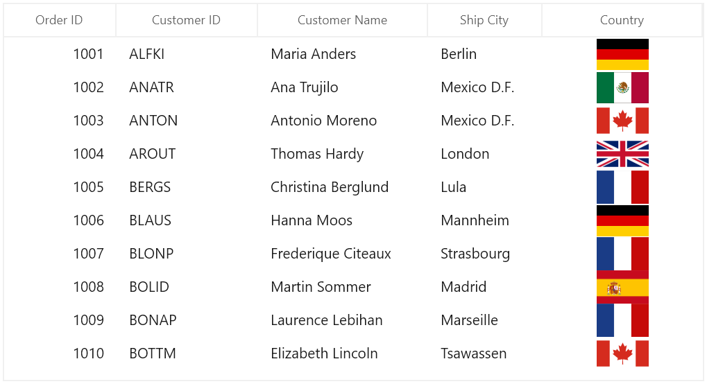
Read image from path using ValueBinding
You can use converter to read image from resource by setting Converter in ValueBinding definition.
Below code, returns the Image URI using ValueBinding property.
class StringToImageConverter : IValueConverter
{
    public object Convert(object value, Type targetType, object parameter, string language)
    {
        if (value != null)
        {
            string imagename = value as string + ".png";
            return new Uri("ms-appx:///Image/" + imagename, UriKind.Absolute);
        }
        return null;
    }

    public object ConvertBack(object value, Type targetType, object parameter, string language)
    {
        return null;
    }
}<Page.Resources>
<local:StringToImageConverter x:Key="stringToImageConverter" />
</Page.Resources>
<Grid>
<dataGrid:SfDataGrid x:Name="dataGrid"
AllowEditing="True"
AutoGenerateColumns="False"
ItemsSource="{Binding Orders}"
ColumnWidthMode="SizeToHeader">
<dataGrid:SfDataGrid.Columns>
<dataGrid:GridTextColumn MappingName="OrderID" HeaderText="Order ID" />
<dataGrid:GridTextColumn HeaderText="Customer ID" MappingName="CustomerID" />
<dataGrid:GridTextColumn MappingName="CustomerName" HeaderText="Customer Name"/>
<dataGrid:GridTextColumn MappingName="ShipCity" HeaderText="Ship City" />
<dataGrid:GridImageColumn MappingName="Country" HeaderText="Flag" TextAlignment="Center" ImageHeight="50" ImageWidth="50"
ValueBinding="{Binding Path=Country, Converter={StaticResource stringToImageConverter}}" />
</dataGrid:SfDataGrid.Columns>
</dataGrid:SfDataGrid>
</Grid>this.dataGrid.Columns.Add(new GridImageColumn() { HeaderText = "Flag", MappingName = "Country", ValueBinding = new Binding() { Path = new PropertyPath("Country"), Converter = new StringToImageConverter() }, TextAlignment = TextAlignment.Center, Stretch = Stretch.Uniform });Customize Image
GridImageColumn allows you to customize the image with below properties.
-
Width and Height- You can change the height and width of the image using GridImageColumn.ImageHeight and GridImageColumn.ImageWidth properties. -
Stretch - The image can be stretch by setting
Stretchproperty. -
Scale - You can scale the image using StretchDirection property.
GridTimeColumn
GridTimeColumn is derived from GridTextColumnBase and displays column data as time. In editing mode, it hosts the SfTimePicker element .
<dataGrid:SfDataGrid x:Name="dataGrid"
                       ItemsSource="{Binding Orders}"
                       AutoGenerateColumns="False"
                      ColumnWidthMode="Star"
                       AllowEditing="True" >
    <dataGrid:SfDataGrid.Columns>
        <dataGrid:GridTextColumn MappingName="OrderID" HeaderText="Order ID" />
        <dataGrid:GridTextColumn MappingName="CustomerID" HeaderText="Customer ID" />
        <dataGrid:GridTextColumn MappingName="CustomerName" HeaderText="Customer Name" />
        <dataGrid:GridTimeColumn MappingName="DeliveredTime" HeaderText="Delivered Time" />
        <dataGrid:GridTextColumn MappingName="ShipCity" HeaderText="Ship City" />
    </dataGrid:SfDataGrid.Columns>
</dataGrid:SfDataGrid>this.dataGrid.Columns.Add(new GridTimeColumn() { HeaderText = "Delivered Time", MappingName = "DeliveredTime" });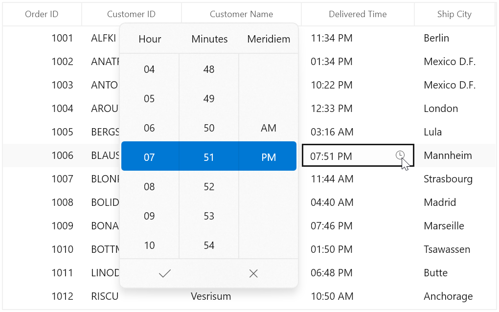
Change the format of time value
By using the DisplayTimeFormat property, you can edit and display the selected time in various formats such as hour, minutes, seconds, meridiem, 12-Hour and 24-Hour format. The default value of DisplayTimeFormat property is hh:mm tt. For example in the below image, the TimeColumn has the DisplayTimeFormat set to HH:mm tt.
<dataGrid:SfDataGrid x:Name="dataGrid"
                       ItemsSource="{Binding Orders}"
                       AutoGenerateColumns="False"
                       ColumnWidthMode="Star"
                       AllowEditing="True" >
    <dataGrid:SfDataGrid.Columns>
        <dataGrid:GridTextColumn MappingName="OrderID" HeaderText="Order ID" />
        <dataGrid:GridTextColumn MappingName="CustomerID" HeaderText="Customer ID" />
        <dataGrid:GridTextColumn MappingName="CustomerName" HeaderText="Customer Name" />
        <dataGrid:GridTimeColumn MappingName="DeliveredTime" HeaderText="Delivered Time" DisplayTimeFormat="HH:mm tt" />
        <dataGrid:GridTextColumn MappingName="ShipCity" HeaderText="Ship City" />
    </dataGrid:SfDataGrid.Columns>
</dataGrid:SfDataGrid>this.dataGrid.Columns.Add(new GridTimeColumn() { HeaderText = "Delivered Time", MappingName = "DeliveredTime" , DisplayTimeFormat="HH:mm tt" });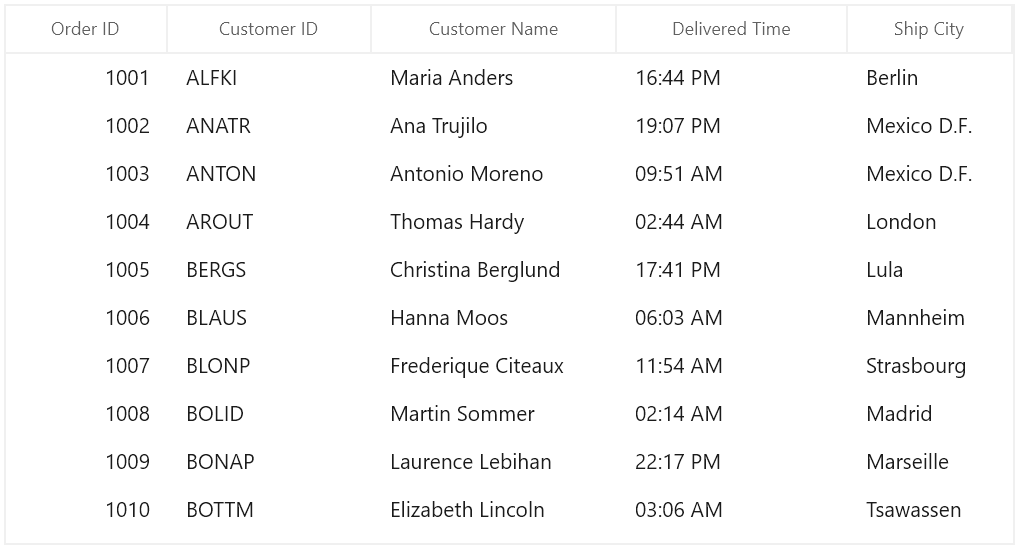
Null value support
GridTimeColumn provides support to restrict or allow null value in columns based on AllowNull property. The default value of AllowNull property is True. Instead of displaying null values, you can display hint text using the PlaceholderText property.
The PlaceholderText is not displayed, when the AllowNull is set to false. The default value of PlaceholderText property is select a time.
<dataGrid:SfDataGrid x:Name="dataGrid"
                       ItemsSource="{Binding Orders}"
                       AutoGenerateColumns="False"
                       ColumnWidthMode="Star"
                       AllowEditing="True" >
    <dataGrid:SfDataGrid.Columns>
        <dataGrid:GridTextColumn MappingName="OrderID" HeaderText="Order ID" />
        <dataGrid:GridTextColumn MappingName="CustomerID" HeaderText="Customer ID" />
        <dataGrid:GridTextColumn MappingName="CustomerName" HeaderText="Customer Name" />
        <dataGrid:GridTimeColumn MappingName="DeliveredTime" HeaderText="Delivered Time" PlaceholderText="Change the Time" />
        <dataGrid:GridTextColumn MappingName="ShipCity" HeaderText="Ship City" />
    </dataGrid:SfDataGrid.Columns>
</dataGrid:SfDataGrid>this.dataGrid.Columns.Add(new GridTimeColumn() { HeaderText = "Delivered Time", MappingName = "DeliveredTime" PlaceholderText="Change the Time" });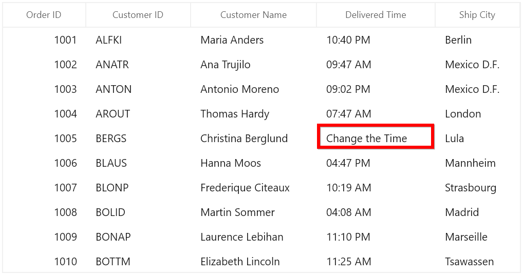
Setting time value range
You can restrict and display the input value within the range using the MinTime and MaxTime properties.
Editing support
GridTimeColumn provides support to edit the time value in different modes.
Normal
To allow editing and perform input validation only after editing is completed, set the EditMode property value as Normal.
For more information refer here.
Mask
To allow editing and perform input validation as user edits the time value, set EditMode property value as Mask.
The default value for EditMode property is Mask.
For more information refer here.
None
You can disable the editing in edit part by setting the EditMode Property as None.
Select time as you scroll spinner
If you want to hide the submit button and select the time directly from the drop-down time spinner without clicking Ok, set the ShowSubmitButtons property value as false. The default value of ShowSubmitButtons property is true.
<dataGrid:SfDataGrid x:Name="dataGrid"
                       ItemsSource="{Binding Orders}"
                       AutoGenerateColumns="False"
                       ColumnWidthMode="Star"
                       AllowEditing="True" >
    <dataGrid:SfDataGrid.Columns>
        <dataGrid:GridTextColumn MappingName="OrderID" HeaderText="Order ID" />
        <dataGrid:GridTextColumn MappingName="CustomerID" HeaderText="Customer ID" />
        <dataGrid:GridTextColumn MappingName="CustomerName" HeaderText="Customer Name" />
        <dataGrid:GridTimeColumn MappingName="DeliveredTime" HeaderText="Delivered Time" ShowSubmitButtons="False" />
        <dataGrid:GridTextColumn MappingName="ShipCity" HeaderText="Ship City" />
    </dataGrid:SfDataGrid.Columns>
</dataGrid:SfDataGrid>this.dataGrid.Columns.Add(new GridTimeColumn() { HeaderText = "Delivered Time", MappingName = "DeliveredTime", ShowSubmitButtons="False" });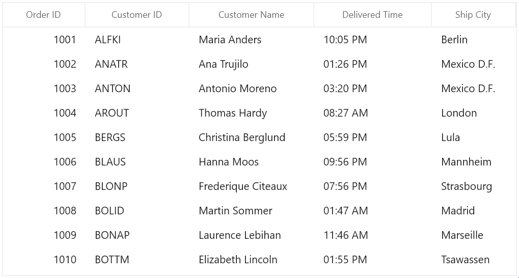
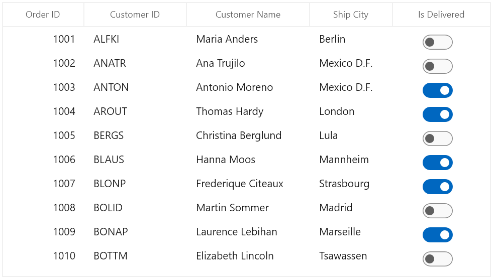
GridToggleSwitchColumn
GridToggleSwitchColumn derived from GridColumn and it is used to display Boolean type data. It hosts ToggleSwitch element as GridCell content.
<dataGrid:SfDataGrid x:Name="sfDataGrid"
                       AutoGenerateColumns="False"
                       AllowEditing="True"
                       ItemsSource="{Binding OrderInfoCollection}">
    <dataGrid:SfDataGrid.Columns>
        <dataGrid:GridToggleSwitchColumn HeaderText="IsDelivered" MappingName="IsDelivered"/>
    </dataGrid:SfDataGrid.Columns>
</dataGrid:SfDataGrid>this.sfDataGrid.Columns.Add(new GridToggleSwitchColumn() { MappingName = "IsDelivered", HeaderText = "IsDelivered" });ToggleSwitch Content Settings
GridToggleSwitchColumn provides support to display the text, while ToggleSwitch is in ON/OFF state based on OnContent and OffContent properties.
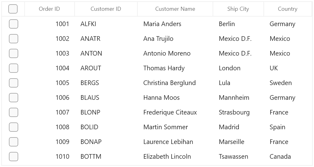
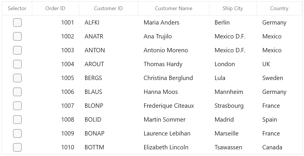
GridCheckBoxSelectorColumn
SfDataGrid allows you to select or deselect individual rows through CheckBox using the GridCheckBoxSelectorColumn, which is not bound with data object from underlying data source, and it can be added like normal columns. The selector column supports row selection alone, and selection in selector column works based on SelectionMode.
<dataGrid:SfDataGrid x:Name="dataGrid"
                       AutoGenerateColumns="False"
                       ItemsSource="{Binding Orders}">
      <dataGrid:SfDataGrid.Columns>
            <dataGrid:GridCheckBoxSelectorColumn MappingName="SelectorColumn"
                                                   Width="50"/>
      </dataGrid:SfDataGrid.Columns>
</dataGrid:SfDataGrid>this.dataGrid.Columns.Add(new GridCheckBoxSelectorColumn()
{
MappingName = "SelectorColumn",
Width = 50
});By default, check box is displayed in header of selector column, which is used to select or deselect all the rows in the datagrid.
Text on column header
You can display text instead of check box in header of selector column by setting the AllowCheckBoxOnHeader property to False.
<dataGrid:SfDataGrid x:Name="dataGrid"
                       AutoGenerateColumns="False"
                       ItemsSource="{Binding Orders}">
      <dataGrid:SfDataGrid.Columns>
            <dataGrid:GridCheckBoxSelectorColumn MappingName="SelectorColumn"
                                                   AllowCheckBoxOnHeader="False"
                                                   HeaderText="Selector"
                                                   Width="70"/>
      </dataGrid:SfDataGrid.Columns>
</dataGrid:SfDataGrid>this.dataGrid.Columns.Add(new GridCheckBoxSelectorColumn()
{
HeaderText = "Selector",
MappingName = "SelectorColumn",
AllowCheckBoxOnHeader = false ,
Width = 70
});
Styling selector column
The style of check box in record cells and header can be customized by changing the default template of check box.
<dataGrid:SfDataGrid x:Name="dataGrid"
AutoGenerateColumns="False"
ItemsSource="{Binding Orders}">
<dataGrid:SfDataGrid.Columns>
<dataGrid:GridCheckBoxSelectorColumn MappingName="SelectorColumn"
Width="80"/>
</dataGrid:SfDataGrid.Columns>
<Syncfusion:SfDataGrid.Resources>
<Style TargetType="CheckBox">
<Setter Property="Background" Value="Transparent" />
<Setter Property="Foreground" Value="{ThemeResource SystemControlForegroundBaseHighBrush}"/>
<Setter Property="Padding" Value="8,5,0,0" />
<Setter Property="HorizontalAlignment" Value="Left" />
<Setter Property="VerticalAlignment" Value="Center" />
<Setter Property="HorizontalContentAlignment" Value="Left"/>
<Setter Property="VerticalContentAlignment" Value="Top"/>
<Setter Property="FontFamily" Value="{ThemeResource ContentControlThemeFontFamily}" />
<Setter Property="FontSize" Value="{ThemeResource ControlContentThemeFontSize}" />
<Setter Property="MinWidth" Value="120" />
<Setter Property="MinHeight" Value="32" />
<Setter Property="UseSystemFocusVisuals" Value="True" />
<Setter Property="Template">
<Setter.Value>
<ControlTemplate TargetType="CheckBox">
<Grid Background="{TemplateBinding Background}"
BorderBrush="{TemplateBinding BorderBrush}"
BorderThickness="{TemplateBinding BorderThickness}">
<VisualStateManager.VisualStateGroups>
<VisualStateGroup x:Name="CombinedStates">
<VisualState x:Name="UncheckedNormal" >
<Storyboard>
<ObjectAnimationUsingKeyFrames Storyboard.TargetName="NormalRectangle"
Storyboard.TargetProperty="Stroke">
<DiscreteObjectKeyFrame KeyTime="0" Value="Red" />
</ObjectAnimationUsingKeyFrames>
</Storyboard>
</VisualState>
<VisualState x:Name="UncheckedPointerOver">
<Storyboard>
<ObjectAnimationUsingKeyFrames Storyboard.TargetName="NormalRectangle"
Storyboard.TargetProperty="Stroke">
<DiscreteObjectKeyFrame KeyTime="0"
Value="{ThemeResource SystemControlHighlightBaseHighBrush}" />
</ObjectAnimationUsingKeyFrames>
</Storyboard>
</VisualState>
<VisualState x:Name="UncheckedPressed">
<Storyboard>
<ObjectAnimationUsingKeyFrames Storyboard.TargetName="NormalRectangle"
Storyboard.TargetProperty="Fill">
<DiscreteObjectKeyFrame KeyTime="0"
Value="{ThemeResource SystemControlBackgroundBaseMediumBrush}" />
</ObjectAnimationUsingKeyFrames>
<ObjectAnimationUsingKeyFrames Storyboard.TargetName="NormalRectangle"
Storyboard.TargetProperty="Stroke">
<DiscreteObjectKeyFrame KeyTime="0"
Value="{ThemeResource SystemControlHighlightTransparentBrush}" />
</ObjectAnimationUsingKeyFrames>
<DoubleAnimation Storyboard.TargetName="NormalRectangle"
Storyboard.TargetProperty="StrokeThickness"
To="{ThemeResource CheckBoxCheckedStrokeThickness}"
Duration="0" />
</Storyboard>
</VisualState>
<VisualState x:Name="UncheckedDisabled">
<Storyboard>
<ObjectAnimationUsingKeyFrames Storyboard.TargetName="NormalRectangle"
Storyboard.TargetProperty="Fill">
<DiscreteObjectKeyFrame KeyTime="0" Value="Transparent" />
</ObjectAnimationUsingKeyFrames>
<ObjectAnimationUsingKeyFrames Storyboard.TargetName="NormalRectangle"
Storyboard.TargetProperty="Stroke">
<DiscreteObjectKeyFrame KeyTime="0"
Value="{ThemeResource SystemControlDisabledBaseLowBrush}" />
</ObjectAnimationUsingKeyFrames>
<ObjectAnimationUsingKeyFrames Storyboard.TargetName="ContentPresenter"
Storyboard.TargetProperty="Foreground">
<DiscreteObjectKeyFrame KeyTime="0"
Value="{ThemeResource SystemControlDisabledBaseLowBrush}" />
</ObjectAnimationUsingKeyFrames>
</Storyboard>
</VisualState>
<VisualState x:Name="CheckedNormal">
<Storyboard>
<ObjectAnimationUsingKeyFrames Storyboard.TargetName="NormalRectangle"
Storyboard.TargetProperty="Fill">
<DiscreteObjectKeyFrame KeyTime="0" Value="Transparent" />
</ObjectAnimationUsingKeyFrames>
<ObjectAnimationUsingKeyFrames Storyboard.TargetName="NormalRectangle"
Storyboard.TargetProperty="Stroke">
<DiscreteObjectKeyFrame KeyTime="0" Value="Red" />
</ObjectAnimationUsingKeyFrames>
<ObjectAnimationUsingKeyFrames Storyboard.TargetName="CheckGlyph"
Storyboard.TargetProperty="Foreground">
<DiscreteObjectKeyFrame KeyTime="0" Value="Black" />
</ObjectAnimationUsingKeyFrames>
<DoubleAnimation Storyboard.TargetName="CheckGlyph"
Storyboard.TargetProperty="Opacity"
To="1" Duration="0" />
</Storyboard>
</VisualState>
<VisualState x:Name="CheckedPointerOver">
<Storyboard>
<ObjectAnimationUsingKeyFrames Storyboard.TargetName="NormalRectangle"
Storyboard.TargetProperty="Fill">
<DiscreteObjectKeyFrame KeyTime="0"
Value="{ThemeResource SystemControlHighlightAccentBrush}" />
</ObjectAnimationUsingKeyFrames>
<ObjectAnimationUsingKeyFrames Storyboard.TargetName="NormalRectangle"
Storyboard.TargetProperty="Stroke">
<DiscreteObjectKeyFrame KeyTime="0"
Value="{ThemeResource SystemControlHighlightBaseHighBrush}" />
</ObjectAnimationUsingKeyFrames>
<DoubleAnimation Storyboard.TargetName="CheckGlyph"
Storyboard.TargetProperty="Opacity"
To="1" Duration="0" />
</Storyboard>
</VisualState>
<VisualState x:Name="CheckedPressed">
<Storyboard>
<ObjectAnimationUsingKeyFrames Storyboard.TargetName="NormalRectangle"
Storyboard.TargetProperty="Fill">
<DiscreteObjectKeyFrame KeyTime="0"
Value="{ThemeResource SystemControlHighlightBaseMediumBrush}" />
</ObjectAnimationUsingKeyFrames>
<ObjectAnimationUsingKeyFrames Storyboard.TargetName="NormalRectangle"
Storyboard.TargetProperty="Stroke">
<DiscreteObjectKeyFrame KeyTime="0"
Value="{ThemeResource SystemControlHighlightTransparentBrush}" />
</ObjectAnimationUsingKeyFrames>
<DoubleAnimation Storyboard.TargetName="NormalRectangle"
Storyboard.TargetProperty="StrokeThickness"
To="{ThemeResource CheckBoxCheckedStrokeThickness}"
Duration="0" />
<DoubleAnimation Storyboard.TargetName="CheckGlyph"
Storyboard.TargetProperty="Opacity"
To="1" Duration="0" />
</Storyboard>
</VisualState>
<VisualState x:Name="CheckedDisabled">
<Storyboard>
<ObjectAnimationUsingKeyFrames Storyboard.TargetName="NormalRectangle"
Storyboard.TargetProperty="Fill">
<DiscreteObjectKeyFrame KeyTime="0" Value="Transparent" />
</ObjectAnimationUsingKeyFrames>
<ObjectAnimationUsingKeyFrames Storyboard.TargetName="NormalRectangle"
Storyboard.TargetProperty="Stroke">
<DiscreteObjectKeyFrame KeyTime="0"
Value="{ThemeResource SystemControlDisabledBaseLowBrush}" />
</ObjectAnimationUsingKeyFrames>
<ObjectAnimationUsingKeyFrames Storyboard.TargetName="CheckGlyph"
Storyboard.TargetProperty="Foreground">
<DiscreteObjectKeyFrame KeyTime="0"
Value="{ThemeResource SystemControlDisabledBaseLowBrush}" />
</ObjectAnimationUsingKeyFrames>
<ObjectAnimationUsingKeyFrames Storyboard.TargetName="ContentPresenter"
Storyboard.TargetProperty="Foreground">
<DiscreteObjectKeyFrame KeyTime="0"
Value="{ThemeResource SystemControlDisabledBaseLowBrush}" />
</ObjectAnimationUsingKeyFrames>
<DoubleAnimation Storyboard.TargetName="CheckGlyph"
Storyboard.TargetProperty="Opacity"
To="1" Duration="0" />
</Storyboard>
</VisualState>
<VisualState x:Name="IndeterminateNormal">
<Storyboard>
<ObjectAnimationUsingKeyFrames Storyboard.TargetName="NormalRectangle"
Storyboard.TargetProperty="Stroke">
<DiscreteObjectKeyFrame KeyTime="0" Value="Red" />
</ObjectAnimationUsingKeyFrames>
<ObjectAnimationUsingKeyFrames Storyboard.TargetName="NormalRectangle"
Storyboard.TargetProperty="Fill">
<DiscreteObjectKeyFrame KeyTime="0"
Value="{ThemeResource SystemControlHighlightTransparentBrush}" />
</ObjectAnimationUsingKeyFrames>
<ObjectAnimationUsingKeyFrames Storyboard.TargetName="CheckGlyph"
Storyboard.TargetProperty="Foreground">
<DiscreteObjectKeyFrame KeyTime="0" Value="Blue" />
</ObjectAnimationUsingKeyFrames>
<ObjectAnimationUsingKeyFrames Storyboard.TargetName="CheckGlyph"
Storyboard.TargetProperty="Glyph">
<DiscreteObjectKeyFrame KeyTime="0" Value="" />
</ObjectAnimationUsingKeyFrames>
<DoubleAnimation Storyboard.TargetName="CheckGlyph"
Storyboard.TargetProperty="Opacity"
To="1" Duration="0" />
</Storyboard>
</VisualState>
<VisualState x:Name="IndeterminatePointerOver">
<Storyboard>
<ObjectAnimationUsingKeyFrames Storyboard.TargetName="NormalRectangle"
Storyboard.TargetProperty="Stroke">
<DiscreteObjectKeyFrame KeyTime="0"
Value="{ThemeResource SystemControlHighlightAccentBrush}" />
</ObjectAnimationUsingKeyFrames>
<ObjectAnimationUsingKeyFrames Storyboard.TargetName="NormalRectangle"
Storyboard.TargetProperty="Fill">
<DiscreteObjectKeyFrame KeyTime="0"
Value="{ThemeResource SystemControlHighlightTransparentBrush}" />
</ObjectAnimationUsingKeyFrames>
<ObjectAnimationUsingKeyFrames Storyboard.TargetName="CheckGlyph"
Storyboard.TargetProperty="Foreground">
<DiscreteObjectKeyFrame KeyTime="0"
Value="{ThemeResource SystemControlForegroundBaseHighBrush}" />
</ObjectAnimationUsingKeyFrames>
<ObjectAnimationUsingKeyFrames Storyboard.TargetName="CheckGlyph"
Storyboard.TargetProperty="Glyph">
<DiscreteObjectKeyFrame KeyTime="0" Value="" />
</ObjectAnimationUsingKeyFrames>
<DoubleAnimation Storyboard.TargetName="CheckGlyph"
Storyboard.TargetProperty="Opacity"
To="1" Duration="0" />
</Storyboard>
</VisualState>
<VisualState x:Name="IndeterminatePressed">
<Storyboard>
<ObjectAnimationUsingKeyFrames Storyboard.TargetName="NormalRectangle"
Storyboard.TargetProperty="Stroke">
<DiscreteObjectKeyFrame KeyTime="0"
Value="{ThemeResource SystemControlHighlightBaseMediumBrush}" />
</ObjectAnimationUsingKeyFrames>
<ObjectAnimationUsingKeyFrames Storyboard.TargetName="NormalRectangle"
Storyboard.TargetProperty="Fill">
<DiscreteObjectKeyFrame KeyTime="0"
Value="{ThemeResource SystemControlHighlightTransparentBrush}" />
</ObjectAnimationUsingKeyFrames>
<ObjectAnimationUsingKeyFrames Storyboard.TargetName="CheckGlyph"
Storyboard.TargetProperty="Foreground">
<DiscreteObjectKeyFrame KeyTime="0"
Value="{ThemeResource SystemControlForegroundBaseMediumBrush}" />
</ObjectAnimationUsingKeyFrames>
<ObjectAnimationUsingKeyFrames Storyboard.TargetName="CheckGlyph"
Storyboard.TargetProperty="Glyph">
<DiscreteObjectKeyFrame KeyTime="0" Value="" />
</ObjectAnimationUsingKeyFrames>
<DoubleAnimation Storyboard.TargetName="CheckGlyph"
Storyboard.TargetProperty="Opacity"
To="1" Duration="0" />
</Storyboard>
</VisualState>
<VisualState x:Name="IndeterminateDisabled">
<Storyboard>
<ObjectAnimationUsingKeyFrames Storyboard.TargetName="NormalRectangle"
Storyboard.TargetProperty="Fill">
<DiscreteObjectKeyFrame KeyTime="0" Value="Transparent" />
</ObjectAnimationUsingKeyFrames>
<ObjectAnimationUsingKeyFrames Storyboard.TargetName="NormalRectangle"
Storyboard.TargetProperty="Stroke">
<DiscreteObjectKeyFrame KeyTime="0"
Value="{ThemeResource SystemControlDisabledBaseLowBrush}" />
</ObjectAnimationUsingKeyFrames>
<ObjectAnimationUsingKeyFrames Storyboard.TargetName="CheckGlyph"
Storyboard.TargetProperty="Foreground">
<DiscreteObjectKeyFrame KeyTime="0"
Value="{ThemeResource SystemControlDisabledBaseLowBrush}" />
</ObjectAnimationUsingKeyFrames>
<ObjectAnimationUsingKeyFrames Storyboard.TargetName="ContentPresenter"
Storyboard.TargetProperty="Foreground">
<DiscreteObjectKeyFrame KeyTime="0"
Value="{ThemeResource SystemControlDisabledBaseLowBrush}" />
</ObjectAnimationUsingKeyFrames>
<ObjectAnimationUsingKeyFrames Storyboard.TargetName="CheckGlyph"
Storyboard.TargetProperty="Glyph">
<DiscreteObjectKeyFrame KeyTime="0" Value="" />
</ObjectAnimationUsingKeyFrames>
<DoubleAnimation Storyboard.TargetName="CheckGlyph"
Storyboard.TargetProperty="Opacity"
To="1" Duration="0" />
</Storyboard>
</VisualState>
</VisualStateGroup>
</VisualStateManager.VisualStateGroups>
<Grid.ColumnDefinitions>
<ColumnDefinition Width="20" />
<ColumnDefinition Width="*" />
</Grid.ColumnDefinitions>
<Grid VerticalAlignment="Top" Height="32">
<Rectangle x:Name="NormalRectangle"
Fill="Transparent"
Stroke="{ThemeResource SystemControlForegroundBaseMediumHighBrush}"
StrokeThickness="{ThemeResource CheckBoxBorderThemeThickness}"
UseLayoutRounding="False"
Height="20"
Width="20" />
<FontIcon x:Name="CheckGlyph"
FontFamily="{ThemeResource SymbolThemeFontFamily}"
Glyph=""
FontSize="20"
Foreground="Green"
Opacity="0" />
</Grid>
<ContentPresenter x:Name="ContentPresenter"
ContentTemplate="{TemplateBinding ContentTemplate}"
ContentTransitions="{TemplateBinding ContentTransitions}"
Content="{TemplateBinding Content}"
Margin="{TemplateBinding Padding}"
HorizontalAlignment="{TemplateBinding HorizontalContentAlignment}"
VerticalAlignment="{TemplateBinding VerticalContentAlignment}"
Grid.Column="1"
AutomationProperties.AccessibilityView="Raw"
TextWrapping="Wrap" />
</Grid>
</ControlTemplate>
</Setter.Value>
</Setter>
</Style>
</Syncfusion:SfDataGrid.Resources>
</dataGrid:SfDataGrid>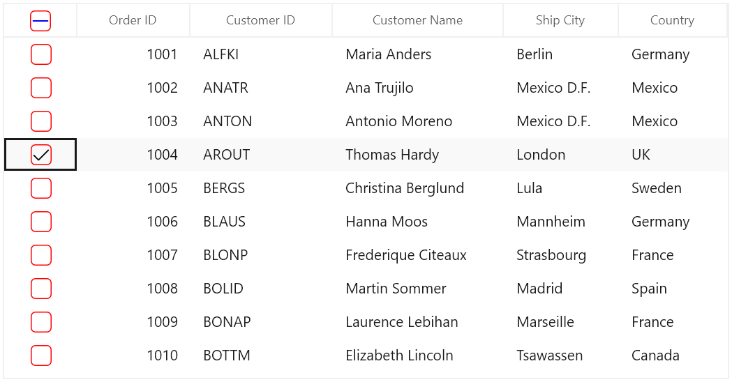
Limitations
The following are the limitations of GridCheckBoxSelectorColumn:
- Selector column does not support cell selection.
- Selector column does not support data operations like sorting, filtering, and grouping.
- Selector column will be excluded in operations like printing and exporting.
- Selector column does not have filter row support.
Custom column support
SfDataGrid allows you to create your own column by overriding predefined column type or creating a new custom column.
Customize column renderer
SfDataGrid allows you to customize the column related operations like key navigation and UI related interactions by overriding the corresponding renderer associated with the column. Each column has its own renderer with set of virtual methods for handling the column level operations.
Below table lists the available cell types for columns and its renderers.
| Column Name | Renderer | Cell Type |
|---|---|---|
| GridTextColumn | TextBox | |
| GridNumericColumn | Numeric | |
| GridDateColumn | DateTimeOffset | |
| GridCheckBoxColumn | CheckBox | |
| GridTemplateColumn | Template | |
| GridTimeColumn | Time | |
| GridImageColumn | Image | |
| GridUnBoundColumn | UnBoundTextColumn UnBoundTemplateColumn | |
| GridComboBoxColumn | SfComboBox | |
| GridHyperlinkColumn | HyperlinkButton | |
| GridCheckBoxSelectorColumn | Selector | |
| GridToggleSwitchColumn | ToggleSwitch |
Below code, creates the GridCellTextBoxRendererExt to change the foreground of CustomerID column and replacing created renderer to CellRenderers.
this.dataGrid.CellRenderers.Remove("TextBox");
this.dataGrid.CellRenderers.Add("TextBox", new GridCellTextBoxRendererExt());

public class GridCellTextBoxRendererExt: GridCellTextBoxRenderer
{

    public override void OnInitializeDisplayElement(DataColumnBase dataColumn, TextBlock uiElement, object dataContext)
    {
        base.OnInitializeDisplayElement(dataColumn, uiElement, dataContext);

        if (dataColumn.GridColumn.MappingName.Equals("CustomerID"))
            uiElement.Foreground = new SolidColorBrush(Colors.Blue);
    }

    public override void OnUpdateDisplayBinding(DataColumnBase dataColumn, TextBlock uiElement, object dataContext)
    {
        base.OnUpdateDisplayBinding(dataColumn, uiElement, dataContext);

        if (dataColumn.GridColumn.MappingName.Equals("CustomerID"))
            uiElement.Foreground = new SolidColorBrush(Colors.Blue);
    }
}
Creating new column and renderer
You can create a new column by deriving GridColumn, rendered in UI using customized CellType using GridVirtualizingCellRenderer.
Below steps to create custom column in SfDataGrid.
- Creating custom column
- Creating renderer
- Adding the custom renderer to SfDataGrid.CellRenderers collection
- Loading custom column
How To
Restrict the input content length
You can restrict the range of input using MaxLength property on GridColumn in below ways.
- Using Converter property in DisplayBinding and ValueBinding
- Using control style
- Overriding existing cell types
Using Converter
You can restrict the length of user input in both display and edit element using Converter using DisplayBinding and ValueBinding.
public class MaxLengthConverter : IValueConverter
{

    public object Convert(object value, Type targetType, object parameter, string language)
    {

        // Define maxLength for column
        int maxLength = 5;

        // Get the ColumnValue
        var columnValue = System.Convert.ToString(value);

        if (columnValue.Length < maxLength)
            return columnValue;

        else
            return columnValue.Substring(0, maxLength);
    }

    public object ConvertBack(object value, Type targetType, object parameter, string language)
    {
        return value;
    }
}<Page.Resources>
<local:MaxLengthConverter x:Key="converter" />
</Page.Resources>
<dataGrid:SfDataGrid x:Name="dataGrid"
AutoGenerateColumns="False"
ItemsSource="{Binding Orders}">
<dataGrid:SfDataGrid.Columns>
<dataGrid:GridTextColumn DisplayBinding="{Binding CustomerName,
Converter={StaticResource converter}}"
HeaderText="Customer Name"
MappingName="CustomerName"
ValueBinding="{Binding CustomerName,
Converter={StaticResource converter}}" />
</dataGrid:SfDataGrid.Columns>
</dataGrid:SfDataGrid>Using control style
You can set the MaxLength property in edit mode by writing style of TargetType edit element of the corresponding column.
NOTE
TextBlock does not have the MaxLength property. Therefore, you can use the converter to format in display.
<Page.Resources>
    <Style TargetType="TextBox">
        <Setter Property="MaxLength" Value="7" />
    </Style>
</Page.Resources>

<dataGrid:SfDataGrid x:Name="dataGrid"
                       AutoGenerateColumns="False"
                       ItemsSource="{Binding Orders}">
    <dataGrid:SfDataGrid.Columns>
        <dataGrid:GridTextColumn  MappingName="CustomerName"/>
    </dataGrid:SfDataGrid.Columns>
</dataGrid:SfDataGrid>
Overriding existing cell types
You can set the MaxLength property to the edit element of the particular column by overriding existing cell types.
Below code, overrides the OnInitializeEditElement method of the corresponding renderer and set the MaxLength to the UIElement and add the renderer to SfDataGrid.CellRenderers collection.
this.dataGrid.CellRenderers.Remove("TextBox");
this.dataGrid.CellRenderers.Add("TextBox", new GridCellTextBoxRendererExt());

public class GridCellTextBoxRendererExt : GridCellTextBoxRenderer
{

    public override void OnInitializeEditElement(DataColumnBase dataColumn, TextBox uiElement, object dataContext)
    {

        if (dataColumn.GridColumn != null && dataColumn.GridColumn.MappingName == "EmployeeName")
        {
            uiElement.MaxLength = 7;
        }

        else
        {
            uiElement.MaxLength = 0;
        }
        base.OnInitializeEditElement(dataColumn, uiElement, dataContext);
    }
}