How can I help you?
XPTaskBar Box Settings in Windows Forms xp taskbar (XPTaskBar)
4 Feb 20255 minutes to read
This section discusses the appearance and behavior settings of the XPTaskBar Box.
Header settings
This section lists the properties used for customizing the header of the XPTaskBar Box.
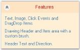
The Header of the XPTaskBar Box contains the Collapse button and text. The header text can be changed using the Text property of the XPTaskBar Box. The other properties are discussed below.
this.xpTaskBarBox1.HeaderBackColor = System.Drawing.Color.Bisque

this.xpTaskBarBox1.HeaderForeColor = System.Drawing.Color.Red;

this.xpTaskBarBox1.HeaderDirection = Syncfusion.Windows.Forms.Tools.XPTaskBarBox.HeaderDirectionFormat.RightToLeft;

this.xpTaskBarBox1.HeaderFont = new System.Drawing.Font("Arial", 9F, System.Drawing.FontStyle.Regular, System.Drawing.GraphicsUnit.Point, ((System.Byte)(0)));

this.xpTaskBarBox1.HeaderTextAlign = System.Drawing.StringAlignment.Center;

this.xpTaskBarBox1.ClipHeaderText = true;Me.xpTaskBarBox1.HeaderBackColor = System.Drawing.Color.Bisque
Me.xpTaskBarBox1.HeaderForeColor = System.Drawing.Color.Red
Me.xpTaskBarBox1.HeaderDirection = Syncfusion.Windows.Forms.Tools.XPTaskBarBox.HeaderDirectionFormat.RightToLeft
Me.xpTaskBarBox1.HeaderFont = New System.Drawing.Font("Arial", 9F, System.Drawing.FontStyle.Regular, System.Drawing.GraphicsUnit.Point, (CByte(0)))
Me.xpTaskBarBox1.HeaderTextAlign = System.Drawing.StringAlignment.Center
Me.xpTaskBarBox1.ClipHeaderText = TrueButton settings
This section discusses the button settings of the XPTaskBar Box.
The collapsed button is used to expand or collapse the XPTaskBar Items. The following table lists the properties associated with collapsing or expanding the XPTaskBar Box.
this.xpTaskBarBox1.Collapsed = true;

this.xpTaskBarBox1.ShowCollapseButton = true;

this.xpTaskBarBox1.ToggleByButton = true;Me.xpTaskBarBox1.Collapsed = True
Me.xpTaskBarBox1.ShowCollapseButton = True
Me.xpTaskBarBox1.ToggleByButton = True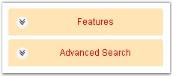
The methods associated with the above properties are given below.
Methods table
| Methods | Description |
|---|---|
| LoadBoxExpandedStates | Loads the expanded child taskbar boxes from the AppStateSerializer |
| SaveBoxExpandedStates | Saves the expanded child taskbar boxes to the AppStateSerializer. |
Animation settings
Animation during expanding/collapsing of the Taskbar items in an XPTaskBar can be controlled using the following properties.
Animation can also be enabled while adding or removing any TaskBar items.
this.xpTaskBarBox1.AnimationDelay = 100;

this.xpTaskBarBox1.AnimationPositionsCount = 20;

this.xpTaskBarBox1.UseAdditionalAnimation = true;Me.xpTaskBarBox1.AnimationDelay = 100
Me.xpTaskBarBox1.AnimationPositionsCount = 20
Me.xpTaskBarBox1.UseAdditionalAnimation = True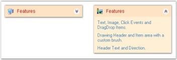
Mouse hover settings
This section discusses the mouse hover settings of the XPTaskBar control.
The position of the mouse with respect to the control can be known using the properties given below.
this.xpTaskBarBox1.HitTaskBoxArea= true;

this.xpTaskBarBox1.HeaderHit= true;Me.xpTaskBarBox1.HitTaskBoxArea = True
Me.xpTaskBarBox1.HeaderHit = TrueIntegrating Child controls to the XPTaskBar box
To host multiple controls inside the XPTaskBar Boxes, we prefer the Panel control. We can set the panel’s height using the PreferredChildPanelHeight property.
this.xpTaskBarBox1.PreferredChildPanelHeight = 35;Me.xpTaskBarBox1.PreferredChildPanelHeight = 35
PreferredChildPanelHeight = “35”
XPTaskBar- ToolTips
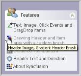
ToolTips can be provided for the TaskBar Items of the XPTaskBar Box. The interesting part is that tooltips can also be assigned for the disabled TaskBar Items.
The ToolTipText property of the XPTaskBar control can be used to set the text of the tooltip, while the tooltip can be displayed using the ShowToolTip property.
// Set the tooltip text for the XPTaskBar Item.

this.xpTaskBarBox1.Items[1].ToolTipText = "Header Image, Gradient Header Brush";

this.xpTaskBarBox1.ShowToolTip = true;
' Set the tooltip text for the XPTaskBar Item.
Me.xpTaskBarBox1.Items(1).ToolTipText = "Header Image, Gradient Header Brush"
Me.xpTaskBarBox1.ShowToolTip = True