Interactive Features in UWP Charts (SfChart)
7 Jan 202524 minutes to read
SfChart provides interactive features such as zooming, selection, and tracking data points.
The following interactive features are supported in SfChart.
- Tooltip
- TrackBall
- Visual Data Editing
- Zoom and Pan
- Selection
- Resizing Scrollbar
- CrossHair
Tooltip
The Tooltip feature allows you to display any information over a ChartSeries. It is used in conjunction with the pointer or at the data point position. It appears when the mouse hovers over any chart segment. It is set to display the metadata of the particular segment or data point.
By default, a small box containing the data points y values are displayed as the Tooltip. The y values vary depending on the ChartSeries. For example, a single y value is usually displayed in the Column and BarSeries. In the FinancialSeries, high, low, open, and close values are displayed in Tooltip.
The tooltip will be visible if you enable ShowTooltip property as in the below code snippet.
<syncfusion:ColumnSeries  ShowTooltip="True"

ItemsSource="{Binding Demands}"

XBindingPath="Demand"  YBindingPath="Year2010"/>

<syncfusion:ColumnSeries ItemsSource="{Binding Demands}"

ShowTooltip="True"

XBindingPath="Demand"  YBindingPath="Year2011"/>
ColumnSeries series1 = new ColumnSeries()
{
ItemsSource = new ViewModel().Demands,
XBindingPath = "Demand",
YBindingPath = "Year2010",
ShowTooltip = true
};
ColumnSeries series2 = new ColumnSeries()
{
ItemsSource = new ViewModel().Demands,
XBindingPath = "Demand",
YBindingPath = "Year2011",
ShowTooltip = true
};
chart.Series.Add(series1);
chart.Series.Add(series2);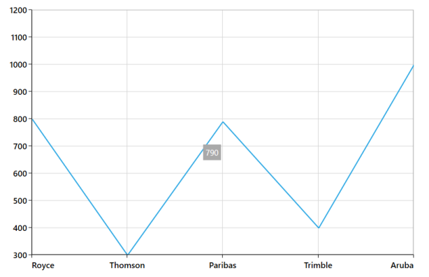
Customizing tooltip using ChartTooltipBehavior
The ChartTooltipBehavior is commonly used for all series to customize the tooltip. For customizing the tooltip, you can create an instance ChartTooltipBehavior and add it to the SfChart Behaviors collection.
The following properties are used to customize and configure tooltip which is available in the ChartTooltipBehavior.
-
EnableAnimation- Used to enable the animation when showing the tooltip. -
Position- Used to position the tooltip at the data point position or the cursor position. -
Style- Used to customize the fill and stroke of the tooltip. -
LabelStyle- Used to customize the tooltip label. -
HorizontalOffset- Used to position the tooltip at a distance from the data point or cursor position horizontally. -
VerticalOffset- Used to position the tooltip at a distance from the data point or cursor position vertically. -
HorizontalAlignment- Used to align the tooltip label at left, right and center of the data point position or cursor position horizontally. -
VerticalAlignment- Used to align the tooltip label at top, center and bottom of the data point position or cursor position vertically. -
ShowDuration- Used to set the amount of time that the tooltip remains visible in milliseconds. -
InitialShowDelay- Used to delay in milliseconds to show the tooltip once the user interacts with series.
<chart:SfChart.Behaviors>

<chart:ChartTooltipBehavior/>

</chart:SfChart.Behaviors>
SfChart chart = new SfChart();
ChartTooltipBehavior behavior = new ChartTooltipBehavior();
chart.Behaviors.Add(behavior);Positioning the tooltip
Tooltip can be positioned at the data point position or the cursor position using the Position property. The Auto will position the tooltip at the data point position and the Pointer will display the tooltip in conjunction with the mouse pointer itself when hovering the mouse inside any chart segment.
NOTE
By default, the tooltip
Positionis set to Auto.
The following code example explains positioning the tooltip at Pointer position.
<chart:SfChart.Behaviors>

<chart:ChartTooltipBehavior x:Name="chartTooltipBehavior" Position="Pointer"/>

</chart:SfChart.Behaviors>
SfChart chart = new SfChart();
...
ChartTooltipBehavior chartTooltipBehavior = new ChartTooltipBehavior();
chartTooltipBehavior.Position = TooltipPosition.Pointer;
chart.Behaviors.Add(chartTooltipBehavior);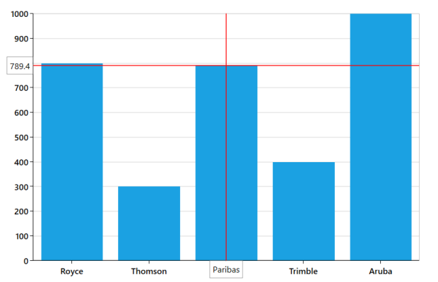
Customizing the tooltip background
The tooltip’s fill and stroke color can be customized using the Style property. To define a style for tooltip background, specify the style of TargetType as Path.
The following code example explains applying the style for tooltip.
<chart:SfChart.Resources>
    <Style TargetType="Path" x:Key="style">
       <Setter Property="Stroke" Value="Gray"/>
       <Setter Property="Fill" Value="Black"/>
    </Style>
</chart:SfChart.Resources>
...
<chart:SfChart.Behaviors>
    <chart:ChartTooltipBehavior LabelStyle = {StaticResource style}/>
</chart:SfChart.Behaviors>
SfChart chart = new SfChart();
Style style = new Style(typeof(Path));
style.Setters.Add(new Setter(Path.StrokeProperty, new SolidColorBrush(Colors.Gray)));
style.Setters.Add(new Setter(Path.FillProperty, new SolidColorBrush(Colors.Black)));
...
ChartTooltipBehavior tooltipBehavior = new ChartTooltipBehavior();
tooltipBehavior.Style = style;
chart.Behaviors.Add(tooltipBehavior);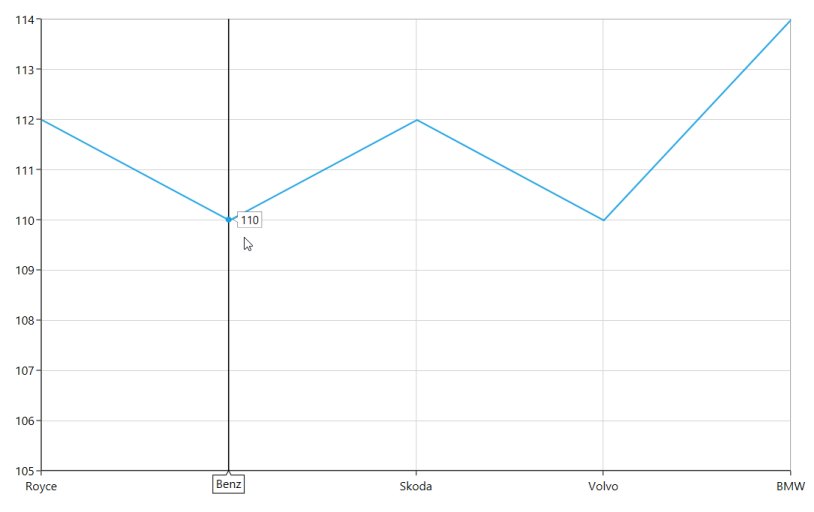
Customizing the tooltip label style
The tooltip label style can be customized using the LabelStyle property. To define a style for the tooltip label, specify the style of TargetType as TextBlock.
The following code example explains applying the style for a tooltip label.
<chart:SfChart.Resources>
    <Style TargetType="TextBlock" x:Key="labelStyle">
       <Setter Property="FontSize" Value="14"/>
       <Setter Property="Foreground" Value="Red"/>
    </Style>
</chart:SfChart.Resources>
...
<chart:SfChart.Behaviors>
   <chart:ChartTooltipBehavior LabelStyle = {StaticResource labelStyle}/>
</chart:SfChart.Behaviors>
SfChart chart = new SfChart();
Style labelStyle = new Style(typeof(TextBlock));
labelStyle.Setters.Add(new Setter(TextBlock.FontSizeProperty, 14d));
labelStyle.Setters.Add(new Setter(TextBlock.ForegroundProperty, new SolidColorBrush(Colors.Red)));
...
ChartTooltipBehavior tooltipBehavior = new ChartTooltipBehavior();
tooltipBehavior.LabelStyle = labelStyle;
chart.Behaviors.Add(tooltipBehavior);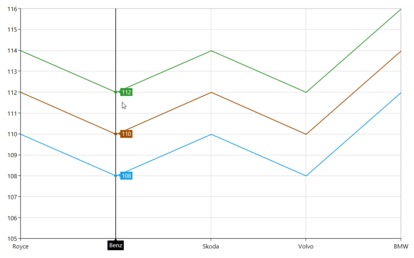
Customizing tooltip using ChartTooltip attached properties
Aligning the Tooltip
The tooltip can be aligned with respect to the cursor position using HorizontalAlignment and VerticalAlignment properties.
HorizontalAlignment
The following code example illustrates the positioning of tooltip to left of the cursor.
<Chart:ColumnSeries ShowTooltip="True" ItemsSource="{Binding Demands}"

Chart:ChartTooltip.HorizontalAlignment="Left"

XBindingPath="Demand"  YBindingPath="Year2010" />

<Chart:ColumnSeries ItemsSource="{Binding Demands}"

Chart:ChartTooltip.HorizontalAlignment="Left" ShowTooltip="True"

XBindingPath="Demand"  YBindingPath="Year2011"/>
ColumnSeries series1 = new ColumnSeries()
{
ItemsSource = new ViewModel().Demands,
XBindingPath = "Demand",
YBindingPath = "Year2010",
ShowTooltip = true
};
ChartTooltip.SetHorizontalAlignment(series1, HorizontalAlignment.Left);
ColumnSeries series2 = new ColumnSeries()
{
ItemsSource = new ViewModel().Demands,
XBindingPath = "Demand",
YBindingPath = "Year2011",
ShowTooltip = true
};
ChartTooltip.SetHorizontalAlignment(series2, HorizontalAlignment.Left);
chart.Series.Add(series1);
chart.Series.Add(series2);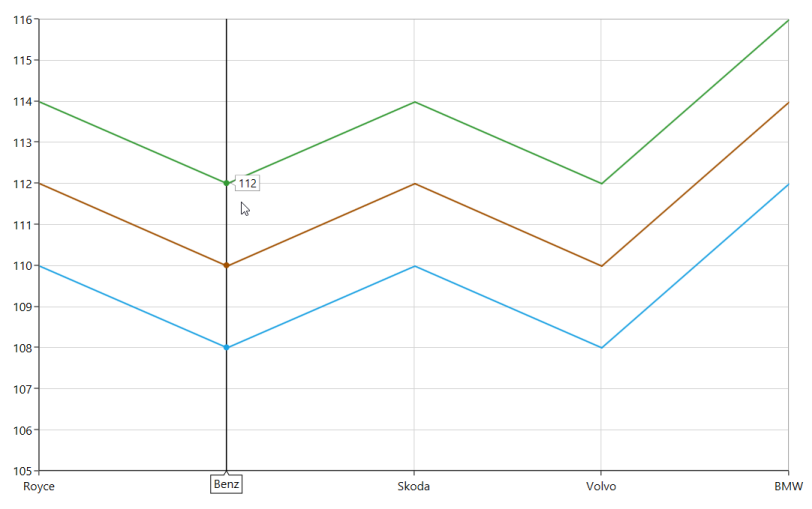
NOTE
By default the
HorizontalAlignmentis center for the tooltip.
VerticalAlignment
The following code example illustrates the positioning of tooltip to bottom of the cursor.
<Chart:ColumnSeries ShowTooltip="True" ItemsSource="{Binding Demands}"

Chart:ChartTooltip.VerticalAlignment="Bottom"

XBindingPath="Demand" YBindingPath="Year2010" />

<Chart:ColumnSeries ItemsSource="{Binding Demands}"

Chart:ChartTooltip.VerticalAlignment="Bottom"

ShowTooltip="True" XBindingPath="Demand"  YBindingPath="Year2011"/>
ColumnSeries series1 = new ColumnSeries()
{
ItemsSource = new ViewModel().Demands,
XBindingPath = "Demand",
YBindingPath = "Year2010",
ShowTooltip = true
};
ChartTooltip.SetVerticalAlignment(series1, VerticalAlignment.Bottom);
ColumnSeries series2 = new ColumnSeries()
{
ItemsSource = new ViewModel().Demands,
XBindingPath = "Demand",
YBindingPath = "Year2011",
ShowTooltip = true
};
ChartTooltip.SetVerticalAlignment(series2, VerticalAlignment.Bottom);
chart.Series.Add(series1);
chart.Series.Add(series2);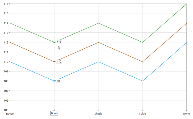
TooltipMargin
You can also set the distance for the margin to be positioned from the cursor using the TooltipMargin property as in the following code sample.
<Chart:ColumnSeries Label="2010" ShowTooltip="True"

ItemsSource="{Binding Demands}"   Interior="#777777"

Chart:ChartTooltip.TooltipMargin="25"

XBindingPath="Demand" YBindingPath="Year2010" />

<Chart:ColumnSeries Label="2011"  ItemsSource="{Binding Demands}"

Interior="#4A4A4A"

Chart:ChartTooltip.TooltipMargin="25"

ShowTooltip="True" XBindingPath="Demand"  YBindingPath="Year2011"/>
ColumnSeries series1 = new ColumnSeries()
{
ItemsSource = new ViewModel().Demands,
XBindingPath = "Demand",
YBindingPath = "Year2010",
ShowTooltip = true,
Interior = new SolidColorBrush(Color.FromRgb(0x77, 0x77, 0x77)),
Label = "2010"
};
ChartTooltip.SetTooltipMargin(series1, new Thickness(25));
ColumnSeries series2 = new ColumnSeries()
{
ItemsSource = new ViewModel().Demands,
XBindingPath = "Demand",
YBindingPath = "Year2011",
ShowTooltip = true,
Interior = new SolidColorBrush(Color.FromRgb(0x4A, 0x4A, 0x4A)),
Label = "2011"
};
ChartTooltip.SetTooltipMargin(series2, new Thickness(25));
chart.Series.Add(series1);
chart.Series.Add(series2);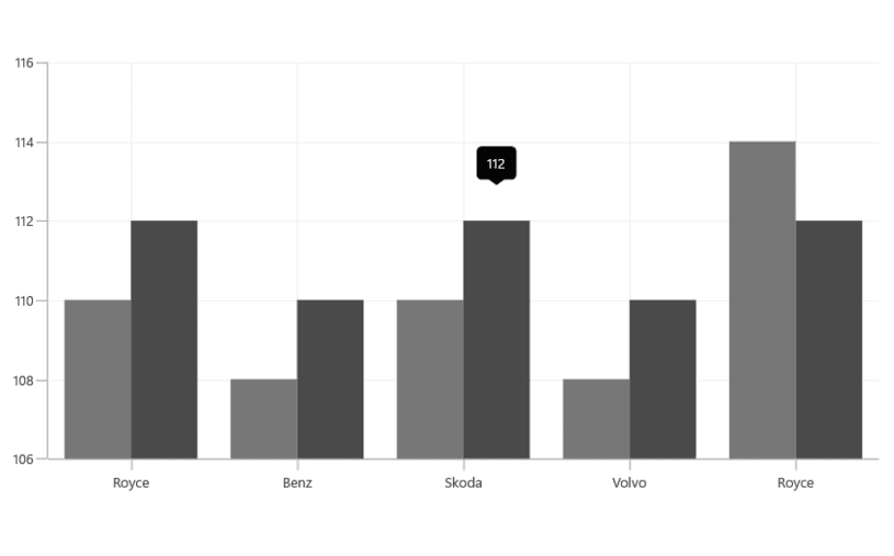
NOTE
By default the
VerticalAlignmentof the Tooltip is Top
VerticalOffset and HorizontalOffset
The tooltip can be positioned at a particular distance from the cursor horizontally using HorizontalOffset and vertically using VerticalOffset properties.
<Chart:ColumnSeries ShowTooltip="True"

ItemsSource="{Binding Demands}"

Chart:ChartTooltip.HorizontalOffset="40"

Chart:ChartTooltip.VerticalOffset="40"

XBindingPath="Demand" YBindingPath="Year2010" />

<Chart:ColumnSeries ItemsSource="{Binding Demands}"

Chart:ChartTooltip.HorizontalOffset="40"

Chart:ChartTooltip.VerticalOffset="40" ShowTooltip="True"

XBindingPath="Demand"  YBindingPath="Year2011"/>
ColumnSeries series1 = new ColumnSeries()
{
ItemsSource = new ViewModel().Demands,
XBindingPath = "Demand",
YBindingPath = "Year2010",
ShowTooltip = true,
Interior = new SolidColorBrush(Color.FromRgb(0x77, 0x77, 0x77)),
Label = "2010"
};
ChartTooltip.SetHorizontalOffset(series1, 40);
ChartTooltip.SetVerticalOffset(series1, 40);
ColumnSeries series2 = new ColumnSeries()
{
ItemsSource = new ViewModel().Demands,
XBindingPath = "Demand",
YBindingPath = "Year2011",
ShowTooltip = true,
Interior = new SolidColorBrush(Color.FromRgb(0x4A, 0x4A, 0x4A)),
Label = "2011"
};
ChartTooltip.SetHorizontalOffset(series2, 40);
ChartTooltip.SetVerticalOffset(series2, 40);
chart.Series.Add(series1);
chart.Series.Add(series2);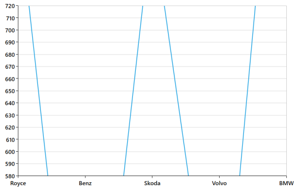
Tooltip Duration
The ShowDuration property in the ChartTooltip sets the duration time for the tooltip to be displayed in milliseconds.
The following code example demonstrates the duration of the tooltip set as 5 seconds.
<Chart:ColumnSeries ShowTooltip="True"

Chart:ChartTooltip.ShowDuration="5000"

ItemsSource="{Binding Demands}" Interior="#777777"

XBindingPath="Demand"  YBindingPath="Year2010">

</Chart:ColumnSeries>
ColumnSeries series = new ColumnSeries()
{
ItemsSource = new ViewModel().Demands,
XBindingPath = "Demand",
YBindingPath = "Year2010",
ShowTooltip = true,
Interior = new SolidColorBrush(Color.FromRgb(0x77, 0x77, 0x77)),
Label = "2010"
};
ChartTooltip.SetShowDuration(series, 5000);
chart.Series.Add(series);NOTE
The tooltip by default will be displayed for 1000 milliseconds.
Show delay
Tooltip also has support for delay the time to display by setting the SetInitialShowDelay property in milliseconds.
The following code example explains the tooltip will be delayed for 1 second before the display.
<Chart:ColumnSeries Label="2010" ShowTooltip="True"

Chart:ChartTooltip.InitialShowDelay="1000"

ItemsSource="{Binding Demands}" Interior="#777777"

XBindingPath="Demand"  YBindingPath="Year2010" />
ColumnSeries series = new ColumnSeries()
{
ItemsSource = new ViewModel().Demands,
XBindingPath = "Demand",
YBindingPath = "Year2010",
ShowTooltip = true,
Interior = new SolidColorBrush(Color.FromRgb(0x77, 0x77, 0x77)),
Label = "2010"
};
ChartTooltip.SetInitialShowDelay(series, 1000);
chart.Series.Add(series);Animation for Tooltip
You can also provide animation effects for tooltip by setting EnableAnimation property as true as shown in the below code snippet.
<Chart:ColumnSeries Label="2010" ShowTooltip="True"

Chart:ChartTooltip.EnableAnimation="True"

ItemsSource="{Binding Demands}" Interior="#777777"

XBindingPath="Demand"  YBindingPath="Year2010">

</Chart:ColumnSeries>
ColumnSeries series = new ColumnSeries()
{
ItemsSource = new ViewModel().Demands,
XBindingPath = "Demand",
YBindingPath = "Year2010",
ShowTooltip = true,
Interior = new SolidColorBrush(Color.FromRgb(0x77, 0x77, 0x77)),
Label = "2010"
};
ChartTooltip.SetEnableAnimation(series, true);
chart.Series.Add(series);Customizing the Tooltip
The TooltipTemplate property allows you to customize the default appearance of the tooltip as explained in the following code sample.
...
<chart:SfChart.Resources>
    <DataTemplate x:Key="tooltipTemplate1">
        <StackPanel Orientation="Horizontal">
            <TextBlock Text="{Binding Item.Demand}"
                Foreground="Black" FontWeight="Medium" FontSize="12" HorizontalAlignment="Center" VerticalAlignment="Center"/>
            <TextBlock Text=" : " Foreground="Black" FontWeight="Medium" FontSize="12" HorizontalAlignment="Center" VerticalAlignment="Center"/>
            <TextBlock Text="{Binding Item.Year2010}"
                Foreground="Black" FontWeight="Medium" FontSize="12" HorizontalAlignment="Center" VerticalAlignment="Center"/>
        </StackPanel>
    </DataTemplate>

    <DataTemplate x:Key="tooltipTemplate2">
        <StackPanel Orientation="Horizontal">
            <TextBlock Text="{Binding Item.Demand}"
                Foreground="Black" FontWeight="Medium" FontSize="12" HorizontalAlignment="Center" VerticalAlignment="Center"/>
            <TextBlock Text=" : " Foreground="Black" FontWeight="Medium" FontSize="12" HorizontalAlignment="Center" VerticalAlignment="Center"/>
            <TextBlock Text="{Binding Item.Year2011}"
                Foreground="Black" FontWeight="Medium" FontSize="12" HorizontalAlignment="Center" VerticalAlignment="Center"/>
        </StackPanel>
    </DataTemplate>

    <Style TargetType="Path" x:Key="style">
        <Setter Property="Stroke" Value="Black"/>
        <Setter Property="Fill" Value="LightGreen"/>
        <Setter Property="StrokeThickness" Value="2"/>
    </Style>
</chart:SfChart.Resources>
...

<chart:ColumnSeries ShowTooltip="True" ItemsSource="{Binding Demands}"
    XBindingPath="Demand" YBindingPath="Year2010"
    TooltipTemplate="{StaticResource tooltipTemplate1}">
</chart:ColumnSeries>

<chart:ColumnSeries  ItemsSource="{Binding Demands}"
    ShowTooltip="True" XBindingPath="Demand"  YBindingPath="Year2011"
    TooltipTemplate="{StaticResource tooltipTemplate2}">
</chart:ColumnSeries>
...
<chart:SfChart.Behaviors>
    <chart:ChartTooltipBehavior Style="{StaticResource style}"/>
</chart:SfChart.Behaviors>
...
...
ColumnSeries series1 = new ColumnSeries()
{
ItemsSource = new ViewModel().Demands,
XBindingPath = "Demand",
YBindingPath = "Year2010",
Label = "2010",
ShowTooltip = true,
TooltipTemplate = chart.Resources["tooltipTemplate1"] as DataTemplate,
};
ColumnSeries series2 = new ColumnSeries()
{
ItemsSource = new ViewModel().Demands,
XBindingPath = "Demand",
YBindingPath = "Year2011",
Label = "2011",
ShowTooltip = true,
TooltipTemplate = chart.Resources["tooltipTemplate2"] as DataTemplate,
};
chart.Series.Add(series1);
chart.Series.Add(series2);
...
NOTE
The
ChartTooltipBehavioris commonly used for all series to customize the tooltip. You can use the attachedChartTooltipproperties in a series if you need to customize the appearance of the tooltip based on a particular series. Series attached properties are considered as a high precedence.
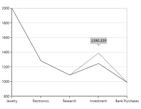
TrackBall
ChartTrackBallBehavior enables you to track a data point closer to the cursor position. The x values are determined from the position of the vertical line in the axis and y values are determined from the points touching the vertical line in the series.
Adding TrackBall to the SfChart
You can create an instance ChartTrackBallBehavior and add it to the Behaviors collection.
<syncfusion:SfChart.Behaviors>

<syncfusion:ChartTrackBallBehavior>

</syncfusion:ChartTrackBallBehavior>

</syncfusion:SfChart.Behaviors>
SfChart chart = new SfChart();
ChartTrackBallBehavior behavior = new ChartTrackBallBehavior();
chart.Behaviors.Add(behavior);To view the TrackBall in the particular Axis you have to enable the ShowTrackBallInfo property in that axis as in the below code snippet.
<syncfusion:SfChart.PrimaryAxis>

<syncfusion:CategoryAxis  ShowTrackBallInfo="True" />

</syncfusion:SfChart.PrimaryAxis>
ChartTrackBallBehavior behavior = new ChartTrackBallBehavior();
chart.Behaviors.Add(behavior);
chart.PrimaryAxis = new CategoryAxis()
{
ShowTrackBallInfo = true
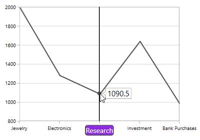
};The default appearance of the trackball in primary axis (CategoryAxis).
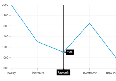
The Trackball is composed of the following parts.
-
Vertical Line
-
Symbol
-
Axis Label
-
Series Label
Vertical line
The vertical line in the trackball is visible when you initialize the TrackBallBehavior.If you want to collapse the visibility of the trackball line then you have to set ShowLine to false.
The following code snippet illustrates the collapsing the visibility of trackball line.
<syncfusion:SfChart.Behaviors>

<syncfusion:ChartTrackBallBehavior ShowLine="False" />

</syncfusion:SfChart.Behaviors>
ChartTrackBallBehavior behavior = new ChartTrackBallBehavior()
{
ShowLine = false
};
chart.Behaviors.Add(behavior);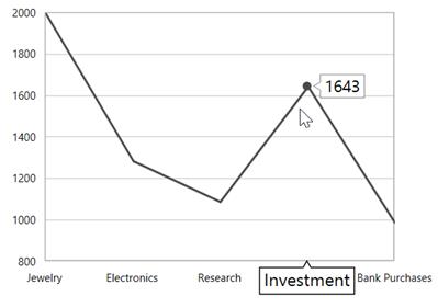
Customization of TrackBall line
SfChart allows you to customize the appearance of trackball vertical line using LineStyle property.
The following code snippet illustrates the customization of trackball line.
<syncfusion:SfChart x:Name="chart">

    <syncfusion:SfChart.Resources>

        <Style TargetType="Line" x:Key="lineStyle">

            <Setter Property="StrokeDashArray" Value="5,1,2"/>

            <Setter Property="Stroke" Value="Red"/>

            <Setter Property="StrokeThickness" Value="1.2"/>

        </Style>

    </syncfusion:SfChart.Resources>

    <syncfusion:SfChart.Behaviors>

        <syncfusion:ChartTrackBallBehavior LineStyle="{StaticResource lineStyle}"/>

    </syncfusion:SfChart.Behaviors>

</syncfusion:SfChart>
ChartTrackBallBehavior trackball = new ChartTrackBallBehavior()
{
LineStyle = chart.Resources["lineStyle"] as Style
};
chart.Behaviors.Add(trackball);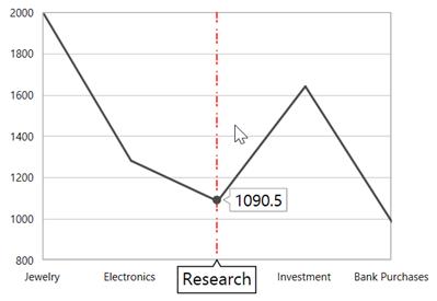
Symbol
By default the trackball symbol is displayed as ellipse, to change the default style of the symbol using ChartTrackBallStyle property.
<syncfusion:SfChart x:Name="chart">

    <syncfusion:SfChart.Resources>

        <Style TargetType="syncfusion:ChartTrackBallControl" x:Key="trackballStyle">

            <Setter Property="Background" Value="red"></Setter>

        </Style>

    </syncfusion:SfChart.Resources>

    <syncfusion:SfChart.Behaviors>

        <syncfusion:ChartTrackBallBehavior ChartTrackBallStyle="{StaticResource trackballStyle}"/>

    </syncfusion:SfChart.Behaviors>

</syncfusion:SfChart>
SfChart chart = new SfChart();
ChartTrackBallBehavior trackball = new ChartTrackBallBehavior()
{
ChartTrackBallStyle = chart.Resources["trackballStyle"] as Style
};
chart.Behaviors.Add(trackball);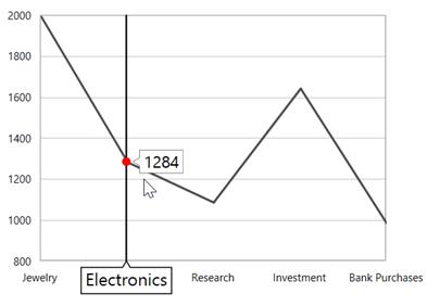
Axis label
The axis label will be viewed when the ShowTrackBallInfo property is set to true. If you want to collapse the visibility of axis label in trackball then you have to set ShowTrackballInfo as false.
NOTE
By default the value of
ShowTrackBallInfois false.
Alignment of axis label
The alignment of the axis label while moving trackball can be defined using AxisLabelAlignment property.
Auto –Axis label is aligned in Near/Far positions based on the trackball movement.
Far-Axis label is positioned far from the position of trackball.
Near- Axis label is near to the position of trackball.
Center-Axis label is aligned to the center of the trackball. By default the axis label will positioned in center.
Far
<syncfusion:SfChart.Behaviors>

<syncfusion:ChartTrackBallBehavior AxisLabelAlignment="Far">

</syncfusion:ChartTrackBallBehavior>

</syncfusion:SfChart.Behaviors>
ChartTrackBallBehavior behavior = new ChartTrackBallBehavior()
{
AxisLabelAlignment = ChartAlignment.Far
};
chart.Behaviors.Add(behavior);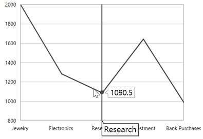
Near
<syncfusion:SfChart.Behaviors>

<syncfusion:ChartTrackBallBehavior AxisLabelAlignment="Near"  >

</syncfusion:ChartTrackBallBehavior>

</syncfusion:SfChart.Behaviors>
ChartTrackBallBehavior behavior = new ChartTrackBallBehavior()
{
AxisLabelAlignment = ChartAlignment.Near
};
chart.Behaviors.Add(behavior);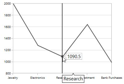
Customization of axis label
You can change the default appearance of the axis label in trackball using TrackballLabelTemplate property in ChartAxis as in the below code snippet.
<syncfusion:SfChart x:Name="chart">

    <syncfusion:SfChart.Resources>

        <DataTemplate x:Key="labelTemplate">

            <Border CornerRadius="4" BorderThickness="1" BorderBrush="Black"

                    Background="BlueViolet" Margin="8">

                    <TextBlock Foreground="White" Text="{Binding ValueX}"/>

            </Border>

        </DataTemplate>

    </syncfusion:SfChart.Resources>

    <syncfusion:SfChart.Behaviors>

            <syncfusion:ChartTrackBallBehavior />

    </syncfusion:SfChart.Behaviors>

    <syncfusion:SfChart.PrimaryAxis>

            <syncfusion:CategoryAxis ShowTrackBallInfo="True"

                                     LabelTemplate="{StaticResource labelTemplate}"/>

    </syncfusion:SfChart.PrimaryAxis>

</syncfusion:SfChart>
SfChart chart = new SfChart();
chart.PrimaryAxis = new NumericalAxis()
{
ShowTrackBallInfo = true,
TrackBallLabelTemplate = chart.Resources["labelTemplate"] as DataTemplate
};
Series label
When the trackball is hovered over you can view the label is also displayed over the series in addition the axis label.
ShowTrackballInfo
ShowTrackballInfo property of Cartesian Series allows user to enable or disable the trackball label for corresponding series. By default, ShowTrackballInfo property is true. The property can be set as shown in the below code example:
<syncfusion:SfChart >
            <syncfusion:SplineSeries Interior="#4a4a4a"/>
            <syncfusion:SplineSeries Interior="#7f7f7f" ShowTrackballInfo="False"/>
            <syncfusion:SplineSeries Interior="#bcbcbc"/>
  </syncfusion:SfChart>
SplineSeries series1 = new SplineSeries()
{
Interior = new SolidColorBrush(Color.FromArgb(0, 0x4a, 0x4a, 0x4a))
};
chart.Series.Add(series1);
SplineSeries series2 = new SplineSeries()
{
Interior = new SolidColorBrush(Color.FromArgb(0, 0x7f, 0x7f, 0x7f)),
ShowTrackballInfo = false
};
chart.Series.Add(series2);
SplineSeries series3 = new SplineSeries()
{
Interior = new SolidColorBrush(Color.FromArgb(0, 0xbc, 0xbc, 0xbc))
};
chart.Series.Add(series3);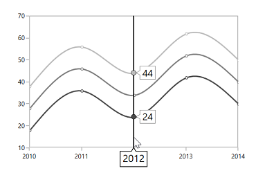
Alignment of series label
The trackball label displayed over the series can be aligned using LabelHorizontalAlignment and LabelVerticalAlignment properties. By default the series label will be horizontally aligned to the left and vertically to the top.
The following code snippet illustrates the aligning the series label to the center of the trackball.
<syncfusion:SfChart.Behaviors>

<syncfusion:ChartTrackBallBehavior LabelHorizontalAlignment="Center"

LabelVerticalAlignment="Center">

</syncfusion:ChartTrackBallBehavior>

</syncfusion:SfChart.Behaviors>
ChartTrackBallBehavior behavior = new ChartTrackBallBehavior()
{
LabelHorizontalAlignment = ChartAlignment.Center,
LabelVerticalAlignment = ChartAlignment.Center
};
chart.Behaviors.Add(behavior);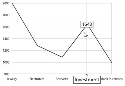
LabelDisplayMode
When there is a multiple series, by default the trackball series label will be displayed only for the nearest point. If you want to display all the y values with respect to the x value then the LabelDisplayMode property is set to FloatAllPoints.
FloatAllPoints
<syncfusion:SfChart.Behaviors>

<syncfusion:ChartTrackBallBehavior LabelDisplayMode="FloatAllPoints" >

</syncfusion:ChartTrackBallBehavior>

</syncfusion:SfChart.Behaviors>
ChartTrackBallBehavior behavior = new ChartTrackBallBehavior()
{
LabelDisplayMode = TrackballLabelDisplayMode.FloatAllPoints
};
chart.Behaviors.Add(behavior);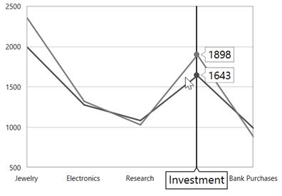
NearestPoint
<syncfusion:SfChart.Behaviors>

<syncfusion:ChartTrackBallBehavior LabelDisplayMode="NearestPoint" >

</syncfusion:ChartTrackBallBehavior>

</syncfusion:SfChart.Behaviors>
ChartTrackBallBehavior behavior = new ChartTrackBallBehavior()
{
LabelDisplayMode = TrackballLabelDisplayMode.NearestPoint
};
chart.Behaviors.Add(behavior);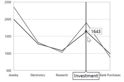
TrackBallLabelTemplate
TrackBallLabelTemplate property in ChartSeries allows you to customize the appearance of series label in trackball.
<syncfusion:SfChart x:Name="chart">

        <syncfusion:SfChart.Resources>

            <DataTemplate x:Key="labelTemplate">

                <Border CornerRadius="5" BorderThickness="1"

                        BorderBrush="Black" Background="BlueViolet" Margin="8">

                    <TextBlock Foreground="White" Text="{Binding ValueY}"/>

                </Border>

            </DataTemplate>

         </syncfusion:SfChart.Resources>

        <syncfusion:SfChart.Behaviors>

                <syncfusion:ChartTrackBallBehavior />

        </syncfusion:SfChart.Behaviors>

        <syncfusion:ColumnSeries Label="2010"

        Interior="#4A4A4A"

        ItemsSource="{Binding Demands}"

        XBindingPath="Demand"

        YBindingPath="Year2010"

        TrackBallLabelTemplate="{StaticResource labelTemplate}"/>

</syncfusion:SfChart>
SfChart chart = new SfChart();
ChartTrackBallBehavior trackball = new ChartTrackBallBehavior();
chart.Behaviors.Add(trackball);
ColumnSeries series = new ColumnSeries()
{
ItemsSource = new ViewModel().Demands,
XBindingPath = "Demand",
YBindingPath = "Year2010",
TrackBallLabelTemplate = chart.Resources["labelTemplate"] as DataTemplate,
Interior = new SolidColorBrush(Color.FromRgb(0x4A, 0x4A, 0x4A))
};
chart.Series.Add(series);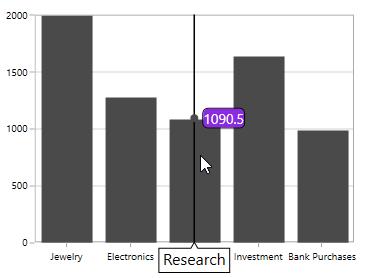
Applying Palette to the Series Label
Palette or Interior color of the Series is applied to the series label by setting UseSeriesPalette to True as shown in the below code snippet.
<syncfusion:SfChart.Behaviors>

<syncfusion:ChartTrackBallBehavior UseSeriesPalette="True" >

</syncfusion:ChartTrackBallBehavior>

</syncfusion:SfChart.Behaviors>
ChartTrackBallBehavior behavior = new ChartTrackBallBehavior()
{
UseSeriesPalette = true
};
chart.Behaviors.Add(behavior);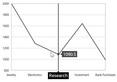
Events
The following events are available in ChartTrackBallBehavior,
PositionChanging
The PositionChanging event occurs when the trackball position is changing from current mouse position to new mouse position. This argument contains the following information.
-
Cancel- Gets or sets a value that indicates whether to show the trackball on new mouse pointer position. -
PointInfos- Gets or sets the currentChartPointInfo.
PositionChanged
The PositionChanged event occurs when the trackball position is changed from current mouse position to new mouse position. This argument contains the following information.
-
PreviousPointInfos- Gets or sets the previousChartPointInfo. -
CurrentPointInfos- Gets or sets the currentChartPointInfo.
The ChartPointInfo class contains the following properties to customize the appearance of trackball label:
-
Axis- Gets the associated axis in which the trackball is activated. -
BaseX- Gets the x-initial coordinate of the trackball label. -
BaseY- Gets the y-initial coordinate of the trackball label. -
BorderBrush- Gets or sets the border color of the trackball label. -
Close- Gets the close value of the trackball label when it is applicable. -
Foreground- Gets or sets the foreground color of the trackball label. -
High- Gets the high value of the trackball label when it is applicable. -
Interior- Gets or sets the interior color of the trackball label. -
Item- Gets the respective underlying object of the data in which the trackball is activated. -
Low- Gets the low value of the trackball label when it is applicable. -
LowerLine- Gets the y-value of the lower line in indicator. -
Median- Gets the median value when it is applicable. -
Open- Gets the open value of the trackball label when it is applicable. -
PolygonPoints- Gets the point collection to render trackball. -
Series- Gets the associated series in which the trackball is activated. -
SeriesValues- Gets the SeriesValues in which the trackball is activated. -
SignalLine- Gets the y-value of the signal line in indicator. -
UpperLine- Gets the y-value of the upper line in indicator. -
ValueX- Gets the x-value of the trackball label. -
ValueY- Gets the y-value of the trackball label. -
X- Gets the x-coordinate of the trackball label. -
Y- Gets the y-coordinate of the trackball label.
Visual data editing
SfChart has a feature that allows you to edit an entire series or a single data point at run time by dragging the single point or the series as a whole.
Segment dragging
Segment Dragging defines the dragging a particular point or segment based on the series type. The segment dragging can be enabled using EnableSegmentDragging property as true.
LineSeries
<syncfusion:LineSeries Label="2010" EnableSegmentDragging="True"

XBindingPath="Demand"   Interior="#777777"

ItemsSource="{Binding Demands}"

YBindingPath="Year2010">

</syncfusion:LineSeries>
LineSeries series = new LineSeries()
{
ItemsSource = new ViewModel().Demands,
XBindingPath = "Demand",
YBindingPath = "Year2010",
EnableSegmentDragging = true,
Interior = new SolidColorBrush(Color.FromRgb(0x77, 0x77, 0x77)),
Label = "2010"
};
chart.Series.Add(series)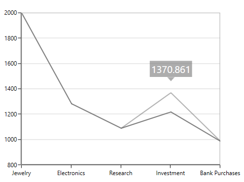
ColumnSeries
<syncfusion:ColumnSeries Label="2010" EnableDragTooltip="True" EnableSegmentDragging="True"

XBindingPath="Demand"   Interior="#777777"

ItemsSource="{Binding Demands}"

YBindingPath="Year2010">

</syncfusion:ColumnSeries>
ColumnSeries series = new ColumnSeries()
{
ItemsSource = new ViewModel().Demands,
XBindingPath = "Demand",
YBindingPath = "Year2010",
EnableSegmentDragging = true,
EnableDragTooltip = true,
Interior = new SolidColorBrush(Color.FromRgb(0x77, 0x77, 0x77)),
Label = "2010"
};
chart.Series.Add(series)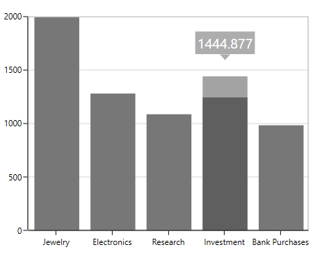
ScatterSeries
This series supports dragging in both the x and y co-ordinates. The dragging co – ordinates can be set by using the enum property DragDirection.
<syncfusion:ScatterSeries ItemsSource="{Binding Data}" XBindingPath="Index"
                         YBindingPath="Value" EnableSegmentDragging="True"
                         Interior="#4A4A4A" DragDirection="XY" />
ScatterSeries scatterSeries = new ScatterSeries()
{
ItemsSource = new ViewModel().Data,
XBindingPath = "Index",
YBindingPath = "Value",
Interior = new SolidColorBrush(Color.FromRgb(0x77, 0x77, 0x77)),
EnableSegmentDragging = true
};
chart.Series.Add(series)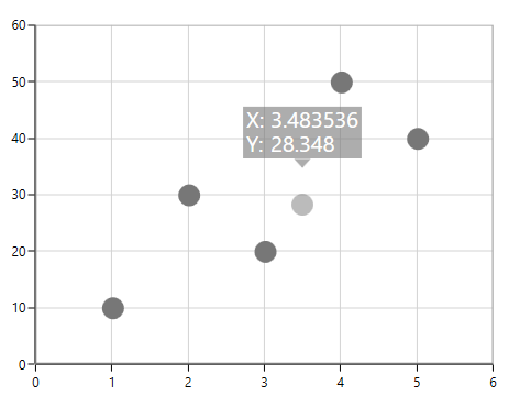
NOTE
By default the
DragDirectionof the scatter series is XY.
Series dragging
SfChart provides support to drag the LineSeries and SplineSeries. This allows the series to move to a new position by dragging. To enable the series dragging, you have to set EnableSeriesDragging property to true.
The following code snippet explains the series dragging feature in LineSeries
<syncfusion:LineSeries Label="2010" EnableDragTooltip="True" EnableSeriesDragging="True"

XBindingPath="Demand"   Interior="#777777" ItemsSource="{Binding Demands}"

YBindingPath="Year2010"/>
LineSeries series = new LineSeries()
{
ItemsSource = new ViewModel().Demands,
XBindingPath = "Demand",
YBindingPath = "Year2010",
EnableSeriesDragging = true,
EnableDragTooltip = true ,
Interior = new SolidColorBrush(Color.FromRgb(0x77, 0x77, 0x77)),
Label = "2010"
};
chart.Series.Add(series);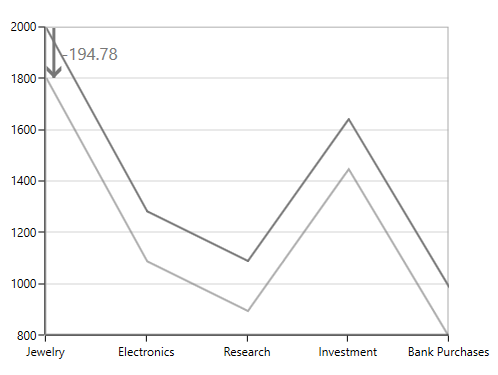
NOTE
In line and Spline Series if segment and series dragging is enabled, the series dragging is having higher priority over segment dragging.
Adding ToolTip for dragging
While the series or segment is dragged by default you can view the tooltip showing the new y value. To disable the tooltip while dragging you have to set the EnableDragToolTip as false.
<syncfusion:LineSeries Label="2010"  EnableSegmentDragging="True" EnableDragTooltip="False"

XBindingPath="Demand"   Interior="#777777"

Focusable="False"

ItemsSource="{Binding Demands}"

</syncfusion:LineSeries>
LineSeries series = new LineSeries()
{
ItemsSource = new ViewModel().Demands,
XBindingPath = "Demand",
YBindingPath = "Year2010",
EnableSeriesDragging = true,
EnableDragTooltip = true ,
Focusable = false,
Interior = new SolidColorBrush(Color.FromRgb(0x77, 0x77, 0x77)),
Label = "2010"
};
chart.Series.Add(series);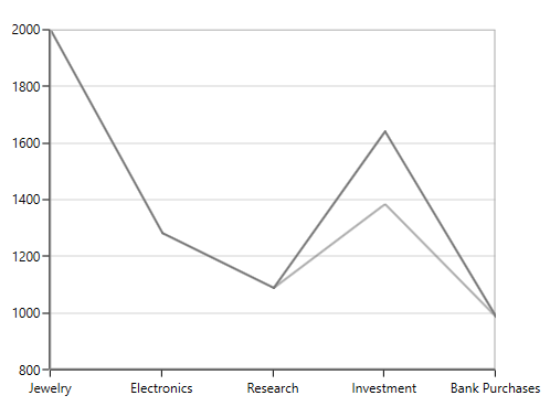
DragTooltipTemplate
DragTooltipTemplate property allows you to customize the default appearance of the tooltip while dragging.
<syncfusion:SfChart x:Name="chart">

            <syncfusion:SfChart.Resources>

                <DataTemplate x:Key="tooltipTemplate">

                    <Border CornerRadius="4" BorderBrush="Black"

                            BorderThickness="1" Background="CadetBlue"

                            Margin="0,0,0,15">

                        <TextBlock  FontSize="12" Text="{Binding NewValue}"

                                    Width="35" Foreground="White"

                                    Margin="2"></TextBlock>

                    </Border>

                </DataTemplate>

            </syncfusion:SfChart.Resources>

            <syncfusion:LineSeries Label="2010" EnableSegmentDragging="True"

                              Interior="#777777" Focusable="False"

                               XBindingPath="Demand" ItemsSource="{Binding Demands}"

                               YBindingPath="Year2010"

                               DragTooltipTemplate="{StaticResource tooltipTemplate }">

            </syncfusion:LineSeries>

</syncfusion:SfChart>
ColumnSeries series = new ColumnSeries()
{
ItemsSource = new ViewModel().Demands,
XBindingPath = "Demand",
YBindingPath = "Year2010",
Focusable = false,
EnableSegmentDragging = true,
DragTooltipTemplate = chart.Resources["tooltipTemplate"] as DataTemplate,
Interior = new SolidColorBrush(Color.FromRgb(0x77, 0x77, 0x77))
};
chart.Series.Add(series);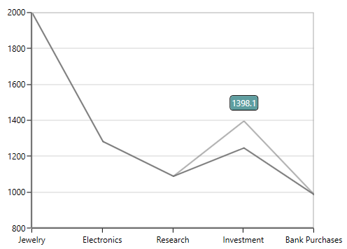
Drag Tooltip style
The dragging tooltip can be customized by using the DragTooltipStyle property of the series.
The following are the API’s in ChartDragTooltipStyle.
FontFamily – Gets or sets the font family for dragging tooltip text.
FontSize – Gets or sets the font size for dragging tooltip text.
FontStyle – Gets or sets the font style for dragging tooltip text.
Foreground – Gets or sets the brush for dragging tooltip text.
Background – Gets or sets the background brush for dragging tooltip.
<syncfusion:LineSeries.DragTooltipStyle>
      <syncfusion:ChartDragTooltipStyle FontFamily="Calibri" FontSize="14"
                                   FontStyle="Italic" Background="DarkGray"
                                   Foreground="Black" />
</syncfusion:LineSeries.DragTooltipStyle>this.lineSeries.DragTooltipStyle = new ChartDragTooltipStyle()
{
FontFamily = new FontFamily("Calibri"),
FontSize = 14,
FontStyle = FontStyle.Italic,
Background = new SolidColorBrush(Colors.DarkGray),
Foreground = new SolidColorBrush(Colors.Black)
};
Rounding Off the dragged value
To round off the dragged values, you have to set the SnapToPoint and RoundToDecimal properties. The following code snippet explains rounding the dragged y value to 2 decimal digits.
<syncfusion:SplineSeries   EnableSegmentDragging="True"

SnapToPoint="Round" RoundToDecimal="2" YBindingPath = "Year2010"

UpdateSource="True" XBindingPath="Demand"   Interior="#777777"

ItemsSource="{Binding Demands}"

</syncfusion:SplineSeries>
SplineSeries series = new SplineSeries()
{
ItemsSource = new ViewModel().Demands,
XBindingPath = "Demand",
YBindingPath = "Year2010",
EnableSegmentDragging = true,
UpdateSource = true ,
RoundToDecimal = 2,
SnapToPoint = SnapToPoint.Round,
Interior = new SolidColorBrush(Color.FromRgb(0x77, 0x77, 0x77))
};
chart.Series.Add(series);Updating the dragged values to the source
When dragging the series or segment at run time, to update the underlying data based on the values you have to set the UpdateSource property to true as in the below code snippet.
<syncfusion:SplineSeries   EnableSegmentDragging="True" UpdateSource="True"

XBindingPath="Demand"   Interior="#777777"

ItemsSource="{Binding Demands}"

YBindingPath="Year2010">

</syncfusion:SplineSeries>
SplineSeries series = new SplineSeries()
{
ItemsSource = new ViewModel().Demands,
XBindingPath = "Demand",
YBindingPath = "Year2010",
EnableSegmentDragging = true,
UpdateSource = true ,
Interior = new SolidColorBrush(Color.FromRgb(0x77, 0x77, 0x77))
};
chart.Series.Add(series);Drag cancel using KeyModifiers
While you are dragging you can set the KeyModifiers to cancel the drag by setting DragCancelKeyModifier property as in the below code snippet.
<syncfusion:SplineSeries

EnableSegmentDragging="True"

DragCancelKeyModifiers="Alt"

UpdateSource="True"

XBindingPath="Demand"

ItemsSource="{Binding Demands}"

YBindingPath="Year2010">

</syncfusion:SplineSeries>
SplineSeries series = new SplineSeries()
{
ItemsSource = new ViewModel().Demands,
XBindingPath = "Demand",
YBindingPath = "Year2010",
EnableSegmentDragging = true,
DragCancelKeyModifiers = ModifierKeys.Alt,
UpdateSource = true ,
Interior = new SolidColorBrush(Color.FromRgb(0x77, 0x77, 0x77))
};
chart.Series.Add(series);Events
Series with visual data editing has support for following events,
-
DragStart- Occurs when segment/series drag started. -
DragDelta- Occurs when segment/series dragging. -
DragEnd- Occurs when segment/series drag end. -
PreviewDragEnd- Occurs before drag end triggered. -
SegmentEnter- Occurs when mouse enters in segment.
Zoom and Pan
SfChart allows you to zoom the chart area with the help of the zoom feature. This behavior is mostly used to view the data point in the specific area, when there are a number of data points inside the chart.
Zooming and panning provides you to take a close-up look of the data point plotted in the series
Adding zooming/panning to the SfChart
You can create an instance ChartZoomPanBehavior and add it to the Behaviors collection.
<syncfusion:SfChart.Behaviors>

<syncfusion:ChartZoomPanBehavior >

</syncfusion:ChartZoomPanBehavior>

</syncfusion:SfChart.Behaviors>
ChartZoomPanBehavior zooming = new ChartZoomPanBehavior();
chart.Behaviors.Add(zooming);Zooming the ChartArea
Zooming by setting ZoomFactor and ZoomPosition
ZoomFactor defines the percentage of visible range from the total range of axis values. ZoomPosition defines the ranges of values that need to be displayed as a result of ZoomFactor.
The following code example demonstrates the zooming the chart axis by setting zoom position and zoom factor.
<syncfusion:SfChart.PrimaryAxis>

<syncfusion:CategoryAxis

ShowGridLines="False"

ZoomFactor="0.3" ZoomPosition="0.1" />

</syncfusion:SfChart.PrimaryAxis>chart.PrimaryAxis = new CategoryAxis()
{
ShowGridLines = false,
ZoomFactor = 0.1,
ZoomPosition = 0.3
};
Mouse wheel zooming
Zooming can be performed by mouse wheel action by setting EnableMouseWheelZooming property to true.
<syncfusion:SfChart.Behaviors>

<syncfusion:ChartZoomPanBehavior EnableMouseWheelZooming="True" >

</syncfusion:ChartZoomPanBehavior>

</syncfusion:SfChart.Behaviors>
ChartZoomPanBehavior zooming = new ChartZoomPanBehavior()
{
EnableMouseWheelZooming = true
};
chart.Behaviors.Add(zooming);Pinch Zooming
If you want to zoom using fingers by touch, then you have to set EnablePinchZooming property to true as shown in the below code snippet.
<syncfusion:SfChart.Behaviors>

<syncfusion:ChartZoomPanBehavior EnablePinchZooming="True" >

</syncfusion:ChartZoomPanBehavior>

</syncfusion:SfChart.Behaviors>
ChartZoomPanBehavior zooming = new ChartZoomPanBehavior()
{
EnablePinchZooming = true
};
chart.Behaviors.Add(zooming);Zooming relative to cursor
To enable the zooming relative to cursor position you can set ZoomRelativeToCursor property to true. This support is applicable only for mouse wheel zooming.
<syncfusion:SfChart.Behaviors>

<syncfusion:ChartZoomPanBehavior ZoomRelativeToCursor="True" >

</syncfusion:ChartZoomPanBehavior>

</syncfusion:SfChart.Behaviors>
ChartZoomPanBehavior zooming = new ChartZoomPanBehavior()
{
ZoomRelativeToCursor = true
};
chart.Behaviors.Add(zooming);SelectionZooming
SelectionZooming helps us to zoom a particular area by selecting the region using rectangle.To enable the selection ,you have to set EnableSelectionZooming property to true.
The following code snippet demonstrated selection zooming.
<syncfusion:SfChart.Behaviors>

<syncfusion:ChartZoomPanBehavior EnableSelectionZooming="True" >

</syncfusion:ChartZoomPanBehavior>

</syncfusion:SfChart.Behaviors>
ChartZoomPanBehavior zooming = new ChartZoomPanBehavior()
{
EnableSelectionZooming = true
};
chart.Behaviors.Add(zooming);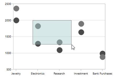
Customization of Selection Rectangle
Selection Rectangle can be customized by setting the following properties
-
Fill-Represents the brush filled in selection rectangle. -
Stroke- Represents the outer line color of selection rectangle. -
StrokeThickness- Represents the selection rectangle outer line thickness.
The following code example demonstrates the customization of selection rectangle
<syncfusion:SfChart.Behaviors>

<syncfusion:ChartZoomPanBehavior EnableSelectionZooming="True"

Fill="LightBlue" Stroke="Blue" StrokeThickness="2" >

</syncfusion:ChartZoomPanBehavior>

</syncfusion:SfChart.Behaviors>
ChartZoomPanBehavior zooming = new ChartZoomPanBehavior()
{
EnableSelectionZooming = true,
Fill = new SolidColorBrush(Colors.LightBlue),
Stroke = new SolidColorBrush(Colors.Blue),
StrokeThickness = 2
};
chart.Behaviors.Add(zooming);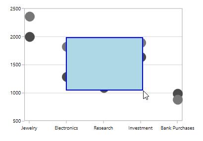
Zooming mode
The zooming can be done both horizontally and vertically. The zooming direction is defined using ZoomMode property.
Zooming along X axis
<syncfusion:SfChart.Behaviors>

<syncfusion:ChartZoomPanBehavior EnableSelectionZooming="True" ZoomMode="X">

</syncfusion:ChartZoomPanBehavior>

</syncfusion:SfChart.Behaviors>
ChartZoomPanBehavior zooming = new ChartZoomPanBehavior()
{
EnableSelectionZooming = true,
ZoomMode = ZoomMode.X
};
chart.Behaviors.Add(zooming);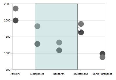
Zooming along Y axis
<syncfusion:SfChart.Behaviors>

<syncfusion:ChartZoomPanBehavior EnableSelectionZooming="True" ZoomMode="Y">

</syncfusion:ChartZoomPanBehavior>

</syncfusion:SfChart.Behaviors>
ChartZoomPanBehavior zooming = new ChartZoomPanBehavior()
{
EnableSelectionZooming = true,
ZoomMode = ZoomMode.Y
};
chart.Behaviors.Add(zooming);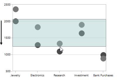
Maximum zoom level
You can also limit the zooming by setting MaximumZoomLevel property as shown in the below code snippet.
<syncfusion:SfChart.Behaviors>

<syncfusion:ChartZoomPanBehavior EnableSelectionZooming="True" MaximumZoomLevel="100">

</syncfusion:ChartZoomPanBehavior>

</syncfusion:SfChart.Behaviors>
ChartZoomPanBehavior zooming = new ChartZoomPanBehavior()
{
EnableSelectionZooming = true,
MaximumZoomLevel = 100
};
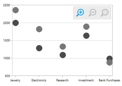
chart.Behaviors.Add(zooming);Zooming Toolbar
Zooming Toolbar encompassed with buttons for performing actions like Zoom In/Out, Reset, Pan, etc. You can add the zooming toolbar to the chart area by setting EnableZoomingToolBar property to True.
<syncfusion:SfChart.Behaviors>

<syncfusion:ChartZoomPanBehavior EnableZoomingToolBar="True">

</syncfusion:ChartZoomPanBehavior>

</syncfusion:SfChart.Behaviors>
ChartZoomPanBehavior zooming = new ChartZoomPanBehavior()
{
EnableZoomingToolBar = true
};
chart.Behaviors.Add(zooming);The following image depicts the default view of the zooming toolbar.
Positioning the zooming toolbar
Zooming Toolbar can be positioned using the HorizontalPosition and VerticalPosition properties.The following code demonstrates the positioning of the toolbar.
<syncfusion:SfChart.Behaviors>

<syncfusion:ChartZoomPanBehavior EnableZoomingToolBar="True" HorizontalPosition="Left" VerticalPosition="Bottom">

</syncfusion:ChartZoomPanBehavior>

</syncfusion:SfChart.Behaviors>
ChartZoomPanBehavior zooming = new ChartZoomPanBehavior()
{
EnableZoomingToolBar = true,
HorizontalPosition = HorizontalAlignment.Left,
VerticalPosition = VerticalAlignment.Bottom
};
chart.Behaviors.Add(zooming);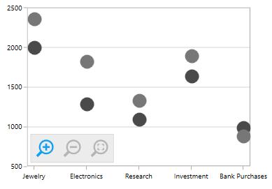
Customization of zooming Toolbar
Zooming Toolbar can be customized using the following API’s
-
ToolBarBackground- Represents the zooming toolkit background. -
ToolBarItems- Collection value that contains zooming toolkit items. -
ToolBarItemMargin-Represents the margin for the toolbar item. -
ToolBarItemWidth-Represents the width of the toolbar item -
ToolBarItemHeight-Represents the height of the toolbar item
<syncfusion:SfChart.Behaviors>

<syncfusion:ChartZoomPanBehavior EnableZoomingToolBar="True" ToolBarItemHeight="15"

ToolBarItemWidth="15" ToolBarBackground="Black"

ToolBarItems="All" ToolBarItemMargin="10">

</syncfusion:ChartZoomPanBehavior>

</syncfusion:SfChart.Behaviors>
ChartZoomPanBehavior zooming = new ChartZoomPanBehavior()
{
EnableZoomingToolBar = true,
ToolBarBackground = new SolidColorBrush(Colors.Black),
ToolBarItemHeight = 15,
ToolBarItemWidth = 15,
ToolBarItemMargin = new Thickness(10),
ToolBarItems = ZoomToolBarItems.All
};
chart.Behaviors.Add(zooming);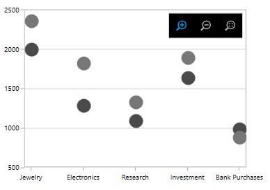
Orientation of zooming Toolbar
Zooming toolbar orientation is horizontal by default.You can change the orientation to vertical by setting
ToolBarOrientation property to Vertical.
<syncfusion:SfChart.Behaviors>

<syncfusion:ChartZoomPanBehavior EnableZoomingToolBar="True"

ToolBarOrientation="Vertical">

</syncfusion:ChartZoomPanBehavior>

</syncfusion:SfChart.Behaviors>
ChartZoomPanBehavior zooming = new ChartZoomPanBehavior()
{
EnableZoomingToolBar = true,
ToolBarOrientation = Orientation.Vertical
};
chart.Behaviors.Add(zooming);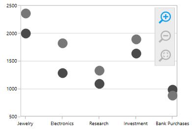
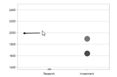
Panning the chart area
Panning feature allows moving the visible area of the chart when it is zoomed in. To enable panning, you have to set EnablePanning property to true.
<syncfusion:SfChart.Behaviors>

<syncfusion:ChartZoomPanBehavior EnableMouseWheelZooming="True" EnablePanning="True">

</syncfusion:ChartZoomPanBehavior>

</syncfusion:SfChart.Behaviors>
ChartZoomPanBehavior zooming = new ChartZoomPanBehavior()
{
EnableMouseWheelZooming = true,
EnablePanning = true
};
chart.Behaviors.Add(zooming);The following image demonstrates the cursor panning in the left direction.
Resetting the zooming/panning
SfChart provides support to reset to the default view when you double tap the chart area by setting ResetOnDoubleTap property to true.
<syncfusion:SfChart.Behaviors>

<syncfusion:ChartZoomPanBehavior  ResetOnDoubleTap="True">

</syncfusion:ChartZoomPanBehavior>

</syncfusion:SfChart.Behaviors>
ChartZoomPanBehavior zooming = new ChartZoomPanBehavior()
{
ResetOnDoubleTap = true
};
chart.Behaviors.Add(zooming);Events
The following events are available in SfChart for ChartZoomPanBehavior,
-
ZoomChanging- Occurs when zoom started in chart area. -
ZoomChanged- Occurs when zooming done in chart area. -
SelectionZoomingStart- Occurs when selection zooming started. -
SelectionZoomingDelta- Occurs when selection zooming. -
SelectionZoomingEnd- Occurs when selection zooming end. -
ResetZooming- Occurs when zooming get reset in chart area.
Selection:
SfChart supports selection that enables you to select a segment in a series or series itself by using ChartSelectionBehavior.
Adding selection behavior to SfChart
You can create an instance ChartSelectionBehavior and add it to the Behaviors collection.
<syncfusion:SfChart.Behaviors>

<syncfusion:ChartSelectionBehavior >

</syncfusion:ChartSelectionBehavior>

</syncfusion:SfChart.Behaviors>
ChartSelectionBehavior selection = new ChartSelectionBehavior();
chart.Behaviors.Add(selection);SegmentSelection
Segment Selection allows you to highlight a segment in a chart series. To enable a segment selection in a chart series, you have to set the EnableSegmentSelection property to True.For highlighting a segment the brush color can be set using SegmentSelectionBrush property.
ColumnSeries
<syncfusion:SfChart.Behaviors>

<syncfusion:ChartSelectionBehavior   EnableSegmentSelection="True" >

</syncfusion:ChartSelectionBehavior>

</syncfusion:SfChart.Behaviors>

<syncfusion:ColumnSeries Label="2011" SegmentSelectionBrush="Green" Interior="#777777"

ItemsSource="{Binding Demands}" XBindingPath="Demand" YBindingPath="Year2011"/>
ChartSelectionBehavior selection = new ChartSelectionBehavior()
{
EnableSegmentSelection = true
};
chart.Behaviors.Add(selection);
ColumnSeries series = new ColumnSeries()
{
ItemsSource = new ViewModel().Demands,
XBindingPath = "Demand",
YBindingPath = "Year2010",
Label ="2011",
SegmentSelectionBrush = new SolidColorBrush(Colors.Green),
Interior = new SolidColorBrush(Color.FromRgb(0x77, 0x77, 0x77))
};
chart.Series.Add(series);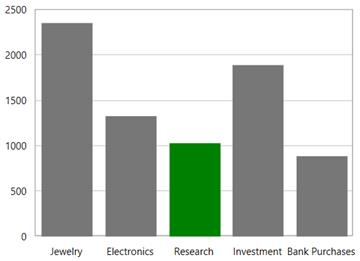
SplineSeries
In Linear type series the segment selection can be viewed by changing the adornments symbol interior.
The following code example demonstrates the spline series segment selection by changing the adornments interior.
<syncfusion:SplineSeries SegmentSelectionBrush="Red"

ItemsSource="{Binding Demands}" Interior="#4A4A4A"

XBindingPath="Demand"

YBindingPath="Year2010">

<syncfusion:SplineSeries.AdornmentsInfo>

<syncfusion:ChartAdornmentInfo ShowMarker="True" Symbol="Ellipse" HighlightOnSelection="True"></syncfusion:ChartAdornmentInfo>

</syncfusion:SplineSeries.AdornmentsInfo>

</syncfusion:SplineSeries>
ChartSelectionBehavior selection = new ChartSelectionBehavior()
{
EnableSegmentSelection = true
};
chart.Behaviors.Add(selection);
SplineSeries series = new SplineSeries()
{
ItemsSource = new ViewModel().Demands,
XBindingPath = "Demand",
YBindingPath = "Year2010",
SegmentSelectionBrush = new SolidColorBrush(Colors.Red),
Interior = new SolidColorBrush(Color.FromRgb(0x4A, 0x4A, 0x4A))
};
ChartAdornmentInfo adornmentInfo = new ChartAdornmentInfo()
{
ShowMarker = true,
HighlightOnSelection = true,
Symbol = ChartSymbol.Ellipse
};
series.AdornmentsInfo = adornmentInfo;
chart.Series.Add(series);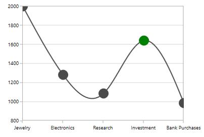
Series selection
Series selection is used in case of multiple series when you want to highlight a particular series.Series Selection can be enabled by setting EnableSeriesSelection property to True. The SeriesSelectionBrush property is used to set the brush color to highlight the series.
The following code example demonstrates highlighting a series.
<syncfusion:SfChart.Behaviors>

<syncfusion:ChartSelectionBehavior EnableSegmentSelection="False" EnableSeriesSelection="True"/>

</syncfusion:SfChart.Behaviors>

<syncfusion:ScatterSeries Label="2010"  SeriesSelectionBrush="Green"

ItemsSource="{Binding Demands}" Interior="#4A4A4A"

XBindingPath="Demand"

YBindingPath="Year2010">

</syncfusion:ScatterSeries>

<syncfusion:ScatterSeries Label="2011" SeriesSelectionBrush="Green" Interior="#777777"

ItemsSource="{Binding Demands}" XBindingPath="Demand"

YBindingPath="Year2011"/>
ChartSelectionBehavior selection = new ChartSelectionBehavior()
{
EnableSegmentSelection = true,
EnableSeriesSelection = true
};
chart.Behaviors.Add(selection);
ScatterSeries series1 = new ScatterSeries()
{
ItemsSource = new ViewModel().Demands,
XBindingPath = "Demand",
YBindingPath = "Year2010",
Label = "2010",
SegmentSelectionBrush = new SolidColorBrush(Colors.Green),
Interior = new SolidColorBrush(Color.FromRgb(0x4A, 0x4A, 0x4A))
};
ScatterSeries series2 = new ScatterSeries()
{
ItemsSource = new ViewModel().Demands,
XBindingPath = "Demand",
YBindingPath = "Year2011",
Label = "2011",
SegmentSelectionBrush = new SolidColorBrush(Colors.Green),
Interior = new SolidColorBrush(Color.FromRgb(0x77, 0x77, 0x77))
};
chart.Series.Add(series1);
chart.Series.Add(series2);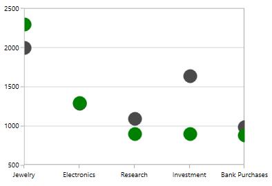
NOTE
By default the segment selection is true, so for selecting series you have to set the
EnableSegmentSelectionproperty to false.
Selection mode
SfChart provides support to select using mouse move or mouse click. By default the selection will take place in mouse click. The selection mode can be defined using SelectionMode property for segment and series selection.
The following code snippet demonstrates the selection mode using MouseMove.
<syncfusion:SfChart.Behaviors>

<syncfusion:ChartSelectionBehavior SelectionMode="MouseMove" EnableSeriesSelection="True">

</syncfusion:ChartSelectionBehavior>

</syncfusion:SfChart.Behaviors>
ChartSelectionBehavior selection = new ChartSelectionBehavior()
{
SelectionMode = Syncfusion.UI.Xaml.Charts.SelectionMode.MouseMove,
EnableSeriesSelection = true
};
chart.Behaviors.Add(selection);Selection style
SfChart allows you to select single or multiple segment /series using SelectionStyle property. By default the SelectionStyle is Single.
The following code snippet demonstrates multiple segment selection.
<syncfusion:SfChart.Behaviors>

<syncfusion:ChartSelectionBehavior SelectionStyle="Multiple" EnableSegmentSelection="True">

</syncfusion:ChartSelectionBehavior>

</syncfusion:SfChart.Behaviors>
ChartSelectionBehavior selection = new ChartSelectionBehavior()
{
SelectionStyle = SelectionStyle.Multiple,
EnableSegmentSelection = true
};
chart.Behaviors.Add(selection);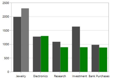
Changing cursor while selection
SelectionCursor property allows you to define the cursor when mouse is hovered over the segment with segment or series selection enabled.
The following code snippet demonstrates hand cursor in segment selection.
<syncfusion:SfChart.Behaviors>

<syncfusion:ChartSelectionBehavior SelectionCursor="Hand"  EnableSegmentSelection="True">

</syncfusion:ChartSelectionBehavior>

</syncfusion:SfChart.Behaviors>
ChartSelectionBehavior selection = new ChartSelectionBehavior()
{
SelectionCursor = Cursors.Hand,
EnableSegmentSelection = true
};
chart.Behaviors.Add(selection);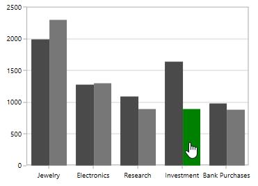
Adornment Selection:
SfChart provides selection for adornments by defining HighlightOnSelection property which allows you to select the segment or series with the corresponding adornments.
HighlightOnSelection
Segment selection
The following code example demonstrates the segment selection with adornments
<syncfusion:ColumnSeries Interior="#4A4A4A"

ItemsSource="{Binding Demands}" XBindingPath="Demand"

SegmentSelectionBrush="Green"

YBindingPath="Year2010">

<syncfusion:ColumnSeries.AdornmentsInfo>

<syncfusion:ChartAdornmentInfo UseSeriesPalette="True" ShowConnectorLine="True"

ConnectorHeight="30" ShowLabel="True" HighlightOnSelection="True">

</syncfusion:ChartAdornmentInfo>

</syncfusion:ColumnSeries.AdornmentsInfo>
ChartSelectionBehavior selection = new ChartSelectionBehavior()
{
EnableSegmentSelection = true
};
chart.Behaviors.Add(selection);
ColumnSeries series = new ColumnSeries()
{
ItemsSource = new ViewModel().Demands,
XBindingPath = "Demand",
YBindingPath = "Year2010",
SegmentSelectionBrush = new SolidColorBrush(Colors.Green),
Interior = new SolidColorBrush(Color.FromRgb(0x4A, 0x4A, 0x4A))
};
ChartAdornmentInfo adornmentInfo = new ChartAdornmentInfo()
{
ShowLabel = true,
ShowConnectorLine = true,
HighlightOnSelection = true,
UseSeriesPalette = true,
ConnectorHeight = 30
};
series.AdornmentsInfo = adornmentInfo;
chart.Series.Add(series);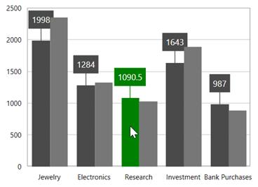
Series selection
The following code example demonstrates the series selection with adornments
<syncfusion:SfChart.Behaviors>

<syncfusion:ChartSelectionBehavior EnableSegmentSelection="False"

EnableSeriesSelection="True"/>

</syncfusion:SfChart.Behaviors>

<syncfusion:SplineSeries ItemsSource="{Binding Demands}" SeriesSelectionBrush="Green"

XBindingPath="Demand"

YBindingPath="Year2010">

<syncfusion:SplineSeries.AdornmentsInfo>

<syncfusion:ChartAdornmentInfo Symbol="Ellipse"

ShowMarker="True"

HighlightOnSelection="True">

</syncfusion:ChartAdornmentInfo>

</syncfusion:SplineSeries.AdornmentsInfo>

</syncfusion:SplineSeries>

<syncfusion:SplineSeries Label="2010" Interior="#4A4A4A"

ItemsSource="{Binding Demands}" SeriesSelectionBrush="Green"

XBindingPath="Demand"

YBindingPath="Year2011">

<syncfusion:SplineSeries.AdornmentsInfo>

<syncfusion:ChartAdornmentInfo Symbol="Ellipse"

ShowMarker="True"

HighlightOnSelection="True">

</syncfusion:ChartAdornmentInfo>

</syncfusion:SplineSeries.AdornmentsInfo>

</syncfusion:SplineSeries>
ChartSelectionBehavior selection = new ChartSelectionBehavior()
{
EnableSegmentSelection = false,
EnableSeriesSelection = true
};
chart.Behaviors.Add(selection);
SplineSeries series1 = new SplineSeries()
{
ItemsSource = new ViewModel().Demands,
XBindingPath = "Demand",
YBindingPath = "Year2010",
SeriesSelectionBrush = new SolidColorBrush(Colors.Green)
};
ChartAdornmentInfo adornmentInfo = new ChartAdornmentInfo()
{
ShowMarker = true,
Symbol = ChartSymbol.Ellipse
};
series1.AdornmentsInfo = adornmentInfo;
SplineSeries series2 = new SplineSeries()
{
ItemsSource = new ViewModel().Demands,
XBindingPath = "Demand",
YBindingPath = "Year2011",
SeriesSelectionBrush = new SolidColorBrush(Colors.Green),
Interior = new SolidColorBrush(Color.FromRgb(0x4A,0x4A,0x4A))
};
ChartAdornmentInfo adornmentInfo1 = new ChartAdornmentInfo()
{
ShowMarker = true,
Symbol = ChartSymbol.Ellipse,
HighlightOnSelection = true
};
series2.AdornmentsInfo = adornmentInfo1;
chart.Series.Add(series1);
chart.Series.Add(series2);
Events
The following events are available in SfChart for ChartSelectionBehavior,
-
SelectionChanging- Occurs when selection changing in chart area. -
SelectionChanged- Occurs when selection changed in chart area.
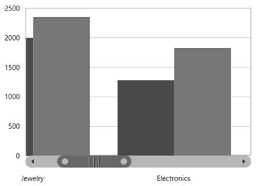
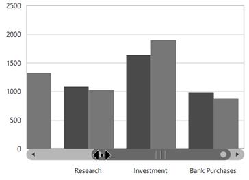
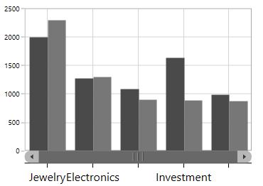
Resizable Scrollbar
The resizable scrollbar is a type of scrollbar that can be resized within the track area by adjusting the scrolling thumbs. In the SfChart, a resizable scrollbar is used for zooming and panning across different chart segments.
Adding scrollBar to the axis
EnableScrollBar property allows you to add the scrollbar for the particular axis. The following code snippet illustrates the scrollbar in the primary axis.
<syncfusion:SfChart.PrimaryAxis>

<syncfusion:CategoryAxis EnableScrollBar="True" />

</syncfusion:SfChart.PrimaryAxis>chart.PrimaryAxis = new CategoryAxis()
{
EnableScrollBar = true
};
Deferred scrolling
SfChart provides support to suspend the value updates for every thumb values. This can be done using DeferredScrolling property in chart axis.The following code snippet demonstrates the deferred scrolling.
<syncfusion:SfChart.PrimaryAxis>

<syncfusion:CategoryAxis EnableScrollBar="True" DeferredScrolling="True"/>

</syncfusion:SfChart.PrimaryAxis>chart.PrimaryAxis = new CategoryAxis()
{
EnableScrollBar = true,
DeferredScrolling = true,
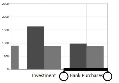
};Resizing the scrollbar
SfChart allows you to resize the scrollbar using EnableScrollBarResizing property to true. By default the EnableScrollBarResizing property is true. The following code example and image demonstrates scrollbar without resizing option.
<syncfusion:SfChart.PrimaryAxis>

<syncfusion:CategoryAxis EnableScrollBar="True" EnableScrollBarResizing="False"/>

</syncfusion:SfChart.PrimaryAxis>chart.PrimaryAxis = new CategoryAxis()
{
EnableScrollBar = true,
EnableScrollBarResizing = false,
};
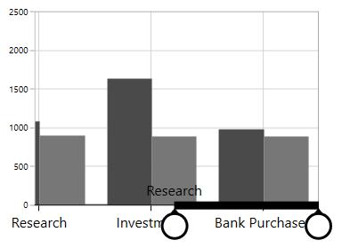
Scrollbar for touch mode
Scrollbar provides a touch mode style by enabling EnableTouchMode property to true as in the below code snippet.
<syncfusion:SfChart.PrimaryAxis>

<syncfusion:CategoryAxis EnableScrollBar="True" EnableTouchMode="True"/>

</syncfusion:SfChart.PrimaryAxis>chart.PrimaryAxis = new CategoryAxis()
{
EnableScrollBar = true,
EnableTouchMode = true
};
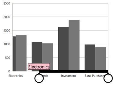
Thumb label
In touch mode while resizing or dragging the scrollbar to view thumb labels the ThumbLabelVisibility is set to true.
The following code example demonstrates the thumb labels in scrollbar.
<syncfusion:SfChart.PrimaryAxis>

<syncfusion:CategoryAxis EnableScrollBar="True" ThumbLabelVisibility="Visible" EnableTouchMode="True"/>

</syncfusion:SfChart.PrimaryAxis>chart.PrimaryAxis = new CategoryAxis()
{
EnableScrollBar = true,
EnableTouchMode = true,
ThumbLabelVisibility = Visibility.Visible
};
ThumbLabelTemplate
ThumbLabelTemplate property provides the custom template for the scroll bar thumb
<syncfusion:SfChart x:Name="chart">

    <syncfusion:SfChart.Resources>

        <DataTemplate x:Key="labelTemplate">

            <Grid>

                <Border BorderBrush="Black" Background="Pink"

                        BorderThickness="2">

                    <TextBlock Text="{Binding}" FontSize="15"/>

                </Border>

            </Grid>

        </DataTemplate>

    </syncfusion:SfChart.Resources>

    <syncfusion:SfChart.PrimaryAxis>

        <syncfusion:CategoryAxis EnableTouchMode="True" EnableScrollBar="True"

                                 ThumbLabelVisibility="Visible"

                                 ThumbLabelTemplate="{StaticResource labelTemplate}"/>

    </syncfusion:SfChart.PrimaryAxis>

</syncfusion:SfChart>chart.PrimaryAxis = new CategoryAxis()
{
EnableTouchMode = true,
EnableScrollBar = true,
ThumbLabelVisibility = Visibility.Visible,
ThumbLabelTemplate = chart.Resources["labelTemplate"] as DataTemplate
};
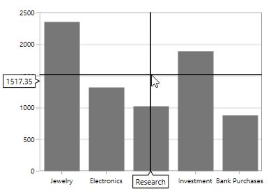
CrossHair
ChartCrossHairBehavior is used to view the values at mouse point or touch contact point. By moving these lines horizontally, you can get the X values and by moving these lines vertically, you can get the Y values.
Adding CrossHairBehavior to SfChart
You can create an instance ChartCrossHairBehavior and add it to the Behaviors collection.
<syncfusion:SfChart.Behaviors>

<syncfusion:ChartCrossHairBehavior />

</syncfusion:SfChart.Behaviors>
ChartCrossHairBehavior behavior = new ChartCrossHairBehavior();
chart.Behaviors.Add(behavior);To view the axis labels then set the ShowTrackBallInfo property to true as in the below code snippet.
<syncfusion:SfChart.PrimaryAxis>

<syncfusion:CategoryAxis  ShowTrackBallInfo="True"/>

</syncfusion:SfChart.PrimaryAxis>

<syncfusion:SfChart.SecondaryAxis>

<syncfusion:NumericalAxis  ShowTrackBallInfo="True"/>

</syncfusion:SfChart.SecondaryAxis>
ChartCrossHairBehavior behavior = new ChartCrossHairBehavior();
chart.Behaviors.Add(behavior);
chart.PrimaryAxis = new CategoryAxis()
{
ShowTrackBallInfo = true
};
chart.SecondaryAxis = new NumericalAxis()
{
ShowTrackBallInfo = true
};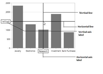
Cross hair is composed of the following parts.
-
Vertical and horizontal line.
-
Axis Labels
Vertical and Horizontal Line
If you add ChartCrossHairBehavior to chart you can see horizontal and vertical lines.The horizontal and vertical lines can be customized using HorizontalLineStyle and VerticalLineStyle properties.
HorizontalLineStyle
The following code snippet demonstrates the line style for horizontal line in cross hair.
<syncfusion:SfChart x:Name="chart">

    <syncfusion:SfChart.Resources>

        <Style TargetType="Line" x:Key="lineStyle">

            <Setter Property="Stroke" Value="Green"></Setter>

            <Setter Property="StrokeThickness" Value="1"></Setter>

        </Style>

    </syncfusion:SfChart.Resources>

    <syncfusion:SfChart.Behaviors>

        <syncfusion:ChartCrossHairBehavior HorizontalLineStyle="{StaticResource lineStyle}"/>

    </syncfusion:SfChart.Behaviors>

</syncfusion:SfChart>
ChartCrossHairBehavior crosshair = new ChartCrossHairBehavior()
{
HorizontalLineStyle = chart.Resources["lineStyle"] as Style
};
chart.Behaviors.Add(crosshair);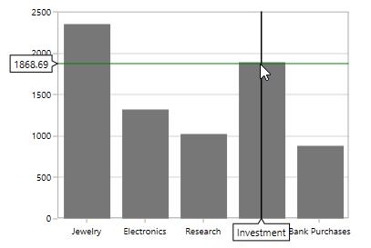
VerticalLineStyle
<syncfusion:SfChart x:Name="chart">

    <syncfusion:SfChart.Resources>

        <Style TargetType="Line" x:Key="lineStyle">

            <Setter Property="StrokeDashArray" Value="10,5"/>

            <Setter Property="Stroke" Value="Red"/>

             <Setter Property="StrokeThickness" Value="1"/>

        </Style>

    </syncfusion:SfChart.Resources>

     <syncfusion:SfChart.Behaviors>

                <syncfusion:ChartCrossHairBehavior VerticalLineStyle="{StaticResource lineStyle}"/>

    </syncfusion:SfChart.Behaviors>

</syncfusion:SfChart>
ChartCrossHairBehavior crosshair = new ChartCrossHairBehavior()
{
VerticalLineStyle = chart.Resources["lineStyle"] as Style
};
chart.Behaviors.Add(crosshair);
Horizontal axis label
The vertical line in contact with the x axes shows axis label. The horizontal axis label can be aligned using HorizontalAxisLabelAlignment property.
Axis Label can be aligned by Near, Far, Center, Auto and None Options.
Auto –Axis label is aligned in Near/Far positions based on the movement of vertical line.
Far-Axis label is positioned far from the position of vertical line in cross hair.
Near- Axis label is near to the position of trackball.
Center-Axis label is aligned to the center of the vertical line. By default the axis label will positioned in center.
The following image demonstrates the horizontal axis label positioned center to the vertical line.
Far
<syncfusion:SfChart.Behaviors>

<syncfusion:ChartCrossHairBehavior HorizontalAxisLabelAlignment="Far ">

</syncfusion:ChartCrossHairBehavior>

</syncfusion:SfChart.Behaviors>
ChartCrossHairBehavior behavior = new ChartCrossHairBehavior()
{
HorizontalAxisLabelAlignment = ChartAlignment.Far
};
chart.Behaviors.Add(behavior);
Near
<syncfusion:SfChart.Behaviors>

<syncfusion:ChartCrossHairBehavior HorizontalAxisLabelAlignment="Near ">

</syncfusion:ChartCrossHairBehavior>

</syncfusion:SfChart.Behaviors>
ChartCrossHairBehavior behavior = new ChartCrossHairBehavior()
{
HorizontalAxisLabelAlignment = ChartAlignment.Near
};
chart.Behaviors.Add(behavior);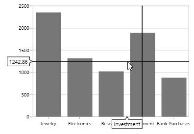
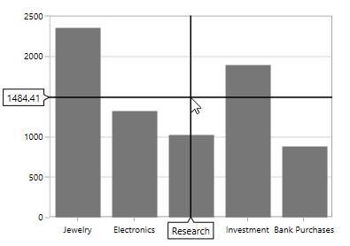
Vertical axis label
Vertical axis label is displayed when the horizontal line in contact with x axis.The label can be aligned using VerticalAxisLabelAlignment property.
Axis Label can be aligned by Near, Far, Center and Auto Options.
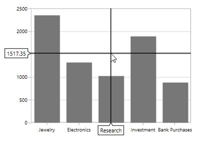
The following image demonstrates the horizontal axis label positioned center to the vertical line.
Near
<syncfusion:SfChart.Behaviors>

<syncfusion:ChartCrossHairBehavior VerticalAxisLabelAlignment="Near">

</syncfusion:ChartCrossHairBehavior>

</syncfusion:SfChart.Behaviors>
ChartCrossHairBehavior behavior = new ChartCrossHairBehavior()
{
VerticalAxisLabelAlignment = ChartAlignment.Near
};
chart.Behaviors.Add(behavior);
Far
<syncfusion:SfChart.Behaviors>

<syncfusion:ChartCrossHairBehavior VerticalAxisLabelAlignment="Far"  >

</syncfusion:ChartCrossHairBehavior>

</syncfusion:SfChart.Behaviors>
ChartCrossHairBehavior behavior = new ChartCrossHairBehavior()
{
VerticalAxisLabelAlignment = ChartAlignment.Far
};
chart.Behaviors.Add(behavior);