How can I help you?
Legend in UWP Charts (SfChart)
7 Jan 202524 minutes to read
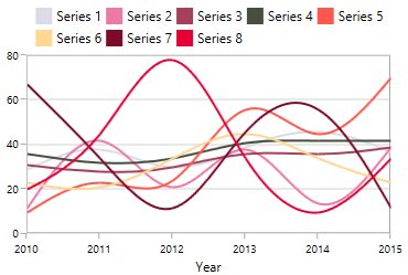
Legend provides metadata which helps for identifying elements in chart like chart series,
technical indicators, and trendlines.
You can define the legend using the following code example.
<chart:SfChart.Legend>

       <chart:ChartLegend />

</chart:SfChart.Legend>
SfChart chart = new SfChart();
chart.Legend = new ChartLegend();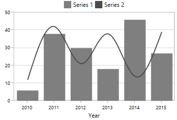
Each legend composed of the following parts:
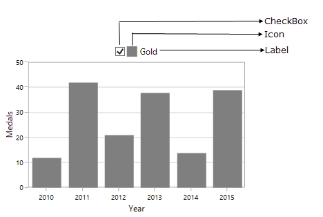
Legend Icon
Represents the symbol associated with each legend item. By default, the legend icon is Rectangle.
This can be customized using the LegendIcon property in any series as in below code snippet:
<chart:SfChart.Legend>

      <chart:ChartLegend/>

</chart:ChartLegend>

<chart:SplineSeries XBindingPath="Year" Label="Gold"

                    ItemsSource="{Binding List}" YBindingPath="India"

LegendIcon="Diamond" />chart.Legend = new ChartLegend();
SplineSeries splineSeries = new SplineSeries()
{
Label = "Gold",
ItemsSource = new ViewModel().List,
XBindingPath = "Year",
YBindingPath = "India",
LegendIcon = ChartLegendIcon.Diamond
};
chart.Series.Add(splineSeries);![]()
The following properties are used to customize the legend icons.
-
IconWidth-Gets or sets the double value that represents the legend icon(s) width. -
IconHeight-Gets or sets the double value that represents that legend icon(s) height. -
IconVisibility-Gets or sets the Visibility of the legend icon. -
ItemMargin-Gets or sets the margin for the legend items. -
CornerRadius-Gets or sets the corner radius of the legend.
The following code example illustrates the customization of legend icon.
<chart:SfChart.Legend>

    <chart:ChartLegend  IconHeight="10" IconWidth="10"

                        Margin="0,0,0,5"

                        HorizontalAlignment="Center"

                        VerticalAlignment="Center"

                        DockPosition="Top"

                        BorderBrush="Black" BorderThickness="1"

                        IconVisibility="Visible" CornerRadius="5"

                        ItemMargin="10">

    </chart:ChartLegend>

</chart:SfChart.Legend>
SfChart chart = new SfChart();
chart.Legend = new ChartLegend()
{
IconHeight = 10,
IconWidth = 10,
Margin = new Thickness(0, 0, 0, 5),
HorizontalAlignment = HorizontalAlignment.Center,
VerticalAlignment = VerticalAlignment.Center,
DockPosition = ChartDock.Top,
IconVisibility = Visibility.Visible,
CornerRadius = new CornerRadius(5),
ItemMargin = new Thickness(10),
BorderThickness = new Thickness(1),
BorderBrush = new SolidColorBrush(Colors.Black)
};![]()
The visibility of the legend icon can be changed by setting IconVisibility property in ChartLegend.
<chart:SfChart.Legend>

   <chart:ChartLegend  IconHeight="8" IconWidth="8"

                       IconVisibility="Collapsed" />

</chart:SfChart.Legend>chart.Legend = new ChartLegend()
{
IconHeight = 8,
IconWidth = 8,
IconVisibility = Visibility.Collapsed,
};![]()
Custom Legend Icon
We can add custom icon for the legend using LegendIconTemplate property in ChartSeries as in below example.
<syncfusion:SfChart x:Name="chart">

    <syncfusion:SfChart.Resources>

        <DataTemplate x:Key="iconTemplate">

            <Ellipse Height="15" Width="15" Fill="White"

                     Stroke="#4a4a4a" StrokeThickness="2"/>

        </DataTemplate>

    </syncfusion:SfChart.Resources>

    <syncfusion:SfChart.Legend>

        <syncfusion:ChartLegend/>

     </syncfusion:SfChart.Legend>

    <syncfusion:SplineSeries XBindingPath="Year"  Label="Gold"

	                         ItemsSource="{Binding List}"

                             YBindingPath="India"

                             LegendIconTemplate="{StaticResource iconTemplate}">

    </syncfusion:SplineSeries>

</syncfusion:SfChart>
SplineSeries series = new SplineSeries()
{
ItemsSource = new ViewModel().List,
XBindingPath = "Year",
YBindingPath = "India",
LegendIconTemplate = chart.Resources["iconTemplate"] as DataTemplate
};
chart.Series.Add(series);![]()
Label
Label property allows us to specify the label for each series which is to be displayed in legend label.
<chart:SfChart.Legend>

    <chart:ChartLegend>

    </chart:ChartLegend>

</chart:SfChart.Legend>

<chart:SplineSeries XBindingPath="Year" Label="Spline"

ItemsSource="{Binding List}" YBindingPath="India"/>chart.Legend = new ChartLegend();
SplineSeries splineSeries = new SplineSeries()
{
Label = "Spline",
ItemsSource = new ViewModel().List,
XBindingPath = "Year",
YBindingPath = "India",
};
chart.Series.Add(splineSeries);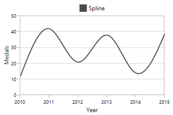
Checkbox
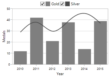
Used to view or collapse the associated series. By default, the CheckboxVisibility is Collapsed.
We can enable it by using the CheckBoxVisibility property as in below code example:
<chart:SfChart.Legend>

        <chart:ChartLegend CheckBoxVisibility="Visible" />

</chart:SfChart.Legend>chart.Legend = new ChartLegend()
{
CheckBoxVisibility = Visibility.Visible
};
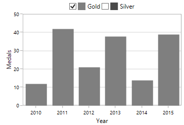
The series can be collapsed by unchecking the CheckBox as below:
ToggleSeriesVisibility
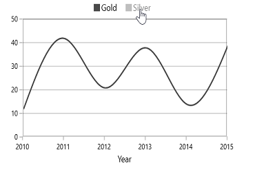
ToggleSeriesVisibility is used to view or collapse the associated series, by clicking on its legend item. By default, ToggleSeriesVisibility property is False.
We can enable the ToggleSeriesVisibility property as in below code example:
<chart:SfChart.Legend>

        <chart:ChartLegend ToggleSeriesVisibility="True" />

</chart:SfChart.Legend>chart.Legend = new ChartLegend()
{
ToggleSeriesVisibility = true
};The series can be collapsed, by clicking on the respective legend item,
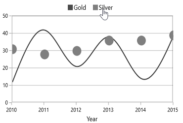
We can view the associated series, by clicking on its disabled legend item,
Positioning the Legend
Legend Position
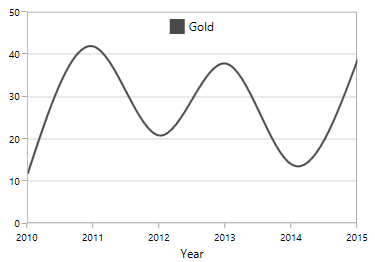
This allows us to position the legends Inside or Outside of the chart area (plotting area).
By default, it will be displayed outside and positioned at top (using DockPosition) of the chart area.
<chart:SfChart.Legend>

     <chart:ChartLegend LegendPosition="Inside" />

</chart:SfChart.Legend>chart.Legend = new ChartLegend()
{
LegendPosition = LegendPosition.Inside
};
Docking
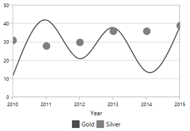
Legends can be docked left, right, and top or bottom around the chart area using DockPosition property.
By default, the ChartLegend is docked at the top of the chart as mentioned earlier.
To display the legend at the bottom, you can set the DockPosition as Bottom as in below code snippet.
<chart:SfChart.Legend>

    <chart:ChartLegend  DockPosition="Bottom"/>

</chart:SfChart.Legend>chart.Legend = new ChartLegend()
{
DockPosition = ChartDock.Bottom
};
Floating Legends
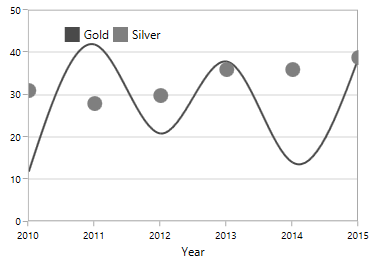
To position the legend at any arbitrary location inside chart, we need to set DockPosition as Floating and provide its relative position using OffsetXand OffsetY properties.
Offset specifies x or y distance from origin.
<chart:SfChart.Legend>

      <chart:ChartLegend  DockPosition="Floating" OffsetX="30" OffsetY="10"/>

</chart:SfChart.Legend>chart.Legend = new ChartLegend()
{
DockPosition = ChartDock.Floating,
OffsetX = 30,
OffsetY = 10
};
Legend Header
Chart provides support to add any UIElement as a header for legend items.
You can define the header for legend using the following code example.
<chart:SfChart.Legend>

      <chart:ChartLegend>

          <chart:ChartLegend.Header>

               <TextBlock Text="Medals" VerticalAlignment="Center"

                           HorizontalAlignment="Center" Margin="15"/>

            </chart:ChartLegend.Header>

     </chart:ChartLegend>

</chart:SfChart.Legend>
ChartLegend legend = new ChartLegend();
TextBlock textBlock = new TextBlock()
{
Text = "Medals",
HorizontalAlignment = HorizontalAlignment.Center,
VerticalAlignment = VerticalAlignment.Center,
Margin = new Thickness(15)
};
legend.Header = textBlock;
chart.Legend = legend;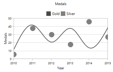
Multiple Legends
Chart control supports showing the legend in multiple panels, to view the legend clearly when multiple areas and greater numbers of chart series are present.
The following code example shows how to create multiple legends in a single chart.
<chart:SfChart.Legend>

   <chart:ChartLegendCollection>

       <chart:ChartLegend chart:SfChart.Column="0"/>

       <chart:ChartLegend chart:SfChart.Column="1" />

    </chart:ChartLegendCollection>

</chart:SfChart.Legend>

<chart:ColumnSeries Interior="#4a4a4a" Label="Legend1"

                    ItemsSource="{Binding SneakersDetail}" XBindingPath="Brand"

					          YBindingPath="ItemsCount1" />

<chart:SplineSeries Label="Legend2" ItemsSource="{Binding SneakersDetail}"

                    XBindingPath="Brand" YBindingPath="ItemsCount" >

    <chart:SplineSeries.XAxis>

          <chart:CategoryAxis chart:SfChart.Column="1">

          </chart:CategoryAxis>

     </chart:SplineSeries.XAxis>

</chart:SplineSeries>
ChartLegendCollection legendCollection = new ChartLegendCollection();
ChartLegend legend1 = new ChartLegend();
SfChart.SetColumn(legend1, 0);
ChartLegend legend2 = new ChartLegend();
SfChart.SetColumn(legend2, 1);
legendCollection.Add(legend1);
legendCollection.Add(legend2);
chart.Legend = legendCollection;
ColumnSeries columnSeries = new ColumnSeries()
{
Label = "Legend1",
ItemsSource = new ViewModel().SneakersDetail,
XBindingPath = "Brand",
YBindingPath = "ItemsCount1",
Interior = new SolidColorBrush(Color.FromRgb(0x4a, 0x4a, 0x4a)),
};
CategoryAxis axis = new CategoryAxis();
SfChart.SetColumn(axis, 1);
SplineSeries splineSeries = new SplineSeries()
{
Label = "Legend1",
ItemsSource = new ViewModel().SneakersDetail,
XBindingPath = "Brand",
YBindingPath = "ItemsCount",
XAxis = axis
};
chart.Series.Add(columnSeries);
chart.Series.Add(splineSeries);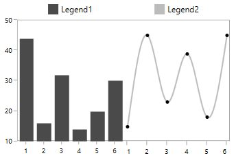
Legends for Accumulation Series
For the series like Pie, Doughnut, Funnel and Pyramid, legends will be generated for all the data points. But for remaining series, each legend corresponds to each series. By default, the Interior color of the segment (data point) is applied to the legend icon.
The following code snippets explains how the legends displaying for accumulation series.
<chart:SfChart.Legend>

   <chart:ChartLegend />

</chart:SfChart.Legend>

<chart:PieSeries  XBindingPath="Category"

ItemsSource="{Binding Tax}" YBindingPath="Percentage"/>chart.Legend = new ChartLegend();
PieSeries pieSeries = new PieSeries()
{
ItemsSource = new ViewModel().Tax,
XBindingPath = "Category",
YBindingPath = "Percentage"
};
chart.Series.Add(pieSeries);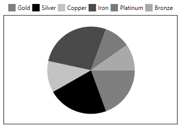
NOTE
Here Legend ‘Label’ will be the x value of the Pie chart.
Series visibility on legend
We can limit the number of series and trendlines to be displayed in chart using VisibilityOnLegend property as shown in below example.
<chart:SfChart.Legend>

    <chart:ChartLegend>

    </chart:ChartLegend>

</chart:SfChart.Legend>

<chart:SplineSeries XBindingPath="Year" Label="Gold"

                    VisibilityOnLegend="Collapsed"

                    ItemsSource="{Binding List}" YBindingPath="India">

</chart:SplineSeries>

<chart:ColumnSeries XBindingPath="Year"

                    VisibilityOnLegend="Visible"

                    Label="Silver" YBindingPath="America"

ItemsSource="{Binding List}" />chart.Legend = new ChartLegend();
SplineSeries splineSeries = new SplineSeries()
{
Label = "Gold",
ItemsSource = new ViewModel().List,
XBindingPath = "Year",
YBindingPath = "India",
VisibilityOnLegend = Visibility.Collapsed
};
ColumnSeries columnSeries = new ColumnSeries()
{
Label = "Silver",
ItemsSource = new ViewModel().List,
XBindingPath = "Year",
YBindingPath = "America",
VisibilityOnLegend = Visibility.Visible
};
chart.Series.Add(splineSeries);
chart.Series.Add(columnSeries);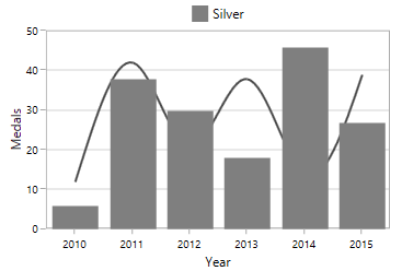
Legend Orientation
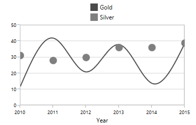
Orientation of the Legend can be vertical or horizontal. By default the Orientation is Horizontal.
<chart:SfChart.Legend>

   <chart:ChartLegend  Orientation="Vertical"/>

</chart:SfChart.Legend>chart.Legend = new ChartLegend()
{
Orientation = ChartOrientation.Vertical
};
Customization
ItemTemplate
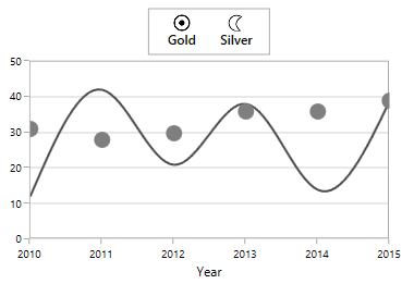
You can customize each legend item using ItemTemplate property in ChartLegend as in below code snippet:
<syncfusion:SfChart x:Name="chart">

     <syncfusion:SfChart.Resources>

            <local:ImageConverter x:Key="imageConverter"/>

            <DataTemplate x:Key="itemTemplate">

                <Grid Margin="10,0,10,0" >

                    <Grid.RowDefinitions>

                        <RowDefinition/>

                        <RowDefinition/>

                    </Grid.RowDefinitions>

                    <Image  Width="30" Height="15"

                            Source="{Binding Converter={StaticResource imageConverter}}"/>

                    <TextBlock HorizontalAlignment="Center" FontSize="12"

                               Grid.Row="1" Foreground="Black"

                               FontWeight="SemiBold" Text="{Binding Label}">

                    </TextBlock>

                </Grid>

             </DataTemplate>

    </syncfusion:SfChart.Resources>

    <syncfusion:SfChart.Legend>

                <syncfusion:ChartLegend ItemTemplate="{StaticResource itemTemplate}"/>

    </syncfusion:SfChart.Legend>

</syncfusion:SfChart>
SfChart chart = new SfChart();
chart.Legend = new ChartLegend()
{
ItemTemplate = chart.Resources["itemTemplate"] as DataTemplate
};
public class ImageConverter:IValueConverter
{
public object Convert(object value, Type targetType, object parameter, System.Globalization.CultureInfo culture)
{
LegendItem item = value as LegendItem;
if (item.Label == "Gold")
return new BitmapImage(new Uri(("gold_symbol.png"),UriKind.RelativeOrAbsolute));
else
return new BitmapImage(new Uri(("silver_symbol.png"), UriKind.RelativeOrAbsolute));
}
public object ConvertBack(object value, Type targetType, object parameter, System.Globalization.CultureInfo culture)
{
return value;
}
}
Customizing Legend Items Layout
When there is more number of legends, the legend exceeds the chart will be cropped, as it arranged horizontally. To avoid the cropping we can change the existing arrangement layout (one which arrange each legend items horizontally) using
ItemsPanel property as in below code snippet:
<syncfusion:SfChart x:Name="chart">

    <syncfusion:SfChart.Resources>

        <ItemsPanelTemplate x:Key="itemPanelTemplate">

             <ItemsWrapGrid Orientation="Horizontal"/>

        </ItemsPanelTemplate>

    </syncfusion:SfChart.Resources>

    <syncfusion:SfChart.Legend>

            <syncfusion:ChartLegend ItemsPanel="{StaticResource itemPanelTemplate}"/>

    </syncfusion:SfChart.Legend>

 </syncfusion:SfChart>
SfChart chart = new SfChart();
chart.Legend = new ChartLegend()
{
ItemsPanel = chart.Resources["itemPanelTemplate"] as ItemsPanelTemplate
};