How can I help you?
Series in UWP Charts (SfChart)
7 Jan 202524 minutes to read
ChartSeries is the visual representation of the data. SfChart offers many types of series ranging from LineSeries to FinancialSeries like HiLo and Candle. Based on your requirements and specifications, any type of Series can be added for data visualization.
The following APIs are common for the most of the series types:
-
XBindingPath-A string property that represents the X values for the series. -
YBindingPath-A string property that represents the Y values for the series. -
Stroke-Represents the brush for the series outline. -
StrokeThickness-Represents the thickness of the for the series outline. -
Interior-Represents the brush to fill the series. -
Palette-Used to define the set of pre-defined or custom colors for the series.
Column and Bar Charts
Column
Column charts plot discrete rectangles for the given values. The following code example demonstrates the usage of ColumnSeries.
<chart:ColumnSeries Interior="#7F7F7F" ItemsSource="{Binding SneakersDetail}"

XBindingPath="Brand" YBindingPath="ItemsCount1"   />
ColumnSeries series = new ColumnSeries()
{
ItemsSource = new ViewModel().SneakersDetail,
XBindingPath = "Brand",
YBindingPath = "ItemsCount1",
Interior = new SolidColorBrush(Color.FromRgb(0x7F, 0x7F, 0x7F))
};
chart.Series.Add(series);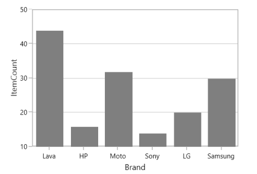
Bar
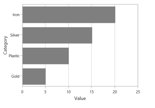
Bar series are similar to column series, excepts its orientation. The following code examples shows how to use BarSeries.
<chart:BarSeries ItemsSource="{Binding CategoricalData}" XBindingPath="Category"

YBindingPath="Value" Interior="#7F7F7F" />
BarSeries series = new BarSeries()
{
ItemsSource = new ViewModel().CategoricalData,
XBindingPath = "Category",
YBindingPath = "Value",
Interior = new SolidColorBrush(Color.FromRgb(0x7F, 0x7F, 0x7F))
};
SegmentSpacing
The SegmentSpacing property sets spacing among the segments when multiple series are added to the chart. Its value ranges from 0 to 1. The following code demonstrates how to use the SegmentSpacing property in series.
<syncfusion:ColumnSeries ItemsSource="{Binding Data}" XBindingPath="Item" YBindingPath="Price" SegmentSpacing="0.6">

</syncfusion:ColumnSeries>

<syncfusion:ColumnSeries ItemsSource="{Binding Data1}" XBindingPath="Item" YBindingPath="Price" SegmentSpacing="0.6">

</syncfusion:ColumnSeries>
SfChart chart = new SfChart();
ColumnSeries series1 = new ColumnSeries()
{
SegmentSpacing = 0.6,
};
chart.Series.Add(series1);
ColumnSeries series2 = new ColumnSeries()
{
SegmentSpacing = 0.6
};
chart.Series.Add(series2);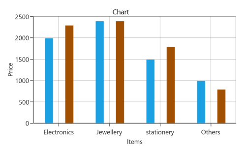
Line and Spline Charts
Line
Line series join points on a plot by straight lines, showing data trends at equal intervals. The following code example explains how to create a simple LineSeries using given data
<chart:LineSeries  XBindingPath="Year

ItemsSource="{Binding List}" YBindingPath="India"

Interior="#4A4A4A"/>

<chart:LineSeries  XBindingPath="Year"

ItemsSource="{Binding List}" YBindingPath="America"

Interior="#4A4A4A"/>
LineSeries series1 = new LineSeries()
{
ItemsSource = new ViewModel().List,
XBindingPath = "Year",
YBindingPath = "India",
Interior = new SolidColorBrush(Color.FromRgb(0x4A, 0x4A, 0x4A))
};
LineSeries series2 = new LineSeries()
{
ItemsSource = new ViewModel().List,
XBindingPath = "Year",
YBindingPath = "America",
Interior = new SolidColorBrush(Color.FromRgb(0x4A, 0x4A, 0x4A))
};
chart.Series.Add(series1);
chart.Series.Add(series2);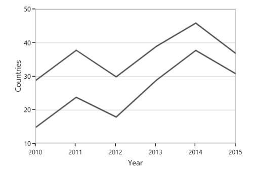
Spline
SplineSeries resembles line series, but the difference between them is that instead of connecting the data points with line segments, the data points are connected by smooth Bezier curves.
<chart:SplineSeries  XBindingPath="Year"

ItemsSource="{Binding List}" YBindingPath="India"

Interior="#4A4A4A"/>

<chart:SplineSeries  XBindingPath="Year"

ItemsSource="{Binding List}" YBindingPath="America"

Interior="#4A4A4A"/>
SplineSeries series1 = new SplineSeries()
{
ItemsSource = new ViewModel().List,
XBindingPath = "Year",
YBindingPath = "India",
Interior = new SolidColorBrush(Color.FromRgb(0x4A, 0x4A, 0x4A))
};
SplineSeries series2 = new SplineSeries()
{
ItemsSource = new ViewModel().List,
XBindingPath = "Year",
YBindingPath = "America",
Interior = new SolidColorBrush(Color.FromRgb(0x4A, 0x4A, 0x4A))
};
chart.Series.Add(series1);
chart.Series.Add(series2);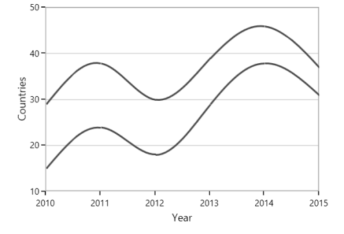
Dashed Lines
StrokeDashArray property of the SplineSeries is used to render spline series with dashes.
<chart:SplineSeries ItemsSource="{Binding List}" XBindingPath="Year" YBindingPath="India" StrokeDashArray="5,3" />SplineSeries series = new SplineSeries()
{
ItemsSource = new ViewModel().List,
XBindingPath = "Year",
YBindingPath = "India"
};
DoubleCollection doubleCollection = new DoubleCollection();
doubleCollection.Add(5);
doubleCollection.Add(3);
series.StrokeDashArray = doubleCollection;
chart.Series.Add(series);Spline rendering types
The SplineType allows you to change the spline curve in series.
The following types are used in SplineSeries:
- Natural
- Monotonic
- Cardinal
- Clamped
By default, the value of SplineType is Natural.
Cardinal
The following code demonstrates how to set the value of SplineType to Cardinal.
<chart:SplineSeries SplineType="Cardinal">

</chart:SplineSeries>
SplineSeries series = new SplineSeries();
series.SplineType = SplineType.Cardinal;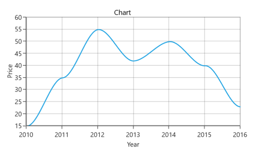
Monotonic
The following code demonstrates how to set the value of SplineType to Monotonic.
<chart:SplineSeries SplineType="Monotonic">

</chart:SplineSeries>
SplineSeries series = new SplineSeries();
series.SplineType = SplineType.Monotonic;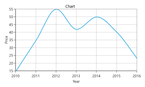
Clamped
The following code demonstrates how to set the value of SplineType to Clamped.
<chart:SplineSeries SplineType="Clamped">

</chart:SplineSeries>
SplineSeries series = new SplineSeries();
series.SplineType = SplineType.Clamped;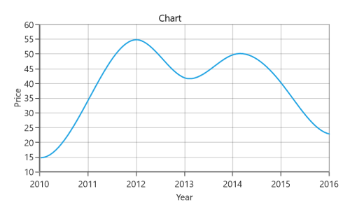
Bubble and Scatter
Bubble
BubbleSeries is represented by closely packed circles, whose areas are proportional to the quantities.
The size of the bubble series is relative proportional to the value bind with the series using Size property. You can set the constraints on this size using MinimumRadius and MaximumRadius.
<chart:BubbleSeries  ItemsSource="{Binding Fruits}"  XBindingPath="FruitName"

YBindingPath="People"   Size="Size" MinimumRadius="5"

MaximumRadius="10"

Interior="#BCBCBC" />
BubbleSeries series = new BubbleSeries()
{
ItemsSource = new ViewModel().Fruits,
XBindingPath = "FruitName",
YBindingPath = "People",
Size = "Size",
MinimumRadius = 5,
Interior = new SolidColorBrush(Color.FromRgb(0x4A, 0x4A, 0x4A))
};
chart.Series.Add(series);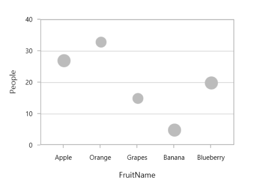
Scatter
ScatterSeries is similar to bubble series, where each point being represented by an ellipse with equal size. This size can be defined using ScatterHeight and ScatterWidth property.
<chart:ScatterSeries Interior="#4A4A4A" ScatterHeight="4" ScatterWidth="4"

ItemsSource="{Binding DataPoints}" XBindingPath="Eruptions"

YBindingPath="WaitingTime"/>
ScatterSeries series = new ScatterSeries()
{
ItemsSource = new ViewModel().DataPoints,
XBindingPath = "Eruptions",
YBindingPath = "WaitingTime",
ScatterHeight = 4,
ScatterWidth = 4,
Interior = new SolidColorBrush(Color.FromRgb(0x4A, 0x4A, 0x4A))
};
chart.Series.Add(series);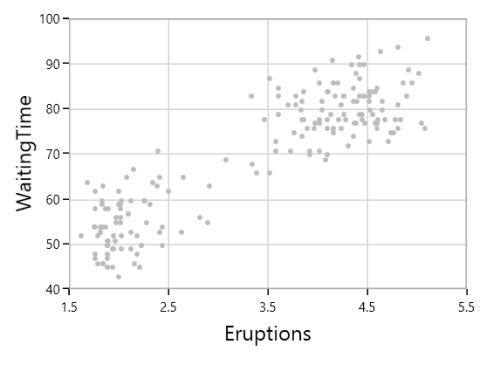
Area Charts
Area
AreaSeries is rendered using a collection of line segments connected to form a closed loop area, filled with the specified color.
The following code example initializes the AreaSeries:
<chart:AreaSeries XBindingPath="FruitName" Interior="#BCBCBC"

YBindingPath="People" ItemsSource="{Binding Fruits}" >
AreaSeries series = new AreaSeries()
{
ItemsSource = new ViewModel().Fruits,
XBindingPath = "FruitName",
YBindingPath = "People",
Interior = new SolidColorBrush(Color.FromRgb(0xBC, 0xBC, 0xBC))
};
chart.Series.Add(series);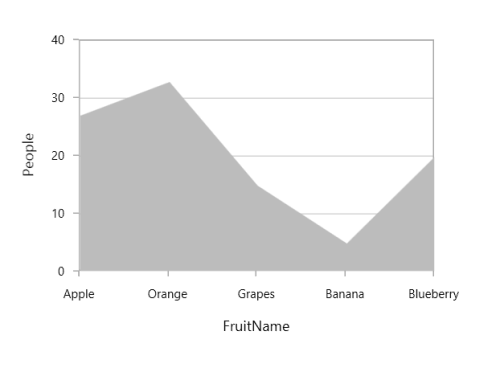
Spline Area
SplineAreaSeries connects a series of data points using smooth Bezier line curves, with the underlying areas filled.
<chart:SplineAreaSeries Interior="#7F7F7F"

ItemsSource="{Binding Products}" XBindingPath="ProdName"

YBindingPath="Price" />
SplineAreaSeries series = new SplineAreaSeries()
{
ItemsSource = new ViewModel().Products,
XBindingPath = "ProdName",
YBindingPath = "Price",
Interior = new SolidColorBrush(Color.FromRgb(0x7F, 0x7F, 0x7F))
};
chart.Series.Add(series);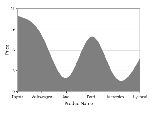
Step Area
StepAreaSeries is similar to AreaSeries but it does not use the shortest distance to connect two data points using Bezier curves. Instead, this ChartSeries uses vertical and horizontal lines to connect the data points in a series forming a step-like progression.
<chart:StepAreaSeries  Interior="#7F7F7F"

ItemsSource="{Binding SneakersDetail}" XBindingPath="Brand"

YBindingPath="ItemsCount"/>
StepAreaSeries series = new StepAreaSeries()
{
ItemsSource = new ViewModel().SneakersDetail,
XBindingPath = "Brand",
YBindingPath = "ItemsCount",
Interior = new SolidColorBrush(Color.FromRgb(0x7F, 0x7F, 0x7F))
};
chart.Series.Add(series);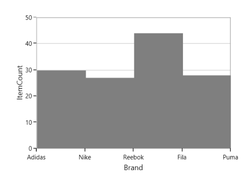
Closed Area
If you wish to draw the open area series (Area with stroke only at top), SfChart provides IsClosed property. By default, this property is true.
<chart:AreaSeries  IsClosed="False"

XBindingPath="FruitName" Interior="#BCBCBC"

YBindingPath="People" ItemsSource="{Binding Fruits}" />
AreaSeries series = new AreaSeries()
{
ItemsSource = new ViewModel().Fruits,
XBindingPath = "FruitName",
YBindingPath = "People",
IsClosed = true,
Interior = new SolidColorBrush(Color.FromRgb(0xBC, 0xBC, 0xBC))
};
chart.Series.Add(series);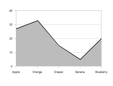
Pie and Doughnut Charts
Pie
PieSeries is divided into sectors, illustrating numerical proportion. The following code example illustrates the PieSeries.
<chart:PieSeries XBindingPath="Category"

ItemsSource="{Binding Tax}"

YBindingPath="Percentage"/>
PieSeries series = new PieSeries()
{
ItemsSource = new ViewModel().Tax,
XBindingPath = "Category",
YBindingPath = "Percentage"
};
chart.Series.Add(series);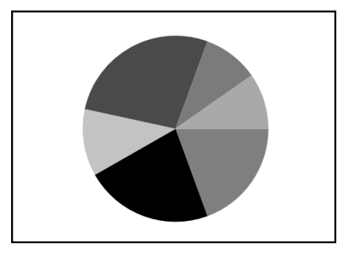
The rendering size of the PieSeries can be controlled using PieCoefficient property as in below code example.
<chart:PieSeries PieCoefficient="0.9"

XBindingPath="Category"

ItemsSource="{Binding Tax}"

YBindingPath="Percentage"/>
PieSeries series = new PieSeries()
{
ItemsSource = new ViewModel().Tax,
XBindingPath = "Category",
YBindingPath = "Percentage",
PieCoefficient = 0.9
};
chart.Series.Add(series);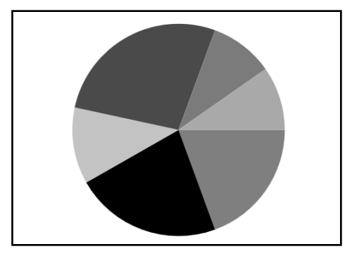
Doughnut
DoughnutSeries is similar to PieSeries. It is used to show the relationship between parts of data and whole data.
The DoughnutSeries can be added to chart as in below code example:
<chart:DoughnutSeries XBindingPath="Category"

ItemsSource="{Binding Tax}"

YBindingPath="Percentage"/>
DoughnutSeries series = new DoughnutSeries()
{
ItemsSource = new ViewModel().Tax,
XBindingPath = "Category",
YBindingPath = "Percentage"
};
chart.Series.Add(series);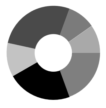
The Doughnut also having coefficient property, DoughnutCoefficient which defines the inner circle. Also it has DoughnutSize, used to define the size for this series like PieCoefficient in PieSeries.
<chart:DoughnutSeries DoughnutCoefficient="0.7"

XBindingPath="Category" ItemsSource="{Binding Tax}"

YBindingPath="Percentage" />
DoughnutSeries series = new DoughnutSeries()
{
ItemsSource = new ViewModel().Tax,
XBindingPath = "Category",
YBindingPath = "Percentage",
DoughnutCoefficient = 0.9
};
chart.Series.Add(series);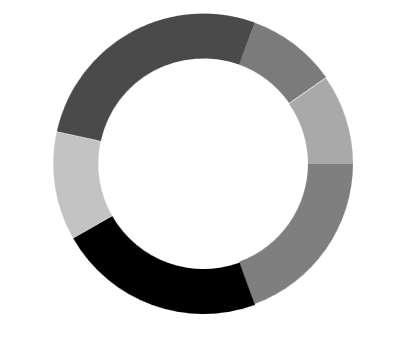
Semi Pie and Doughnut
By having custom StartAngle and EndAngle, you can draw pie series in different shapes like semicircular or quarter circular series.
<syncfusion:PieSeries StartAngle="180" EndAngle="360"

XBindingPath="Utilization"

YBindingPath="ResponseTime"

ItemsSource="{Binding}"/>
PieSeries series = new PieSeries()
{
ItemsSource = new ViewModel().Value,
XBindingPath = "Utilization",
YBindingPath = "ResponseTime",
StartAngle = 180,
EndAngle = 360
};
chart.Series.Add(series);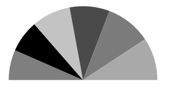
<syncfusion:DoughnutSeries StartAngle="180" EndAngle="360"

XBindingPath="Utilization"

YBindingPath="ResponseTime"

ItemsSource="{Binding}"/>
DoughnutSeries series = new DoughnutSeries()
{
ItemsSource = new ViewModel().Value,
XBindingPath = "Utilization",
YBindingPath = "ResponseTime",
StartAngle = 180,
EndAngle = 360
};
chart.Series.Add(series);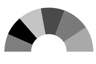
Explode Segments
The following properties are used to explode the individual segments in Pie, Doughnut, Funnel and Pyramid.
-
ExplodeAll- Used to explode all the segments of these series. -
ExplodeIndex- Used to explode any specific segment. -
ExplodeRadius- Used to define the explode distance. -
ExplodeOnMouseClick-Used to explode the segment on mouse click or tap.
Explode Index
<syncfusion:PieSeries ItemsSource="{Binding}"

ExplodeIndex="2"

ExplodeRadius="10"

XBindingPath="Utilization"

YBindingPath="ResponseTime" />
PieSeries series = new PieSeries()
{
ItemsSource = new ViewModel().Data,
XBindingPath = "Utilization",
YBindingPath = "ResponseTime",
ExplodeIndex = 2,
ExplodeRadius = 10
};
chart.Series.Add(series);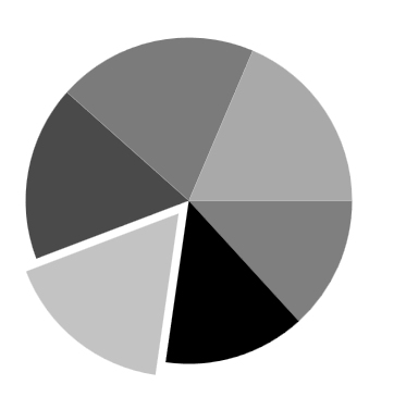
NOTE
We have defined
ExplodeRadiusas 10, by default its value is zero. So you need to defineExplodeRadius, when you setExplodeIndexorExplodeAll.
Explode All
<chart:PieSeries ExplodeAll="True"

ExplodeRadius="15"

XBindingPath="Category"

ItemsSource="{Binding Tax}"

YBindingPath="Percentage">
PieSeries series = new PieSeries()
{
ItemsSource = new ViewModel().Tax,
XBindingPath = "Category",
YBindingPath = "Percentage",
ExplodeAll = true,
ExplodeRadius = 15
};
chart.Series.Add(series);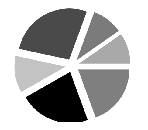
Stacked doughnut
Doughnut segments can be separated as individual circles using the IsStackedDoughnut property. The following properties are used to customize the stacked doughnut chart:
-
CapStyle- Specifies the shapes of the start and end points of a circular segment. The supported values areBothFlat,BothCurve,StartCurve, andEndCurve. The default value of the this property is BothFlat. -
SegmentSpacing- Changes the spacing between two individual segments. The default value of spacing is 0, and the value ranges from 0 to 1. Here, 1 represents 100%, and 0 represents 0% of the available space. -
MaximumValue- Represents the entire span of an individual circle. The default value of the this property is double.NaN. -
TrackColor- Changes the color of the track area. -
TrackBorderColor- Changes the color of the track border. -
TrackBorderWidth- Changes the width of the track border.
<Syncfusion:DoughnutSeries XBindingPath="Category" YBindingPath="Expenditure" ItemsSource="{Binding ExpenditureData}"
    IsStackedDoughnut="True" CapStyle="BothCurve" SegmentSpacing="0.2"
      MaximumValue="100">
</syncfusion:DoughnutSeries>
SfChart chart = new SfChart();
DoughnutSeries doughnutSeries = new DoughnutSeries()
{
XBindingPath = "Category",
YBindingPath = "Expenditure",
ItemsSource = new ViewModel().ExpenditureData,
IsStackedDoughnut = true,
CapStyle = DoughnutCapStyle.BothCurve,
SegmentSpacing = 0.2,
MaximumValue = 100
};
chart.Series.Add(doughnutSeries);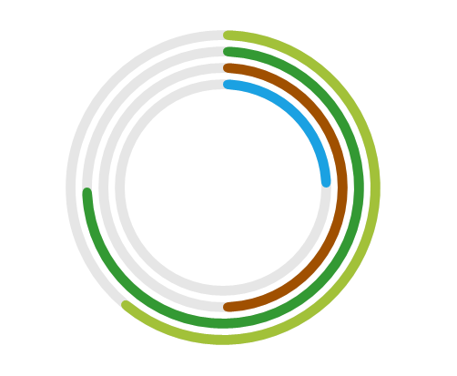
Add content to the center of doughnut chart
You can add any content to the center of the doughnut chart using the CenterView property of DoughnutSeries. The binding context of the CenterView will be the respective DoughnutSeries.
<syncfusion:DoughnutSeries.CenterView>
    <ContentControl HorizontalAlignment="Center" VerticalAlignment="Center" >
    <Image Source="/Image/Person.png" Width="164" Height="164"/>
    </ContentControl>
</syncfusion:DoughnutSeries.CenterView>
ContentControl centerView = new ContentControl()
{
Content = new Image()
{
HorizontalAlignment = HorizontalAlignment.Center,
VerticalAlignment = VerticalAlignment.Center,
Source = new BitmapImage(new Uri("Image/Person.png", UriKind.Relative)),
Width = 164,
Height = 164
}
};
doughnutSeries.CenterView = centerView;
Funnel and Pyramid Charts
Pyramid
PyramidSeries has the form of a triangle with lines dividing it into sections and each section has a different width. Depending on the Y co-ordinates, this width indicates a level of hierarchy among other categories.
<chart:PyramidSeries XBindingPath="Category"

ItemsSource="{Binding Tax}"

YBindingPath="Percentage"/>
PyramidSeries series = new PyramidSeries()
{
ItemsSource = new ViewModel().Tax,
XBindingPath = "Category",
YBindingPath = "Percentage"
};
chart.Series.Add(series);
The PyramidMode is used to define the rendering mode such as Surface or Linear for pyramid segments.
PyramidMode as Surface
<chart:PyramidSeries XBindingPath="Category"

PyramidMode="Surface"

ItemsSource="{Binding Tax}"

YBindingPath="Percentage"/>
PyramidSeries series = new PyramidSeries()
{
ItemsSource = new ViewModel().Tax,
XBindingPath = "Category",
YBindingPath = "Percentage",
PyramidMode = ChartPyramidMode.Surface
};
chart.Series.Add(series);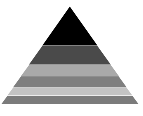
PyramidMode as Linear
<chart:PyramidSeries XBindingPath="Category"

PyramidMode="Linear"

ItemsSource="{Binding Tax}"

YBindingPath="Percentage"/>
PyramidSeries series = new PyramidSeries()
{
ItemsSource = new ViewModel().Tax,
XBindingPath = "Category",
YBindingPath = "Percentage",
PyramidMode = ChartPyramidMode.Linear
};
chart.Series.Add(series);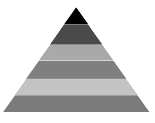
Funnel
FunnelSeries is similar to PyramidSeries, displays data in a funnel shape that equals to 100% when totaled. It is a single series, representing data as portions of 100% and does not use any axes.
The following code example shows how to use the funnel series:
<chart:FunnelSeries XBindingPath="Category" ItemsSource="{Binding list}"

YBindingPath="Percentage" />
FunnelSeries series = new FunnelSeries()
{
ItemsSource = new ViewModel().List,
XBindingPath = "Category",
YBindingPath = "Percentage",
};
chart.Series.Add(series);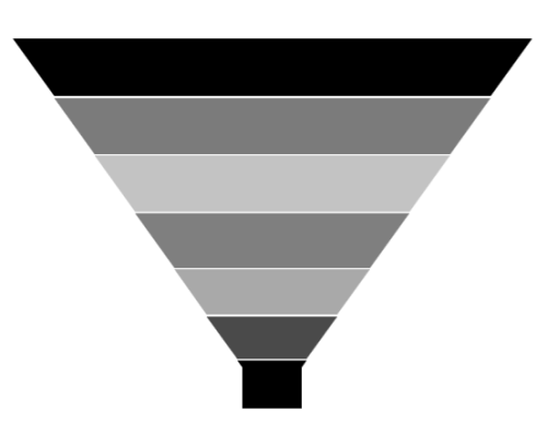
Funnel Mode
The FunnelMode defines a rendering mode for the funnel series which define, where to bind your values (to height or width). The following example demonstrates ValueIsHeight and ValueIsWidth funnel mode:
ValueIsHeight
<chart:FunnelSeries XBindingPath="Category" ItemsSource="{Binding list}"

FunnelMode="ValueIsHeight"

YBindingPath="Percentage" />
FunnelSeries series = new FunnelSeries()
{
ItemsSource = new ViewModel().List,
XBindingPath = "Category",
YBindingPath = "Percentage",
FunnelMode = ChartFunnelMode.ValueIsHeight
};
chart.Series.Add(series);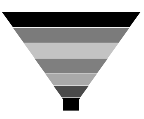
ValueIsWidth
<chart:FunnelSeries XBindingPath="Category" ItemsSource="{Binding list}"

FunnelMode="ValueIsWidth"

YBindingPath="Percentage" />
FunnelSeries series = new FunnelSeries()
{
ItemsSource = new ViewModel().List,
XBindingPath = "Category",
YBindingPath = "Percentage",
FunnelMode = ChartFunnelMode.ValueIsWidth
};
chart.Series.Add(series);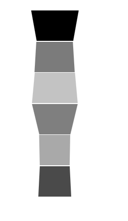
Explode Segments
The following properties are used to explode the individual segments in Pie, Doughnut, Funnel and Pyramid.
-
ExplodeAll- Used to explode all the segments of these series. -
ExplodeIndex- Used to explode any specific segment. -
ExplodeOffset- Used to define the explode distance like ExplodeRadius for Pie. -
ExplodeOnMouseClick-Used to explode the segment on mouse click or tap.
Explode Offset
<chart:FunnelSeries XBindingPath="Category" ItemsSource="{Binding list}"

ExplodeIndex="4"  ExplodeOffset="70" YBindingPath="Percentage" >

</chart:FunnelSeries>
FunnelSeries series = new FunnelSeries()
{
ItemsSource = new ViewModel().List,
XBindingPath = "Category",
YBindingPath = "Percentage",
ExplodeIndex = 4,
ExplodeOffset = 70
};
chart.Series.Add(series);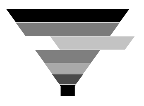
Gap Ratio
The gap between each segment using GapRatio property as in the following code example.
<chart:FunnelSeries XBindingPath="Category" ItemsSource="{Binding list}"

GapRatio="0.5" YBindingPath="Percentage">

</chart:FunnelSeries>
FunnelSeries series = new FunnelSeries()
{
ItemsSource = new ViewModel().List,
XBindingPath = "Category",
YBindingPath = "Percentage",
GapRatio = 0.5
};
chart.Series.Add(series);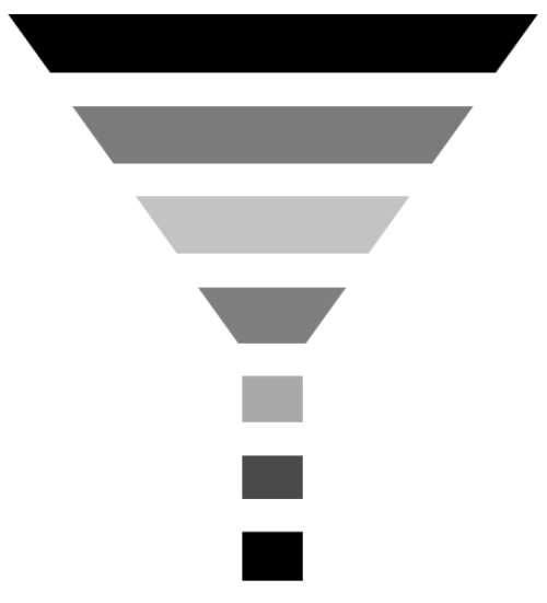
Radar and Polar Charts
Radar
RadarSeries represents a collection of data, displayed by quantitative variables, represented on axes starting from the same point. The relative position and angle of the axes is not uniform.
The following code example illustrates the use of radar series:
<chart:RadarSeries ItemsSource="{Binding PlantDetails}"

Interior="#BCBCBC"

XBindingPath="Direction"

YBindingPath="Tree" >

</chart:RadarSeries>
RadarSeries series = new RadarSeries()
{
ItemsSource = new ViewModel().PlantDetails,
XBindingPath = "Direction",
YBindingPath = "Tree",
Interior = new SolidColorBrush(Color.FromRgb(0xBC, 0xBC, 0XBC))
};
chart.Series.Add(series);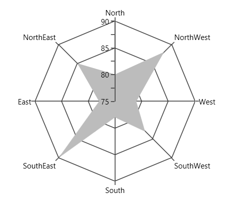
Polar
PolarSeries displays data points that are grouped by category, on a 360 degree circle. The following code example shows how to use polar series.
<chart:PolarSeries Interior="#4A4A4A"

ItemsSource="{Binding PlantDetails}"

XBindingPath="Direction"

YBindingPath="Tree" />
PolarSeries series = new PolarSeries()
{
ItemsSource = new ViewModel().PlantDetails,
XBindingPath = "Direction",
YBindingPath = "Tree",
Interior = new SolidColorBrush(Color.FromRgb(0x4A, 0x4A, 0X4A))
};
chart.Series.Add(series);
The Radar and Polar charts having the following properties in common:
IsClosed
This property used to draw the closed path as below.
<chart:PolarSeries x:Name="series1" Interior="#4A4A4A"

ItemsSource="{Binding PlantDetails}"

Label="Amount Spent" DrawType="Line" IsClosed="False"

XBindingPath="Direction" YBindingPath="Tree"

StrokeThickness="2" />
PolarSeries series = new PolarSeries()
{
ItemsSource = new ViewModel().PlantDetails,
XBindingPath = "Direction",
YBindingPath = "Tree",
IsClosed = false,
DrawType = ChartSeriesDrawType.Line,
Label = "Amount Spent",
StrokeThickness = 2,
Interior = new SolidColorBrush(Color.FromRgb(0x4A, 0x4A, 0X4A))
};
chart.Series.Add(series);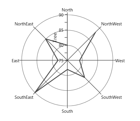
DrawType
This property defines type of curve, whether its Line or Area.
DrawType as Area
<chart:PolarSeries x:Name="series1" Interior="#4A4A4A"

ItemsSource="{Binding PlantDetails}"

DrawType="Area" IsClosed="True"

XBindingPath="Direction" YBindingPath="Tree" />
PolarSeries series = new PolarSeries()
{
ItemsSource = new ViewModel().PlantDetails,
XBindingPath = "Direction",
YBindingPath = "Tree",
IsClosed = True,
DrawType = ChartSeriesDrawType.Area,
Interior = new SolidColorBrush(Color.FromRgb(0x4A, 0x4A, 0X4A))
};
chart.Series.Add(series);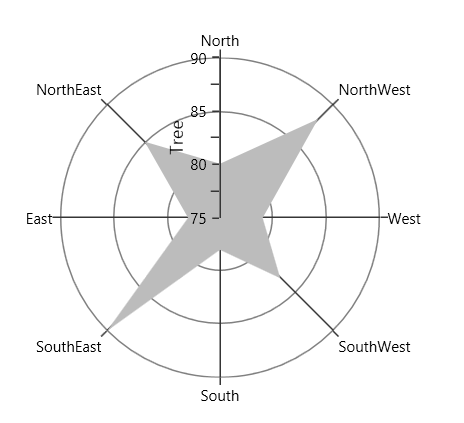
DrawType as Line
<chart:PolarSeries x:Name="series1" Interior="#4A4A4A"

ItemsSource="{Binding PlantDetails}"

DrawType="Line" IsClosed="True"

XBindingPath="Direction" YBindingPath="Tree"

StrokeThickness="2" />
PolarSeries series = new PolarSeries()
{
ItemsSource = new ViewModel().PlantDetails,
XBindingPath = "Direction",
YBindingPath = "Tree",
IsClosed = True,
DrawType = ChartSeriesDrawType.Line,
StrokeThickness = 2,
Interior = new SolidColorBrush(Color.FromRgb(0x4A, 0x4A, 0X4A))
};
chart.Series.Add(series);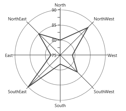
PolarAngle
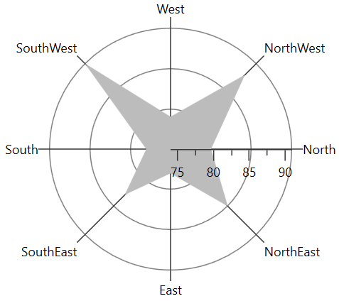
Chart axis provides support to render polar and radar series on 0,90,180 and 270 degree. It can be achieved by its PolarAngle property.The PolarAngle is type of ChartPolarAngle and its default value is Rotate270, Rotate0, Rotate90 and Rotate180 are another supported value of PolarAngle.Both the primary and secondary axes can be rotated individually based on its PolarAngle value.
Rotate0
The below snippet explains how the axes of series has been rotated when PolarAngle value is Rotate0,
<chart:SfChart.PrimaryAxis>

<chart:CategoryAxis  PolarAngle="Rotate0"/>

</chart:SfChart.PrimaryAxis>

<chart:SfChart.SecondaryAxis>

<chart:NumericalAxis PolarAngle="Rotate0"/>

</chart:SfChart.SecondaryAxis>chart.PrimaryAxis = new CategoryAxis()
{
PolarAngle = ChartPolarAngle.Rotate0
};
chart.SecondaryAxis = new NumericalAxis()
{
PolarAngle = ChartPolarAngle.Rotate0
};
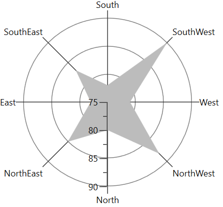
Rotate90
The below snippet explains how the axes of series has been rotated when PolarAngle value is Rotate90,
<chart:SfChart.PrimaryAxis>

<chart:CategoryAxis  PolarAngle="Rotate90"/>

</chart:SfChart.PrimaryAxis>

<chart:SfChart.SecondaryAxis>

<chart:NumericalAxis PolarAngle="Rotate90"/>

</chart:SfChart.SecondaryAxis>chart.PrimaryAxis = new CategoryAxis()
{
PolarAngle = ChartPolarAngle.Rotate90
};
chart.SecondaryAxis = new NumericalAxis()
{
PolarAngle = ChartPolarAngle.Rotate90
};
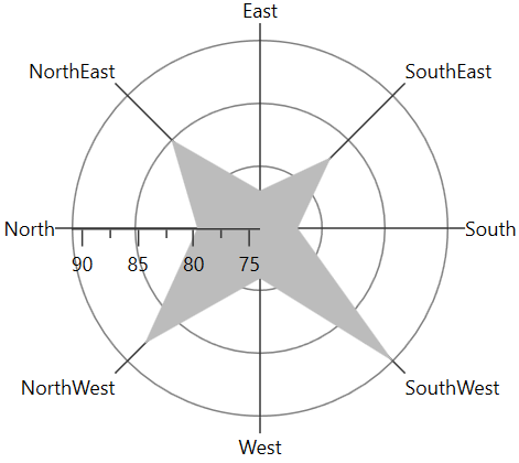
Rotate180
The below snippet explains how the axes of series has been rotated when PolarAngle value is Rotate180,
<chart:SfChart.PrimaryAxis>

<chart:CategoryAxis  PolarAngle="Rotate180"/>

</chart:SfChart.PrimaryAxis>

<chart:SfChart.SecondaryAxis>

<chart:NumericalAxis PolarAngle="Rotate180"/>

</chart:SfChart.SecondaryAxis>chart.PrimaryAxis = new CategoryAxis()
{
PolarAngle = ChartPolarAngle.Rotate180
};
chart.SecondaryAxis = new NumericalAxis()
{
PolarAngle = ChartPolarAngle.Rotate180
};
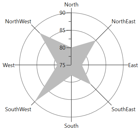
Rotate270
The below snippet explains how the axes of series has been rotated, when PolarAngle value is Rotate270,
<chart:SfChart.PrimaryAxis>

<chart:CategoryAxis  PolarAngle="Rotate270"/>

</chart:SfChart.PrimaryAxis>

<chart:SfChart.SecondaryAxis>

<chart:NumericalAxis PolarAngle="Rotate270"/>

</chart:SfChart.SecondaryAxis>chart.PrimaryAxis = new CategoryAxis()
{
PolarAngle = ChartPolarAngle.Rotate270
};
chart.SecondaryAxis = new NumericalAxis()
{
PolarAngle = ChartPolarAngle.Rotate270
};
Financial Charts
OHLC
HiLoOpenCloseSeries displays each data point as a group of horizontal and one vertical line. The values for this series can be bind using High, Low, Open and Close property.
The following code example shows how to use OHLC series:
<chart:HiLoOpenCloseSeries ItemsSource="{Binding StockPriceDetails}"

XBindingPath="Date"  High="High" Low="Low"

Interior="#4A4A4A"

Open="Open" Close="Close"  />
HiLoOpenCloseSeries series = new HiLoOpenCloseSeries()
{
ItemsSource = new ViewModel().StockPriceDetails,
XBindingPath = "Date",
High = "High", Low = "Low",
Open = "Open", Close = "Close",
Interior = new SolidColorBrush(Color.FromRgb(0x4A, 0x4A, 0X4A))
};
chart.Series.Add(series);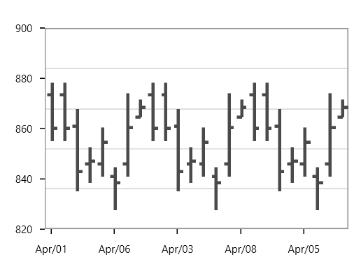
Candle
CandleSeries displays each data point as a combination of a vertical column and a vertical line. This series is most widely used in decision making places, like the stock market.
The values for this series can be bind using High, Low, Open and Close property and the following code example shows the usage of candle series.
<chart:CandleSeries ItemsSource="{Binding StockPriceDetails}"

XBindingPath="Date"  High="High" Open="Open"

Close="Close" Low="Low"

Interior="#4A4A4A"/>
CandleSeries series = new CandleSeries()
{
ItemsSource = new ViewModel().StockPriceDetails,
XBindingPath = "Date",
High = "High", Low = "Low",
Open = "Open", Close = "Close",
Interior = new SolidColorBrush(Color.FromRgb(0x4A, 0x4A, 0X4A))
};
chart.Series.Add(series);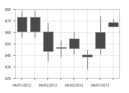
The APIs present in the Candle series are,
-
High-Gets or sets the string that describes high value in Y-axis. -
Low- Gets or sets the string that describes low value in Y-axis. -
Open-Gets or sets the string that describes open value in Y-axis. -
Close- Gets or sets the string that describes close value in Y-axis. -
BearFillColor-Represents the brush color for the segments that show stock price has gone up in measured time interval. -
BullFillColor-Represents that brush color for the segments that show stock price has gone down in measured time interval.
<chart:CandleSeries ItemsSource="{Binding StockPriceDetails}" XBindingPath="Date"
                    High="High" Open="Open"  Close="Close" Low="Low"  BearFillColor="Black"
                    BullFillColor="#BCBCBC"/>
CandleSeries series = new CandleSeries()
{
ItemsSource = new ViewModel().StockPriceDetails,
XBindingPath = "Date",
High = "High", Low = "Low",
Open = "Open", Close = "Close",
BearFillColor = new SolidColorBrush(Colors.Black),
BullFillColor = new SolidColorBrush(Color.FromRgb(0xBC, 0xBC, 0XBC))
};
chart.Series.Add(series);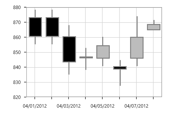
HiLo
In HiLoSeries, each segment is represented by a line. The height of the line depends on the value of the data point, high or low. The values for this series can be bind using High and Low.
The following code example shows the use of HiLo series:
<chart:HiLoSeries Name="series" Interior="#4A4A4A"

ItemsSource="{Binding StockPriceDetails}"

XBindingPath="Date" StrokeThickness="3"

High="High" Low="Low" />
HiLoSeries series = new HiLoSeries()
{
ItemsSource = new ViewModel().StockPriceDetails,
XBindingPath = "Date",
High = "High", Low = "Low",
StrokeThickness = 3,
Interior = new SolidColorBrush(Color.FromRgb(0x4A, 0x4A, 0X4A))
};
chart.Series.Add(series);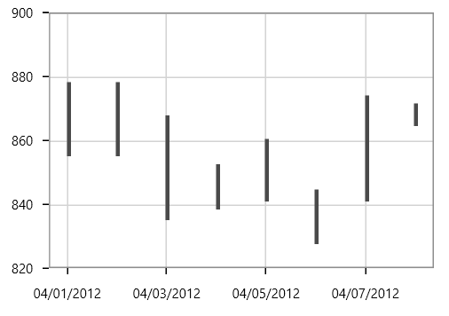
Stacking Charts
Stacking Line
StackingLineSeries resembles multiple types of series of the LineSeries. Each series is vertically stacked one above the other. When there is only one series, then it is LineSeries.
The following code example illustrates how to use StackingLineSeries:
<chart:StackingLineSeries

XBindingPath="MonthlyExpenses"

YBindingPath="Father"

Interior="#4A4A4A"

ItemsSource="{Binding Data}"/>

<chart:StackingLineSeries

XBindingPath="MonthlyExpenses"

YBindingPath="Mother"

Interior="#BCBCBC"

ItemsSource="{Binding Data}"/>

<chart:StackingLineSeries

XBindingPath="MonthlyExpenses"

YBindingPath="Son"

Interior="#7F7F7F"

ItemsSource="{Binding Data}" />
StackingLineSeries series1 = new StackingLineSeries()
{
ItemsSource = new ViewModel().Data,
XBindingPath = "MonthlyExpenses",
YBindingPath ="Father",
Interior = new SolidColorBrush(Color.FromRgb(0x4A, 0x4A, 0X4A))
};
StackingLineSeries series2 = new StackingLineSeries()
{
ItemsSource = new ViewModel().Data,
XBindingPath = "MonthlyExpenses",
YBindingPath = "Mother",
Interior = new SolidColorBrush(Color.FromRgb(0xBC, 0xBC, 0XBC))
};
StackingLineSeries series3 = new StackingLineSeries()
{
ItemsSource = new ViewModel().Data,
XBindingPath = "MonthlyExpenses",
YBindingPath = "Son",
Interior = new SolidColorBrush(Color.FromRgb(0x7F, 0x7F, 0X7F))
};
chart.Series.Add(series1);
chart.Series.Add(series2);
chart.Series.Add(series3);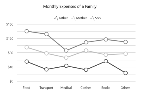
Stacking Line 100
StackingLine100Series resembles StackingLinenSeries but the cumulative portion of each stacked element always comes to a total of 100%.
<chart:StackingLine100Series ItemsSource="{Binding Data}"

XBindingPath="MonthlyExpenses"

YBindingPath="Father"

Interior="#4A4A4A"
/>

<chart:StackingLine100Series ItemsSource="{Binding Data}"

XBindingPath="MonthlyExpenses"

YBindingPath="Mother"

Interior="#BCBCBC"/>

<chart:StackingLine100Series ItemsSource="{Binding Data}"

XBindingPath="MonthlyExpenses"

YBindingPath="Son"

Interior="#7F7F7F"/>
StackingLine100Series series1 = new StackingLine100Series()
{
ItemsSource = new ViewModel().Data,
XBindingPath = "MonthlyExpenses",
YBindingPath = "Father",
Interior = new SolidColorBrush(Color.FromRgb(0x4A, 0x4A, 0X4A))
};
StackingLine100Series series2 = new StackingLine100Series()
{
ItemsSource = new ViewModel().Data,
XBindingPath = "MonthlyExpenses",
YBindingPath = "Mother",
Interior = new SolidColorBrush(Color.FromRgb(0xBC, 0xBC, 0XBC))
};
StackingLine100Series series3 = new StackingLine100Series()
{
ItemsSource = new ViewModel().Data,
XBindingPath = "MonthlyExpenses",
YBindingPath = "Son",
Interior = new SolidColorBrush(Color.FromRgb(0x7F, 0x7F, 0X7F))
};
chart.Series.Add(series1);
chart.Series.Add(series2);
chart.Series.Add(series3);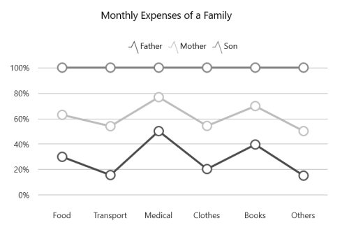
Stacking Column
StackingColumnSeries resembles multiple types of series of the ColumnSeries. Each series is vertically stacked one above the other. When there is only one series, then it is ColumnSeries.
The following code example illustrates how to use StackingColumnSeries:
<chart:StackingColumnSeries

XBindingPath="CountryName"

YBindingPath="GoldMedals"

Interior="#4A4A4A"

ItemsSource="{Binding MedalDetails}"/>

<chart:StackingColumnSeries

Interior="#BCBCBC"

XBindingPath="CountryName"

YBindingPath="SilverMedals"

ItemsSource="{Binding MedalDetails}"/>

<chart:StackingColumnSeries

Interior="#7F7F7F"

XBindingPath="CountryName"

YBindingPath="BronzeMedals" />
StackingColumnSeries series1 = new StackingColumnSeries()
{
ItemsSource = new ViewModel().MedalDetails,
XBindingPath = "CountryName",
YBindingPath ="GoldMedals",
Interior = new SolidColorBrush(Color.FromRgb(0x4A, 0x4A, 0X4A))
};
StackingColumnSeries series2 = new StackingColumnSeries()
{
ItemsSource = new ViewModel().MedalDetails,
XBindingPath = "CountryName",
YBindingPath = "SilverMedals",
Interior = new SolidColorBrush(Color.FromRgb(0xBC, 0xBC, 0XBC))
};
StackingColumnSeries series3 = new StackingColumnSeries()
{
ItemsSource = new ViewModel().MedalDetails,
XBindingPath = "CountryName",
YBindingPath = "BronzeMedals",
Interior = new SolidColorBrush(Color.FromRgb(0x7F, 0x7F, 0X7F))
};
chart.Series.Add(series1);
chart.Series.Add(series2);
chart.Series.Add(series3);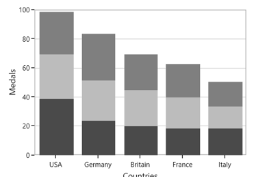
Stacking Column 100
StackingColumn100Series resembles StackingColumnSeries but the cumulative portion of each stacked element always comes to a total of 100%.
<chart:StackingColumn100Series  XBindingPath="CountryName"

YBindingPath="GoldMedals" Interior="#4A4A4A"

ItemsSource="{Binding MedalDetails}"/>

<chart:StackingColumn100Series ItemsSource="{Binding MedalDetails}"

XBindingPath="CountryName"

YBindingPath="SilverMedals"

Interior="#BCBCBC"/>

<chart:StackingColumn100Series Interior="#7F7F7F"

XBindingPath="CountryName"

YBindingPath="BronzeMedals"

ItemsSource="{Binding MedalDetails}"/>
StackingColumn100Series series1 = new StackingColumn100Series()
{
ItemsSource = new ViewModel().MedalDetails,
XBindingPath = "CountryName",
YBindingPath = "GoldMedals",
Interior = new SolidColorBrush(Color.FromRgb(0x4A, 0x4A, 0X4A))
};
StackingColumn100Series series2 = new StackingColumn100Series()
{
ItemsSource = new ViewModel().MedalDetails,
XBindingPath = "CountryName",
YBindingPath = "SilverMedals",
Interior = new SolidColorBrush(Color.FromRgb(0xBC, 0xBC, 0XBC))
};
StackingColumn100Series series3 = new StackingColumn100Series()
{
ItemsSource = new ViewModel().MedalDetails,
XBindingPath = "CountryName",
YBindingPath = "BronzeMedals",
Interior = new SolidColorBrush(Color.FromRgb(0x7F, 0x7F, 0X7F))
};
chart.Series.Add(series1);
chart.Series.Add(series2);
chart.Series.Add(series3);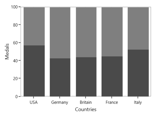
Stacking Bar
StackingBarSeries is a multiple series type of BarSeries. Each BarSeries is then stacked horizontally, side by side to each other. When there exists only one series, it resembles a simple BarSeries.
<chart:StackingBarSeries XBindingPath="CountryName"

Interior="#BCBCBC"

YBindingPath="GoldMedals"

ItemsSource="{Binding MedalDetails}" >

</chart:StackingBarSeries>

<chart:StackingBarSeries Interior="#4A4A4A"

XBindingPath="CountryName"

YBindingPath="SilverMedals"

ItemsSource="{Binding MedalDetails}">

</chart:StackingBarSeries>

<chart:StackingBarSeries Interior="#7F7F7F"

XBindingPath="CountryName"

YBindingPath="BronzeMedals"

ItemsSource="{Binding MedalDetails}" >

</chart:StackingBarSeries>
StackingBarSeries series1 = new StackingBarSeries()
{
ItemsSource = new ViewModel().MedalDetails,
XBindingPath = "CountryName",
YBindingPath = "GoldMedals",
Interior = new SolidColorBrush(Color.FromRgb(0x4A, 0x4A, 0X4A))
};
StackingBarSeries series2 = new StackingBarSeries()
{
ItemsSource = new ViewModel().MedalDetails,
XBindingPath = "CountryName",
YBindingPath = "SilverMedals",
Interior = new SolidColorBrush(Color.FromRgb(0xBC, 0xBC, 0XBC))
};
StackingBarSeries series3 = new StackingBarSeries()
{
ItemsSource = new ViewModel().MedalDetails,
XBindingPath = "CountryName",
YBindingPath = "BronzeMedals",
Interior = new SolidColorBrush(Color.FromRgb(0x7F, 0x7F, 0X7F))
};
chart.Series.Add(series1);
chart.Series.Add(series2);
chart.Series.Add(series3);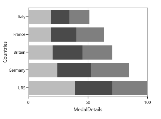
Stacking Bar 100
StackingBar100Series resembles a StackingBarSeries. StackingBar100Series displays multiple series as stacked bars and the cumulative portion of each stacked element is always 100%.
<chart:StackingBar100Series Interior="#BCBCBC"

XBindingPath="CountryName"

YBindingPath="GoldMedals"

ItemsSource="{Binding MedalDetails}" />

<chart:StackingBar100Series Interior="#4A4A4A"

XBindingPath="CountryName"

YBindingPath="SilverMedals"

ItemsSource="{Binding MedalDetails}" />

<chart:StackingBar100Series Interior="#7F7F7F"

XBindingPath="CountryName"

YBindingPath="BronzeMedals"

ItemsSource="{Binding MedalDetails}" />
StackingBar100Series series1 = new StackingBar100Series()
{
ItemsSource = new ViewModel().MedalDetails,
XBindingPath = "CountryName",
YBindingPath = "GoldMedals",
Interior = new SolidColorBrush(Color.FromRgb(0x4A, 0x4A, 0X4A))
};
StackingBar100Series series2 = new StackingBar100Series()
{
ItemsSource = new ViewModel().MedalDetails,
XBindingPath = "CountryName",
YBindingPath = "SilverMedals",
Interior = new SolidColorBrush(Color.FromRgb(0xBC, 0xBC, 0XBC))
};
StackingBar100Series series3 = new StackingBar100Series()
{
ItemsSource = new ViewModel().MedalDetails,
XBindingPath = "CountryName",
YBindingPath = "BronzeMedals",
Interior = new SolidColorBrush(Color.FromRgb(0x7F, 0x7F, 0X7F))
};
chart.Series.Add(series1);
chart.Series.Add(series2);
chart.Series.Add(series3);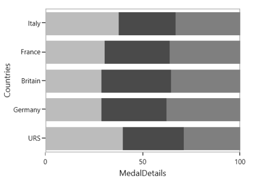
Stacking Area
StackingAreaSeries is representing areas stacked vertically one above the other.
<chart:StackingAreaSeries Interior="#BCBCBC"

XBindingPath="Month" YBindingPath="Bus"

ItemsSource="{Binding Accidents}" />

<chart:StackingAreaSeries Interior="#4A4A4A"

XBindingPath="Month" YBindingPath="Car"

ItemsSource="{Binding Accidents}" />

<chart:StackingAreaSeries  Interior="#7F7F7FC"

XBindingPath="Month"

YBindingPath="Truck"

ItemsSource="{Binding Accidents}" />
StackingAreaSeries series1 = new StackingAreaSeries()
{
ItemsSource = new ViewModel().Accidents,
XBindingPath = "Month",
YBindingPath = "Bus",
Interior = new SolidColorBrush(Color.FromRgb(0x4A, 0x4A, 0X4A))
};
StackingAreaSeries series2 = new StackingAreaSeries()
{
ItemsSource = new ViewModel().Accidents,
XBindingPath = "Month",
YBindingPath = "Car",
Interior = new SolidColorBrush(Color.FromRgb(0xBC, 0xBC, 0XBC))
};
StackingAreaSeries series3 = new StackingAreaSeries()
{
ItemsSource = new ViewModel().Accidents,
XBindingPath = "Month",
YBindingPath = "Truck",
Interior = new SolidColorBrush(Color.FromRgb(0x7F, 0x7F, 0X7F))
};
chart.Series.Add(series1);
chart.Series.Add(series2);
chart.Series.Add(series3);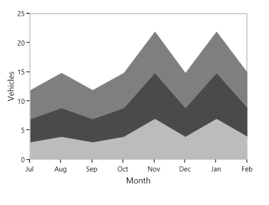
Stacking Area 100
StackingArea100Series is similar to StackingAreaSeries, but the cumulative portion of each stacked element always totals 100%.
The following code example shows the way to add stacking area 100 series:
<chart:StackingArea100Series Interior="#BCBCBC"

XBindingPath="Month"

YBindingPath="Bus"

ItemsSource="{Binding Accidents}"

/>

<chart:StackingArea100Series Interior="#4A4A4A"

XBindingPath="Month" YBindingPath="Car"

ItemsSource="{Binding Accidents}" />

<chart:StackingArea100Series Interior="#7F7F7F"

XBindingPath="Month"

YBindingPath="Truck"

ItemsSource="{Binding Accidents}" />
StackingArea100Series series1 = new StackingArea100Series()
{
ItemsSource = new ViewModel().Accidents,
XBindingPath = "Month",
YBindingPath = "Bus",
Interior = new SolidColorBrush(Color.FromRgb(0x4A, 0x4A, 0X4A))
};
StackingArea100Series series2 = new StackingArea100Series()
{
ItemsSource = new ViewModel().Accidents,
XBindingPath = "Month",
YBindingPath = "Car",
Interior = new SolidColorBrush(Color.FromRgb(0xBC, 0xBC, 0XBC))
};
StackingArea100Series series3 = new StackingArea100Series()
{
ItemsSource = new ViewModel().Accidents,
XBindingPath = "Month",
YBindingPath = "Truck",
Interior = new SolidColorBrush(Color.FromRgb(0x7F, 0x7F, 0X7F))
};
chart.Series.Add(series1);
chart.Series.Add(series2);
chart.Series.Add(series3);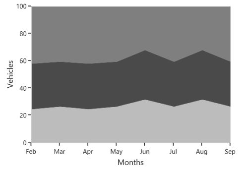
You can draw open curve like Area using this IsClosed property.
<chart:StackingAreaSeries  Interior="#BCBCBC" Stroke="Black" StrokeThickness="3"

IsClosed="False" XBindingPath="Month"

YBindingPath="Bus"

ItemsSource="{Binding Accidents}"/>

<chart:StackingAreaSeries  Interior="#777777" Stroke="White" StrokeThickness="3"

IsClosed="False"  XBindingPath="Month"

YBindingPath="Car"

ItemsSource="{Binding Accidents}"/>

<chart:StackingAreaSeries  Interior="#7F7F7F" Stroke="Black"

StrokeThickness="3" IsClosed="False"

XBindingPath="Month"

YBindingPath="Truck"

ItemsSource="{Binding Accidents}" />
StackingAreaSeries series1 = new StackingAreaSeries()
{
ItemsSource = new ViewModel().Accidents,
XBindingPath = "Month",
YBindingPath = "Bus",
Stroke = new SolidColorBrush(Colors.Black),
StrokeThickness = 3,
IsClosed = false,
Interior = new SolidColorBrush(Color.FromRgb(0xBC, 0xBC, 0XBC))
};
StackingAreaSeries series2 = new StackingAreaSeries()
{
ItemsSource = new ViewModel().Accidents,
XBindingPath = "Month",
YBindingPath = "Car",
Stroke = new SolidColorBrush(Colors.White),
StrokeThickness = 3,
IsClosed = false,
Interior = new SolidColorBrush(Color.FromRgb(0x77, 0x77, 0X77))
};
StackingAreaSeries series3 = new StackingAreaSeries()
{
ItemsSource = new ViewModel().Accidents,
XBindingPath = "Month",
YBindingPath = "Truck",
Stroke = new SolidColorBrush(Colors.Black),
StrokeThickness = 3,
IsClosed = false,
Interior = new SolidColorBrush(Color.FromRgb(0x7F, 0x7F, 0X7F))
};
chart.Series.Add(series1);
chart.Series.Add(series2);
chart.Series.Add(series3);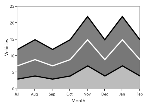
Grouping Stacked Series
You can group the stacked series using GroupingLabel property. The following code example shows how to group the stacking series.
<chart:StackingColumnSeries   Interior="#4A4A4A"

GroupingLabel="Group1"

XBindingPath="Year"

YBindingPath="Quarter1"

ItemsSource="{Binding AnnualDetails}"/>

<chart:StackingColumnSeries Interior="#BCBCBC"

GroupingLabel="Group1"

XBindingPath="Year"

YBindingPath="Quarter2"

ItemsSource="{Binding AnnualDetails}"/>

<chart:StackingColumnSeries Interior="#7F7F7F"

XBindingPath="Year"

GroupingLabel="Group2"

YBindingPath="Quarter3"

ItemsSource="{Binding AnnualDetails}"/>

<chart:StackingColumnSeries XBindingPath="Year"

GroupingLabel="Group2"

Interior="#343434"

YBindingPath="Quarter4"

ItemsSource="{Binding AnnualDetails}"/>
StackingColumnSeries series1 = new StackingColumnSeries()
{
ItemsSource = new ViewModel().AnnualDetails,
XBindingPath = "Year",
YBindingPath = "Quarter1",
GroupingLabel="Group1",
Interior = new SolidColorBrush(Color.FromRgb(0x4A,0x4A,0x4A))
};
StackingColumnSeries series2 = new StackingColumnSeries()
{
ItemsSource = new ViewModel().AnnualDetails,
XBindingPath = "Year",
YBindingPath = "Quarter2",
GroupingLabel = "Group1",
Interior = new SolidColorBrush(Color.FromRgb(0xBC, 0xBC, 0xBC))
};
StackingColumnSeries series3 = new StackingColumnSeries()
{
ItemsSource = new ViewModel().AnnualDetails,
XBindingPath = "Year",
YBindingPath = "Quarter3",
GroupingLabel = "Group2",
Interior = new SolidColorBrush(Color.FromRgb(0x7F, 0x7F, 0x7F))
};
StackingColumnSeries series4 = new StackingColumnSeries()
{
ItemsSource = new ViewModel().AnnualDetails,
XBindingPath = "Year",
YBindingPath = "Quarter4",
GroupingLabel = "Group2",
Interior = new SolidColorBrush(Color.FromRgb(0x34, 0x34, 0x34))
};
chart.Series.Add(series1);
chart.Series.Add(series2);
chart.Series.Add(series3);
chart.Series.Add(series4);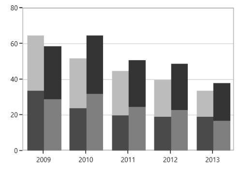
Range Series
Range Column
RangeColumnSeries is a collection of vertical columns where positioning and height depends on the high and low values of each data point. RangeColumnSeries is used when minimum and maximum need to be specified for the ColumnSeries.
<chart:RangeColumnSeries  ItemsSource="{Binding FinancialData}"

XBindingPath="Time" Interior="#4A4A4A"

High="High" Low="Low"  />
RangeColumnSeries series = new RangeColumnSeries()
{
ItemsSource = new ViewModel().FinancialData,
XBindingPath = "Time",
High = "High", Low = "Low",
Interior = new SolidColorBrush(Color.FromRgb(0x4A, 0x4A, 0x4A))
};
chart.Series.Add(series);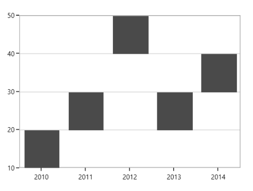
Range Area
RangeAreaSeries is used to display continuous data points as a set of lines that vary between High and Low values over intervals of time and across different categories.
<chart:RangeAreaSeries XBindingPath="ProdName"

High="Stock" Low="Price"

Interior="#BCBCBC"

ItemsSource="{Binding Products}" />
RangeAreaSeries series = new RangeAreaSeries()
{
ItemsSource = new ViewModel().Products,
XBindingPath = "ProdName",
High = "Stock", Low = "Price",
Interior = new SolidColorBrush(Color.FromRgb(0xBC, 0xBC, 0xBC))
};
chart.Series.Add(series);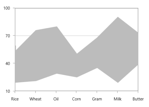
The APIs present in the RangeArea series are,
-
HighValueInterior-Gets or sets the brush that represents the interior color for the high value data. -
LowValueInterior- Gets or sets the brush that represents the interior color for the low value data.
<chart:RangeAreaSeries x:Name="RangeAreaSeries" XBindingPath="ProdName"

High="Stock" Low="Price"

LowValueInterior="#4A4A4A"

HighValueInterior="#777777"

ItemsSource="{Binding Products}" />
RangeAreaSeries series = new RangeAreaSeries()
{
ItemsSource = new ViewModel().Products,
XBindingPath = "ProdName",
High = "Stock", Low = "Price",
HighValueInterior = new SolidColorBrush(Color.FromRgb(0x77, 0x77, 0x77)),
LowValueInterior = new SolidColorBrush(Color.FromRgb(0x4A, 0x4A, 0x4A))
};
chart.Series.Add(series);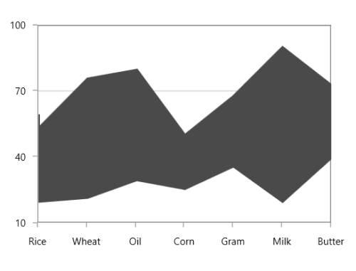
Spline Range Area
SplineRangeAreaSeries is used to display continuous data points as smooth Bezier curves that vary between High and Low values over intervals of time and across different categories.
<chart:SplineRangeAreaSeries ItemsSource = "{Binding Products}"

                             XBindingPath="ProdName"

                             High="Stock"

                             Low="Price"

                             Interior="#BCBCBC" />
SplineRangeAreaSeries splineRangeAreaSeries = new SplineRangeAreaSeries();
splineRangeAreaSeries.ItemsSource = new ViewModel().Products;
splineRangeAreaSeries.XBindingPath = "ProdName";
splineRangeAreaSeries.High = "Stock";
splineRangeAreaSeries.Low = "Price";
splineRangeAreaSeries.Interior = new SolidColorBrush(Color.FromRgb(0xBC, 0xBC, 0xBC));
chart.Series.Add(splineRangeAreaSeries);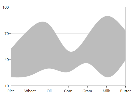
Histogram
HistogramSeries is one of the seven basic tools of quality control. HistogramSeries is often used to plot the density of data.
The following code example shows how to add the HistogramSeries:
<chart:HistogramSeries x:Name="histogramSeries"

HistogramInterval="5"

Interior="#BCBCBC"

ItemsSource="{Binding Product}"

XBindingPath="Price"

YBindingPath="Value"/>
HistogramSeries series = new HistogramSeries()
{
ItemsSource = new ViewModel().Product,
XBindingPath = "Price",
YBindingPath = "Value",
HistogramInterval = 5,
Interior = new SolidColorBrush(Color.FromRgb(0xBC, 0xBC, 0xBC))
};
chart.Series.Add(series);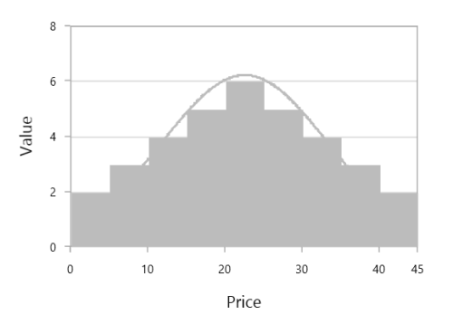
You can customize interval using HistogramInterval property and the normal distribution curve can be collapsed using ShowNormalDistributionCurve.
<chart:HistogramSeries x:Name="histogramSeries"

HistogramInterval="5"

ShowNormalDistributionCurve="False"

Interior="#BCBCBC"

ItemsSource="{Binding Product}"

XBindingPath="Price"

YBindingPath="Value"/>
HistogramSeries series = new HistogramSeries()
{
ItemsSource = new ViewModel().Product,
XBindingPath = "Price",
YBindingPath = "Value",
HistogramInterval = 5,
ShowNormalDistributionCurve = false,
Interior = new SolidColorBrush(Color.FromRgb(0xBC, 0xBC, 0xBC))
};
chart.Series.Add(series);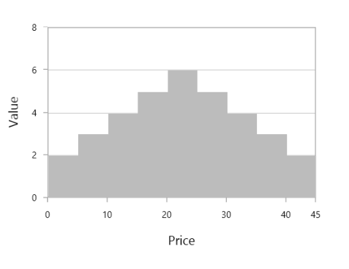
CurveLineStyle
You can customize the normal distribution curve by using the CurveLineStyle property.
...
<Style TargetType="Polyline" x:Key="CurveColorStyle">
    <Setter Property="Stroke" Value="LightSeaGreen"/>
    <Setter Property="StrokeThickness" Value="3"/>
    <Setter Property="StrokeDashArray" Value="1,2" />
</Style>
...

<chart:HistogramSeries x:Name="histogramSeries"

HistogramInterval="5"

ShowNormalDistributionCurve="True"

CurveLineStyle="{StaticResource CurveColorStyle}"

Interior="LightSkyBlue"

ItemsSource="{Binding Product}"

XBindingPath="Price"

YBindingPath="Value"/>
...
HistogramSeries series = new HistogramSeries()
{
ItemsSource = new ViewModel().Product,
XBindingPath = "Price",
YBindingPath = "Value",
HistogramInterval = 5,
ShowNormalDistributionCurve = True,
CurveLineStyle = histogramChart.Resources["CurveColorStyle"] as Style,
Interior = new SolidColorBrush(new SolidColorBrush(Colors.LightSkyBlue))
};
chart.Series.Add(series);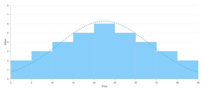
Box and Whisker
BoxAndWhiskerSeries plots a combination of rectangles and lines to show the distribution of data set. The following code demonstrates how to define the series in chart.
<syncfusion:BoxAndWhiskerSeries ItemsSource="{Binding BoxWhiskerData}"

    XBindingPath="Department"

    YBindingPath="Age">

</syncfusion:BoxAndWhiskerSeries>
BoxAndWhiskerSeries boxAndWhisker = new BoxAndWhiskerSeries();
boxAndWhisker.ItemsSource = new BoxWhiskerViewModel().BoxWhiskerData;
boxAndWhisker.XBindingPath = "Department";
boxAndWhisker.YBindingPath = "Age";
boxWhiskerChart.Series.Add(boxAndWhisker);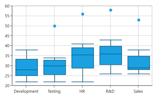
NOTE
By default, the value of the
BoxPlotModeproperty is Exclusive.
Customize the series box mode
The series box plotting mode can be changed using the BoxPlotMode property of BoxAndWhiskerSeries. The plotting mode of series can be calculated as follows:
-
Exclusive– The quartile values are calculated using the formula (N+1) * P (N count, P percentile), and its index value starts from 1 in the list. -
Inclusive– The quartile values are calculated using the formula (N−1) * P (N count, P percentile), and its index value starts from 0 in the list. -
Normal– The quartile values are calculated by splitting the list and getting the median values.
Normal
The following code demonstrates how to define the BoxPlotMode value to Normal.
<syncfusion:BoxAndWhiskerSeries  BoxPlotMode="Normal">

</syncfusion:BoxAndWhiskerSeries>
BoxAndWhiskerSeries boxAndWhisker = new BoxAndWhiskerSeries();
boxAndWhisker.BoxPlotMode = BoxPlotMode.Normal;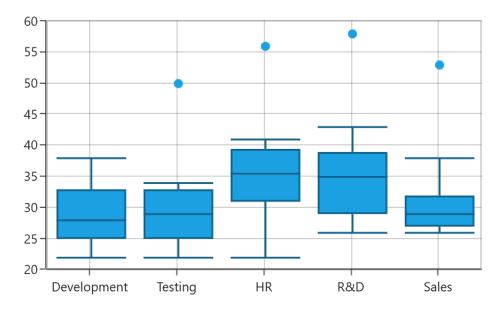
Inclusive
The following code demonstrates how to define the BoxPlotMode value to Inclusive.
<syncfusion:BoxAndWhiskerSeries  BoxPlotMode="Inclusive">

</syncfusion:BoxAndWhiskerSeries>
BoxAndWhiskerSeries boxAndWhisker = new BoxAndWhiskerSeries();
boxAndWhisker.BoxPlotMode = BoxPlotMode.Inclusive;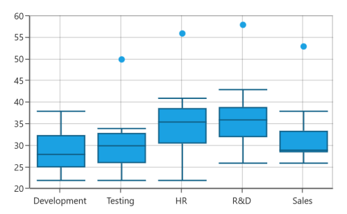
ShowMedian
The Median values of given data set is viewed by enabling the ShowMedian property of BoxAndWhiskerSeries. The following code demonstrates how to enable the ShowMedian property.
<syncfusion:BoxAndWhiskerSeries  ShowMedian="True">

</syncfusion:BoxAndWhiskerSeries>
BoxAndWhiskerSeries boxAndWhisker = new BoxAndWhiskerSeries();
boxAndWhisker.ShowMedian = true;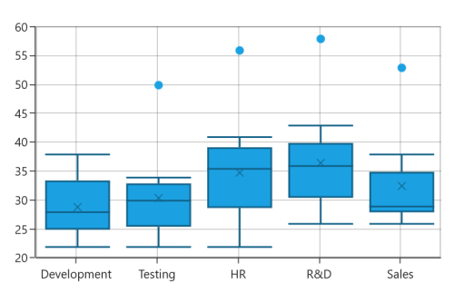
Outlier
The outlier is used to display the outlier point that lies either below the lower whisker or above the upper whisker line and it is an observation that is numerically distant from the rest of the data.
ShowOutlier
The outlier value in the box plot can be viewed by enabling the ShowOutlier property of BoxAndWhiskerSeries are are used to customize the visible of the outlier. By default, ShowOutlier value is true. The following code demonstrates how to disable the ShowOutlier property.
<syncfusion:BoxAndWhiskerSeries  ShowOutlier="False">

</syncfusion:BoxAndWhiskerSeries>
BoxAndWhiskerSeries boxAndWhisker = new BoxAndWhiskerSeries();
boxAndWhisker.ShowOutlier = false;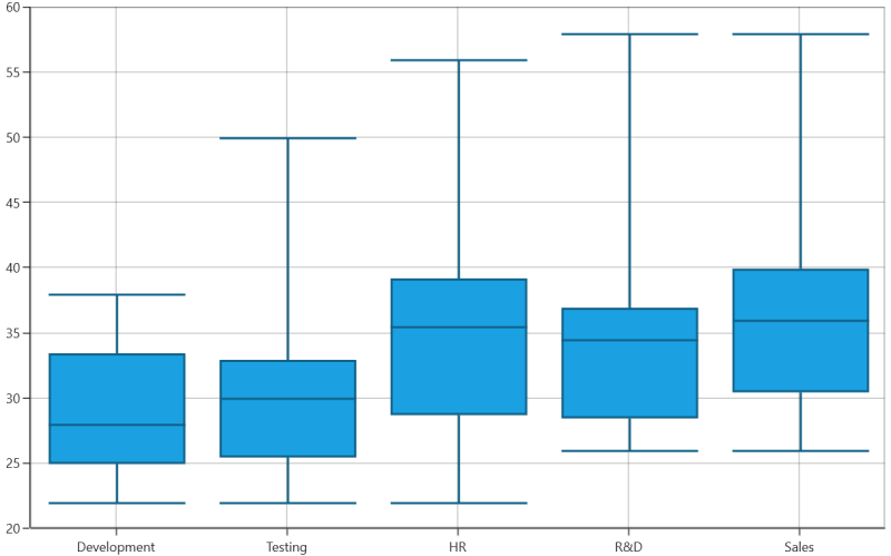
OutlierTemplate
The default appearance of the outlier symbol can be customized using the OutlierTemplate property of BoxAndWhiskerSeries. The following code demonstrates how to customize the outlier symbol.
<syncfusion:BoxAndWhiskerSeries.OutlierTemplate>

    <DataTemplate>

        <Canvas>

            <Path Stretch="Fill" Height="10" Width="10"  Fill="{Binding Interior}"

                Canvas.Left="{Binding RectX}" Canvas.Top="{Binding RectY}"

                Data="F1 M 145.193,54.8249L 169.315,54.8249L 169.315,

                78.9463L 145.193,78.9463L 145.193,103.074L 121.071,

                103.074L 121.071,78.9463L 96.946,78.9463L 96.946,

                54.8249L 121.071,54.8249L 121.071,

                30.6983L 145.193,30.6983L 145.193,54.8249 Z"/>

            </Canvas>

    </DataTemplate>

</syncfusion:BoxAndWhiskerSeries.OutlierTemplate>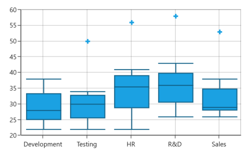
Waterfall Series
WaterfallSeries clarifies the cumulative effect of set of provided positive and negative values. The series is represented by rectangles and a connector between the rectangles.
The following code demonstrates how to use the series in chart.
<syncfusion:WaterfallSeries ItemsSource="{Binding RevenueDetails}"

                       XBindingPath="Category"

                       YBindingPath="Value">

</syncfusion:WaterfallSeries>
WaterfallSeries waterfallSeries = new WaterfallSeries();
waterfallSeries.ItemsSource = new ViewModel().RevenueDetails;
waterfallSeries.XBindingPath = "Category";
waterfallSeries.YBindingPath = "Value";
chart.Series.Add(waterfallSeries);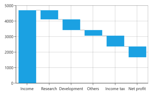
SummaryBindingPath and SummarySegmentBrush
The SummaryBindingPath gets or sets the string value that indicates the sum of the previous segments in series.
The summary segment can be differentiated by applying SummarySegmentBrush in series.
<syncfusion:WaterfallSeries ItemsSource="{Binding RevenueDetails}"

                                   XBindingPath="Category"

                                   YBindingPath="Value" Interior="Gray"

                                   SummaryBindingPath="IsSummary"

                                   SummarySegmentBrush="RoyalBlue">

</syncfusion:WaterfallSeries>
WaterfallSeries waterfallSeries = new WaterfallSeries();
waterfallSeries.ItemsSource = new ViewModel().RevenueDetails;
waterfallSeries.XBindingPath = "Category";
waterfallSeries.YBindingPath = "Value";
waterfallSeries.SummaryBindingPath = "IsSummary";
waterfallSeries.SummarySegmentBrush = new SolidColorBrush(Colors.RoyalBlue);
chart.Series.Add(waterfallSeries);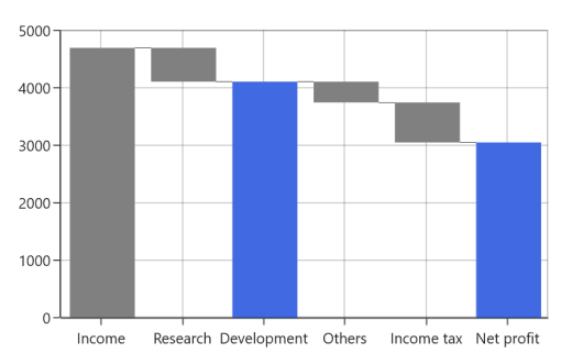
NegativeSegmentBrush
The appearance of the negative segment can be changed using the NegativeSegmentBrush property of series. The following code demonstrates how to change the appearance of the negative segment.
<chart:WaterfallSeries NegativeSegmentBrush="Red">

</chart:WaterfallSeries>
WaterfallSeries waterfallSeries = new WaterfallSeries();
waterfallSeries.NegativeSegmentBrush = new SolidColorBrush(Colors.Red);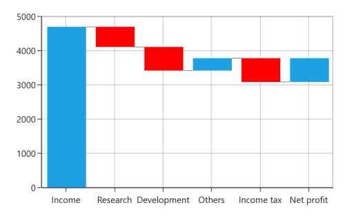
AllowAutoSum
The summary segment calculation can be changed using the AllowAutoSum property. By default, this property is true. When disabling this property, it renders the segment using the y-value of provided ItemsSource collection.
The following code example demonstrates how the to set value to the AllowAutoSum property.
<syncfusion:WaterfallSeries AllowAutoSum="False"

    SummaryBindingPath="IsSummary"

    SummarySegmentBrush="RoyalBlue">

</syncfusion:WaterfallSeries>
WaterfallSeries waterfallSeries = new WaterfallSeries();
waterfallSeries.AllowAutoSum = false;
waterfallSeries.SummaryBindingPath = "IsSummary";
waterfallSeries.SummarySegmentBrush = new SolidColorBrush(Colors.RoyalBlue);
chart.Series.Add(waterfallSeries);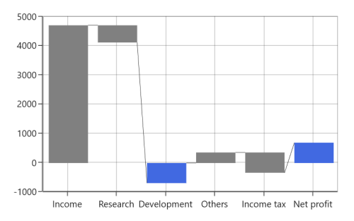
ConnectorLine
The connector line of series can be enabled or disabled using its ShowConnector line property. By default, the value of this property is true.
<syncfusion:WaterfallSeries ShowConnector="False">

</syncfusion:WaterfallSeries>
WaterfallSeries waterfallSeries = new WaterfallSeries();
waterfallSeries.ShowConnector = false;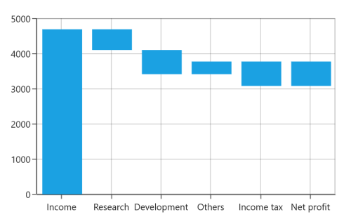
Connector line customization
The connector line can be customized by applying the ConnectorLineStyle property of the series. The following code example demonstrates how to apply style to connector line.
<syncfusion:WaterfallSeries.ConnectorLineStyle>

<Style TargetType="Line">

<Setter Property="Stroke" Value="Red"/>

<Setter Property="StrokeDashArray" Value="1"/>

<Setter Property="StrokeThickness" Value="2"/>

</Style>

</syncfusion:WaterfallSeries.ConnectorLineStyle>
Style style = new Style(typeof(Line));
style.Setters.Add(new Setter(Line.StrokeProperty, new SolidColorBrush(Colors.Red)));
style.Setters.Add(new Setter(Line.StrokeDashArrayProperty, new DoubleCollection() { 1 }));
style.Setters.Add(new Setter(Line.StrokeThicknessProperty, 2));
WaterfallSeries series = new WaterfallSeries();
series.ConnectorLineStyle = style;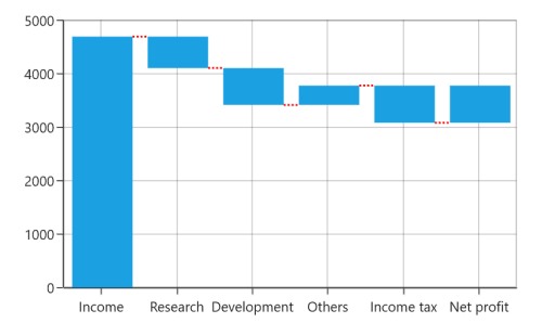
Fast Charts
Fast Line
The FastLineSeries is a special kind of line series that can render a collection with a huge number of datapoints. This was rendered using polyline segment.
<chart:FastLineSeries x:Name="FastLineSeries" ItemsSource="{Binding Data}"

XBindingPath="Date" Interior="#7F7F7F"

YBindingPath="Value"/>
FastLineSeries series = new FastLineSeries()
{
ItemsSource = new ViewModel().Data,
XBindingPath = "Date",
YBindingPath = "Value",
Interior = new SolidColorBrush(Color.FromRgb(0x7F, 0x7F, 0x7F))
};
chart.Series.Add(series);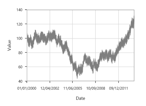
The following line properties are available for FastLineSeries:
Fast Line Bitmap
FastLineBitmapSeries displays a series of line segments rendered using WritableBitmap. The advantage of FastLineBitmapSeries renders a million data point in a fraction of seconds.
The following code example shows how to use the fast line bitmap series:
<chart:FastLineBitmapSeries ItemsSource="{Binding Data}"

XBindingPath="Date" Interior="#7F7F7F"

YBindingPath="Value" />
fChart chart = new SfChart();
FastLineBitmapSeries series = new FastLineBitmapSeries()
{
ItemsSource = new ViewModel().Data,
XBindingPath = "Date",
YBindingPath = "Value",
Interior = new SolidColorBrush(Color.FromRgb(0x7F, 0x7F, 0x7F))
};
chart.Series.Add(series);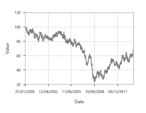
Like FastLineSeries, this bitmap series is also having line properties.
NOTE
As it was rendered using bitmap, there might be some jagged lines at edges. This is can be reduced using
EnableAntiAliasingproperty.
<chart:FastLineBitmapSeries x:Name="FastLineSeries"

XBindingPath="Date" Interior="#7F7F7F"

StrokeDashArray="5,5"

YBindingPath="Value" EnableAntiAliasing="True"/>
FastLineBitmapSeries series = new FastLineBitmapSeries()
{
ItemsSource = new ViewModel().Data,
XBindingPath = "Date",
YBindingPath = "Value",
EnableAntiAliasing =true,
StrokeDashArray =new DoubleCollection() { 5,5},
Interior = new SolidColorBrush(Color.FromRgb(0x7F, 0x7F, 0x7F))
};
chart.Series.Add(series);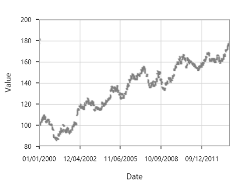
Fast Column
FastColumnBitmapSeries is used to boost up the performance of the ColumnSeries.
<chart:FastColumnBitmapSeries Interior="#7F7F7F"

ItemsSource="{Binding List}"

XBindingPath="Date" YBindingPath="Price" />
FastColumnBitmapSeries series = new FastColumnBitmapSeries()
{
ItemsSource = new ViewModel().List,
XBindingPath = "Date",
YBindingPath = "Value",
Interior = new SolidColorBrush(Color.FromRgb(0x7F, 0x7F, 0x7F))
};
chart.Series.Add(series);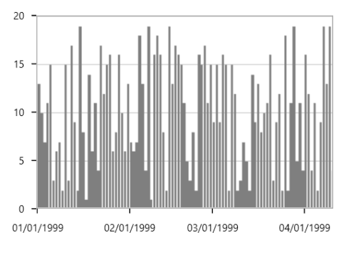
Fast Bar
FastBarBitmapSeries is used to boost up the performance of the series.
<chart:FastBarBitmapSeries ItemsSource="{Binding List}"

XBindingPath="Date" YBindingPath="Price"

Interior="#7F7F7F"/>
FastBarBitmapSeries series = new FastBarBitmapSeries()
{
ItemsSource = new ViewModel().List,
XBindingPath = "Date",
YBindingPath = "Value",
Interior = new SolidColorBrush(Color.FromRgb(0x7F, 0x7F, 0x7F))
};
chart.Series.Add(series);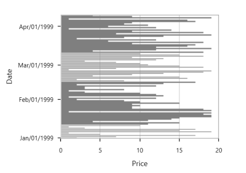
Fast Candle
FastCandleBitmapSeries renders using bitmap and it displays each data point as a combination of a vertical column and a vertical line, like CandleSeries.
<chart:FastCandleBitmapSeries ItemsSource="{Binding TestingModel}"

XBindingPath="X" High="Y"

Low="Y1" Open="Y2" Close="Y3"

BullFillColor="#BCBCBC"

BearFillColor="#4A4A4A"  />
FastCandleBitmapSeries series = new FastCandleBitmapSeries()
{
ItemsSource = new ViewModel().TestingModel,
XBindingPath = "X",
High="Y", Low="Y1",
Open="Y2", Close="Y3",
BullFillColor = new SolidColorBrush(Color.FromRgb(0xBC, 0xBC, 0xBC)),
BearFillColor = new SolidColorBrush(Color.FromRgb(0x4A, 0x4A, 0x4A))
};
chart.Series.Add(series);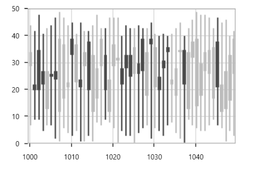
Fast HiLo
FastHiLoBitmapSeries represents a series of line segments with high and low values rendered using WritableBitmap.
<chart:FastHiLoBitmapSeries StrokeThickness="5" ItemsSource="{Binding List}"

Interior="#7F7F7F" XBindingPath="Date" High="Stock"

Low="Price"/>
FastHiLoBitmapSeries series = new FastHiLoBitmapSeries()
{
ItemsSource = new ViewModel().List,
XBindingPath = "Date",
High = "Stock",Low = "Price",
Interior = new SolidColorBrush(Color.FromRgb(0x7F, 0x7F, 0X7F)),
StrokeThickness = 5
};
chart.Series.Add(series);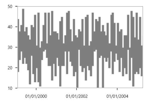
Fast OHLC
FastHiLoOpenCloseBitmapSeries are rendered using WritableBitmap like other bitmap series. The following code example illustrates the use of OHLC bitmap series.
<chart:FastHiLoOpenCloseBitmapSeries ItemsSource="{Binding TestingModel}"

XBindingPath="X" High="Y" Low="Y1" Open="Y2"

Close="Y3" BullFillColor="#7F7F7F"

BearFillColor="#4A4A4A"/>
FastHiLoOpenCloseBitmapSeries series = new FastHiLoOpenCloseBitmapSeries()
{
ItemsSource = new ViewModel().TestingModel,
XBindingPath = "X",
High="Y", Low="Y1",
Open="Y2", Close="Y3",
BullFillColor = new SolidColorBrush(Color.FromRgb(0xBC, 0xBC, 0xBC)),
BearFillColor = new SolidColorBrush(Color.FromRgb(0x4A, 0x4A, 0x4A))
};
chart.Series.Add(series);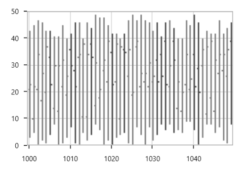
Fast Scatter
FastScatterBitmapSeries used to render high number scatter points. The ScatterHeight and ScatterWidth also available as in ScatterSeries. ShapeType is used to change the rendering shape of fast scatter bitmap series. The available shapes are Cross, Diamond, Ellipse, Hexagon, InvertedTriangle, Pentagon, Plus, Square and Triangle.
<chart:FastScatterBitmapSeries Interior="#7F7F7F"

ItemsSource="{Binding Data}"

XBindingPath="Date"

YBindingPath="Value" ScatterHeight="4"

ScatterWidth="4"/>
FastScatterBitmapSeries series = new FastScatterBitmapSeries()
{
ItemsSource = new ViewModel().Data,
XBindingPath = "Date",
YBindingPath = "Value",
ScatterHeight = 4,
ScatterWidth = 4,
Interior = new SolidColorBrush(Color.FromRgb(0x7F, 0x7F, 0X7F))
};
chart.Series.Add(series);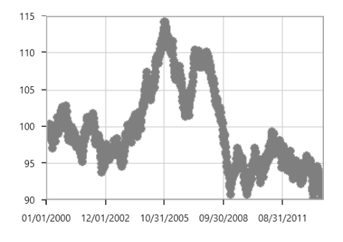
Fast Step Line
FastStepLineBitmapSeries is the high performance version of StepLineSeries.
<chart:FastStepLineBitmapSeries ItemsSource="{Binding Data}"

XBindingPath="Date"

YBindingPath="Value" Interior="#4A4A4A" />
FastStepLineBitmapSeries series = new FastStepLineBitmapSeries()
{
ItemsSource = new ViewModel().Data,
XBindingPath = "Date",
YBindingPath = "Value",
Interior = new SolidColorBrush(Color.FromRgb(0x4A, 0x4A, 0X4A))
};
chart.Series.Add(series);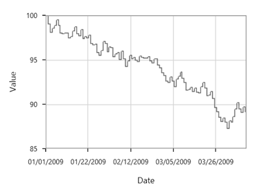
The anti aliasing mode can be enabled using EnableAntiAliasing property of FastStepLineBitmapSeries as in below code snippet:
<chart:FastStepLineBitmapSeries EnableAntiAliasing="True" ItemsSource="{Binding Data}"

XBindingPath="Date"

YBindingPath="Value" Interior="#4A4A4A"/>
FastStepLineBitmapSeries series = new FastStepLineBitmapSeries()
{
ItemsSource = new ViewModel().Data,
XBindingPath = "Date",
YBindingPath = "Value",
EnableAntiAliasing = true ,
Interior = new SolidColorBrush(Color.FromRgb(0x4A, 0x4A, 0X4A))
};
chart.Series.Add(series);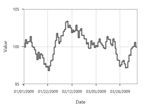
Fast Stacking Column
FastStackingColumnBitmapSeries similar to StackingColumnSeries except that it loads faster and provides better performance.
<chart:FastStackingColumnBitmapSeries StrokeThickness="5"

ItemsSource="{Binding MedalDetails}”

XBindingPath="CountryName" YBindingPath="GoldMedals"

Interior="#4A4A4A" />
FastStackingColumnBitmapSeries series = new FastStackingColumnBitmapSeries()
{
ItemsSource = new ViewModel().MedalDetails,
XBindingPath = "CountryName",
YBindingPath = "GoldMedals",
Interior = new SolidColorBrush(Color.FromRgb(0x4A, 0x4A, 0X4A))
};
chart.Series.Add(series);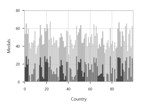
Fast Range Area
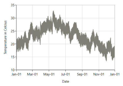
FastRangeAreaBitmapSeries is the high performance version of RangeAreaSeries.
<chart:FastRangeAreaBitmapSeries ItemsSource = "{Binding Data}"

                             XBindingPath="Date"

                             High="HighTemperature"

                             Low="LowTemperature"

                             Interior="#7F7F7F" />
FastRangeAreaBitmapSeries fastRangeAreaBitmapSeries = new FastRangeAreaBitmapSeries();
fastRangeAreaBitmapSeries.ItemsSource = new ViewModel().Data;
fastRangeAreaBitmapSeries.XBindingPath = "Date";
fastRangeAreaBitmapSeries.High = "HighTemperature";
fastRangeAreaBitmapSeries.Low = "LowTemperature";
fastRangeAreaBitmapSeries.Interior = new SolidColorBrush(Color.FromRgb(0x7F, 0x7F, 0x75));
chart.Series.Add(fastRangeAreaBitmapSeries);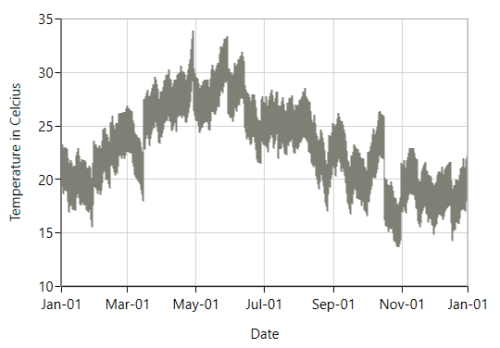
The anti-aliasing mode can be enabled using EnableAntiAliasing property of FastRangeAreaBitmapSeries as in below code snippet:
<chart:FastRangeAreaBitmapSeries ItemsSource = "{Binding Data}"

                                 XBindingPath="Date"

                                 High="HighTemperature"

                                 Low="LowTemperature"

                                 EnableAntiAliasing="True"

                                 Interior="#7F7F7F" />
FastRangeAreaBitmapSeries fastRangeAreaBitmapSeries = new FastRangeAreaBitmapSeries();
fastRangeAreaBitmapSeries.ItemsSource = new ViewModel().Data;
fastRangeAreaBitmapSeries.XBindingPath = "Date";
fastRangeAreaBitmapSeries.High = "HighTemperature";
fastRangeAreaBitmapSeries.Low = "LowTemperature";
fastRangeAreaBitmapSeries.EnableAntiAliasing = true;
fastRangeAreaBitmapSeries.Interior = new SolidColorBrush(Color.FromRgb(0x7F, 0x7F, 0x75));
chart.Series.Add(fastRangeAreaBitmapSeries);