Axis in UWP Charts (SfChart)
10 Jul 202624 minutes to read
ChartAxis is used to locate a data point inside the chart area. Generally, to locate a data point, you require two axes along each direction, that is, horizontal and vertical, in a chart. The vertical axis, or y-axis, usually represents numerical values. The horizontal axis, or x-axis, represents categorical or numerical or date and time values. ChartAxis supports the following types.
- Double
- DateTime(Linear)
- DateTime(Category)
- String
- TimeSpan
- Logarithmic
You can choose any ChartAxis derived types, like DateTimeAxis, NumericalAxis, CategoryAxis, LogarithmicAxis or TimeSpanAxis depending on the value type. DateTimeCategoryAxis is a special type, used to plot date and time values for the given datapoints.
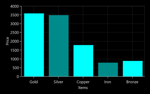
NumericAxis
NumericalAxis is used to plot numerical value to the chart. You can set NumericalAxis for both PrimaryAxis and SecondaryAxis.
The following APIs are used to customize NumericalAxis.
Properties
| Property | Definition |
|---|---|
| Gets or sets the double that represents the interval between the labels. | |
| Gets or sets the double that represents the Minimum value for the Axis. | |
| Gets or sets the double that represents the Maximum value for the Axis. | |
| Gets or sets the NumericalPadding that specifies how to render the segments in chart area. | |
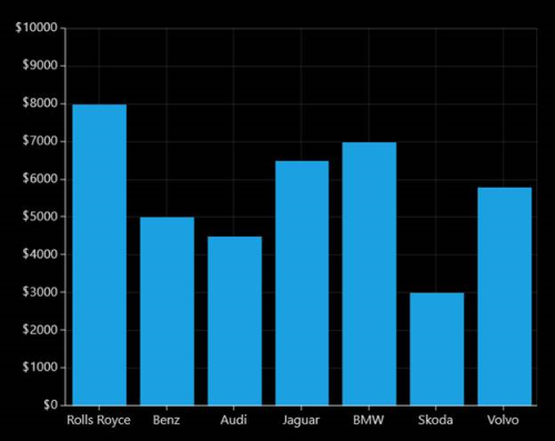
| Gets or sets the bool that represents a value to enable start the range from zero. |
<syncfusion:SfChart x:Name="Chart" Margin="5,0,10,0">

    <syncfusion:SfChart.DataContext>
        <local:ViewModel />
    </syncfusion:SfChart.DataContext>

    <syncfusion:SfChart.PrimaryAxis>
        <syncfusion:CategoryAxis Header="Company Name" />
    </syncfusion:SfChart.PrimaryAxis>

    <syncfusion:SfChart.SecondaryAxis>
        <syncfusion:NumericalAxis
            Interval="100"
            Minimum="0"
            Maximum="1000"
            RangePadding="Round"
            Header="Gross Revenue " />
    </syncfusion:SfChart.SecondaryAxis>

    <syncfusion:ColumnSeries
        x:Name="series1"
        Label="Company Details"
        XBindingPath="CompanyName"
        YBindingPath="CompanyTurnOver"
        ItemsSource="{Binding CompanyDetails}" />

</syncfusion:SfChart>
SfChart chart = new SfChart();
chart.Margin = new Thickness(5, 0, 10, 0);
chart.DataContext = new ViewModel();
chart.PrimaryAxis = new CategoryAxis() { Header = "Company Name" };
chart.SecondaryAxis = new NumericalAxis()
{
Header = "Gross Revenue",
Minimum = 0,
Maximum = 1000,
Interval = 100,
RangePadding = NumericalPadding.Round
};
ColumnSeries series = new ColumnSeries()
{
ItemsSource = new ViewModel().CompanyDetails,
XBindingPath = "CompanyName",
YBindingPath = "CompanyTurnOver"
};
chart.Series.Add(series);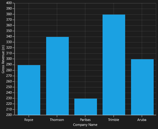
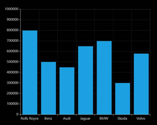
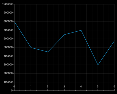
CategoryAxis
CategoryAxis is an index based axis that plots values based on the index of the data point collection. The points are equally spaced here.
The following APIs are used in CategoryAxis.
CategoryAxis
| Property | Definition |
|---|---|
| Gets or sets the double value that represents the interval between the labels. | |
| Gets or sets the LabelPlacement that represents the position of the label in the axis. |
<syncfusion:SfChart
    x:Name="Chart"
    Margin="5,0,10,0">

    <syncfusion:SfChart.DataContext>
        <local:ViewModel />
    </syncfusion:SfChart.DataContext>

    <syncfusion:SfChart.PrimaryAxis>
        <syncfusion:CategoryAxis Header="Company Name" />
    </syncfusion:SfChart.PrimaryAxis>

    <syncfusion:SfChart.SecondaryAxis>
        <syncfusion:NumericalAxis
            Interval="10"
            Minimum="200"
            Maximum="400"
            RangePadding="Round"
            Header="Gross Revenue" />
    </syncfusion:SfChart.SecondaryAxis>

    <syncfusion:ColumnSeries
        x:Name="series1"
        Label="Company Details"
        XBindingPath="CompanyName"
        YBindingPath="CompanyTurnOver"
        ItemsSource="{Binding CompanyDetails}" />

</syncfusion:SfChart>
SfChart chart = new SfChart();
chart.Margin = new Thickness(5, 0, 10, 0);
chart.DataContext = new ViewModel();
chart.PrimaryAxis = new CategoryAxis() { Header = "Company Name" };
chart.SecondaryAxis = new NumericalAxis()
{
Header = "Gross Revenue",
Minimum = 200,
Maximum = 400,
Interval = 10,
RangePadding = NumericalPadding.Round
};
ColumnSeries series = new ColumnSeries()
{
ItemsSource = new ViewModel().CompanyDetails,
XBindingPath = "CompanyName",
YBindingPath = "CompanyTurnOver"
};
chart.Series.Add(series);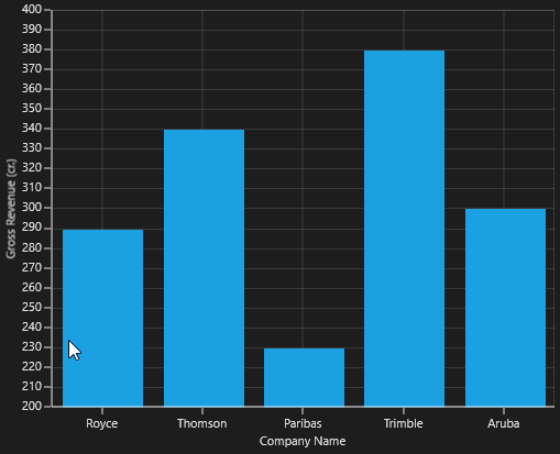
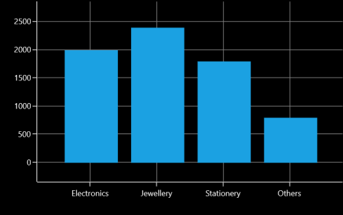
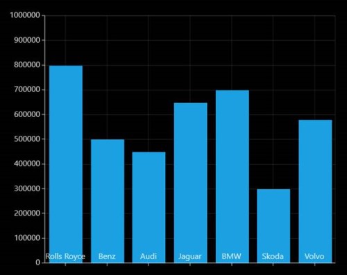
IsIndexed
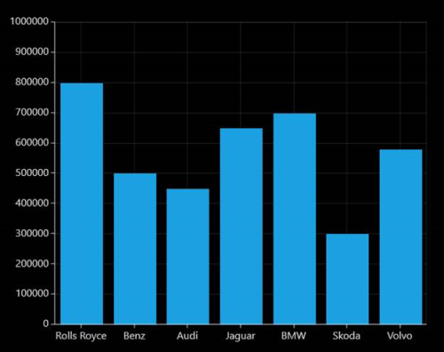
By default, CategoryAxis plots values based on the index of the data points. However, the CategoryAxis can be made to plot the data points based on its data by disabling the IsIndexed property of CategoryAxis, and it is shown in the following code example.
<syncfusion:SfChart.PrimaryAxis>

    <syncfusion:CategoryAxis IsIndexed="False"/>

</syncfusion:SfChart.PrimaryAxis>chart.PrimaryAxis = new CategoryAxis()
{
IsIndexed = false,
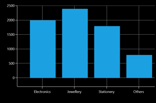
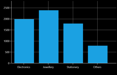
};The following screenshot illustrates the series with IsIndexed value as False.
By default, the value of IsIndexed property is true, and it is shown in following screenshot.
NOTE
This feature is not applicable for Accumulation series, ErrorBarSeries, RadarSeries, and PolarSeries.
AggregateFunctions
When the IsIndexed property of CategoryAxis is disabled, the same index values(XValue) are grouped using the AggregateFunctions property of the axis. The AggregateFunctions property has the following types:
- Average
- Count
- Max
- Min
- None
- Sum
The default value of AggregateFunctions is None.
Average
The following code example demonstrates the axis with AggregateFunctions as Average.
<syncfusion:SfChart.PrimaryAxis>

    <syncfusion:CategoryAxis IsIndexed="False" AggregateFunctions="Average"/>

</syncfusion:SfChart.PrimaryAxis>chart.PrimaryAxis = new CategoryAxis()
{
IsIndexed = false,
AggregateFunctions = AggregateFunctions.Average
};
Count
The following code example demonstrates the axis with AggregateFunctions as Count.
<syncfusion:SfChart.PrimaryAxis>

    <syncfusion:CategoryAxis IsIndexed="False" AggregateFunctions="Count"/>

</syncfusion:SfChart.PrimaryAxis>chart.PrimaryAxis = new CategoryAxis()
{
IsIndexed = false,
AggregateFunctions = AggregateFunctions.Count
};
Max
The following code example demonstrates the axis with AggregateFunctions as Max.
<syncfusion:SfChart.PrimaryAxis>

    <syncfusion:CategoryAxis IsIndexed="False" AggregateFunctions="Max"/>

</syncfusion:SfChart.PrimaryAxis>chart.PrimaryAxis = new CategoryAxis()
{
IsIndexed = false,
AggregateFunctions = AggregateFunctions.Max
};
Min
The following code example demonstrates the axis with AggregateFunctions as Min.
<syncfusion:SfChart.PrimaryAxis>

    <syncfusion:CategoryAxis IsIndexed="False" AggregateFunctions="Min"/>

</syncfusion:SfChart.PrimaryAxis>chart.PrimaryAxis = new CategoryAxis()
{
IsIndexed = false,
AggregateFunctions = AggregateFunctions.Min
};
Sum
The following code example demonstrates the axis with AggregateFunctions as Sum.
<syncfusion:SfChart.PrimaryAxis>

    <syncfusion:CategoryAxis IsIndexed="False" AggregateFunctions="Sum"/>

</syncfusion:SfChart.PrimaryAxis>chart.PrimaryAxis = new CategoryAxis()
{
IsIndexed = false,
AggregateFunctions = AggregateFunctions.Sum
};
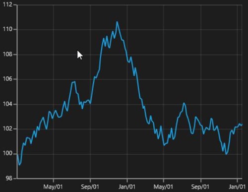
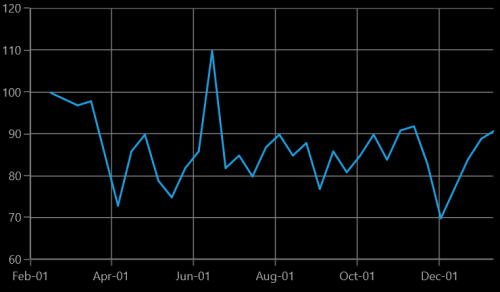
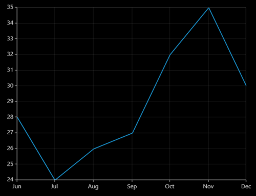
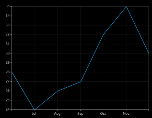
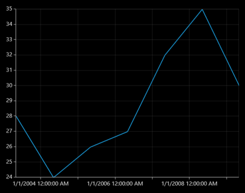
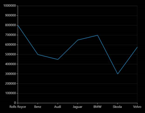
DateTimeAxis
DateTimeAxis is used to plot DateTime values. The DateTimeAxis is widely used to make financial charts in places like the Stock Market, where index plotting is done everyday.
The following APIs are used for customizing DateTimeAxis.
DateTimeAxis
| Property | Definition |
|---|---|
| Gets or sets the DateTime value that represents a minimum value of the Axis. | |
| Gets or sets the DateTime value that represents a maximum value of the Axis. | |
| Gets or sets the DateTimeRangePadding value that specifies segment arrangement in the chart area. | |
| Gets or sets the double value as the interval between labels. | |
| Gets or sets the DateTimeIntervalType. It represents the type of the interval. This property is used to define the type of interval to be displayed and considered for plotting the series. | |
| Gets or sets the bool value that represents a value to enable business hours. | |
| Gets or sets the double value that represents the open working time of a day. | |
| Gets or sets the double value that represents the close working time of a day. | |
| Gets or sets the double value that represents the working days of a week. |
DateTimeIntervalType
The DateTime interval corresponds to the type specified in the IntervalType property.
For instance, if the Interval is set as 2 and IntervalType is set as Days, the labels are plotted for every two days. The following are the values for IntervalType property:
- Auto
- Days
- Hours
- Milliseconds
- Minutes
- Months
- Seconds
- Years
The default IntervalType of a DateTimeAxis is Auto. It calculates the type automatically and the interval, accordingly.
<syncfusion:SfChart.PrimaryAxis>

    <syncfusion:DateTimeAxis
        Name="Primary"
        IntervalType="Years"
        Interval="1" />

</syncfusion:SfChart.PrimaryAxis>chart.PrimaryAxis = new DateTimeAxis()
{
IntervalType = DateTimeIntervalType.Years,
Interval = 1
};The following code example and screenshot are for DateTimeAxis.
<syncfusion:SfChart
    x:Name="Chart"
    Margin="5,0,10,0">

    <syncfusion:SfChart.DataContext>
        <local:ViewModel />
    </syncfusion:SfChart.DataContext>

    <syncfusion:SfChart.PrimaryAxis>
        <syncfusion:DateTimeAxis
            Interval="1"
            LabelFormat="yyyy"
            IntervalType="Years" />
    </syncfusion:SfChart.PrimaryAxis>

    <syncfusion:SfChart.SecondaryAxis>
        <syncfusion:NumericalAxis />
    </syncfusion:SfChart.SecondaryAxis>

    <syncfusion:LineSeries
        x:Name="series1"
        Label="Company Details"
        XBindingPath="Year"
        YBindingPath="CompanyTurnOver"
        ItemsSource="{Binding CompanyDetails}" />

</syncfusion:SfChart>chart.Margin = new Thickness(5, 0, 10, 0);
chart.DataContext = new ViewModel();
chart.PrimaryAxis = new DateTimeAxis()
{
IntervalType = DateTimeIntervalType.Years,
Interval = 1,
LabelFormat = "yyyy"
};
chart.SecondaryAxis = new NumericalAxis();
ColumnSeries series = new ColumnSeries()
{
ItemsSource = new ViewModel().CompanyDetails,
XBindingPath = "Year",
YBindingPath = "CompanyTurnOver"
};
chart.Series.Add(series);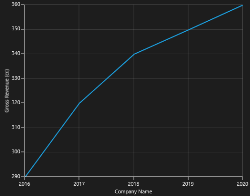
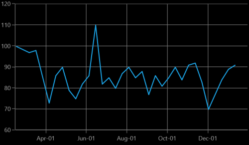
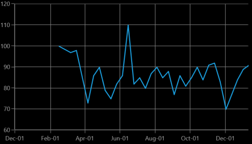
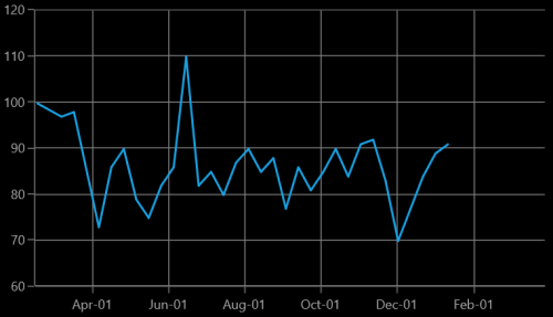
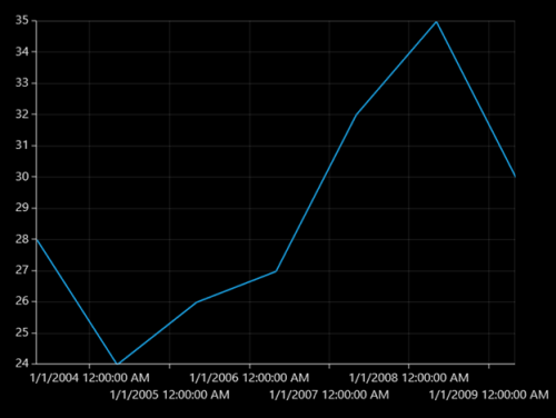
DateTimeCategoryAxis
DateTimeCategoryAxis is a special type of axis used mainly with financial series. All the data points are plotted with equal spaces, similar to CategoryAxis, thereby removing space for missing dates. Intervals and range for the axis are calculated similar to DateTimeAxis. There are no visual gaps between points, even when the difference between two points is more than a year.
DateTimeCategoryAxis
| Property | Definition |
|---|---|
| Gets or sets the double value that represents the interval between the labels. | |
| Gets or sets the DateTimeIntervalType that represents the type of the interval. |
<syncfusion:SfChart x:Name="Chart" Margin="5,0,10,0">

    <syncfusion:SfChart.DataContext>
        <local:ViewModel />
    </syncfusion:SfChart.DataContext>

    <syncfusion:SfChart.PrimaryAxis>
        <syncfusion:DateTimeCategoryAxis
            Interval="1"
            LabelFormat="yyyy"
            IntervalType="Years"
            Header="Company Name" />
    </syncfusion:SfChart.PrimaryAxis>

    <syncfusion:SfChart.SecondaryAxis>
        <syncfusion:NumericalAxis Header="Gross Revenue (cr.)" />
    </syncfusion:SfChart.SecondaryAxis>

    <syncfusion:LineSeries
        x:Name="series1"
        Label="Company Details"
        XBindingPath="Year"
        YBindingPath="CompanyTurnOver"
        ItemsSource="{Binding CompanyDetails}" />

</syncfusion:SfChart>chart.Margin = new Thickness(5, 0, 10, 0);
chart.DataContext = new ViewModel();
chart.PrimaryAxis = new DateTimeCategoryAxis()
{
IntervalType = DateTimeIntervalType.Years,
Interval = 1,
LabelFormat = "yyyy",
Header = "Company Name"
};
chart.SecondaryAxis = new NumericalAxis()
{
Header="Gross Revenue (cr.)"
};
ColumnSeries series = new ColumnSeries()
{
ItemsSource = new ViewModel().CompanyDetails,
XBindingPath = "Year",
YBindingPath = "CompanyTurnOver"
};
chart.Series.Add(series);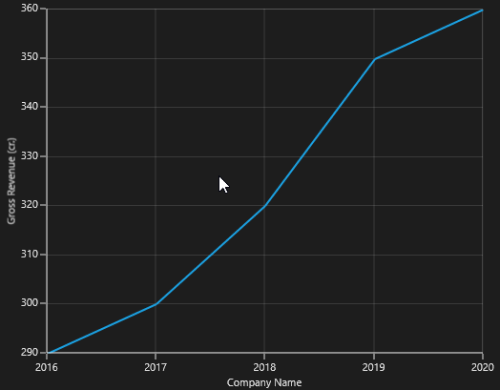
TimeSpanAxis
TimeSpanAxis is used to plot the time span values in the PrimaryAxis. TimeSpanAxis has the advantage of plotting data with milliseconds difference. The limitation of TimeSpanAxis is that it can only accept timespan values (hh:mm:ss) and datetime values are not accepted.
The following APIs are used in TimeSpanAxis.
TimeSpanAxis
| Property | Definition |
|---|---|
| Gets or sets the double value that represents the interval between the labels. | |
| Gets or sets the timespan value that represents the minimum value for the Axis. | |
| Gets or sets the timespan value that represents the maximum value for the Axis. |
 <syncfusion:SfChart
    x:Name="Chart"
    Margin="5,0,10,0">

    <syncfusion:SfChart.DataContext>
        <local:ViewModel />
    </syncfusion:SfChart.DataContext>

    <syncfusion:SfChart.PrimaryAxis>
        <syncfusion:TimeSpanAxis
            Interval="00:00:01"
            Header="Company Name" />
    </syncfusion:SfChart.PrimaryAxis>

    <syncfusion:SfChart.SecondaryAxis>
        <syncfusion:NumericalAxis
            Header="Gross Revenue (cr.)" />
    </syncfusion:SfChart.SecondaryAxis>

    <syncfusion:LineSeries
        x:Name="series1"
        Label="Company Details"
        XBindingPath="Year"
        YBindingPath="CompanyTurnOver"
        ItemsSource="{Binding CompanyDetails}" />

</syncfusion:SfChart>chart.Margin = new Thickness(5, 0, 10, 0);
chart.DataContext = new ViewModel();
chart.PrimaryAxis = new TimeSpanAxis()
{
Interval = new TimeSpan(00, 00, 01),
Header = "Company Name"
};
chart.SecondaryAxis = new NumericalAxis()
{
Header="Gross Revenue (cr.)"
};
ColumnSeries series = new ColumnSeries()
{
ItemsSource = new ViewModel().CompanyDetails,
XBindingPath = "Year",
YBindingPath = "CompanyTurnOver"
};
chart.Series.Add(series);
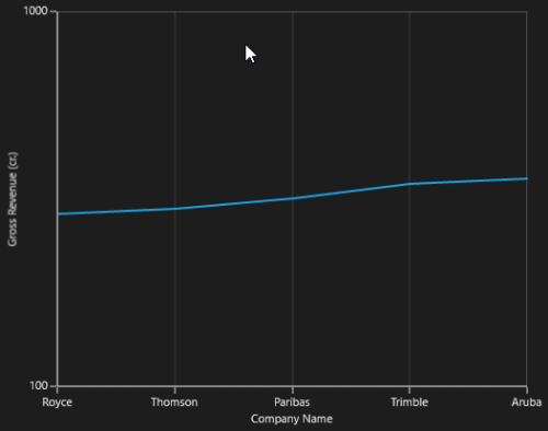
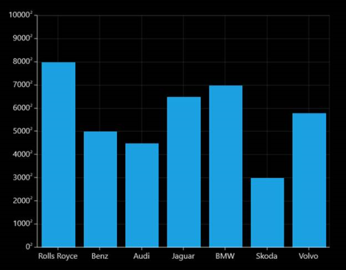
LogarithmicAxis
LogarithmicAxis is used to plot the logarithmic scale for the chart. In order to plot the logarithmic scale, you must specify the base value using LogarithmicBase Property.
The following APIs are used to customize the LogarithmicAxis.
LogarithmicAxis
| Property | Definition |
|---|---|
| Gets or sets the double value that represents the interval between the labels | |
| Gets or sets the double value that represents the minimum value for the Axis. | |
| Gets or sets the double value that represents the maximum value of the Axis. | |
| Gets or sets the double value that represents the logarithmic base value of the Axis. |
<syncfusion:SfChart x:Name="Chart" Margin="5,0,10,0">

    <syncfusion:SfChart.DataContext>
        <local:ViewModel />
    </syncfusion:SfChart.DataContext>

    <syncfusion:SfChart.PrimaryAxis>
        <syncfusion:CategoryAxis Header="Company Name" />
    </syncfusion:SfChart.PrimaryAxis>

    <syncfusion:SfChart.SecondaryAxis>
        <syncfusion:LogarithmicAxis
            LogarithmicBase="10"
            Header="Gross Revenue (cr.)" />
    </syncfusion:SfChart.SecondaryAxis>

    <syncfusion:LineSeries
        x:Name="series1"
        Label="Company Details"
        XBindingPath="CompanyName"
        YBindingPath="CompanyTurnOver"
        ItemsSource="{Binding CompanyDetails}" />

</syncfusion:SfChart>chart.Margin = new Thickness(5, 0, 10, 0);
chart.DataContext = new ViewModel();
chart.PrimaryAxis = new CategoryAxis()
{
Header = "Company Name"
};
chart.SecondaryAxis = new LogarithmicAxis()
{
Header = "Gross Revenue",
LogarithmicBase = 10
};
ColumnSeries series = new ColumnSeries()
{
ItemsSource = new ViewModel().CompanyDetails,
XBindingPath = "Year",
YBindingPath = "CompanyTurnOver"
};
chart.Series.Add(series);Logarithmic Axis does not support zero or negative values.
The following screenshot illustrates the SfChart with LogarithmicAxis.
Multiple axes
SfChart provides a way to arrange multiple series inside the same chart area, giving the chart more space than x-axis and y-axis.These axes can be arranged in a stack or in a side by side pattern.
By default, all the series are plotted based on Primary and Secondary Axis. You can add more axes by adding additional axis to the series. There are two properties XAxis and YAxis in all the series, except Accumulation Series.
<syncfusion:ColumnSeries
    Label="2010"
    ItemsSource="{Binding Demands}"
    XBindingPath="Demand"
    YBindingPath="Year2010"
    Interior="Green">

    <syncfusion:ColumnSeries.XAxis>
        <syncfusion:NumericalAxis Header="Additional X Axis" />
    </syncfusion:ColumnSeries.XAxis>

    <syncfusion:ColumnSeries.YAxis>
        <syncfusion:NumericalAxis Header="Additional Y Axis" />
    </syncfusion:ColumnSeries.YAxis>

</syncfusion:ColumnSeries>

<syncfusion:LineSeries
    Label="2011"
    ItemsSource="{Binding Demands}"
    XBindingPath="Demand"
    YBindingPath="Year2011"
    Interior="Black"
    StrokeThickness="2" />
ColumnSeries series1 = new ColumnSeries()
{
ItemsSource = new ViewModel().Demands,
XBindingPath = "Demand",
YBindingPath = "Year2010",
Label ="2010",
Interior = new SolidColorBrush(Colors.Green)
};
series1.XAxis = new NumericalAxis()
{
Header = "Additional X Axis"
};
series1.YAxis = new NumericalAxis()
{
Header = "Additional Y Axis"
};
LineSeries series2 = new LineSeries()
{
ItemsSource = new ViewModel().Demands,
XBindingPath = "Demand",
YBindingPath = "Year2011",
Label = "2011",
Interior = new SolidColorBrush(Colors.Black),
StrokeThickness = 2
};
chart.Series.Add(series1);
chart.Series.Add(series2);The following screenshot illustrates SfChart with multiple axes.
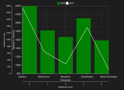
The first series is plotting based on additional X & Y axis and second series (or remaining series) is plotting against the Primary and Secondary axis.
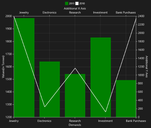
Axis positioning
By default, the x-axis is arranged horizontally at the bottom of the chart and the y-axis is arranged vertically on the left-side of the chart. You can change the alignment of the axes by setting OpposedPosition to True. It arranges the x-axis at the top and the y-axis on the right-side of the chart.
The following is the code example for setting the OpposedPosition property.
<syncfusion:ColumnSeries>

    <syncfusion:ColumnSeries.XAxis>

        <syncfusion:NumericalAxis
            Header="Additional X Axis"
            OpposedPosition="True" />

    </syncfusion:ColumnSeries.XAxis>

    <syncfusion:ColumnSeries.YAxis>

        <syncfusion:NumericalAxis
            Header="Additional Y Axis"
            OpposedPosition="True" />

    </syncfusion:ColumnSeries.YAxis>

</syncfusion:ColumnSeries>columnSeries.XAxis = new NumericalAxis()
{
Header = "Additional X Axis",
OpposedPosition = true
};
columnSeries.YAxis = new NumericalAxis()
{
Header = "Additional Y Axis",
OpposedPosition = true
};The following is a screenshot demonstrating y-axis of a chart arranged in OpposedPosition.
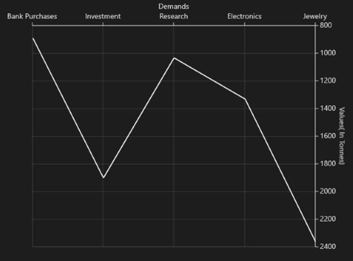
Inversed axis
IsInversed property is used to reverse chart plotting inverse the axis scaling.
<syncfusion:SfChart.PrimaryAxis>

    <syncfusion:CategoryAxis
        FontSize="16"
        IsInversed="True"
        OpposedPosition="True" />

</syncfusion:SfChart.PrimaryAxis>

<syncfusion:SfChart.SecondaryAxis>

    <syncfusion:NumericalAxis
        FontSize="16"
        Minimum="0"
        Maximum="2000"
        Interval="200"
        IsInversed="True"
        OpposedPosition="True" />

</syncfusion:SfChart.SecondaryAxis>chart.PrimaryAxis = new CategoryAxis()
{
FontSize = 16,
OpposedPosition = true,
IsInversed = true
};
chart.SecondaryAxis = new NumericalAxis()
{
FontSize = 16,
Minimum = 0,
Maximum = 2000,
Interval = 200,
IsInversed = true,
OpposedPosition = true
};
Axis range and interval
ChartAxis calculates the range and intervals automatically based on the values of series data points. You can also explicitly specify the range and interval using the Minimum, Maximum and Interval properties.
TIPS
You cannot specify range for
CategoryAxisinstead you can useZoomFactorandZoomPosition.
You can force the NumericalAxis to start range from zero by enabling StartRangeFromZero. The following is the code example for setting the ChartAxis properties.
The following is the code sample for setting the ChartAxis properties:
<syncfusion:SfChart.PrimaryAxis>

    <syncfusion:CategoryAxis FontSize="14" />

</syncfusion:SfChart.PrimaryAxis>

<syncfusion:SfChart.SecondaryAxis>

    <syncfusion:NumericalAxis FontSize="14" />

</syncfusion:SfChart.SecondaryAxis>chart.PrimaryAxis = new CategoryAxis()
{
FontSize = 14
};
chart.SecondaryAxis = new NumericalAxis()
{
FontSize = 14
};Range padding
The NumericalAxis and DateTimeAxis have a RangePadding property that can be used to add padding to the range of a chart’s axes.
NumericalAxis RangePadding
The following types are available for NumericalAxis:
- Additional
- None
- Normal
- Round
- RoundStart
- RoundEnd
- PrependInterval
- AppendInterval
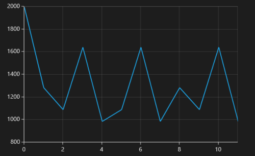
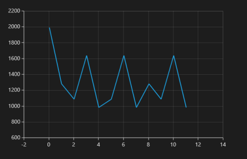
By default, the default RangePadding value for PrimaryAxis is Auto and for SecondaryAxis, the default value is Round.
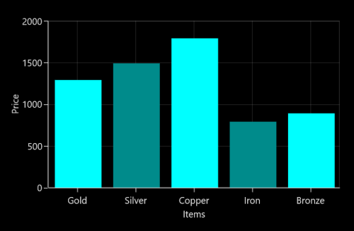
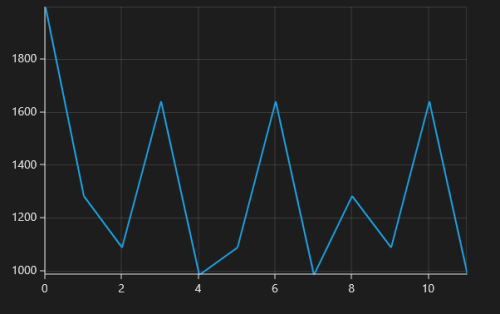
The following screenshot demonstrates RangePadding as None, where no padding is applied for the axis.
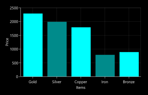
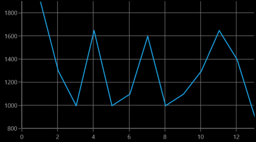
Normal RangePadding for a NumericalAxis is used mostly for the y-axis to have padding based on the Range calculation.
The following screenshot illustrates a chart’s y-axis with RangePadding set to Normal.
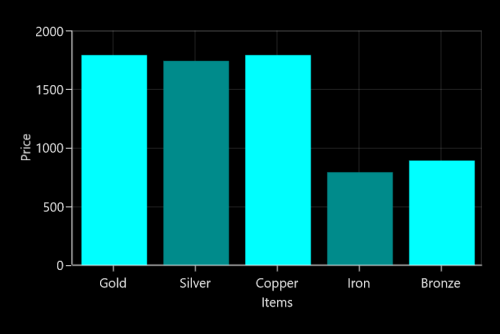
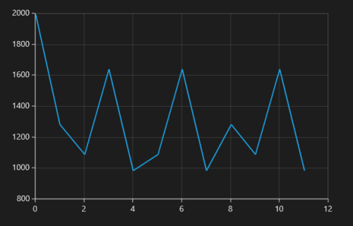
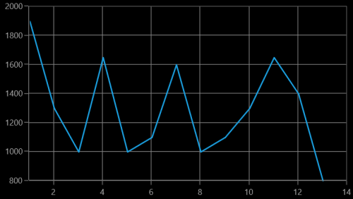
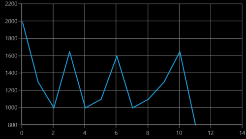
Round RangePadding for a NumericalAxis rounds the range of the chart axis to the nearest possible value.
The following screenshot demonstrates a chart’s x-axis with RangePadding set to Round.
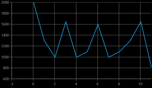
If RangePadding for NumericalAxis is set to Additional, the interval of the axis is added as padding.
The following screenshot demonstrates a chart’s x-axis with RangePadding set to Additional.
If RangePadding for NumericalAxis is set to RoundStart , rounds the range of the chart axis in the start to the nearest possible value.
The following screenshot demonstrates a chart’s x-axis with RangePadding set to RoundStart .
If RangePadding for NumericalAxis is set to RoundEnd , rounds the range of the chart axis in the end to the nearest possible value.
The following screenshot demonstrates a chart’s x-axis with RangePadding set to RoundEnd .
If RangePadding for NumericalAxis is set to PrependInterval , the interval of the axis is added in the start as padding.
The following screenshot demonstrates a chart’s x-axis with RangePadding set to PrependInterval .
If RangePadding for NumericalAxis is set to AppendInterval , the interval of the axis is added in the end as padding.
The following screenshot demonstrates a chart’s x-axis with RangePadding set to AppendInterval .
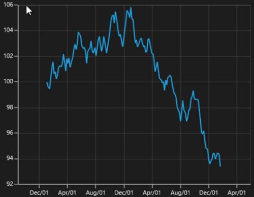
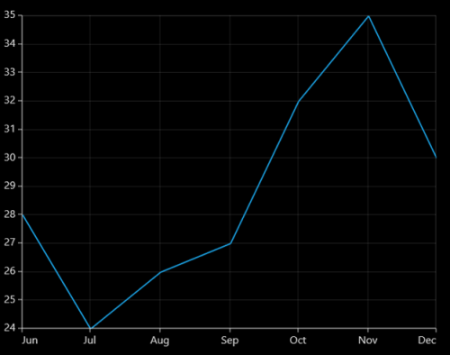
DateTimeAxis RangePadding
The RangePadding types available in the DateTimeAxis are:
- Additional
- None
- Round
- RoundStart
- RoundEnd
- PrependInterval
- AppendInterval
By default, the RangePadding for a DateTimeAxis is None.
The following screenshot demonstrates a chart’s x-axis with RangePadding set to None.
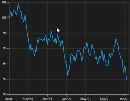
When RangePadding for DateTimeAxis is set to Additional, the DateTime interval of the axis is added as padding, as shown in the following screenshot.
When RangePadding for DateTimeAxis is set to Round, the range of the chart axis is rounded off to the nearest possible DateTime value, as shown in the following screenshot.
When RangePadding for DateTimeAxis is set to RoundStart, the range of the chart axis is rounded in the start off to the nearest possible DateTime value, as shown in the following screenshot.
When RangePadding for DateTimeAxis is set to RoundEnd, the range of the chart axis is rounded in the end off to the nearest possible DateTime value, as shown in the following screenshot.
When RangePadding for DateTimeAxis is set to PrependInterval, the DateTime interval of the axis is added in the start as padding, as shown in the following screenshot.
When RangePadding for DateTimeAxis is set to AppendInterval, the DateTime interval of the axis is added in the end as padding, as shown in the following screenshot.
Applying padding to the axis
The PlotOffset property is used to provide padding to the axis. The following code sample demonstrates the padding applied to both x and y-axes.
<syncfusion:SfChart.PrimaryAxis>

    <syncfusion:CategoryAxis PlotOffset="30" />

</syncfusion:SfChart.PrimaryAxis>

<syncfusion:SfChart.SecondaryAxis>

    <syncfusion:NumericalAxis PlotOffset="30" />

</syncfusion:SfChart.SecondaryAxis>chart.PrimaryAxis = new CategoryAxis()
{
PlotOffset = 30
};
chart.SecondaryAxis = new NumericalAxis()
{
PlotOffset = 30
};
PlotOffsetStart
The PlotOffsetStart property is used to provide padding to the axis at start position. The following code sample demonstrates the padding applied to Start position for both x and y-axes.
<syncfusion:SfChart.PrimaryAxis>

    <syncfusion:CategoryAxis PlotOffsetStart="30" />

</syncfusion:SfChart.PrimaryAxis>

<syncfusion:SfChart.SecondaryAxis>

    <syncfusion:NumericalAxis PlotOffsetStart="30" />

</syncfusion:SfChart.SecondaryAxis>chart.PrimaryAxis = new CategoryAxis()
{
PlotOffsetStart = 30
};
chart.SecondaryAxis = new NumericalAxis()
{
PlotOffsetStart = 30
};
PlotOffsetEnd
The PlotOffsetEnd property is used to provide padding to the axis at end position. The following code sample demonstrates the padding applied to end position for both x and y-axes.
<syncfusion:SfChart.PrimaryAxis>

    <syncfusion:CategoryAxis  PlotOffsetEnd="30" />

</syncfusion:SfChart.PrimaryAxis>

<syncfusion:SfChart.SecondaryAxis>

    <syncfusion:NumericalAxis PlotOffsetEnd="30" />

</syncfusion:SfChart.SecondaryAxis>chart.PrimaryAxis = new CategoryAxis()
{
PlotOffsetEnd = 30
};
chart.SecondaryAxis = new NumericalAxis()
{
PlotOffsetEnd = 30
};
AutoScrollingDelta
AutoScrollingDelta is used to ensure whether the specified range of data is always visible in the chart. It always shows the recently added data points at the end, and scrolling will be reset to the end of the range whenever a new point is added.
By activating the EnableScrollBar property of the axis or by adding ChartZoomPanBehavior to the chart, you can scroll to the previous data points.
AutoScrollingDeltaType
In DateTimeAxis, you can apply auto scrolling delta value in Years, Months, Days, Hours, Minutes, Seconds and Milliseconds by setting the AutoScrollingDeltaType property. The default value of this property is Auto, and the delta will be calculated automatically based on range.
<chart:SfChart.PrimaryAxis>

    <chart:DateTimeAxis AutoScrollingDelta = "3" AutoScrollingDeltaType = "Days">

</chart:SfChart.PrimaryAxis>chart.PrimaryAxis = new DateTimeAxis()
{
AutoScrollingDelta = 3,
AutoScrollingDeltaType = DateTimeIntervalType.Days
};AutoScrollingMode
The AutoScrollingMode property is used to determine whether the axis should be scrolled from the start position or end position. The default value of this property is End.
<chart:SfChart.PrimaryAxis>

    <chart:DateTimeAxis AutoScrollingDelta = "3" AutoScrollingMode = "Start">

</chart:SfChart.PrimaryAxis>chart.PrimaryAxis = new DateTimeAxis()
{
AutoScrollingDelta = 3,
AutoScrollingMode = ChartAutoScrollingMode.Start
};Positioning axis labels
Label placement
The CategoryAxis includes the LabelPlacement property, used to set the labels of the axis between the tick lines or on the tick lines of the category axis. By default the LabelPlacement value for the CategoryAxis is OnTicks.
There are two types of LabelPlacement:
- BetweenTicks
- OnTicks
The following code example and screenshot shows LabelPlacement set to OnTicks.
<syncfusion:SfChart.PrimaryAxis>

     <syncfusion:CategoryAxis LabelPlacement="OnTicks" FontSize="16"  />

</syncfusion:SfChart.PrimaryAxis>chart.PrimaryAxis = new CategoryAxis()
{
FontSize = 16,
LabelPlacement = LabelPlacement.OnTicks
};
The following code example and screenshot shows LabelPlacement set to BetweenTicks.
<syncfusion:SfChart.PrimaryAxis>

    <syncfusion:CategoryAxis LabelPlacement="BetweenTicks" FontSize="16"  />

</syncfusion:SfChart.PrimaryAxis>chart.PrimaryAxis = new CategoryAxis()
{
FontSize = 16,
LabelPlacement = LabelPlacement.BetweenTicks
};
Label position
The LabelsPosition property is used to position the axis label either Inside or Outside the chart plotting area.
The following code example and screenshot illustrate the use of LabelsPosition.
<syncfusion:SfChart.PrimaryAxis>

    <syncfusion:CategoryAxis  LabelsPosition="Inside" FontSize="16"  />

</syncfusion:SfChart.PrimaryAxis>chart.PrimaryAxis = new CategoryAxis()
{
FontSize = 16,
LabelsPosition = AxisElementPosition.Inside
};
<syncfusion:SfChart.PrimaryAxis>

    <syncfusion:CategoryAxis
        LabelsPosition="Outside"
        FontSize="16" />

</syncfusion:SfChart.PrimaryAxis>chart.PrimaryAxis = new CategoryAxis()
{
FontSize = 16,
LabelsPosition = AxisElementPosition.Outside
};
Positioning edge labels
SfChart provides support to customize the edge labels of the axis to adjust its position using the EdgeLabelsDrawingMode property.
The following are the customizing options in EdgeLabelsDrawingMode.
- Center- Positions the label with tickline as center.
- Fit- Position the gridline inside based on the edge label size.
- Hide- Hides the edge labels.
- Shift- Shifts the edge labels inside to label width.
The following code example and screenshot show EdgeLabelsDrawingMode set to Center.
<syncfusion:SfChart.PrimaryAxis>

    <syncfusion:DateTimeAxis LabelFormat="MM/yy" EdgeLabelsDrawingMode="Center" FontSize="16"  />

</syncfusion:SfChart.PrimaryAxis>chart.PrimaryAxis = new CategoryAxis()
{
FontSize = 16,
LabelFormat = "MM/yy",
EdgeLabelsDrawingMode = EdgeLabelsDrawingMode.Center
};
The following code example and screenshot shows EdgeLabelsDrawingMode set to Fit.
<syncfusion:SfChart.PrimaryAxis>

    <syncfusion:DateTimeAxis LabelFormat="MM/yy" EdgeLabelsDrawingMode="Fit" FontSize="16"  />

</syncfusion:SfChart.PrimaryAxis>chart.PrimaryAxis = new CategoryAxis()
{
FontSize = 16,
LabelFormat = "MM/yy",
EdgeLabelsDrawingMode = EdgeLabelsDrawingMode.Fit
};
The following code example and screenshot shows EdgeLabelDrawingMode set to Hide.
<syncfusion:SfChart.PrimaryAxis>

    <syncfusion:DateTimeAxis LabelFormat="MM/yy" EdgeLabelsDrawingMode="Hide" FontSize="16"  />

</syncfusion:SfChart.PrimaryAxis>chart.PrimaryAxis = new CategoryAxis()
{
FontSize = 16,
LabelFormat = "MM/yy",
EdgeLabelsDrawingMode = EdgeLabelsDrawingMode.Hide
};
The following code example and screenshot shows EdgeLabelsDrawingMode set to Shift.
<syncfusion:SfChart.PrimaryAxis>

    <syncfusion:DateTimeAxis LabelFormat="MM/yy" EdgeLabelsDrawingMode="Shift" FontSize="16"  />

</syncfusion:SfChart.PrimaryAxis>chart.PrimaryAxis = new CategoryAxis()
{
FontSize = 16,
LabelFormat = "MM/yy",
EdgeLabelsDrawingMode = EdgeLabelsDrawingMode.Shift
};
LabelExtent
The LabelExtent property allows us to set the distance between the axis header and the axis label. The following code sample demonstrates the LabelExtent property.
<syncfusion:SfChart.PrimaryAxis>

    <syncfusion:CategoryAxis Header="Items" LabelExtent="50"/>

</syncfusion:SfChart.PrimaryAxis>chart.PrimaryAxis = new CategoryAxis()
{
Header = "Items",
LabelExtent = 50
};
Smart labels
When a number of axis labels exist, they may overlap with each other. SfChart provides features to handle the overlapping labels using the LabelsIntersectAction property.
The following are the options for intersecting action.
- None
- Hide
- MultipleRows
The following code example and screenshot shows LabelsIntersectAction set to None.
<syncfusion:SfChart.PrimaryAxis>

    <syncfusion:DateTimeAxis LabelsIntersectAction="None" FontSize="16" />

</syncfusion:SfChart.PrimaryAxis>chart.PrimaryAxis = new CategoryAxis()
{
FontSize = 16,
LabelsIntersectAction = AxisLabelsIntersectAction.None
};
The following code example and screenshot shows LabelsIntersectAction set to Hide.
<syncfusion:SfChart.PrimaryAxis>

    <syncfusion:DateTimeAxis LabelsIntersectAction="Hide" FontSize="16" />

</syncfusion:SfChart.PrimaryAxis>chart.PrimaryAxis = new CategoryAxis()
{
FontSize = 16,
LabelsIntersectAction = AxisLabelsIntersectAction.Hide
};
The following code example and screenshot show LabelsIntersectAction set to MultipleRows.
<syncfusion:SfChart.PrimaryAxis>

    <syncfusion:DateTimeAxis LabelsIntersectAction="MultipleRows" FontSize="16" />

</syncfusion:SfChart.PrimaryAxis>chart.PrimaryAxis = new CategoryAxis()
{
FontSize = 16,
LabelsIntersectAction = AxisLabelsIntersectAction.MultipleRows
};
Custom labels
SfChart allows user to define the labels for the axis. For defining the axis label you have to set the LabelContent and Position properties.You can define the labels using CustomLabels property as demonstrated in the following code snippet.
<syncfusion:SfChart.PrimaryAxis>

    <syncfusion:CategoryAxis>

        <syncfusion:CategoryAxis.CustomLabels>
            <syncfusion:ChartAxisLabel Position="0" LabelContent="0-1" />
            <syncfusion:ChartAxisLabel Position="1" LabelContent="1-2" />
            <syncfusion:ChartAxisLabel Position="2" LabelContent="2-3" />
            <syncfusion:ChartAxisLabel Position="3" LabelContent="3-4" />
            <syncfusion:ChartAxisLabel Position="4" LabelContent="4-5" />
            <syncfusion:ChartAxisLabel Position="5" LabelContent="5-5" />
        </syncfusion:CategoryAxis.CustomLabels>

    </syncfusion:CategoryAxis>

</syncfusion:SfChart.PrimaryAxis>
CategoryAxis axis = new CategoryAxis();
axis.CustomLabels.Add(new ChartAxisLabel() { Position = 0, LabelContent = "0-1" });
axis.CustomLabels.Add(new ChartAxisLabel() { Position = 1, LabelContent = "1-2" });
axis.CustomLabels.Add(new ChartAxisLabel() { Position = 2, LabelContent = "2-3" });
axis.CustomLabels.Add(new ChartAxisLabel() { Position = 3, LabelContent = "3-4" });
axis.CustomLabels.Add(new ChartAxisLabel() { Position = 4, LabelContent = "4-5" });
axis.CustomLabels.Add(new ChartAxisLabel() { Position = 5, LabelContent = "5-5" });
chart.PrimaryAxis = axis;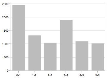
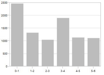
You can also directly bind the collection of labels to the LabelsSource property for defining custom labels. The following code example demonstrates how to define a label collection in code behind and binding the property in XAML page.
<syncfusion:SfChart.PrimaryAxis>

    <syncfusion:CategoryAxis
        LabelsSource="{Binding Labels}"
        ContentPath="Content"
        PositionPath="Position" />

</syncfusion:SfChart.PrimaryAxis>chart.PrimaryAxis = new CategoryAxis()
{
ContentPath ="Content",
PositionPath = "Position",
LabelsSource = Labels
};
public List<LabelItem> Labels { get; set; }
Labels = new List<LabelItem>
{
new LabelItem() {Position=0, Content = "0-1"},
new LabelItem() {Position=1, Content = "1-2"},
new LabelItem() {Position=2, Content = "2-3"},
new LabelItem() {Position=3, Content = "3-4"},
new LabelItem() {Position=4, Content = "4-5"},
new LabelItem() {Position=5, Content = "5-6"},
new LabelItem() {Position=6, Content = "6-7"},
new LabelItem() {Position=7, Content = "7-8"},
};
public class LabelItem
{
public string Content { get; set; }
public int Position { get; set; }
}
Add units to labels
You can customize the axis label to display its measuring units by adding a prefix or a suffix. This feature can be achieved using the PrefixLabelTemplate and PostfixLabelTemplate properties.
The following code example and screenshot demonstrate the usage of PrefixLabelTemplate.
<DataTemplate x:Key="yPrefix">

    <TextBlock FontSize="15" VerticalAlignment="Center" Text="$"/>

</DataTemplate>

<syncfusion:SfChart.SecondaryAxis>

    <syncfusion:NumericalAxis FontSize="16" Minimum="0" Maximum="1000" PrefixLabelTemplate="{StaticResource yPrefix}" />

</syncfusion:SfChart.SecondaryAxis>chart.SecondaryAxis = new NumericalAxis()
{
FontSize = 16,
Minimum = 0,
Maximum = 1000,
PrefixLabelTemplate = this.Resources["yPrefix"] as DataTemplate
};
The following code example and screenshot demonstrate the usage of PostfixLabelTemplate.
<DataTemplate x:Key="yPostfix">
    <TextBlock FontSize="8" VerticalAlignment="Top" Text="0" />
</DataTemplate>

<chart:SfChart.SecondaryAxis>
    <chart:NumericalAxis
        FontSize="16"
        Minimum="0"
        Maximum="100"
        PostfixLabelTemplate="{StaticResource yPostfix}" />
</chart:SfChart.SecondaryAxis>chart.SecondaryAxis = new NumericalAxis()
{
FontSize = 16,
Minimum = 0,
Maximum = 1000,
PostfixLabelTemplate = this.Resources["yPrefix"] as DataTemplate
};
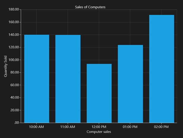
Formatting axis labels
SfChart provides the LabelFormat property for defining the custom formatting for the axis labels. This property supports all standard formatting type of numerical and date time values.
 <syncfusion:SfChart.PrimaryAxis>

      <syncfusion:DateTimeAxis LabelFormat="hh:mm tt" IntervalType="Hours" Interval="1" Header="Computer sales" />

</syncfusion:SfChart.PrimaryAxis>

<syncfusion:SfChart.SecondaryAxis>

      <syncfusion:NumericalAxis Header="Quantity Sold" LabelFormat="##.00"/>

</syncfusion:SfChart.SecondaryAxis>chart.PrimaryAxis = new DateTimeAxis()
{
Header = "Computer sales",
IntervalType = DateTimeIntervalType.Hours,
Interval = 1,
LabelFormat = "hh:mm:tt"
};
chart.SecondaryAxis = new NumericalAxis()
{
Header = "Quantity Sold",
LabelFormat ="##:00"
};
Origin customization
SfChart allows you to customize the origin. By default the axis will be rendered with(0,0) as origin in x and y-axes.
ShowAxisNextToOrigin
The ShowAxisNextToOrigin property is used to move the axis line to the origin value in Origin property based on x or y-axis. The following code example demonstrates how to shift the axis in the origin value in numerical axis.
<syncfusion:SfChart.SecondaryAxis>

    <syncfusion:NumericalAxis Origin="3" ShowAxisNextToOrigin="True" />

</syncfusion:SfChart.SecondaryAxis>chart.SecondaryAxis = new NumericalAxis()
{
Origin = 3,
ShowAxisNextToOrigin = true
};
Styling header and labels
SfChart provides support to customize the axis Header and label. The following APIs are used to customize the header and label.
| Property | Definition |
|---|---|
| HeaderStyle | Gets or sets the style for the axis header. The header’s , and are customized using this property. |
| LabelStyle | Gets or sets the style for the axis labels. The label’s , and are customized using this property. |
<syncfusion:SfChart
    Height="250"
    Width="500">

    <syncfusion:SfChart.PrimaryAxis>

        <syncfusion:CategoryAxis
            Header="City">

            <syncfusion:CategoryAxis.LabelStyle>

                <syncfusion:LabelStyle
                    FontSize="10"
                    FontFamily="Arial"
                    Foreground="Green" />

            </syncfusion:CategoryAxis.LabelStyle>

        </syncfusion:CategoryAxis>

    </syncfusion:SfChart.PrimaryAxis>

    <syncfusion:SfChart.SecondaryAxis>

        <syncfusion:NumericalAxis
            x:Name="axis"
            Header="Year">

            <syncfusion:NumericalAxis.LabelStyle>

                <syncfusion:LabelStyle
                    FontSize="10"
                    FontFamily="Arial"
                    Foreground="Green" />

            </syncfusion:NumericalAxis.LabelStyle>

        </syncfusion:NumericalAxis>

    </syncfusion:SfChart.SecondaryAxis>

    <syncfusion:LineSeries
        XBindingPath="City"
        YBindingPath="Year1950"
        ItemsSource="{Binding PopulationPercent}" />

</syncfusion:SfChart>
SfChart chart = new SfChart();
LabelStyle labelStyle;
chart.PrimaryAxis = new CategoryAxis() { Header = "City" };
labelStyle = new LabelStyle()
{
FontSize = 10,
FontFamily = new FontFamily("Arial"),
Foreground = new SolidColorBrush(Colors.Green)
};
chart.PrimaryAxis.LabelStyle = labelStyle;
chart.SecondaryAxis = new NumericalAxis()
{
Header = "Year",
};
chart.SecondaryAxis.LabelStyle = labelStyle;
LineSeries series = new LineSeries()
{
ItemsSource = new ViewModel().PopulationPercent,
XBindingPath = "City",
YBindingPath = "Year1950"
};
chart.Series.Add(series);Axis label border
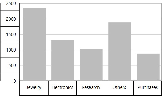
ChartAxis provides support to place border around its label.To place the border around axis, we should enable ShowLabelBorder property of axis and it can be set as shown in the below code snippet,
<syncfusion:SfChart.PrimaryAxis>

    <syncfusion:CategoryAxis ShowLabelBorder="True"/>

</syncfusion:SfChart.PrimaryAxis>

<syncfusion:SfChart.SecondaryAxis>

    <syncfusion:NumericalAxis ShowLabelBorder="True"  />

</syncfusion:SfChart.SecondaryAxis>chart.PrimaryAxis = new CategoryAxis()
{
ShowLabelBorder = true,
};
chart.SecondaryAxis = new NumericalAxis()
{
ShowLabelBorder = true
};
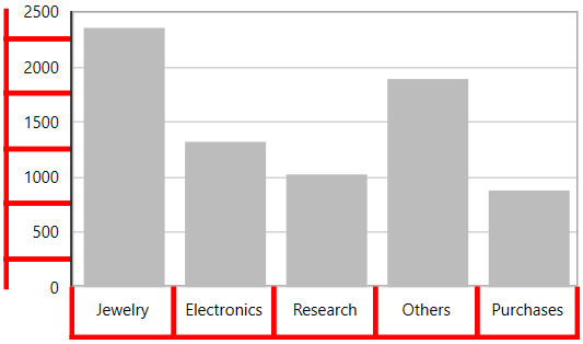
The border color and width can be customized with LabelBorderBrush and LabelBorderWidth properties of chart axis and it can be set as shown in the below code snippet,
<syncfusion:SfChart.PrimaryAxis>

    <syncfusion:CategoryAxis LabelBorderWidth="3" ShowLabelBorder="True" LabelBorderBrush="Red"/>

</syncfusion:SfChart.PrimaryAxis>

<syncfusion:SfChart.SecondaryAxis>

    </syncfusion:NumericalAxis ShowLabelBorder="True"  LabelBorderWidth="3" LabelBorderBrush="Red"/>

</syncfusion:SfChart.SecondaryAxis>chart.PrimaryAxis = new CategoryAxis()
{
ShowLabelBorder = true,
LabelBorderWidth = 3,
LabelBorderBrush = new SolidColorBrush(Colors.Red)
};
chart.SecondaryAxis = new NumericalAxis()
{
ShowLabelBorder = true,
LabelBorderWidth = 3,
LabelBorderBrush = new SolidColorBrush(Colors.Red),
};
GridLines and ticklines
GridLines
By default, gridlines are automatically added to the ChartAxis in its defined intervals. SfChart supports customization of gridline. You can control the visibility of the gridlines using the ShowGridLines property.
The following code example and screenshot show ShowGridLines set to False.
<syncfusion:SfChart.PrimaryAxis>

    <syncfusion:CategoryAxis ShowGridLines="False" FontSize="16"  />

</syncfusion:SfChart.PrimaryAxis>chart.PrimaryAxis = new CategoryAxis()
{
ShowGridLines = false,
FontSize = 16
};
Ticklines
Ticklines are small markers extending from the gridlines, used to indicate the axis scaling. Tickline can be positioned either inside or outside of the axis line.
The following code example and screenshot illustrate major and small ticklines set to Inside.
<syncfusion:SfChart.PrimaryAxis>

    <syncfusion:NumericalAxis
        LabelsPosition="Inside"
        TickLineSize="10"
        SmallTickLineSize="5"
        TickLinesPosition="Inside"
        SmallTickLinesPosition="Inside"
        SmallTicksPerInterval="2"
        FontSize="16" />

</syncfusion:SfChart.PrimaryAxis>chart.PrimaryAxis = new NumericalAxis()
{
LabelsPosition = AxisElementPosition.Inside,
TickLineSize = 10,
SmallTickLineSize = 5,
TickLinesPosition = AxisElementPosition.Inside,
SmallTickLinesPosition = AxisElementPosition.Inside,
SmallTicksPerInterval = 2,
FontSize = 16
};
You can customize the appearance of major gridline, minor gridlines and ticklines using the MajorTickLineStyle, MinorTickLineStyle, MajorGridLineStyle and MinorGridLineStyle properties. Also axis lines can be customized using AxisLineStyle as follows.
<syncfusion:SfChart>

    <syncfusion:SfChart.Resources>

        <Style x:Key="majorTickLineStyle" TargetType="Line">
            <Setter Property="Stroke" Value="Red" />
            <Setter Property="StrokeThickness" Value="1" />
        </Style>

        <Style x:Key="minorTickLineStyle" TargetType="Line">
            <Setter Property="Stroke" Value="Green" />
            <Setter Property="StrokeThickness" Value="1" />
        </Style>

        <Style x:Key="axisLineStyle" TargetType="Line">
            <Setter Property="Stroke" Value="OrangeRed" />
            <Setter Property="StrokeThickness" Value="1" />
        </Style>

        <Style x:Key="majorGridLineStyle" TargetType="Line">
            <Setter Property="Stroke" Value="Gray" />
            <Setter Property="StrokeThickness" Value="1" />
            <Setter Property="StrokeDashArray" Value="4,2" />
        </Style>

        <Style x:Key="minorGridLineStyle" TargetType="Line">
            <Setter Property="Stroke" Value="Gray" />
            <Setter Property="StrokeThickness" Value="1" />
            <Setter Property="StrokeDashArray" Value="1,2" />
        </Style>

    </syncfusion:SfChart.Resources>

    <syncfusion:SfChart.PrimaryAxis>

        <syncfusion:DateTimeAxis
            MajorGridLineStyle="{StaticResource majorGridLineStyle}"
            MinorGridLineStyle="{StaticResource minorGridLineStyle}"
            MajorTickLineStyle="{StaticResource majorTickLineStyle}"
            MinorTickLineStyle="{StaticResource minorTickLineStyle}"
            AxisLineStyle="{StaticResource axisLineStyle}"
            SmallTicksPerInterval="1"
            TickLineSize="10"
            SmallTickLineSize="6"
            LabelFormat="yyyy" />

    </syncfusion:SfChart.PrimaryAxis>

    <syncfusion:SfChart.SecondaryAxis>

        <syncfusion:NumericalAxis
            MajorTickLineStyle="{StaticResource majorTickLineStyle}"
            MajorGridLineStyle="{StaticResource majorGridLineStyle}"
            MinorGridLineStyle="{StaticResource minorGridLineStyle}"
            MinorTickLineStyle="{StaticResource minorTickLineStyle}"
            AxisLineStyle="{StaticResource axisLineStyle}"
            SmallTicksPerInterval="1"
            TickLineSize="10"
            SmallTickLineSize="5"
            HorizontalAlignment="Right" />

    </syncfusion:SfChart.SecondaryAxis>

    <syncfusion:FastLineBitmapSeries XBindingPath="Date" YBindingPath="Value" />

</syncfusion:SfChart>chart.PrimaryAxis = new DateTimeAxis()
{
MajorGridLineStyle = chart.Resources[" majorGridLineStyle"] as Style,
MinorGridLineStyle = chart.Resources["minorGridLineStyle"] as Style,
MajorTickLineStyle = chart.Resources["majorTickLineStyle"] as Style,
MinorTickLineStyle = chart.Resources["minorTickLineStyle"] as Style,
AxisLineStyle = chart.Resources["axisLineStyle"] as Style,
TickLineSize = 10,
SmallTickLineSize = 6,
SmallTicksPerInterval = 1,
LabelFormat = "yyyy"
};
chart.SecondaryAxis = new NumericalAxis()
{
MajorGridLineStyle = chart.Resources[" majorGridLineStyle"] as Style,
MinorGridLineStyle = chart.Resources["minorGridLineStyle"] as Style,
MajorTickLineStyle = chart.Resources["majorTickLineStyle"] as Style,
MinorTickLineStyle = chart.Resources["minorTickLineStyle"] as Style,
AxisLineStyle = chart.Resources["axisLineStyle"] as Style,
TickLineSize = 10,
SmallTickLineSize = 6,
SmallTicksPerInterval = 1,
HorizontalAlignment = HorizontalAlignment.Center
};
FastLineBitmapSeries series = new FastLineBitmapSeries()
{
ItemsSource = new ViewModel().Data,
XBindingPath = "Date",
YBindingPath = "Value"
};
chart.Series.Add(series);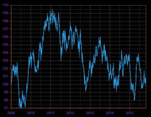
Customize individual axis elements
The RangeStyles can be used to customize the gridlines, ticks and axis labels for a specific region of ChartAxis. The following properties are used to customize the specific range in an axis:
-
Start- Sets the start range of an axis. -
End- Sets the end range of an axis. -
MajorGridLineStyle- Customizes the major grid lines of an axis. -
MinorGridLineStyle- Customizes the minor grid lines of an axis. -
MajorTickStyle- Customizes the major tick lines of an axis. -
MinorTickStyle- Customizes the minor tick lines of an axis. -
LabelStyle- Customizes the axis labels for a specific range.
<syncfusion:SfChart.Resources>

    <Style x:Key="RangeLineStyle" TargetType="Line">
        <Setter Property="StrokeThickness" Value="2" />
        <Setter Property="Stroke" Value="RoyalBlue" />
    </Style>

    <Style x:Key="lineStyle" TargetType="Line">
        <Setter Property="StrokeThickness" Value="2" />
        <Setter Property="Stroke" Value="Green" />
    </Style>

</syncfusion:SfChart.Resources>

<syncfusion:SfChart.SecondaryAxis>

    <syncfusion:NumericalAxis
        MajorGridLineStyle="{StaticResource lineStyle}"
        MajorTickLineStyle="{StaticResource lineStyle}">

        <syncfusion:NumericalAxis.LabelStyle>
            <syncfusion:LabelStyle Foreground="Green" />
        </syncfusion:NumericalAxis.LabelStyle>

        <syncfusion:NumericalAxis.RangeStyles>

            <syncfusion:ChartAxisRangeStyleCollection>

                <syncfusion:ChartAxisRangeStyle
                    Start="18"
                    End="22"
                    MajorGridLineStyle="{StaticResource RangeLineStyle}"
                    MajorTickLineStyle="{StaticResource RangeLineStyle}">

                    <syncfusion:ChartAxisRangeStyle.LabelStyle>
                        <syncfusion:LabelStyle Foreground="RoyalBlue" />
                    </syncfusion:ChartAxisRangeStyle.LabelStyle>

                </syncfusion:ChartAxisRangeStyle>

            </syncfusion:ChartAxisRangeStyleCollection>

        </syncfusion:NumericalAxis.RangeStyles>

    </syncfusion:NumericalAxis>

</syncfusion:SfChart.SecondaryAxis>
NumericalAxis secondaryAxis = new NumericalAxis();
secondaryAxis.MajorGridLineStyle = chart.Resources["lineStyle"] as Style;
secondaryAxis.MajorTickLineStyle = chart.Resources["lineStyle"] as Style;
secondaryAxis.LabelStyle.Foreground = new SolidColorBrush(Colors.Green);
ChartAxisRangeStyleCollection axisRangeStyles = new ChartAxisRangeStyleCollection();
ChartAxisRangeStyle rangeStyle = new ChartAxisRangeStyle()
{
Start = 18,
End = 22
};
rangeStyle.MajorGridLineStyle = chart.Resources["RangeLineStyle"] as Style;
rangeStyle.MajorTickLineStyle = chart.Resources["RangeLineStyle"] as Style;
rangeStyle.LabelStyle = new LabelStyle();
rangeStyle.LabelStyle.Foreground = new SolidColorBrush(Colors.RoyalBlue);
axisRangeStyles.Add(rangeStyle);
secondaryAxis.RangeStyles = axisRangeStyles;
chart.SecondaryAxis = secondaryAxis;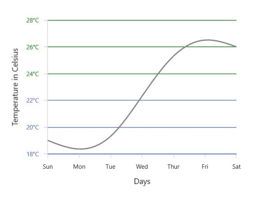
Multi-level labels
Axis can be customized with multiple levels of label by using its MultiLevelLabels property. These labels are placed based on the provided Start and End range values and we can add any number of labels to an axis. The below code snippet shows how to set a multilevel label,
<chart:SfChart.PrimaryAxis>

    <chart:CategoryAxis ShowLabelBorder="True">

        <chart:CategoryAxis.MultiLevelLabels>

            <chart:ChartMultiLevelLabel Start="-0.5" End="2.5" Text="Quarter 1" />

        </chart:CategoryAxis.MultiLevelLabels>

    </chart:CategoryAxis>

</chart:SfChart.PrimaryAxis>chart.PrimaryAxis = new CategoryAxis()
{
ShowLabelBorder = true,
};
ChartMultiLevelLabel label = new ChartMultiLevelLabel()
{
Start = -0.5,
End = 2.5,
Text = "Quarter 1"
};
chart.PrimaryAxis.MultiLevelLabels.Add(label);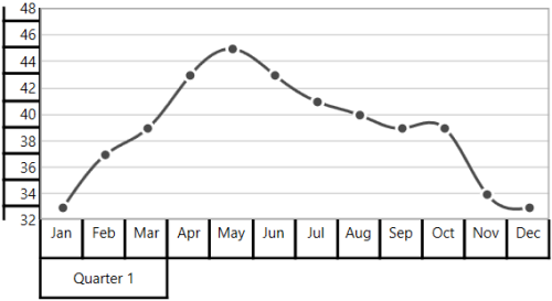
Regarding start and end property
Start and End properties of ChartMultiLevelLabel are type of objects, we can provide the start and end values for a multi-level label based on its Axis type. It is described in the following table,
| S.No | Axis Type | Start/End value | Example |
|---|---|---|---|
| 1 | CategoryAxis | Index-Based | Start=0(zeroth index position) End = 1(first index position) |
| 2 | DateTimeCategoryAxis | Index-Based | Start = 0(zeroth index position) End = 1(first index position) |
| 3 | NumericalAxis | Value-Based | Start= 5( Value) End= 10( Value) |
| 4 | LogarithmicAxis | Value-Based | Start= 10(Value) End= 1000(Value) |
| 5 | DateTimeAxis | Value-Based | Start = "2017/01/01" End="2017/01/02" |
| 6 | TimeSpanAxis | Value-Based | Start = "00:00:01" End="00:00:05" |
Customizing multi-level labels
Border customization
ChartMultiLevelLabel's border width and color can be customized with LabelBorderWidth and LabelBorderBrush properties of chart axis.It can be set as shown in the below code snippet,
<chart:SfChart.PrimaryAxis>

<chart:CategoryAxis  LabelBorderBrush="Red" LabelBorderWidth="3"  ShowLabelBorder="True">

<chart:CategoryAxis.MultiLevelLabels>

<chart:ChartMultiLevelLabel Start="-0.5" End="2.5" Text="Quarter 1"  />

</chart:CategoryAxis.MultiLevelLabels>

</chart:CategoryAxis>

</chart:SfChart.PrimaryAxis>chart.PrimaryAxis = new CategoryAxis()
{
LabelBorderWidth = 3,
ShowLabelBorder = true,
LabelBorderBrush = new SolidColorBrush(Colors.Red),
};
ChartMultiLevelLabel label = new ChartMultiLevelLabel()
{
Start = -0.5,
End = 2.5,
Text = "Quarter 1",
BorderWidth = 4
};
chart.PrimaryAxis.MultiLevelLabels.Add(label);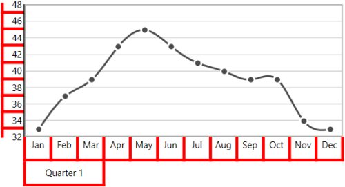
Border type
ChartAxis provides support to various types of border for ChartMultiLevelLabels and it can be applied by using its MultiLevelLabelsBorderType property.The default MultiLevelLabelsBorderType is Rectangle. The another supported border types are Brace,None and WithoutTopAndBottomBorder.
Rectangle
<chart:SfChart.PrimaryAxis>

    <chart:CategoryAxis ShowLabelBorder="True">

        <chart:CategoryAxis.MultiLevelLabels>

            <chart:ChartMultiLevelLabel
                Start="-0.5"
                End="2.5"
                Text="Quarter 1" />

            <chart:ChartMultiLevelLabel
                Start="2.5"
                End="5.5"
                Text="Quarter 2" />

            <chart:ChartMultiLevelLabel
                Start="5.5"
                End="8.5"
                Text="Quarter 3" />

            <chart:ChartMultiLevelLabel
                Start="8.5"
                End="11.5"
                Text="Quarter 4" />

        </chart:CategoryAxis.MultiLevelLabels>

    </chart:CategoryAxis>

</chart:SfChart.PrimaryAxis>

<chart:SfChart.SecondaryAxis>

    <chart:NumericalAxis ShowLabelBorder="True">

        <chart:NumericalAxis.MultiLevelLabels>

            <chart:ChartMultiLevelLabel
                Start="32"
                End="36"
                Text="Low" />

            <chart:ChartMultiLevelLabel
                Start="36"
                End="42"
                Text="Medium" />

            <chart:ChartMultiLevelLabel
                Start="42"
                End="48"
                Text="High" />

        </chart:NumericalAxis.MultiLevelLabels>

    </chart:NumericalAxis>

</chart:SfChart.SecondaryAxis>chart.PrimaryAxis = new CategoryAxis()
{
ShowLabelBorder = true,
};
ChartMultiLevelLabel label1 = new ChartMultiLevelLabel()
{
Start = -0.5,
End = 2.5,
Text = "Quarter 1",
};
chart.PrimaryAxis.MultiLevelLabels.Add(label1);
ChartMultiLevelLabel label2 = new ChartMultiLevelLabel()
{
Start = 2.5,
End = 5.5,
Text = "Quarter 2"
};
chart.PrimaryAxis.MultiLevelLabels.Add(label2);
ChartMultiLevelLabel label3 = new ChartMultiLevelLabel()
{
Start = 5.5,
End = 8.5,
Text = "Quarter 3"
};
chart.PrimaryAxis.MultiLevelLabels.Add(label3);
ChartMultiLevelLabel label4 = new ChartMultiLevelLabel()
{
Start = 8.5,
End = 11.5,
Text = "Quarter 4"
};
chart.PrimaryAxis.MultiLevelLabels.Add(label4);
chart.SecondaryAxis = new NumericalAxis()
{
ShowLabelBorder = true,
};
ChartMultiLevelLabel label5 = new ChartMultiLevelLabel()
{
Start = 32,
End = 36,
Text = "Low"
};
chart.SecondaryAxis.MultiLevelLabels.Add(label5);
ChartMultiLevelLabel label6 = new ChartMultiLevelLabel()
{
Start = 36,
End = 42,
Text = "Medium"
};
chart.SecondaryAxis.MultiLevelLabels.Add(label6);
ChartMultiLevelLabel label7 = new ChartMultiLevelLabel()
{
Start = 42,
End = 48,
Text = "High"
};
chart.SecondaryAxis.MultiLevelLabels.Add(label7);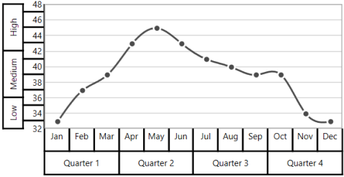
Brace
<chart:SfChart.PrimaryAxis>

    <chart:CategoryAxis
        MultiLevelLabelsBorderType="Brace"
        ShowLabelBorder="True">

        <chart:CategoryAxis.MultiLevelLabels>

            <chart:ChartMultiLevelLabel
                Start="-0.5"
                End="2.5"
                Text="Quarter 1" />

            <chart:ChartMultiLevelLabel
                Start="2.5"
                End="5.5"
                Text="Quarter 2" />

            <chart:ChartMultiLevelLabel
                Start="5.5"
                End="8.5"
                Text="Quarter 3" />

            <chart:ChartMultiLevelLabel
                Start="8.5"
                End="11.5"
                Text="Quarter 4" />

        </chart:CategoryAxis.MultiLevelLabels>

    </chart:CategoryAxis>

</chart:SfChart.PrimaryAxis>

<chart:SfChart.SecondaryAxis>

    <chart:NumericalAxis
        MultiLevelLabelsBorderType="Brace"
        ShowLabelBorder="True">

        <chart:NumericalAxis.MultiLevelLabels>

            <chart:ChartMultiLevelLabel
                Start="32"
                End="36"
                Text="Low" />

            <chart:ChartMultiLevelLabel
                Start="36"
                End="42"
                Text="Medium" />

            <chart:ChartMultiLevelLabel
                Start="42"
                End="48"
                Text="High" />

        </chart:NumericalAxis.MultiLevelLabels>

    </chart:NumericalAxis>

</chart:SfChart.SecondaryAxis>chart.PrimaryAxis = new CategoryAxis()
{
ShowLabelBorder = true,
MultiLevelLabelsBorderType = BorderType.Brace
};
ChartMultiLevelLabel label1 = new ChartMultiLevelLabel()
{
Start = -0.5,
End = 2.5,
Text = "Quarter 1",
};
chart.PrimaryAxis.MultiLevelLabels.Add(label1);
ChartMultiLevelLabel label2 = new ChartMultiLevelLabel()
{
Start = 2.5,
End = 5.5,
Text = "Quarter 2",
};
chart.PrimaryAxis.MultiLevelLabels.Add(label2);
ChartMultiLevelLabel label3 = new ChartMultiLevelLabel()
{
Start = 5.5,
End = 8.5,
Text = "Quarter 3",
};
chart.PrimaryAxis.MultiLevelLabels.Add(label3);
ChartMultiLevelLabel label4 = new ChartMultiLevelLabel()
{
Start = 8.5,
End = 11.5,
Text = "Quarter 4",
};
chart.PrimaryAxis.MultiLevelLabels.Add(label4);
chart.SecondaryAxis = new NumericalAxis()
{
ShowLabelBorder = true,
MultiLevelLabelsBorderType = BorderType.Brace
};
ChartMultiLevelLabel label5 = new ChartMultiLevelLabel()
{
Start = 32,
End = 36,
Text = "Low",
};
chart.SecondaryAxis.MultiLevelLabels.Add(label5);
ChartMultiLevelLabel label6 = new ChartMultiLevelLabel()
{
Start = 36,
End = 42,
Text = "Medium",
};
chart.SecondaryAxis.MultiLevelLabels.Add(label6);
ChartMultiLevelLabel label7 = new ChartMultiLevelLabel()
{
Start = 42,
End = 48,
Text = "High",
};
chart.SecondaryAxis.MultiLevelLabels.Add(label7);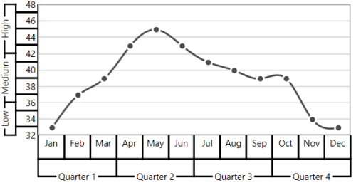
None
<chart:SfChart.PrimaryAxis>

    <chart:CategoryAxis
        MultiLevelLabelsBorderType="None"
        ShowLabelBorder="True">

        <chart:CategoryAxis.MultiLevelLabels>

            <chart:ChartMultiLevelLabel
                Start="-0.5"
                End="2.5"
                Text="Quarter 1" />

            <chart:ChartMultiLevelLabel
                Start="2.5"
                End="5.5"
                Text="Quarter 2" />

            <chart:ChartMultiLevelLabel
                Start="5.5"
                End="8.5"
                Text="Quarter 3" />

            <chart:ChartMultiLevelLabel
                Start="8.5"
                End="11.5"
                Text="Quarter 4" />

        </chart:CategoryAxis.MultiLevelLabels>

    </chart:CategoryAxis>

</chart:SfChart.PrimaryAxis>

<chart:SfChart.SecondaryAxis>

    <chart:NumericalAxis
        MultiLevelLabelsBorderType="None"
        ShowLabelBorder="True">

        <chart:NumericalAxis.MultiLevelLabels>

            <chart:ChartMultiLevelLabel
                Start="32"
                End="36"
                Text="Low" />

            <chart:ChartMultiLevelLabel
                Start="36"
                End="42"
                Text="Medium" />

            <chart:ChartMultiLevelLabel
                Start="42"
                End="48"
                Text="High" />

        </chart:NumericalAxis.MultiLevelLabels>

    </chart:NumericalAxis>

</chart:SfChart.SecondaryAxis>chart.PrimaryAxis = new CategoryAxis()
{
ShowLabelBorder = true,
MultiLevelLabelsBorderType = BorderType.None
};
ChartMultiLevelLabel label1 = new ChartMultiLevelLabel()
{
Start = -0.5,
End = 2.5,
Text = "Quarter 1"
};
chart.PrimaryAxis.MultiLevelLabels.Add(label1);
ChartMultiLevelLabel label2 = new ChartMultiLevelLabel()
{
Start = 2.5,
End = 5.5,
Text = "Quarter 2"
};
chart.PrimaryAxis.MultiLevelLabels.Add(label2);
ChartMultiLevelLabel label3 = new ChartMultiLevelLabel()
{
Start = 5.5,
End = 8.5,
Text = "Quarter 3"
};
chart.PrimaryAxis.MultiLevelLabels.Add(label3);
ChartMultiLevelLabel label4 = new ChartMultiLevelLabel()
{
Start = 8.5,
End = 11.5,
Text = "Quarter 4"
};
chart.PrimaryAxis.MultiLevelLabels.Add(label4);
chart.SecondaryAxis = new NumericalAxis()
{
ShowLabelBorder = true,
MultiLevelLabelsBorderType = BorderType.None
};
ChartMultiLevelLabel label5 = new ChartMultiLevelLabel()
{
Start = 32,
End = 36,
Text = "Low"
};
chart.SecondaryAxis.MultiLevelLabels.Add(label5);
ChartMultiLevelLabel label6 = new ChartMultiLevelLabel()
{
Start = 36,
End = 42,
Text = "Medium"
};
chart.SecondaryAxis.MultiLevelLabels.Add(label6);
ChartMultiLevelLabel label7 = new ChartMultiLevelLabel()
{
Start = 42,
End = 48,
Text = "High"
};
chart.SecondaryAxis.MultiLevelLabels.Add(label7);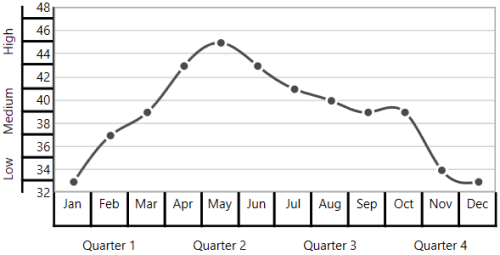
WithoutTopAndBottomBorder
<chart:SfChart.PrimaryAxis>

    <chart:CategoryAxis ShowLabelBorder="True"
        MultiLevelLabelsBorderType="WithoutTopAndBottomBorder">

        <chart:CategoryAxis.MultiLevelLabels>

            <chart:ChartMultiLevelLabel Start="-0.5" End="2.5" Text="Quarter 1" />
            <chart:ChartMultiLevelLabel Start="2.5" End="5.5" Text="Quarter 2" />
            <chart:ChartMultiLevelLabel Start="5.5" End="8.5" Text="Quarter 3" />
            <chart:ChartMultiLevelLabel Start="8.5" End="11.5" Text="Quarter 4" />

        </chart:CategoryAxis.MultiLevelLabels>

    </chart:CategoryAxis>

</chart:SfChart.PrimaryAxis>

<chart:SfChart.SecondaryAxis>

    <chart:NumericalAxis ShowLabelBorder="True"
        MultiLevelLabelsBorderType="WithoutTopAndBottomBorder">

        <chart:NumericalAxis.MultiLevelLabels>

            <chart:ChartMultiLevelLabel Start="32" End="36" Text="Low" />
            <chart:ChartMultiLevelLabel Start="36" End="42" Text="Medium" />
            <chart:ChartMultiLevelLabel Start="42" End="48" Text="High" />

        </chart:NumericalAxis.MultiLevelLabels>

    </chart:NumericalAxis>

</chart:SfChart.SecondaryAxis>chart.PrimaryAxis = new CategoryAxis()
{
ShowLabelBorder = true,
MultiLevelLabelsBorderType = BorderType.WithoutTopAndBottomBorder
};
ChartMultiLevelLabel label1 = new ChartMultiLevelLabel()
{
Start = -0.5,
End = 2.5,
Text = "Quarter 1",
};
chart.PrimaryAxis.MultiLevelLabels.Add(label1);
ChartMultiLevelLabel label2 = new ChartMultiLevelLabel()
{
Start = 2.5,
End = 5.5,
Text = "Quarter 2",
};
chart.PrimaryAxis.MultiLevelLabels.Add(label2);
ChartMultiLevelLabel label3 = new ChartMultiLevelLabel()
{
Start = 5.5,
End = 8.5,
Text = "Quarter 3",
};
chart.PrimaryAxis.MultiLevelLabels.Add(label3);
ChartMultiLevelLabel label4 = new ChartMultiLevelLabel()
{
Start = 8.5,
End = 11.5,
Text = "Quarter 4",
};
chart.PrimaryAxis.MultiLevelLabels.Add(label4);
chart.SecondaryAxis = new NumericalAxis()
{
ShowLabelBorder = true,
MultiLevelLabelsBorderType = BorderType.WithoutTopAndBottomBorder
};
ChartMultiLevelLabel label5 = new ChartMultiLevelLabel()
{
Start = 32,
End = 36,
Text = "Low",
};
chart.SecondaryAxis.MultiLevelLabels.Add(label5);
ChartMultiLevelLabel label6 = new ChartMultiLevelLabel()
{
Start = 36,
End = 42,
Text = "Medium",
};
chart.SecondaryAxis.MultiLevelLabels.Add(label6);
ChartMultiLevelLabel label7 = new ChartMultiLevelLabel()
{
Start = 42,
End = 48,
Text = "High",
};
chart.SecondaryAxis.MultiLevelLabels.Add(label7);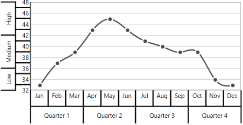
Text customization
ChartMultiLevelLabel's text can be customized with its FontSize, FontFamily and Foreground property and it is shown in below code snippet,
<chart:SfChart.PrimaryAxis>

    <chart:CategoryAxis ShowLabelBorder="True">

        <chart:CategoryAxis.MultiLevelLabels>

            <chart:ChartMultiLevelLabel
                Start="-0.5" End="11.5"
                Text="Year - 2016" FontFamily="Algerian"
                FontSize="14" Foreground="Blue" />

        </chart:CategoryAxis.MultiLevelLabels>

    </chart:CategoryAxis>

</chart:SfChart.PrimaryAxis>chart.PrimaryAxis = new CategoryAxis()
{
ShowLabelBorder = true,
};
ChartMultiLevelLabel label = new ChartMultiLevelLabel()
{
Start = -0.5,
End = 11.5,
Text = "Year - 2016",
Foreground = new SolidColorBrush(Colors.Blue),
FontSize = 14,
FontFamily = new FontFamily("Algerian")
};
chart.PrimaryAxis.MultiLevelLabels.Add(label);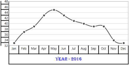
Label alignment
The text of ChartMultiLevelLabel can be aligned with its LabelAlignment property. The default value of LabelAlignment property is Center.
Center
<chart:SfChart.PrimaryAxis>

    <chart:CategoryAxis ShowLabelBorder="True">

        <chart:CategoryAxis.MultiLevelLabels>

            <chart:ChartMultiLevelLabel Start="-0.5" End="2.5" Text="Quarter 1" />
            <chart:ChartMultiLevelLabel Start="2.5" End="5.5" Text="Quarter 2" />
            <chart:ChartMultiLevelLabel Start="5.5" End="8.5" Text="Quarter 3" />
            <chart:ChartMultiLevelLabel Start="8.5" End="11.5" Text="Quarter 4" />

        </chart:CategoryAxis.MultiLevelLabels>

    </chart:CategoryAxis>

</chart:SfChart.PrimaryAxis>

<chart:SfChart.SecondaryAxis>

    <chart:NumericalAxis ShowLabelBorder="True">

        <chart:NumericalAxis.MultiLevelLabels>

            <chart:ChartMultiLevelLabel Start="32" End="36" Text="Low" />
            <chart:ChartMultiLevelLabel Start="36" End="42" Text="Medium" />
            <chart:ChartMultiLevelLabel Start="42" End="48" Text="High" />

        </chart:NumericalAxis.MultiLevelLabels>

    </chart:NumericalAxis>

</chart:SfChart.SecondaryAxis>chart.PrimaryAxis = new CategoryAxis()
{
ShowLabelBorder = true,
};
ChartMultiLevelLabel label1 = new ChartMultiLevelLabel()
{
Start = -0.5,
End = 2.5,
Text = "Quarter 1",
};
chart.PrimaryAxis.MultiLevelLabels.Add(label1);
ChartMultiLevelLabel label2 = new ChartMultiLevelLabel()
{
Start = 2.5,
End = 5.5,
Text = "Quarter 2"
};
chart.PrimaryAxis.MultiLevelLabels.Add(label2);
ChartMultiLevelLabel label3 = new ChartMultiLevelLabel()
{
Start = 5.5,
End = 8.5,
Text = "Quarter 3"
};
chart.PrimaryAxis.MultiLevelLabels.Add(label3);
ChartMultiLevelLabel label4 = new ChartMultiLevelLabel()
{
Start = 8.5,
End = 11.5,
Text = "Quarter 4"
};
chart.PrimaryAxis.MultiLevelLabels.Add(label4);
chart.SecondaryAxis = new NumericalAxis()
{
ShowLabelBorder = true,
};
ChartMultiLevelLabel label5 = new ChartMultiLevelLabel()
{
Start = 32,
End = 36,
Text = "Low"
};
chart.SecondaryAxis.MultiLevelLabels.Add(label5);
ChartMultiLevelLabel label6 = new ChartMultiLevelLabel()
{
Start = 36,
End = 42,
Text = "Medium"
};
chart.SecondaryAxis.MultiLevelLabels.Add(label6);
ChartMultiLevelLabel label7 = new ChartMultiLevelLabel()
{
Start = 42,
End = 48,
Text = "High"
};
chart.SecondaryAxis.MultiLevelLabels.Add(label7);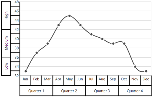
Near
<chart:SfChart.PrimaryAxis>

    <chart:CategoryAxis ShowLabelBorder="True">

        <chart:CategoryAxis.MultiLevelLabels>

            <chart:ChartMultiLevelLabel Start="-0.5" End="2.5" Text="Quarter 1" LabelAlignment="Near" />
            <chart:ChartMultiLevelLabel Start="2.5" End="5.5" Text="Quarter 2" LabelAlignment="Near" />
            <chart:ChartMultiLevelLabel Start="5.5" End="8.5" Text="Quarter 3" LabelAlignment="Near" />
            <chart:ChartMultiLevelLabel Start="8.5" End="11.5" Text="Quarter 4" LabelAlignment="Near" />

        </chart:CategoryAxis.MultiLevelLabels>

    </chart:CategoryAxis>

</chart:SfChart.PrimaryAxis>

<chart:SfChart.SecondaryAxis>

    <chart:NumericalAxis ShowLabelBorder="True">

        <chart:NumericalAxis.MultiLevelLabels>

            <chart:ChartMultiLevelLabel Start="32" End="36" Text="Low" LabelAlignment="Near" />
            <chart:ChartMultiLevelLabel Start="36" End="42" Text="Medium" LabelAlignment="Near" />
            <chart:ChartMultiLevelLabel Start="42" End="48" Text="High" LabelAlignment="Near" />

        </chart:NumericalAxis.MultiLevelLabels>

    </chart:NumericalAxis>

</chart:SfChart.SecondaryAxis>chart.PrimaryAxis = new CategoryAxis()
{
ShowLabelBorder = true,
};
ChartMultiLevelLabel label1 = new ChartMultiLevelLabel()
{
Start = -0.5,
End = 2.5,
Text = "Quarter 1",
LabelAlignment = LabelAlignment.Near
};
chart.PrimaryAxis.MultiLevelLabels.Add(label1);
ChartMultiLevelLabel label2 = new ChartMultiLevelLabel()
{
Start = 2.5,
End = 5.5,
Text = "Quarter 2",
LabelAlignment = LabelAlignment.Near
};
chart.PrimaryAxis.MultiLevelLabels.Add(label2);
ChartMultiLevelLabel label3 = new ChartMultiLevelLabel()
{
Start = 5.5,
End = 8.5,
Text = "Quarter 3",
LabelAlignment = LabelAlignment.Near
};
chart.PrimaryAxis.MultiLevelLabels.Add(label3);
ChartMultiLevelLabel label4 = new ChartMultiLevelLabel()
{
Start = 8.5,
End = 11.5,
Text = "Quarter 4",
LabelAlignment = LabelAlignment.Near
};
chart.PrimaryAxis.MultiLevelLabels.Add(label4);
chart.SecondaryAxis = new NumericalAxis()
{
ShowLabelBorder = true,
};
ChartMultiLevelLabel label5 = new ChartMultiLevelLabel()
{
Start = 32,
End = 36,
Text = "Low",
LabelAlignment = LabelAlignment.Near
};
chart.SecondaryAxis.MultiLevelLabels.Add(label5);
ChartMultiLevelLabel label6 = new ChartMultiLevelLabel()
{
Start = 36,
End = 42,
Text = "Medium",
LabelAlignment = LabelAlignment.Near
};
chart.SecondaryAxis.MultiLevelLabels.Add(label6);
ChartMultiLevelLabel label7 = new ChartMultiLevelLabel()
{
Start = 42,
End = 48,
Text = "High",
LabelAlignment = LabelAlignment.Near
};
chart.SecondaryAxis.MultiLevelLabels.Add(label7);
Far
<chart:SfChart.PrimaryAxis>

    <chart:CategoryAxis ShowLabelBorder="True">

        <chart:CategoryAxis.MultiLevelLabels>

            <chart:ChartMultiLevelLabel Start="-0.5" End="2.5" Text="Quarter 1" LabelAlignment="Far" />
            <chart:ChartMultiLevelLabel Start="2.5" End="5.5" Text="Quarter 2" LabelAlignment="Far" />
            <chart:ChartMultiLevelLabel Start="5.5" End="8.5" Text="Quarter 3" LabelAlignment="Far" />
            <chart:ChartMultiLevelLabel Start="8.5" End="11.5" Text="Quarter 4" LabelAlignment="Far" />

        </chart:CategoryAxis.MultiLevelLabels>

    </chart:CategoryAxis>

</chart:SfChart.PrimaryAxis>

<chart:SfChart.SecondaryAxis>

    <chart:NumericalAxis ShowLabelBorder="True">

        <chart:NumericalAxis.MultiLevelLabels>

            <chart:ChartMultiLevelLabel Start="32" End="36" Text="Low" LabelAlignment="Far" />
            <chart:ChartMultiLevelLabel Start="36" End="42" Text="Medium" LabelAlignment="Far" />
            <chart:ChartMultiLevelLabel Start="42" End="48" Text="High" LabelAlignment="Far" />

        </chart:NumericalAxis.MultiLevelLabels>

    </chart:NumericalAxis>

</chart:SfChart.SecondaryAxis>chart.PrimaryAxis = new CategoryAxis()
{
ShowLabelBorder = true,
};
ChartMultiLevelLabel label1 = new ChartMultiLevelLabel()
{
Start = -0.5,
End = 2.5,
Text = "Quarter 1",
LabelAlignment = LabelAlignment.Near
};
chart.PrimaryAxis.MultiLevelLabels.Add(label1);
ChartMultiLevelLabel label2 = new ChartMultiLevelLabel()
{
Start = 2.5,
End = 5.5,
Text = "Quarter 2",
LabelAlignment = LabelAlignment.Near
};
chart.PrimaryAxis.MultiLevelLabels.Add(label2);
ChartMultiLevelLabel label3 = new ChartMultiLevelLabel()
{
Start = 5.5,
End = 8.5,
Text = "Quarter 3",
LabelAlignment = LabelAlignment.Near
};
chart.PrimaryAxis.MultiLevelLabels.Add(label3);
ChartMultiLevelLabel label4 = new ChartMultiLevelLabel()
{
Start = 8.5,
End = 11.5,
Text = "Quarter 4",
LabelAlignment = LabelAlignment.Near
};
chart.PrimaryAxis.MultiLevelLabels.Add(label4);
chart.SecondaryAxis = new NumericalAxis()
{
ShowLabelBorder = true,
};
ChartMultiLevelLabel label5 = new ChartMultiLevelLabel()
{
Start = 32,
End = 36,
Text = "Low",
LabelAlignment = LabelAlignment.Near
};
chart.SecondaryAxis.MultiLevelLabels.Add(label5);
ChartMultiLevelLabel label6 = new ChartMultiLevelLabel()
{
Start = 36,
End = 42,
Text = "Medium",
LabelAlignment = LabelAlignment.Near
};
chart.SecondaryAxis.MultiLevelLabels.Add(label6);
ChartMultiLevelLabel label7 = new ChartMultiLevelLabel()
{
Start = 42,
End = 48,
Text = "High",
LabelAlignment = LabelAlignment.Near
};
chart.SecondaryAxis.MultiLevelLabels.Add(label7);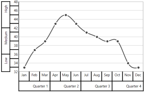
The text of ChartMultiLevelLabel text will automatically trim, when the text width exceeds the width of ChartMultiLevelLabel and it is shown below,
<chart:SfChart.SecondaryAxis>

    <chart:NumericalAxis ShowLabelBorder="True">

        <chart:NumericalAxis.MultiLevelLabels>

            <chart:ChartMultiLevelLabel Start="32" End="36" Text="Low Temperature" />
            <chart:ChartMultiLevelLabel Start="36" End="42" Text="Medium Temperature" />
            <chart:ChartMultiLevelLabel Start="42" End="48" Text="High Temperature" />

        </chart:NumericalAxis.MultiLevelLabels>

    </chart:NumericalAxis>

</chart:SfChart.SecondaryAxis>chart.SecondaryAxis = new NumericalAxis()
{
ShowLabelBorder = true,
};
ChartMultiLevelLabel label5 = new ChartMultiLevelLabel()
{
Start = 32,
End = 36,
Text = "Low Temperature"
};
chart.SecondaryAxis.MultiLevelLabels.Add(label5);
ChartMultiLevelLabel label6 = new ChartMultiLevelLabel()
{
Start = 36,
End = 42,
Text = "Medium Temperature"
};
chart.SecondaryAxis.MultiLevelLabels.Add(label6);
ChartMultiLevelLabel label7 = new ChartMultiLevelLabel()
{
Start = 42,
End = 48,
Text = "High Temperature"
};
chart.SecondaryAxis.MultiLevelLabels.Add(label7);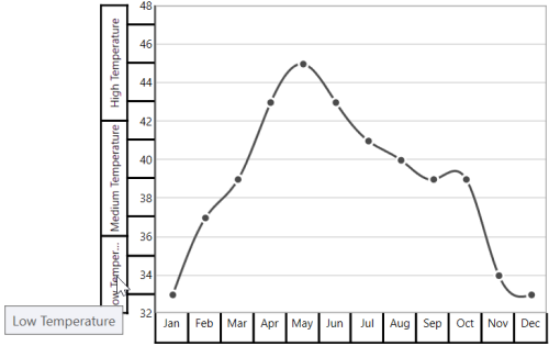
Events
ActualRangeChanged
The ActualRangeChanged event occurs when an axis range is changed. This argument contains the following information.
-
ActualMinimum- Gets or sets the actual minimum value of axis. -
ActualMaximum- Gets or sets the actual maximum value of axis. -
VisibleMinimum- Gets or sets the visible minimum value of axis. -
VisibleMaximum- Gets or sets the visible maximum value of axis. -
ActualInterval- Gets the actual interval of axis.
LabelCreated
The LabelCreated event occurs when the axis label is created. This argument contains AxisLabel of ChartAxisLabel, which contains the following properties.
-
LabelContent- Gets or sets the content of label. -
Position- Gets or sets the position of label.
AxisBoundsChanged
The AxisBoundsChanged event occurs when the bounds of the axis are changed. This argument contains the following information.
LabelClicked
The LabelClicked event is triggered when labels are clicked. Supports for 2D axis. The argument contains AxisLabel of ChartAxisLabel, which contains the following properties.
-
LabelContent- Gets the content of label. -
Position- Gets the position of label. -
PrefixLabelTemplate- Gets the prefix template of label. -
PostfixLabelTemplate- Gets the postfix template of label.