Annotations in UWP Charts (SfChart)
10 Jul 202624 minutes to read
SfChart supports Annotations, which allows you to mark the specific area of interest in the chart area. You can draw custom shapes, also text and images can be added using Annotations.
The following annotations are supported in SfChart
Adding annotation
You can create an instance for any type of Annotation and add it to Annotations collection. Here for instance, the EllipseAnnotation is added.
<syncfusion:SfChart.Annotations>

    <syncfusion:EllipseAnnotation X1="2.5" Y1="1500"
        X2="3.6" Y2="1680" Text="Ellipse Annotation" />

</syncfusion:SfChart.Annotations>
EllipseAnnotation annotation=new EllipseAnnotation()
{
X1 = 2.5, Y1 = 1500,
X2 = 3.6, Y2 = 1680,
Text = "Ellipse Annotation"
};
chart.Annotations.Add(annotation);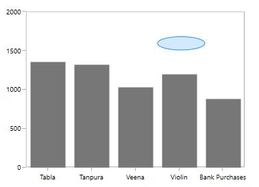
Positioning the annotation
Annotations can be positioned in plot area based on X1 and Y1 properties and for image and shape annotations you need to specify X2 and Y2 properties. These X and Y values can be specified with axis units or pixel units and this can be identified using CoordinateUnit property.
Positioning based on CoordinateUnit as axis
To position based on axis you need to set the X1 and Y1, X2 and Y2 (if needed) properties based on the primary and secondary axis range values and CoordinateUnit as Axis.
Positioning based on CoordinateUnit as pixels
To position based on the pixel values you have to set the CoordinateUnit as Pixel and the pixel values in X1 and Y1, X2 and Y2 properties in Annotation.
Adding annotation for multiple axes
You can also add annotation for a particular axis when there is multiple axes using XAxisName and YAxisName properties as in the below code snippet.
<Chart:SfChart>

    <Chart:SfChart.RowDefinitions>

        <Chart:ChartRowDefinition />
        <Chart:ChartRowDefinition />

    </Chart:SfChart.RowDefinitions>

    <Chart:SfChart.PrimaryAxis>
        <Chart:CategoryAxis />
    </Chart:SfChart.PrimaryAxis>

    <Chart:SfChart.SecondaryAxis>

        <Chart:NumericalAxis
            x:Name="FirstYAxis"
            Chart:ChartBase.Row="0" />

    </Chart:SfChart.SecondaryAxis>

    <Chart:SfChart.Annotations>

        <Chart:HorizontalLineAnnotation
            X1="-0.5"
            X2="3.5"
            Y1="500"
            Stroke="DarkGray"
            StrokeThickness="2"
            LineCap="Arrow"
            CanDrag="True"
            CanResize="True"
            YAxisName="FirstYAxis">

        </Chart:HorizontalLineAnnotation>

        <Chart:RectangleAnnotation
            X1="0.6"
            X2="2.2"
            Y1="1500"
            Y2="1800"
            CanDrag="True"
            CanResize="True"
            Stroke="DarkGray"
            Fill="LightGray"
            Opacity="0.5"
            YAxisName="SecondYAxis">

        </Chart:RectangleAnnotation>

    </Chart:SfChart.Annotations>

    <Chart:ColumnSeries
        Label="2011"
        Interior="#777777"
        ItemsSource="{Binding Demands}"
        XBindingPath="Demand"
        YBindingPath="Year2011" />

    <Chart:ScatterSeries
        Interior="#777777"
        ItemsSource="{Binding Demands}"
        XBindingPath="Demand"
        YBindingPath="Year2010">

        <Chart:ScatterSeries.YAxis>

            <Chart:NumericalAxis
                x:Name="SecondYAxis"
                LabelTemplate="{StaticResource label}"
                TickLineSize="5"
                MajorTickLineStyle="{StaticResource tick}"
                Minimum="0"
                Maximum="2000"
                Interval="500"
                AxisLineStyle="{StaticResource axis}"
                ShowGridLines="False"
                Chart:ChartBase.Row="1">

            </Chart:NumericalAxis>

        </Chart:ScatterSeries.YAxis>

    </Chart:ScatterSeries>

</Chart:SfChart>
SfChart chart = new SfChart();
chart.RowDefinitions.Add(new ChartRowDefinition());
chart.RowDefinitions.Add(new ChartRowDefinition());
chart.PrimaryAxis = new CategoryAxis();
chart.SecondaryAxis = new NumericalAxis();
ChartBase.SetRow(chart.SecondaryAxis, 0);
HorizontalLineAnnotation annotation = new HorizontalLineAnnotation()
{
X1 = -0.5, Y1 = 500,
X2 = 3.5,
Stroke = new SolidColorBrush(Colors.DarkGray),
StrokeThickness = 2,
LineCap = LineCap.Arrow,
CanDrag = true,
CanResize = true,
YAxisName = "FirstYAxis"
};
RectangleAnnotation annotation1 = new RectangleAnnotation()
{
X1 = 0.6, Y1 = 1500,
X2 = 2.2, Y2 = 1800,
Stroke = new SolidColorBrush(Colors.DarkGray),
Fill = new SolidColorBrush(Colors.LightGray),
StrokeThickness = 2,
Opacity = 0.5,
CanDrag = true,
CanResize = true,
YAxisName = "SecondYAxis"
};
chart.Annotations.Add(annotation);
chart.Annotations.Add(annotation1);
ColumnSeries columnSeries = new ColumnSeries()
{
ItemsSource = new ViewModel().Demands,
XBindingPath = "Demand",
YBindingPath = "Year2011",
Interior = new SolidColorBrush(Color.FromRgb(0x77, 0x77, 0x77))
};
ScatterSeries scatterSeries = new ScatterSeries()
{
ItemsSource = new ViewModel().Demands,
XBindingPath = "Demand",
YBindingPath = "Year2010",
Interior = new SolidColorBrush(Color.FromRgb(0x77, 0x77, 0x77))
};
NumericalAxis axis = new NumericalAxis()
{
Minimum = 0,
Maximum = 2000,
Interval = 500,
ShowGridLines = false,
TickLineSize = 5,
LabelTemplate = chart.Resources["labelTemplate"] as DataTemplate,
MajorTickLineStyle = chart.Resources["lineStyle1"] as Style,
AxisLineStyle = chart.Resources["lineStyle2"] as Style
};
ChartBase.SetRow(axis, 1);
scatterSeries.YAxis = axis;
chart.Series.Add(columnSeries);
chart.Series.Add(scatterSeries);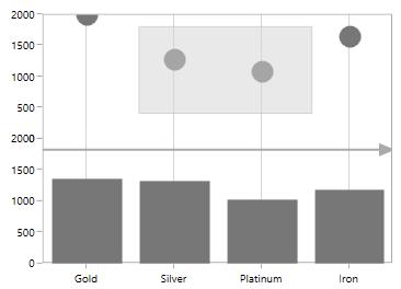
Aligning the annotation
You can align the annotation horizontally and vertically from its actual plotting position using the HorizontalAlignment and VerticalAlignment properties as in the following code sample.
<syncfusion:SfChart.Annotations>
<syncfusion:RectangleAnnotation
X1="0.6"
X2="2.2"
Y1="1800"
Y2="1500"
HorizontalAlignment="Left"
VerticalAlignment="Bottom"
Stroke="DarkGray"
Fill="LightGray"
Opacity="0.5" />
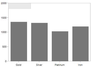
</syncfusion:SfChart.Annotations>In the following image, you can see the rectangle annotation aligned to the bottom left from its actual position in the chart area.
Text annotation
TextAnnotations are used to add simple text in specific points over the chart area.
Rotate the text annotation
The Angle property is used to get or set the angle for rotating the Annotation. The following code example demonstrate the rotation feature for TextAnnotation.
<syncfusion:SfChart.Annotations>

    <syncfusion:TextAnnotation
        CoordinateUnit="Axis"
        Text="Annotation"
        HorizontalAlignment="Stretch"
        VerticalAlignment="Stretch"
        FontWeight="Bold"
        Foreground="Black"
        Angle="90"
        X1="3.5"
        Y1="500" />

</syncfusion:SfChart.Annotations>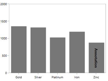
Editing text annotation
SfChart provides you with an editing option for the text in any annotations. When text annotation is enabled editing, if we click the text annotation it switches to edit mode which provide easy way of customizing the text at run time. You can enable the editing mode in TextAnnotation using EnableEditing property.
The following code example and screenshot demonstrate TextAnnotation while editing the text.
<syncfusion:SfChart.Annotations>

    <syncfusion:TextAnnotation
        CoordinateUnit="Axis"
        Text="Annotation"
        EnableEditing="True"
        HorizontalAlignment="Stretch"
        VerticalAlignment="Stretch"
        FontWeight="Bold"
        Foreground="Black"
        Angle="90"
        X1="3.5"
        Y1="500" />

</syncfusion:SfChart.Annotations>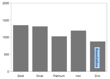
Shape annotation
ShapeAnnotation allows you to add annotations in the form of shapes such as rectangle, ellipse,horizontal line and vertical line at the specific area of interest, in the chart area.
-
EllipseAnnotation- Used to draw a circle or an ellipse over the chart area. -
RectangleAnnotation- Used to draw a rectangle over the chart area. -
VerticalLineAnnotation- Used to draw a vertical line across the chart area. -
HorizontalLineAnnotation- Used to add a horizontal line across the chart area.
The following API’s are commonly used in all ShapeAnnotation:
-
Fill- Represents the brush inside the Shape Annotation. -
X2- Represents the X2 Coordinate of the Shape Annotation. -
Y2- Represents the Y2 Coordinate of the Shape Annotation. -
CanDrag- A Boolean value that represent to drag the Annotation. -
CanResize- A Boolean value that represent to resize the Annotation.
Customization options for LineAnnotation
GrabExtent
GrabExtent property of LineAnnotation allows user to extent the hit visible area, while performing dragging and resizing. We need to set the desired pixel value for GrabExtent property and it can be set as shown in the below code example:
<syncfusion:SfChart.Annotations>

    <syncfusion:LineAnnotation
        X1="0"
        X2="3"
        Y1="1500"
        Y2="1500"
        GrabExtent="10"
        Stroke="DarkGray"
        CanDrag="True"
        CanResize="True" />

</syncfusion:SfChart.Annotations>
LineAnnotation annotation = new LineAnnotation()
{
X1 = 0,
X2 = 3,
Y1 = 1500,
Y2 = 1500,
CanDrag = true,
Stroke = new SolidColorBrush(Colors.DarkGray),
CanResize = true,
GrabExtent = 10
};
chart.Annotations.Add(annotation);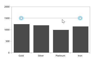
Toggling LineAnnotation visibility
LineAnnotation by default will be visible. You can also collapse the visibility of the line annotation using ShowLine property.
<syncfusion:SfChart.Annotations>

    <syncfusion:HorizontalLineAnnotation
        X1="-0.5"
        X2="3.5"
        Y1="1500"
        Stroke="DarkGray"
        StrokeThickness="1"
        ShowLine="False"
        Fill="LightGray" />

    <syncfusion:VerticalLineAnnotation
        X1="1.5"
        Stroke="DarkGray"
        StrokeThickness="1" />

</syncfusion:SfChart.Annotations>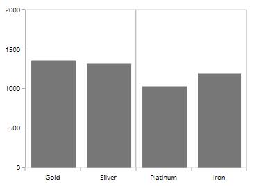
Displaying axis labels for LineAnnotation
VerticalLineAnnotation and HorizontalLineAnnotation also displays the axis labels in which the line is placed. This feature can be enabled by setting ShowAxisLabel property to true as in the below code snippet.
<syncfusion:SfChart.Annotations>

    <syncfusion:HorizontalLineAnnotation
        X1="-0.5"
        X2="3.5"
        Y1="1500"
        Stroke="DarkGray"
        StrokeThickness="1"
        ShowAxisLabel="True"
        Fill="LightGray" />

    <syncfusion:VerticalLineAnnotation
        X1="1.5"
        Stroke="DarkGray"
        StrokeThickness="1"
        ShowAxisLabel="True" />

</syncfusion:SfChart.Annotations>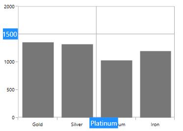
AxisLabelTemplate
You can also customize the default appearance of the axis label using AxisLabelTemplate property as in the below code snippet.
<syncfusion:SfChart.Annotations>

    <syncfusion:HorizontalLineAnnotation
        X1="-0.5"
        X2="3.5"
        Y1="1500"
        Stroke="DarkGray"
        StrokeThickness="1"
        ShowAxisLabel="True">

        <syncfusion:HorizontalLineAnnotation.AxisLabelTemplate>

            <DataTemplate>

                <Border
                    BorderBrush="DarkGray"
                    BorderThickness="1"
                    CornerRadius="5"
                    Background="LightGray">

                    <TextBlock
                        Foreground="Black"
                        FontSize="11"
                        Text="{Binding}" />

                </Border>

            </DataTemplate>

        </syncfusion:HorizontalLineAnnotation.AxisLabelTemplate>

    </syncfusion:HorizontalLineAnnotation>

</syncfusion:SfChart.Annotations>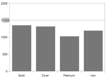
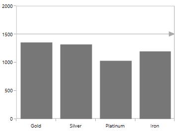
Adding arrow to LineAnnotation
To display single headed arrow you can modify the line annotation by setting LineCap property to Arrow. By default the LineCap property value in none.
Adding text in ShapeAnnotation
For all the annotations like Text, Shape, Image and Line, you can display the text for the annotation using Text property as in the below code snippet.
<syncfusion:SfChart.Annotations>

    <syncfusion:EllipseAnnotation
        X1="2.5"
        Y1="1500"
        X2="3.6"
        Y2="1680"
        Fill="LightBlue"
        Text="Annotation" />

</syncfusion:SfChart.Annotations>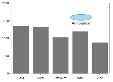
Aligning text in ShapeAnnotation
The text alignment can be changed using HorizontalTextAlignment and VerticalTextAlignment properties.
EllipseAnnotation
<syncfusion:SfChart.Annotations>

    <syncfusion:EllipseAnnotation
        X1="2.5"
        Y1="1500"
        X2="3.6"
        Y2="1680"
        Fill="LightBlue"
        Text="Annotation"
        HorizontalTextAlignment="Center"
        VerticalTextAlignment="Center" />

</syncfusion:SfChart.Annotations>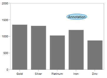
Line annotation
<syncfusion:SfChart.Annotations>

    <syncfusion:HorizontalLineAnnotation
        Text="Line Annotation"
        X1="2"
        X2="3.5"
        Y1="1500"
        Stroke="Black"
        StrokeThickness="1"
        HorizontalTextAlignment="Center"
        VerticalTextAlignment="Bottom" />

</syncfusion:SfChart.Annotations>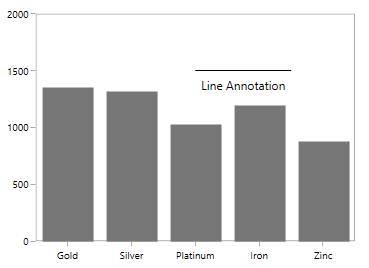
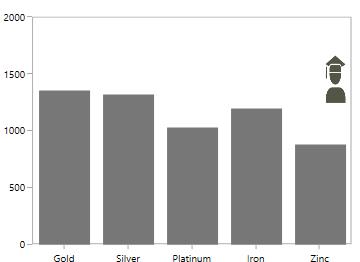
Image annotation
<syncfusion:SfChart.Annotations>

    <syncfusion:ImageAnnotation
        Text="Annotation"
        ImageSource="Images\Graduate.png"
        X1="2.5"
        Y1="1200"
        X2="3.6"
        Y2="1700"
        HorizontalTextAlignment="Center"
        VerticalTextAlignment="Top" />

</syncfusion:SfChart.Annotations>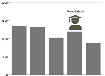
NOTE
HorizontalTextAlignmentandVerticalTextAlignmentproperties are not applicable forTextAnnotation.
Customization of ShapeAnnotation
SfChart allows customization of shape annotation using the following properties.
-
Stroke- Represents the brush for the annotation outline. -
StrokeThickness- Represents the thickness of the annotation outline. -
StrokeDashArray- Represents the DashArray of the annotation stroke. -
StrokeDashCap- Represents the DashCap of the annotation stroke. -
StrokeDashOffset- Represents the DashOffset of the annotation stroke. -
StrokeStartLineCap- Represents the start line cap of the annotation stroke. -
StrokeEndLineCap- Represents the end line cap of the annotation stroke. -
StrokeLineJoin- Represents the line join of the annotation outline. -
StrokeMiterLimit- Represents the limit on the ratio of the miter length to half of the annotation shape.
<syncfusion:SfChart.Annotations>

    <syncfusion:HorizontalLineAnnotation
        X1="-0.5"
        X2="3.5"
        Y1="1500"
        Stroke="DarkGray"
        StrokeThickness="3"
        Fill="LightGray"
        HorizontalTextAlignment="Center"
        VerticalTextAlignment="Bottom"
        StrokeDashArray="1,1"
        StrokeDashOffset="1.5"
        StrokeStartLineCap="Square"
        StrokeEndLineCap="Square"
        StrokeDashCap="Round" />

</syncfusion:SfChart.Annotations>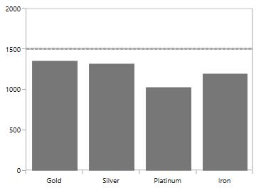
Image annotation
SfChart provides support to add images as Annotation over the chart area, using the class ImageAnnotation.
The following API’s are used in ImageAnnotation
-
Angle– An integer value that represents the rotation angle for the text in Annotation. -
ImageSource- Represents the source from where the image must be added. -
X2- Represents the X2 Coordinate of the Annotation.** -
Y2- Represents the Y2 Coordinate of the Annotation.**
<syncfusion:SfChart.Annotations>

    <syncfusion:ImageAnnotation
        CoordinateUnit="Axis"
        ImageSource="apple.png"
        X1="3"
        Y1="1200"
        X2="4"
        Y2="1450" />

    <syncfusion:ImageAnnotation
        CoordinateUnit="Axis"
        ImageSource="Fruit-Banana-01.png"
        X1="2"
        Y1="1000"
        X2="3"
        Y2="1400" />

    <syncfusion:ImageAnnotation
        CoordinateUnit="Axis"
        ImageSource="Fruit-Grapes.png"
        HorizontalAlignment="Center"
        VerticalAlignment="Center"
        X1="1"
        Y1="1350"
        X2="2"
        Y2="1750" />

    <syncfusion:ImageAnnotation
        CoordinateUnit="Axis"
        ImageSource="Fruit-Strawberry.png"
        HorizontalAlignment="Center"
        VerticalAlignment="Center"
        X1="0"
        Y1="1350"
        X2="1"
        Y2="1600" />

</syncfusion:SfChart.Annotations>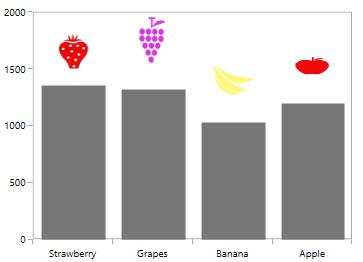
Rotating the image in ImageAnnotation
<syncfusion:SfChart.Annotations>

    <syncfusion:ImageAnnotation
        Angle="-90"
        CoordinateUnit="Axis"
        ImageSource="apple.png"
        HorizontalAlignment="Center"
        VerticalAlignment="Top"
        X1="3"
        Y1="1300"
        X2="3.5"
        Y2="1450" />

    <syncfusion:ImageAnnotation
        Angle="-90"
        CoordinateUnit="Axis"
        ImageSource="Fruit-Banana-01.png"
        HorizontalAlignment="Center"
        VerticalAlignment="Center"
        X1="2"
        Y1="1000"
        X2="2.5"
        Y2="1400" />

    <syncfusion:ImageAnnotation
        Angle="-90"
        CoordinateUnit="Axis"
        ImageSource="Fruit-Grapes.png"
        HorizontalAlignment="Center"
        VerticalAlignment="Center"
        X1="1"
        Y1="1350"
        X2="1.5"
        Y2="1750" />

    <syncfusion:ImageAnnotation
        Angle="-90"
        CoordinateUnit="Axis"
        ImageSource="Fruit-Strawberry.png"
        HorizontalAlignment="Center"
        VerticalAlignment="Center"
        X1="0"
        Y1="1350"
        X2="0.5"
        Y2="1650" />

</syncfusion:SfChart.Annotations>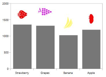
Interactivity
Tooltip
SfChart provides support to view the tooltip when mouse hovered on the annotation. To view to tooltip you have to enable the ShowToolTip property. By default for tooltip there is no content, you have to set the content for the tooltip in ToolTipContent property.
The following code example demonstrates the default tooltip.
<syncfusion:SfChart.Annotations>

    <syncfusion:EllipseAnnotation
        X1="2.5"
        Y1="1500"
        X2="3.6"
        Y2="1680"
        Stroke="DarkGray"
        Fill="LightGray"
        ToolTipContent="Annotation"
        ShowToolTip="True" />

</syncfusion:SfChart.Annotations>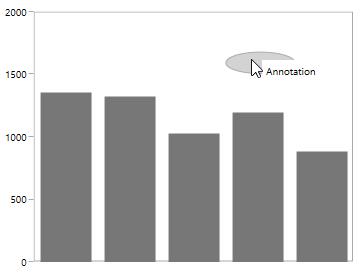
Position the tooltip
Tooltip can be placed top, bottom, left or right side of the cursor using ToolTipPlacement property. The tooltip by default will be placed in Right. The following code example demonstrates the tooltip placed at the bottom.
<syncfusion:SfChart.Annotations>

    <syncfusion:EllipseAnnotation
        X1="2.5"
        Y1="1500"
        X2="3.6"
        Y2="1680"
        Stroke="DarkGray"
        Fill="LightGray"
        ToolTipContent="Annotation"
        ToolTipPlacement="Bottom"
        ShowToolTip="True" />

</syncfusion:SfChart.Annotations>
ToolTipTemplate
The default appearance of the Tooltip can be changed using TooltipTemplate property as in the below code snippet.
<syncfusion:SfChart.Annotations>

    <syncfusion:EllipseAnnotation
        X1="2.5"
        Y1="1500"
        X2="3.6"
        Y2="1680"
        Stroke="DarkGray"
        Fill="LightGray"
        ShowToolTip="True">

        <syncfusion:EllipseAnnotation.ToolTipTemplate>

            <DataTemplate>

                <Border
                    CornerRadius="5"
                    BorderBrush="DarkGray"
                    BorderThickness="1">

                    <TextBlock
                        FontSize="11"
                        Foreground="Black"
                        Text="Annotation" />

                </Border>

            </DataTemplate>

        </syncfusion:EllipseAnnotation.ToolTipTemplate>

    </syncfusion:EllipseAnnotation>

</syncfusion:SfChart.Annotations>
Drag and resize the annotation
SfChart provides dragging and resizing support for ShapeAnnotations.
The following API’s are used for dragging and resizing the annotation
-
CanDrag- A Boolean value that allows the annotation to drag. -
CanResize- A Boolean value that allows the annotation to resize. -
DraggingMode- Represents the dragging direction for the annotation. -
ResizingMode- Represents the resizing direction for the annotation.
Dragging the annotation
The following code example demonstrates the dragging the rectangle annotation.
<syncfusion:SfChart.Annotations>

    <syncfusion:RectangleAnnotation
        X1="0.6"
        X2="2.2"
        Y1="1800"
        Y2="1500"
        CanDrag="True"
        Stroke="DarkGray"
        Fill="LightGray"
        Opacity="0.5" />

</syncfusion:SfChart.Annotations>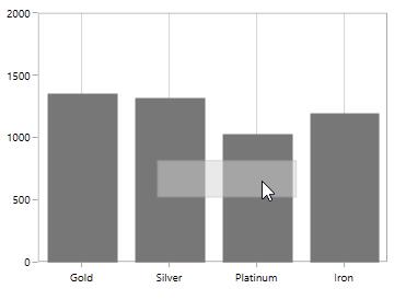
You can set the DraggingMode as Horizontal which will limit the annotation to be dragged only by horizontally as in the below code snippet.
<syncfusion:SfChart.Annotations>

    <syncfusion:RectangleAnnotation
        X1="0.6"
        X2="2.2"
        Y1="1800"
        Y2="1500"
        CanDrag="True"
        DraggingMode="Horizontal"
        Stroke="DarkGray"
        Fill="LightGray"
        Opacity="0.5" />

</syncfusion:SfChart.Annotations>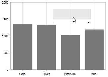
Resizing the annotation
You can resize the annotation by enabling CanResize property to True as in the below code snippet.
<syncfusion:SfChart.Annotations>

    <syncfusion:RectangleAnnotation
        X1="0.6"
        X2="2.2"
        Y1="1800"
        Y2="1500"
        CanResize="True"
        Stroke="DarkGray"
        Fill="LightGray"
        Opacity="0.5" />

</syncfusion:SfChart.Annotations>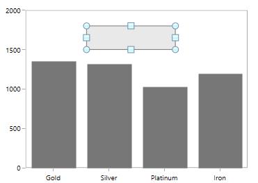
ResizingMode allows you to limit the resizing to a particular direction may be horizontal, vertical or both direction. The following code example demonstrates the resizing of annotation along vertical direction.
<syncfusion:SfChart.Annotations>

    <syncfusion:RectangleAnnotation
        X1="0.6"
        X2="2.2"
        Y1="1800"
        Y2="1500"
        CanResize="True"
        ResizingMode="Vertical"
        Stroke="DarkGray"
        Fill="LightGray"
        Opacity="0.5" />

</syncfusion:SfChart.Annotations>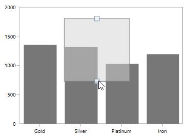
Annotation clipping
SfChart allows you to clip the annotation if the annotation crosses the boundary by setting EnableClipping property to True as in the below code snippet.
<syncfusion:SfChart.Annotations>

    <syncfusion:ImageAnnotation
        ImageSource="Images\Graduate.png"
        EnableClipping="True"
        HorizontalTextAlignment="Center"
        VerticalTextAlignment="Top"
        X1="4"
        Y1="1200"
        X2="7"
        Y2="1700" />

</syncfusion:SfChart.Annotations>
The following screenshot explains that even when x value is provided out of bounds the image annotation is placed inside the chart area.
Customizing text in annotation
The text in annotation can be customized using the following API’s
-
FontSize– An int value that represents the font size of the annotation text. -
FontFamily– Represents the font family of the annotation text. -
FontStyle– Represents the font style of the annotation text. -
FontWeight- Represents the font weight of the annotation text. -
Foreground– Represents the brush value of the annotation text color. -
FontStretch- Represents the font stretch for the annotation description.
The following code example demonstrates the customization of annotation text.
<syncfusion:SfChart.Annotations>

    <syncfusion:EllipseAnnotation
        X1="2.5"
        Y1="1500"
        X2="3.6"
        Y2="1680"
        Stroke="DarkGray"
        Fill="LightGray"
        Text="Annotation"
        FontSize="12"
        Foreground="DarkGray"
        FontStyle="Italic"
        FontWeight="Bold"
        ShowToolTip="True" />

</syncfusion:SfChart.Annotations>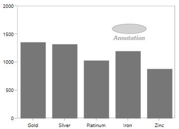
Text can also be customized by setting ContentTemplate property as in the below code snippet.
<syncfusion:SfChart.Annotations>

    <syncfusion:TextAnnotation
        CoordinateUnit="Pixel"
        X1="266"
        Y1="4">

        <syncfusion:TextAnnotation.ContentTemplate>

            <DataTemplate>

                <Border
                    Width="80"
                    Height="20"
                    BorderBrush="Black"
                    CornerRadius="2"
                    Background="LightGray">

                    <TextBlock
                        HorizontalAlignment="Center"
                        VerticalAlignment="Center"
                        FontFamily="Calibri (Body)"
                        FontSize="12"
                        FontWeight="SemiBold"
                        FontStyle="Italic"
                        Foreground="Black"
                        Text="Gold Demand" />

                </Border>

            </DataTemplate>

        </syncfusion:TextAnnotation.ContentTemplate>

    </syncfusion:TextAnnotation>

</syncfusion:SfChart.Annotations>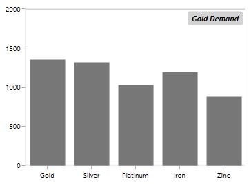
Events
SfChart provides the following events in Annotation.
-
Selected- Occurs when the annotation is selected. -
UnSelected- Occurs when annotation is deselected. -
DragStarted- Occurs at the start of the dragging. -
DragDelta- Occurs when the drag takes place. -
DragCompleted- Occurs when the dragging is completed. You can cancel the dragging by using Cancel argument. -
PointerPressed- Occurs when the pointer is pressed, while the mouse pointer is over the annotation. -
PointerMoved- Occurs when the pointer is moved, while the mouse pointer is over the annotation. -
PointerReleased- Occurs when the pointer is released, while the mouse pointer is over the annotation.