Data Editors in .NET MAUI DataForm (SfDataForm)
20 Jun 202524 minutes to read
To get start quickly with data editors in .NET MAUI DataForm, you can check on this video:
The data form supports the following built-in editors to edit the data:
| Editor name | Generated DataFormItem Type | Supported Data Type / Attribute | Input control loaded |
|---|---|---|---|
| Text | The string type property and any other type apart from the below specified cases. | ||
| MultilineText | The string type property with [DataType(DataType.MultilineText)] attribute. | ||
| Password | The string type property with [DataType(DataType.Password)] attribute. | ||
| Numeric | The int, double, float type property and any other type apart from the below specified cases. | ||
| MaskedText | The string type property with [DataType(DataType.PhoneNumber)] and [DataType(DataType.CreditCard)] attribute. | ||
| Date | The DateTime, DateOnly, and DateTimeOffset type property or the properties with [DataType(DataType.Date)] or [DataType(DataType.DateTime)] attributes. | ||
| Time | The TimeSpan and TimeOnly type property or the properties with [DataType(DataType.Time)] attribute. | ||
| Checkbox | Bool type property. | ||
| Switch | Bool type property. | ||
| Picker | Enum and List type property. | ||
| ComboBox | Enum and List type property. | ||
| AutoComplete | Enum and List type property. | ||
| RadioGroup | Enum and List type property. | ||
| Segment | Enum and List type property. |
Change the editor for any data type
By default, the editors will be loaded based on the primitive data type such as string, enumeration, DateTime, and TimeSpan.
this.dataForm.RegisterEditor(typeof(string), DataFormEditorType.MultilineText);Here, the MultilineText editor will be loaded for the string type instead of the Text editor.
Change the editor for a property
To change the editor for any property, use the RegisterEditor method and specify the property name and editor.
this.dataForm.RegisterEditor("On", DataFormEditorType.Switch);Here, the Switch editor will be loaded for the On property (bool type) instead of the CheckBox editor.
Text editor
In the text editor, the Entry is loaded.
[DataType(DataType.Text)]
public string Name { get; set; }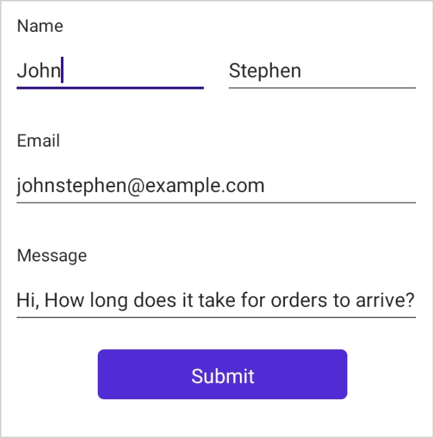
In Text, MultilineText and Password editors you can change the soft input keyboard type by using the Keyboard property of DataFormTextEditorItem in the GenerateDataFormItem event when AutoGenerateItems is true.
NOTE
If AutoGenerateItems is false, you can set the property directly by using the DataFormItem. Please refer here to learn more about creating data editors explicitly.
this.dataForm.GenerateDataFormItem += OnGenerateDataFormItem;

private void OnGenerateDataFormItem(object sender, GenerateDataFormItemEventArgs e)
{
    if (e.DataFormItem != null && e.DataFormItem.FieldName == "Name" && e.DataFormItem is DataFormTextEdiorItem textEditorItem)
    {
         textEditorItem.Keyboard= Keyboard.Text;
    }
}
In Text, MultilineText, and Password editors you can set the maximum allowed length of input by using the MaxLength property of DataFormTextEditorItem in the GenerateDataFormItem event when AutoGenerateItems is true.
NOTE
If AutoGenerateItems is false, you can set the property directly by using the DataFormItem. Please refer here to learn more about creating data editors explicitly.
this.dataForm.GenerateDataFormItem += OnGenerateDataFormItem;

private void OnGenerateDataFormItem(object sender, GenerateDataFormItemEventArgs e)
{
    if (e.DataFormItem != null && e.DataFormItem.FieldName == "Name" && e.DataFormItem is DataFormTextEdiorItem textEditorItem)
    {
        textEditorItem.MaxLength = 20;
    }
}
Multiline Text editor
In the MultilineText editor, the Editor is loaded.
MultilineText editor height will auto expand or reduce based on the line wraps, allowing text to be readable without scrolling the editor.
[DataType(DataType.MultilineText)]
public string Address { get; set; }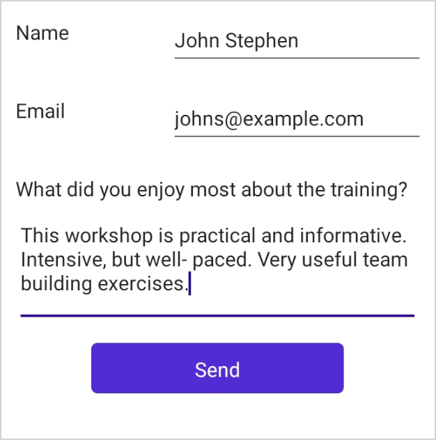
Password editor
In the password editor, the Entry is loaded.
[Display(ShortName = "Transaction password", Prompt = "Enter password")]
[DataType(DataType.Password)]
public string Password { get; set; }
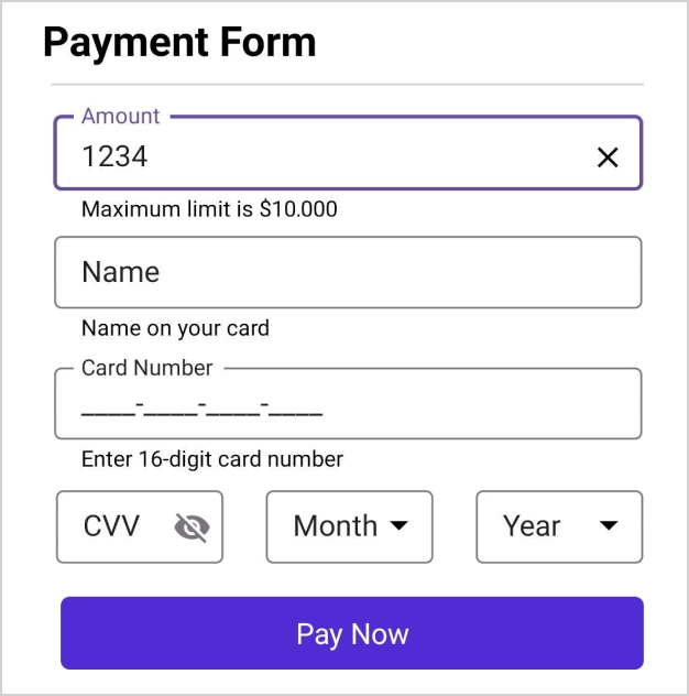
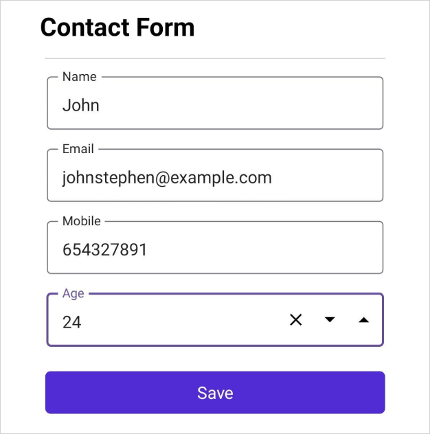
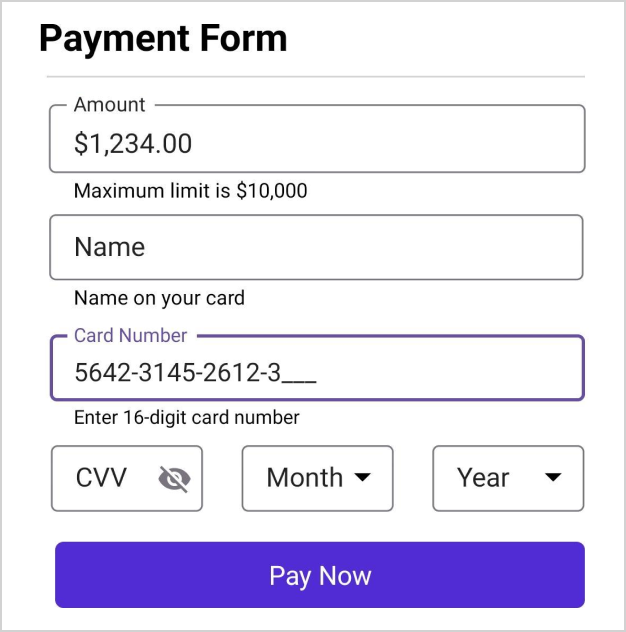
Numeric editor
In the numeric editor, the SfNumericEntry will be loaded and the DataForm Numeric editor supports int, double, and float data type properties.
Also, to add a DataForm numeric editor, register the editor as DataFormEditorType.Numeric for the required field using the RegisterEditor method.
Changing the Numeric editor properties
You can use the GenerateDataFormItem event to change Numeric editor properties.
public decimal Amount { get; set; }
public double Number { get; set; }
public int Percentage { get; set; }this.dataForm.RegisterEditor("Amount", DataFormEditorType.Numeric);
this.dataForm.GenerateDataFormItem += OnGenerateDataFormItem;
private void OnGenerateDataFormItem(object sender, GenerateDataFormItemEventArgs e)
{
if (e.DataFormItem != null)
{
if (e.DataFormItem.FieldName == "Amount" && e.DataFormItem is DataFormNumericItem amount)
{
amount.AllowNull = true;
amount.Culture = new CultureInfo("et-EE");
// To enter a minimum of 2 decimal digits and maximum of 4 decimal digits, set CustomFormat = "#,0.00##"
amount.CustomFormat = "#,0.00##";
}
else if (e.DataFormItem.FieldName == "Percentage" && e.DataFormItem is DataFormNumericItem percentage)
{
percentage.AllowNull = true;
percentage.CustomFormat = "P";
percentage.Culture = new CultureInfo("en-In");
percentage.ShowClearButton = false;
percentage.Maximum = 123.45;
percentage.Minimum = 0.012;
percentage.Keyboard = Keyboard.Numeric;
}
}
}Numeric up-down editor
The numeric up-down button will be displayed in the numeric editor when the UpDownPlacementMode property of DataFormNumericItem is set to NumericEditorUpDownPlacementMode.Inline. By default, the NumericEditorUpDownPlacementMode is Hidden.
public double Amount { get; set; }this.dataForm.GenerateDataFormItem += OnGenerateDataFormItem;
private void OnGenerateDataFormItem(object sender, GenerateDataFormItemEventArgs e)
{
if (e.DataFormItem != null)
{
if (e.DataFormItem.FieldName == "Amount" && e.DataFormItem is DataFormNumericItem amount)
{
amount.AllowNull = true;
amount.UpDownPlacementMode = NumericEditorUpDownPlacementMode.Inline;
}
}
}
Masked text editor
In the Masked text editor, the SfMaskedEntry will be loaded and DataForm Masked text editor supports the PhoneNumber and CreditCard data type property of DataTypeAttribute.
Also, to add a DataForm Masked text editor, register the editor as DataFormEditorType.MaskedText for the required field using the RegisterEditor method.
Changing the Masked text editor properties
You can use the GenerateDataFormItem event to change Masked text editor properties
[DataType(DataType.PhoneNumber)]
public string PhoneNumber { get; set; }

[DataType(DataType.CreditCard)]
public string CreditCard { get; set; }

public decimal Amount { get; set; }this.dataForm.RegisterEditor("Amount", DataFormEditorType.MaskedText);
this.dataForm.GenerateDataFormItem += OnGenerateDataFormItem;
private void OnGenerateDataFormItem(object sender, GenerateDataFormItemEventArgs e)
{
if (e.DataFormItem != null)
{
if (e.DataFormItem.FieldName == "Amount" && e.DataFormItem is DataFormMaskedTextItem amount)
{
amount.PromptChar = 'X'
amount.MaskType = MaskedEditorMaskType.Simple;
amount.Mask = "000000.00";
amount.ValueMaskFormat = MaskedEditorMaskFormat.IncludeLiterals;
}
else if (e.DataFormItem.FieldName == "PhoneNumber" && e.DataFormItem is DataFormMaskedTextItem phoneNumber)
{
phoneNumber.PromptChar = '#';
phoneNumber.MaskType = MaskedEditorMaskType.Simple;
phoneNumber.Mask="000 000 0000";
phoneNumber.Culture = new CultureInfo("en-In");
phoneNumber.ClearButtonVisibility = MaskedEditorClearButtonVisibility.WhileEditing;
}
}
}Date editor
In the date editor, the DatePicker will be loaded.
In the date editor, the default date value will be the current date. You can also add nullable DateTime data type for the date picker property in data form, which allows you to set the current date and display the current date in the date editor.
[DataType(DataType.Date)]
[Display(Name ="Event Date")]
public DateTime? EventDate { get; set; }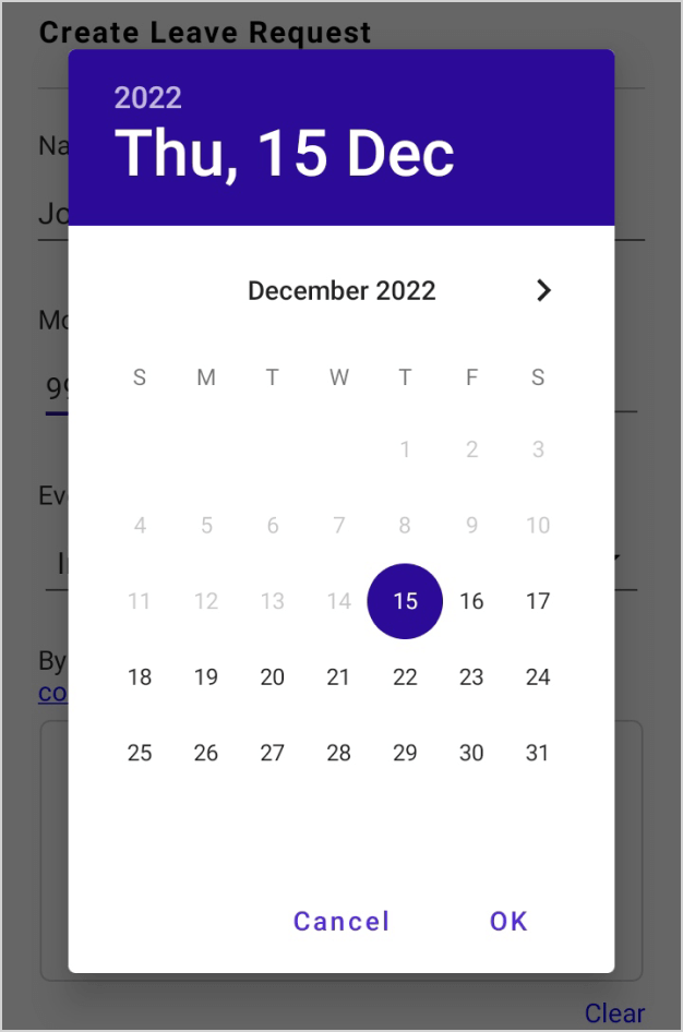
Change the format of the date editor
In the DatePicker, the short date will be shown by default. You can change the applied format by setting the Format property of DataFormDateItem in the GenerateDataFormItem event when AutoGenerateItems is true.
NOTE
If AutoGenerateItems is false, you can set the property directly by using the DataFormItem. Please refer here to learn more about creating data editors explicitly.
this.dataForm.GenerateDataFormItem += OnGenerateDataFormItem;

private void OnGenerateDataFormItem(object sender, GenerateDataFormItemEventArgs e)
{
    if (e.DataFormItem != null && e.DataFormItem.FieldName == "Date" && e.DataFormItem is DataFormDateItem dateItem)
    {
        dateItem.Format = "dd, MM, yyyy";
    }
}
Change the minimum and maximum date in date editor
You can customize the maximum and minimum allowable dates in the DatePicker by setting the MaximumDate and MinimumDate of the DataFormDateItem respectively in the GenerateDataFormItem event when AutoGenerateItems is true.
NOTE
If AutoGenerateItems is false, you can set the property directly by using the DataFormItem. Please refer here to learn more about creating data editors explicitly.
this.dataForm.GenerateDataFormItem += OnGenerateDataFormItem;

private void OnGenerateDataFormItem(object sender, GenerateDataFormItemEventArgs e)
{
    if (e.DataFormItem != null && e.DataFormItem.FieldName == "Date" && e.DataFormItem is DataFormDateItem dateItem)
    {
        dateItem.MinimumDate = new DateTime(2022, 5, 5);
        dateItem.MaximumDate = new DateTime(2022, 9, 2);
    }
}
Time editor
In the time editor, the TimePicker will be loaded.
In the time editor, by default (12:00 AM) will be displayed.
[DataType(DataType.Time)]
[Display(Name = "Event Time")]
public TimeSpan? EventTime { get; set; }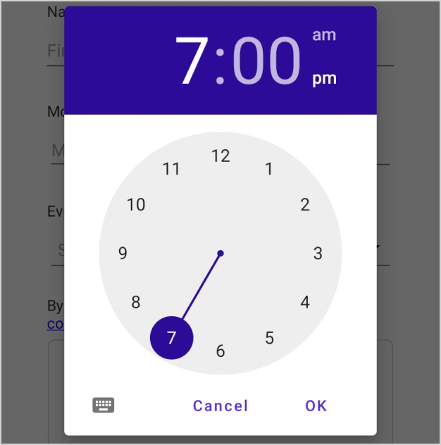
Change the format of time editor
In the time editor, a short time will be shown by default. You can change the applied format by setting the Format property of DataFormTimeItem in the GenerateDataFormItem event when AutoGenerateItems is true.
NOTE
If AutoGenerateItems is false, you can set the property directly by using the DataFormItem. Please refer here to learn more about creating data editors explicitly.
this.dataForm.GenerateDataFormItem += OnGenerateDataFormItem;
private void OnGenerateDataFormItem(object sender, GenerateDataFormItemEventArgs e)
{
if (e.DataFormItem != null && e.DataFormItem.FieldName == "EventTime" && e.DataFormItem is DataFormTimeItem timeItem)
{
timeItem.Format = "HH:mm";
}
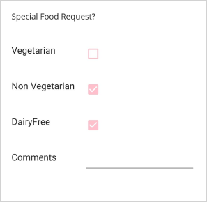
}CheckBox editor
In the CheckBox editor, the SfCheckBox control is loaded. By default, for bool data type property, the CheckBox editor will be loaded in data form.
[Display(Name = "Is Billable")]
public bool IsBillable { get; set; } = true;

[Display(Name = "Registered Member")]
public bool RegisteredMember { get; set; }
Changing the checkbox color
By default, the checkbox color is blue. You can change the checkbox color by using Color property of DataFormCheckBoxItem in the GenerateDataFormItem event when AutoGenerateItems is true.
NOTE
If AutoGenerateItems is false, you can set the property directly by using the DataFormItem. Please refer here to learn more about creating data editors explicitly.
this.dataForm.GenerateDataFormItem += OnGenerateDataFormItem;

private void OnGenerateDataFormItem(object sender, GenerateDataFormItemEventArgs e)
{
    if (e.DataFormItem.FieldName == "IsBillable" && e.DataFormItem is DataFormCheckBoxItem dataFormCheckBox)
    {
         dataFormCheckBox.Color = Colors.Pink;
    }
}
Switch Editor
In switch editor, SfSwitch is loaded, and DataForm Switch editor supports bool data type property.
To add a switch editor in DataForm, register the editor as DataFormEditorType.Switch for the required property using the RegisterEditor method.
this.dataForm.RegisterEditor("CellularData", DataFormEditorType.Switch);
this.dataForm.RegisterEditor("AirplaneMode", DataFormEditorType.Switch);

[Display(Name ="Cellular Data")]
public bool CellularData { get; set; } = true;

[Display(Name = "Airplane Mode")]
public bool AirplaneMode { get; set; }
Changing the Switch Editor thumb color
You can change the thumb color by using the ThumbColor property of the DataFormSwitchItem in the GenerateDataFormItem event when AutoGenerateItems is true.
NOTE
If AutoGenerateItems is false, you can set the property directly by using the DataFormItem. Please refer here to learn more about creating data editors explicitly.
this.dataForm.GenerateDataFormItem += OnGenerateDataFormItem;

private void OnGenerateDataFormItem(object sender, GenerateDataFormItemEventArgs e)
{
    if (e.DataFormItem != null && e.DataFormItem.FieldName == "Agree" && e.DataFormItem is DataFormSwitchItem switchItem)
    {
        switchItem.ThumbColor = Colors.Pink;
    }
}
Changing the Switch editor on color
You can change the switch on color by using the OnColor property of the DataFormSwitchItem in the GenerateDataFormItem event when AutoGenerateItems is true.
NOTE
If AutoGenerateItems is false, you can set the property directly by using the DataFormItem. Please refer here to learn more about creating data editors explicitly.
this.dataForm.GenerateDataFormItem += OnGenerateDataFormItem;

private void OnGenerateDataFormItem(object sender, GenerateDataFormItemEventArgs e)
{
    if (e.DataFormItem != null && e.DataFormItem.FieldName == "Agree" && e.DataFormItem is DataFormSwitchItem switchItem)
    {
        switchItem.OnColor = Colors.Black;
    }
}
Combo Box editor
In the Combo Box editor, the SfComboBox will be loaded.
Changing the ItemsSource of combo box
By default, the ItemsSource for ComboBox is auto-generated for enum types properties.
Using IDataFormSourceProvider
public string Country { get; set; }

public class DataFormItemsSourceProvider : IDataFormSourceProvider
{
    public object GetSource(string sourceName)
    {
        if (sourceName == "Country")
        {
            List<string> list = new List<string>()
            {
                "USA",
                "Japan",
                "India"
            };

            return list;
        }

        return new List<string>();
    }
}

this.dataForm.ItemsSourceProvider = new DataFormItemsSourceProvider();
this.dataForm.RegisterEditor("Country", DataFormEditorType.ComboBox);
NOTE
Due to AOT limitations, auto-generated ItemSource for enum types is not supported when publishing in AOT mode on iOS and macOS.
Using GenerateDataFormItem event
You can also set the ItemsSource for combo box editor by using the GenerateDataFormItem event when AutoGenerateItems is true.
NOTE
If AutoGenerateItems is false, you can set the property directly by using the DataFormItem. Please refer here to learn more about creating data editors explicitly.
this.dataForm.GenerateDataFormItem += OnGenerateDataFormItem;

private void OnGenerateDataFormItem(object sender, GenerateDataFormItemEventArgs e)
{
    if (e.DataFormItem != null && e.DataFormItem.FieldName == "Name" && e.DataFormItem is DataFormComboBoxItem comboBoxItem)
    {
        List<string> list = new List<string>()
        {
            "Home",
            "Food",
            "Utilities",
            "Education"
        };
        comboBoxItem.ItemsSource = list;
    }
}
Enabling editing mode in combobox
By default, in the combobox editor, you can select a needed item by scrolling the whole list of items.
You can filter a particular item in the list using the IsEditable property. This property enables you to type a list of items in the combo box editor.
this.dataForm.GenerateDataFormItem += OnGenerateDataFormItem;

private void OnGenerateDataFormItem(object sender, GenerateDataFormItemEventArgs e)
{
    if (e.DataFormItem != null && e.DataFormItem.FieldName == "City" && e.DataFormItem is DataFormComboBoxItem comboBoxItem)
    {
        comboBoxItem.IsEditable = true;
    }
}
ComboBox editor filtering options
The string comparison for filtering suggestions can be changed using the TextSearchMode property of DataFormComboBoxItem. The default text search strategy is “StartsWith,” and it is case insensitive. The available text search modes are;
- StartsWith
- Contains
Searching words that starts with the input text
Displays all the matches that contain the first character of the typed characters in the item source of the combo box editor. This strategy is case-insensitive.
this.dataForm.GenerateDataFormItem += OnGenerateDataFormItem;

private void OnGenerateDataFormItem(object sender, GenerateDataFormItemEventArgs e)
{
    if (e.DataFormItem != null && e.DataFormItem.FieldName == "City" && e.DataFormItem is DataFormComboBoxItem comboBoxItem)
    {
        comboBoxItem.TextSearchMode = DataFormTextSearchMode.StartsWith;
    }
}
Searching words that contains the input text
Displays all the matches that contain the typed characters in items source of the combo box editor. This strategy is case-insensitive.
this.dataForm.GenerateDataFormItem += OnGenerateDataFormItem;

private void OnGenerateDataFormItem(object sender, GenerateDataFormItemEventArgs e)
{
    if (e.DataFormItem != null && e.DataFormItem.FieldName == "City" && e.DataFormItem is DataFormComboBoxItem comboBoxItem)
    {
        comboBoxItem.TextSearchMode = DataFormTextSearchMode.Contains;
    }
}
Changing the height of Combobox drop down
By default, the combo box drop down list item height is 400d. You can change the size for the drop down list item size by using the MaxDropDownHeight property of the DataFormComboBoxItem in the GenerateDataFormItem event when AutoGenerateItems is true.
NOTE
If AutoGenerateItems is false, you can set the property directly by using the DataFormItem. Please refer here to learn more about creating data editors explicitly.
this.dataForm.GenerateDataFormItem += OnGenerateDataFormItem;

private void OnGenerateDataFormItem(object sender, GenerateDataFormItemEventArgs e)
{
    if (e.DataFormItem != null && e.DataFormItem.FieldName == "Country" && e.DataFormItem is DataFormComboBoxItem comboBoxItem)
    {
        comboBoxItem.MaxDropDownHeight = 200;
    }
}
Loading the complex type property values in combo box editor
You can display the complex type property values in the combo box editor by using the DisplayMemberPath and SelectedValuePath properties of DataFormComboBoxItem. You need to use the GenerateDataFormItem event to set the DisplayMemberPath and SelectedValuePath property value of DataFormComboBoxItem event when AutoGenerateItems is true.
NOTE
If AutoGenerateItems is false, you can set the property directly by using the DataFormItem. Please refer here to learn more about creating data editors explicitly.
NOTE
When publishing in AOT mode on iOS, ensure that
[Preserve(AllMembers = true)]is added to both the model class and any classes used for complex types, in order to maintain functionality for DisplayMemberPath and SelectedValuePath.
NOTE
Class cannot be directly set as data type for combo box editor in this complex type scenario.
this.dataForm.ItemsSourceProvider = new DataFormItemsSourceProvider();
this.dataForm.DataObject = new ContactInfo();
this.dataForm.GenerateDataFormItem += OnGenerateDataFormItem;
this.dataForm.RegisterEditor("EmployeeDetails", DataFormEditorType.ComboBox);

private void OnGenerateDataFormItem(object sender, GenerateDataFormItemEventArgs e)
{
    if (e.DataFormItem != null && e.DataFormItem.FieldName == "EmployeeDetails" && e.DataFormItem is DataFormComboBoxItem comboBoxItem)
    {
        comboBoxItem.DisplayMemberPath = "ID";
        comboBoxItem.SelectedValuePath = "Name";
    }
}

public class DataFormItemsSourceProvider  : IDataFormSourceProvider
{
    public object GetSource(string sourceName)
    {
        if (sourceName == "EmployeeDetails")
        {
            List<EmployeeInfo> details = new List<EmployeeInfo>();
            details.Add(new EmployeeInfo() { ID = 1, Name =  "Eric"  });
            details.Add(new EmployeeInfo() { ID = 2, Name = "James"  });
            details.Add(new EmployeeInfo() { ID = 3, Name = "Jacob"  });
            details.Add(new EmployeeInfo() { ID = 4, Name = "Lucas"  });
            details.Add(new EmployeeInfo() { ID = 5, Name = "Mark"  });
            details.Add(new EmployeeInfo() { ID = 6, Name = "Aldan"  });
            details.Add(new EmployeeInfo() { ID = 7, Name = "Aldrin"  });
            details.Add(new EmployeeInfo() { ID = 8, Name = "Alan"  });
            details.Add(new EmployeeInfo() { ID = 9, Name = "Aaron"  });

            return details;
        }

        return new List<string>();
    }
}

public class ContactInfo
{
    [Display(Name ="First Name")]
    public String FirstName { get; set; }
    public string EmployeeDetails { get; set; }
}

public class EmployeeInfo
{
    public int ID { get; set; }
    public string Name { get; set; }
}
NOTE
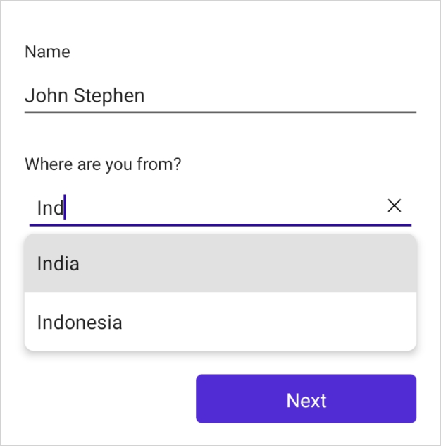
AutoComplete editor
In the autocomplete editor, the SfAutoComplete is loaded.
Changing the ItemsSource of autocomplete editor
By default, the ItemsSource for AutoComplete editor is auto-generated for enum types. For other types, you can set the ItemsSource using IDataFormSourceProvider.
Using IDataFormSourceProvider
public string Country { get ; set ; }
public class DataFormItemsSourceProvider : IDataFormSourceProvider
{
	public object GetSource(string sourceName)
    {
        if (sourceName == "Country")
        {
            List<string> list = new List<string>()
            {
                "Indonesia",
                "Italy",
                "India",
                "Iran",
                "Iraq",
                "Uganda"
                "Ukraine"
                "Canada"
                "Australia"
                "Uzbekistan"
                "France"
                "United Kingdom"
                "United States"
            };

            return list;
        }

        return new List<string>();
    }
}

this.dataForm.ItemsSourceProvider = new DataFormItemsSourceProvider();
this.dataForm.RegisterEditor("Country", DataFormEditorType.AutoComplete);
Using GenerateDataFormItem event
You can also set ItemsSource for autocomplete editor by using the ItemsSource property of the DataFormAutoCompleteItem in the GenerateDataFormItem event when AutoGenerateItems is true.
NOTE
If AutoGenerateItems is false, you can set the property directly by using the DataFormItem. Please refer here to learn more about creating data editors explicitly.
this.dataForm.RegisterEditor("Country", DataFormEditorType.AutoComplete);
this.dataForm.GenerateDataFormItem += OnGenerateDataFormItem;

private void OnGenerateDataFormItem(object sender, GenerateDataFormItemEventArgs e)
{
    if (e.DataFormItem != null && e.DataFormItem.FieldName == "Country" && e.DataFormItem is DataFormAutoCompleteItem autoCompleteItem)
    {
        List<string> list = new List<string>();
        list.Add("Indonesia");
        list.Add("Italy");
        list.Add("India");
        list.Add("Iran");
        list.Add("Iraq");
        list.Add("Uganda");
        list.Add("Ukraine");
        list.Add("Canada");
        list.Add("Australia");
        list.Add("Uzbekistan");
        list.Add("France");
        list.Add("United Kingdom");
        list.Add("United States");
        autoCompleteItem.ItemsSource = list;
    }
}
Loading the complex type property values in autocomplete editor
You can display the complex type property values in autocomplete editor by using the DisplayMemberPath and SelectedValuePath properties of DataFormAutoCompleteItem. You need to use the GenerateDataFormItem event to set the DisplayMemberPath and SelectedValuePath property values of DataFormAutoCompleteItem when AutoGenerateItems is true.
NOTE
If AutoGenerateItems is false, you can set the property directly by using the DataFormItem. Please refer here to learn more about creating data editors explicitly.
NOTE
When publishing in AOT mode on iOS, ensure that
[Preserve(AllMembers = true)]is added to both the model class and any classes used for complex types, in order to maintain functionality for DisplayMemberPath and SelectedValuePath.
NOTE
Class cannot be directly set as data type for autocomplete editor in this complex type scenario.
this.dataForm.ItemsSourceProvider = new DataFormItemsSourceProvider();
this.dataForm.DataObject = new ContactInfo();
this.dataForm.GenerateDataFormItem += OnGenerateDataFormItem;
this.dataForm.RegisterEditor("EmployeeDetails", DataFormEditorType.ComboBox);

private void OnGenerateDataFormItem(object sender, GenerateDataFormItemEventArgs e)
{
    if (e.DataFormItem != null && e.DataFormItem.FieldName == "EmployeeDetails" && e.DataFormItem is DataFormAutoCompleteItem autoCompleteItem)
    {
        autoCompleteItem.DisplayMemberPath = "ID";
        autoCompleteItem.SelectedValuePath = "Name";
    }
}

public class DataFormItemsSourceProvider  : IDataFormSourceProvider
{
    public object GetSource(string sourceName)
    {
        if (sourceName == "EmployeeDetails")
        {
            List<EmployeeInfo> details = new List<EmployeeInfo>();
            details.Add(new EmployeeInfo() { ID = 1, Name =  "Eric"  });
            details.Add(new EmployeeInfo() { ID = 2, Name = "James"  });
            details.Add(new EmployeeInfo() { ID = 3, Name = "Jacob"  });
            details.Add(new EmployeeInfo() { ID = 4, Name = "Lucas"  });
            details.Add(new EmployeeInfo() { ID = 5, Name = "Mark"  });
            details.Add(new EmployeeInfo() { ID = 6, Name = "Aldan"  });
            details.Add(new EmployeeInfo() { ID = 7, Name = "Aldrin"  });
            details.Add(new EmployeeInfo() { ID = 8, Name = "Alan"  });
            details.Add(new EmployeeInfo() { ID = 9, Name = "Aaron"  });

            return details;
        }

		return new List<string>();
    }
}

public class ContactInfo
{
    [Display(Name ="First Name")]
    public String FirstName { get; set; }
    public string EmployeeDetails { get; set; }
}

public class EmployeeInfo
{
    public int ID { get; set; }
    public string Name { get; set; }
}
NOTE
AutoComplete editor suggestion options
The string comparison for filtering suggestions can be changed using the TextSearchMode property of DataFormAutoCompleteItem. The default text search strategy is “StartsWith,” and it is case insensitive. The available text search modes are;
- StartsWith
- Contains
Filtering words that starts with the input text
Displays all the matches that contain first character of the typed characters in items source of autocomplete editor. This strategy is case in-sensitive.
this.dataForm.GenerateDataFormItem += OnGenerateDataFormItem;

private void OnGenerateDataFormItem(object sender, GenerateDataFormItemEventArgs e)
{
    if (e.DataFormItem != null && e.DataFormItem.FieldName == "Country" && e.DataFormItem is DataFormAutoCompleteItem autoCompleteItem)
    {
        autoComplete.TextSearchMode = DataFormTextSearchMode.StartsWith;
    }
}
Filtering words that contains the input text
Displays all the matches that contain the typed characters in items source of autocomplete editor. This strategy is case in-sensitive.
this.dataForm.GenerateDataFormItem += OnGenerateDataFormItem;

private void OnGenerateDataFormItem(object sender, GenerateDataFormItemEventArgs e)
{
    if (e.DataFormItem != null && e.DataFormItem.FieldName == "Country" && e.DataFormItem is DataFormAutoCompleteItem autoCompleteItem)
    {
        autoComplete.TextSearchMode = DataFormTextSearchMode.Contains;
    }
}
Changing the maximum height of autocomplete drop down
By default the autocomplete drop down list item height is 400d. You can change the size for the drop down list item size by using the MaxDropDownHeight property in the DataFormAutoCompleteItem.
this.dataForm.GenerateDataFormItem += OnGenerateDataFormItem;

private void OnGenerateDataFormItem(object sender, GenerateDataFormItemEventArgs e)
{
    if (e.DataFormItem != null && e.DataFormItem.FieldName == "Country" && e.DataFormItem is DataFormAutoCompleteItem autoCompleteItem)
    {
        autoComplete.MaxDropDownHeight = 300;
    }
}
Picker editor
In the picker editor, the Picker will be loaded.
Changing the ItemsSource of Picker
By default, the ItemsSource for the picker is auto-generated for the enum type property. For other types, you can set the ItemsSource by using IDataFormSourceProvider.
Using IDataFormSourceProvider
public string Country { get; set; }

public class DataFormItemsSourceProvider : IDataFormSourceProvider
{
        public object GetSource(string sourceName)
    {
        if (sourceName == "Country")
        {
            List<string> list = new List<string>()
            {
                "USA",
                "China",
                "Italy",
                "India"
            };

            return list;
        }
        return new List<string>();
    }
}

this.dataForm.ItemsSourceProvider = new DataFormItemsSourceProvider();
this.dataForm.RegisterEditor("Country", DataFormEditorType.Picker);
Using event
You can also set ItemsSource for the picker editor by using the ItemsSource property of the DataFormPickerItem in the GenerateDataFormItem event when AutoGenerateItems is true.
NOTE
If AutoGenerateItems is false, you can set the property directly by using the DataFormItem. Please refer here to learn more about creating data editors explicitly.
this.dataForm.GenerateDataFormItem += OnGenerateDataFormItem;

private void OnGenerateDataFormItem(object sender, GenerateDataFormItemEventArgs e)
{
    if (e.DataFormItem != null && e.DataFormItem.FieldName == "Name" && e.DataFormItem is DataFormPickerItem pickerItem)
    {
        List<string> list = new Lisvt<string>()
        {
            "Home",
            "Food",
            "Utilities",
            "Education"
        };
        pickerItem.ItemsSource = list;
    }
}
Loading the complex type property values in picker
You can display the complex type property values in the picker editor by using the DisplayMemberPath and SelectedValuePath properties of DataFormPickerItem. You need to use the GenerateDataFormItem event to set DisplayMemberPath and SelectedValuePath property values when AutoGenerateItems is true.
NOTE
If AutoGenerateItems is false, you can set the property directly by using the DataFormItem. Please refer here to learn more about creating data editors explicitly.
NOTE
When publishing in AOT mode on iOS, ensure that
[Preserve(AllMembers = true)]is added to both the model class and any classes used for complex types, in order to maintain functionality for DisplayMemberPath and SelectedValuePath.
NOTE
Class cannot be directly set as data type for picker editor in this complex type scenario.
this.dataForm.ItemsSourceProvider = new DataFormItemsSourceProvider();
this.dataForm.DataObject = new ContactInfo();
this.dataForm.GenerateDataFormItem += OnGenerateDataFormItem;
this.dataForm.RegisterEditor("EmployeeDetails", DataFormEditorType.Picker);

private void OnGenerateDataFormItem(object sender, GenerateDataFormItemEventArgs e)
{
    if (e.DataFormItem != null && e.DataFormItem.FieldName == "EmployeeDetails" && e.DataFormItem is DataFormPickerItem pickerItem)
    {
        pickerItem.DisplayMemberPath = "ID";
        pickerItem.SelectedValuePath = "Name";
    }
}

public class DataFormItemsSourceProvider  : IDataFormSourceProvider
{
    public object GetSource(string sourceName)
    {
        if (sourceName == "EmployeeDetails")
        {
            List<EmployeeInfo> details = new List<EmployeeInfo>();
            details.Add(new EmployeeInfo() { ID = 1, Name =  "Eric"  });
            details.Add(new EmployeeInfo() { ID = 2, Name = "James"  });
            details.Add(new EmployeeInfo() { ID = 3, Name = "Jacob"  });
            details.Add(new EmployeeInfo() { ID = 4, Name = "Lucas"  });
            details.Add(new EmployeeInfo() { ID = 5, Name = "Mark"  });
            details.Add(new EmployeeInfo() { ID = 6, Name = "Aldan"  });
            details.Add(new EmployeeInfo() { ID = 7, Name = "Aldrin"  });
            details.Add(new EmployeeInfo() { ID = 8, Name = "Alan"  });
            details.Add(new EmployeeInfo() { ID = 9, Name = "Aaron"  });

            return details;
        }

        return new List<string>();
    }
}

public class ContactInfo
{
    [Display(Name ="First Name")]
    public String FirstName { get; set; }
    public string EmployeeDetails { get; set; }
}

public class EmployeeInfo
{
    public int ID { get; set; }
    public string Name { get; set; }
}
NOTE
RadioGroup editor
In the RadioGroup editor, the SfRadioButton control is loaded.
The ItemsSource for the radio group editor is generated for the enum data type property. In order to add the RadioButton editor in the DataForm, you need to register the editor as DataFormEditorType.RadioGroup for the required property by using the RegisterEditor method.
Support for enum data type
For the enum data type property, SfRadioButton items will be added based on the specified property of enum values.
this.dataForm.RegisterEditor("Phone", DataFormEditorType.RadioGroup);

public Numbers Phone  { get; set; }

public enum Numbers
{
    Home,
    Work,
    Other
}
Support for list data type
For the List data type property, you have to set the ItemsSource by using the IDataFormSourceProvider.
this.dataForm.RegisterEditor("Phone", DataFormEditorType.RadioGroup);
this.dataForm.ItemsSourceProvider = new DataFormItemsSourceProvider();

public string Phone  { get; set; }

public class DataFormItemsSourceProvider : IDataFormSourceProvider
{
        public object GetSource(string sourceName)
    {
        if(sourceName == "Phone")
        {
            List<string> list = new List<string>() {"Home", "Work", "Other"};
            return list;
        }
        return new List<string>();
    }
}
NOTE
Segment editor
In the Segment editor, the SfSegmentedControl will be loaded.
Changing the ItemsSource of Segment
The ItemsSource for the segment editor is generated for the enum data type property. In order to add the Segment editor in the DataForm, you need to register the editor as DataFormEditorType.Segment for the required property by using the RegisterEditor method.
Using IDataFormSourceProvider
public string Country { get; set; }

public class DataFormItemsSourceProvider : IDataFormSourceProvider
{
        public object GetSource(string sourceName)
    {
        if (sourceName == "Country")
        {
            List<string> list = new List<string>()
            {
                "USA",
                "China",
                "Italy",
                "India"
            };

            return list;
        }
        return new List<string>();
    }
}

this.dataForm.ItemsSourceProvider = new DataFormItemsSourceProvider();
this.dataForm.RegisterEditor("Country", DataFormEditorType.Segment);
Using event
You can also set ItemsSource for the segment editor by using the ItemsSource property of the DataFormSegmentItem in the GenerateDataFormItem event when AutoGenerateItems is true.
NOTE
If AutoGenerateItems is false, you can set the property directly by using the DataFormItem. Please refer here to learn more about creating data editors explicitly.
this.dataForm.GenerateDataFormItem += OnGenerateDataFormItem;

private void OnGenerateDataFormItem(object sender, GenerateDataFormItemEventArgs e)
{
    if (e.DataFormItem != null && e.DataFormItem.FieldName == "Name" && e.DataFormItem is DataFormSegmentItem segmentItem)
    {
        List<string> list = new Lisvt<string>()
        {
            "Home",
            "Food",
            "Utilities",
            "Education"
        };
        segmentItem.ItemsSource = list;
    }
}
Loading the complex type property values in segment
You can display the complex type property values in the segment editor by using the DisplayMemberPath and SelectedValuePath properties of DataFormSegmentItem. You need to use the GenerateDataFormItem event to set DisplayMemberPath and SelectedValuePath property values when AutoGenerateItems is true.
NOTE
When publishing in AOT mode on iOS, ensure that
[Preserve(AllMembers = true)]is added to both the model class and any classes used for complex types, in order to maintain functionality for DisplayMemberPath and SelectedValuePath.
this.dataForm.ItemsSourceProvider = new DataFormItemsSourceProvider();
this.dataForm.DataObject = new ContactInfo();
this.dataForm.GenerateDataFormItem += OnGenerateDataFormItem;
this.dataForm.RegisterEditor("EmployeeDetails", DataFormEditorType.Segment);

private void OnGenerateDataFormItem(object sender, GenerateDataFormItemEventArgs e)
{
    if (e.DataFormItem != null && e.DataFormItem.FieldName == "EmployeeDetails" && e.DataFormItem is DataFormSegmentItem segmentItem)
    {
        segmentItem.DisplayMemberPath = "ID";
        segmentItem.SelectedValuePath = "Name";
    }
}

public class DataFormItemsSourceProvider  : IDataFormSourceProvider
{
    public object GetSource(string sourceName)
    {
        if (sourceName == "EmployeeDetails")
        {
            List<EmployeeInfo> details = new List<EmployeeInfo>();
            details.Add(new EmployeeInfo() { ID = 1, Name =  "Eric"  });
            details.Add(new EmployeeInfo() { ID = 2, Name = "James"  });
            details.Add(new EmployeeInfo() { ID = 3, Name = "Jacob"  });
            details.Add(new EmployeeInfo() { ID = 4, Name = "Lucas"  });
            details.Add(new EmployeeInfo() { ID = 5, Name = "Mark"  });
            details.Add(new EmployeeInfo() { ID = 6, Name = "Aldan"  });
            details.Add(new EmployeeInfo() { ID = 7, Name = "Aldrin"  });
            details.Add(new EmployeeInfo() { ID = 8, Name = "Alan"  });
            details.Add(new EmployeeInfo() { ID = 9, Name = "Aaron"  });

            return details;
        }

        return new List<string>();
    }
}

public class ContactInfo
{
    [Display(Name ="First Name")]
    public String FirstName { get; set; }
    public string EmployeeDetails { get; set; }
}

public class EmployeeInfo
{
    public int ID { get; set; }
    public string Name { get; set; }
}
Custom editor
The custom editor can be added to DataForm by inheriting the IDataFormEditor class for business models. You can create a custom editor using implement all method in IDataFormEditor.
To add a custom editor in DataForm, register the editor with a custom registered type for the required property using the RegisterEditor method. You can also customize editor settings by using available methods in IDataFormEditor.
Creating custom editor using IDataFormEditor
Views such as labels, buttons, and sliders can be loaded into the custom editor. The custom editor should be registered for a property using RegisterEditor method.
this.dataForm.RegisterEditor("FieldName", new CustomEditor());Below mentioned example code for the Numeric editor which accepts only numbers
Here, the entry is loaded as a custom editor for the PhoneNumber property.
this.dataForm.RegisterEditor("PhoneNumber", new NumericEditor(dataForm));

public class NumericTextEditor : IDataFormEditor
{
    private SfDataForm dataForm;
    private DataFormCustomItem? dataFormCustomItem;

    public NumericEditor(SfDataForm dataForm)
    {
        this.dataForm = dataForm;
    }

    public View CreateEditorView(DataFormItem dataFormItem)
    {
        Entry inputView = new Entry();
        inputView.Keyboard = Keyboard.Numeric;
        inputView.Placeholder = dataFormItem.PlaceholderText;
        DataFormTextStyle textStyle = this.dataForm.EditorTextStyle;
        inputView.TextColor = textStyle.TextColor;
        inputView.FontSize = textStyle.FontSize;
        inputView.FontFamily = textStyle.FontFamily;
        inputView.FontAttributes = textStyle.FontAttributes;
        inputView.TextChanged += this.OnViewTextChanged;
        this.dataFormCustomItem = (DataFormCustomItem)dataFormItem;
        this.dataFormCustomItem.EditorValue = string.Empty;
        return inputView;
    }

    public void CommitValue(DataFormItem dataFormItem, View view)
    {
        if (view is InputView numericText)
        {
            double numericValue;
            double.TryParse(numericText.Text, out numericValue);
            dataFormItem.SetValue(numericValue);
        }
    }

    public void UpdateReadyOnly(DataFormItem dataFormItem)
    {
    }

    private void ValidateValue(DataFormItem dataFormItem)
    {
        this.dataForm.Validate(new List<string>() { dataFormItem.FieldName });
    }

    private void OnViewTextChanged(object? sender, TextChangedEventArgs e)
    {
        if (sender is not InputView numericEntry || dataFormCustomItem == null)
        {
            return;
        }

        string? numericText = Regex.Replace(numericEntry.Text, "[^0-9]+", string.Empty);
        if (numericText != numericEntry.Text)
        {
            numericEntry.Text = numericText;
            return;
        }

        dataFormCustomItem.EditorValue = numericText;
        this.ValidateValue(dataFormCustomItem);
        this.CommitValue(dataFormCustomItem, numericEntry);
    }
}
NOTE
If SfDataForm.ValidationMode is set to ValidationMode.Manual, then update DataFormCustomItem.EditorValue property once the value is committed to its respective model property. This value will be used for the DataFormValidateFormEventArgs.NewValues on manual validation.
NOTE
If custom validation is required, you can set error and valid messages using the SfDataForm.ValidateProperty event.