Floating label layout in .NET MAUI DataForm (SfDataForm)
22 Sep 202524 minutes to read
Overview
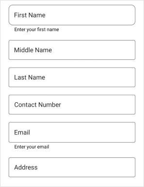
The floating label layout is a powerful feature that enhances the user experience and makes it easier for users to interact with forms. The data form supports a floating label layout which includes assistive labels, leading and trailing icons, and a password toggle icon to show or hide a password. It offers three different containers, including filled, outlined, and none. Setting LayoutType to TextInputLayout enables a floating label layout.
Changing the layout type for the data form
By default, the dataform arranges the editors and their labels corresponding to the fields in the layout. However, to enable the floating label layout for data form, set the LayoutType property of the SfDataForm or DataFormItem to TextInputLayout.
<ContentPage
...
xmlns:dataForm="clr-namespace:Syncfusion.Maui.DataForm;assembly=Syncfusion.Maui.DataForm">
    <dataForm:SfDataForm
        x:Name="dataForm"
        LayoutType="TextInputLayout">
    </dataForm:SfDataForm>
</ContentPage>
SfDataForm dataForm = new SfDataForm();
dataForm.LayoutType = DataFormLayoutType.TextInputLayout;
this.Content = dataForm;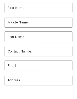
Changing the layout type for the editor
Change the layout type for the editor by using the LayoutType property of the DataFormItem, and it will be handled in the GenerateDataFormItem event.
<ContentPage
...
xmlns:dataForm="clr-namespace:Syncfusion.Maui.DataForm;assembly=Syncfusion.Maui.DataForm">
<dataForm:SfDataForm x:Name="dataForm"
                        LayoutType="Default"
                        DataObject="{Binding ContactInfo}"
                        GenerateDataFormItem="OnGenerateDataFormItem">
</dataForm:SfDataForm>
</ContentPage>
SfDataForm dataForm = new SfDataForm();
dataForm.LayoutType = DataFormLayoutType.Default;
dataForm.GenerateDataFormItem += OnGenerateDataFormItem;
this.Content = dataForm;
private void OnGenerateDataFormItem(object sender, GenerateDataFormItemEventArgs e)
{
if (e.DataFormItem != null && e.DataFormItem.FieldName == "FirstName")
{
e.DataFormItem.LayoutType = DataFormLayoutType.TextInputLayout;
}
}Supported editors
Dataform supports the floating label layout for the following editors.
- Text editor
- Password editor
- MultilineText editor
- ComboBox editor
- AutoComplete editor
- Custom editor
- Picker editor
- Date picker
- Time picker
NOTE
The time picker will not work in the Windows platform within the text input layout.
Container types
Containers enhance the perspective of the dataform editor views. By default, the container type is Outlined. By using the ContainerType property of the TextInputLayoutSettings in DataForm or DataFormItem, modify the container type to Filled or None.
Outlined
The Outlined container type draws a thin border around the text input field and adds a hint text that floats above the input field when the user starts typing. To enable the outlined container type, set the ContainerType property of the TextInputLayoutSettings to Outlined in SfDataForm or DataFormItem, which covers the editor view with rounded-corner.
<ContentPage
...
xmlns:dataForm="clr-namespace:Syncfusion.Maui.DataForm;assembly=Syncfusion.Maui.DataForm">
<dataForm:SfDataForm x:Name="dataForm"
                        LayoutType="TextInputLayout"
                        DataObject="{Binding ContactInfo}">
    <dataForm:SfDataForm.TextInputLayoutSettings>
        <dataForm:TextInputLayoutSettings ContainerType="Outlined"/>
    </dataForm:SfDataForm.TextInputLayoutSettings>
</dataForm:SfDataForm>
</ContentPage>
SfDataForm dataForm = new SfDataForm();
dataForm.LayoutType = DataFormLayoutType.TextInputLayout;
dataForm.GenerateDataFormItem += OnGenerateDataFormItem;
this.Content = dataForm;
private void OnGenerateDataFormItem(object sender, GenerateDataFormItemEventArgs e)
{
if (e.DataFormItem != null && e.DataFormItem.FieldName == "Name")
{
e.DataFormItem.LayoutType = DataFormLayoutType.TextInputLayout;
e.DataFormItem.TextInputLayoutSettings = new TextInputLayoutSettings
{
ContainerType = TextInputLayoutContainerType.Outlined
};
}
}public class ContactInfo
{
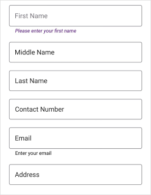
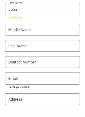
[Display(Name = "First Name", Prompt = "Enter your first name")]
[DataFormDisplayOptions(ValidMessage = "Valid name")]
[Required(ErrorMessage = "Please enter your first name")]
[StringLength(10, ErrorMessage = "First name should not exceed 10 characters")]
public string FirstName { get; set; }
[Display(Name = "Middle Name")]
[Required(ErrorMessage = "Please enter your middle name")]
[StringLength(10, ErrorMessage = "First name should not exceed 10 characters")]
public string MiddleName { get; set; }
[Display(Name = "Last Name")]
[Required(ErrorMessage = "Please enter your last name")]
[StringLength(10, ErrorMessage = "First name should not exceed 10 characters")]
public string LastName { get; set; }
[Display(Name = "Contact Number")]
public string ContactNumber { get; set; }
[Display(Name = "Email", Prompt = "Enter your email")]
[EmailAddress(ErrorMessage = "Invalid email address")]
public string Email { get; set; }
public string Address { get; set; }
}
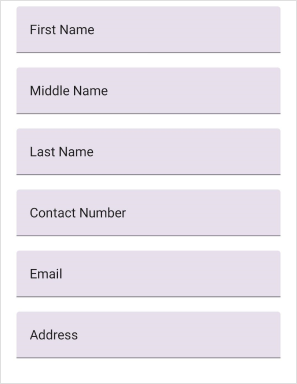
Filled
The Filled container type fills the background of the text input field with a solid color and adds a hint of text that floats above the input field when the user starts typing. It can be enabled by setting the ContainerType property to Filled in the SfDataForm or DataFormItem.
<ContentPage
...
xmlns:dataForm="clr-namespace:Syncfusion.Maui.DataForm;assembly=Syncfusion.Maui.DataForm">
<dataForm:SfDataForm x:Name="dataForm"
                        LayoutType="TextInputLayout"
                        DataObject="{Binding ContactInfo}">
    <dataForm:SfDataForm.TextInputLayoutSettings>
        <dataForm:TextInputLayoutSettings ContainerType="Filled"/>
    </dataForm:SfDataForm.TextInputLayoutSettings>
</dataForm:SfDataForm>
</ContentPage>
SfDataForm dataForm = new SfDataForm();
dataForm.LayoutType = DataFormLayoutType.TextInputLayout;
dataForm.GenerateDataFormItem += OnGenerateDataFormItem;
this.Content = dataForm;
private void OnGenerateDataFormItem(object sender, GenerateDataFormItemEventArgs e)
{
if (e.DataFormItem != null && e.DataFormItem.FieldName == "Name")
{
e.DataFormItem.LayoutType = DataFormLayoutType.TextInputLayout;
e.DataFormItem.TextInputLayoutSettings = new TextInputLayoutSettings
{
ContainerType = TextInputLayoutContainerType.Filled
};
}
}
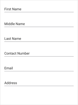
None
The None container type adds no border or background to the text input field. It can be enabled by setting the ContainerType property to None in the SfDataForm or DataFormItem. It will have an empty background and enough spacing.
<ContentPage
...
xmlns:dataForm="clr-namespace:Syncfusion.Maui.DataForm;assembly=Syncfusion.Maui.DataForm">
<dataForm:SfDataForm x:Name="dataForm"
                        LayoutType="TextInputLayout"
                        DataObject="{Binding ContactInfo}">
    <dataForm:SfDataForm.TextInputLayoutSettings>
        <dataForm:TextInputLayoutSettings ContainerType="None"/>
    </dataForm:SfDataForm.TextInputLayoutSettings>
</dataForm:SfDataForm>
</ContentPage>
SfDataForm dataForm = new SfDataForm();
dataForm.LayoutType = DataFormLayoutType.TextInputLayout;
dataForm.GenerateDataFormItem += OnGenerateDataFormItem;
this.Content = dataForm;
private void OnGenerateDataFormItem(object sender, GenerateDataFormItemEventArgs e)
{
if (e.DataFormItem != null && e.DataFormItem.FieldName == "Name")
{
e.DataFormItem.LayoutType = DataFormLayoutType.TextInputLayout;
e.DataFormItem.TextInputLayoutSettings = new TextInputLayoutSettings
{
ContainerType = TextInputLayoutContainerType.None
};
}
}
Leading and Trailing view
Leading view
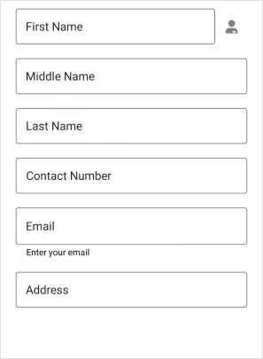
The leading view is a view that appears to the left of the text input field. It can add functionality or visual elements to the text input such as a label or an icon. It can be added to the floating label layout by setting the LeadingView property of the DataFormItem. Show the leading view only when the ShowLeadingView property is true.
<ContentPage
...
xmlns:dataForm="clr-namespace:Syncfusion.Maui.DataForm;assembly=Syncfusion.Maui.DataForm">
<dataForm:SfDataForm x:Name="dataForm"
                        LayoutType="TextInputLayout"
                        DataObject="{Binding ContactInfo}">
<dataForm:SfDataForm.Items>
    <dataForm:DataFormTextItem FieldName="Name"
                                ShowLeadingView="True">
        <dataForm:DataFormTextItem.LeadingView>
            <Label Text="F" FontSize="18" TextColor="Gray" FontFamily="InputLayoutIcons" HeightRequest="24" VerticalTextAlignment="End" />
        </dataForm:DataFormTextItem.LeadingView>
    </dataForm:DataFormTextItem>
</dataForm:SfDataForm.Items>
</dataForm:SfDataForm>
</ContentPage>
SfDataForm dataForm = new SfDataForm();
dataForm.LayoutType = DataFormLayoutType.TextInputLayout;
dataForm.GenerateDataFormItem += OnGenerateDataFormItem;
this.Content = dataForm;
private void OnGenerateDataFormItem(object sender, GenerateDataFormItemEventArgs e)
{
if (e.DataFormItem != null && e.DataFormItem.FieldName == "Name")
{
e.DataFormItem.LayoutType = DataFormLayoutType.TextInputLayout;
e.DataFormItem.ShowLeadingView = true;
e.DataFormItem.LeadingView = new Label { Text = "F", FontSize = 18, TextColor = Colors.Gray, FontFamily = "InputLayoutIcons", HeightRequest = 24, VerticalTextAlignment = TextAlignment.End };
}
}NOTE
The LeadingView is applicable for both Default and TextInputLayout layout types
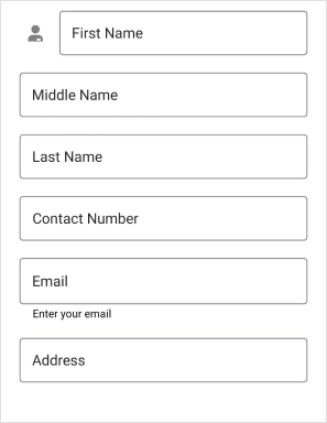
Trailing view
The trailing view is a view that appears to the right of the text input field. It can be used to add additional functionality or visual elements to the text input such as a clear button or an icon. It can be added to the floating label layout by setting the TrailingView property of the DataFormItem. Show a trailing view only when the ShowTrailingView property is true.
<ContentPage
...
xmlns:dataForm="clr-namespace:Syncfusion.Maui.DataForm;assembly=Syncfusion.Maui.DataForm">
<dataForm:SfDataForm x:Name="dataForm"
                        LayoutType="TextInputLayout"
                        DataObject="{Binding ContactInfo}">
<dataForm:SfDataForm.Items>
    <dataForm:DataFormTextItem FieldName="Name"
                                ShowTrailingView="True">
        <dataForm:DataFormTextItem.TrailingView>
            <Label Text="F" FontSize="18" TextColor="Gray" FontFamily="InputLayoutIcons" HeightRequest="24" VerticalTextAlignment="End" />
        </dataForm:DataFormTextItem.TrailingView>
    </dataForm:DataFormTextItem>
</dataForm:SfDataForm.Items>
</dataForm:SfDataForm>
</ContentPage>
SfDataForm dataForm = new SfDataForm();
dataForm.LayoutType = DataFormLayoutType.TextInputLayout;
dataForm.GenerateDataFormItem += OnGenerateDataFormItem;
this.Content = dataForm;
private void OnGenerateDataFormItem(object sender, GenerateDataFormItemEventArgs e)
{
if (e.DataFormItem != null && e.DataFormItem.FieldName == "Name")
{
e.DataFormItem.LayoutType = DataFormLayoutType.TextInputLayout;
e.DataFormItem.ShowTrailingView = true;
e.DataFormItem.TrailingView = new Label { Text = "F", FontSize = 18, TextColor = Colors.Gray, FontFamily = "InputLayoutIcons", HeightRequest = 24, VerticalTextAlignment = TextAlignment.End };
}
}NOTE
The TrailingView is applicable only when the LayoutType is TextInputLayout.
Leading and Trailing View Position
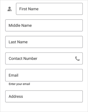
The LeadingViewPosition and TrailingViewPosition properties of the DataFormItem allow you to adjust the leading and trailing view’s positions. The view is positioned outside the container if the leading and trailing view positions are set to TextInputLayoutViewPosition.Outside. The view is positioned inside the container if the leading and trailing view positions are set to TextInputLayoutViewPosition.Inside.
<ContentPage
...
xmlns:dataForm="clr-namespace:Syncfusion.Maui.DataForm;assembly=Syncfusion.Maui.DataForm">
<dataForm:SfDataForm x:Name="dataForm"
                        LayoutType="TextInputLayout"
                        DataObject="{Binding ContactInfo}">
<dataForm:SfDataForm.Items>
    <dataForm:DataFormTextItem FieldName="Name"
                                ShowLeadingView="True"
                                LeadingViewPosition="Outside">
        <dataForm:DataFormTextItem.LeadingView>
            <Label Text="F" FontSize="18" TextColor="Gray" FontFamily="InputLayoutIcons" HeightRequest="24" VerticalTextAlignment="End" />
        </dataForm:DataFormTextItem.LeadingView>
    </dataForm:DataFormTextItem>
</dataForm:SfDataForm.Items>
</dataForm:SfDataForm>
</ContentPage>
SfDataForm dataForm = new SfDataForm();
dataForm.LayoutType = DataFormLayoutType.TextInputLayout;
dataForm.GenerateDataFormItem += OnGenerateDataFormItem;
this.Content = dataForm;
private void OnGenerateDataFormItem(object sender, GenerateDataFormItemEventArgs e)
{
if (e.DataFormItem != null && e.DataFormItem.FieldName == "Name")
{
e.DataFormItem.LayoutType = DataFormLayoutType.TextInputLayout;
e.DataFormItem.ShowLeadingView = true;
e.DataFormItem.LeadingViewPosition = TextInputLayoutViewPosition.Outside;
e.DataFormItem.LeadingView = new Label { Text = "F", FontSize = 18, TextColor = Colors.Gray, FontFamily = "InputLayoutIcons", HeightRequest = 24, VerticalTextAlignment = TextAlignment.End };
}
}<ContentPage
...
xmlns:dataForm="clr-namespace:Syncfusion.Maui.DataForm;assembly=Syncfusion.Maui.DataForm">
<dataForm:SfDataForm x:Name="dataForm"
LayoutType="TextInputLayout"
DataObject="{Binding ContactInfo}">
<dataForm:SfDataForm.Items>
<dataForm:DataFormTextItem FieldName="Contact Number"
ShowTrailingView="True"
TrailingViewPosition="Inside">
<dataForm:DataFormTextItem.TrailingView>
<Label Text="F" FontSize="18" TextColor="Gray" FontFamily="InputLayoutIcons" HeightRequest="24" VerticalTextAlignment="End" />
</dataForm:DataFormTextItem.TrailingView>
</dataForm:DataFormTextItem>
</dataForm:SfDataForm.Items>
</dataForm:SfDataForm>
</ContentPage>SfDataForm dataForm = new SfDataForm();
dataForm.LayoutType = DataFormLayoutType.TextInputLayout;
dataForm.GenerateDataFormItem += OnGenerateDataFormItem;
this.Content = dataForm;
private void OnGenerateDataFormItem(object sender, GenerateDataFormItemEventArgs e)
{
if (e.DataFormItem != null && e.DataFormItem.FieldName == "Contact Number")
{
e.DataFormItem.LayoutType = DataFormLayoutType.TextInputLayout;
e.DataFormItem.ShowTrailingView = true;
e.DataFormItem.TrailingViewPosition = TextInputLayoutViewPosition.Inside;
e.DataFormItem.TrailingView = new Label { Text = "F", FontSize = 18, TextColor = Colors.Gray, FontFamily = "InputLayoutIcons", HeightRequest = 24, VerticalTextAlignment = TextAlignment.End };
}
}
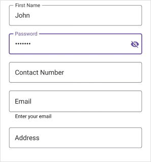
Enable password visibility toggle for password editor
Password toggle visibility in a floating label layout is used to show or hide the visibility of characters in the dataform password editor. Enable this toggle by setting the EnablePasswordVisibilityToggle property to true in the DataFormItem. The default value of the EnablePasswordVisibilityToggle is true.
<ContentPage
...
xmlns:dataForm="clr-namespace:Syncfusion.Maui.DataForm;assembly=Syncfusion.Maui.DataForm">
<dataForm:SfDataForm x:Name="dataForm"
                        LayoutType="TextInputLayout"
                        DataObject="{Binding ContactInfo}">
<dataForm:SfDataForm.Items>
    <dataForm:DataFormPasswordItem FieldName="Name"
                                EnablePasswordVisibilityToggle="True">
    </dataForm:DataFormPasswordItem>
</dataForm:SfDataForm.Items>
</dataForm:SfDataForm>
</ContentPage>
SfDataForm dataForm = new SfDataForm();
dataForm.LayoutType = DataFormLayoutType.TextInputLayout;
dataForm.GenerateDataFormItem += OnGenerateDataFormItem;
this.Content = dataForm;
private void OnGenerateDataFormItem(object sender, GenerateDataFormItemEventArgs e)
{
if (e.DataFormItem != null && e.DataFormItem.FieldName == "Name" && e.DataFormItem is DataFormPasswordItem passwordItem)
{
passwordItem.LayoutType = DataFormLayoutType.TextInputLayout;
passwordItem.EnablePasswordVisibilityToggle = true;
}
}
Assistive label
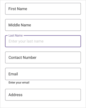
Hint label
The data field name will be displayed as a floating or hint label for the editor and enabled by using the Name or LabelText property.
Helper label
The helper label displays the watermark for the editor to provide hints for users, and it can be set using Prompt or PlaceHolderText.
The visibility of the helper text in the DataForm floating label layout for the DataForm and DataFormItem can be collapsed by setting the ShowHelperText property of the TextInputLayoutSettings to false.
<ContentPage
...
xmlns:dataForm="clr-namespace:Syncfusion.Maui.DataForm;assembly=Syncfusion.Maui.DataForm">
<dataForm:SfDataForm x:Name="dataForm"
                        LayoutType="TextInputLayout"
                        DataObject="{Binding ContactInfo}">
    <dataForm:SfDataForm.TextInputLayoutSettings>
        <dataForm:TextInputLayoutSettings ShowHelperText="False"/>
    </dataForm:SfDataForm.TextInputLayoutSettings>
</dataForm:SfDataForm>
</ContentPage>
SfDataForm dataForm = new SfDataForm();
dataForm.LayoutType = DataFormLayoutType.TextInputLayout;
dataForm.GenerateDataFormItem += OnGenerateDataFormItem;
this.Content = dataForm;
private void OnGenerateDataFormItem(object sender, GenerateDataFormItemEventArgs e)
{
if (e.DataFormItem != null && e.DataFormItem.FieldName == "Name")
{
e.DataFormItem.LayoutType = DataFormLayoutType.TextInputLayout;
e.DataFormItem.TextInputLayoutSettings = new TextInputLayoutSettings
{
ShowHelperText = false,
};
}
}
Validation label
The validation label displays the dataform validation messages such as valid or invalid data. Refer to the validation to learn more about the dataform validation.
Customize Assistive label using text style
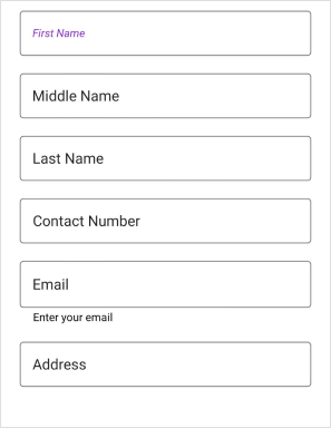
Customize the font of assistive labels by setting the TextColor, FontFamily, FontSize, and FontAttributes properties of the DataFormTextStyle property.
Hint label style
Customize the text of the hint label by setting the TextColor, FontFamily, FontSize, and FontAttributes properties of the LabelTextStyle in the DataFormItem.
<ContentPage
...
xmlns:dataForm="clr-namespace:Syncfusion.Maui.DataForm;assembly=Syncfusion.Maui.DataForm">
<dataForm:SfDataForm x:Name="dataForm"
                        LayoutType="TextInputLayout"
                        DataObject="{Binding ContactInfo}"
                        AutoGenerateItems="False"
                        GenerateDataFormItem="OnGenerateDataFormItem">
    <dataForm:SfDataForm.Items>
        <dataForm:DataFormTextItem FieldName="Name">
            <dataForm:DataFormTextItem.LabelTextStyle>
                <dataForm:DataFormTextStyle TextColor="CadetBlue" FontAttributes="None"/>
            </dataForm:DataFormTextItem.LabelTextStyle>
        </dataForm:DataFormTextItem>
    </dataForm:SfDataForm.Items>
</dataForm:SfDataForm>
</ContentPage>
SfDataForm dataForm = new SfDataForm();
dataForm.LayoutType = DataFormLayoutType.TextInputLayout;
dataForm.GenerateDataFormItem += OnGenerateDataFormItem;
this.Content = dataForm;
private void OnGenerateDataFormItem(object sender, GenerateDataFormItemEventArgs e)
{
if (e.DataFormItem != null && e.DataFormItem.FieldName == "Name")
{
e.DataFormItem.LayoutType = DataFormLayoutType.TextInputLayout;
e.DataFormItem.LabelTextStyle = new DataFormTextStyle { FontAttributes = FontAttributes.Bold, TextColor = Colors.BlueViolet };
}
}
Helper label style
Customize the text of the helper label by setting the TextColor, FontFamily, FontSize, and FontAttributes properties of the TextInputLayoutSettings.HelperTextStyle in the DataFormItem.
<ContentPage
...
xmlns:dataForm="clr-namespace:Syncfusion.Maui.DataForm;assembly=Syncfusion.Maui.DataForm">
<dataForm:SfDataForm x:Name="dataForm"
                        LayoutType="TextInputLayout"
                        DataObject="{Binding ContactInfo}"
                        GenerateDataFormItem="OnGenerateDataFormItem">
    <dataForm:SfDataForm.TextInputLayoutSettings>
        <dataForm:TextInputLayoutSettings ShowHelperText="True">
            <dataForm:TextInputLayoutSettings.HelperTextStyle>
                <dataForm:DataFormTextStyle FontAttributes="Italic" TextColor="Violet" />
            </dataForm:TextInputLayoutSettings.HelperTextStyle>
        </dataForm:TextInputLayoutSettings>
    </dataForm:SfDataForm.TextInputLayoutSettings>
</dataForm:SfDataForm>
</ContentPage>
SfDataForm dataForm = new SfDataForm();
dataForm.LayoutType = DataFormLayoutType.TextInputLayout;
dataForm.GenerateDataFormItem += OnGenerateDataFormItem;
this.Content = dataForm;
private void OnGenerateDataFormItem(object sender, GenerateDataFormItemEventArgs e)
{
if (e.DataFormItem != null && e.DataFormItem.FieldName == "Name")
{
e.DataFormItem.LayoutType = DataFormLayoutType.TextInputLayout;
e.DataFormItem.TextInputLayoutSettings = new TextInputLayoutSettings
{
HelperTextStyle = new DataFormTextStyle { TextColor = Colors.Blue, FontAttributes = FontAttributes.Bold },
};
}
}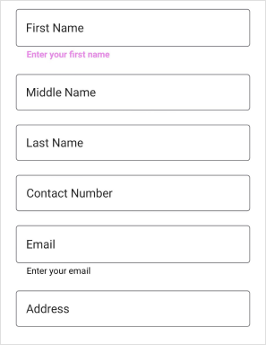
Error message label style
Customize the text of the error message label by setting the TextColor, FontFamily, FontSize, and FontAttributes properties of the ErrorLabelTextStyle in the DataFormItem.
<ContentPage
...
xmlns:dataForm="clr-namespace:Syncfusion.Maui.DataForm;assembly=Syncfusion.Maui.DataForm">
<dataForm:SfDataForm x:Name="dataForm"
                        LayoutType="TextInputLayout"
                        DataObject="{Binding ContactInfo}"
                        AutoGenerateItems="False"
                        GenerateDataFormItem="OnGenerateDataFormItem">
    <dataForm:SfDataForm.Items>
        <dataForm:DataFormTextItem FieldName="Name">
            <dataForm:DataFormTextItem.ErrorLabelTextStyle>
                <dataForm:DataFormTextStyle TextColor="RosyBrown" FontAttributes="Italic"/>
            </dataForm:DataFormTextItem.ErrorLabelTextStyle>
        </dataForm:DataFormTextItem>
    </dataForm:SfDataForm.Items>
</dataForm:SfDataForm>
</ContentPage>
SfDataForm dataForm = new SfDataForm();
dataForm.LayoutType = DataFormLayoutType.TextInputLayout;
dataForm.GenerateDataFormItem += OnGenerateDataFormItem;
this.Content = dataForm;
private void OnGenerateDataFormItem(object sender, GenerateDataFormItemEventArgs e)
{
if (e.DataFormItem != null && e.DataFormItem.FieldName == "Name")
{
e.DataFormItem.LayoutType = DataFormLayoutType.TextInputLayout;
e.DataFormItem.ErrorLabelTextStyle = new DataFormTextStyle { FontAttributes = FontAttributes.Bold, TextColor = Colors.IndianRed };
}
}
Valid message label style
Customize the text of a valid message label by setting the TextColor, FontFamily, FontSize, and FontAttributes properties of the ValidMessageLabelTextStyle in the DataFormItem.
<ContentPage
...
xmlns:dataForm="clr-namespace:Syncfusion.Maui.DataForm;assembly=Syncfusion.Maui.DataForm">
<dataForm:SfDataForm x:Name="dataForm"
                        LayoutType="TextInputLayout"
                        DataObject="{Binding ContactInfo}"
                        AutoGenerateItems="False"
                        GenerateDataFormItem="OnGenerateDataFormItem">
    <dataForm:SfDataForm.Items>
        <dataForm:DataFormTextItem FieldName="Name">
            <dataForm:DataFormTextItem.ValidMessageLabelTextStyle>
                <dataForm:DataFormTextStyle TextColor="ForestGreen" FontAttributes="Italic"/>
            </dataForm:DataFormTextItem.ValidMessageLabelTextStyle>
        </dataForm:DataFormTextItem>
    </dataForm:SfDataForm.Items>
</dataForm:SfDataForm>
</ContentPage>
SfDataForm dataForm = new SfDataForm();
dataForm.LayoutType = DataFormLayoutType.TextInputLayout;
dataForm.GenerateDataFormItem += OnGenerateDataFormItem;
this.Content = dataForm;
private void OnGenerateDataFormItem(object sender, GenerateDataFormItemEventArgs e)
{
if (e.DataFormItem != null && e.DataFormItem.FieldName == "Name")
{
e.DataFormItem.LayoutType = DataFormLayoutType.TextInputLayout;
e.DataFormItem.ValidMessageLabelTextStyle = new DataFormTextStyle { FontAttributes = FontAttributes.Bold, TextColor = Colors.GreenYellow };
}
}
Appearance customization
Changing outline corner radius
The corner radius of the container will be changed by setting the OutlineCornerRadius property of the TextInputLayoutSettings to double value.
<ContentPage
...
xmlns:dataForm="clr-namespace:Syncfusion.Maui.DataForm;assembly=Syncfusion.Maui.DataForm">
<dataForm:SfDataForm x:Name="dataForm"
                        LayoutType="TextInputLayout"
                        DataObject="{Binding ContactInfo}"
                        GenerateDataFormItem="OnGenerateDataFormItem">
    <dataForm:SfDataForm.TextInputLayoutSettings>
        <dataForm:TextInputLayoutSettings OutlineCornerRadius="10"/>
    </dataForm:SfDataForm.TextInputLayoutSettings>
</dataForm:SfDataForm>
</ContentPage>
SfDataForm dataForm = new SfDataForm();
this.dataForm.LayoutType = DataFormLayoutType.TextInputLayout;
this.dataForm.GenerateDataFormItem += OnGenerateDataFormItem;
this.Content = dataForm;
private void OnGenerateDataFormItem(object sender, GenerateDataFormItemEventArgs e)
{
if (e.DataFormItem != null && e.DataFormItem.FieldName == "Name")
{
e.DataFormItem.LayoutType = DataFormLayoutType.TextInputLayout;
e.DataFormItem.TextInputLayoutSettings = new TextInputLayoutSettings
{
OutlineCornerRadius = 10,
};
}
}
Stroke color
The Stroke property of the TextInputLayoutSettings changes the label text and border color of the editors.
<ContentPage
...
xmlns:dataForm="clr-namespace:Syncfusion.Maui.DataForm;assembly=Syncfusion.Maui.DataForm">
<dataForm:SfDataForm x:Name="dataForm"
                        LayoutType="TextInputLayout"
                        DataObject="{Binding ContactInfo}"
                        GenerateDataFormItem="OnGenerateDataFormItem">
    <dataForm:SfDataForm.TextInputLayoutSettings>
        <dataForm:TextInputLayoutSettings Stroke="Blue"/>
    </dataForm:SfDataForm.TextInputLayoutSettings>
</dataForm:SfDataForm>
</ContentPage>
SfDataForm dataForm = new SfDataForm();
dataForm.LayoutType = DataFormLayoutType.TextInputLayout;
dataForm.GenerateDataFormItem += OnGenerateDataFormItem;
this.Content = dataForm;
private void OnGenerateDataFormItem(object sender, GenerateDataFormItemEventArgs e)
{
if (e.DataFormItem != null && e.DataFormItem.FieldName == "Name")
{
e.DataFormItem.LayoutType = DataFormLayoutType.TextInputLayout;
e.DataFormItem.TextInputLayoutSettings = new TextInputLayoutSettings
{
Stroke = Colors.Blue,
};
}
}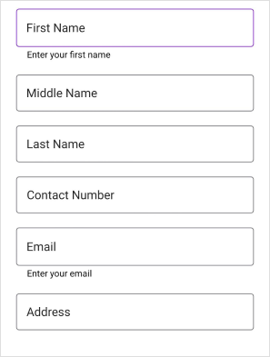
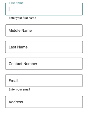
Focused stroke color
When the given editor view is focused, the FocusedStroke property value will be applied to the label text and border.
<ContentPage
...
xmlns:dataForm="clr-namespace:Syncfusion.Maui.DataForm;assembly=Syncfusion.Maui.DataForm">
<dataForm:SfDataForm x:Name="dataForm"
                        LayoutType="TextInputLayout"
                        DataObject="{Binding ContactInfo}"
                        GenerateDataFormItem="OnGenerateDataFormItem">
    <dataForm:SfDataForm.TextInputLayoutSettings>
        <dataForm:TextInputLayoutSettings FocusedStroke="Green"/>
    </dataForm:SfDataForm.TextInputLayoutSettings>
</dataForm:SfDataForm>
</ContentPage>
SfDataForm dataForm = new SfDataForm();
dataForm.LayoutType = DataFormLayoutType.TextInputLayout;
dataForm.GenerateDataFormItem += OnGenerateDataFormItem;
this.Content = dataForm;
private void OnGenerateDataFormItem(object sender, GenerateDataFormItemEventArgs e)
{
if (e.DataFormItem != null && e.DataFormItem.FieldName == "Name")
{
e.DataFormItem.LayoutType = DataFormLayoutType.TextInputLayout;
e.DataFormItem.TextInputLayoutSettings = new TextInputLayoutSettings
{
FocusedStroke = Colors.Green,
};
}
}
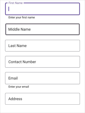
Focused and unfocused stroke thickness
When the editor’s view is focused and unfocused, the border’s thickness can be changed using the FocusedStrokeThickness and UnfocusedStrokeThickness properties of the TextInputLayoutSettings.
<ContentPage
...
xmlns:dataForm="clr-namespace:Syncfusion.Maui.DataForm;assembly=Syncfusion.Maui.DataForm">
<dataForm:SfDataForm x:Name="dataForm"
                        LayoutType="TextInputLayout"
                        DataObject="{Binding ContactInfo}"
                        GenerateDataFormItem="OnGenerateDataFormItem">
    <dataForm:SfDataForm.TextInputLayoutSettings>
        <dataForm:TextInputLayoutSettings FocusedStrokeThickness="3.0"
                                    UnfocusedStrokeThickness="2.0"/>
    </dataForm:SfDataForm.TextInputLayoutSettings>
</dataForm:SfDataForm>
</ContentPage>
SfDataForm dataForm = new SfDataForm();
dataForm.LayoutType = DataFormLayoutType.TextInputLayout;
dataForm.GenerateDataFormItem += OnGenerateDataFormItem;
this.Content = dataForm;
private void OnGenerateDataFormItem(object sender, GenerateDataFormItemEventArgs e)
{
if (e.DataFormItem != null && e.DataFormItem.FieldName == "Name")
{
e.DataFormItem.LayoutType = DataFormLayoutType.TextInputLayout;
e.DataFormItem.TextInputLayoutSettings = new TextInputLayoutSettings
{
FocusedStrokeThickness = 3.0,
UnfocusedStrokeThickness = 2.0,
};
}
}
NOTE
Unsupported editors
The Floating label layout does not support non-editable editors such as RadioGroup editor, CheckBox editor, and Switch editor.
NOTE
By default, the layout type of unsupported editors is
Default. You can also set the layout type for the unsupported editor using this Changing layout type of the DataFormItem.
NOTE
The time picker will not work in Windows platform within the text input layout.