Layout in .NET MAUI DataForm (SfDataForm)
12 Sep 202514 minutes to read
Overview
The data form supports linear and grid layouts and manages the layout of the label, editor, and validation label.
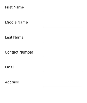
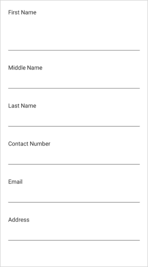
Linear data form layout
By default, the data form arranges the fields one by one. It is applicable for both label positions: left and top.
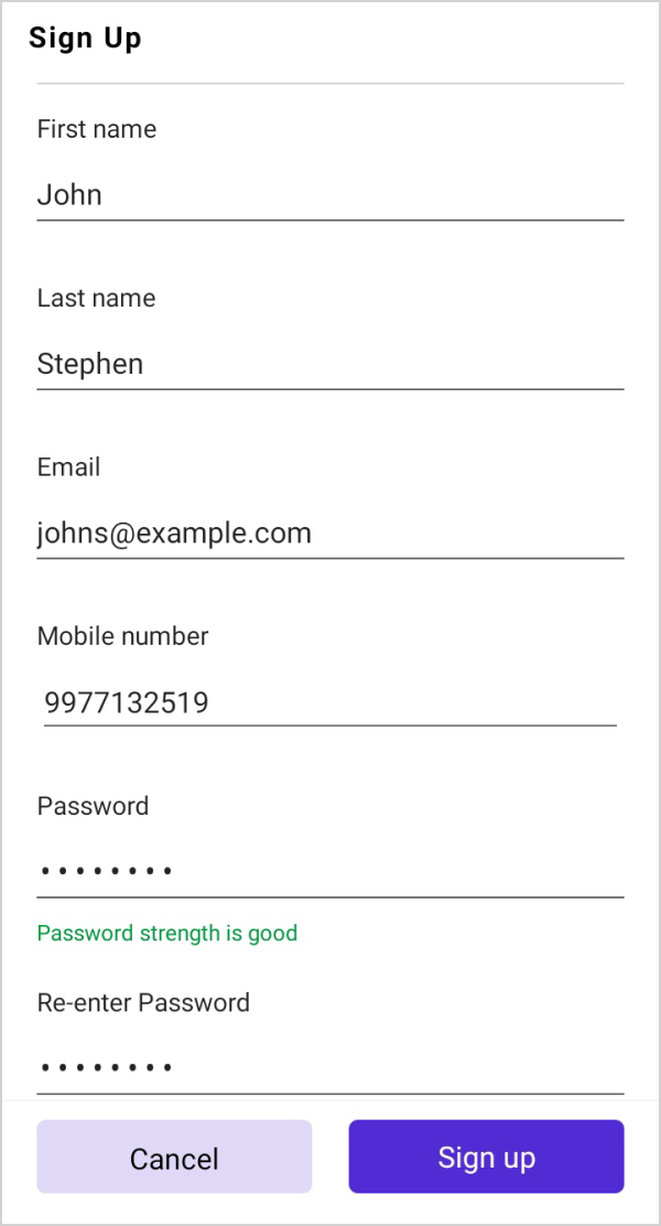
When the label position is Left, the linear layout is shown as follows:

When the label position is Top, the linear layout is shown as follows:
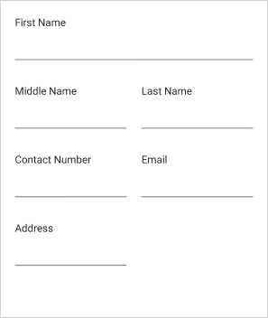
Grid data form layout
By default, the data form arranges one data field per row. It is possible to have more than one data field per row by setting the ColumnCount property which provides a grid-like layout for the data form. The column order of the data form field in a row can be changed using the ItemsOrderInRow.
<ContentPage
...
xmlns:dataForm="clr-namespace:Syncfusion.Maui.DataForm;assembly=Syncfusion.Maui.DataForm">
    <dataForm:SfDataForm
        x:Name="dataForm"
        ColumnCount="2">
    </dataForm:SfDataForm>
</ContentPage>
SfDataForm dataForm = new SfDataForm();
dataForm.ColumnCount = 2;
this.Content = dataForm;NOTE
Setting the ColumnCount property to SfDataForm does not arrange the data fields in a group according to the column count. To set the column count for data fields in the data form group, refer to the loading different layout for data form group.
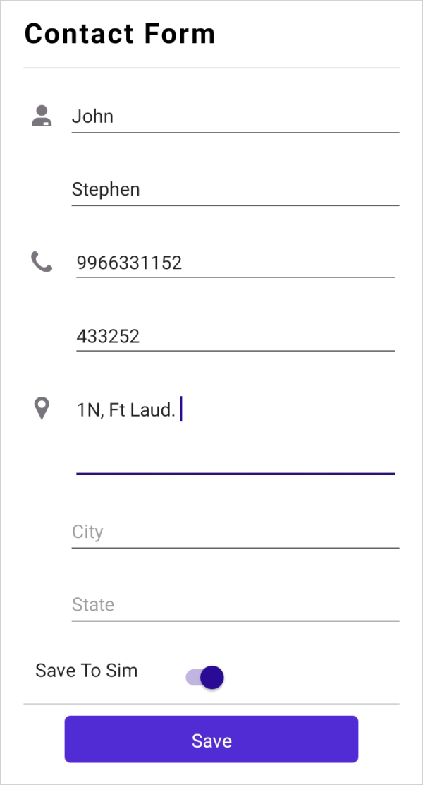
When the label position is Top, the grid layout is shown as follows:

Label visibility
The label can be hidden by defining the DataFormDisplayOptions attribute or by handling the GenerateDataFormItem event. In this case, only the editor will be loaded.
Using attributes
[DataFormDisplayOptions(ShowLabel = false)]
public string Name { get; set; }
Using event
this.dataForm.GenerateDataFormItem += OnGenerateDataFormItem;

private void OnGenerateDataFormItem(object sender, GenerateDataFormItemEventArgs e)
{
    if (e.DataFormItem != null)
    {
        if (e.DataFormItem.FieldName == "Name")
        {
            e.DataFormItem.ShowLabel = false;
        }
    }
}
Label position
The label can be positioned either top or left side of the editor. By using the DataFormDefaultLayoutSettings.LabelPosition property, lay out the label associated with the editor for the data form.
By default, the label will be positioned at left side of the editor.
<ContentPage
...
xmlns:dataForm="clr-namespace:Syncfusion.Maui.DataForm;assembly=Syncfusion.Maui.DataForm">
    <dataForm:SfDataForm
        x:Name="dataForm">
        <dataForm:SfDataForm.DefaultLayoutSettings>
            <dataForm:DataFormDefaultLayoutSettings
                LabelPosition="Top"/>
        </dataForm:SfDataForm.DefaultLayoutSettings>
    </dataForm:SfDataForm>
</ContentPage>
SfDataForm dataForm = new SfDataForm();
dataForm.DefaultLayoutSettings.LabelPosition = DataFormLabelPosition.Top;
this.Content = dataForm;Changing particular editors label position
The label position of a particular editor can be changed by using the DataFormDefaultLayoutSettings.LabelPosition property in the DataFormItem, and it will be handled in the GenerateDataFormItem event.
<ContentPage
...
xmlns:dataForm="clr-namespace:Syncfusion.Maui.DataForm;assembly=Syncfusion.Maui.DataForm">
    <dataForm:SfDataForm
        x:Name="dataForm"
        DataObject="{Binding DataObjects}"
        GenerateDataFormItem="OnGenerateDataFormItem">
    </dataForm:SfDataForm>
</ContentPage>
SfDataForm dataForm = new SfDataForm();
dataForm.GenerateDataFormItem += OnGenerateDataFormItem;
this.Content = dataForm;
private void OnGenerateDataFormItem(object sender, GenerateDataFormItemEventArgs e)
{
if (e.DataFormItem != null)
{
if (e.DataFormItem.FieldName == "Name")
{
e.DataFormItem.DefaultLayoutSettings = new DataFormDefaultLayoutSettings
{
LabelPosition = DataFormLabelPosition.Top,
};
}
}
}Loading images for label
The image can be loaded instead of the label by using the LeadingView property of the DataFormItem.
Using event
this.dataForm.GenerateDataFormItem += OnGenerateDataFormItem;

private void OnGenerateDataFormItem(object sender, GenerateDataFormItemEventArgs e)
{
    if (e.DataFormItem != null)
    {
        if (e.DataFormItem.FieldName == "Name")
        {
            e.DataFormItem.LeadingView = new Label { Text = "F", FontSize = 18, TextColor = Colors.Gray, FontFamily = "InputLayoutIcons", HeightRequest = 24, VerticalTextAlignment = TextAlignment.End };
        }
    }
}
NOTE
Changing order of the editors
The order of the data form editors can be changed by using attributes or by handling the GenerateDataFormItem event.
Using attributes
The data form editors’ order can be changed by using the RowOrder property in the DataFormDisplayOptionsAttribute attribute.
[DataFormDisplayOptions(RowOrder = 1)]
public string Adress { get; set; }

[DataFormDisplayOptions(RowOrder = 0)]
public string Name { get; set; }
Using event
The data form editors’ order can be changed by using the RowOrder property in the DataFormItem.
this.dataForm.GenerateDataFormItem += OnGenerateDataFormItem;

private void OnGenerateDataFormItem(object sender, GenerateDataFormItemEventArgs e)
{
    if (e.DataFormItem != null)
    {
        if (e.DataFormItem.FieldName == "Name")
        {
            e.DataFormItem.RowOrder = 0;
        }
    }
}
Change the label and editor width
The label and editor width are set proportionally by using the LabelWidth and EditorWidth properties of the DefaultLayoutSettings class.
The Value and UnitType properties of the DataFormItemLength each return the value and unit type of the corresponding DataFormItemLength respectively.
The label and Editor are specified with proportionate values such as 0.4* and 0.6* when the DataFormItemLength.UnitType is Star.
Additionally, Specify a defined width for the editor and label such as 300, 400, and the DataFormItemLength.UnitType is Absolute.
<ContentPage
...
xmlns:dataForm="clr-namespace:Syncfusion.Maui.DataForm;assembly=Syncfusion.Maui.DataForm">
    <dataForm:SfDataForm
        x:Name="dataForm">
        <dataForm:SfDataForm.DefaultLayoutSettings>
            <dataForm:DataFormDefaultLayoutSettings
                LabelWidth="0.4*"
                EditorWidth="0.6*"/>
        </dataForm:SfDataForm.DefaultLayoutSettings>
    </dataForm:SfDataForm>
</ContentPage>
SfDataForm dataForm = new SfDataForm();
dataForm.DefaultLayoutSettings.LabelWidth = new DataFormItemLength(300, DataFormItemLengthUnitType.Absolute);
dataForm.DefaultLayoutSettings.EditorWidth = new DataFormItemLength(400, DataFormItemLengthUnitType.Absolute);
this.Content = dataForm;SfDataForm dataForm = new SfDataForm();
this.dataForm.DefaultLayoutSettings.LabelWidth = new DataFormItemLength(0.3, DataFormItemLengthUnitType.Star);
this.dataForm.DefaultLayoutSettings.EditorWidth = new DataFormItemLength(0.7, DataFormItemLengthUnitType.Star);
this.Content = dataForm;NOTE
The label width customization is applicable only when the LabelPosition is Left.
By default, the available width is divided into 40% for the label and 60% for the editor.
Spanning editors rows and columns
The row height and column width are increased by defining the DataFormDisplayOptions attribute or by handling the GenerateDataFormItem event.
Row span
Using attributes
The row height is increased by using the RowSpan property in the DataFormDisplayOptions attribute.
[DataFormDisplayOptions(RowSpan = 2)]
public string FirstName { get; set; }
Using event
The row height of each DataFormItem can also be increased by using the RowSpan property, and it will be handled in the GenerateDataFormItem event.
this.dataForm.GenerateDataFormItem += OnGenerateDataFormItem;

private void OnGenerateDataFormItem(object sender, GenerateDataFormItemEventArgs e)
{
    if (e.DataFormItem != null)
    {
        if (e.DataFormItem.FieldName == "FirstName")
        {
            e.DataFormItem.RowSpan = 2;
        }
    }
}
Here, FirstName field’s row height is increased.
Column span
Using attributes
When the grid layout is used, the column width is increased by using the ColumnSpan property in the DataFormDisplayOptions attribute.
this.dataForm.ColumnCount = 2;[DataFormDisplayOptions(ColumnSpan = 2)]
public string FirstName { get; set; }Using event
When the grid layout is used, increase the column width of each DataFormItem using the ColumnSpan property, and it will be handled in the GenerateDataFormItem event.
this.dataForm.GenerateDataFormItem += OnGenerateDataFormItem;

private void OnGenerateDataFormItem(object sender, GenerateDataFormItemEventArgs e)
{
    if (e.DataFormItem != null)
    {
        if (e.DataFormItem.FieldName == "FirstName")
        {
            e.DataFormItem.ColumnSpan = 2;
        }
    }
}
Change the editor visibility
The data form editor visibility is changed by using the IsVisible property of the DataFormItem.
this.dataForm.GenerateDataFormItem += OnGenerateDataFormItem;

private void OnGenerateDataFormItem(object sender, GenerateDataFormItemEventArgs e)
{
    if (e.DataFormItem != null)
    {
        if (e.DataFormItem.FieldName == "Name")
        {
            e.DataFormItem.IsVisible = false;
        }
    }
}
Here, the Name field will be hidden.
Programmatically scroll to specific editor
You can programmatically scroll to specific editor using the ScrollTo method by passing the property name.
dataForm.ScrollTo("FirstName");
Change the editor height
The .NET MAUI DataForm allows you to modify the height of each editor to fit the height of the data form or to customize the height based on text size by using the EditorHeight property of the DataFormItem.
this.dataForm.GenerateDataFormItem += OnGenerateDataFormItem;

private void OnGenerateDataFormItem(object sender, GenerateDataFormItemEventArgs e)
{
    if (e.DataFormItem != null)
    {
        if (e.DataFormItem.FieldName == "Name")
        {
            e.DataFormItem.EditorHeight = 60;
        }
    }
}
NOTE
The
EditorHeightcustomization is applicable for both Default and TextInputLayout layout types.