About Syncfusion® .NET MAUI DataForm Control
18 Nov 20185 minutes to read
The Syncfusion® .NET MAUI DataForm (SfDataForm) control is used to create or edit DataForm such as login, reservation, contact, employee form and more based on the business purpose.
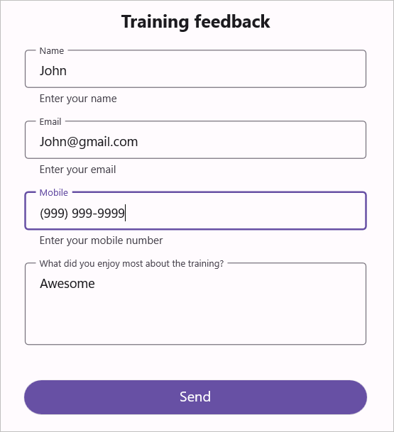
Business use cases
- Business applications that require dynamic form generation for data entry such as employee, customer, or product forms.
- Registration and login workflows that require validated user input and structured form layouts.
- Enterprise applications that handle data editing and validation across multiple fields and sections.
- Mobile and desktop apps that require consistent and reusable form UI across platforms.
Key features
- Built-in editor support allows using predefined editors such as text, password, multiline, combo box, autocomplete, date, time, checkbox, switch, and radio group based on data types.
- Custom editor support allows adding custom input controls when default editors do not meet specific requirements.
- Validation allows validating user input and displaying messages to ensure accurate data entry.
- Commit mode configuration allows controlling when user input is committed to the underlying data object.
- Flexible layout and grouping allows arranging fields using linear or grid layouts and organizing them into logical sections.
- Appearance customization allows styling editors, labels, and group headers to match application themes.
Globalization
The following table summarizes the globalization support available in this control.
 Full Support
 Not Applicable
| Control | Localization | RTL | Time zone | Screen reader | Keyboard navigation |
|---|---|---|---|---|---|
| DataForm | |
|
|
|
|
Related controls
- ComboBox for providing dropdown-based selection in forms.
- Date Picker for capturing date inputs within forms.
- Text Input Layout for enhancing input fields with labels and validation.
See Also
- Getting Started shows a step‑by‑step guide to begin using the DataForm control.
- Data Editors explores built‑in and custom editor configurations.
- Validation explains how to configure validation rules and behaviors.
- UI Kit provides interactive demos and ready‑made UI examples.
Resources
Feature Tour
Get a quick overview of key features and capabilities to kick start your journey.
Explore Features
Tutorial Videos
Watch step‑by‑step video guides to quickly understand concepts and implementation.
Watch now
Knowledge Base
Find practical solutions, troubleshooting tips and how‑to guides for common scenarios.
Search KB's