About Syncfusion® .NET MAUI ComboBox Control
18 Nov 20185 minutes to read
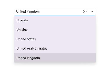
The .NET MAUI ComboBox control is a selection component that allows users to type a value or choose an option from a list of predefined options. It has many features, such as data binding, editing, searching, clear button and dropdown button customization, and more.
Business use cases
- Form-based applications that require dropdown selection with optional text input for flexibility.
- Search-driven interfaces that allow to filter and select items from large datasets.
- Enterprise applications that use lookup fields for selecting values such as customers, products, or categories.
- Mobile apps that require compact and efficient selection controls with autocomplete behavior.
Key features
- Flexible data binding allows connecting the control to various data sources such as collections and models.
- Editable mode enables switching between editable and non-editable input for controlled user interaction.
- Filtering allows narrowing down items based on user input and automatically suggesting matches.
- Search highlighting highlights matching results in the dropdown list to improve visibility and usability.
- Drop‑down customization allows tailoring the appearance and behavior of the suggestion list.
Globalization
The following table summarizes the globalization support available in this control.
 Full Support
 Partial Support
 Not Applicable
| Control | Localization | RTL | Time zone | Screen reader | Keyboard navigation |
|---|---|---|---|---|---|
| ComboBox | |
|
|
|
|
Related controls
- Autocomplete for implementing search-based suggestion inputs.
- Date Picker for selecting values using picker-based inputs.
- Masked Entry for adding strict formatting, useful in forms.
See Also
- Getting Started shows a step‑by‑step guide to begin using the ComboBox control.
- Filtering explains how to configure filtering and search behavior.
- Customization helps customize appearance and interaction settings.
- UI Kit provides interactive demos and ready‑made UI examples.
Resources
Feature Tour
Get a quick overview of key features and capabilities to kick start your journey.
Explore Features
Tutorial Videos
Watch step‑by‑step video guides to quickly understand concepts and implementation.
Watch now
Knowledge Base
Find practical solutions, troubleshooting tips and how‑to guides for common scenarios.
Search KB's
Use Case Sample
Explore a real-world application that demonstrates the practical use of the ComboBox.
View Sample