How can I help you?
LoadMore in .NET MAUI ComboBox (SfComboBox)
24 Apr 20259 minutes to read
Restrict the number of suggestions displayed and have the remaining items loaded by selecting LoadMore. We can restrict maximum suggestion to be displayed with the MaximumSuggestion property.
<editors:SfComboBox x:Name="comboBox"
                    IsFilteringEnabled="True"
                    IsEditable="True"
                    ItemsSource="{Binding SocialMedias}"
                    MaximumSuggestion="2"
                    DisplayMemberPath="Name"
                    TextMemberPath="Name"/>
SfComboBox comboBox = new SfComboBox()
{
MaximumSuggestion = 2,
IsEditable = true,
IsFilteringEnabled = true,
TextMemberPath = "Name",
DisplayMemberPath = "Name",
ItemsSource = socialMediaViewModel.SocialMedias
};The following gif image illustrates the result of the above code:

LoadMore text customization
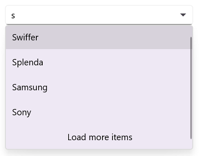
The LoadMore support provides LoadMoreText. We can set the desire text for the displaying the Load more text with the property LoadMoreText.
<editors:SfComboBox x:Name="comboBox"
                    IsFilteringEnabled="True"
                    IsEditable="True"
                    ItemsSource="{Binding SocialMedias}"
                    MaximumSuggestion="2"
                    LoadMoreText="Load more items"
                    DisplayMemberPath="Name"
                    TextMemberPath="Name"/>
SfComboBox comboBox = new SfComboBox()
{
MaximumSuggestion = 2,
LoadMoreText= "Load more items",
IsEditable = true,
IsFilteringEnabled = true,
TextMemberPath = "Name",
DisplayMemberPath = "Name",
ItemsSource = socialMediaViewModel.SocialMedias
};The following gif image illustrates the result of the above code:
LoadMore view customization
SfComboBox allows customizing User Interface(UI) of Load More view. To customize the load more text, add the custom UI in the LoadMoreTemplate API in SfComboBox, as shown in the following code snippet.
<editors:SfComboBox x:Name="comboBox"
                    IsFilteringEnabled="True"
                    IsEditable="True"
                    ItemsSource="{Binding SocialMedias}"
                    MaximumSuggestion="2"
                    DisplayMemberPath="Name"
                    TextMemberPath="Name">
    <editors:SfComboBox.LoadMoreTemplate>
        <DataTemplate>
            <Grid BackgroundColor="LightGreen">
                <Label Text="Load more items..." VerticalOptions="Center" FontAttributes="Bold" HorizontalOptions="Center" TextColor="Red"/>
            </Grid>
        </DataTemplate>
    </editors:SfComboBox.LoadMoreTemplate>
</editors:SfComboBox>
SfComboBox comboBox = new SfComboBox
{
IsFilteringEnabled = true,
IsEditable = true,
ItemsSource = socialMediaViewModel.SocialMedias,
MaximumSuggestion = 2,
DisplayMemberPath = "Name",
TextMemberPath = "Name"
};
comboBox.LoadMoreTemplate = new DataTemplate(() =>
{
var grid = new Grid
{
BackgroundColor = Colors.LightGreen
};
var label = new Label
{
Text = "Load more items...",
TextColor = Colors.Red,
HorizontalOptions = LayoutOptions.Center,
VerticalOptions = LayoutOptions.Center,
FontAttributes = FontAttributes.Bold
};
grid.Children.Add(label);
return grid;
});The following gif image illustrates the result of the above code:

LoadMore Button Tapped Event
The LoadMore support provides LoadMoreButtonTapped Event. The event can be triggered only when you tap on the load more button.
<editors:SfComboBox x:Name="comboBox"
                    IsFilteringEnabled="True"
                    IsEditable="True"
                    MaximumSuggestion="2"
                    ItemsSource="{Binding SocialMedias}"
                    LoadMoreButtonTapped="ComboBox_LoadMoreButtonTapped"
                    DisplayMemberPath="Name"
                    TextMemberPath="Name">
</editors:SfComboBox>
SfComboBox comboBox = new SfComboBox
{
IsFilteringEnabled = true,
IsEditable = true,
MaximumSuggestion = 2,
ItemsSource = socialMediaViewModel.SocialMedias,
DisplayMemberPath = "Name",
TextMemberPath = "Name"
};
comboBox.LoadMoreButtonTapped += ComboBox_LoadMoreButtonTapped;
private void ComboBox_LoadMoreButtonTapped(object? sender, EventArgs e)
{
// Triggered when the load more button is tapped.
}