Selection in .NET MAUI ComboBox
18 Nov 201824 minutes to read
The .NET MAUI ComboBox control allows users to select a single item or multiple items from the drop-down. Use the SelectionMode property to choose between Single and Multiple selection. The default value of SelectionMode is Single.
Prerequisites
Before using the SfComboBox, ensure the following NuGet package is installed in your .NET MAUI project:
Syncfusion.Maui.Inputs
For a step-by-step setup, refer to the Getting Started documentation.
Single selection
In single selection mode, the ComboBox allows users to select a single item from the drop-down. This is the default mode when SelectionMode is Single.
UI selection
The selected item can be changed interactively by selecting from the drop-down or by typing a value into the editor.
<editors:SfComboBox x:Name="comboBox"
                    IsEditable="True"
                    ItemsSource="{Binding SocialMedias}"
                    DisplayMemberPath="Name"
                    TextMemberPath="Name">
    <editors:SfComboBox.BindingContext>
        <local:SocialMediaViewModel />
    </editors:SfComboBox.BindingContext>
</editors:SfComboBox>
SocialMediaViewModel socialMediaViewModel = new SocialMediaViewModel();
SfComboBox comboBox = new SfComboBox
{
IsEditable = true,
ItemsSource = socialMediaViewModel.SocialMedias,
DisplayMemberPath = "Name",
TextMemberPath = "Name",
BindingContext = socialMediaViewModel,
};// ViewModel
public class SocialMediaViewModel
{
public ObservableCollection<SocialMedia> SocialMedias { get; set; }
public SocialMediaViewModel()
{
this.SocialMedias = new ObservableCollection<SocialMedia>
{
new SocialMedia { Name = "Facebook", ID = 0 },
new SocialMedia { Name = "Google Plus", ID = 1 },
new SocialMedia { Name = "Instagram", ID = 2 },
new SocialMedia { Name = "LinkedIn", ID = 3 },
new SocialMedia { Name = "Skype", ID = 4 },
new SocialMedia { Name = "Telegram", ID = 5 },
new SocialMedia { Name = "Twitter", ID = 6 },
new SocialMedia { Name = "WhatsApp", ID = 7 },
new SocialMedia { Name = "YouTube", ID = 8 }
};
}
}
public class SocialMedia
{
public string Name { get; set; }
public int ID { get; set; }
}The following image illustrates the result of the above code:

Programmatic selection
The selected item can be changed programmatically by using the SelectedItem (object) or SelectedIndex (int) property. SelectedIndex defaults to -1 (no selection).
<editors:SfComboBox x:Name="comboBox"
                    MaxDropDownHeight="250"
                    IsEditable="True"
                    ItemsSource="{Binding SocialMedias}"
                    DisplayMemberPath="Name"
                    TextMemberPath="Name"
                    SelectedIndex="2">
    <editors:SfComboBox.BindingContext>
        <local:SocialMediaViewModel />
    </editors:SfComboBox.BindingContext>
</editors:SfComboBox>
SocialMediaViewModel socialMediaViewModel = new SocialMediaViewModel();
SfComboBox comboBox = new SfComboBox
{
MaxDropDownHeight = 250,
IsEditable = true,
ItemsSource = socialMediaViewModel.SocialMedias,
DisplayMemberPath = "Name",
TextMemberPath = "Name",
SelectedIndex = 2,
BindingContext = socialMediaViewModel,
};// ViewModel
public class SocialMediaViewModel
{
public ObservableCollection<SocialMedia> SocialMedias { get; set; }
public SocialMediaViewModel()
{
this.SocialMedias = new ObservableCollection<SocialMedia>
{
new SocialMedia { Name = "Facebook", ID = 0 },
new SocialMedia { Name = "Google Plus", ID = 1 },
new SocialMedia { Name = "Instagram", ID = 2 },
new SocialMedia { Name = "LinkedIn", ID = 3 },
new SocialMedia { Name = "Skype", ID = 4 },
new SocialMedia { Name = "Telegram", ID = 5 },
new SocialMedia { Name = "Twitter", ID = 6 },
new SocialMedia { Name = "WhatsApp", ID = 7 },
new SocialMedia { Name = "YouTube", ID = 8 }
};
}
}
public class SocialMedia
{
public string Name { get; set; }
public int ID { get; set; }
}The following image illustrates the result of the above code:

Multiple selection
The ComboBox allows users to select multiple values from the drop-down by setting the SelectionMode property to Multiple. The selected items can be changed programmatically by using the SelectedItems property, which supports two-way binding.
There are two ways to display multi-selection items, controlled by the MultiSelectionDisplayMode property. The default value is Token.
- Delimiter - Displays selected items as a single line separated by a custom character.
- Token - Displays each selected item as a token (chip).
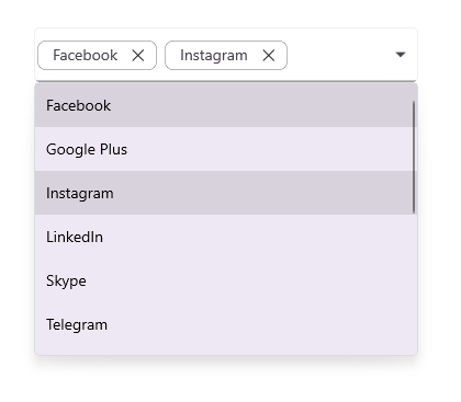
The following example uses MultiSelectionDisplayMode="Token" (the default) and binds SelectedItems to a view model property.
<editors:SfComboBox x:Name="comboBox"
                    ItemsSource="{Binding SocialMedias}"
                    SelectedItems="{Binding SelectedItemsList}"
                    SelectionMode="Multiple"
                    MaxDropDownHeight="250"
                    DisplayMemberPath="Name"
                    TextMemberPath="Name">
    <editors:SfComboBox.BindingContext>
        <local:SocialMediaViewModel />
    </editors:SfComboBox.BindingContext>
</editors:SfComboBox>
// ViewModel
public class SocialMediaViewModel
{
public ObservableCollection<SocialMedia> SocialMedias { get; set; }
public ObservableCollection<SocialMedia> SelectedItemsList { get; set; }
public SocialMediaViewModel()
{
this.SocialMedias = new ObservableCollection<SocialMedia>
{
new SocialMedia { Name = "Facebook", ID = 0 },
new SocialMedia { Name = "Google Plus", ID = 1 },
new SocialMedia { Name = "Instagram", ID = 2 },
new SocialMedia { Name = "LinkedIn", ID = 3 },
new SocialMedia { Name = "Skype", ID = 4 },
new SocialMedia { Name = "Telegram", ID = 5 },
new SocialMedia { Name = "Twitter", ID = 6 },
new SocialMedia { Name = "WhatsApp", ID = 7 },
new SocialMedia { Name = "YouTube", ID = 8 }
};
SelectedItemsList = new ObservableCollection<SocialMedia>
{
SocialMedias[0],
SocialMedias[2],
};
}
}
public class SocialMedia
{
public string Name { get; set; }
public int ID { get; set; }
}The following image illustrates the result of the above code:
Switching
SelectionModefromMultipletoSingleat runtime clears the currentSelectedItemscollection.
Delimiter
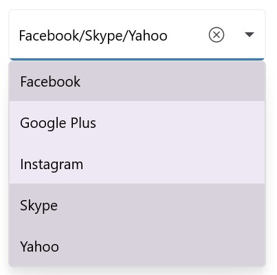
Set MultiSelectionDisplayMode to Delimiter to display selected items as a single line separated by a custom character. Use the DelimiterText property to set the separator. The default value is ",".
<editors:SfComboBox x:Name="comboBox"
                    ItemsSource="{Binding SocialMedias}"
                    SelectionMode="Multiple"
                    MultiSelectionDisplayMode="Delimiter"
                    DelimiterText="/"
                    DisplayMemberPath="Name"
                    TextMemberPath="Name"
                    Placeholder="Enter Media">
    <editors:SfComboBox.BindingContext>
        <local:SocialMediaViewModel />
    </editors:SfComboBox.BindingContext>
</editors:SfComboBox>
SocialMediaViewModel socialMediaViewModel = new SocialMediaViewModel();
SfComboBox comboBox = new SfComboBox
{
ItemsSource = socialMediaViewModel.SocialMedias,
SelectionMode = ComboBoxSelectionMode.Multiple,
MultiSelectionDisplayMode = ComboBoxMultiSelectionDisplayMode.Delimiter,
DelimiterText = "/",
DisplayMemberPath = "Name",
TextMemberPath = "Name",
Placeholder = "Enter Media",
BindingContext = socialMediaViewModel,
};// ViewModel
public class SocialMediaViewModel
{
public ObservableCollection<SocialMedia> SocialMedias { get; set; }
public SocialMediaViewModel()
{
this.SocialMedias = new ObservableCollection<SocialMedia>
{
new SocialMedia { Name = "Facebook", ID = 0 },
new SocialMedia { Name = "Google Plus", ID = 1 },
new SocialMedia { Name = "Instagram", ID = 2 },
new SocialMedia { Name = "LinkedIn", ID = 3 },
new SocialMedia { Name = "Skype", ID = 4 },
new SocialMedia { Name = "Telegram", ID = 5 },
new SocialMedia { Name = "Twitter", ID = 6 },
new SocialMedia { Name = "WhatsApp", ID = 7 },
new SocialMedia { Name = "YouTube", ID = 8 }
};
}
}
public class SocialMedia
{
public string Name { get; set; }
public int ID { get; set; }
}
Token
Token mode supports two layouts for displaying selected items, controlled by the TokensWrapMode property. The default value is None.
- Wrap - Wraps tokens onto multiple lines.
- None - Displays all tokens on a single horizontal line that scrolls horizontally.
Wrap mode
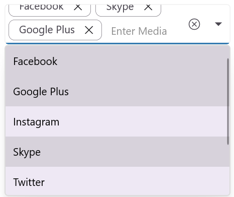
When TokensWrapMode is set to Wrap, the selected tokens wrap onto the next line when they exceed the editor width.
<editors:SfComboBox x:Name="comboBox"
                    ItemsSource="{Binding SocialMedias}"
                    SelectionMode="Multiple"
                    Placeholder="Enter Media"
                    DisplayMemberPath="Name"
                    TextMemberPath="Name"
                    TokensWrapMode="Wrap">
    <editors:SfComboBox.BindingContext>
        <local:SocialMediaViewModel />
    </editors:SfComboBox.BindingContext>
</editors:SfComboBox>
SocialMediaViewModel socialMediaViewModel = new SocialMediaViewModel();
SfComboBox comboBox = new SfComboBox
{
ItemsSource = socialMediaViewModel.SocialMedias,
SelectionMode = ComboBoxSelectionMode.Multiple,
Placeholder = "Enter Media",
DisplayMemberPath = "Name",
TextMemberPath = "Name",
TokensWrapMode = ComboBoxTokensWrapMode.Wrap,
BindingContext = socialMediaViewModel,
};// ViewModel
public class SocialMediaViewModel
{
public ObservableCollection<SocialMedia> SocialMedias { get; set; }
public SocialMediaViewModel()
{
this.SocialMedias = new ObservableCollection<SocialMedia>
{
new SocialMedia { Name = "Facebook", ID = 0 },
new SocialMedia { Name = "Google Plus", ID = 1 },
new SocialMedia { Name = "Instagram", ID = 2 },
new SocialMedia { Name = "LinkedIn", ID = 3 },
new SocialMedia { Name = "Skype", ID = 4 },
new SocialMedia { Name = "Telegram", ID = 5 },
new SocialMedia { Name = "Twitter", ID = 6 },
new SocialMedia { Name = "WhatsApp", ID = 7 },
new SocialMedia { Name = "YouTube", ID = 8 }
};
}
}
public class SocialMedia
{
public string Name { get; set; }
public int ID { get; set; }
}
None mode
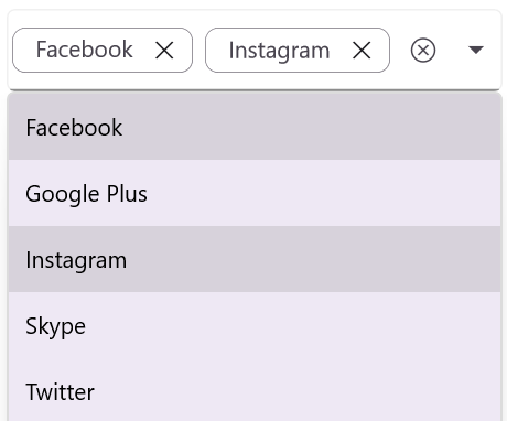
When TokensWrapMode is set to None, the selected tokens are displayed on a single horizontal line that scrolls horizontally when it overflows.
<editors:SfComboBox x:Name="comboBox"
                    ItemsSource="{Binding SocialMedias}"
                    SelectionMode="Multiple"
                    Placeholder="Enter Media"
                    DisplayMemberPath="Name"
                    TextMemberPath="Name"
                    TokensWrapMode="None">
    <editors:SfComboBox.BindingContext>
        <local:SocialMediaViewModel />
    </editors:SfComboBox.BindingContext>
</editors:SfComboBox>
SocialMediaViewModel socialMediaViewModel = new SocialMediaViewModel();
SfComboBox comboBox = new SfComboBox
{
ItemsSource = socialMediaViewModel.SocialMedias,
SelectionMode = ComboBoxSelectionMode.Multiple,
Placeholder = "Enter Media",
DisplayMemberPath = "Name",
TextMemberPath = "Name",
TokensWrapMode = ComboBoxTokensWrapMode.None,
BindingContext = socialMediaViewModel,
};// ViewModel
public class SocialMediaViewModel
{
public ObservableCollection<SocialMedia> SocialMedias { get; set; }
public SocialMediaViewModel()
{
this.SocialMedias = new ObservableCollection<SocialMedia>
{
new SocialMedia { Name = "Facebook", ID = 0 },
new SocialMedia { Name = "Google Plus", ID = 1 },
new SocialMedia { Name = "Instagram", ID = 2 },
new SocialMedia { Name = "LinkedIn", ID = 3 },
new SocialMedia { Name = "Skype", ID = 4 },
new SocialMedia { Name = "Telegram", ID = 5 },
new SocialMedia { Name = "Twitter", ID = 6 },
new SocialMedia { Name = "WhatsApp", ID = 7 },
new SocialMedia { Name = "YouTube", ID = 8 }
};
}
}
public class SocialMedia
{
public string Name { get; set; }
public int ID { get; set; }
}
Selection events
The ComboBox raises events before and after the selection changes. The following sections describe each event and its arguments.
SelectionChanging
The SelectionChanging event fires before the selection changes. Use this event to cancel or modify the selection based on predefined criteria.
The SelectionChangingEventArgs provides the following members:
- CurrentSelection - The items that are about to be selected.
- PreviousSelection - The items that were previously selected.
-
Cancel- Set totrueto cancel the selection change.
The XAML below references an event handler defined in the page code-behind. The C# samples show the page constructor (which wires up the ComboBox and event) and the event handler.
<editors:SfComboBox x:Name="comboBox"
                    WidthRequest="250"
                    HeightRequest="40"
                    ItemsSource="{Binding SocialMedias}"
                    TextMemberPath="Name"
                    DisplayMemberPath="Name"
                    SelectionChanging="OnSelectionChanging">
    <editors:SfComboBox.BindingContext>
        <local:SocialMediaViewModel />
    </editors:SfComboBox.BindingContext>
</editors:SfComboBox>
// Run this code in a ContentPage code-behind file (MainPage.xaml.cs).
SocialMediaViewModel socialMediaViewModel = new SocialMediaViewModel();
SfComboBox comboBox = new SfComboBox
{
WidthRequest = 250,
HeightRequest = 40,
ItemsSource = socialMediaViewModel.SocialMedias,
TextMemberPath = "Name",
DisplayMemberPath = "Name",
BindingContext = socialMediaViewModel,
};
comboBox.SelectionChanging += OnSelectionChanging;
Content = comboBox;// ViewModel
public class SocialMediaViewModel
{
public ObservableCollection<SocialMedia> SocialMedias { get; set; }
public SocialMediaViewModel()
{
this.SocialMedias = new ObservableCollection<SocialMedia>
{
new SocialMedia { Name = "Facebook", ID = 0 },
new SocialMedia { Name = "Google Plus", ID = 1 },
new SocialMedia { Name = "Instagram", ID = 2 },
new SocialMedia { Name = "LinkedIn", ID = 3 },
new SocialMedia { Name = "Skype", ID = 4 },
new SocialMedia { Name = "Telegram", ID = 5 },
new SocialMedia { Name = "Twitter", ID = 6 },
new SocialMedia { Name = "WhatsApp", ID = 7 },
new SocialMedia { Name = "YouTube", ID = 8 }
};
}
}
public class SocialMedia
{
public string Name { get; set; }
public int ID { get; set; }
}The SelectionChanging event can be handled in C# as follows:
private void OnSelectionChanging(object sender, SelectionChangingEventArgs e)
{
    await DisplayAlert("Alert", "Selecting Item has changing", "Ok");
}
The following image illustrates the result of the above code:

SelectionChanged
The SelectionChanged event fires after the selection changes. The SelectionChangedEventArgs provides the following members:
-
AddedItems- The items that were just selected. -
RemovedItems- The items that were unselected.
<editors:SfComboBox x:Name="comboBox"
                    TextMemberPath="Name"
                    DisplayMemberPath="Name"
                    ItemsSource="{Binding SocialMedias}"
                    SelectionChanged="OnSelectionChanged">
    <editors:SfComboBox.BindingContext>
        <local:SocialMediaViewModel />
    </editors:SfComboBox.BindingContext>
</editors:SfComboBox>
SocialMediaViewModel socialMediaViewModel = new SocialMediaViewModel();
SfComboBox comboBox = new SfComboBox
{
ItemsSource = socialMediaViewModel.SocialMedias,
DisplayMemberPath = "Name",
TextMemberPath = "Name",
BindingContext = socialMediaViewModel,
};
comboBox.SelectionChanged += OnSelectionChanged;
Content = comboBox;// ViewModel
public class SocialMediaViewModel
{
public ObservableCollection<SocialMedia> SocialMedias { get; set; }
public SocialMediaViewModel()
{
this.SocialMedias = new ObservableCollection<SocialMedia>
{
new SocialMedia { Name = "Facebook", ID = 0 },
new SocialMedia { Name = "Google Plus", ID = 1 },
new SocialMedia { Name = "Instagram", ID = 2 },
new SocialMedia { Name = "LinkedIn", ID = 3 },
new SocialMedia { Name = "Skype", ID = 4 },
new SocialMedia { Name = "Telegram", ID = 5 },
new SocialMedia { Name = "Twitter", ID = 6 },
new SocialMedia { Name = "WhatsApp", ID = 7 },
new SocialMedia { Name = "YouTube", ID = 8 }
};
}
}
public class SocialMedia
{
public string Name { get; set; }
public int ID { get; set; }
}The SelectionChanged event can be handled in C# as follows:
private void OnSelectionChanged(object sender, SelectionChangedEventArgs e)
{
    await DisplayAlert("Alert", $"Selected Item has changed", "Ok");
}
The following image illustrates the result of the above code:

SelectionChanged event arguments
CurrentSelectionandPreviousSelectionmarked as “Obsolete”. You can use theAddedItemsandRemovedItemsevent arguments.
Selected value
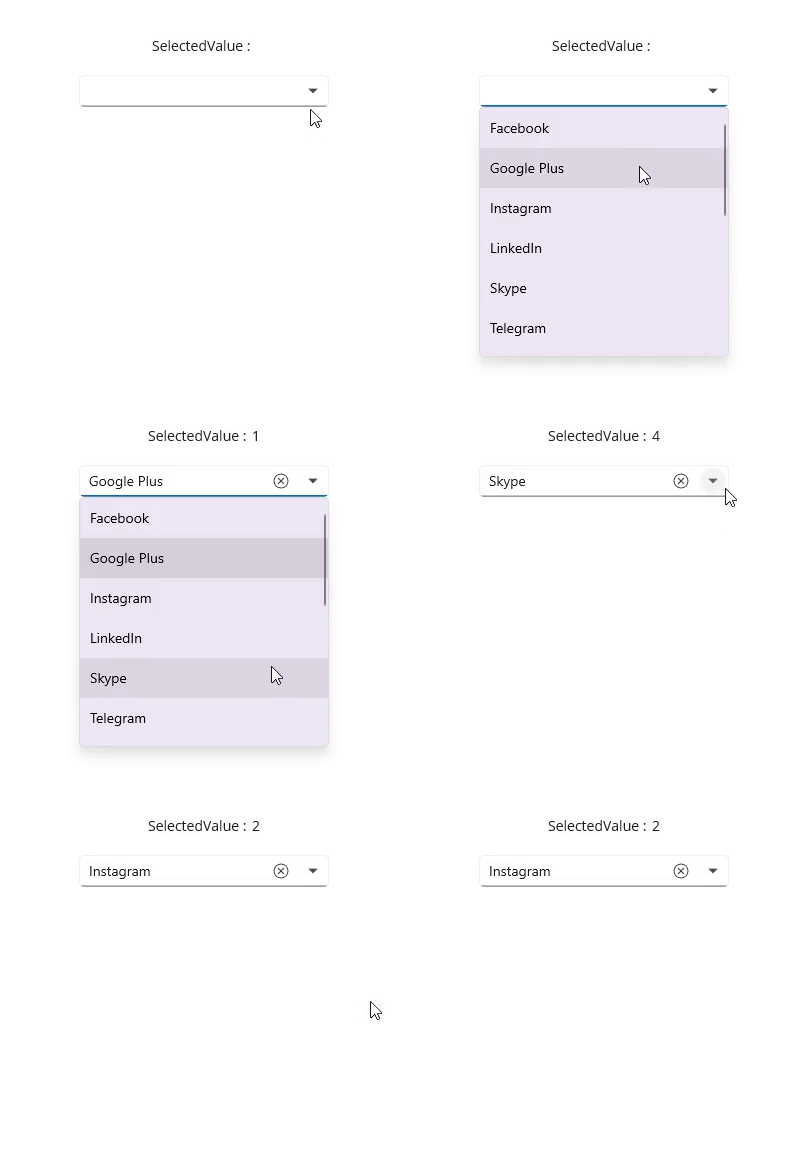
The SelectedValue property gets or sets a value based on the SelectedItem or SelectedItems, depending on the selection mode. The SelectedValuePath property specifies which property of the selected item is used to populate SelectedValue.
Single selection
In single selection mode, SelectedValue holds the value defined by SelectedValuePath, such as the ID property. When SelectedItem returns the entire object (for example, SocialMedia), SelectedValue contains the value of the SocialMedia.ID property.
<StackLayout>
    <Label Text="SelectedValue:" />
    <Label x:Name="selectedValue" />

    <editors:SfComboBox x:Name="comboBox"
                        MaxDropDownHeight="250"
                        TextMemberPath="Name"
                        DisplayMemberPath="Name"
                        ItemsSource="{Binding SocialMedias}"
                        SelectedValuePath="ID"
                        SelectionChanged="OnSelectionChanged">
        <editors:SfComboBox.BindingContext>
            <local:SocialMediaViewModel />
        </editors:SfComboBox.BindingContext>
    </editors:SfComboBox>
</StackLayout>
SocialMediaViewModel socialMediaViewModel = new SocialMediaViewModel();
SfComboBox comboBox = new SfComboBox
{
MaxDropDownHeight = 250,
ItemsSource = socialMediaViewModel.SocialMedias,
DisplayMemberPath = "Name",
TextMemberPath = "Name",
SelectedValuePath = "ID",
BindingContext = socialMediaViewModel,
};
comboBox.SelectionChanged += OnSelectionChanged;
Label selectedValue = new Label
{
Text = string.Empty
};
Content = new StackLayout
{
Children =
{
new Label { Text = "SelectedValue:" },
selectedValue,
comboBox,
},
};// ViewModel
public class SocialMediaViewModel
{
public ObservableCollection<SocialMedia> SocialMedias { get; set; }
public SocialMediaViewModel()
{
this.SocialMedias = new ObservableCollection<SocialMedia>
{
new SocialMedia { Name = "Facebook", ID = 0 },
new SocialMedia { Name = "Google Plus", ID = 1 },
new SocialMedia { Name = "Instagram", ID = 2 },
new SocialMedia { Name = "LinkedIn", ID = 3 },
new SocialMedia { Name = "Skype", ID = 4 },
new SocialMedia { Name = "Telegram", ID = 5 },
new SocialMedia { Name = "Twitter", ID = 6 },
new SocialMedia { Name = "WhatsApp", ID = 7 },
new SocialMedia { Name = "YouTube", ID = 8 }
};
}
}
public class SocialMedia
{
public string Name { get; set; }
public int ID { get; set; }
}The SelectionChanged event can be handled in C# as follows:
private void OnSelectionChanged(object sender, SelectionChangedEventArgs e)
{
    if (comboBox.SelectedValue is not null)
    {
        selectedValue.Text = comboBox.SelectedValue.ToString();
    }
}
The following image illustrates the result of the above code:
Multiple selection
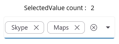
In multiple selection mode, SelectedValue is a collection of values derived from SelectedItems based on SelectedValuePath (for example, a list of SocialMedia.ID values for the selected items).
<StackLayout>
    <Label Text="SelectedValue count:" />
    <Label x:Name="selectedValue" />

    <editors:SfComboBox x:Name="comboBox"
                        TextMemberPath="Name"
                        DisplayMemberPath="Name"
                        ItemsSource="{Binding SocialMedias}"
                        SelectionMode="Multiple"
                        SelectedValuePath="ID"
                        SelectedValue="{Binding SelectedValueList}"
                        SelectionChanged="OnSelectionChanged">
        <editors:SfComboBox.BindingContext>
            <local:SocialMediaViewModel />
        </editors:SfComboBox.BindingContext>
    </editors:SfComboBox>
</StackLayout>
SocialMediaViewModel socialMediaViewModel = new SocialMediaViewModel();
SfComboBox comboBox = new SfComboBox
{
ItemsSource = socialMediaViewModel.SocialMedias,
TextMemberPath = "Name",
DisplayMemberPath = "Name",
SelectionMode = ComboBoxSelectionMode.Multiple,
SelectedValuePath = "ID",
BindingContext = socialMediaViewModel,
};
comboBox.SelectionChanged += OnSelectionChanged;
Label selectedValue = new Label
{
Text = string.Empty
};
Content = new StackLayout
{
Children =
{
new Label { Text = "SelectedValue count:" },
selectedValue,
comboBox,
},
};// ViewModel
public class SocialMediaViewModel
{
public ObservableCollection<SocialMedia> SocialMedias { get; set; }
public ObservableCollection<object> SelectedValueList { get; set; }
public SocialMediaViewModel()
{
this.SocialMedias = new ObservableCollection<SocialMedia>
{
new SocialMedia { Name = "Facebook", ID = 0 },
new SocialMedia { Name = "Google Plus", ID = 1 },
new SocialMedia { Name = "Instagram", ID = 2 },
new SocialMedia { Name = "LinkedIn", ID = 3 },
new SocialMedia { Name = "Skype", ID = 4 },
new SocialMedia { Name = "Telegram", ID = 5 },
new SocialMedia { Name = "Twitter", ID = 6 },
new SocialMedia { Name = "WhatsApp", ID = 7 },
new SocialMedia { Name = "YouTube", ID = 8 }
};
SelectedValueList = new ObservableCollection<object>
{
SocialMedias[4].ID,
SocialMedias[6].ID,
};
}
}
public class SocialMedia
{
public string Name { get; set; }
public int ID { get; set; }
}The SelectionChanged event can be handled in C# as follows:
private void OnSelectionChanged(object sender, SelectionChangedEventArgs e)
{
    if(comboBox != null && comboBox.SelectedValue is IList<object> value)
    {
        selectedValue.Text = value.Count.ToString();
    }
}
The following image illustrates the result of the above code:
If
SelectedValuePathis not specified,SelectedValueis the same asSelectedItem(single mode) orSelectedItems(multiple mode).
Open or close the drop-down programmatically
The drop-down can be opened or closed programmatically by setting the IsDropDownOpen bool property. The default value is false.
<editors:SfComboBox x:Name="comboBox"
                    IsEditable="True"
                    ItemsSource="{Binding SocialMedias}"
                    IsDropDownOpen = "True";
                    DisplayMemberPath="Name"
                    TextMemberPath="Name">
</editors:SfComboBox>
SfComboBox comboBox = new SfComboBox
{
IsEditable = true,
ItemsSource = socialMediaViewModel.SocialMedias,
IsDropDownOpen = true,
DisplayMemberPath = "Name",
TextMemberPath = "Name"
};// ViewModel
public class SocialMediaViewModel
{
public ObservableCollection<SocialMedia> SocialMedias { get; set; }
public SocialMediaViewModel()
{
this.SocialMedias = new ObservableCollection<SocialMedia>
{
new SocialMedia { Name = "Facebook", ID = 0 },
new SocialMedia { Name = "Google Plus", ID = 1 },
new SocialMedia { Name = "Instagram", ID = 2 },
new SocialMedia { Name = "LinkedIn", ID = 3 },
new SocialMedia { Name = "Skype", ID = 4 },
new SocialMedia { Name = "Telegram", ID = 5 },
new SocialMedia { Name = "Twitter", ID = 6 },
new SocialMedia { Name = "WhatsApp", ID = 7 },
new SocialMedia { Name = "YouTube", ID = 8 }
};
}
}
public class SocialMedia
{
public string Name { get; set; }
public int ID { get; set; }
}Clear selected items
Use the Clear method to remove all selected items and clear the editor text. The snippet assumes comboBox is an instance reference to a SfComboBox in the current scope (for example, a field on the page code-behind).
comboBox.Clear();