Flutter Circular Charts Radial Bar Chart (SfCircularChart)
16 Apr 202622 minutes to read
To create a Flutter radial bar chart quickly, you can check this video.
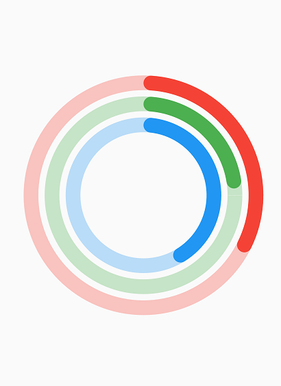
The radial bar chart is used for showing the comparisons among the categories using the circular shapes. To render a radial bar chart, create an instance of RadialBarSeries, and add to the series collection property of SfCircularChart. The following properties can be used to customize the appearance of radial bar segment:
-
opacity- controls the transparency of the chart series. -
strokeWidth- changes the stroke width of the series. -
strokeColor- changes the stroke color of the series. -
pointColorMapper- maps the color for individual points from the data source. -
gap- changes the spacing between two individual segments. The default value of spacing is 1%. -
maximumValue- represents the entire span of an individual circle. The default value of the this property is null. -
pointShaderMapper- maps the shader (gradient or image shader) for individual points from the data source.
@override
    Widget build(BuildContext context) {
        final List<ChartData> chartData = [
            ChartData('David', 25),
            ChartData('Steve', 38),
            ChartData('Jack', 34),
            ChartData('Others', 52)
        ];
        return Scaffold(
            body: Center(
                child: Container(
                    child: SfCircularChart(
                        series: <CircularSeries>[
                            // Renders radial bar chart
                            RadialBarSeries<ChartData, String>(
                                dataSource: chartData,
                                xValueMapper: (ChartData data, _) => data.x,
                                yValueMapper: (ChartData data, _) => data.y
                            )
                        ]
                    )
                )
            )
        );
    }
    class ChartData {
        ChartData(this.x, this.y);
        final String x;
        final double y;
    }
Changing the radial bar size
You can use the radius property to change the diameter of the radial bar chart with respect to the plot area. The default value is 80%.
@override
    Widget build(BuildContext context) {
        return Scaffold(
            body: Center(
                child: Container(
                    child: SfCircularChart(
                        series: <CircularSeries>[
                            RadialBarSeries<ChartData, String>(
                                dataSource: chartData,
                                xValueMapper: (ChartData data, _) => data.x,
                                yValueMapper: (ChartData data, _) => data.y,
                                // Radius of the radial bar
                                radius: '50%'
                            )
                        ]
                    )
                )
            )
        );
    }
Changing the radial bar inner radius
You can change the inner radius of radial bar chart using the innerRadius property with respect to the plot area. The value ranges from 0% to 100%.
@override
    Widget build(BuildContext context) {
        return Scaffold(
            body: Center(
                child: Container(
                    child: SfCircularChart(
                        series: <CircularSeries>[
                            RadialBarSeries<ChartData, String>(
                                dataSource: chartData,
                                xValueMapper: (ChartData data, _) => data.x,
                                yValueMapper: (ChartData data, _) => data.y,
                                // Radius of the radial bar's inner circle
                                innerRadius: '80%'
                            )
                        ]
                    )
                )
            )
        );
    }
Rounded corners
The cornerStyle property specifies the corner type for radial bar chart. The corners can be customized using the CornerStyle.bothFlat, CornerStyle.bothCurve, CornerStyle.startCurve, and CornerStyle.endCurve options. The default value of this property is CornerStyle.bothFlat.
@override
    Widget build(BuildContext context) {
        return Scaffold(
            body: Center(
                child: Container(
                    child: SfCircularChart(
                        series: <CircularSeries>[
                            RadialBarSeries<ChartData, String>(
                                dataSource: chartData,
                                xValueMapper: (ChartData data, _) => data.x,
                                yValueMapper: (ChartData data, _) => data.y,
                                // Corner style of radial bar segment
                                cornerStyle: CornerStyle.bothCurve
                            )
                        ]
                    )
                )
            )
        );
    }
Track customization
The radial bar series renders above the track area. The following properties are used to customize the appearance.
trackColor - changes the color of the track area.
trackBorderColor - changes the stroke color of the track area.
trackBorderWidth - changes the stroke width of the track area.
trackOpacity - specifies the opacity of the track area.
useSeriesColor - uses the point color for filling the track area.
@override
    Widget build(BuildContext context) {
        final List<ChartData> chartData = [
            ChartData(1924, 90, '100%', Colors.blue),
            ChartData(1925, 50, '100%', Colors.green),
            ChartData(1926, 70, '100%', Colors.red),
        ];
        return Scaffold(
            body: Center(
                child: Container(
                    child: SfCircularChart(
                        series:  <RadialBarSeries<ChartData, int>>[
                            RadialBarSeries<ChartData, int>(
                                useSeriesColor: true,
                                trackOpacity: 0.3,
                                cornerStyle: CornerStyle.bothCurve,
                                dataSource: chartData,
                                pointRadiusMapper: (ChartData data, _) => data.text,
                                pointColorMapper: (ChartData data, _) => data.color,
                                xValueMapper: (ChartData sales, _) => sales.x,
                                yValueMapper: (ChartData sales, _) => sales.y,
                            )
                        ]
                    )
                )
            )
        );
    }
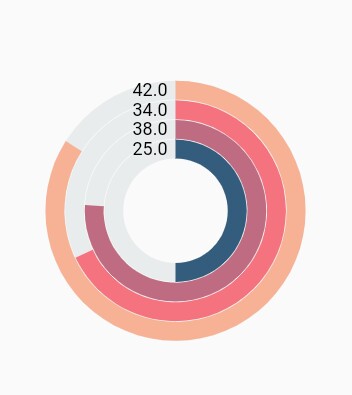
Rendering data labels
Data labels can be enabled using the isVisible property of dataLabelSettings. The appearance of label can be customized using the following properties:
-
color- changes the label background color. -
textStyle- changes the text color, size, font family, fontStyle, and font weight. -
color- changes the color of the text. -
fontFamily- changes the font family for chart title. -
fontStyle- changes the font style for the chart title. -
fontSize- changes the font size for the chart title. -
opacity- controls the transparency of the label background color. -
borderRadius- customizes the data label border radius. -
angle- rotates the labels. -
borderWidth- changes the stroke width of the data label shape. -
borderColor- changes the stroke color of the data label shape. -
useSeriesColor- uses the series color for filling the data label shape.
@override
    Widget build(BuildContext context) {
        return Scaffold(
            body: Center(
                child: Container(
                    child: SfCircularChart(
                        series: <CircularSeries>[
                            RadialBarSeries<ChartData, String>(
                                dataSource: chartData,
                                xValueMapper: (ChartData data, _) => data.x,
                                yValueMapper: (ChartData data, _) => data.y,
                                dataLabelSettings: DataLabelSettings(
                                    // Renders the data label
                                    isVisible: true
                                )
                            )
                        ]
                    )
                )
            )
        );
    }
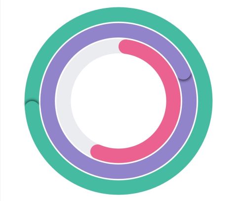
Overfilled radial bar
The overfilled radial bar is a graphical representation of the exit value of the radial bar.
For example, if you set the maximum value of the radial bar to 100% but the given data is more than the maximum value it shows the extra value as an overfilled.
@override
    Widget build(BuildContext context) {
      final List<_ChartData> chartData = <_ChartData>[
        _ChartData('Low', 3500, const Color.fromRGBO(235, 97, 143, 1)),
        _ChartData('Average', 7200, const Color.fromRGBO(145, 132, 202, 1)),
        _ChartData('High', 10500, const Color.fromRGBO(69, 187, 161, 1)),
      ];
      return Scaffold(
          body: Center(
              child: Container(
                  child: SfCircularChart(
                      series: <CircularSeries<_ChartData, String>>[
            RadialBarSeries<_ChartData, String>(
                maximumValue: 6000,
                radius: '100%',
                gap: '3%',
                dataSource: chartData,
                cornerStyle: CornerStyle.bothCurve,
                xValueMapper: (_ChartData data, _) => data.x,
                yValueMapper: (_ChartData data, _) => data.y,
                pointColorMapper: (_ChartData data, _) => data.color)
          ]))));
    }