Flutter Circular Charts Doughnut Chart (SfCircularChart)
16 Apr 202624 minutes to read
To create a Flutter doughnut chart quickly, you can check this video.
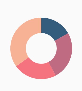
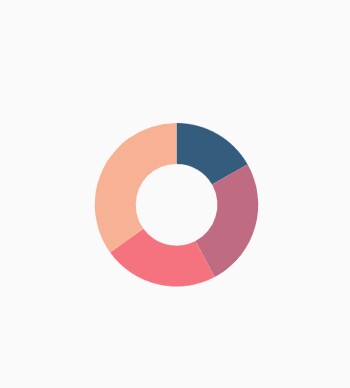
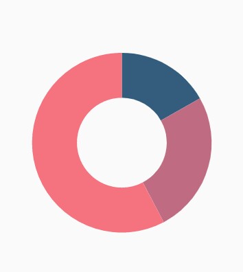
To render a doughnut chart, create an instance of DoughnutSeries, and add it to the series collection property of SfCircularChart. The following properties can be used to customize the appearance of doughnut segment:
-
opacity- controls the transparency of the chart series. -
strokeWidth- changes the stroke width of the series. -
strokeColor- changes the stroke color of the series. -
pointColorMapper- maps the color for individual points from the data source. -
pointShaderMapper- maps the shader (gradient or image shader) for individual points from the data source. -
pointRenderMode- defines the painting mode for the data points either as segment or gradient.
@override
    Widget build(BuildContext context) {
        final List<ChartData> chartData = [
            ChartData('David', 25, Color.fromRGBO(9,0,136,1)),
            ChartData('Steve', 38, Color.fromRGBO(147,0,119,1)),
            ChartData('Jack', 34, Color.fromRGBO(228,0,124,1)),
            ChartData('Others', 52, Color.fromRGBO(255,189,57,1))
        ];
        return Scaffold(
            body: Center(
                child: Container(
                    child: SfCircularChart(
                        series: <CircularSeries>[
                            // Renders doughnut chart
                            DoughnutSeries<ChartData, String>(
                                dataSource: chartData,
                                pointColorMapper:(ChartData data,  _) => data.color,
                                xValueMapper: (ChartData data, _) => data.x,
                                yValueMapper: (ChartData data, _) => data.y
                            )
                        ]
                    )
                )
            )
        );
    }

    class ChartData {
        ChartData(this.x, this.y, this.color);
            final String x;
            final double y;
            final Color color;
    }
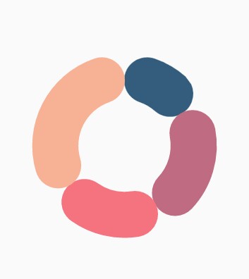
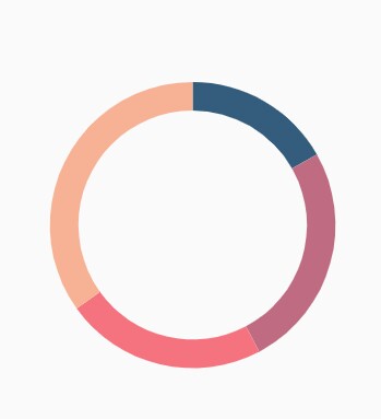
Rounded corners
The cornerStyle property specifies the corner type for doughnut chart. The corners can be customized using the CornerStyle.bothFlat, CornerStyle.bothCurve, CornerStyle.startCurve, and CornerStyle.endCurve options. The default value of this property is CornerStyle.bothFlat.
@override
    Widget build(BuildContext context) {
        return Scaffold(
            body: Center(
                child: Container(
                    child: SfCircularChart(
                        series: <CircularSeries>[
                            DoughnutSeries<ChartData, String>(
                                dataSource: chartData,
                                xValueMapper: (ChartData data, _) => data.x,
                                yValueMapper: (ChartData data, _) => data.y,
                                // Corner style of doughnut segment
                                cornerStyle: CornerStyle.bothCurve
                            )
                        ]
                    )
                )
            )
        );
    }
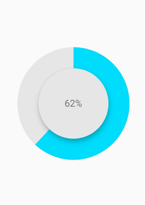
Doughnut with center elevation
You can use the Annotations property in charts, to provide center elevation text in doughnut charts as shown below:
@override
    Widget build(BuildContext context) {
        return Scaffold(
            body: Center(
                child: Container(
                    child: SfCircularChart(
                        annotations: <CircularChartAnnotation>[
                         CircularChartAnnotation(
                           widget: Container(
                             child: PhysicalModel(
                              child: Container(),
                                shape: BoxShape.circle,
                                elevation: 10,
                                shadowColor: Colors.black,
                                color: const Color.fromRGBO(230, 230, 230, 1)))),
                                CircularChartAnnotation(
                                  widget: Container(
                                  child: const Text('62%',
                                 style: TextStyle(
                                color: Color.fromRGBO(0, 0, 0, 0.5), fontSize: 25))))
                                   ],
                        series: <CircularSeries>[
                            DoughnutSeries<ChartData, String>(
                                dataSource: chartData,
                                xValueMapper: (ChartData data, _) => data.x,
                                yValueMapper: (ChartData data, _) => data.y,
                                // Radius of doughnut
                                radius: '50%'
                            )
                        ]
                    )
                )
            )
        );
    }
Doughnut with color mapping
You can use the pointColorMapper property to provide different color mappings to the doughnut charts as shown below:
@override
    Widget build(BuildContext context) {
        return Scaffold(
            body: Center(
                child: Container(
                    child: SfCircularChart(
                        series: <CircularSeries>[
                            DoughnutSeries<ChartData, String>(
                                dataSource: chartData,
                                xValueMapper: (ChartData data, _) => data.x,
                                yValueMapper: (ChartData data, _) => data.y,
                                pointColorMapper: (ChartSampleData data, _) => data.pointColor,
                                // Radius of doughnut
                                radius: '50%'
                            )
                        ]
                    )
                )
            )
        );
    }
Changing the doughnut size
You can use the radius property to change the diameter of the doughnut chart with respect to the plot area. The default value of this property is 80%.
@override
    Widget build(BuildContext context) {
        return Scaffold(
            body: Center(
                child: Container(
                    child: SfCircularChart(
                        series: <CircularSeries>[
                            DoughnutSeries<ChartData, String>(
                                dataSource: chartData,
                                xValueMapper: (ChartData data, _) => data.x,
                                yValueMapper: (ChartData data, _) => data.y,
                                // Radius of doughnut
                                radius: '50%'
                            )
                        ]
                    )
                )
            )
        );
    }
Changing doughnut inner radius
You can change the inner radius of doughnut chart using the innerRadius property with respect to the plot area. The value ranges from 0% to 100%.
@override
    Widget build(BuildContext context) {
        return Scaffold(
            body: Center(
                child: Container(
                    child: SfCircularChart(
                        series: <CircularSeries>[
                            DoughnutSeries<ChartData, String>(
                                dataSource: chartData,
                                xValueMapper: (ChartData data, _) => data.x,
                                yValueMapper: (ChartData data, _) => data.y,
                                // Radius of doughnut's inner circle
                                innerRadius: '80%'
                            )
                        ]
                    )
                )
            )
        );
    }
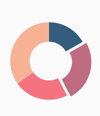
Exploding a segment
You can explode a doughnut segment by enabling the explode property. The following properties are used to customize the explode options:
-
explodeIndex- specifies the index of the slice to explode it at the initial rendering. -
explodeOffset- specifies the offset of exploded slice. The value ranges from 0% to 100%. -
explodeGesture- gesture for activating the explode. Explode can be activated in single tap, double tap, and long press. The available gesture types areActivationMode.singleTap,ActivationMode.doubleTap,ActivationMode.longPress, andActivationMode.none. The default value isActivationMode.singleTap.
@override
    Widget build(BuildContext context) {
        return Scaffold(
            body: Center(
                child: Container(
                    child: SfCircularChart(
                        series: <CircularSeries>[
                            DoughnutSeries<ChartData, String>(
                                dataSource: chartData,
                                xValueMapper: (ChartData data, _) => data.x,
                                yValueMapper: (ChartData data, _) => data.y,
                                // Explode the segments on tap
                                explode: true,
                                explodeIndex: 1
                            )
                        ]
                    )
                )
            )
        );
    }
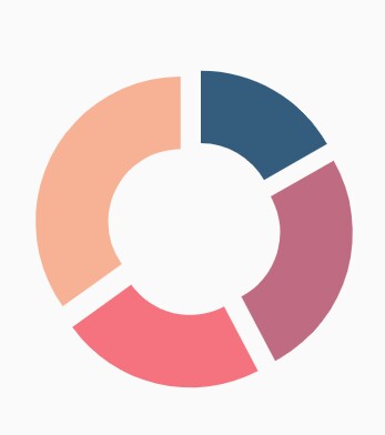
Exploding all the segments
Using the explodeAll property of DoughnutSeries, you can explode all the doughnut segments.
@override
    Widget build(BuildContext context) {
        return Scaffold(
            body: Center(
                child: Container(
                    child: SfCircularChart(
                        series: <CircularSeries>[
                            DoughnutSeries<ChartData, String>(
                                dataSource: chartData,
                                xValueMapper: (ChartData data, _) => data.x,
                                yValueMapper: (ChartData data, _) => data.y,
                                explode: true,
                                // Explode all the segments
                                explodeAll: true
                            )
                        ]
                    )
                )
            )
        );
    }
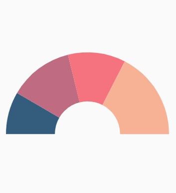
Angle of doughnut
SfCircularChart allows you to render all the data points or segments in semi-pie, quarter-pie, or in any sector using the startAngle and endAngle properties.
@override
    Widget build(BuildContext context) {
        return Scaffold(
            body: Center(
                child: Container(
                    child: SfCircularChart(
                        series: <CircularSeries>[
                            DoughnutSeries<ChartData, String>(
                                dataSource: chartData,
                                xValueMapper: (ChartData data, _) => data.x,
                                yValueMapper: (ChartData data, _) => data.y,
                                // Starting angle of doughnut
                                startAngle: 270,
                                // Ending angle of doughnut
                                endAngle: 90
                            )
                        ]
                    )
                )
            )
        );
    }
Grouping data points
The small segments in the doughnut chart can be grouped into others category using the groupTo and groupMode properties of DoughnutSeries. The groupMode property is used to specify the grouping type based on the actual data point value or by points length, and the groupTo property is used to set the limit to group data points into a single slice. The grouped segment is labeled as Others in legend and toggled as any other segment. The default value of the groupTo property is null, and the default value of groupMode property is CircularChartGroupMode.point.
@override
    Widget build(BuildContext context) {
        return Scaffold(
            body: Center(
                child: Container(
                    child: SfCircularChart(
                        series: <CircularSeries>[
                            DoughnutSeries<ChartData, String>(
                                dataSource: chartData,
                                xValueMapper: (ChartData data, _) => data.x,
                                yValueMapper: (ChartData data, _) => data.y,
                                // Mode of grouping
                                groupMode: CircularChartGroupMode.point,
                                groupTo: 2
                            )
                        ]
                    )
                )
            )
        );
    }
Note: You can refer to our Flutter Doughnut Chart feature tour page for its groundbreaking feature representations.