Flutter Circular Charts Legend (SfCircularChart)
16 Apr 202623 minutes to read
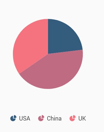
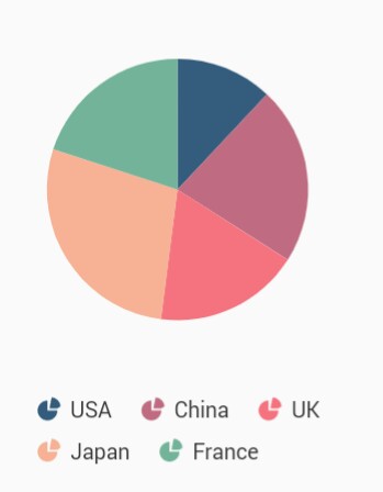
The legend contains list of data points in chart. The information provided in each legend item helps to identify the corresponding data points in chart.
@override
    Widget build(BuildContext context) {
      final List<ChartData> chartData = [
        ChartData('USA', 20),
        ChartData('China', 35),
        ChartData('UK', 38),
      ];
      return Scaffold(
        body: Center(
          child: Container(
              child:SfCircularChart(
                // Enables the legend
                legend: Legend(isVisible: true),
                series: <CircularSeries>[
                  PieSeries<ChartData, String>(
                    dataSource: chartData,
                    xValueMapper: (ChartData data, _) => data.x,
                    yValueMapper: (ChartData data, _) => data.y
                  )
                ]
              )
            )
          )
        );
      }
      class ChartData {
        ChartData(this.x, this.y);
        final String x;
        final double? y;
      }
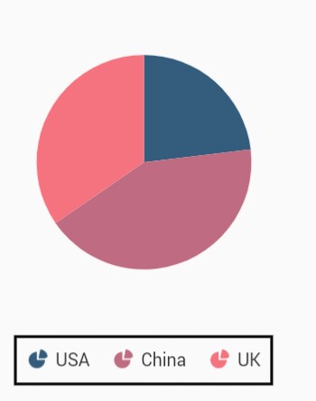
Customizing legend
The name property of CircularSeries is used to define the label for the corresponding series legend item and for CircularSeries type chart by default values mapped with xValueMapper will be displayed. The appearance of the label can be customized using the below properties.
-
borderWidth- used to change the stroke width of the legend shape. -
borderColor- used to change the stroke color of the legend shape. -
backgroundColor- used to change the background color of legend shape. -
opacity- used to control the transparency of the legend icon shape. -
padding- used to add padding between the icon shape and the text. -
iconHeight- used to change the height of the icon shape. -
iconWidth- used to change the width of the icon shape. -
borderWidth- used to change the stroke width of the legend icon shape. -
iconBorderColor- used to change the stroke color of the legend icon shape. -
itemPadding- used to add padding between the first legend text and the second legend icon shape.
@override
    Widget build(BuildContext context) {
      return Scaffold(
        body: Center(
          child: Container(
            child:SfCircularChart(
              legend: Legend(
                isVisible: true,
                // Border color and border width of legend
                borderColor: Colors.black,
                borderWidth: 2
              ),
              series: <CircularSeries>[
                PieSeries<ChartData, String>(
                  dataSource: chartData,
                  xValueMapper: (ChartData data, _) => data.x,
                  yValueMapper: (ChartData data, _) => data.y
                )
              ]
            )
          )
        )
      );
    }
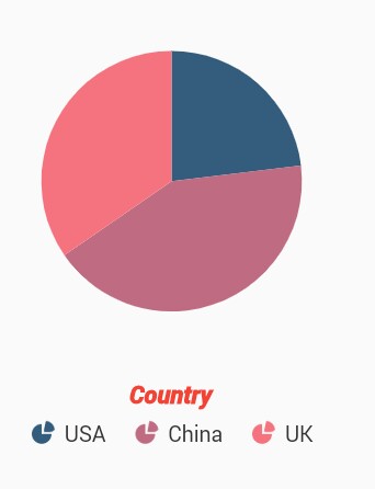
Legend title
The following properties can be used to define and customize the title of legend.
-
text- used to change the text of the title. -
textStyle- used to change the text color, size, font family, fontStyle, and font weight. -
color- used to change the color of the text. -
fontFamily- used to change the font family for legend text. -
fontStyle- used to change the font style for the legend text. -
fontSize- used to change the font size for the legend text. -
alignment- used to change the alignment of the title text. It can be near, center, or far.
@override
    Widget build(BuildContext context) {
      return Scaffold(
        body: Center(
            child: Container(
                child:SfCircularChart(
                legend: Legend(
                    isVisible: true,
                    // Legend title
                    title: LegendTitle(
                      text:'Country',
                      textStyle: TextStyle(
                      color: Colors.red,
                      fontSize: 15,
                      fontStyle: FontStyle.italic,
                      fontWeight: FontWeight.w900
                    )
                  )
                ),
                series: <CircularSeries>[
                  PieSeries<ChartData, String>(
                    dataSource: chartData,
                    xValueMapper: (ChartData data, _) => data.x,
                    yValueMapper: (ChartData data, _) => data.y
                )
              ]
            )
          )
        )
      );
    }
Toggles the series visibility
You can control the visibility of the series by tapping the legend item. You can enable this feature by enabling the toggleSeriesVisibility property.
@override
    Widget build(BuildContext context) {
      return Scaffold(
        body: Center(
          child: Container(
            child:SfCircularChart(
              legend: Legend(
                isVisible: true,
                // Toggles the series visibility on tapping the legend item
                toggleSeriesVisibility: true
              ),
              series: <CircularSeries>[
                PieSeries<ChartData, String>(
                  dataSource: chartData,
                  xValueMapper: (ChartData data, _) => data.x,
                  yValueMapper: (ChartData data, _) => data.y
                )
              ]
            )
          )
        )
      );
    }
Legend visibility
The isVisible property of legend is used to toggle the visibility of legend.
@override
    Widget build(BuildContext context) {
      return Scaffold(
        body: Center(
          child: Container(
            child:SfCircularChart(
              legend: Legend(
                // Visibility of legend
                isVisible: false
              ),
              series: <CircularSeries>[
                PieSeries<ChartData, String>(
                  dataSource: chartData,
                  xValueMapper: (ChartData data, _) => data.x,
                  yValueMapper: (ChartData data, _) => data.y
                )
              ]
            )
          )
        )
      );
    }
Legend overflow
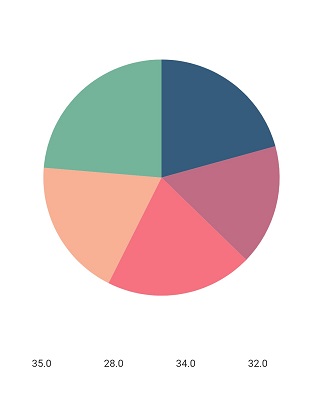
The legend items can be placed in multiple rows or scroll can be enabled using the overflowMode property if size of the total legend items exceeds the available size. The default value of the overflowMode property is LegendItemOverflowMode.scroll.
@override
    Widget build(BuildContext context) {
      return Scaffold(
        body: Center(
          child: Container(
            child: SfCircularChart(
              legend: Legend(
                isVisible: true,
                // Overflowing legend content will be wrapped
                overflowMode: LegendItemOverflowMode.wrap
              ),
              series: <CircularSeries>[
                PieSeries<ChartData, String>(
                  dataSource: chartData,
                  xValueMapper: (ChartData data, _) => data.x,
                  yValueMapper: (ChartData data, _) => data.y
                )
              ]
            )
          )
        )
      );
    }
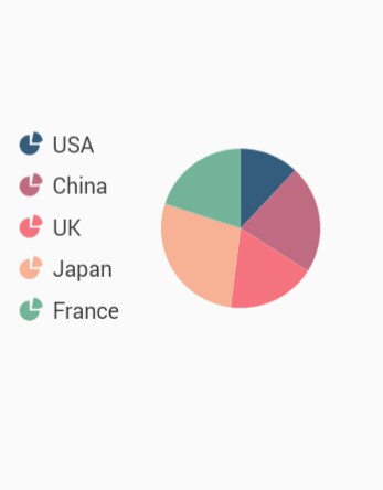
Positioning the legend
You can change the position of the legend inside the chart. The following properties are used to customize the position of legend. LegendPosition.auto position will place the legend at the right, if the chart’s width is greater than the chart’s height. Else the legend will be placed at the bottom position.
-
position- used to position the legend relatively. The available options are auto, bottom, left, right, and top. Defaults toLegendPosition.auto. -
orientation- used to change the orientation of the legend, the default value isLegendItemOrientation.auto. Also you can set this toLegendItemOrientation.horizontalorLegendItemOrientation.vertical.
@override
    Widget build(BuildContext context) {
      return Scaffold(
        body: Center(
          child: Container(
            child: SfCircularChart(
              legend: Legend(
                isVisible: true,
                // Legend will be placed at the left
                position: LegendPosition.left
              ),
              series: <CircularSeries>[
                PieSeries<ChartData, String>(
                  dataSource: chartData,
                  xValueMapper: (ChartData data, _) => data.x,
                  yValueMapper: (ChartData data, _) => data.y
                ),
              ]
            )
          )
        )
      );
    }
Floating legend
Places the legend in custom position. If the offset has been set, the legend is moved from its actual position. For example, if the position is LegendPosition.top, then the legend will be placed in the top but in the position added to the actual top position.
Also, the legend will not take a dedicated position for it and will be drawn on the top of the chart’s plot area.
@override
    Widget build(BuildContext context) {
      return Scaffold(
        body: Center(
          child: Container(
            child: SfCircularChart(
              legend: Legend(
                isVisible: true,
                // Legend will placed at the specified offset
                offset: Offset(20, 40)),
              series: <PieSeries>[
              PieSeries<ChartData, String>(
                dataSource: chartData,
                xValueMapper: (ChartData data, _) => data.x,
                yValueMapper: (ChartData data, _) => data.y),
              ]
            )
          )
        )
      );
    }

    class ChartData {
        ChartData(this.x, this.y);
        final String x;
        final double? y;
    }
Legend item template
You can customize the appearance of legend items with your template by using legendItemBuilder property of legend. Here you can specify the content that needs to be displayed in the legend text as widget.
@override
    Widget build(BuildContext context) {
      return Scaffold(
        body: Center(
          child: Container(
            child: SfCircularChart(
              legend: Legend(
                isVisible: true,
                // Templating the legend item
                legendItemBuilder: (String name, dynamic series, dynamic point, int index) {
                  return Container(
                    height: 20,
                    width: 10,
                    child: Container(child: Text(point.y.toString()))
                  );
                }
              ),
              series: <CircularSeries>[
                PieSeries<ChartData, String>(
                  dataSource: chartData,
                  xValueMapper: (ChartData data, _) => data.x,
                  yValueMapper: (ChartData data, _) => data.y
                )
              ]
            )
          )
        )
      );
    }