Container Type in Xamarin Text Input Layout (SfTextInputLayout)
22 Jan 20244 minutes to read
Containers improve the discoverability of input view by creating a contrast between the input view and assistive elements.
Filled
The background of the input view will be filled with container color, and its stroke (at the bottom edge) color and thickness will be changed based on its states. It can be enabled by setting the ContainerType property to Filled.
<inputLayout:SfTextInputLayout
    Hint="Name"
    ContainerType="Filled">
    <Entry Text="John" />
</inputLayout:SfTextInputLayout>
var inputLayout = new SfTextInputLayout();
inputLayout.Hint = "Name";
inputLayout.ContainerType = ContainerType.Filled;
inputLayout.InputView = new Entry() { Text = "John" };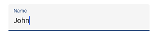
Outlined
When setting the ContainerType property to Outlined, the container will be covered with a rounded-corner border.
<inputLayout:SfTextInputLayout
    Hint="Name"
    ContainerType="Outlined">
    <Entry Text="John" />
</inputLayout:SfTextInputLayout>
var inputLayout = new SfTextInputLayout();
inputLayout.Hint = "Name";
inputLayout.ContainerType = ContainerType.Outlined;
inputLayout.InputView = new Entry() { Text = "John" };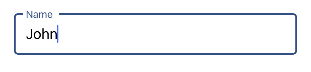
Customize the corner radius of the outline border
When setting the OutlineCornerRadius property to double value, the corner radius of the container will be changed.
<inputLayout:SfTextInputLayout
    Hint="Name"
    ContainerType="Outlined"
    OutlineCornerRadius="8">
    <Entry />
</inputLayout:SfTextInputLayout>
var inputLayout = new SfTextInputLayout();
inputLayout.Hint = "Name";
inputLayout.ContainerType = ContainerType.Outlined;
inputLayout.OutlineCornerRadius = 8;
inputLayout.InputView = new Entry();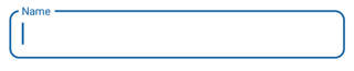
NOTE
It is applicable for the outline border when setting the container type to outlined.
Custom Padding
Spaces around the input view can be customized by setting the InputViewPadding property to thickness value.
<inputLayout:SfTextInputLayout
    Hint="Name"
    InputViewPadding="5"
    ContainerType="Outlined"
    HelperText="Enter your name">
    <Entry />
 </inputLayout:SfTextInputLayout>
var inputLayout = new SfTextInputLayout();
inputLayout.Hint = "Name";
inputLayout.InputViewPadding = new Thickness(5);
inputLayout.ContainerType = ContainerType.Outlined;
inputLayout.HelperText = "Enter your name";
inputLayout.InputView = new Entry();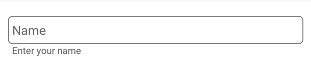
See Also
None
When setting the ContainerType property to None, the container will have empty background and enough spacing.
<inputLayout:SfTextInputLayout
    Hint="Name"
    ContainerType="None">
    <Entry Text="John" />
</inputLayout:SfTextInputLayout>
var inputLayout = new SfTextInputLayout();
inputLayout.Hint = "Name";
inputLayout.ContainerType = ContainerType.None;
inputLayout.InputView = new Entry() { Text = "John" };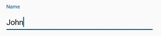
See also
How to create a rounded corner SfTextInputLayout
How to reduce the inner padding of SfTextInputLayout
How to customize the color of border and labels in SfTextInputLayout