Assistive Labels in Xamarin Text Input Layout (SfTextInputLayout)
11 Sep 20233 minutes to read
Assistive labels provide additional information about text entered in the input view controls.
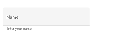
Helper text
Helper text conveys additional guidance about the input field such as how it will be used. It can be set using the HelperText property.
<inputLayout:SfTextInputLayout
  Hint="Name"
  HelperText="Enter your name">
  <Entry />
</inputLayout:SfTextInputLayout>
var inputLayout = new SfTextInputLayout();
inputLayout.Hint = "Name";
inputLayout.HelperText = "Enter your name";
inputLayout.InputView = new Entry();The visibility of the helper text can be disabled by setting the ShowHelperText property to false. By default, it is set to true.
Error message
When the text input is not accepted, an error message will display instructions to fix it. Error messages will be displayed below the input line till entering the correct text. It can be set using the ErrorText property, but it will be displayed only when the HasError property is set to true.
<inputLayout:SfTextInputLayout
    Hint="Email"
    HelperText="Enter your email address"
    ErrorText="Invalid email"
    HasError="true">
    <Entry />
</inputLayout:SfTextInputLayout>
var inputLayout = new SfTextInputLayout();
inputLayout.Hint = "Email";
inputLayout.HelperText = "Enter your email address";
inputLayout.ErrorText = "Invalid email";
inputLayout.HasError = true;
inputLayout.InputView = new Entry();
NOTE
Error validations should be done in the application level.
Character counter
Character counter is used when you need to limit the characters. Character limit can be set using the CharMaxLength property. The character counter can be enabled by setting the ShowCharCount property to true.
<inputLayout:SfTextInputLayout
    Hint="Password"
    ShowCharCount="true"
    CharMaxLength="8"
    HelperText="Enter 5 to 8 characters">
    <Entry />
</inputLayout:SfTextInputLayout>
var inputLayout = new SfTextInputLayout();
inputLayout.Hint = "Password";
inputLayout.CharMaxLength = 8;
inputLayout.ShowCharCount = true;
inputLayout.HelperText = "Enter 5 to 8 characters";
inputLayout.InputView = new Entry();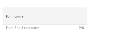
NOTE
When character count reaches the maximum character length, the error color will be applied to hint, border, and counter label.
Reserve spaces for assistive labels
The reserved spaces for assistive labels can be removed by setting the ReserveSpaceForAssistiveLabels property to false.
<inputLayout:SfTextInputLayout
            ContainerType="Outlined"
            Hint="Name"
            ReserveSpaceForAssistiveLabels="False">
            <Entry />
</inputLayout:SfTextInputLayout>
var inputLayout = new SfTextInputLayout();
inputLayout.Hint = "Name";
inputLayout.ContainerType = ContainerType.Outlined;
inputLayout.ReserveSpaceForAssistiveLabels = false;
inputLayout.InputView = new Entry();
See also
How to remove the space at the bottom of SfTextInputLayout
How to apply LineBreakMode for labels in SfTextInputLayout
How to customize the color of border and labels in SfTextInputLayout