States and Colors in Xamarin Text Input Layout (SfTextInputLayout)
24 Sep 20218 minutes to read
Based on the states, the colors will be applied to the hint labels and borders. So, when the input view is in focused state, the focused color will be applied; it is similar to other states also. The current hint color or active color can be obtained from the CurrentActiveColor property.
NOTE
Since error is not a state, the error color will not be set to CurrentActiveColor when HasError property is set to
true.
Focused color
When the input view is focused, the FocusedColor property value will be applied to the hint label and border.
IMPORTANT
Cursor color of the input view will be same as the
Accentcolor of the application in each platform.
<inputLayout:SfTextInputLayout
    Hint="User name"
    FocusedColor="#00AFA0"
    HelperText="Enter your name"
    <Entry Text="John" />
</inputLayout:SfTextInputLayout>
var inputLayout = new SfTextInputLayout();
inputLayout.Hint = "User name";
inputLayout.FocusedColor = Color.FromHex("#00AFA0");
inputLayout.ErrorText = "User name available";
inputLayout.InputView = new Entry() { Text = "John" };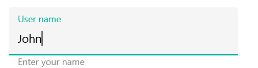
Unfocused color
When the input view is unfocused, the UnfocusedColor property value will be applied to the hint label and border.
NOTE
Thickness of the border will also vary between the focused and unfocused states.
<inputLayout:SfTextInputLayout
    Hint="User name"
    UnfocusedColor="Silver"
    HelperText="User name available">
    <Entry Text="John" />
</inputLayout:SfTextInputLayout>
var inputLayout = new SfTextInputLayout();
inputLayout.Hint = "User name";
inputLayout.UnfocusedColor = Color.Silver;
inputLayout.ErrorText = "User name available";
inputLayout.InputView = new Entry() { Text = "John" };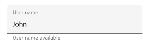
Error color
The error color can also be customized by setting the ErrorColor property.
<inputLayout:SfTextInputLayout
    Hint="Name"
    ErrorColor="#B00020"
    ErrorText="Should not contain special characters"
    HasError="true">
    <Entry Text="John/" />
</inputLayout:SfTextInputLayout>
var inputLayout = new SfTextInputLayout();
inputLayout.Hint = "Name";
inputLayout.ErrorColor = Color.FromHex("#B00020");
inputLayout.ErrorText = "Should not contain special characters";
inputLayout.HasError = true;
inputLayout.InputView = new Entry() { Text = "John/" };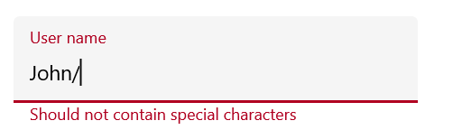
Container color
The color of the container can be customized by setting the ContainerBackgroundColor property. It is applicable when the ContainerType property is set to Filled and Outlined.
Filled
The color of the container is customized when the ContainerType is Filled.
<inputLayout:SfTextInputLayout
    Hint="Name"
    FocusedColor="#0450C2"
    ContainerType="Filled"
    ContainerBackgroundColor="#E6EEF9">
    <Entry Text="John" />
</inputLayout:SfTextInputLayout>
var inputLayout = new SfTextInputLayout();
inputLayout.Hint = "Name";
inputLayout.FocusedColor = Color.FromHex("#0450C2");
inputLayout.ContainerBackgroundColor = Color.FromHex("#E6EEF9");
inputLayout.ContainerType = ContainerType.Filled;
inputLayout.InputView = new Entry() { Text = "John" };
Outlined
The color of the container is customized when the ContainerType is Outlined.
<inputLayout:SfTextInputLayout
    Hint="Name"
    FocusedColor="#0450C2"
    ContainerType="Outlined"
    ContainerBackgroundColor="#E6EEF9">
    <Entry Text="John" />
</inputLayout:SfTextInputLayout>
var inputLayout = new SfTextInputLayout();
inputLayout.Hint = "Name";
inputLayout.ContainerType = ContainerType.Outlined;
inputLayout.FocusedColor = Color.FromHex("#0450C2");
inputLayout.ContainerBackgroundColor = Color.FromHex("#E6EEF9");
inputLayout.InputView = new Entry() { Text = "John" };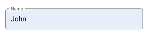
Disabled state
The text input layout is disabled by setting the IsEnabled property to false. The color of the container and other UI elements will also be changed to the disabled state, but its color cannot be customized.
<inputLayout:SfTextInputLayout
    Hint="Name"
    IsEnabled="false">
    <Entry />
</inputLayout:SfTextInputLayout>
var inputLayout = new SfTextInputLayout();
inputLayout.Hint = "Name";
inputLayout.IsEnabled = false;
inputLayout.InputView = new Entry();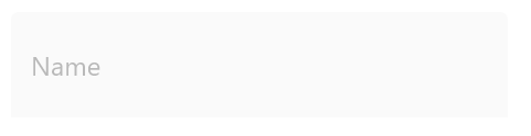
Customizing the text color of label
You can customize the text color of the hint label, counter label, helper label and error label using the Color property of the LabelStyle.
<inputLayout:SfTextInputLayout
    Hint="Name" ContainerType="Outlined" HelperText="Enter your name"
    ErrorText="Invalid text" ErrorColor="#B00020"
    ShowCharCount="true" CharMaxLength="3">

    <inputLayout:SfTextInputLayout.HintLabelStyle>
        <inputLayout:LabelStyle Color="Green"/>
    </inputLayout:SfTextInputLayout.HintLabelStyle>
    <inputLayout:SfTextInputLayout.HelperLabelStyle>
        <inputLayout:LabelStyle Color="Blue"/>
    </inputLayout:SfTextInputLayout.HelperLabelStyle>
    <inputLayout:SfTextInputLayout.CounterLabelStyle>
        <inputLayout:LabelStyle Color="Brown"/>
    </inputLayout:SfTextInputLayout.CounterLabelStyle>
    <inputLayout:SfTextInputLayout.ErrorLabelStyle>
        <inputLayout:LabelStyle Color="Maroon"/>
    </inputLayout:SfTextInputLayout.ErrorLabelStyle>

    <Entry Text="John" />

</inputLayout:SfTextInputLayout>
SfTextInputLayout inputLayout = new SfTextInputLayout();
inputLayout.Hint = "Name";
inputLayout.ContainerType = ContainerType.Outlined;
inputLayout.HelperText = "Enter your name";
inputLayout.ErrorColor = Color.FromHex("#B00020");
inputLayout.CharMaxLength = 3;
inputLayout.ShowCharCount = true;
inputLayout.ErrorText = "Invalid text";
inputLayout.InputView = new Entry();
inputLayout.HintLabelStyle = new LabelStyle() { Color = Color.Green };
inputLayout.HelperLabelStyle = new LabelStyle() { Color = Color.Blue };
inputLayout.CounterLabelStyle = new LabelStyle() { Color = Color.Brown };
inputLayout.ErrorLabelStyle = new LabelStyle() { Color = Color.Maroon };
this.Content = inputLayout;
See also
How to validate with required verification in SfTextInputLayout
How to change the cursor color in SfTextInputLayout
How to customize the color of border and labels in SfTextInputLayout