Custom Icons in Xamarin Text Input Layout (SfTextInputLayout)
1 Jul 20226 minutes to read
Any custom icons can be added to the leading edge or the trailing edge of input view in the text input layout control. The events and commands related to the custom icons should be handled at the application level.
Unicode or font icons for the labels can be displayed as icons.
NOTE
Refer to the following links to learn more about font icons:
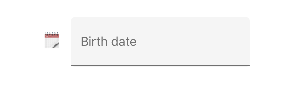
Leading view
A label can be added as a leading icon for the input view by setting the LeadingView property. It can be positioned either inside or outside the container by setting the LeadingViewPosition property. By default, it is positioned Outside.
<inputLayout:SfTextInputLayout
Hint="Birth date"
LeadingViewPosition="Inside" >
<Entry />
<inputLayout:SfTextInputLayout.LeadingView>
<Label
Text="🗓">
</Label>
</inputLayout:SfTextInputLayout.LeadingView>
</inputLayout:SfTextInputLayout>var inputLayout = new SfTextInputLayout();
inputLayout.Hint = "Birth date";
inputLayout.LeadingViewPosition = ViewPosition.Inside;
inputLayout.LeadingView = new Label() { Text = "\U0001F5D3" };
inputLayout.InputView = new Entry();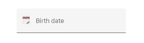
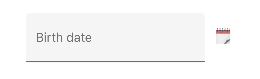
Trailing view
A label can be added as a trailing icon for the input view by setting the TrailingView property. It can be positioned either inside or outside the container of input view by setting the TrailingViewPosition property. By default, it is positioned Inside.
<inputLayout:SfTextInputLayout
Hint="Birth date"
TrailingViewPosition="Outside">
<Entry />
<inputLayout:SfTextInputLayout.TrailingView>
<Label
Text="🗓">
</Label>
</inputLayout:SfTextInputLayout.TrailingView>
</inputLayout:SfTextInputLayout>var inputLayout = new SfTextInputLayout();
inputLayout.Hint = "Birth date";
inputLayout.TrailingViewPosition = ViewPosition.Outside;
inputLayout. TrailingView = new Label() { Text = "\U0001F5D3" };
inputLayout.InputView = new Entry();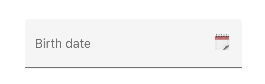
Leading and trailing view customization
The height and width of the leading and trailing view’s direct child can be customized inside the text input layout. The leading and trailing view’s height can be customized up to 48px, but there is no limit on width.
<inputLayout:SfTextInputLayout Padding="15"
                                 Hint="Password"
                                 TrailingViewPosition="Inside"
                                 EnablePasswordVisibilityToggle="false">
   <Entry />
   <inputLayout:SfTextInputLayout.TrailingView>
      <border:SfBorder WidthRequest="130"
                       CornerRadius="20"
                       HeightRequest="30"
                       BackgroundColor="#00619e">
        <Label TextColor="White"
               VerticalTextAlignment="Center"
               HorizontalTextAlignment="Center"
               Text="Show password"/>
      </border:SfBorder>
   </inputLayout:SfTextInputLayout.TrailingView>
   </inputLayout:SfTextInputLayout>
var inputLayout = new SfTextInputLayout();
var border = new SfBorder();
var label = new Label();
inputLayout.Hint = "Password";
inputLayout.EnablePasswordVisibilityToggle = false;
border.WidthRequest = 130;
border.HeightRequest = 30;
border.CornerRadius = 20;
border.BackgroundColor = Color.FromHex("#00619e");
label.TextColor= Color.White;
label.VerticalTextAlignment = TextAlignment.Center;
label.HorizontalTextAlignment = TextAlignment.Center;
label.Text = "Show password";
border.Content = label;
inputLayout.TrailingView = border;
inputLayout.InputView = new Entry();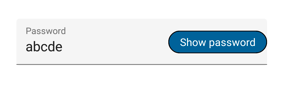
Leading and trailing view visibility customization
The ShowLeadingView and ShowTrailingView properties in SfTextInputLayout can be used to control the visibility of the leading and trailing views respectively.
<inputLayout:SfTextInputLayout
Hint="Birth date"
ContainerType="Outlined"
ShowLeadingView="False"
ShowTrailingView="False" >
<Entry />
<inputLayout:SfTextInputLayout.LeadingView>
<Label
Text="🗓">
</Label>
</inputLayout:SfTextInputLayout.LeadingView>
<inputLayout:SfTextInputLayout.TrailingView>
<Label
Text="🗓">
</Label>
</inputLayout:SfTextInputLayout.TrailingView>
</inputLayout:SfTextInputLayout>var inputLayout = new SfTextInputLayout();
inputLayout.Hint = "Birth date";
inputLayout.LeadingView = new Label() { Text = "\U0001F5D3" };
inputLayout.TrailingView = new Label() { Text = "\U0001F5D3" };
inputLayout.InputView = new Entry();
inputLayout.ContainerType = ContainerType.Outlined;
inputLayout.ShowLeadingView = false;
inputLayout.ShowTrailingView = false;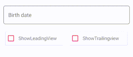