Chart Types in SfChart
29 Nov 202224 minutes to read
Line Chart
To render a line chart, create an instance of SFLineSeries and add to the Series collection property of SFChart. You can use the following properties to customize the appearance.
-
Color– used to change the color of the line. -
Alpha- used to control the transparency of the chart series. -
LineWidth– used to change the width of the line.
SFChart chart = new SFChart();
...

SFLineSeries lineSeries = new SFLineSeries()
{
    ItemsSource = Data,
    XBindingPath = "Year",
    YBindingPath = "Value"
};
chart.Series.Add(lineSeries);
Dashed Lines
Dashes property of the SFLineSeries is used to render line series with dashes.
SFLineSeries series = new SFLineSeries ();
series.ItemsSource = Data;
series.XBindingPath = "XValue";
series.YBindingPath = "YValue";

NSObject[] dashes       = new NSObject[2];
dashes [0]              = (NSNumber)2;
dashes [1]              = (NSNumber)3;
series.Dashes           = NSArray.FromObjects (dashes);
chart.Series.Add(series);
Stacked Line Chart
To render a stacked line chart, create an instance of SFStackingLineSeries and add to the Series collection property of SFChart. You can use the following properties to customize the stacked line appearance.
-
Color– used to change the color of the line. -
Alpha- used to control the transparency of the chart series. -
LineWidth– used to change the width of the line.
SFChart chart = new SFChart();
...

SFStackingLineSeries stackingLineSeries1 = new SFStackingLineSeries()
{
    ItemsSource = Data1,
    XBindingPath = "XValue",
    YBindingPath = "YValue"
};

SFStackingLineSeries stackingLineSeries2 = new SFStackingLineSeries()
{
    ItemsSource = Data2,
    XBindingPath = "XValue",
    YBindingPath = "YValue"
};

SFStackingLineSeries stackingLineSeries3 = new SFStackingLineSeries()
{
    ItemsSource = Data3,
    XBindingPath = "XValue",
    YBindingPath = "YValue"
};

SFStackingLineSeries stackingLineSeries4 = new SFStackingLineSeries()
{
    ItemsSource = Data4,
    XBindingPath = "XValue",
    YBindingPath = "YValue"
};

chart.Series.Add(stackingLineSeries1);
chart.Series.Add(stackingLineSeries2);
chart.Series.Add(stackingLineSeries3);
chart.Series.Add(stackingLineSeries4);
Dashed Lines
Dashes property of the SFStackingLineSeries is used to render stacking line series with dashes.
SFStackingLineSeries series1 = new SFStackingLineSeries ();
series1.ItemsSource = Data1;
series1.XBindingPath = "XValue";
series1.YBindingPath = "YValue";

NSObject[] dashes       = new NSObject[2];
dashes [0]              = (NSNumber)13;
dashes [1]              = (NSNumber)4;
series1.Dashes           = NSArray.FromObjects (dashes);
chart.Series.Add(series1);

SFStackingLineSeries series2 = new SFStackingLineSeries ();
series2.ItemsSource = Data2;
series2.XBindingPath = "XValue";
series2.YBindingPath = "YValue";

NSObject[] dashes       = new NSObject[2];
dashes [0]              = (NSNumber)13;
dashes [1]              = (NSNumber)4;
series2.Dashes           = NSArray.FromObjects (dashes);
chart.Series.Add(series2);

SFStackingLineSeries series3 = new SFStackingLineSeries ();
series3.ItemsSource = Data3;
series3.XBindingPath = "XValue";
series3.YBindingPath = "YValue";

NSObject[] dashes       = new NSObject[2];
dashes [0]              = (NSNumber)13;
dashes [1]              = (NSNumber)4;
series3.Dashes           = NSArray.FromObjects (dashes);
chart.Series.Add(series3);

SFStackingLineSeries series4 = new SFStackingLineSeries ();
series4.ItemsSource = Data4;
series4.XBindingPath = "XValue";
series4.YBindingPath = "YValue";

NSObject[] dashes       = new NSObject[2];
dashes [0]              = (NSNumber)13;
dashes [1]              = (NSNumber)4;
series4.Dashes           = NSArray.FromObjects (dashes);
chart.Series.Add(series4);
100% Stacked Line Chart
To render a 100% stacked line chart, create an instance of SFStackingLine100Series and add to the Series collection property of SFChart. You can use the following properties to customize the 100% stacked line appearance.
-
Color– used to change the color of the line. -
Alpha- used to control the transparency of the chart series. -
LineWidth– used to change the width of the line. -
Dashes- used to render the dashes of the stacking line series.
SFChart chart = new SFChart();
...

SFStackingLine100Series stackingLine100Series1 = new SFStackingLine100Series()
{
    ItemsSource = Data1,
    XBindingPath = "XValue",
    YBindingPath = "YValue"
};

SFStackingLine100Series stackingLine100Series2 = new SFStackingLine100Series()
{
    ItemsSource = Data2,
    XBindingPath = "XValue",
    YBindingPath = "YValue"
};

SFStackingLine100Series stackingLine100Series3 = new SFStackingLine100Series()
{
    ItemsSource = Data3,
    XBindingPath = "XValue",
    YBindingPath = "YValue"
};

SFStackingLine100Series stackingLine100Series4 = new SFStackingLine100Series()
{
    ItemsSource = Data4,
    XBindingPath = "XValue",
    YBindingPath = "YValue"
};

chart.Series.Add(stackingLine100Series1);
chart.Series.Add(stackingLine100Series2);
chart.Series.Add(stackingLine100Series3);
chart.Series.Add(stackingLine100Series4);
Area Chart
To render an area chart, create an instance of SFAreaSeries and add to the Series collection property of SFChart. You can use the following properties to customize the appearance.
-
Color– used to change the color of the series. -
Alpha- used to control the transparency of the chart series. -
BorderWidth– used to change the border width of the series. -
BorderColor– used to change the border color of the series.
SFChart chart = new SFChart();
...

SFAreaSeries areaSeries = new SFAreaSeries()
{
    ItemsSource = Data,
    XBindingPath = "Year",
    YBindingPath = "Value"
};
chart.Series.Add(areaSeries);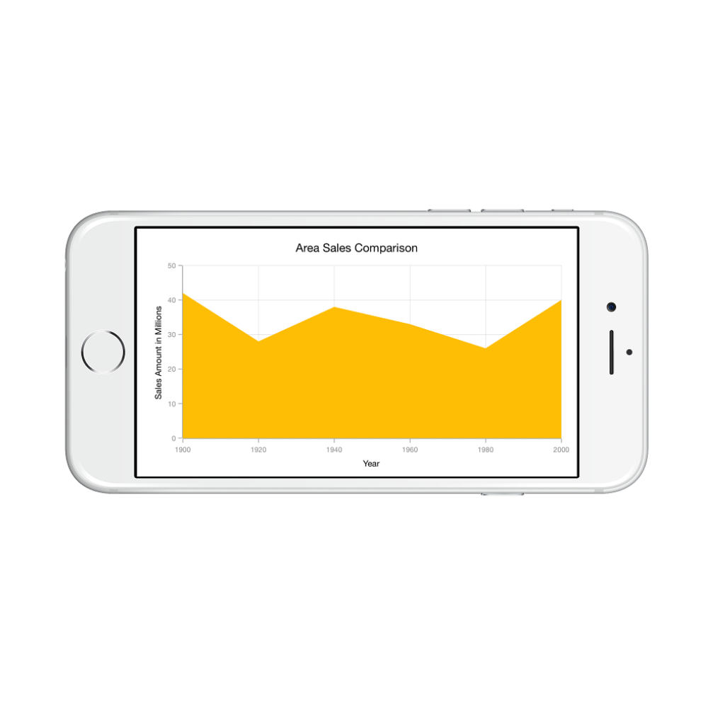
Spline Area Chart
To render a spline area chart, create an instance of SFSplineAreaSeries and add to the Series collection property of SFChart. You can use the following properties to customize the spline area appearance.
-
Color– used to change the color of the series. -
Alpha- used to control the transparency of the chart series. -
BorderWidth– used to change the border width of the series. -
BorderColor– used to change the border color of the series.
SFChart chart = new SFChart();
...

SFSplineAreaSeries splineAreaSeries = new SFSplineAreaSeries()
{
    ItemsSource = Data,
    XBindingPath = "Year",
    YBindingPath = "Value"
};
chart.Series.Add(splineAreaSeries);
Spline area series types
SplineType allows you to change the spline area curve in series.
The following types are used in SFSplineAreaSeries as
By default SplineType value is Natural.
The following code shows how to set the SplineType value as Cardinal
SFChart chart = new SFChart();
...

SFSplineAreaSeries splineAreaSeries = new SFSplineAreaSeries()
{
    ItemsSource = Data,
    XBindingPath = "Year",
    YBindingPath = "Value",
    SplineType = SplineType.Cardinal
};
chart.Series.Add(splineAreaSeries);
Step Area Chart
To render a step area chart, create an instance of SFStepAreaSeries and add to the Series collection property of SFChart. You can use the following properties to customize the step area appearance.
-
Color– used to change the color of the series. -
Alpha- used to control the transparency of the chart series. -
BorderWidth– used to change the border width of the series. -
BorderColor– used to change the border color of the series.
SFChart chart = new SFChart();
...
SFStepAreaSeries stepAreaSeries = new SFStepAreaSeries()
{
ItemsSource = Data,
XBindingPath = "Year",
YBindingPath = "Value"
};
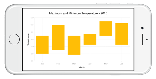
chart.Series.Add(stepAreaSeries);Range Area Chart
To render a range area chart, create an instance of SFRangeAreaSeries and add to the Series collection property of SFChart.
Since the SFRangeAreaSeries requires two Y values for a point, your data should contain HighValues and LowValues. High and Low value specifies the maximum and minimum range of the point.
SFChart chart = new SFChart();
...

SFRangeAreaSeries rangeAreaSeries = new SFRangeAreaSeries()
{
    ItemsSource = Data,
    XBindingPath = "Month",
    High = "Value1",
    Low = "Value2"
};
chart.Series.Add(rangeAreaSeries);
Following properties are used to customize the range area segment appearance,
-
Color– used to change the color of the series. -
Alpha- used to control the transparency of the chart series. -
BorderWidth– used to change the border width of the series. -
BorderColor– used to change the border color of the series.
Stacked Area Chart
To render a stacked area chart, create an instance of SFStackingAreaSeries and add to the Series collection property of SFChart. You can use the following properties to customize the stacked area appearance.
-
Color– used to change the color of the series. -
Alpha- used to control the transparency of the chart series. -
BorderWidth– used to change the border width of the series. -
BorderColor– used to change the border color of the series.
SFChart chart = new SFChart();
...

SFStackingAreaSeries stackingAreaSeries1 = new SFStackingAreaSeries()
{
    ItemsSource = Data1,
    XBindingPath = "Year",
    YBindingPath = "Value"
};

SFStackingAreaSeries stackingAreaSeries2 = new SFStackingAreaSeries()
{
    ItemsSource = Data2,
    XBindingPath = "Year",
    YBindingPath = "Value"
};

SFStackingAreaSeries stackingAreaSeries3 = new SFStackingAreaSeries()
{
    ItemsSource = Data3,
    XBindingPath = "Year",
    YBindingPath = "Value"
};

chart.Series.Add(stackingAreaSeries1);
chart.Series.Add(stackingAreaSeries2);
chart.Series.Add(stackingAreaSeries3);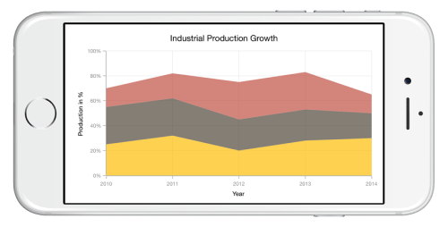
100% Stacked Area Chart
To render a 100% stacked area chart, create an instance of SFStackingArea100Series and add to the Series collection property of SFChart. You can use the following properties to customize the 100% stacked area appearance.
-
Color– used to change the color of the series. -
Alpha- used to control the transparency of the chart series. -
BorderWidth– used to change the border width of the series. -
BorderColor– used to change the border color of the series.
SFChart chart = new SFChart();
...

SFStackingArea100Series stackingAreaSeries1 = new SFStackingArea100Series()
{
    ItemsSource = Data1,
    XBindingPath = "Year",
    YBindingPath = "Value"
};

SFStackingArea100Series stackingAreaSeries2 = new SFStackingArea100Series()
{
    ItemsSource = Data2,
    XBindingPath = "Year",
    YBindingPath = "Value"
};

SFStackingArea100Series stackingAreaSeries3 = new SFStackingArea100Series()
{
    ItemsSource = Data3,
    XBindingPath = "Year",
    YBindingPath = "Value"
};

chart.Series.Add(stackingAreaSeries1);
chart.Series.Add(stackingAreaSeries2);
chart.Series.Add(stackingAreaSeries3);
Spline Range Area Chart
To render a Spline range Area chart, create an instance of SplineRangeAreaSeries and add to the series collection of SfChart.
Since the SplineRangeAreaSeries requires two Y values for a point, your data should contain high and low values. High and low value specifies the maximum and minimum range of the point.
Following properties are used to customize the spline range area segment appearance,
-
Color– used to change the color of the series. -
Alpha- used to control the transparency of the chart series. -
BorderWidth– used to change the stroke width of the series. -
BorderColor– used to change the stroke color of the series.
[C#]

SfChart chart = new SfChart();
...

SFSplineRangeAreaSeries splineRangeAreaSeries = new SFSplineRangeAreaSeries()
{
	ItemsSource = Data,
	XBindingPath = "XValue",
	High = "High",
	Low = "Low"
};
chart.Series.Add(splineRangeAreaSeries);
Column Chart
To render a column chart, create an instance of SFColumnSeries and add to the Series collection property of SFChart. You can use the following properties to customize the appearance.
-
Color– used to change the color of the series. -
Alpha- used to control the transparency of the chart series. -
BorderWidth– used to change the border width of the series. -
BorderColor– used to change the border color of the series. -
CornerRadius- used to add the rounded corners to the rectangle. TheTopLeft,TopRight,BottomLeftandBottomRightofChartCornerRadiusproperties are used to set the radius value for each corner. -
DataMarkerPosition- used to position the data marker atBottom, Top and Center of the rectangle. -
Spacing- used to change the spacing between two segments. The default value of spacing is 0, and the value ranges from 0 to 1. Here, 1 and 0 correspond to 100% and 0% of the available space, respectively. -
Width- used to change the width of the rectangle. The default value of the width is 0.8, and the value ranges from 0 to 1. Here, 1 and 0 correspond to 100% and 0% of the available width, respectively.
SFChart chart = new SFChart();
...

SFColumnSeries columnSeries = new SFColumnSeries()
{
    ItemsSource = Data,
    XBindingPath = "Country",
    YBindingPath = "Value"
};
chart.Series.Add(columnSeries);
Overlapped placement
By default, all the column series which has the same x and y axes are placed side by side in a chart. If you want place the series one over the other (overlapped), set the SideBySideSeriesPlacement property of SFChart to false and configure the Width property to differentiate the series. The following code snippet and screenshot illustrate the overlapped placement of column series.
SFChart chart = new SFChart()
{
    SideBySideSeriesPlacement = false
};

SFColumnSeries series1 = new SFColumnSeries()
 {
    ItemsSource = view.Data1,
    XBindingPath = "Year",
    YBindingPath = "Medals"
 };
 SFColumnSeries series2 = new SFColumnSeries()
 {
    ItemsSource = view.Data2,
    XBindingPath = "Year",
    YBindingPath = "Medals",
    Width="0.5"
 };

chart.Series.Add(series1);
chart.Series.Add(series2);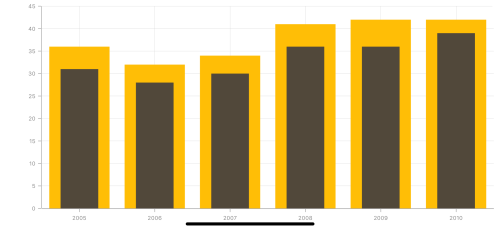
Histogram Chart
To render a histogram chart, create an instance of SFHistogramSeries, and add it to the Series collection property of SFChart.
Histogram chart provides a visual display of large amount of data that are difficult to understand in a tabular or data grid form.
You can customize intervals using the Interval property and collapse the normal distribution curve using the ShowNormalDistributionCurve property. You can use the following properties to customize the appearance.
-
Color– used to change the color of the series. -
StrokeWidth– used to change the stroke width of the series. -
StrokeColor– used to change the stroke color of the series. -
CurveColor– used to change the color of the normal distribution curve.
SFChart chart = new SFChart();
...

SFHistogramSeries histogramSeries = new SFHistogramSeries()
{
    ItemsSource = Data,
    XBindingPath = "XValue",
    YBindingPath = "YValue",
    Interval = 20
};
chart.Series.Add(histogramSeries);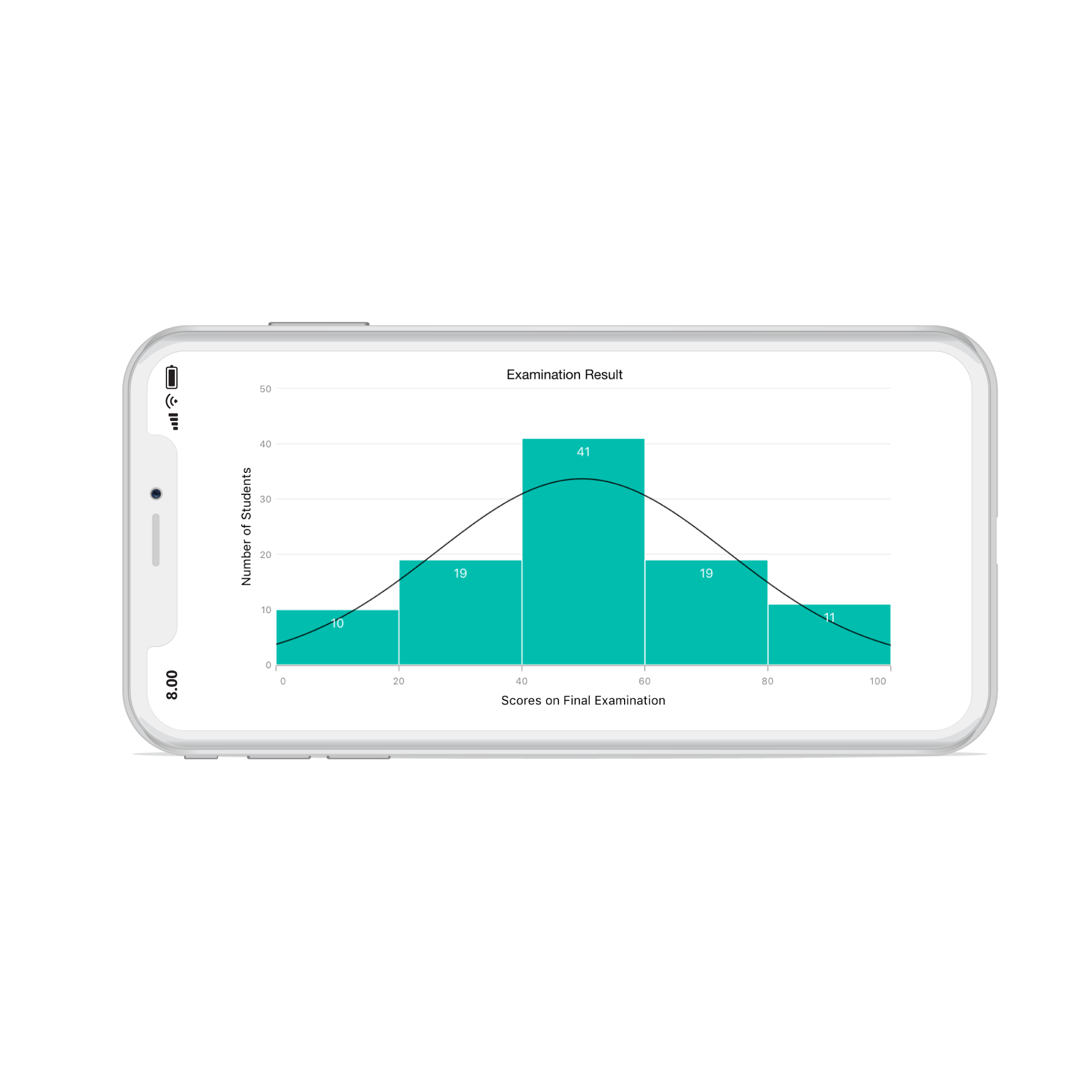
Range Column Chart
To render a range column chart, create an instance of SFRangeColumnSeries and add to the Series collection property of SFChart.
Since the SFRangeColumnSeries requires two Y values for a point, your data should contain high and low values. High and low value specifies the maximum and minimum range of the point.
SFChart chart = new SFChart();
...

SFRangeColumnSeries rangeColumnSeries = new SFRangeColumnSeries()
{
    ItemsSource = Data,
    XBindingPath = "Month",
    High = "Value1",
    Low = "Value2"
};
chart.Series.Add(rangeColumnSeries);
Following properties are used to customize the range column segment appearance,
-
Color– used to change the color of the series. -
Alpha- used to control the transparency of the chart series. -
BorderWidth– used to change the border width of the series. -
BorderColor– used to change the border color of the series. -
CornerRadius- used to add the rounded corners to the rectangle. TheTopLeft,TopRight,BottomLeftandBottomRightofChartCornerRadiusproperties are used to set the radius value for each corner. -
Spacing- used to change the spacing between two segments. The default value of spacing is 0, and the value ranges from 0 to 1. Here, 1 and 0 correspond to 100% and 0% of the available space, respectively. -
Width- used to change the width of the rectangle. The default value of the width is 0.8, and the value ranges from 0 to 1. Here, 1 and 0 correspond to 100% and 0% of the available width, respectively.
Stacked Column Chart
To render a stacked column chart, create an instance of SFStackingColumnSeries and add to the Series collection property of SFChart. You can use the following properties to customize the stacked column segment appearance.
-
Color– used to change the color of the series. -
Alpha- used to control the transparency of the chart series. -
BorderWidth– used to change the border width of the series. -
BorderColor– used to change the border color of the series. -
CornerRadius- used to add the rounded corners to the rectangle. TheTopLeft,TopRight,BottomLeftandBottomRightofChartCornerRadiusproperties are used to set the radius value for each corner. -
DataMarkerPosition- used to position the data marker at bottom, top and center of the rectangle. -
Spacing- used to change the spacing between two segments. The default value of spacing is 0, and the value ranges from 0 to 1. Here, 1 and 0 correspond to 100% and 0% of the available space, respectively. -
Width- used to change the width of the rectangle. The default value of the width is 0.8, and the value ranges from 0 to 1. Here, 1 and 0 correspond to 100% and 0% of the available width, respectively.
SFChart chart = new SFChart();
...

SFStackingColumnSeries stackingColumnSeries1 = new SFStackingColumnSeries()
{
    ItemsSource = Data1,
    XBindingPath = "Month",
    YBindingPath = "Value"
};

SFStackingColumnSeries stackingColumnSeries2 = new SFStackingColumnSeries()
{
    ItemsSource = Data2,
    XBindingPath = "Month",
    YBindingPath = "Value"
};

SFStackingColumnSeries stackingColumnSeries3 = new SFStackingColumnSeries()
{
    ItemsSource = Data3,
    XBindingPath = "Month",
    YBindingPath = "Value"
};

chart.Series.Add(stackingColumnSeries1);
chart.Series.Add(stackingColumnSeries2);
chart.Series.Add(stackingColumnSeries3);
100% Stacked Column Chart
To render a 100% stacked column chart, create an instance of SFStackingColumn100Series and add to the Series collection property of SFChart. You can use the following properties to customize the series appearance.
-
Color– used to change the color of the series. -
Alpha- used to control the transparency of the chart series. -
BorderWidth– used to change the border width of the series. -
BorderColor– used to change the border color of the series. -
CornerRadius- used to add the rounded corners to the rectangle. TheTopLeft,TopRight,BottomLeftandBottomRightofChartCornerRadiusproperties are used to set the radius value for each corner. -
DataMarkerPosition- used to position the data marker at bottom, top and center of the rectangle. -
Spacing- used to change the spacing between two segments. The default value of spacing is 0, and the value ranges from 0 to 1. Here, 1 and 0 correspond to 100% and 0% of the available space, respectively. -
Width- used to change the width of the rectangle. The default value of the width is 0.8, and the value ranges from 0 to 1. Here, 1 and 0 correspond to 100% and 0% of the available width, respectively.
SFChart chart = new SFChart();
...

SFStackingColumn100Series stackingColumn100Series1 = new SFStackingColumn100Series()
{
    ItemsSource = Data1,
    XBindingPath = "Month",
    YBindingPath = "Value"
};

SFStackingColumn100Series stackingColumn100Series2 = new SFStackingColumn100Series()
{
    ItemsSource = Data2,
    XBindingPath = "Month",
    YBindingPath = "Value"
};

SFStackingColumn100Series stackingColumn100Series3 = new SFStackingColumn100Series()
{
    ItemsSource = Data3,
    XBindingPath = "Month",
    YBindingPath = "Value"
};

chart.Series.Add(stackingColumn100Series1);
chart.Series.Add(stackingColumn100Series2);
chart.Series.Add(stackingColumn100Series3);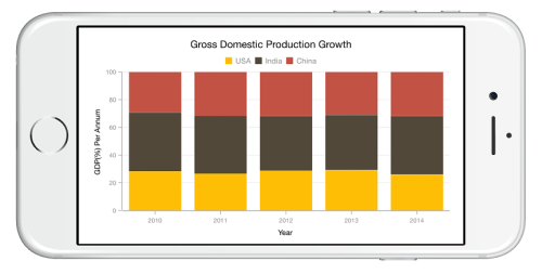
Bar Chart
To render a bar chart, create an instance of SFBarSeries and add to the Series collection property of SFChart. You can use the following properties to customize the bar segment appearance.
-
Color– used to change the color of the series. -
Alpha- used to control the transparency of the chart series. -
BorderWidth– used to change the border width of series. -
BorderColor– used to change the border color of the series. -
CornerRadius- used to add the rounded corners to the rectangle. TheTopLeft,TopRight,BottomLeftandBottomRightofChartCornerRadiusproperties are used to set the radius value for each corner. -
DataMarkerPosition- used to position the data marker at bottom, top and center of the rectangle. -
Spacing- used to change the spacing between two segments. The default value of spacing is 0, and the value ranges from 0 to 1. Here, 1 and 0 correspond to 100% and 0% of the available space, respectively. -
Width- used to change the width of the rectangle. The default value of the width is 0.8, and the value ranges from 0 to 1. Here, 1 and 0 correspond to 100% and 0% of the available width, respectively.
SFChart chart = new SFChart();
...

SFBarSeries barSeries = new SFBarSeries ()
{
    ItemsSource = Data,
    XBindingPath = "Year",
    YBindingPath = "Value"
};
chart.Series.Add(barSeries);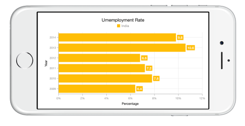
Stacked Bar Chart
To render a stacked bar chart, create an instance of SFStackingBarSeries and add to the Series collection property of SFChart. You can use the following properties to customize the stacked bar segment appearance.
-
Color– used to change the color of the series. -
Alpha- used to control the transparency of the chart series. -
BorderWidth– used to change the border width of the series. -
BorderColor– used to change the border color of the series. -
CornerRadius- used to add the rounded corners to the rectangle. TheTopLeft,TopRight,BottomLeftandBottomRightofChartCornerRadiusproperties are used to set the radius value for each corner. -
DataMarkerPosition- used to position the data marker at bottom, top and center of the rectangle. -
Spacing- used to change the spacing between two segments. The default value of spacing is 0, and the value ranges from 0 to 1. Here, 1 and 0 correspond to 100% and 0% of the available space, respectively. -
Width- used to change the width of the rectangle. The default value of the width is 0.8, and the value ranges from 0 to 1. Here, 1 and 0 correspond to 100% and 0% of the available width, respectively.
SFChart chart = new SFChart();
...

SFStackingBarSeries stackingBarSeries1 = new SFStackingBarSeries()
{
    ItemsSource = Data1,
    XBindingPath = "Month",
    YBindingPath = "Value"
};

SFStackingBarSeries stackingBarSeries2 = new SFStackingBarSeries()
{
    ItemsSource = Data2,
    XBindingPath = "Month",
    YBindingPath = "Value"
};

SFStackingBarSeries stackingBarSeries3 = new SFStackingBarSeries()
{
    ItemsSource = Data3,
    XBindingPath = "Month",
    YBindingPath = "Value"
};

chart.Series.Add(stackingBarSeries1);
chart.Series.Add(stackingBarSeries2);
chart.Series.Add(stackingBarSeries3);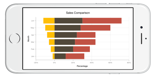
100% Stacked Bar Chart
To render a 100% stacked bar chart, create an instance of SFStackingBar100Series and add to the Series collection property of SFChart. You can use the following properties to customize the series appearance.
-
Color– used to change the color of the series. -
Alpha- used to control the transparency of the chart series. -
BorderWidth– used to change the border width of the series. -
BorderColor– used to change the border color of the series. -
CornerRadius- used to add the rounded corners to the rectangle. TheTopLeft,TopRight,BottomLeftandBottomRightofChartCornerRadiusproperties are used to set the radius value for each corner. -
DataMarkerPosition- used to position the data marker at bottom, top and center of the rectangle. -
Spacing- used to change the spacing between two segments. The default value of spacing is 0, and the value ranges from 0 to 1. Here, 1 and 0 correspond to 100% and 0% of the available space, respectively. -
Width- used to change the width of the rectangle. The default value of the width is 0.8, and the value ranges from 0 to 1. Here, 1 and 0 correspond to 100% and 0% of the available width, respectively.
SFChart chart = new SFChart();
...

SFStackingBar100Series stackingBar100Series1 = new SFStackingBar100Series()
{
    ItemsSource = Data1,
    XBindingPath = "Year",
    YBindingPath = "Value"
};

SFStackingBar100Series stackingBar100Series2 = new SFStackingBar100Series()
{
    ItemsSource = Data2,
    XBindingPath = "Year",
    YBindingPath = "Value"
};

SFStackingBar100Series stackingBar100Series3 = new SFStackingBar100Series()
{
    ItemsSource = Data3,
    XBindingPath = "Year",
    YBindingPath = "Value"
};

chart.Series.Add(stackingBar100Series1);
chart.Series.Add(stackingBar100Series2);
chart.Series.Add(stackingBar100Series3);
Spline Chart
To render a spline chart, create an instance of SFSplineSeries and add to the Series collection property of SFChart. You can use the following properties to customize the spline segment appearance.
-
Color– used to change the color of the series. -
Alpha- used to control the transparency of the chart series. -
LineWidth– used to change the line width of the series.
SFChart chart = new SFChart();
...

SFSplineSeries splineSeries = new SFSplineSeries()
{
    ItemsSource = Data,
    XBindingPath = "Month",
    YBindingPath = "Value"
};
chart.Series.Add(splineSeries);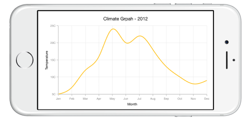
Dashed Lines
Dashes property of the SFSplineSeries is used to render spline series with dashes.
[C#]

SFSplineSeries splineSeries = new SFSplineSeries()
{
    ItemsSource = Data,
    XBindingPath = "Month",
    YBindingPath = "Value"
};

NSObject[] dashes = new NSObject[2];
dashes[0] = (NSNumber)5;
dashes[1] = (NSNumber)6;
splineSeries.Dashes = NSArray.FromObjects(dashes);
chart.Series.Add(splineSeries);
Spline series types
SplineType allows you to change the spline curve in series.
The following types are used in SFSplineSeries as
By default SplineType value is Natural.
The following code shows how to set the SplineType value as Cardinal
SFChart chart = new SFChart();
...

SFSplineSeries splineSeries = new SFSplineSeries()
{
    ItemsSource = Data,
    XBindingPath = "Year",
    YBindingPath = "Value",
    SplineType = SplineType.Cardinal
};
chart.Series.Add(splineAreaSeries);
StepLine Chart
To render a step line chart, create an instance of SFStepLineSeries and add to the Series collection property of SFChart. You can use the following properties to customize the appearance.
-
Color– used to change the color of the line. -
Alpha- used to control the transparency of the chart series. -
LineWidth– used to change the line width of the series.
SFChart chart = new SFChart();
...

SFStepLineSeries stepLine = new SFStepLineSeries()
{
    ItemsSource = Data,
    XBindingPath = "Month",
    YBindingPath = "Value"
};
chart.Series.Add(stepLine);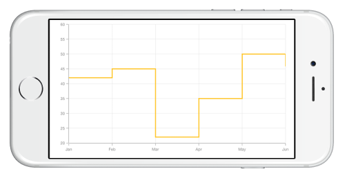
Fast Line Chart
SFFastLineSeries is a line chart, but it loads faster than SFLineSeries. You can use this when there are large number of points to be loaded in chart. To render a fast line chart, create an instance of SFFastLineSeries and add to the Series collection property of SFChart. You can use the following properties to customize the fast line segment appearance.
-
Color– used to change the color of the series. -
Alpha- used to control the transparency of the chart series. -
LineWidth– used to change the line width of the series. -
EnableAntiAliasing- SinceFastLineSeriescan be loaded with a large number of points, the rendering of series should be smooth. This requirement can be achieved by settingEnableAntiAliasingproperty ofFastLineSeriesas false.
SFChart chart = new SFChart();
...

SFFastLineSeries fastLineSeries = new SFFastLineSeries()
{
    ItemsSource = Data,
    XBindingPath = "XValue",
    YBindingPath = "YValue"
};
chart.Series.Add(fastLineSeries);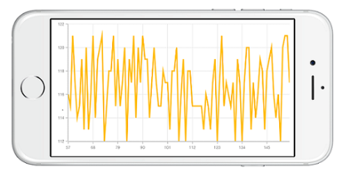
Dashed Lines
Dashes property of the SFFastLineSeries is used to render fast line series with dashes.
SFFastLineSeries series = new SFFastLineSeries ();
series.ItemsSource = Data;
series.XBindingPath = "XValue";
series.YBindingPath = "YValue";

NSObject[] dashes       = new NSObject[2];
dashes [0]              = (NSNumber)2;
dashes [1]              = (NSNumber)3;
series.Dashes           = NSArray.FromObjects (dashes);
chart.Series.Add(series);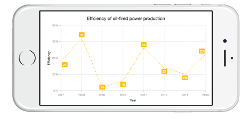
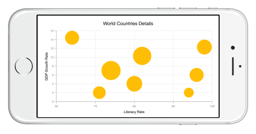
Bubble Chart
To render a bubble chart, create an instance of SFBubbleSeries and add to the Series collection property of SFChart.
Bubble chart requires 3 fields (X, Y and Size) to plot a point. Here Size is used to specify the size of each bubble segment.
SFChart chart = new SFChart();
...

SFBubbleSeries bubbleSeries = new SFBubbleSeries()
{
    ItemsSource = Data,
    XBindingPath = "XValue",
    YBindingPath = "YValue",
    Size = "Size”
};
chart.Series.Add(bubbleSeries);
Following properties are used to customize the bubble segment appearance.
-
Color– used to change the color of the series. -
Alpha- used to control the transparency of the chart series. -
BorderWidth– used to change the border width of the series. -
BorderColor– used to change the border color of the series. -
MinimumRadius– used to change the minimum size of the series. -
MaximumRadius– used to change the maximum size of the series.
Scatter Chart
To render a scatter chart, create an instance of SFScatterSeries and add to the Series collection property of SFChart. You can use the following properties to customize the scatter segment appearance.
-
Color– used to change the color of the series. -
Alpha- used to control the transparency of the chart series. -
BorderWidth– used to change the border width of the series. -
BorderColor– used to change the border color of the series. -
ScatterWidth– used to change the width of the series. -
ScatterHeight– used to change the height of the series. -
ShapeType- used to change the rendering shape of scatter series. The available shapes areCross,Diamond,Ellipse,Hexagon,InvertedTriangle,Pentagon,Plus,RectangleandTriangle.
SFChart chart = new SFChart();
...

SFScatterSeries scatterSeries = new SFScatterSeries()
{
    ShapeType = ChartScatterShapeType.Ellipse,
    ItemsSource = Data,
    XBindingPath = "XValue",
    YBindingPath = "YValue"
};
chart.Series.Add(scatterSeries);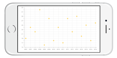
Fast Scatter Chart
The FastScatterSeries is a special kind of scatter series that renders a collection with a huge number of data points. You can use the following properties to customize the appearance of a fast scatter point.
-
Color– used to change the color of series. -
Alpha- used to control the transparency of chart series. -
BorderWidth– used to change the border width of series. -
BorderColor– used to change the border color of series. -
ScatterWidth– used to change the width of series. -
ScatterHeight– used to change the height of series. -
ShapeType- used to change the rendering shape of fast scatter series. The available shapes areCross,Diamond,Ellipse,Hexagon,InvertedTriangle,Pentagon,Plus,RectangleandTriangle. -
EnableAntiAliasing– Enables or disables the smoothness of series. Default value ofEnableAntiAliasingproperty is true.
SFChart chart = new SFChart();
...

SFFastScatterSeries fastScatterSeries = new SFFastScatterSeries()
{
    ScatterHeight = 8,
    ScatterWidth = 8,
    ShapeType = ChartScatterShapeType.Ellipse,
    ItemsSource = Data,
    XBindingPath = "XValue",
    YBindingPath = "YValue"
};
chart.Series.Add(fastScatterSeries);
OHLC Chart
To render an OHLC chart, create an instance of SFOHLCSeries and add to the Series collection property of SFChart.
OHLC chart requires five values XValue, Open, High, Low and Close to plot a point.
SFChart chart = new SFChart();
...

SFOHLCSeries hiLoOpenCloseSeries = new SFOHLCSeries()
{
    ItemsSource = Data,
    XBindingPath = "Year",
    Open = "Value1",
    High = "Value2",
    Low = "Value3",
    Close = "Value4"
};
chart.Series.Add(hiLoOpenCloseSeries);
You can use the following properties to customize the HiLoOpenCloseSeries segment appearance.
-
Color– used to change the color of the series. -
Alpha- used to control the transparency of the chart series. -
LineWidth– used to change the border width of the series. -
Spacing- used to change the spacing between two segments. The default value of spacing is 0, and the value ranges from 0 to 1. Here, 1 and 0 correspond to 100% and 0% of the available space, respectively.
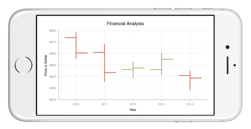
Bull and Bear Color
In OHLC chart, BullFillColor property is used to specify a fill color for the segments that indicates an increase in stock price in the measured time interval and BearFillColor property is used to specify a fill color for the segments that indicates a decrease in stock price in the measured time interval.
SFChart chart = new SFChart();
...

SFOHLCSeries hiLoOpenCloseSeries = new SFOHLCSeries()
{
    ItemsSource = Data,
    XBindingPath = "Year",
    Open = "Value1",
    High = "Value2",
    Low = "Value3",
    Close = "Value4"
    BearFillColor = UIColor.Blue,
    BullFillColor = UIColor.Purple
};
chart.Series.Add(hiLoOpenCloseSeries);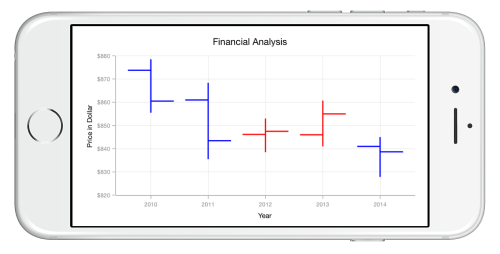
Candle Chart
To render a candle chart, create an instance of SFCandleSeries and add to the Series collection property of SFChart.
Candle chart requires five values XValue, Open, High, Low and Close to plot a point.
SFChart chart = new SFChart();
...

SFCandleSeries candleSeries = new SFCandleSeries()
{
    ItemsSource = Data,
    XBindingPath = "Year",
    Open = "Value1",
    High = "Value2",
    Low = "Value3",
    Close = "Value4"
};
chart.Series.Add(candleSeries);
You can use the following properties to customize the candle segment appearance.
-
Color– used to change the color of the series. -
Alpha- used to control the transparency of the chart series. -
BorderWidth– used to change the border width of the series. -
BorderColor– used to change the border color of the series. -
Spacing- used to change the spacing between two segments. The default value of spacing is 0, and the value ranges from 0 to 1. Here, 1 and 0 correspond to 100% and 0% of the available space, respectively.
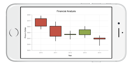
Bull and Bear Color
In Candle chart, BullFillColor property is used to specify a fill color for the segments that indicates an
increase in stock price in the measured time interval and BearFillColor property is used to specify a fill color
for the segments that indicates a decrease in stock price in the measured time interval.
SFCandleSeries candleSeries = new SFCandleSeries()
{
    ItemsSource = Data,
    XBindingPath = "Year",
    Open = "Value1",
    High = "Value2",
    Low = "Value3",
    Close = "Value4"
    BearFillColor = UIColor.Blue,
    BullFillColor = UIColor.Purple
};
chart.Series.Add(candleSeries);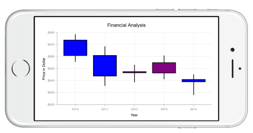
Enable solid candles
In Candle Series, EnableSolidCandles property is used to specify whether the candle segment should be filled or hollow. The default value of this property is false.
SFCandleSeries candleSeries = new SFCandleSeries()
{
ItemsSource = Data,
XBindingPath = "Year",
Open = "Value1",
High = "Value2",
Low = "Value3",
Close = "Value4",
EnableSolidCandles = true
};
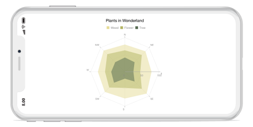
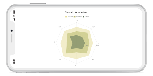
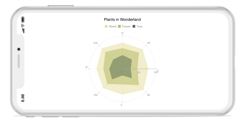
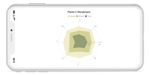
chart.Series.Add(candleSeries);Radar Chart
To render a radar chart, create an instance of SFRadarSeries and add to the Series collection property of SFChart.
Draw type
DrawType property is used to specify the radar series rendering type. Following are the two options you can set to this property,
SFRadarSeries radar = new SFRadarSeries ();
radar.ItemsSource = viewModel.RadarData;
radar.XBindingPath = "Name";
radar.YBindingPath = "Value";
radar.DrawType = SFChartPolarRadarSeriesDrawType.Line;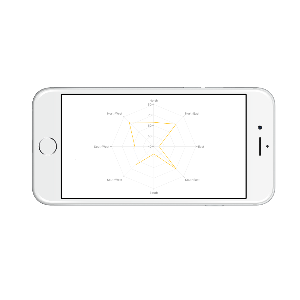
Customize the appearance
You can use the following properties to customize the appearance.
-
Color– used to change the color of the series. -
Alpha- used to control the transparency of the chart series. -
BorderWidth– used to change the border width of the series. -
BorderColor– used to change the border color of the series when draw types is set to area. -
Dashes– used to render lines with dashes when the draw type is set to ‘Line’.
SFRadarSeries radarSeries   = new SFRadarSeries();
radarSeries.Color           = UIColor.Cyan;
radarSeries.BorderWidth     = 3;
radarSeries.BorderColor     = UIColor.Blue;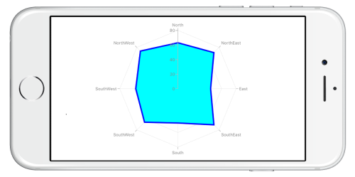
Closed
Closed property is used to determine, whether to connect the first and last data point of the series. By default, the property is set to true.
SFRadarSeries radarSeries   = new SFRadarSeries();
radarSeries.Closed          = false;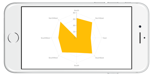
Radar Start Angle for primary axis
The start position of the radar series can be set by using PolarAngle property of axis. Default value of PolarAngle property is Rotate270. PolarAngle property can be set for primary axis, secondary axis, or both axes.
chart.PrimaryAxis = new SFCategoryAxis()
{
    PolarAngle = ChartPolarAngle.Rotate0
};

chart.SecondaryAxis = new SFNumericalAxis();
Radar Start Angle for secondary axis
chart.PrimaryAxis = new SFCategoryAxis();

chart.SecondaryAxis = new SFNumericalAxis()
{
    PolarAngle = ChartPolarAngle.Rotate0
};
Radar Start Angle for both axis
chart.PrimaryAxis  = new SFCategoryAxis()
{
    PolarAngle = ChartPolarAngle.Rotate0
};

chart.SecondaryAxis =  new SFNumericalAxis()
{
    PolarAngle = ChartPolarAngle.Rotate0
};
Polar Chart
To render a polar chart, create an instance of SFPolarSeries and add to the Series collection property of SFChart.
NOTE
You need to set
XBindingPathandYBindingPathproperties, so thatSFChartwould fetch values from the respective properties in the data model to plot the series.
Draw type
DrawType property is used to specify the polar series rendering type. Following are the two options you can set to this property,
SFPolarSeries polarSeries        = new SFPolarSeries();
polarSeries.DrawType             = SFChartPolarRadarSeriesDrawType.Line;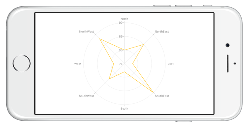
Customize the appearance
You can use the following properties to customize the appearance.
-
Color– used to change the color of the series. -
Alpha- used to control the transparency of the chart series. -
BorderWidth– used to change the border width of the series. -
BorderColor– used to change the border color of the series when draw types is set to area. -
Dashes– used to render lines with dashes when the draw type is set to ‘Line’.
SFPolarSeries polarSeries        = new SFPolarSeries();
polarSeries.Color                = UIColor.Cyan;
polarSeries.BorderWidth          = 3;
polarSeries.BorderColor          = UIColor.Blue;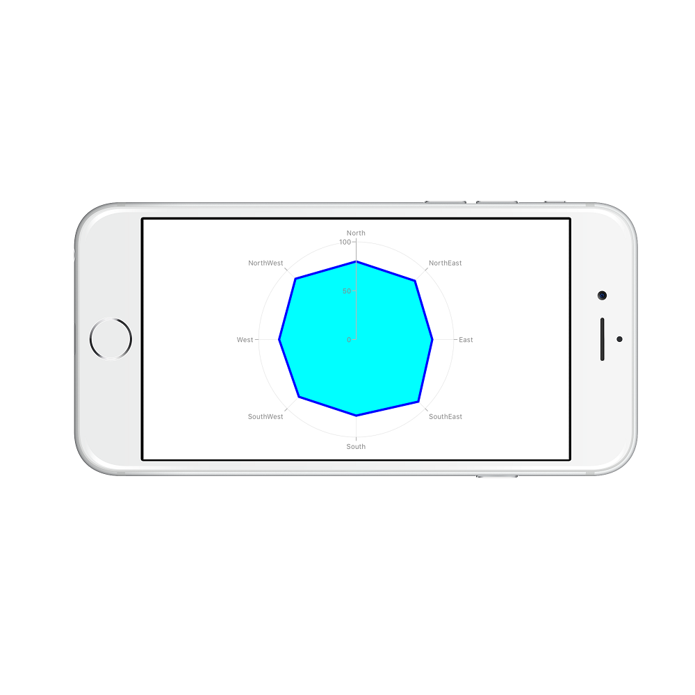
Closed
Closed property is used to determine, whether to connect the first and last data point of the series. By default, the property is set to true.
SFPolarSeries polarSeries      = new SFPolarSeries();
polarSeries.Closed             = false;
Polar start angle for primary axis
The start position of the polar series can be set by using PolarAngle property of axis. Default value of PolarAngle property is Rotate270. PolarAngle property can be set for primary axis, secondary axis, or both axes.
chart.PrimaryAxis = new SFCategoryAxis()
{
    PolarAngle = ChartPolarAngle.Rotate0
};

chart.SecondaryAxis = new SFNumericalAxis();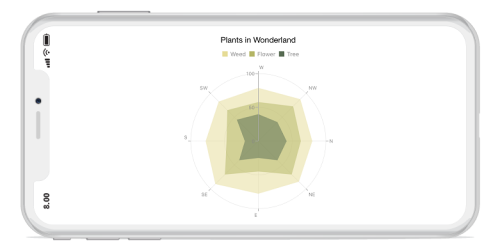
Polar start angle for secondary axis
chart.PrimaryAxis = new SFCategoryAxis();

chart.SecondaryAxis = new SFNumericalAxis()
{
    PolarAngle = ChartPolarAngle.Rotate0
};
Polar start angle for both axis
chart.PrimaryAxis  = new SFCategoryAxis()
{
    PolarAngle = ChartPolarAngle.Rotate0
};

chart.SecondaryAxis =  new SFNumericalAxis()
{
    PolarAngle = ChartPolarAngle.Rotate0
};
Pie Chart
To render a pie chart, create an instance of SFPieSeries and add to the Series collection property of SFChart. You can use the following properties to customize the pie segment appearance.
-
Color– used to change the color of the series. -
Alpha- used to control the transparency of the chart series. -
BorderWidth– used to change the border width of the series. -
BorderColor– used to change the border color of the series. -
DataMarkerPosition - used to change the position of data marker at
Inside,OutsideorOutsideExtend.
NOTE
You need to set
XBindingPathandYBindingPathproperties, so thatSFChartwould fetch values from the respective properties in the data model to plot the series.
SFChart chart = new SFChart();
...

SFPieSeries pieSeries = new SFPieSeries()
{
    ItemsSource = Data,
    XBindingPath = "Expense",
    YBindingPath = "Value",
    CircularCoefficient = 0.5
};
chart.Series.Add(pieSeries);
Exploding a pie segment
You can explode a pie segment using ExplodeIndex property and specify the explode radius using ExplodeRadius property of SFPieSeries.
SFPieSeries series  = new SFPieSeries ();
series.ExplodeIndex = 1;
Also, the segments can be exploded by touch using ExplodeOnTouch property of SFPieSeries. Default value of this property is false.

Exploding all the segments
Using ExplodeAll property of SFPieSeries, you can explode all the pie segments.
SFPieSeries series = new SFPieSeries ();
series.ExplodeAll  = true;
Sector of Pie
SFChart allows you to render all the data points/segments in semi-pie, quarter-pie or in any sector using StartAngle and EndAngle properties.
SFPieSeries series = new SFPieSeries ();
series.StartAngle  = 180;
series.EndAngle    = 360;
Group small data points into “others”
The small segments in the pie chart can be grouped into “others” category using the GroupTo and GroupMode properties of PieSeries. The GroupMode property is used to specify the grouping type based on slice Angle, actual data point value, or Percentage, and the GroupTo property is used to set the limit to group data points into a single slice. The grouped segment is labeled as “Others” in legend and toggled as any other segment. The default value of the GroupTo property is double.NAN, and GroupMode property is Value.
Doughnut Chart
To render a doughnut chart, create an instance of SFDoughnutSeries and add to the Series collection property of SFChart. You can use the following properties to customize the doughnut segment appearance.
-
Color– used to change the color of the series. -
Alpha- used to control the transparency of the chart series. -
BorderWidth– used to change the border width of the series. -
BorderColor– used to change the border color of the series. -
InnerRadius– used to get the inner radius of doughnut series.
SFChart chart = new SFChart();
...

SFDoughnutSeries doughnutSeries = new SFDoughnutSeries()
{
    ItemsSource = Data,
    XBindingPath = "Expense",
    YBindingPath = "Value"
};
chart.Series.Add(doughnutSeries);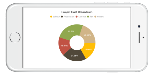
Stacked doughnut
Doughnut segments can be separated as individual circles using the IsStackedDoughnut property. The following properties are used to customize the stacked doughnut chart:
-
CapStyle- Specifies the shape of the start and end points of the circular segment. The supported values areBothFlat,BothCurve,StartCurve, andEndCurve. The default value of the this property isBothFlat. -
Spacing- Changes the spacing between two individual segments. The default value of spacing is 0, and the value ranges from 0 to 1. Here, 1 and 0 correspond to 100% and 0% of the available space, respectively. -
MaximumValue- Represents the entire span of an individual circle. The default value of the this property isdouble.NaN. -
TrackColor- Changes the color of the track area. -
TrackBorderColor- Changes the color of the track border. -
TrackBorderWidth- Changes the width of the track border.
[C#]

SFChart chart = new SFChart();
...

SFDoughnutSeries doughnutSeries = new SFDoughnutSeries()
{
    ItemsSource = Data,
    XBindingPath = "XValue",
    YBindingPath = "YValue",
    IsStackedDoughnut = true,
    CapStyle = DoughnutCapStyle.BothCurve,
    Spacing = 0.4,
    MaximumValue = 100
};
chart.Series.Add(doughnutSeries);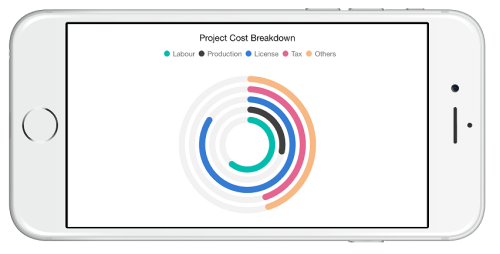
Changing doughnut inner radius
You can change the doughnut chart inner radius using DoughnutCoefficient with respect to the plot area. It ranges from 0 to 1 and the default value is 0.4.
SFDoughnutSeries series     = new SFDoughnutSeries ();
series.DoughnutCoefficient = 0.6f;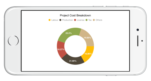
Changing the doughnut size
You can use the CircularCoefficient property to change the diameter of the doughnut chart with respect to the plot area. It ranges from 0 to 1 and the default value is 0.8.
SFDoughnutSeries series     = new SFDoughnutSeries ();
series.CircularCoefficient  = 0.5f;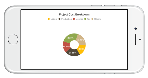
Exploding a doughnut segment
Exploding a specific doughnut segment, you have to set the index to be exploded using ExplodeIndex property of the series.
SFDoughnutSeries series = new SFDoughnutSeries ();
series.ExplodeIndex     = 1;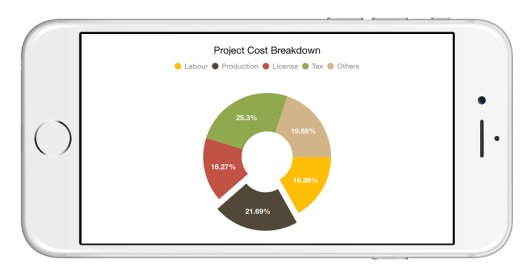
Exploding all the segments
To explode all the segments, you have to enable ExplodeAll property of the series.
SFDoughnutSeries series = new SFDoughnutSeries ();
series.ExplodeAll       = true;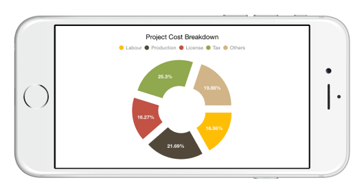
Sector of doughnut
SfChart allows you to render all the data points/segments in semi-doughnut, quarter- doughnut or in any sector using StartAngle and EndAngle properties.
SFDoughnutSeries series = new SFDoughnutSeries ();
series.StartAngle       = 180;
series.EndAngle         = 360;
Group small data points into “others”
The small segments in the doughnut chart can be grouped into “others” category using the GroupTo and GroupMode properties of DoughnutSeries. The GroupMode property is used to specify the grouping type based on slice angle, actual data point value, or percentage, and the GroupTo property is used to set the limit to group data points into a single slice. The grouped segment is labeled as “Others” in legend and toggled as any other segment. The default value of the GroupTo property is double.NAN, and GroupMode property is Value.
Add view to the center of doughnut chart
Any view can be added to the center of doughnut chart using the CenterView property of SFDoughnutSeries.
UILabel label = new UILabel();
label.Text = "CenterView";
label.Frame = new CGRect(0, 0, 100, 40);
SFDoughnutSeries doughnutSeries = new SFDoughnutSeries();
doughnutSeries.CenterView = label;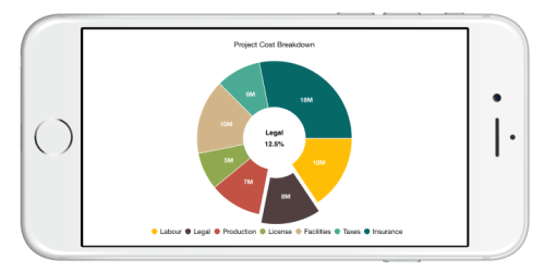
Pyramid Chart
To render a pyramid chart, create an instance of SFPyramidSeries and add to the Series collection property of SFChart. You can use the following properties to customize the pyramid segment appearance.
-
Color– used to change the color of the series. -
Alpha- used to control the transparency of the chart series. -
BorderWidth– used to change the border width of the series. -
BorderColor– used to change the border color of the series.
SFChart chart = new SFChart();
...

SFPyramidSeries pyramidSeries = new SFPyramidSeries()
{
    ItemsSource = Data,
    XBindingPath = "Country",
    YBindingPath = "Value"
};
chart.Series.Add(pyramidSeries);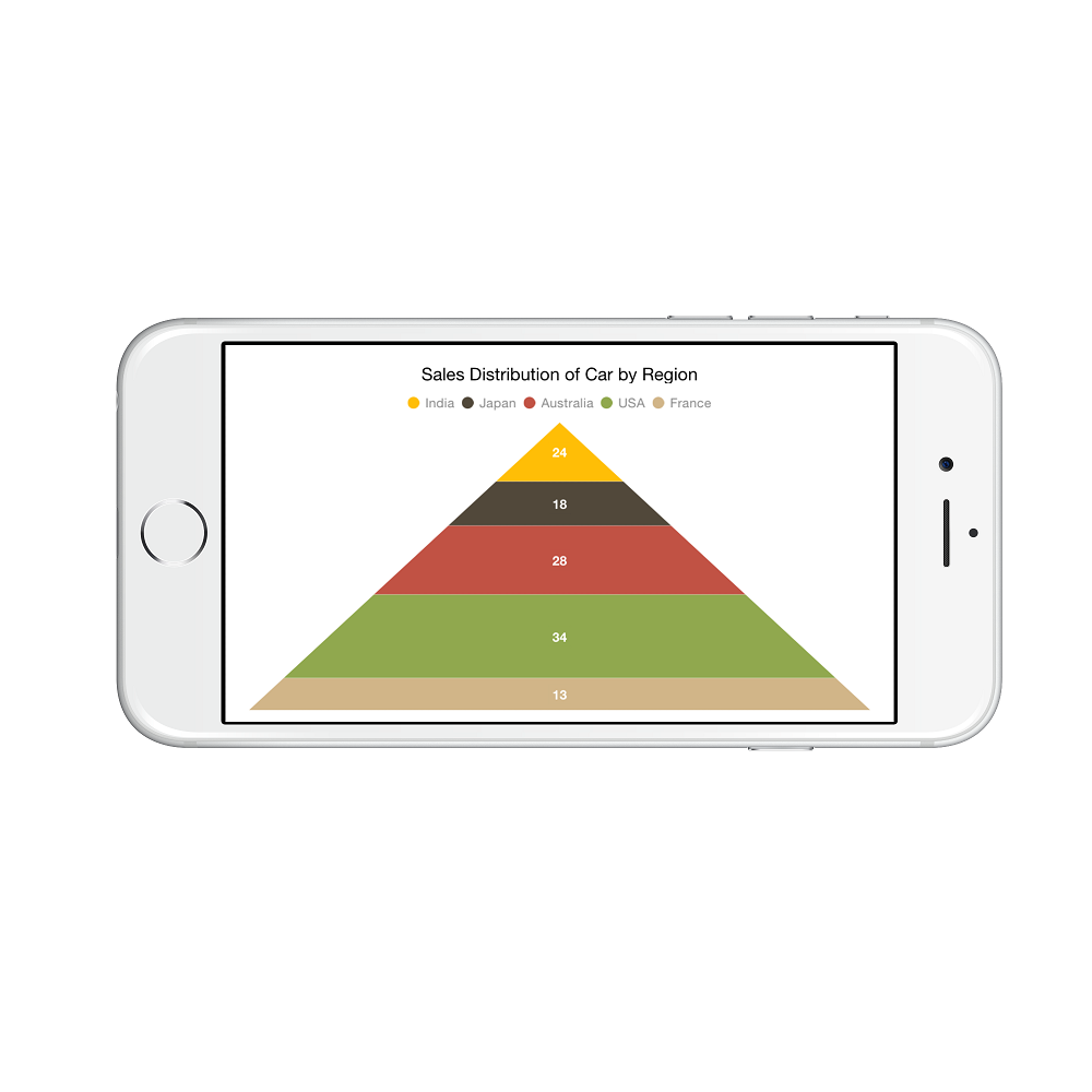
Pyramid Mode
You can render the pyramid series as linear or surface mode. In linear mode, height of the pyramid segment is based on the Y value and in surface mode, area of the pyramid segment is based on the Y values. The default value of PyramidMode property is SFChartPyramidMode.Linear.
SFPyramidSeries series = new SFPyramidSeries ();
series.PyramidMode     = SFChartPyramidMode.Surface;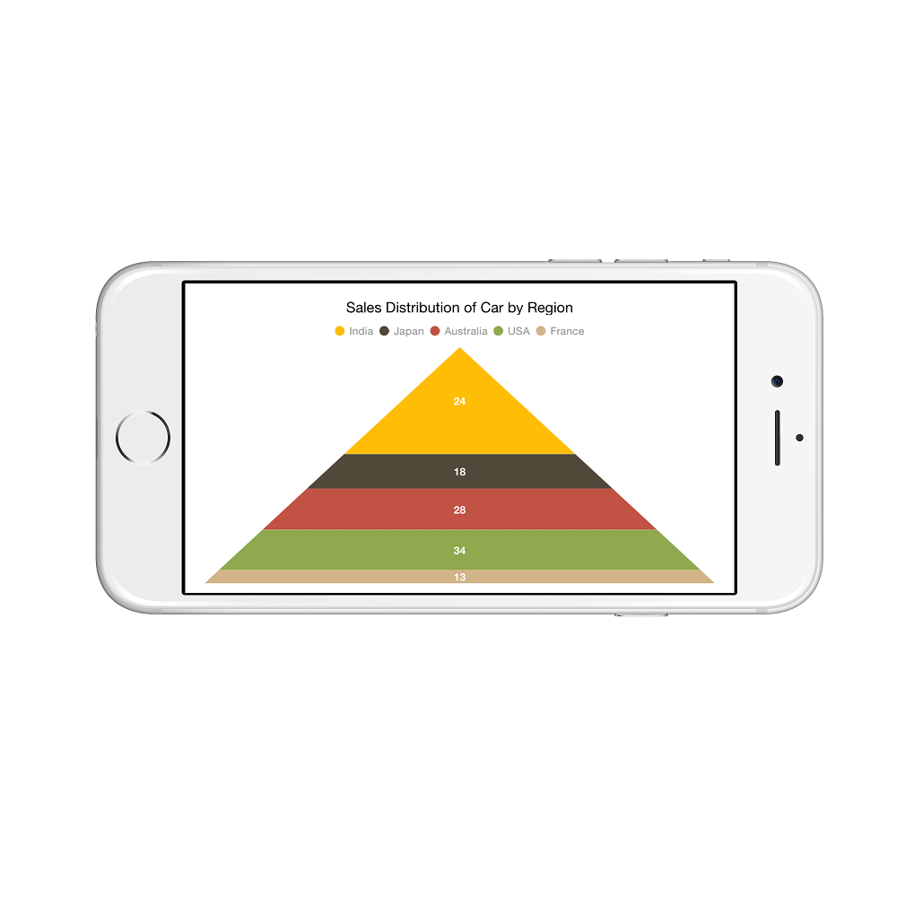
Gap between the segments
You can control the gap between the two segments using GapRatio property. Its ranges from 0 to 1.
SFPyramidSeries series = new SFPyramidSeries ();
series.GapRatio        = 0.1;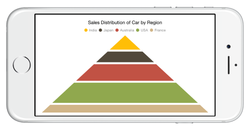
Exploding a pyramid segment
You can explode a pyramid segment using ExplodeIndex property, and ExplodeOffset property is used to specify the exploded segment’s distance.
SFPyramidSeries series = new SFPyramidSeries ();
series.ExplodeIndex    = 2;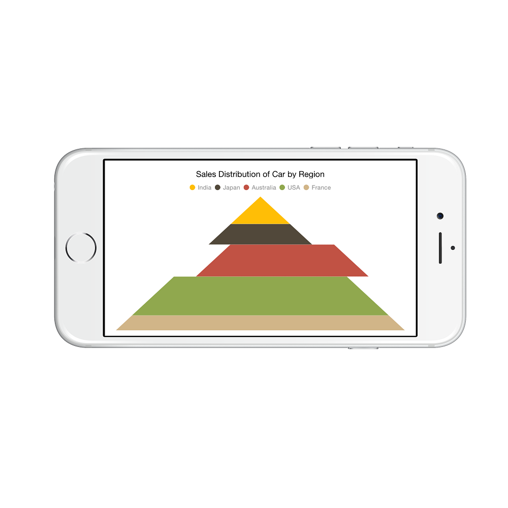
Funnel Chart
To render a funnel chart, create an instance of SFFunnelSeries and add to the Series collection property of SFChart. You can use the following properties to customize the funnel segment appearance.
-
Color– used to change the color of the series. -
Alpha- used to control the transparency of the chart series. -
BorderWidth– used to change the border width of the series. -
BorderColor– used to change the border color of the series.
SFChart chart = new SFChart();
...

SFFunnelSeries funnelSeries = new SFFunnelSeries()
{
    ItemsSource = Data,
    XBindingPath = "Status",
    YBindingPath = "Value"
};
chart.Series.Add(funnelSeries);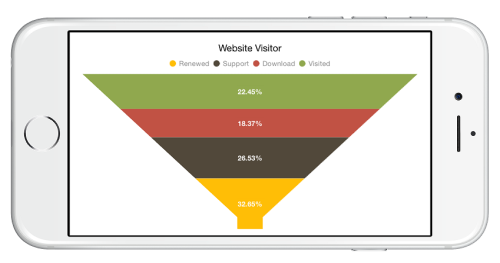
Gap between the segments
You can control the gap between the two segments using GapRatio property. Its ranges from 0 to 1.
SFFunnelSeries series = new SFFunnelSeries ();
series.GapRatio       = 0.1;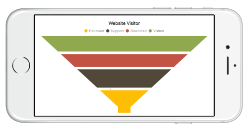
Exploding a funnel segment
You can explode a funnel segment using ExplodeIndex property and ExplodeOffset property is used to specify the exploded segment’s distance.
SFFunnelSeries series = new SFFunnelSeries ();
series.ExplodeIndex   = 2;
Changing the minimum width of the funnel
You can change the minimum width of the funnel neck using MinimumWidth property of SFFunnelSeries. Default value of MinimumWidth is 20.
SFFunnelSeries series = new SFFunnelSeries ();
series.MinimumWidth   = 20;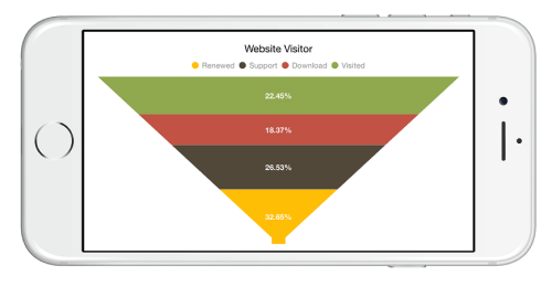
Waterfall Chart
WaterfallSeries clarifies the cumulative effect of a set of provided positive and negative values. The series is represented by a rectangle and a connector between the rectangles.
-
SummaryBindingPath– Gets or sets the string value that indicates the sum of previous segments in series. -
SummarySegmentColor– Changes the color of summary segment in series. -
NegativeSegmentColor– Changes the color of negative segment in series. -
AllowAutoSum– Enables or disables the segment that has been drawn based on the sum value of previous segments. By default, the value of this property is true. When disabling this property, it renders the segment by using the y-value of provided ItemsSource collection. -
ShowConnectorLine– Enables or disables the connector line of series. By default, value of this property is true. -
ConnectorLineStyle– Customizes the appearance of connector line style.
WaterfallSeries waterfallSeries = new WaterfallSeries()
{
	ItemsSource = RevenueDetails,
	XBindingPath = "Category",
	YBindingPath = "Value",
	AllowAutoSum = true,
	SummaryBindingPath = "IsSummary",
	NegativeSegmentColor = UIColor.Pink,
	SummarySegmentColor = UIColor.Gray,
	ShowConnectorLine = true
};

chart.Series.Add(waterfallSeries);
Box and Whisker Chart
BoxAndWhiskerSeries plots a combination of rectangles and lines to show the distribution of data sets. To render a box and whisker(box plot) chart, create an instance of SFBoxAndWhiskerSeries and add to the series collection property of SFChart. You can use the following properties to customize the appearance.
-
Color- used to change the color of the series. -
BorderWidth- used to change the border width of the series. -
BorderColor- used to change the border color of the series. -
Spacing- used to change the spacing between two segments. The default value of spacing is 0, and the value ranges from 0 to 1. Here, 1 and 0 corresponds to 100% and 0% of the available space, respectively. -
Width- used to change the width of the rectangle. The default value of the width is 0.8, and the value ranges from 0 to 1. Here, 1 and 0 corresponds to 100% and 0% of the available width, respectively.
[C#]

SFChart chart = new SFChart();
...

SFBoxAndWhiskerSeries boxPlotSeries = new SFBoxAndWhiskerSeries()
{
    ItemsSource = Data,
    XBindingPath = "Department",
    YBindingPath = "Ages",
    ShowMedian = true
}
chart.Series.Add(boxPlotSeries);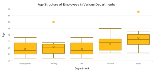
Customize the series box mode
The series box plotting mode can be changed using the BoxPlotMode property of SFBoxAndWhiskerSeries. The plotting mode of series can be calculated as follows:
-
Exclusive- The quartile values are calculated using the formula (N+1) * P (N count, P percentile), and their index value starts from 1 in the list. -
Inclusive- The quartile values are calculated using the formula (N−1) * P (N count, P percentile), and their index value starts from 0 in the list. -
Normal- The quartile values are calculated by splitting the list and getting the median values.
By default, BoxPlotMode value is Exclusive.
The following code shows how to set the BoxPlotMode value as Inclusive.
[C#]

SFChart chart = new SFChart();
...

SFBoxAndWhiskerSeries boxPlotSeries = new SFBoxAndWhiskerSeries()
{
    ItemsSource = Data,
    XBindingPath = "Department",
    YBindingPath = "Ages",
    ShowMedian = true,
    BoxPlotMode = BoxPlotMode.Inclusive,
};
chart.Series.Add(boxPlotSeries);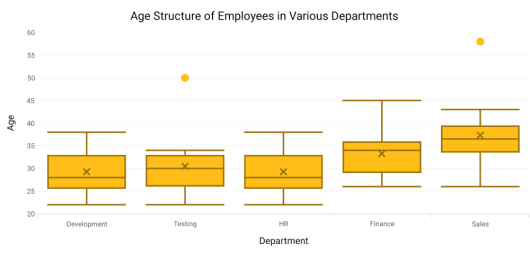
ShowMedian
The Median values of given data set is viewed by enabling the ShowMedian property of SFBoxAndWhiskerSeries.By default, ShowMedian value is false. The following code demonstrates how to enable the ShowMedian property.
[C#]

SFChart chart = new SFChart();
...

SFBoxAndWhiskerSeries boxPlotSeries = new SFBoxAndWhiskerSeries()
{
    ItemsSource = Data,
    XBindingPath = "Department",
    YBindingPath = "Ages",
    ShowMedian = true
}
chart.Series.Add(boxPlotSeries);
Outlier
The outlier is used to display the outlier point that lies either below the lower whisker or above the upper whisker line and it is an observation that is numerically distant from the rest of the data.
ShowOutlier
The outlier value in the box plot can be viewed by enabling the ShowOutlier property of SFBoxAndWhiskerSeries. By default, ShowOutlier value is true. The following code demonstrates how to disable the ShowOutlier property.
[C#]

SFChart chart = new SFChart();
...

SFBoxAndWhiskerSeries boxPlotSeries = new SFBoxAndWhiskerSeries()
{
    ItemsSource = Data,
    XBindingPath = "Department",
    YBindingPath = "Ages",
    ShowMedian = true,
    ShowOutlier = false
}
chart.Series.Add(boxPlotSeries);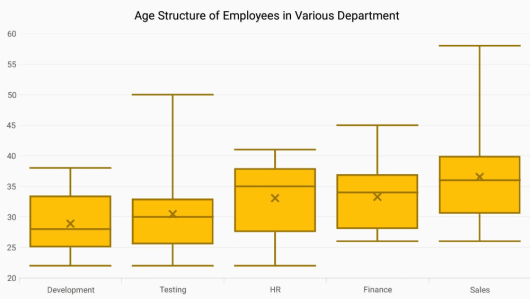
SymbolType
The SymbolType is used to display the outlier point with different types of symbols. The available symbols are Cross, Diamond, Ellipse, Hexagon, InvertedTriangle, Pentagon, Plus, Rectangle and Triangle. By default, SymbolType value is Ellipse.
The following code shows how to set the SymbolType value as Cross.
[C#]

SFChart chart = new SFChart();
...

SFBoxAndWhiskerSeries boxPlotSeries = new SFBoxAndWhiskerSeries()
{
    ItemsSource = Data,
    XBindingPath = "Department",
    YBindingPath = "Ages",
    ShowMedian = true,
    SymbolType = ChartSymbolType.Cross
}
chart.Series.Add(boxPlotSeries);
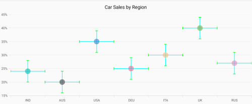
Error Bar Chart
ErrorBarSeries is a graphical representations of the variations of data and used on graphs to indicate the errors or uncertainty in a reported measurement. To render a error bar chart, create an instance of SFErrorBarSeries and add to the Series collection property of SFChart
SFScatterSeries scatterSeries = new SFScatterSeries()
{
    ItemsSource = CarDistributionDetails,
    XBindingPath = "Country",
    YBindingPath = "Value",
    ShapeType = ChartScatterShapeType.Ellipse,
    ScatterWidth = 20,
    ScatterHeight = 20
};
scatterSeries.ColorModel.Palette  = SFChartColorPalette.Natural;
chart.Series.Add(scatterSeries);

SFErrorBarSeries errorBarSeries = new SFErrorBarSeries()
{
	ItemsSource = CarDistributionDetails,
	XBindingPath = "Country",
	YBindingPath = "Value",
        Type = ErrorBarType.Fixed,
	Mode = ErrorBarMode.Both,
	HorizontalDirection = ErrorBarDirection.Both,
        VerticalDirection = ErrorBarDirection.Both,
	HorizontalErrorValue = 0.5,
	VerticalErrorValue = 4
};
chart.Series.Add(errorBarSeries);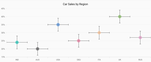
Type
The Type property is used to define the error bar type value in Fixed, Custom, Percentage, StandardDeviation and StandardErrors. The default value of this property is Fixed. For all types, you have to set values for HorizontalErrorValue and VerticalErrorValue except Custom.
Fixed
SFErrorBarSeries errorBarSeries = new SFErrorBarSeries()
{
	ItemsSource = CarDistributionDetails,
	XBindingPath = "Country",
	YBindingPath = "Value",
        Type = ErrorBarType.Fixed,
	Mode = ErrorBarMode.Both,
	HorizontalErrorValue = 0.5,
	VerticalErrorValue = 4
};
chart.Series.Add(errorBarSeries);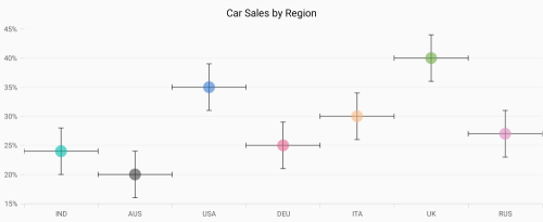
Percentage
SFErrorBarSeries errorBarSeries = new SFErrorBarSeries()
{
	ItemsSource = CarDistributionDetails,
	XBindingPath = "Country",
	YBindingPath = "Value",
        Type = ErrorBarType.Percentage,
	Mode = ErrorBarMode.Both,
	HorizontalErrorValue = 1,
	VerticalErrorValue = 8
};
chart.Series.Add(errorBarSeries);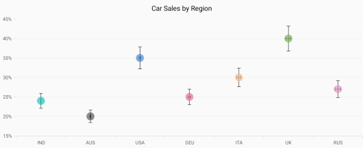
Standard Deviation
SFErrorBarSeries errorBarSeries = new SFErrorBarSeries()
{
	ItemsSource = CarDistributionDetails,
	XBindingPath = "Country",
	YBindingPath = "Value",
        Type = ErrorBarType.StandardDeviation,
	Mode = ErrorBarMode.Both,
	HorizontalErrorValue = 1,
	VerticalErrorValue = 4
};
chart.Series.Add(errorBarSeries);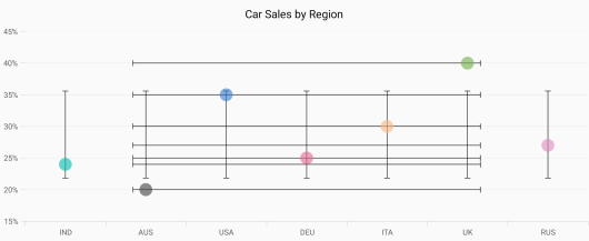
Standard Errors
SFErrorBarSeries errorBarSeries = new SFErrorBarSeries()
{
	ItemsSource = CarDistributionDetails,
	XBindingPath = "Country",
	YBindingPath = "Value",
        Type = ErrorBarType.StandardErrors,
	Mode = ErrorBarMode.Both,
	HorizontalErrorValue = 1,
	VerticalErrorValue = 4
};
chart.Series.Add(errorBarSeries);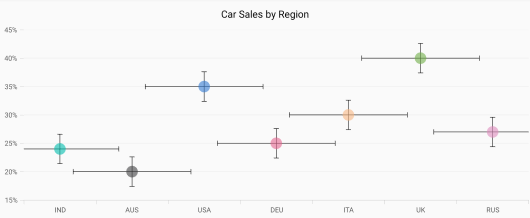
Custom
If Type is Custom, you have to set values for HorizontalErrorPath and VerticalErrorPath as shown in the following code snippet.
SFErrorBarSeries errorBarSeries = new SFErrorBarSeries()
{
	ItemsSource = CarDistributionDetails,
	XBindingPath = "Country",
	YBindingPath = "Value",
        Type = ErrorBarType.Custom,
	Mode = ErrorBarMode.Both,
	HorizontalErrorPath = "HorizontalErrorValues",
	VerticalErrorValue = "VerticalErrorValues"
};
chart.Series.Add(errorBarSeries);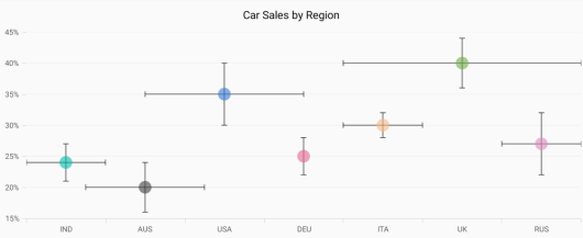
Mode
The error value shown on the chart is based on the Mode property. It have the values of Both, Horizontal, and Vertical. The default value of this property is Both.
Both
To display horizontal and vertical error values, you can set the Mode as Both as shown in the following code.
SFErrorBarSeries errorBarSeries = new SFErrorBarSeries()
{
	ItemsSource = CarDistributionDetails,
	XBindingPath = "Country",
	YBindingPath = "Value",
        Type = ErrorBarType.Fixed,
	Mode = ErrorBarMode.Horizontal,
	HorizontalErrorValue = 0.5,
	VerticalErrorValue = 4
};
chart.Series.Add(errorBarSeries);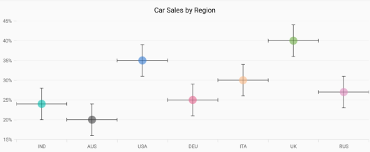
Horizontal
To display horizontal error value only, you can set the Mode as Horizontal as shown in the following code.
SFErrorBarSeries errorBarSeries = new SFErrorBarSeries()
{
	ItemsSource = CarDistributionDetails,
	XBindingPath = "Country",
	YBindingPath = "Value",
        Type = ErrorBarType.Fixed,
	Mode = ErrorBarMode.Horizontal,
	HorizontalErrorValue = 0.5,
	VerticalErrorValue = 4
};
chart.Series.Add(errorBarSeries);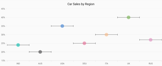
Vertical
To display vertical error value only, you can set the Mode as Vertical as shown in the following code.
SFErrorBarSeries errorBarSeries = new SFErrorBarSeries()
{
	ItemsSource = CarDistributionDetails,
	XBindingPath = "Country",
	YBindingPath = "Value",
        Type = ErrorBarType.Fixed,
	Mode = ErrorBarMode.Vertical,
	HorizontalErrorValue = 0.5,
	VerticalErrorValue = 4
};
chart.Series.Add(errorBarSeries);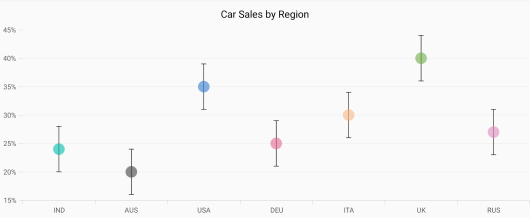
Direction
The HorizontalDirection and VerticalDirection properties are used to set the direction of error bar lines. The default value is Both.
-
Both- used to set error value in positive and negative directions. -
Minus- used to set error value in a negative direction. -
Plus- used to set error value in a positive direction.
SFErrorBarSeries errorBarSeries = new SFErrorBarSeries()
{
	ItemsSource = CarDistributionDetails,
	XBindingPath = "Country",
	YBindingPath = "Value",
	HorizontalDirection = ErrorBarDirection.Plus,
        VerticalDirection = ErrorBarDirection.Minus,
	HorizontalErrorValue = 0.5,
	VerticalErrorValue = 4
};
chart.Series.Add(errorBarSeries);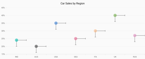
Customization
You can customize the SFErrorBarSeries with the following style properties.
-
HorizontalLineStyle– used to customizes the appearance of horizontal error bar line. -
VerticalLineStyle– used to customizes the appearance of vertical error error line. -
HorizontalCapLineStyle– used to customizes the appearance of horizontal error bar cap line. -
VerticalCapLineStyle– used customizes the appearance of vertical error bar cap line.
errorBarSeries.HorizontalLineStyle = new ErrorBarLineStyle();
 errorBarSeries.HorizontalLineStyle.LineColor = UIColor.Cyan;
 errorBarSeries.HorizontalLineStyle.LineWidth = 4;

 errorBarSeries.VerticalLineStyle = new ErrorBarLineStyle();
 errorBarSeries.VerticalLineStyle.LineColor = UIColor.Cyan;
 errorBarSeries.VerticalLineStyle.LineWidth = 4;

 errorBarSeries.HorizontalCapLineStyle = new ErrorBarCapLineStyle();
 errorBarSeries.HorizontalCapLineStyle.LineColor = UIColor.Green;
 errorBarSeries.HorizontalCapLineStyle.LineWidth = 4;
 errorBarSeries.HorizontalCapLineStyle.Visible = true;

 errorBarSeries.VerticalCapLineStyle = new ErrorBarCapLineStyle();
 errorBarSeries.VerticalCapLineStyle.LineColor = UIColor.Green;
 errorBarSeries.VerticalCapLineStyle.LineWidth = 4;
 errorBarSeries.VerticalCapLineStyle.Visible = true;