Data Markers in Xamarin.iOS Chart
29 Nov 20229 minutes to read
Data markers are used to provide information about the data points to the user. You can add a shape and label to adorn each data point. This can be enabled using following code snippet,
lineSeries.DataMarker.ShowLabel	 = true;

lineSeries.DataMarker.ShowMarker = true;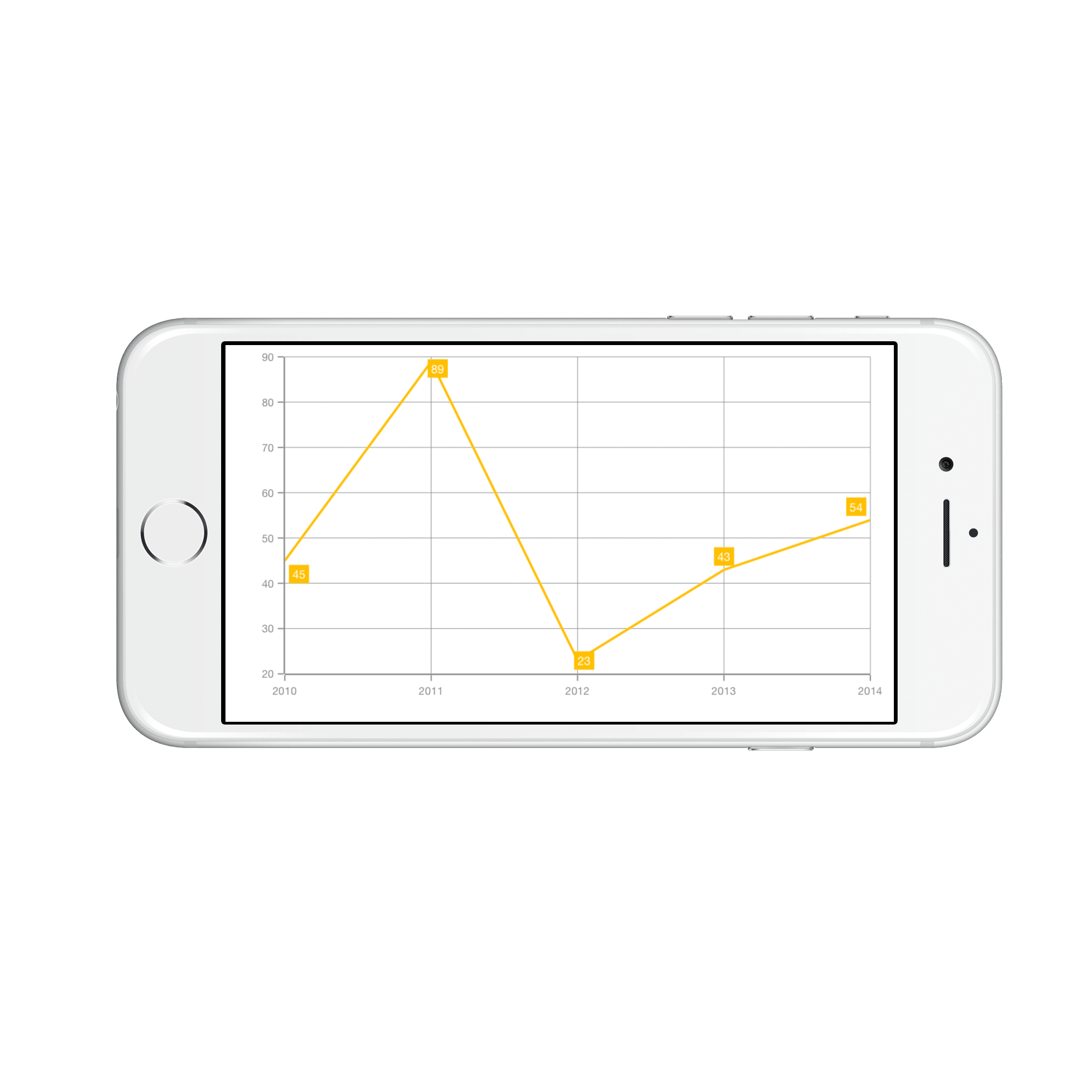
Customizing Labels
Data labels are enabled by default but you can also change the visibility of the labels using ShowLabel property of SFChartDataMarker. The label appearance can be customized using LabelStyle property.
The following properties are used to customize the data marker label appearance.
-
Color– used to change the color of the label. -
BackgroundColor– used to change the background color of the label. -
BorderColor– used to change the border color. -
BorderWidth– used to change the thickness of the border. -
Font– used to change the text size, font family and font weight of the label. -
Margin- used to set the margin of the label. -
Angle– used to rotate the labels. -
LabelPadding- used to move the data label in the respective direction. For example, the positive labels in column series will be moved upwards and negative labels in column series will be moved downwards.
Following code snippet illustrates the customization of label and its background,
lineSeries.DataMarker.LabelStyle.Color           = UIColor.Blue;

lineSeries.DataMarker.LabelStyle.BorderColor     = UIColor.Red;

lineSeries.DataMarker.LabelStyle.BorderWidth     = 2;

lineSeries.DataMarker.LabelStyle.BackgroundColor = UIColor.Cyan;

lineSeries.DataMarker.LabelStyle.Angle           = 315;

lineSeries.DataMarker.LabelStyle.Margin          = new UIEdgeInsets(5,5,5,5);

lineSeries.DataMarker.LabelStyle.Font            = UIFont.ItalicSystemFontOfSize (18);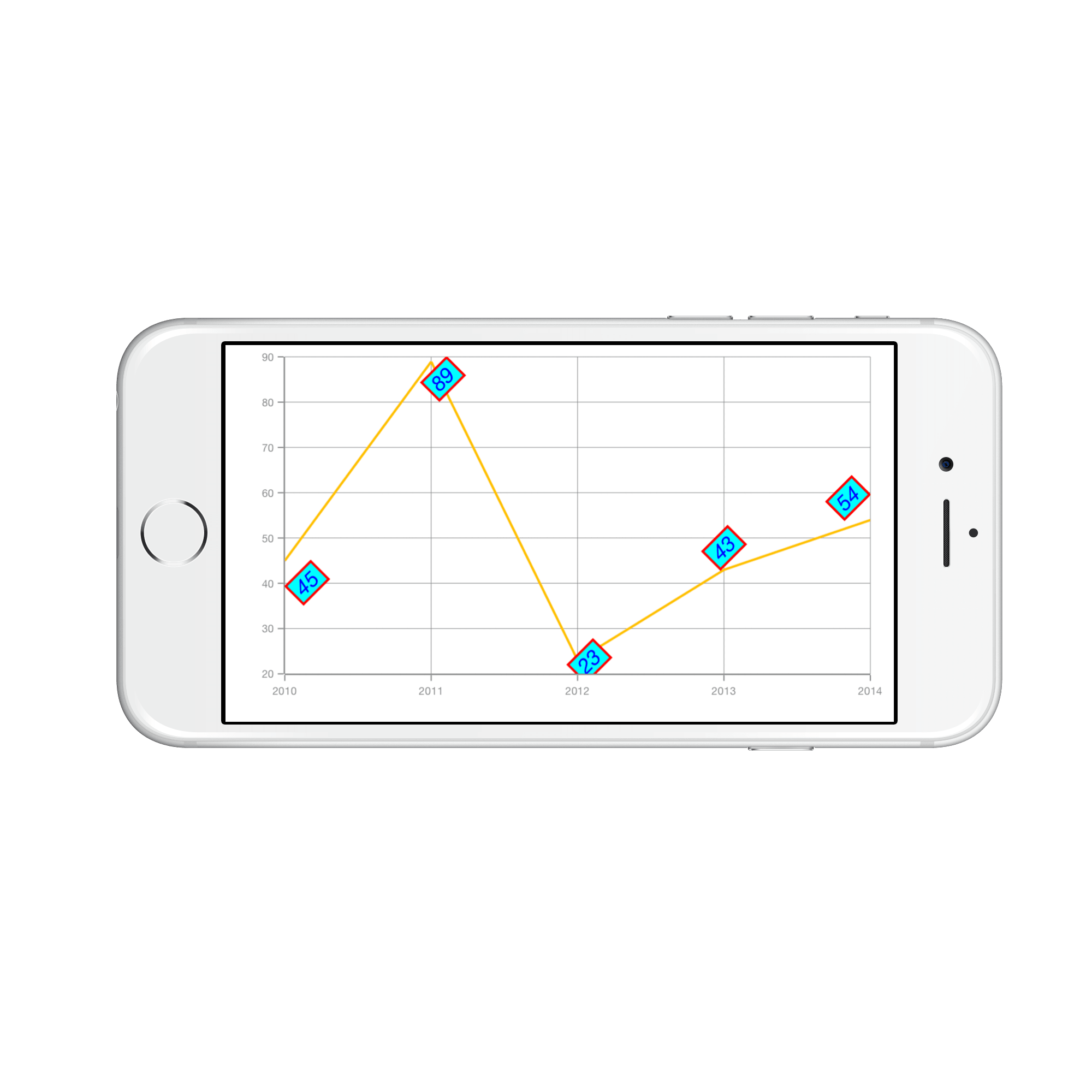
Formatting Label Content
You can customize the content of the label using LabelContent property. Following are the two options that are supported now,
-
SFChartLabelContent.Percentage– This will show the percentage value of corresponding data point Y value, this is often used in pie, doughnut, funnel and pyramid series types. -
SFChartLabelContent.YValues– This will show the corresponding Y value (Default).
pieSeries.DataMarker.LabelContent = SFChartLabelContent.Percentage;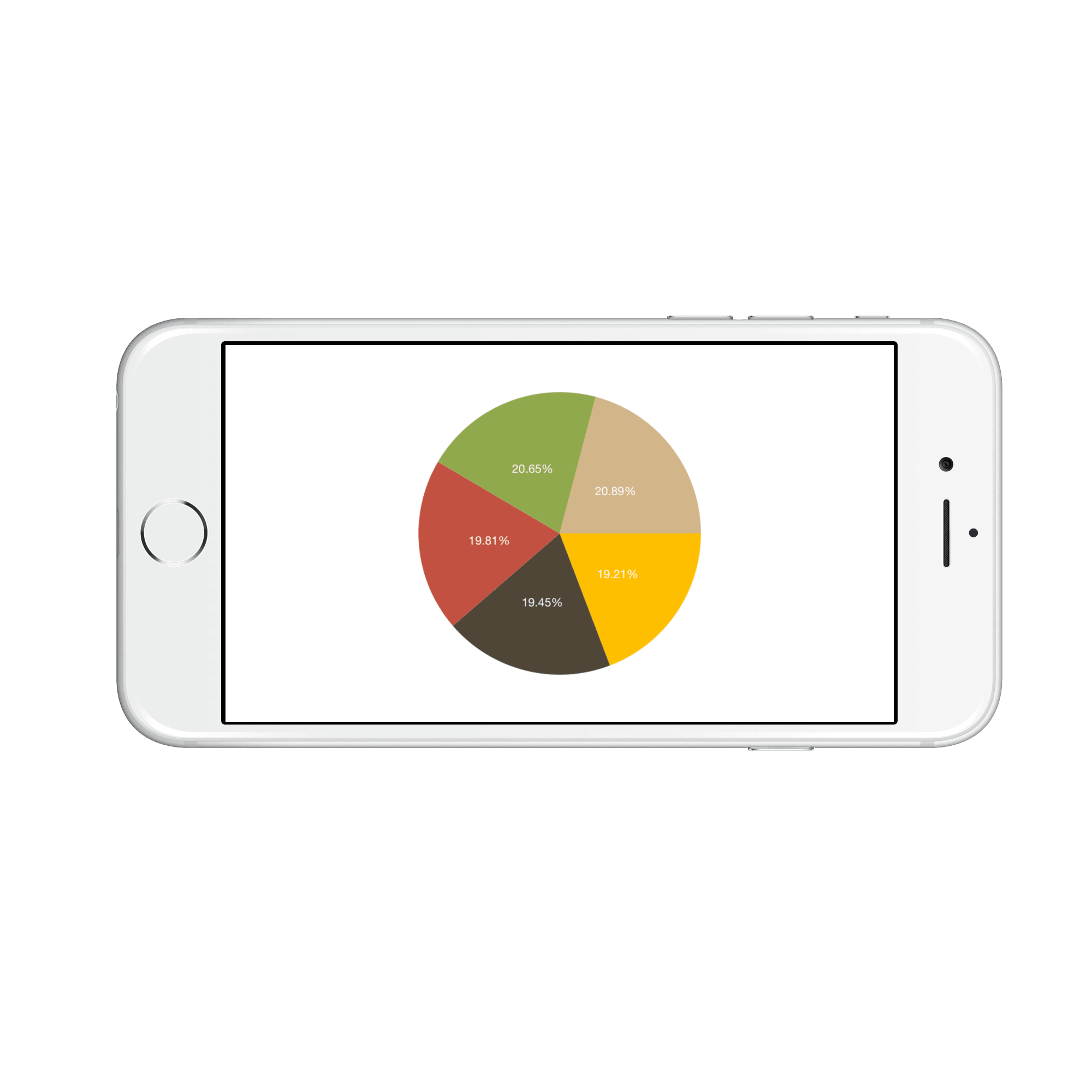
Label Position
The LabelPosition property is used to position the data marker labels at Center, Inner and Outer position of the actual data point position. By default, labels are positioned based on the series types for better readability. You can move the labels horizontally and vertically using OffsetX and OffsetY properties respectively.
The following screenshot illustrates the default position of data marker labels,

The following code sample illustrates the center position of data marker labels,
series.DataMarker.LabelStyle.LabelPosition = SFChartDataMarkerLabelPosition.Center;
The following code sample illustrates the Inner position of data marker labels,
series.DataMarker.LabelStyle.LabelPosition = SFChartDataMarkerLabelPosition.Inner;
The following code sample illustrates the outer position of data marker labels,
series.DataMarker.LabelStyle.LabelPosition = SFChartDataMarkerLabelPosition.Outer;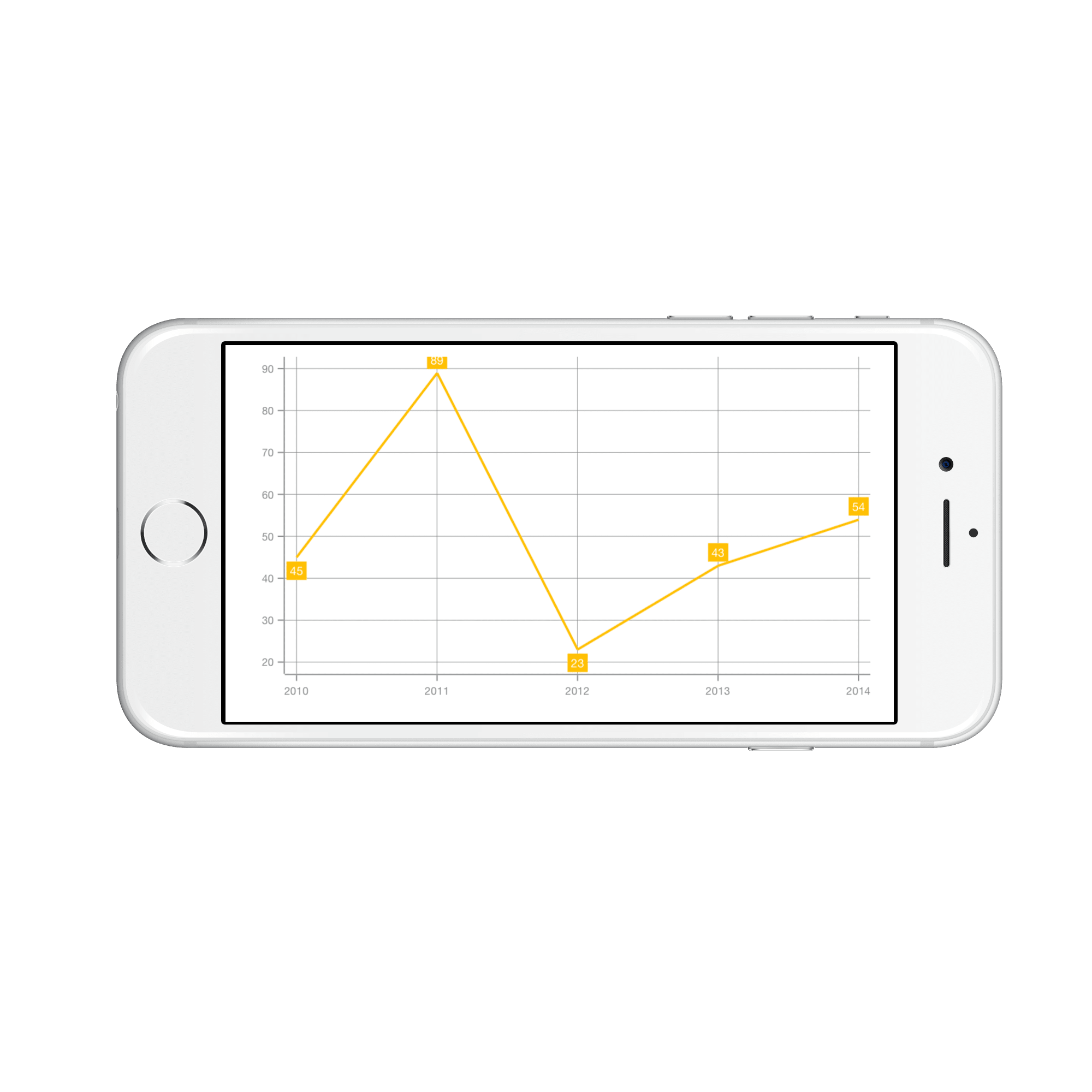
Smart Labels
This feature is used to arrange the data marker labels smartly and avoid the intersection when there is
overlapping of labels. The property EnableSmartLabels in CircularSeries, is used to arrange the data marker labels
smartly. By default, it is false, we need to enable this property.
The following code sample illustrates how to enable the smart labels.
SFPieSeries series              = new SFPieSeries ();

series.StartAngle               = 75;

series.EndAngle                 = 435;

series.EnableSmartLabels        = true;

series.DataMarkerPosition       = SFChartCircularSeriesLabelPosition.OutsideExtended;

series.ConnectorLineType        = SFChartConnectorLineType.Bezier;

series.DataMarker.ShowLabel     = true;

series.LegendIcon               = SFChartLegendIcon.Rectangle;
return series;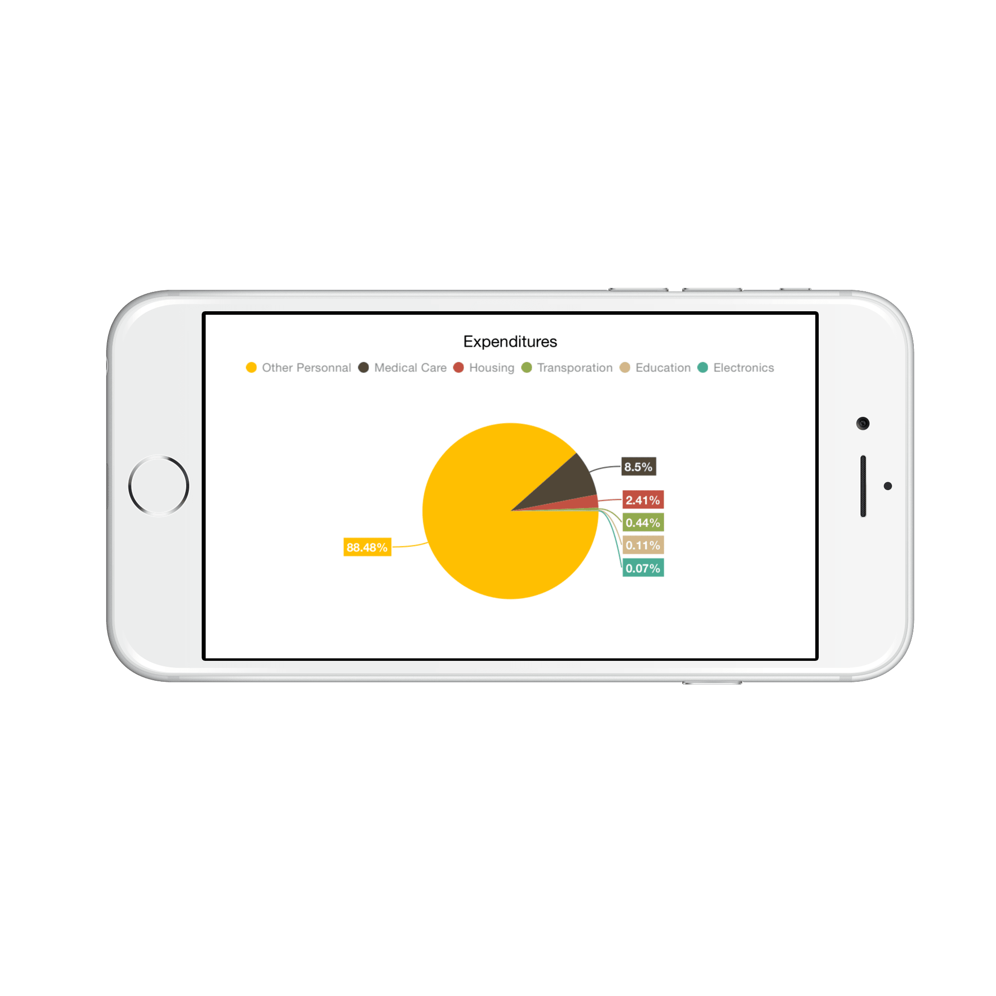
Customizing Marker Shapes
Shapes can be added to chart data marker by setting the ShowMarker property to true. There are different shapes you can set to the chart using MarkerType property such as rectangle, circle, diamond etc. Following properties are used to customize marker appearance,
-
MarkerWidth- used to change the width of the marker -
MarkerHeight- used to change the height of the marker -
MarkerColor- used to change the color of the marker -
MarkerBorderColor- used to change the border color of the shape -
MarkerBorderWidth– used to change the marker border thickness
The following code example shows how to enable marker and specify its types,
lineSeries.DataMarker.ShowLabel         = false;

lineSeries.DataMarker.ShowMarker        = true;

lineSeries.DataMarker.MarkerType        = SFChartDataMarkerType.Hexagon;

lineSeries.DataMarker.MarkerWidth       = 20;

lineSeries.DataMarker.MarkerHeight      = 20;

lineSeries.DataMarker.MarkerColor       = UIColor.Cyan;

lineSeries.DataMarker.MarkerBorderColor = UIColor.Red;

lineSeries.DataMarker.MarkerBorderWidth = 2;
Apply series color
The UseSeriesPalette property is used to apply the series color to background color of data marker labels. The default value of this property is true.
lineSeries.DataMarker.ShowLabel  = true;

lineSeries.DataMarker.UseSeriesPalette = false;
Connector Line
This feature is used to connect label and data point using a line. It can be enabled for any chart types but this is often used with Pie and Doughnut chart types. The ConnectorLineStyle property used to customize the connector line.
-
LineColor– used to change the color of the line. -
LineWidth– used to change the stroke thickness of the line. -
Dashes– used to set the dashes for the line. -
ConnectorHeight- used to set the height of the line. -
ConnectorRotationAngle- used to set the rotation angle of the line.
The following code illustrates how to specify the connector height and its angle,
lineSeries.DataMarker.ConnectorLineStyle.ConnectorHeight = 50;

lineSeries.DataMarker.ConnectorLineStyle.ConnectorRotationAngle = 175;

lineSeries.DataMarker.ConnectorLineStyle.LineColor = UIColor.Blue;

lineSeries.DataMarker.ConnectorLineStyle.LineWidth = 3;

NSObject[] dashes = new NSObject[2];

dashes [0] = (NSNumber)2;

dashes [1] = (NSNumber)3;

lineSeries.DataMarker.ConnectorLineStyle.Dashes = NSArray.FromNSObjects (dashes);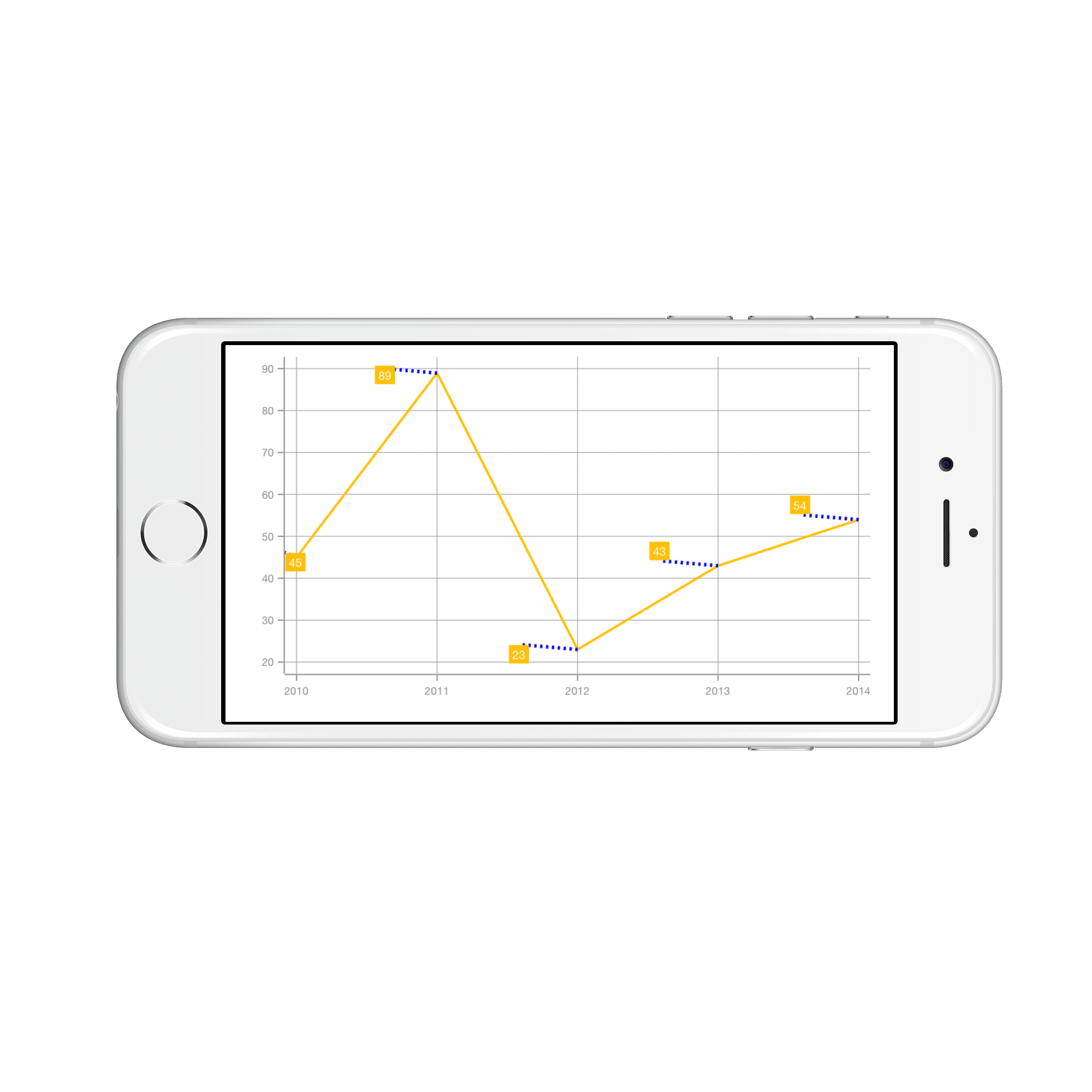
NOTE
For Pie and Doughnut series, you can set the
Beziercurve for connector line usingConnectorLineTypeproperty of Pie and Doughnut series.
Event
DataMarkerLabelCreated
The DataMarkerLabelCreated event occurs when the data marker label is created. This argument contains object of the DataMarkerLabel. The following properties are available in DataMarkerLabel to customize the appearance of data markers based on condition.
-
Label– Gets or sets the text of data marker. -
BackgroundColor– Gets or sets the background color of data marker label. -
Index– Gets the data point index of data marker label. -
XPosition– Gets the x-position of data marker label. -
YPosition– Gets the y-position of data marker label. -
LabelStyle– Gets or sets the label style to customize the appearance of individual data marker label. -
MarkerWidth– Gets or sets the marker width. -
MarkerHeight– Gets or sets the marker height. -
MarkerBorderWidth– Gets or sets the border width of marker symbol. -
MarkerBorderColor– Gets or sets the border color of marker symbol. -
MarkerColor– Gets or sets the marker color. -
MarkerType– Gets or sets the shape type of marker. The available shapes areEllipse,Diamond,Hexagon,Cross,HorizontalLine,VerticalLine,InvertedTriangle,Triangle,Pentagon,Plus, andSquare. -
View- Gets or sets the view. -
GrandTotal- Gets the sum of y-values data.