Tooltip
29 Nov 20229 minutes to read
SFChart provides tooltip support for all series. It is used to show information about the segment, when you tap on
the segment. To enable the tooltip, you need to set EnableTooltip property as true.
SFColumnSeries series          = new SFColumnSeries ();

series.EnableTooltip           = true;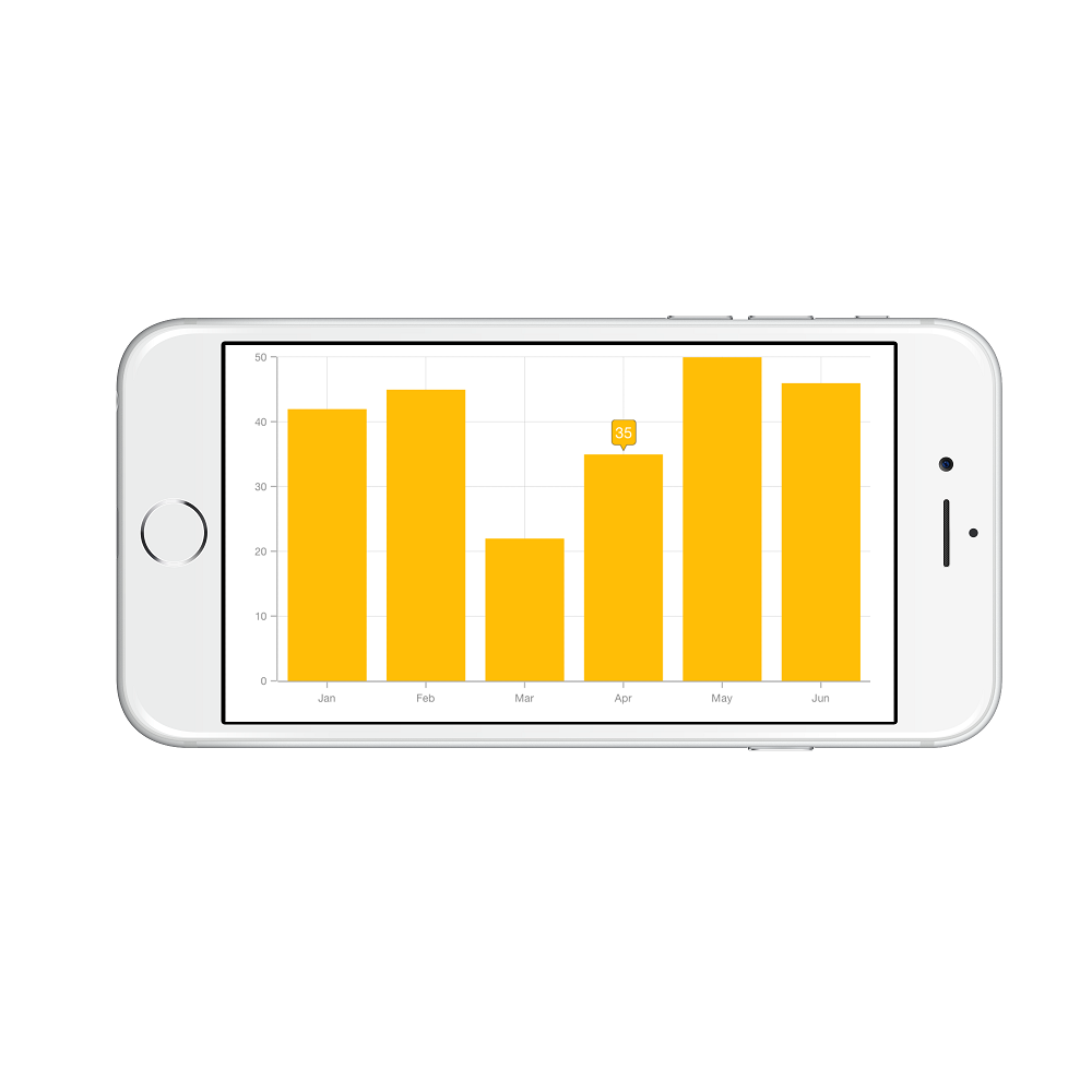
Customizing appearance
You can customize the tooltip label. For customizing, you need to add an instance of SFChartTooltipBehavior using the addChartBehavior method of SFChart.
Following properties of SFChartTooltipBehavior are used to customize the tooltip label.
-
BorderColor– used to change the label border color. -
BorderWidth– used to change the label border width. -
BackgroundColor– used to change the label background color. -
EdgeInsets– used to change tooltip content edge insets. -
TextColor– used to change the text color. -
Font– used to change label font size, family and weight. -
LabelFormatter– used to format the label. -
Duration– used to set the visible duration of label. -
OffsetX- used to move the label horizontally. -
OffsetY- used to move the label vertically. -
Position- used to position the tooltip atBottom, Left, Right, or Top. -
Animation- used to animate the tooltip(Fade, None, Pop). -
MaximumWidth- used to change label maximum width.
SFChartTooltipBehavior behavior       = new SFChartTooltipBehavior ();

behavior.BackgroundColor              = UIColor.FromRGBA (203.0f / 255.0f, 75.0f / 255.0f, 65.0f / 255.0f, 1.0f);

behavior.BorderColor                  = UIColor.Black;

behavior.BorderWidth                  = 1.5f;

behavior.Duration                     = 10;

behavior.MaximumWidth                 = 50;

NSNumberFormatter formatter           = new NSNumberFormatter();

formatter.PositiveFormat              = "$###.00 millions";

behavior.LabelFormatter               = formatter;

behavior.Position                     = SFChartElementPosition.Right;

behavior.Animation                    = SFChartTooltipAnimation.Fade;

behavior.OffsetX                      = 22;

behavior.OffsetY                      = 5;

behavior.TextColor                    = UIColor.White;

behavior.EdgeInsets                   = new UIEdgeInsets(5 ,10, 5, 10);

behavior.Font                         = UIFont.FromName("Times",15);

chart.AddChartBehavior (behavior);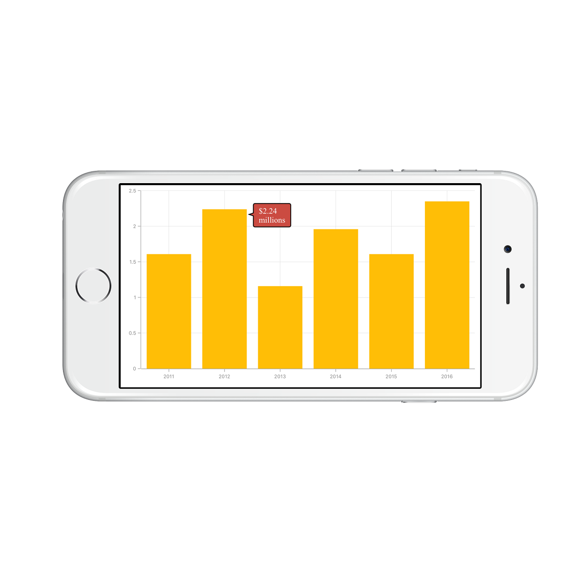
Delegates
We need to implement delegate to deal with the user interactions in chart for tooltip. In order to do this, you need to adopt the SFChartDelegate protocol through the class extension as shown below.
public override void ViewDidLoad ()
{
    chart.Delegate = new ChartDelegate ();
}

public class ChartDelegate : SFChartDelegate
{
    public override void DidShowTooltip (SFChart chart, SFChartTooltip tooltipView)
    {

    }
}-
WillShowTooltip- this method is invoked before the tooltip is shown. -
DidShowTooltip- this method is invoked after the tooltip is shown. -
WillHideTooltip- this method is invoked before the tooltip is hidden. -
DidHideTooltip- this method is invoked after the tooltip is hidden.
Customizing appearance of SFChartTooltip view
The following properties available in the SFChartTooltip to customize the appearance of tooltip view. The customized view can be used in SFChartTooltipBehavior methods and delegates.
-
Text– used to change the text of the tooltip. -
CustomView– used to change the custom view of the tooltip. -
PointerLength– used to change the pointer length of the tooltip. -
CornerRadius– used to change the corner radius of the tooltip. -
Color– used to change the tooltip color. -
TextAlignment– used to change text alignment horizontally. -
Series– returns the series at the tapped location. -
DataPoint– returns the chart data point at the tapped location. -
Behavior- returns the SFChartTooltipBehavior of the tooltip.
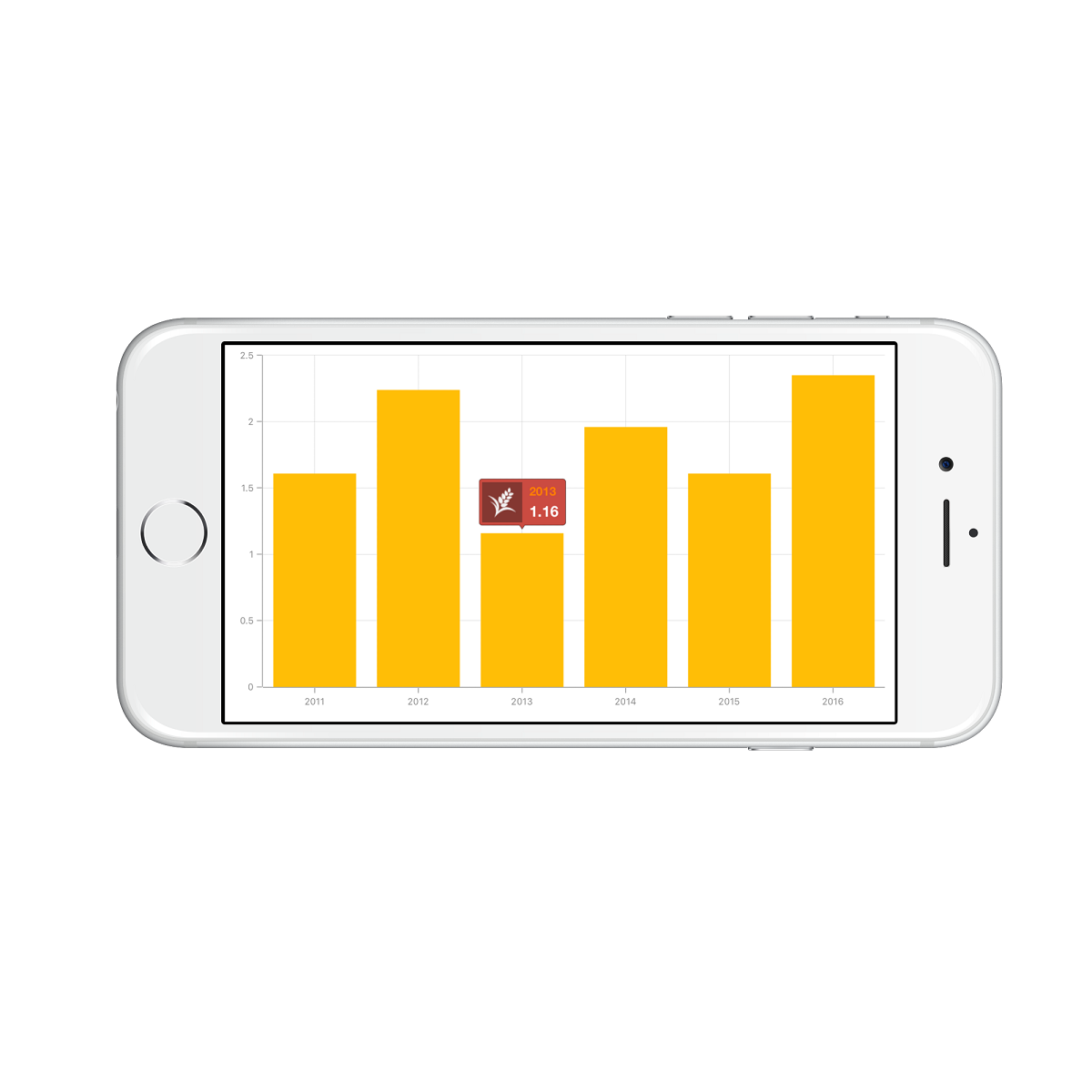
public override void WillShowTooltip (SFChart chart, SFChartTooltip tooltipView)
{
    UIView customView       = new UIView ();

    customView.Frame        = new CGRect (0,0,80,40);

    UIImageView imageView   = new UIImageView ();

    imageView.Frame         = new CGRect (0, 0, 40, 40);

    imageView.Image         = UIImage.FromBundle ("Images/grain.png");

    UILabel xLabel          = new UILabel ();

    xLabel.Frame            = new CGRect (47,0,35,18);

    xLabel.TextColor        = UIColor.Orange;

    xLabel.Font             = UIFont.FromName("Helvetica", 12f);

    xLabel.Text             = (tooltipView.DataPoint as Model).XValue.ToString();

    UILabel yLabel          = new UILabel ();

    yLabel.Frame            = new CGRect (47, 20, 35, 18);

    yLabel.TextColor        = UIColor.White;

    yLabel.Font             = UIFont.FromName("Helvetica", 15f);

    yLabel.Text             = tooltipView.Text;

    customView.AddSubview (imageView);

    customView.AddSubview (xLabel);

    customView.AddSubview (yLabel);

    tooltipView.CustomView  = customView;
}
Methods
Show method
The Show method is used to activate the tooltip at the specified location.
public partial class ViewController : UIViewController
{
    SFChartTooltipBehavior tooltipBehavior;

    public override void ViewDidLoad()
    {
        . . .

        UIButton button = new UIButton();
        button.TouchUpInside += Button_TouchUpInside

        tooltipBehavior = new SFChartTooltipBehavior();
        chart.Behaviors.Add(tooltipBehavior);

        . . .
    }

    void Button_TouchUpInside(object sender, EventArgs e)
    {
        //point - determines the x, y positions of tooltip and bool value determines whether the tooltip should be animated while displaying.
        tooltipBehavior.Show(point, true);
    }
}
The Show(CGPoint,UIView,Boolean) method shows the tooltip at the specified coordinate location.
Hide method
The Hide method is used to hide the tooltip programmatically.
// The argument determines whether the tooltip should be animated while hiding.

tooltip.Hide(true);
GetView method
The GetView(SFChartTooltip) method can be overridden to customize the tooltip view or to return custom view to be displayed as a tooltip.
DrawRect method
The DrawRect(CGRect) method is used to drawing the tooltip within the specified rectangle.