How can I help you?
Trackball
29 Nov 20228 minutes to read
Trackball feature displays the tooltip for the data points that are closer to the point where you touch on the chart area. This feature, especially, can be used instead of data label feature when you cannot show data labels for all data points due to space constraint. To enable this feature, add an instance of SFChartTrackballBehavior to the Behaviors collections property of SFChart using AddChartBehavior method. Trackball will be activated once you long-press anywhere on the chart area. Once it is activated, it will appear in the UI and move based on your touch movement until you stop touching on the chart.
You can use the following properties to show/hide the line and labels.
-
ShowLabel– Shows/hides trackball label. Default value is true. -
ShowLine– Shows/hides the trackball line. Default value is true.
SFChartTrackballBehavior behavior = new SFChartTrackballBehavior ();

chart.AddChartBehavior (behavior);
Label Display Mode
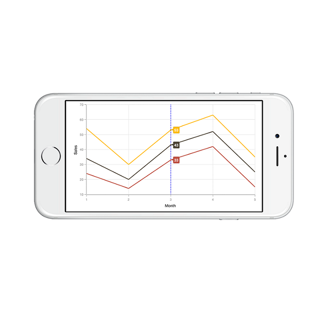
LabelDisplayMode property is used to specify whether to display label for all the data points along the vertical line or display only single label. Following are the two options you can set to this property,
-
FloatAllPoints– Displays label for all the data points along the vertical line. -
GroupAllPoints– Displays label for all the data points on top of the chart along the vertical line. -
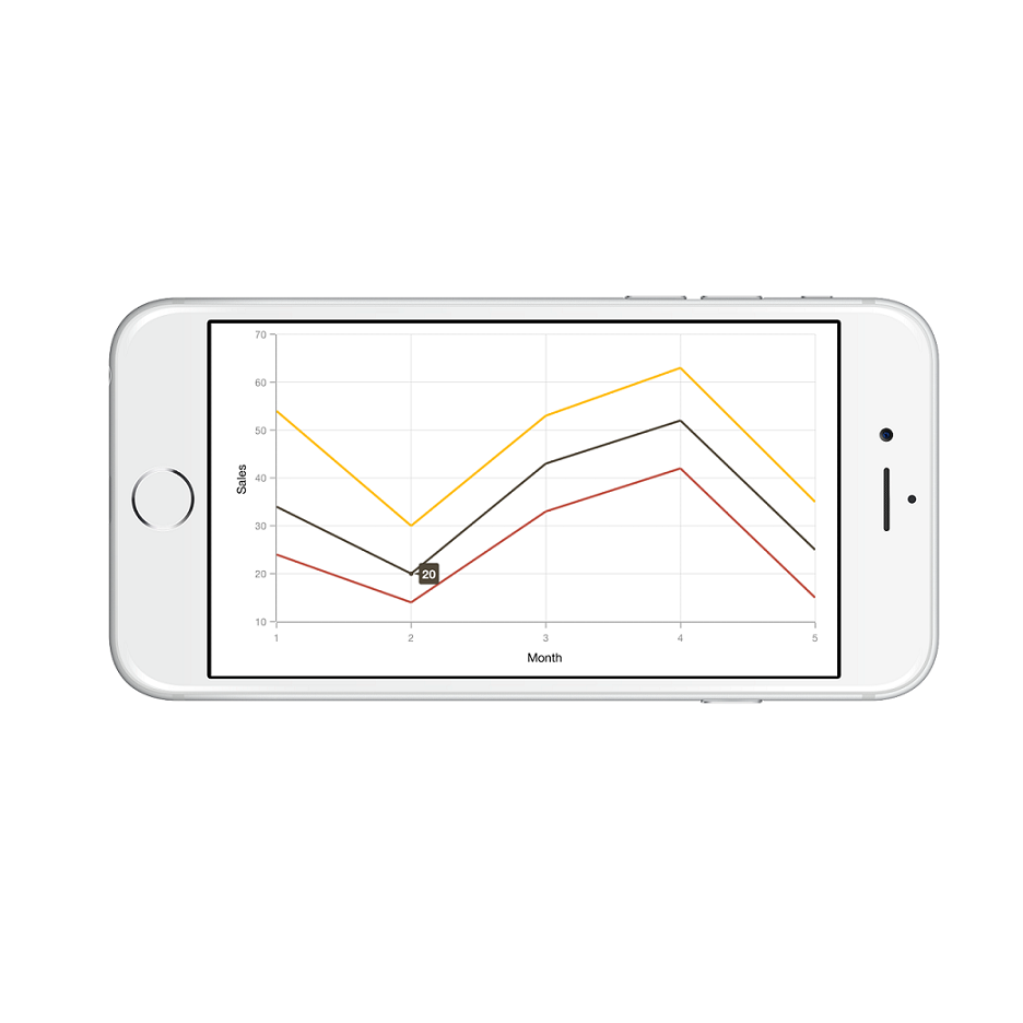
NearestPoint– Displays label for single data point that is nearer to the touch contact position.
SFChartTrackballBehavior behavior   = new SFChartTrackballBehavior ();

behavior.LineStyle.Visible          = false;

behavior.LabelDisplayMode           = SFChartTrackballLabelDisplayMode.NearestPoint;

chart.AddChartBehavior (behavior);
In the following screenshot, trackball label is shown for only single data point,
Activation mode
The ActivationMode property is used to restrict the visibility of trackball based on the touch actions. The default value of this property is SFChartTrackballActivationMode.LongPress.
The SFChartTrackballActivationMode enum contains the following values:
-
LongPress– Activates trackball only when performing the long press action. -
TouchMove– Activates trackball only when performing touch move action. -
None– Hides the visibility of trackball when setting activation mode toNone. It will be activated when calling theShowmethod.
Customizing appearance
Customize Trackball Labels
The LabelStyle property provides options to customize the trackball labels.
-
BorderColor– used to change the label border color. -
BackgroundColor– used to change the label background color. -
BorderWidth– used to change the label border width. -
Color– used to change the text color. -
Font– used to change label font size, family and weight. -
Visible– used to control the visibility of label. -
Margin– used to set the margin for label. -
LabelFormatter– used to format the label.
SFChartTrackballBehavior behavior   = new SFChartTrackballBehavior ();

behavior.LabelStyle.BorderColor     = UIColor.Brown;

behavior.LabelStyle.BorderWidth     = 2;

behavior.LabelStyle.Font            = UIFont.ItalicSystemFontOfSize (18);

behavior.LabelStyle.BackgroundColor = UIColor.Cyan;

behavior.LabelStyle.Color           = UIColor.Red;

chart.AddChartBehavior (behavior);
Customize Trackball Marker
The MarkerStyle property provides options to customize the trackball markers.
-
Visible– used to enable / disable the marker. Default value is true. -
BorderColor– used to change the marker border color. -
Color– used to change the marker background color. -
BorderWidth– used to change the width of the marker border. -
Width– used to change the width of the marker. -
Height– used to change the height of the marker. -
MarkerType– used to change the shapes of the marker.
SFChartTrackballBehavior behavior   = new SFChartTrackballBehavior ();

behavior.MarkerStyle.BorderWidth    = 1;

behavior.MarkerStyle.BorderColor    = UIColor.Purple;

behavior.MarkerStyle.Height         = 8;

behavior.MarkerStyle.Width          = 8;

behavior.MarkerStyle.Color          = UIColor.Green;

behavior.MarkerStyle.Visible        = true;

chart.AddChartBehavior (behavior);
Customize Trackball Line
The LineStyle property provides options to customize the trackball line.
-
Visible– used to enable / disable the line. Default value is true. -
LineWidth– used to change the stroke width of the line. -
LineColor– used to change the stroke color of the line. -
Dashes– Specifies the dashes to be applied on the line.
SFChartTrackballBehavior behavior = new SFChartTrackballBehavior ();

behavior.LineStyle.Visible        = true;

behavior.LineStyle.LineWidth      = new NSNumber (2);

behavior.LineStyle.LineColor      = UIColor.Blue;

NSObject[] dashes                 = new NSObject[2];

dashes [0]                        = (NSNumber)2;

dashes [1]                        = (NSNumber)3;

behavior.LineStyle.Dashes         = NSArray.FromNSObjects (dashes);

chart.AddChartBehavior (behavior);
Following screenshot illustrates the customization of trackball elements.
Axis label alignment
The position of trackball’s axis label can be changed using the LabelAlignment property of SFChartTrackballAxisLabelStyle. The following options are available in LabelAlignment.
-
Far- The label will be positioned below the tick in vertical axis and right of the tick in horizontal axis. -
Near- The label will be positioned above the tick in vertical axis and left of the tick in horizontal axis. -
Center- The label will be positioned at the center of tick. This is the default value.
Show/hide the series label
This feature is used to show/hide the trackball label of the series by using CartesianSeries.ShowTrackballInfo property. Default value of CartesianSeries.ShowTrackballInfo property is True.
SFChart chart = new SFChart();
...

SFLineSeries lineSeries = new SFLineSeries()
{
    ItemsSource = Data,
    XBindingPath = "Year",
    YBindingPath = "Value",
    ShowTrackballInfo = false

};
chart.Series.Add(lineSeries);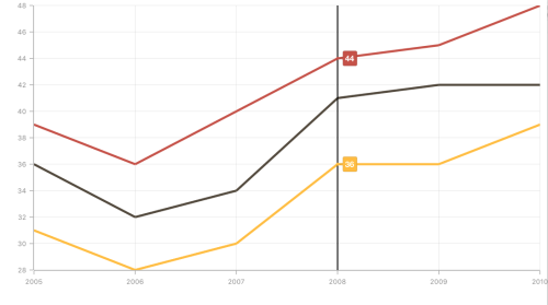
Methods
Show method
The Show method is used to activate the trackball at the specified location.
[C#]

trackball.Show(point);
Hide method
The Hide method is used to hide the trackball programmatically.
[C#]

trackball.Hide();
HitTest method
The HitTest method is used to check whether the point is in trackball or not.
[C#]

trackball.HitTest(pointX, pointY);
TrackballLabelsGenerated
To customize the appearance of trackball label based on condition, override the TrackballLabelsGenerated method of SFChartTrackballBehavior. The argument of this method is SFChartPointInfo which contains the following properties:
-
Label- Used to provide text for trackball label. -
Visible- Determines the visibility of trackball. -
Series- Gets the respective series of the data point in which the trackball is activated. -
LabelStyle- Customize the appearance of trackball label. -
MarkerStyle- Gets the marker style of trackball label. -
Data- Gets the corresponding data model of the trackball label. -
X- Positions the trackball label horizontally. -
Y- Positions the trackball label vertically. -
Color- Customize the color of trackball label.