Appearance in WPF TabControl (TabControlExt)
18 Feb 20254 minutes to read
This section explains different UI customization and theming options available in TabControl.
Change flow direction
You can change the flow direction of the TabControl layout from right to left by setting the FlowDirection property value as RightToLeft. The default value of FlowDirection property is LeftToRight.
<syncfusion:TabControlExt FlowDirection="RightToLeft"
                          Name="tabControlExt">
    <syncfusion:TabItemExt Content="This is the first tab item"
                           Header="tabItem1"/>
</syncfusion:TabControlExt>tabControlExt.FlowDirection = FlowDirection.RightToLeft;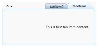
NOTE
View Sample in GitHub
TabItemHeaderStyle
The tab header style can be customized using the TabItemHeaderStyle property in ThemeStudio themes. The default value of TabItemHeaderStyle is Underline.
The available header styes are,
-
Underline
-
Curve
-
Fill
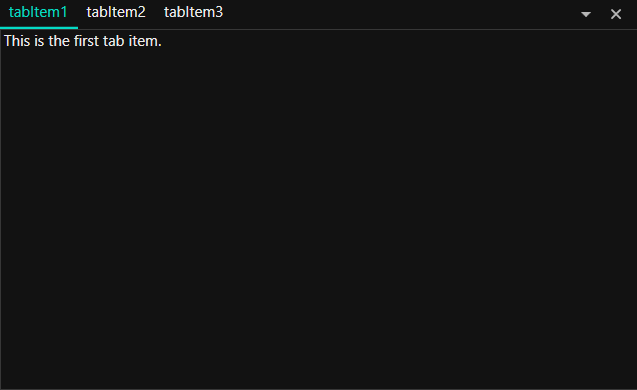
Underline
The following example demonstrates the UI of the Underline header style.
<syncfusion:TabControlExt x:Name="tabControlExt" TabItemHeaderStyle="Underline">
    <syncfusion:TabItemExt Header="tabItem1">
        <TextBlock Name="textBlock" Text="This is the first tab item." />
    </syncfusion:TabItemExt>
    <syncfusion:TabItemExt Header="tabItem2">
        <TextBlock Name="textBlock1" Text="This is the second tab item." />
    </syncfusion:TabItemExt>
    <syncfusion:TabItemExt Header="tabItem3">
        <TextBlock Name="textBlock2" Text="This is the third tab item." />
    </syncfusion:TabItemExt>
</syncfusion:TabControlExt>tabControlExt.TabItemHeaderStyle = TabItemHeaderStyle.Underline;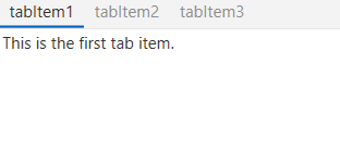
Curve
The following example demonstrates the UI of the Curve header style.
<syncfusion:TabControlExt x:Name="tabControlExt" TabItemHeaderStyle="Curve">
    <syncfusion:TabItemExt Header="tabItem1">
        <TextBlock Name="textBlock" Text="This is the first tab item." />
    </syncfusion:TabItemExt>
    <syncfusion:TabItemExt Header="tabItem2">
        <TextBlock Name="textBlock1" Text="This is the second tab item." />
    </syncfusion:TabItemExt>
    <syncfusion:TabItemExt Header="tabItem3">
        <TextBlock Name="textBlock2" Text="This is the third tab item." />
    </syncfusion:TabItemExt>
</syncfusion:TabControlExt>tabControlExt.TabItemHeaderStyle = TabItemHeaderStyle.Curve;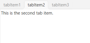
Fill
The following example demonstrates the UI of the Fill header style.
<syncfusion:TabControlExt x:Name="tabControlExt" TabItemHeaderStyle="Fill">
    <syncfusion:TabItemExt Header="tabItem1">
        <TextBlock Name="textBlock" Text="This is the first tab item." />
    </syncfusion:TabItemExt>
    <syncfusion:TabItemExt Header="tabItem2">
        <TextBlock Name="textBlock1" Text="This is the second tab item." />
    </syncfusion:TabItemExt>
    <syncfusion:TabItemExt Header="tabItem3">
        <TextBlock Name="textBlock2" Text="This is the third tab item." />
    </syncfusion:TabItemExt>
</syncfusion:TabControlExt>tabControlExt.TabItemHeaderStyle = TabItemHeaderStyle.Fill;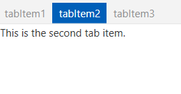
Theme
TabControl supports various built-in themes. Refer to the below links to apply themes for the TabControl,