How can I help you?
Arrange tabs in WPF TabControl (TabControlExt)
18 Feb 202514 minutes to read
This section explains how to arrange the tab item and its alignment functionalities in the TabControl.
Rearrange position of tab items
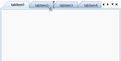
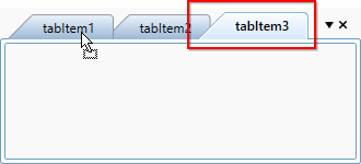
If you want to rearrange the tab items position, drag that item and drop to anywhere you want to place it in the tab panel. You can restrict it by setting the AllowDragDrop property value as false. The default value of AllowDragDrop property is true. The drag marker will preview the location, where you drop the dragged tab item.
<syncfusion:TabControlExt AllowDragDrop="True" >
    <syncfusion:TabItemExt Header="tabItem1" />
    <syncfusion:TabItemExt Header="tabItem2" />
    <syncfusion:TabItemExt Header="tabItem3" />
    <syncfusion:TabItemExt Header="tabItem4" />
    <syncfusion:TabItemExt Header="tabItem5" />
</syncfusion:TabControlExt>tabControlExt.AllowDragDrop = true;NOTE
View Sample in GitHub
Rearrange position of tab items with auto scrolling
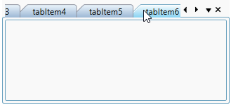
You can easily move or rearrange tab items when there are several tab items by setting the EnableAutoScroll property as true and dragging the respective item over the overflow button (with three dots) or tab scroll buttons to autoscroll.
The default value of EnableAutoScroll property is false.
<syncfusion:TabControlExt EnableAutoScroll="True">
    <syncfusion:TabItemExt Header="tabItem 1" />
    <syncfusion:TabItemExt Header="tabItem 2" />
    <syncfusion:TabItemExt Header="tabItem 3" />
    <syncfusion:TabItemExt Header="tabItem 4" />
    <syncfusion:TabItemExt Header="tabItem 5" />
    <syncfusion:TabItemExt Header="tabItem 6" />
    <syncfusion:TabItemExt Header="tabItem 7" />
</syncfusion:TabControlExt>
TabControlExt tabControlExt = new TabControlExt();
tabControlExt.EnableAutoScroll = true;
change drag marker color
You can change the drag marker color by setting the color value for the DragMarkerColor property. The default value of DragMarkerColor property is Black.
<syncfusion:TabControlExt DragMarkerColor="Red"
                          AllowDragDrop="True">
    <syncfusion:TabItemExt Header="tabItem1" />
    <syncfusion:TabItemExt Header="tabItem2" />
</syncfusion:TabControlExt>tabControlExt.DragMarkerColor = Brushes.Red;
tabControlExt.AllowDragDrop = true;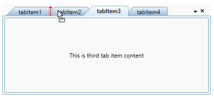
NOTE
View Sample in GitHub
Tab item order changed notification
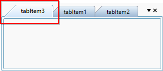
You will be notified when the tab item’s order is changed by using the TabOrderChanged event. You can get the order changed item with its old and new index values by using the TargetItem, OldIndex and NewIndex properties.
NOTE
The
TabOrderChangedevent occurs only during drag and drop operation. Not occurs when add or remove items interactively or using code behind.
<syncfusion:TabControlExt TabOrderChanged="TabControlExt_TabOrderChanged"
                          AllowDragDrop="True" >
    <syncfusion:TabItemExt Header="tabItem1" />
    <syncfusion:TabItemExt Header="tabItem2" />
    <syncfusion:TabItemExt Header="tabItem3" />
</syncfusion:TabControlExt>tabControlExt.AllowDragDrop = true;
tabControlExt.TabOrderChanged += TabControlExt_TabOrderChanged;You can handle the event as follows,
private void TabControlExt_TabOrderChanged(object sender, Syncfusion.Windows.Tools.Controls.TabOrderChangedEventArgs e)
{
    var drag_Drop_Item = e.TargetItem;
    var oldIndex = e.OldIndex;
    var newIndex = e.NewIndex;
}
NOTE
Restrict tab item reordering
If you want to restrict the user to reordering the tab item by drag and drop operation, use the TabOrderChanging event and set Cancel property value as true.
NOTE
The
TabOrderChangingevent occurs only during drag and drop operation. Not occurs when add or remove items using code behind.
<syncfusion:TabControlExt TabOrderChanging="TabControlExt_TabOrderChanging"
                          AllowDragDrop="True" >
    <syncfusion:TabItemExt Header="tabItem1" />
    <syncfusion:TabItemExt Header="tabItem2" />
    <syncfusion:TabItemExt Header="tabItem3" />
</syncfusion:TabControlExt>tabControlExt.AllowDragDrop = true;
tabControlExt.TabOrderChanging += TabControlExt_TabOrderChanging;You can handle the event as follows,
private void TabControlExt_TabOrderChanging(object sender, Syncfusion.Windows.Tools.Controls.TabOrderChangedEventArgs e)
{
    // Restrict the Tab item order changing
    e.Cancel = true;

    var dragged_Item = e.TargetItem;
    var oldIndex = e.OldIndex;
    var newIndex = e.NewIndex;
}
NOTE
Tab items alignment
Tab items can be aligned to any side of the TabControl by using the TabStripPlacement property. The default value of TabStripPlacement property is Top.
The following TabStrip placement options are supported by the TabControl.
- Top - Tab items are placed at top of the
TabControl. - Bottom - Tab items are placed at bottom of the
TabControl. - Left - Tab items are placed at left side of the
TabControl. - Right - Tab items are placed at right side of the
TabControl.
<syncfusion:TabControlExt TabStripPlacement="Bottom">
    <syncfusion:TabItemExt Header="tabItem1" />
    <syncfusion:TabItemExt Header="tabItem2" />
</syncfusion:TabControlExt>tabControlExt.TabStripPlacement = Dock.Bottom;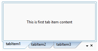
NOTE
View Sample in GitHub
Rotating the tab items
Whenever the TabStripPlacement is set to Left or Right, the tab headers are vertically arranged. To improve the user readability, the tab items can be rotated by using the RotateTextWhenVertical property as true. The default value of RotateTextWhenVertical property is false.
<syncfusion:TabControlExt RotateTextWhenVertical="True"
                          TabStripPlacement="Right">
    <syncfusion:TabItemExt Header="tabItem1" />
    <syncfusion:TabItemExt Header="tabItem2" />
</syncfusion:TabControlExt>tabControlExt.RotateTextWhenVertical = true;
tabControlExt.TabStripPlacement = Dock.Right;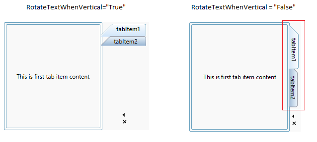
NOTE
View Sample in GitHub
Arrange tab item on single or multiple lines
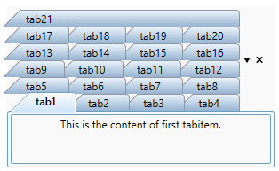
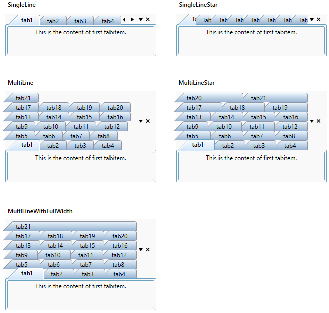
You can arrange the tab item in single-line or multi-line by using the TabItemLayout property. By default, the tab items are arranged in a single line. The default value of TabItemLayout property is SingleLine.
TabControl provides the following layout types.
| TabItemLayout | Description | Image |
|---|---|---|
| SingleLine | Tabs are displayed in single line with default width. If you add more tabs and they exceed the TabControl size, then they are in hidden state and you can navigate to that hidden tabs only by using the scroll button or mouse scrolling. In this mode, each tab size not changed based on the TabControl size. |

|
| SingleLineStar | All the tabs are visible and arranged in single line. TabControl width is equally divided by the tabs. In this mode, each tab size changed based on the TabControl size. |

|
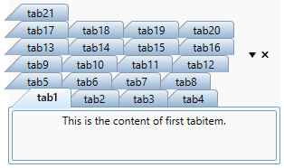
| MultiLine | If you want to arrange tabs with equal width in multiple tab rows , use "MultiLine" mode. |
|
| MultiLineWithFullWidth | To eliminate the empty space at the end of the row,"MultiLineWithFullWidth" is used. Here, the tabs arranged like in multiline except they expand to fill up the empty space at last row. |
|
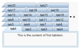
| MultiLineStar | If you want to arrange the multiple tabs with equal with and without any unwanted space at last tab, use the "MultiLineStar" mode. In this mode, multiple tabs are arranged in last row to fill the empty space |
|
NOTE
MultiLineStarmode is preferable for theTabControlwhich contains larger width.
NOTE
View Sample in GitHub
<syncfusion:TabControlExt TabItemLayout="MultiLineStar"
                          Width="300"
                          Name="tabControlExt">
    <syncfusion:TabItemExt Header="tabItem1" />
    <syncfusion:TabItemExt Header="tabItem2" />
</syncfusion:TabControlExt>tabControlExt.TabItemLayout = TabItemLayoutType.MultiLineStar;
NOTE
View Sample in GitHub
Restrict size of a TabItem
By default, size of the tab item is based on its content. When content size changes, tab item size also changes. You can restrict it for any TabItemLayout modes by using theTabItemExt.Width, TabItemExt.MinWidth and TabItemExt.MaxWidth properties. You can resize the tab item only within the TabItemExt.MinWidth and TabItemExt.MaxWidth values.
<syncfusion:TabControlExt  TabItemLayout="SingleLine"
                          Margin="30"
                          Name="tabControlExt">
    <syncfusion:TabItemExt  MinWidth="100"
                            Header="tabItem1"/>
    <syncfusion:TabItemExt Header="tabItem2" />
    <syncfusion:TabItemExt Header="tabItem3" />
</syncfusion:TabControlExt>tabControlExt.TabItemLayout = TabItemLayoutType.SingleLine;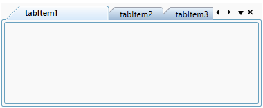
Navigate using mouse or keyboard
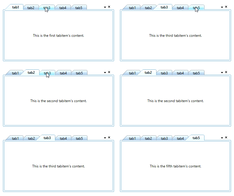
You can navigate from one tab to any other tab by using the mouse click on the tab header. You can use the Ctrl + Tab key to navigate to the next tab item when control not in focused state. You also use the Left-Arrow and Right-Arrow key, to navigate the previous tab item or next tab item from the current tab item.
Navigate using scroll button
If you add more tab items, then some tab headers are collapsed. If you navigate to the collapsed tab items, click the scroll button which is placed in the top-right corner of the tab header panel. You can auto visible or hide the scroll button by using the TabScrollButtonVisibility property value as Auto or Hidden.
The following TabScrollStyle supported by the TabControl control.
- Extended Mode - Provides the Next, Previous, Last and First navigation options
- Normal Mode – Provides the Next and Previous navigation options only
<syncfusion:TabControlExt TabScrollButtonVisibility="Auto"
                          Width="300"
                          Name="tabControlExt">
    <syncfusion:TabItemExt Header="tabItem1" />
    <syncfusion:TabItemExt Header="tabItem2" />
</syncfusion:TabControlExt>tabControlExt.TabScrollButtonVisibility = TabScrollButtonVisibility.Auto;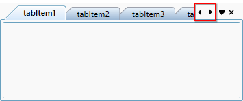
Navigate using scroll button in extended mode
You can easily navigate to first or last or next or previous tab items by setting the TabScrollStyle property value as Extended, then it will show the First, Last, Next, Previous button options in the scroll button. The default value of the TabScrollStyle property is Normal.
<syncfusion:TabControlExt TabScrollButtonVisibility="Auto"
                          TabScrollStyle="Extended"
                          Width="300"
                          Name="tabControlExt">
    <syncfusion:TabItemExt Header="tabItem1" />
    <syncfusion:TabItemExt Header="tabItem2" />
</syncfusion:TabControlExt>tabControlExt.TabScrollStyle = TabScrollStyle.Extended;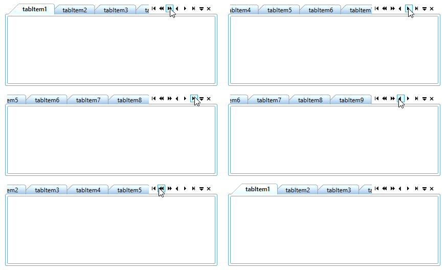
NOTE
View Sample in GitHub
Navigate using tab list menu
You can easily navigate to any tab item by using the tab list menu which is placed in the top-right corner of the tab header panel .The header of all tab item’s are shown as a menu item in the tab list menu. You can hide this tab list menu by using the ShowTabListContextMenu property value as false. The default value of ShowTabListContextMenu property is true.
<syncfusion:TabControlExt ShowTabListContextMenu="True"
                          Name="tabControlExt">
    <syncfusion:TabItemExt Header="tabItem1" />
    <syncfusion:TabItemExt Header="tabItem2" />
</syncfusion:TabControlExt>tabControlExt.ShowTabListContextMenu = true;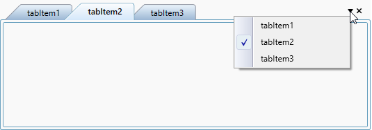
NOTE
View Sample in GitHub
Scroll items using mouse wheel
You can scroll the tab items in TabItemLayout.SingleLine layout mode, by mouse over tab header and scroll the mouse backward or forward direction.
