DataBinding in WPF TabControl (TabControlExt)
9 Jul 202611 minutes to read
You can add a tab item using data binding in the WPF TabControl.
Adding tab items using data binding
The TabControl can be bound to an external source to automatically create tabs and display the data using ItemsSource property. When you are auto generating tabitem using ItemsSource, you need to set HeaderTemplate property in ItemContainerStyle or ItemTemplate to define header and use ContentTemplate to display the content of the tab item.
If the data source implements INotifyCollectionChanged interface, then TabControl will automatically refresh the UI when item is added, removed or cleared in the collection. When an item is added or removed in ObservableCollection, TabControl automatically refresh the UI as ObservableCollection implements INotifyCollectionChanged. But when an item is added or removed in List, TabControl will not refresh the UI automatically.
NOTE
To bind
ItemsSourcetoTabControl, you need to have collection with data object which holds header and content details.
Here, Model class defined with Header and Content properties and ViewModel class has ItemsSource property of type ObservableCollection<Model>.
NOTE
Download demo application from GitHub
// Model.cs
public class Model {
    public string Header { get; set; }
    public string Content { get; set; }
    public Model() {

    }
}

//ViewModel.cs
using Syncfusion.Windows.Shared;

public class ViewModel : NotificationObject {
    private ObservableCollection<Model> tabItems;
    public ObservableCollection<Model> TabItems {
        get { return tabItems; }
        set {
            tabItems = value;
            this.RaisePropertyChanged("TabItems");
        }
    }

    public ViewModel() {
        tabItems = new ObservableCollection<Model>();
        PopulateCollection();
    }

    public void PopulateCollection() {
        Model model1 = new Model() {
            Header = "tab1",
            Content = "This is the content of first tabitem."
        };
        Model model2 = new Model() {
            Header = "tab2",
            Content = "This is the content of second tabitem."
        };

        //Adding the tab items into the collection
        tabItems.Add(model1);
        tabItems.Add(model2);
    }
}<Window.DataContext>
<local:ViewModel />
</Window.DataContext>
<Grid>
<syncfusion:TabControlExt ItemsSource="{Binding TabItems}"
Name="tabControlExt">
<!--Binding the header text for the Tab item-->
<syncfusion:TabControlExt.ItemContainerStyle>
<Style TargetType="syncfusion:TabItemExt">
<Setter Property="HeaderTemplate">
<Setter.Value>
<DataTemplate>
<TextBlock Text="{Binding Header, Mode=TwoWay}" />
</DataTemplate>
</Setter.Value>
</Setter>
</Style>
</syncfusion:TabControlExt.ItemContainerStyle>
<!--Binding the content for the Tab item-->
<syncfusion:TabControlExt.ContentTemplate>
<DataTemplate>
<TextBlock Text="{Binding Content}" />
</DataTemplate>
</syncfusion:TabControlExt.ContentTemplate>
</syncfusion:TabControlExt>
</Grid>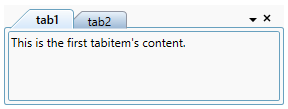
NOTE
View Sample in GitHub
TabItem Header
You can define tab item header using ItemTemplate or HeaderTemplate in ItemContainerStyle properties. Otherwise, Tab Item header will display the data object class name associated with tab item.
NOTE
The data object associated with tab item is the BindingContext for both
ItemContainerStyle.HeaderTemplateandItemTemplate.
<Window.DataContext>
    <local:ViewModel />
</Window.DataContext>

<Grid>
    <syncfusion:TabControlExt x:Name="tabControlExt"
                              ItemsSource="{Binding TabItems}">
        <syncfusion:TabControlExt.ItemContainerStyle>
            <Style TargetType="syncfusion:TabItemExt">
                <Setter Property="HeaderTemplate">
                    <Setter.Value>
                        <DataTemplate>
                            <TextBlock Text="{Binding Header, Mode=TwoWay}" />
                        </DataTemplate>
                    </Setter.Value>
                </Setter>
            </Style>
        </syncfusion:TabControlExt.ItemContainerStyle>
    </syncfusion:TabControlExt>
</Grid>
Below code is used to define the tabitem header using ItemTemplate property.
<Window.DataContext>
    <local:ViewModel />
</Window.DataContext>
<Grid>
    <syncfusion:TabControlExt x:Name="tabControl"
                              ItemsSource="{Binding TabItems}">
        <syncfusion:TabControlExt.ItemTemplate>
            <DataTemplate>
                <TextBlock Text="{Binding Header}"/>
            </DataTemplate>
        </syncfusion:TabControlExt.ItemTemplate>
    </syncfusion:TabControlExt>
</Grid>
NOTE
View Sample in GitHub
TabItem content
You can define the tab item content using ContentTemplate property. Otherwise, Tab item content will display the data object class name which is associated with tab item.
<Window.DataContext>
    <local:ViewModel />
</Window.DataContext>
<Grid>
    <syncfusion:TabControlExt x:Name="tabControl"
                              ItemsSource="{Binding TabItems}">
        <syncfusion:TabControlExt.ContentTemplate>
            <DataTemplate>
                <TextBlock Text="{Binding Content}" />
            </DataTemplate>
        </syncfusion:TabControlExt.ContentTemplate>
    </syncfusion:TabControlExt>
</Grid>
Editing tab header
By default, built-in TextBox is used as editor for the tab item header editing. You can customize the editing tab item header appearance for the each tab items by using the EditHeaderTemplate property.
<Window.DataContext>
    <local:ViewModel />
</Window.DataContext>
<Grid>
    <syncfusion:TabControlExt ItemsSource="{Binding TabItems}"
                              Name="tabControlExt"
                              Margin="20">
        <syncfusion:TabControlExt.ItemContainerStyle>
            <Style TargetType="syncfusion:TabItemExt">
                <Setter Property="HeaderTemplate">
                    <Setter.Value>
                        <DataTemplate>
                            <TextBlock Text="{Binding Header}" />
                        </DataTemplate>
                    </Setter.Value>
                </Setter>
                <Setter Property="Content"
                        Value="{Binding Content}" />
            </Style>
        </syncfusion:TabControlExt.ItemContainerStyle>

        <!--Custom UI for edit header template-->
        <syncfusion:TabControlExt.EditHeaderTemplate>
            <DataTemplate>
                <TextBox Text="{Binding Header, Mode=TwoWay}"
                  Background="Red"
                  Foreground="White" />
            </DataTemplate>
        </syncfusion:TabControlExt.EditHeaderTemplate>
    </syncfusion:TabControlExt>
</Grid>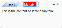
NOTE
View Sample in GitHub