About Syncfusion® WPF Tab Control
18 Nov 20181 minute to read
The WPF Tab Control is similar to the dividers in a notebook or the labels in a file cabinet. By using this control, an application can define multiple pages for the same area of a window. It contains the TabItemExt, which is used to define Tab Items for WPF Tab Control. By clicking a tab item header, the data corresponding to that particular tab item will be displayed.
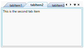
Key features
Tab Orientation - Provides support to position the tabs horizontally at the top or bottom and vertically at the left or right.
Editable header - Provides support to edit the headers interactively in UI by pressing the F2 key or by double-clicking a tab header.
Display mode - Provides support to customize the display mode of the Close button.
Layout - Provides different layout types for enhanced usage to the control. The types are SingleLine, SingleLineStar, MultiLine, MultiLineWithFullWidth, and MultiLineStar.
Pin and UnPin - Provides support to pinning tabs for quick access and allows users to interactively pin and unpin the tabs.
Selection - Provides support to select the tabs quickly through keyboard or mouse interaction.
Styles - Provides a rich set of built-in themes and customizes the style of each part of WPF Tab Control.
Drag and drop - Provides support to reorder the tabs by dragging and dropping headers and change the color of drag marker while dragging the tab page in WPF Tab Control.
Scrolling - Provides support to scroll the tab items to next, previous, first, and last in WPF Tab Control.
Images - Provides support to add images to the tab header and also aligns the header image to any position.
Context menu - Provides support to built-in context menu option for tab list and tab item.