How can I help you?
Select tab in WPF TabControl (TabControlExt)
18 Feb 20255 minutes to read
This section explains how to select tab item and selection functionalities in the TabControl.
Select tab item using mouse or keyboard
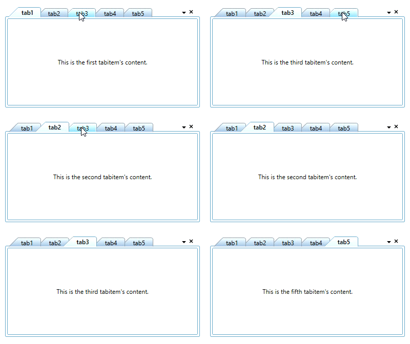
You can select a particular tab item by using the mouse click on the tab header. You can use the Ctrl + Tab key to select a next tab item when control not in focused state. You also use the Left-Arrow and Right-Arrow key , to select the previous tab item or next tab item of current selected tab item when control in focused state. You can get the selected item by using the SelectedItem property. By default, the first tab item is selected.
NOTE
You can select only one tab item at a time.

Tab selection changed notification
The TabControl notifies that the selected tabitem is changed by user through the SelectedItemChangedEvent event. You can use the OldSelectedItem and NewSelectedItem properties to get the old and new selected tabitem in the SelectedItemChangedEvent event.
<syncfusion:TabControlExt SelectedItemChangedEvent="TabControlExt_SelectedItemChangedEvent"
                          Name="tabControlExt" />
TabControlExt tabControlExt = new TabControlExt();
tabControlExt.SelectedItemChangedEvent += TabControlExt_SelectedItemChangedEvent;You can handle the event as follows:
private void TabControlExt_SelectedItemChangedEvent(object sender, SelectedItemChangedEventArgs e) {
    var newTabItem = e.NewSelectedItem.Header;
    if (e.OldSelectedItem != null) {
        var oldTabItem = e.OldSelectedItem.Header;
    }
    else {
        var oldTabItem = string.Empty;
    }
}
Load the previously selected tab item content
If you want to load the previously selected tab item in background after new tab item is selected, use the IsDisableUnloadTabItemExtContent property value as true. The default value of IsDisableUnloadTabItemExtContent property is false.
<syncfusion:TabControlExt IsDisableUnloadTabItemExtContent="True"
                          Name="tabControlExt">
    <syncfusion:TabItemExt Header="tab1" Name="tabItemExt1"/>
    <syncfusion:TabItemExt Header="tab2" Name="tabItemExt2"/>
</syncfusion:TabControlExt>tabControlExt.IsDisableUnloadTabItemExtContent = true;
NOTE
View Sample in GitHub
Display mode of the selected tab item
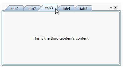
If you want to show tab items without its headers in the TabControl, use the FullScreenMode property. If you set FullScreenMode property value as ControlMode, then it will auto hide headers and show it only on when hover the mouse on respective tab header placed area. You can also display the TabControl in the full window by setting the FullScreenMode property value as WindowMode. The default value of FullScreenMode property is None.
<syncfusion:TabControlExt FullScreenMode="ControlMode"
                          TabStripPlacement="Bottom"
                          Name="tabControlExt">
    <syncfusion:TabItemExt Header="tabItem1" />
    <syncfusion:TabItemExt Header="tabItem2" />
    <syncfusion:TabItemExt Header="tabItem3" />
</syncfusion:TabControlExt>tabControlExt.FullScreenMode = FullScreenMode.ControlMode;
tabControlExt.TabStripPlacement = Dock.Bottom;
Customize selected tab item header
You can change the selected tab item header font weight, background and foreground.
Change selected tab header font weight
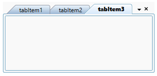
If you want to highlight the selected tab header, change the font of tab header from semi bold to extra bold by using the SelectedItemFontWeight property. The default value of SelectedItemFontWeight property is SemiBold.
<syncfusion:TabControlExt SelectedItemFontWeight="ExtraBold"
                          Name="tabControlExt">
    <syncfusion:TabItemExt Header="tabItem1" Name="tabItemExt1"/>
    <syncfusion:TabItemExt Header="tabItem2" Name="tabItemExt2"/>
</syncfusion:TabControlExt>tabControlExt.SelectedItemFontWeight = FontWeights.ExtraBold;
NOTE
View Sample in GitHub
Change selected tab header background and foreground
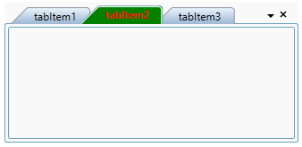
You can change the highlighting background and foreground of the selected tab item by using the TabItemSelectedForeground and TabItemSelectedBackground properties. The default value of TabItemSelectedForeground property is Black and TabItemSelectedBackground property is Lavender.
<syncfusion:TabControlExt TabItemSelectedForeground="Red"
                          TabItemSelectedBackground="Green"
                          Name="tabControlExt">
    <syncfusion:TabItemExt Header="tabItem1" Name="tabItemExt1"/>
    <syncfusion:TabItemExt Header="tabItem2" Name="tabItemExt2"/>
</syncfusion:TabControlExt>tabControlExt.TabItemSelectedForeground = Brushes.Red;
tabControlExt.TabItemSelectedBackground = Brushes.Green;
NOTE
View Sample in GitHub