Getting Started with WPF TabControl (TabControlExt)
9 Jul 202620 minutes to read
This section explains how to create a WPF TabControl and explains about its structure.
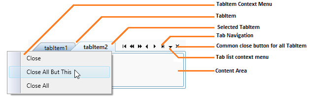
Structure of TabControl
The various elements of TabControl are illustrated in the following images.
Assembly deployment
Refer to the Control Dependencies section to get the list of assemblies or NuGet package that needs to be added as a reference to use the control in any application.
Refer to this documentation to find more details about installing nuget packages in a WPF application.
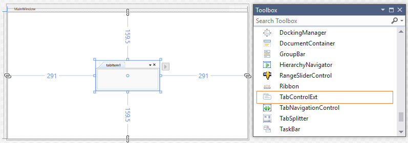
Adding WPF TabControl via designer
You can add the TabControl control to an application by dragging it from the toolbox to a view of the designer. The following dependent assembly will be added automatically.
- Syncfusion.Tools.WPF
- Syncfusion.Shared.WPF
Adding WPF TabControl via XAML
To add the TabControl manually in XAML, follow these steps:
-
Create a new WPF project in Visual Studio.
-
Add the following required assembly references to the project:
- Syncfusion.Tools.WPF
- Syncfusion.Shared.WPF
-
Import Syncfusion® WPF schema http://schemas.syncfusion.com/wpf, and declare the
TabControlin XAML page.<Window x:Class="TabControlExt_sample.MainWindow" xmlns="http://schemas.microsoft.com/winfx/2006/xaml/presentation" xmlns:x="http://schemas.microsoft.com/winfx/2006/xaml" xmlns:d="http://schemas.microsoft.com/expression/blend/2008" xmlns:mc="http://schemas.openxmlformats.org/markup-compatibility/2006" xmlns:local="clr-namespace:TabControlExt_sample" xmlns:syncfusion="http://schemas.syncfusion.com/wpf" mc:Ignorable="d" Title="MainWindow" Height="450" Width="800"> <Grid Name="grid"> <syncfusion:TabControlExt Name="tabControl" Height="100" Width="280" /> </Grid>
Adding WPF TabControl via C#
To add the TabControl control manually in C#, follow these steps:
-
Create a new WPF application via Visual Studio.
- Add the following assembly references to the project,
- Syncfusion.Shared.WPF
- Syncfusion.Tools.WPF
-
Include the required namespace and create an instance of
TabControland add it to the window.using Syncfusion.Windows.Tools.Controls; public partial class MainWindow : Window { public MainWindow() { InitializeComponent(); // Creating an instance of the TabControl TabControlExt tabControlExt = new TabControlExt(); // Setting height and width to TabControl tabControlExt.Height = 100; tabControlExt.Width = 280; //Adding TabControl as window content this.Content = tabControlExt; } }
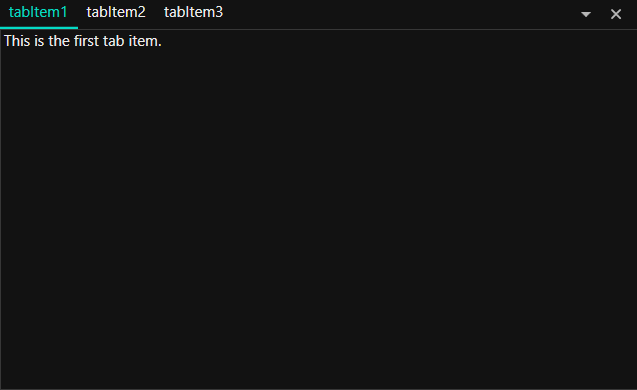
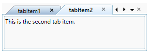
Adding TabItem
You can add the tab item using the Items property of TabControl. You can set the tab item name using TabItemExt property and add the content to each tab item by using TabItemExt.Content property.
<syncfusion:TabControlExt Name="tabControlExt">
    <syncfusion:TabItemExt Header="tabItem1">
        <TextBlock Name="textBlock" Text="This is the first tab item." />
    </syncfusion:TabItemExt>
    <syncfusion:TabItemExt Header="tabItem2">
        <TextBlock Name="textBlock1" Text="This is the second tab item." />
    </syncfusion:TabItemExt>
    <syncfusion:TabItemExt Header="tabItem3">
        <TextBlock Name="textBlock2" Text="This is the third tab item." />
    </syncfusion:TabItemExt>
</syncfusion:TabControlExt>
// Creating an instances of tabitems and adding header & content
TabItemExt tabItemExt1 = new TabItemExt()
{
Header= "tabItem1",
Content= new TextBlock() { Text= "This is the first tab item" }
};
TabItemExt tabItemExt2 = new TabItemExt()
{
Header= "tabItem2",
Content= new TextBlock() { Text= "This is the second tab item" }
};
TabItemExt tabItemExt3 = new TabItemExt()
{
Header= "tabItem3",
Content= new TextBlock() { Text= "This is the third tab item" }
};
// Creating an instances of TabControl and adding the tabitems into the TabControl
TabControlExt tabControlExt = new TabControlExt();
tabControlExt.Items.Add(tabItemExt1);
tabControlExt.Items.Add(tabItemExt2);
tabControlExt.Items.Add(tabItemExt3);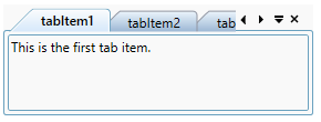
Please refer DataBinding page to know about how to add a tab item using Data Binding.
NOTE
View Sample in GitHub
Placement of TabItem
You can place the tab item header at any of the four sides of TabControl using the TabStripPlacement property.
<syncfusion:TabControlExt TabStripPlacement="Bottom"
                          Name="tabControlExt">
    <syncfusion:TabItemExt Header="tabItem1" />
    <syncfusion:TabItemExt Header="tabItem2" />
    <syncfusion:TabItemExt Header="tabItem3" />
</syncfusion:TabControlExt>tabControlExt.TabStripPlacement = Dock.Bottom;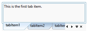
NOTE
View Sample in GitHub
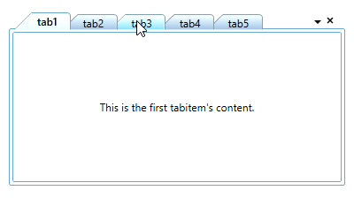
Selecting TabItem
You can select a particular tab item by using the mouse click on the tab header. You can use the Ctrl + Tab key to select a tab item when the control is in a focused state. You can also use the Left-Arrow and Right-Arrow keys to select the previous tab item or next tab item of the currently selected tab item when the control is focused. You can get the selected item by using the SelectedItem property. By default, the first tab item is selected.
NOTE
You can select only one tab item at a time.
NOTE
View Sample in GitHub
Tab selection changed notification
The TabControl notifies that the selected tab item is changed by user through the SelectedItemChangedEvent event. You can use the OldSelectedItem and NewSelectedItem properties to get the old and new selected tabitem in the SelectedItemChangedEvent event.
<syncfusion:TabControlExt SelectedItemChangedEvent="TabControlExt_SelectedItemChangedEvent"
                          Name="tabControlExt" />
TabControlExt tabControlExt = new TabControlExt();
tabControlExt.SelectedItemChangedEvent += TabControlExt_SelectedItemChangedEvent;You can handle the event as follows:
private void TabControlExt_SelectedItemChangedEvent(object sender, SelectedItemChangedEventArgs e) {
    var newTabItem = e.NewSelectedItem.Header;
    if (e.OldSelectedItem != null) {
        var oldTabItem = e.OldSelectedItem.Header;
    }
    else {
        var oldTabItem = string.Empty;
    }
}
Closing the tab item
TabControl allows end-users to close the tabs using close button. The close button can be displayed in Tabcontrol using TabControlExt.CloseButtonType property.
The following options are supported to show close the button in TabControl.
-
Common - Only,
TabControlshows the close button. -
Individual - The close button displayed only in the headers of tab items.
-
Both -
TabControland tab items displays the close button. -
Hide - The close button is not visible.
-
IndividualOnMouseOver - The close button displayed only when the mouse is over the tab item.
-
Extended - The close button displayed only for the selected tabitem and the remaining tab item displays close button while mouse is over the tab header.
For example, when you set the TabControlExt.CloseButtonType as Both, then the close button is displayed in both TabItem and TabControl.
<syncfusion:TabControlExt Name="tabControlExt" CloseButtonType="Both">
    <syncfusion:TabItemExt Header="tabItem1" />
    <syncfusion:TabItemExt Header="tabItem2" />
</syncfusion:TabControlExt>
//set `Both` option to `CloseButtonType` property.
tabControlExt.CloseButtonType = CloseButtonType.Both;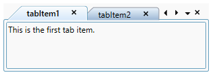
NOTE
View Sample in GitHub
Disable particular tab close button
You can disable the users from closing on particular tab item by setting TabItemExt.CanClose property as false.
<syncfusion:TabControlExt CloseButtonType="Both"
                  Name="tabControlExt" >
    <syncfusion:TabItemExt Header="tabItem1" Name="tabItem1"/>
    <syncfusion:TabItemExt Header="tabItem2" Name="tabItem2"
                           CanClose="False" />
</syncfusion:TabControlExt>
//set `Both` option to `CloseButtonType` property.
tabControlExt.CloseButtonType = CloseButtonType.Both;
//Disable the close button.
tabItem2.CanClose = false;In the below screenshot, second tabitem TabItemExt.CanClose property is false. So, close button in tabitem header and TabControl is in disabled state for second tabitem.
NOTE
View Sample in GitHub
Hide particular tab close button
If you want to hide the visibility of close button in particular tab item, then you can collapse using TabItemExt.CloseButtonState property value as Collapsed.
<syncfusion:TabControlExt CloseButtonType="Both"
                          Name="tabControlExt" >
    <syncfusion:TabItemExt Header="tabItem1" Name="tabItem1" />
    <syncfusion:TabItemExt Header="tabItem2" Name="tabItem2"
                           CloseButtonState="Collapsed"
                           CanClose="False"/>
</syncfusion:TabControlExt>
//set `Both` option to `CloseButtonType` property.
tabControlExt.CloseButtonType = CloseButtonType.Both;
//Disable the close button.
tabItem2.CanClose = false;
//Collapse the close button.
tabItem2.CloseButtonState = Collapsed;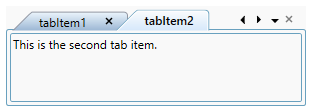
Here, tabItem2 close button is collapsed.
NOTE
View Sample in GitHub
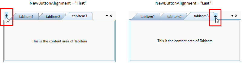
Add new TabItem using new button
You can add the new tab item by clicking the New button. You can show the new tab button by setting the TabControlExt.IsNewButtonEnabled property to true in TabControl. The NewButtonClick event handles the click action of new tab button to add new tab item in TabControl.
<syncfusion:TabControlExt IsNewButtonEnabled="True"
                          NewButtonClick="TabControlExt_NewButtonClick"
                          Name="tabControlExt" >
    <syncfusion:TabItemExt Header="tabItem1" />
    <syncfusion:TabItemExt Header="tabItem2" />
</syncfusion:TabControlExt>
tabControlExt.IsNewButtonEnabled = true;
tabControlExt.NewButtonClick += TabControlExt_NewButtonClick;
private void TabControlExt_NewButtonClick(object sender, EventArgs e) {
    TabItemExt itemExt = new TabItemExt();
    itemExt.Header = "tabItem" + (tabControlExt.Items.Count + 1);

    //Add a new item in a TabControl
    tabControlExt.Items.Add(itemExt);
}
NOTE
View Sample in GitHub
Tab list menu for switching tabs
You can easily navigate to any tab item by using the tab list menu which is placed in the top-right corner of the tab header panel .The header of all tab item’s are shown as a menu item in the tab list menu. You can hide this tab list menu by using the ShowTabListContextMenu property value as false. The default value of ShowTabListContextMenu property is true.
<syncfusion:TabControlExt ShowTabListContextMenu="True"
                          Name="tabControlExt" >
    <syncfusion:TabItemExt Header="tabItem1" />
    <syncfusion:TabItemExt Header="tabItem2" />
</syncfusion:TabControlExt>tabControlExt.ShowTabListContextMenu = true;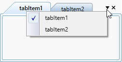
NOTE
View Sample in GitHub
Show hidden tab items
By default, all the tab items except hidden items are listed in the tab list context menu. If you wants to show the hidden tab items into tab list context menu to navigate, use the TabListContextMenuOptions property value as Default, ShowHiddenItems. You can set single or multiple options for the TabListContextMenuOptions to show single or different types of tab items into the context menu. The default value of TabListContextMenuOptions property is Default.
<syncfusion:TabControlExt TabListContextMenuOptions="Default, ShowHiddenItems"
                          ShowTabListContextMenu="True"
                          Name="tabControlExt">
    <syncfusion:TabItemExt Header="tabItem1" Visibility="Collapsed"/>
    <syncfusion:TabItemExt Header="tabItem2"/>
    <syncfusion:TabItemExt Header="tabItem3" Visibility="Collapsed"/>
    <syncfusion:TabItemExt Header="tabItem4" IsEnabled="False"/>
    <syncfusion:TabItemExt Header="tabItem5"/>
    <syncfusion:TabItemExt Header="tabItem6" Visibility="Collapsed"/>
</syncfusion:TabControlExt>tabControlExt.ShowTabListContextMenu = true;
tabControlExt.TabListContextMenuOptions = TabListContextMenuOptions.Default |
TabListContextMenuOptions.ShowHiddenItems;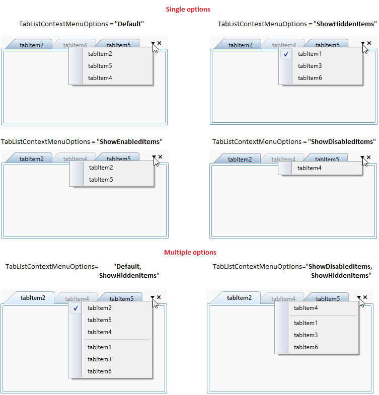
NOTE
View Sample in GitHub
Enable or disable tab navigation bar
You can enable or disable the the tab navigation bar in TabControl by using the TabScrollButtonVisibility property value as Visible or Hidden. You can show the different tab navigation style in TabControl using the TabScrollStyle property.
<syncfusion:TabControlExt TabScrollButtonVisibility="Visible"
                          TabScrollStyle="Extended"
                          Name="tabControlExt" >
    <syncfusion:TabItemExt Header="tabItem1" />
    <syncfusion:TabItemExt Header="tabItem2" />
</syncfusion:TabControlExt>tabControlExt.TabScrollButtonVisibility = TabScrollButtonVisibility.Visible;
tabControlExt.TabScrollStyle = TabScrollStyle.Extended;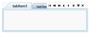
NOTE
View Sample in GitHub
Show or hide built-in context menu
You can show the built-in context menu of the tab item by setting the ShowTabItemContextMenu property to true in TabControl.
The built-in context menu of the tab item has following menu items:
- Close - Closes the current or selected tab item.
- Close All But This - Closes all the tab items, except the current or selected tab item.
- Close All - Closes all the tab items.
<syncfusion:TabControlExt ShowTabItemContextMenu="True"
                          Name="tabControlExt" >
    <syncfusion:TabItemExt Header="tabItem1" />
    <syncfusion:TabItemExt Header="tabItem2" />
</syncfusion:TabControlExt>
//Changing the visibility of context menu
tabControlExt.ShowTabItemContextMenu = true;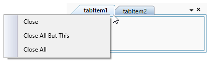
You can add custom context menu item using the TabItemExt.ContextMenuItems property in TabControl. This property is enabled by setting the IsCustomTabItemContextMenuEnabled property to true.
<syncfusion:TabControlExt IsCustomTabItemContextMenuEnabled="True"
                          Name="tabControlExt">
    <syncfusion:TabItemExt Header="tabItem1" Name="tabItem1">
        <syncfusion:TabItemExt.ContextMenuItems>
            <syncfusion:CustomMenuItem Header="Menu1" />
        </syncfusion:TabItemExt.ContextMenuItems>
    </syncfusion:TabItemExt>
    <syncfusion:TabItemExt Header="tabItem2" Name="tabItem2">
        <syncfusion:TabItemExt.ContextMenuItems>
            <syncfusion:CustomMenuItem Header="Menu2" />
        </syncfusion:TabItemExt.ContextMenuItems>
    </syncfusion:TabItemExt>
</syncfusion:TabControlExt>
// Enabling custom tabitem context menu
tabControlExt.IsCustomTabItemContextMenuEnabled = true;
// Adding custom context menu for the first tabitem
CustomMenuItem customMenuItem = new CustomMenuItem() { Header="Menu1" };
tabItem1.ContextMenuItems.Add(customMenuItem);
// Adding custom context menu for the second tabitem
CustomMenuItem customMenuItem1 = new CustomMenuItem() { Header = "Menu1" };
tabItem2.ContextMenuItems.Add(customMenuItem1);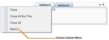
NOTE
View Sample in GitHub
Localization support
Localization is the process of translating the application resources into different language for the specific cultures. You can localize the TabControl control by adding resource file for each language.
Refer the following links to know more about how provide a localization support for the TabControl,
- https://help.syncfusion.com/wpf/localization
- https://github.com/syncfusion/wpf-controls-localization-resx-files
Theme
The WPF TabControl supports various built-in themes. Refer to the below links to apply themes for the TabControl,
NOTE
View Sample in GitHub