TabItem Header in WPF TabControl (TabControlExt)
9 Jul 202615 minutes to read
This section explains how to set header text and UI customization of the tab header in the TabControl.
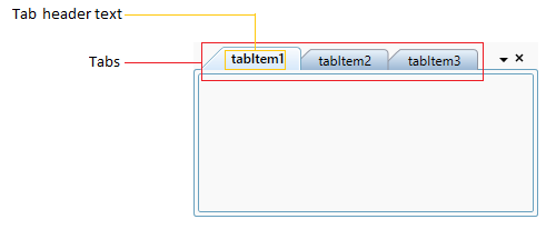
Setting tab item header
You can add text to each tab header by using the TabItemExt.Header property.
<syncfusion:TabControlExt Name="tabControlExt">
    <syncfusion:TabItemExt Header="tabItem1" Name="tabItemExt1"/>
    <syncfusion:TabItemExt Header="tabItem2" Name="tabItemExt2"/>
    <syncfusion:TabItemExt Header="tabItem3" Name="tabItemExt3"/>
</syncfusion:TabControlExt>
// Creating an instances of tabitems and adding header
TabItemExt tabItemExt1 = new TabItemExt() { Header = "tabItem1" };
TabItemExt tabItemExt2 = new TabItemExt() { Header = "tabItem2" };
TabItemExt tabItemExt3 = new TabItemExt() { Header = "tabItem3" };
// Creating an instances of TabControl and adding the tabitems into the TabControl
TabControlExt tabControlExt = new TabControlExt();
tabControlExt.Items.Add(tabItemExt1);
tabControlExt.Items.Add(tabItemExt2);
tabControlExt.Items.Add(tabItemExt3);
Edit tab item header at runtime
You can edit the text of the tab header at runtime by double clicking the tab header or selecting a tab and pressing the Ctrl + F2 key. Press Enter to commit the change or Esc to cancel the edit. You can restrict all the tab header editing by using the EnableLabelEdit property value as false. The default value of EnableLabelEdit property is true.
<syncfusion:TabControlExt EnableLabelEdit="True"
                          Name="tabControlExt">
    <syncfusion:TabItemExt Header="tabItem1"/>
    <syncfusion:TabItemExt Header="tabItem2"/>
</syncfusion:TabControlExt>tabControlExt.EnableLabelEdit = true;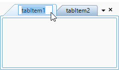
NOTE
View Sample in GitHub
Restrict header editing for specific tab item
If you want to restrict header editing for specific tab item, handle the BeforeLabelEdit and setting the EnableLabelEdit property as true for that specific tab item.
<syncfusion:TabControlExt BeforeLabelEdit="tabControlExt_BeforeLabelEdit"
                          EnableLabelEdit="True"
                          Name="tabControlExt">
    <syncfusion:TabItemExt Header="tabItem1"/>
    <syncfusion:TabItemExt Header="tabItem2"/>
</syncfusion:TabControlExt>tabControlExt.BeforeLabelEdit += tabControlExt_BeforeLabelEdit;
tabControlExt.EnableLabelEdit = true;You can restrict the specific tab item as follows,
private void tabControlExt_BeforeLabelEdit(object sender, BeforeLabelEditEventArgs e) {
    //Retrict header editing for tabItem1
    if( e.HeaderBeforeEdit.ToString() == "tabItem1" ) {
        e.Cancel = true;
    }
}
Custom UI for the edit tab item header
You can customize the editing tab item header appearance for each tab item by using the EditHeaderTemplate property.
Please refer Editing tab header topic to know more details about EditHeaderTemplate.
NOTE
View Sample in GitHub
Setting size and alignment of tab header
You can set a size of each tab by using the TabItemExt.Width and TabItemExt.Height properties. You can also align the header content horizontally and vertically by using the TabItemExt.HorizontalContentAlignment and TabItemExt.VerticalContentAlignment properties. The default value of TabItemExt.HorizontalContentAlignment and TabItemExt.VerticalContentAlignment properties is Stretch.
<syncfusion:TabControlExt Name="tabControlExt">
    <syncfusion:TabItemExt Width="200" Height="30"
                           HorizontalContentAlignment="Left"
                           VerticalContentAlignment="Center"
                           Header="tabItem1"
                           Name="tabItemExt1"/>
    <syncfusion:TabItemExt Width="100" Height="30"
                           VerticalContentAlignment="Bottom"
                           HorizontalContentAlignment="Right"
                           Header="tabItem2"
                           Name="tabItemExt2"/>
</syncfusion:TabControlExt>
//Adding size and alignment of tabItemExt1 header
tabItemExt1.Width = 200;
tabItemExt1.Height = 30;
tabItemExt1.HorizontalContentAlignment = HorizontalAlignment.Left;
tabItemExt1.VerticalContentAlignment = VerticalAlignment.Center;
//Adding size and alignment of tabItemExt2 header
tabItemExt2.Width = 100;
tabItemExt2.Height = 30;
tabItemExt2.HorizontalContentAlignment = HorizontalAlignment.Right;
tabItemExt2.VerticalContentAlignment = VerticalAlignment.Bottom;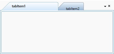
Setting image for tab item header
You can add images to the tab item headers by using the TabItemExt.Image property. You can change the height and width of the header image by using the TabItemExt.ImageHeight and TabItemExt.ImageWidth properties.
<!-- Adding TabcontrolExt  -->
<syncfusion:TabControlExt Name="tabControlExt">

    <!-- Adding TabItemExt with image  -->
    <syncfusion:TabItemExt Image="sync_icon.ico"
                           ImageWidth="20"
                           ImageHeight="20"
                           Header="TabItemExt1"
                           Name="tabItemExt1">
    </syncfusion:TabItemExt>
</syncfusion:TabControlExt>
//Adding header image for tabItemExt1
tabItemExt1.Image = new BitmapImage(
new Uri(@"\sync_icon.ico", UriKind.RelativeOrAbsolute));
//Setting height and width for the tab header image
tabItemExt1.ImageWidth = 20;
tabItemExt1.ImageHeight = 20;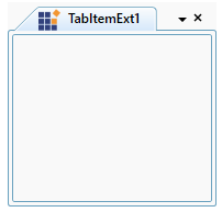
NOTE
View Sample in GitHub
Tab header image alignment
You can align the tab item header image by using the TabItemExt.ImageAlignment property. You can set a margin for the image by using the TabItemExt.IconMargin property. The default value of TabItemExt.ImageAlignment property is LeftOfText and TabItemExt.IconMargin property is 0,0,0,4. You can align the image to any one of the following positions.
-
AboveText- Images are placed above the tab item header text. -
BelowText– Images are placed below the tab item header text. -
LeftOfText– Images are placed to the left of the tab item header text. -
RightOfText– Images are placed to the right of the tab item header text.
<!-- Adding TabcontrolExt  -->
<syncfusion:TabControlExt Name="tabControlExt">

    <!-- Adding TabItemExt with image with alignment  -->
    <syncfusion:TabItemExt Image="sync.png"
                           ImageAlignment="AboveText"
                           IconMargin= "2"
                           Header="TabItemExt1"
                           Name="tabItemExt1">
    </syncfusion:TabItemExt>
</syncfusion:TabControlExt>
//Setting alignment for the tab header image
tabItemExt1.ImageAlignment = ImageAlignment.AboveText;
tabItemExt1.IconMargin = new Thickness(2);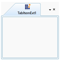
NOTE
View Sample in GitHub
Setting tooltip
ToolTip is used to show the information about the segment, when you mouse over on the segment. You can add a tooltip information for each tab item by using the TabItemExt.ItemToolTip property and show it by hovering the mouse on the respective header of the tab item.
<syncfusion:TabControlExt Name="tabControlExt">
    <syncfusion:TabItemExt ItemToolTip="First item"
                           Header="tabItem1" Name="tabItemExt1"/>
    <syncfusion:TabItemExt ItemToolTip="Second item"
                           Header="tabItem2" Name="tabItemExt2"/>
</syncfusion:TabControlExt>tabItemExt1.ItemToolTip = "First item";
tabItemExt2.ItemToolTip = "Second item";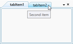
Hide tab header when there is single tab item
You can hide the header of tab item only on when single tab item present in the TabControl. You can enable it by using the HideHeaderOnSingleChild property value as true. The Default value of HideHeaderOnSingleChild property is false.
<syncfusion:TabControlExt HideHeaderOnSingleChild="True"
                          Name="tabControlExt">
    <syncfusion:TabItemExt Content="This is the first tab item"
                           Header="tabItem1"/>
</syncfusion:TabControlExt>tabControlExt.HideHeaderOnSingleChild = true;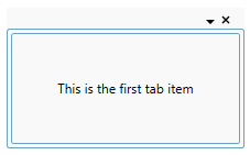
NOTE
View Sample in GitHub
Customize tab item header
You can change the tab item header background and foreground.
Change tab item background
If you want to change the tab item and its header panel background, use the Background and TabPanelBackground properties. You can change the hover background of all tab headers by using the TabItemHoverBackground property. You can also change the individual tab item header background and its hover background by using the TabItemExt.Background and TabItemExt.HoverBackground properties.
NOTE
If you use both
TabItemHoverBackgroundandTabItemExt.HoverBackgroundfor the tab item, theTabItemExt.HoverBackgroundhave higher priority for that tab item.
<syncfusion:TabControlExt Background="LightPink"
                          TabPanelBackground="Green"
                          TabItemHoverBackground="Orange"
                          Name="tabControlExt">
    <syncfusion:TabItemExt HoverBackground="LightPink"
                           Background="Red"
                           Header="tabItem1"
                           Name="tabItemExt1"/>
    <syncfusion:TabItemExt HoverBackground="Green"
                           Background="Blue"
                           Header="tabItem2"
                           Name="tabItemExt2"/>
</syncfusion:TabControlExt>
//Setting the tab items panel, headers and its hover background
tabControlExt.Background = Brushes.LightPink;
tabControlExt.TabPanelBackground = Brushes.Green;
tabControlExt.TabItemHoverBackground = Brushes.Orange;
//Setting the header and hover background for the particular tab item
tabItemExt1.Background = Brushes.Red;
tabItemExt2.Background = Brushes.Blue;
tabItemExt1.HoverBackground = Brushes.LightPink;
tabItemExt2.HoverBackground = Brushes.Green;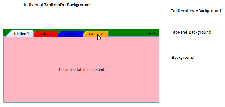
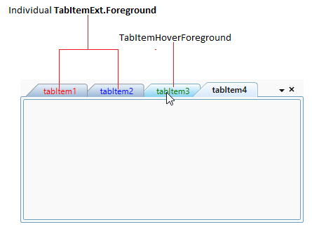
Change tab item foreground
You can change the hover foreground of all tab headers by using the TabItemHoverForeground property. You can also change the individual tab item header foreground by using the TabItemExt.Foreground property. The default value of TabItemHoverForeground and TabItemExt.Foreground properties is Black.
<syncfusion:TabControlExt TabItemHoverForeground="Green"
                          Name="tabControlExt">
    <syncfusion:TabItemExt Foreground="Red"
                           Header="tabItem1"
                           Name="tabItemExt1"/>
    <syncfusion:TabItemExt Foreground="Blue"
                           Header="tabItem2"
                           Name="tabItemExt2"/>
</syncfusion:TabControlExt>
//Setting the tab items hover foreground
tabControlExt.TabItemHoverForeground = Brushes.Green;
//Setting the header and item foreground for the particular tab item
tabItemExt1.Foreground = Brushes.Red;
tabItemExt2.Foreground = Brushes.Blue;