How can I help you?
Appearance in WPF AutoComplete (Classic)
5 May 20211 minute to read
Theme
AutoComplete supports various built-in themes. Refer to the below links to apply themes for the AutoComplete,
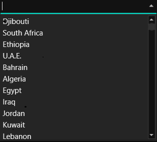
Show the shadow effect
You can show the shadow effect of AutoComplete by using DropShadowEffect. You can also set the distance between the control and shadow by using ShadowDepth property.
Refer the below code for your reference.
<syncfusion:AutoComplete Height="30" Width="150" Text="AutoComplete">
    <syncfusion:AutoComplete.Effect>
        <DropShadowEffect ShadowDepth="10" Color="LightGray" Opacity="2" />
    </syncfusion:AutoComplete.Effect>
</syncfusion:AutoComplete>
AutoComplete autoComplete = new AutoComplete();
autoComplete.Height = 30;
autoComplete.Width = 150;
autoComplete.Text = "AutoComplete";
DropShadowEffect shadowEffect = new DropShadowEffect();
shadowEffect.ShadowDepth = 10;
shadowEffect.Color = Colors.LightGray;
shadowEffect.Opacity = 2;
autoComplete.Effect = shadowEffect;
grid.Children.Add(autoComplete);