How can I help you?
ToolTip in WinUI TreeGrid
27 Feb 20257 minutes to read
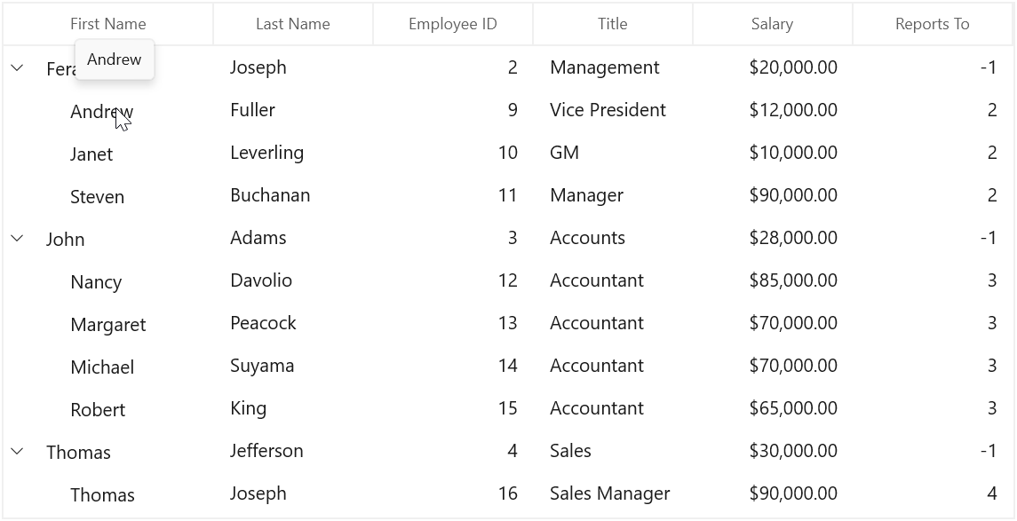
Tooltip supports showing the pop-up window that displays the information when the mouse hovers over a cell of the SfTreeGrid.
Record cell tooltip
You can enable tooltip for the TreeGridCell by setting the SfTreeGrid.ShowToolTip property to true.
<treeGrid:SfTreeGrid Name="treeGrid"
                       ColumnWidthMode="Star"
                       ShowToolTip="True"
                       AutoExpandMode="RootNodesExpanded"
                       AutoGenerateColumns="False"
                       ChildPropertyName="ReportsTo"
                       ItemsSource="{Binding Employees}"
                       ParentPropertyName="ID"
SelfRelationRootValue="-1" />this.treeGrid.ShowToolTip = true;You can enable the tooltip of a particular column by setting the TreeGridColumn.ShowToolTip property to true.
<treeGrid:TreeGridTextColumn HeaderText="First Name" MappingName="FirstName" ShowToolTip="True" />
<treeGrid:TreeGridTextColumn HeaderText="Last Name" MappingName="LastName" ShowToolTip="True" />this.treeGrid.Columns["FirstName"].ShowToolTip = true;
this.treeGrid.Columns["LastName"].ShowToolTip = true;NOTE
It has higher priority than SfTreeGrid.ShowToolTip.
Header tooltip
You can enable the tooltip of a header cell by setting the TreeGridColumn.ShowHeaderToolTip property to true.
<treeGrid:SfTreeGrid.Columns>
    <treeGrid:TreeGridTextColumn HeaderText="First Name" MappingName="FirstName" ShowHeaderToolTip="True" />
</treeGrid:SfTreeGrid.Columns>this.treeGrid.Columns["FirstName"].ShowHeaderToolTip = true;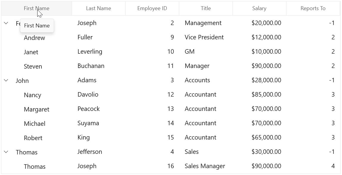
Tooltip customization
You can customize the template of ToolTip by using the TreeGridColumn.ToolTipTemplate and TreeGridColumn.ToolTipTemplateSelector properties.
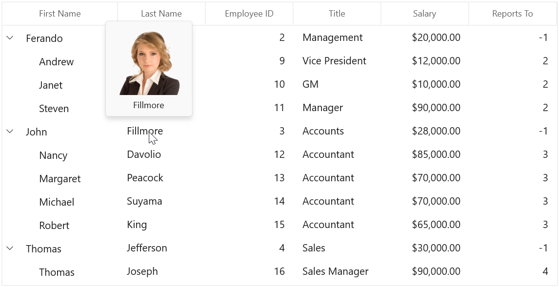
Customize the tooltip using ToolTipTemplate
You can customize appearance of the tooltip of a particular column by setting the TreeGridColumn.ToolTipTemplate. You can also customize appearance of the header tooltip of a particular column by using the TreeGridColumn.HeaderToolTipTemplate property.
<treeGrid:SfTreeGrid>
    <treeGrid:SfTreeGrid.Resources>
        <local:StringToImageConverter x:Key="ImageConverter" />
        <DataTemplate x:Key="TemplateToolTip">
            <Grid>
                <Grid.RowDefinitions>
                    <RowDefinition Height="*"/>
                    <RowDefinition Height="*"/>
                </Grid.RowDefinitions>
                <Image Height="100" Width="100" Source="{Binding LastName,Converter={StaticResource ImageConverter}}" />
                <TextBlock Grid.Row="1" Text="{Binding LastName}" HorizontalAlignment="Center"/>
            </Grid>
        </DataTemplate>
    </treeGrid:SfTreeGrid.Resources>
    <treeGrid:SfTreeGrid.Columns>
        <treeGrid:TreeGridTextColumn HeaderText="Last Name" MappingName="LastName" ToolTipTemplate="{StaticResource TemplateToolTip}" ShowToolTip="True" />
    </treeGrid:SfTreeGrid.Columns>
</treeGrid:SfTreeGrid>
public class StringToImageConverter : IValueConverter
{
public object Convert(object value, Type targetType, object parameter, string language)
{
string imagename = value.ToString();
return @"Assets\" + imagename + @".png";
}
public object ConvertBack(object value, Type targetType, object parameter, string language)
{
return value;
}
}
NOTE
View sample in GitHub.
Events
CellToolTipOpening event
The CellToolTipOpening event occurs when any tooltip of the cell is opened. The CellToolTipOpening event receives the TreeGridCellToolTipOpeningEventArgs as argument which has the following properties:
- Column: Gets the hovered cell column in the SfTreeGrid.
- Node: Gets the hovered cell node.
- Record: Gets the data context of hovered cell.
- RowColumnIndex: Gets the row and column index of the hovered cell.
- ToolTip: Gets the tooltip of the hovered cells.
<treeGrid:SfTreeGrid Name="treeGrid"
                       ColumnWidthMode="Star"
                       AutoExpandMode="RootNodesExpanded"
                       AutoGenerateColumns="False"
                       CellToolTipOpening="treeGrid_CellToolTipOpening"
                       ChildPropertyName="ReportsTo"
                       ItemsSource="{Binding Employees}"
                       ParentPropertyName="ID"
SelfRelationRootValue="-1"/>this.treeGrid.CellToolTipOpening += TreeGrid_CellToolTipOpening;
private void TreeGrid_CellToolTipOpening(object sender, TreeGridCellToolTipOpeningEventArgs e)
{
}